The magic of light
"Ich trete in die dunkelblaue Stunde -
da ist der Flur, die Kette schließt sich zu
und nun im Raum ein Rot auf einem Munde
und eine Schale später Rosen – Du!"
Gottfried Benn, Blaue Stunde
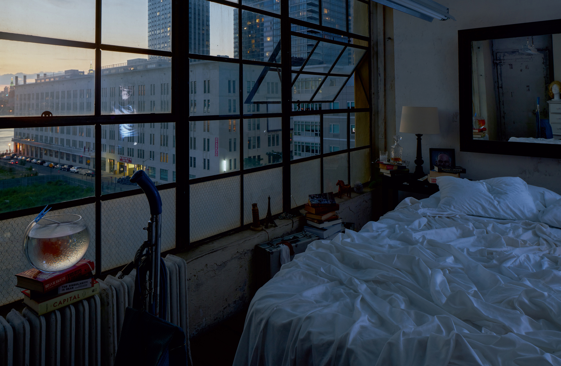
When the sun has vanished from between the buildings in the city and its rays glow faintly in the distance, then starts the “Blue Hour”. At the tipping point between day and night the blueish shimmering residual light lies like a soft filter over the sky and the city. The edges of buildings suddenly seem softer, the sky glows in intense blues, and the lights slowly flick on beautifully around town. This natural drama between dusk and sundown has always fascinated painters, photographers and poets. Elizabeth Diller of New York architects Diller Scofidio + Renfro captured the transition from day to night and the nascent excitement and anticipation for the jubilee edition of the Zumtobel Group Annual Report (2015-6) in a total of 45 large-format images by photographer Matthew Monteith.
In all the shots, the viewer gazes from one and the same perspective into the bedroom of a New York loft apartment. We can discern the tip of the Empire State Building in the large windows. In the room itself there’s a bed with tousled sheets, books, a goldfish in a bowl, a vacuum cleaner. Reminiscent of American realism, the backdrop hardly changes in the first few images, the key player being the light of the setting sun that shines softly into the room. Only once the Blue Hour starts does the vague outline of a person appear, whose image can be seen in the large mirror above the bed. When night falls, the mysterious protagonist changes position, turns into another person, and eventually leaves us alone with the artificial city lights.
The extraordinary photo project shows impressively how the mood of a room changes as the natural light seeps away and is gradually replaced by artificial light. “In the spectrum of the ‘Blue Hour’, the colors gleam more intensively, shadow and light become more diffuse and buildings somehow look sexy,” is how architect Elizabeth Diller describes her view of the seemingly magic phenomenon. The graphic concept for the annual report also visualizes the inner life of the Blue Hour: The volume, which like the picture volume is sized 28 times 37 centimeters, boasts print and paper that runs from deep blue to dark blue to bright blue.
MORE on Stylepark:
You have to fight for good ideas
David Chipperfield, Bruce Mau, Anish Kapoor, Stefan Sagmeister,
Sanaa, Snøhetta and James Turrell – all of them have designed artistic
annual reports for the Zumtobel Group. Adeline Seidel asked Jürg
Zumtobel how the idea came about and where his passion for beautiful
books comes from.

