Clear lines for conferences
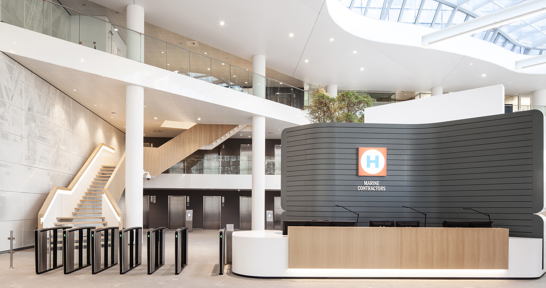
For the interior design of the headquarters of Heerema, one of the world’s leading off-shore companies in the field of structures and extraction systems for the oil and gas industry, Dutch interior designers Heyligers relied on a thoroughly pared-down design idiom. In the Dutch town of Leiden, not far from the main railway station and the university, lies the 22,000-square-meter, twelve-story building; it is based on a C-shaped floor plan and was designed by OPL Architecten. The core element of Heyligers’ interior design concept is the introduction of “dynamic working”, which is reflected in almost all areas of the headquarters. Here, the lower three floors are allocated to communal usage: It’s here that you can find, amongst other things, the entrance foyer with reception and spacious “Plaza”, as well as a company restaurant, sports facilities, a bar and the conference center. The basic ambiance of the light and airy building is welcoming: White walls and ceilings combined with light wood create a clear framework, while noise-absorbing glazed dividing walls and carpeted floors ensure a focused atmosphere. The careful use of colors also delineates the various areas of the company.
The result is various room situations for individual and group work, as well as for individual meetings – from the small meeting table for the personal discussions in twos or fours to the large conference room on the management level. While the Wilkhahn tables “Graph” and “Timetable” (with oak veneer or coated in white) reflect the basic tone of the surrounding surfaces, the “Graph” conference chairs in black and anthracite set a deliberate graphic tone: “We were on the hunt for a comfortable conference chair with a solid and clear design, so we opted for the graph”, explains Heyligers interior designer Lonneke Leijnse. In addition, the work environment had to be flexible in its design - a brief that the swivel, roller-based chairs fulfill in a playful way.
The “Graph” chair created by Stuttgart designers jehs+laub got its flowing form during the design process, as the organic shell of the seat is cut first horizontally and then vertically, so that it can then be assembled again in modified fashion. The modelling of all the surfaces and the invisible screws further emphasize the clear form. Even the seams of the covers follow precisely the elegant lines of the interior design concept. This is matched in both the “Graph” table and the mobile conference table “Timetable”, the top of which can be tilted upwards around the central frame by means of an easily-operated hinge mechanism. In order to ensure the table legs don’t get in the way along the long sides, the frame geometry has been significantly broadened, so that two chairs can comfortably fit between the base.


