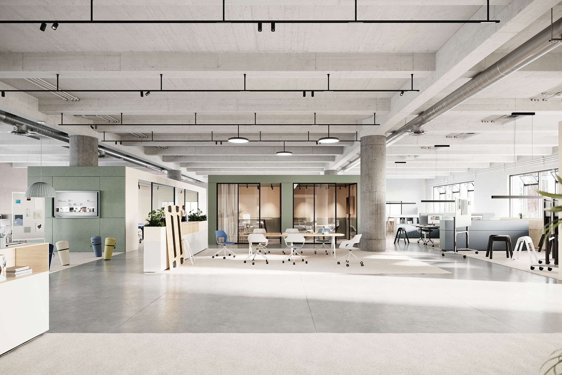
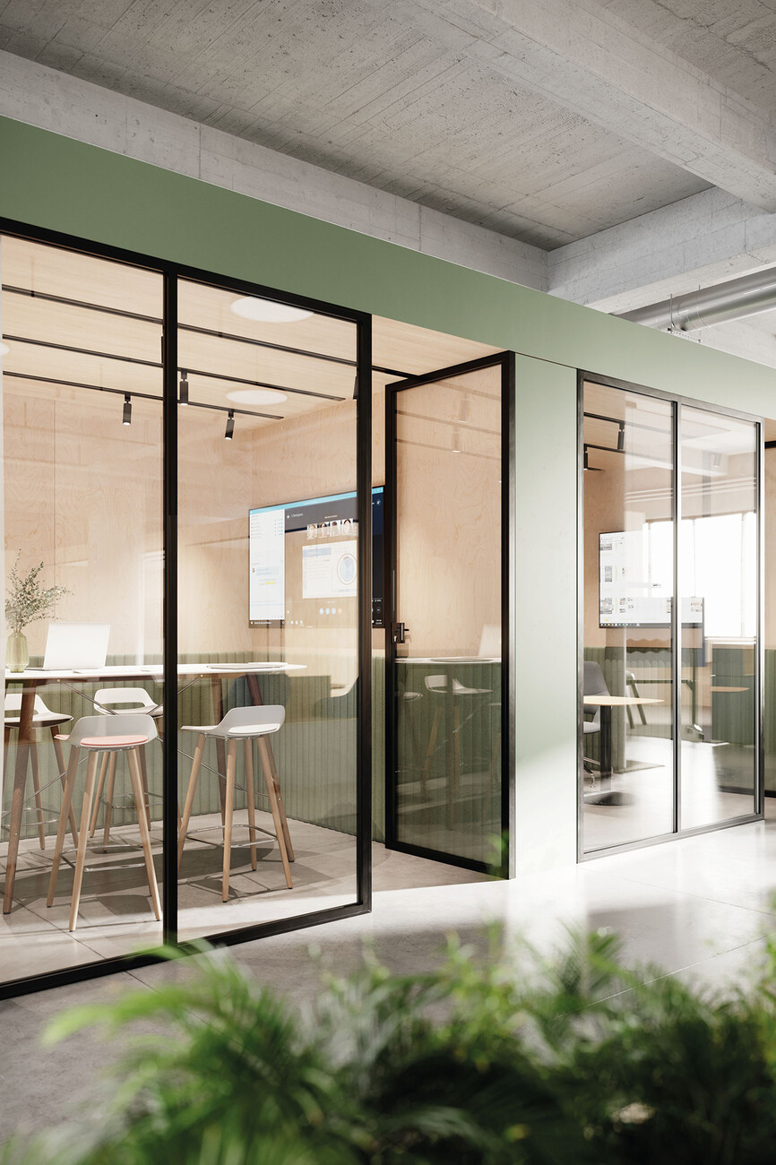
A realistic virtual building
Fabian Peters: In what way does 1zu33 differ from a “normal” architecture practice?
Georg Thiersch: The idea behind 1zu33 is to some extent explained by the name: Architects use the scale 1:33 for visualizing interiors. We see our work as being located somewhere between that of architects, interior designers and communications experts. After all, as we see it architecture often has a lot to do with communications.
Could you explain that by way of a specific example?
Georg Thiersch: Well, people talk for instance of brand architecture – architecture intended to convey the image of a brand to the public, an idea found, say, in the retail sector or with exhibition architecture. What is just as important though less obvious is getting a message across to the people or employees using the building. It will become increasingly important to communicate a company’s values, convictions and tasks to its own staffers. What we attempt is to find innovative solutions for the communication of architecture – in both directions.
Working in collaboration with Wilkhahn you have developed the “Human Centered Workplace”, an extremely diverse concept aimed at helping architects and users to implement tailored New Work solutions. How did this collaboration come about?
Georg Thiersch: Wilkhahn had asked us to find ways of presenting New Work scenarios in an attractive virtual setting with the help of 3D and modern rendering techniques. In looking for suitable strategies for addressing the task we reflected on the old Wilkhahn virtues: We studied the problems from a practical perspective and stayed close to reality in order to develop the best-possible product for users. We were quick to realize that we definitely had no desire to create a virtual world that has nothing in common with real life. Everything was to have a clear connection: to potential users, to a specific place, a certain outlook on life. And that made us think of Denmark because we feel that the balance between work and life is handled really well there in a way we find highly inspiring. Which is why we designed a virtual office building in Copenhagen’s Nordhavn district.
Unlike customary commissions, here you did not have a project for a client who needed rooms for a certain number of employees or rooms that have certain functions. Yet the design was to be as realistic as possible. How did you go about it?
Georg Thiersch: During our research we came across a Danish entrepreneur and art collector who has a warehouse where he keeps his collection. And we began to elaborate on this idea: What if such a cultivated man were to establish an art book publishing firm and locate it in Nordhavn? Our next step was to consider which staff would work there and what they would need for their work.
Was there a particular reason why you decided on a publishing company as the inhabitant of your virtual office building?
Georg Thiersch: What made a publisher so attractive for us was that we would be able to visualize a great many different functions and working areas. Areas are needed for discussions, for conferences, for coordinating workflow, for creative development work in the group, and likewise for the focused work on your own, and naturally also archive and library spaces. And then we thought it would be nice to have a connection to the general public and so we installed a small bookshop in the virtual publishing house where you can buy the company’s publications.
You decided to accommodate the publishing firm in an existing building, a former warehouse that will be converted for its new purpose. Why was that?
Georg Thiersch: It’s my firm conviction that we architects have a responsibility to make use of existing structures and adapt them to new requirements. The solution can’t be to constantly be demolishing intact buildings in order to build new ones. That is simply not sustainable. We have to make an effort to reactivate old buildings on a much larger scale than has been the case to date. To my mind the results are often much more interesting than a new building. Incidentally, companies should be aware that through such a responsible handling of resources they can also communicate commendable values to the outside world.
The highlight of the virtual conversion is a large concrete insert that divides the former warehouse into zones. What’s that about?
Georg Thiersch: This actual installation – we like to call it a “table top” – is a large gallery that rests on concrete pillars. On three of the four sides it is set several meters apart from the outer walls so that the large room can be experienced in its full height in this area. On the one side of the “table” stairs resembling an amphitheater lead from the ground floor to the gallery. They also serve as seating for people attending readings and other events. On the other side of the “table” on the ground floor we installed a library cube. Below the gallery you have all the necessary utility rooms – including showers and lockers so that staff who cycle to work have facilities where they can get changed. And we also located a kitchen here, which provides the food for the cafeteria where both employees and also members of the public can have a meal. And very importantly: There is storage space beneath the “table” for furniture say for workshops or other creative get-togethers. The workplaces are arranged on the “table top” itself but due to the large airspaces they are always still linked to what is happening on the ground floor.
Can you give us some idea of what the area on the gallery looks like?
Georg Thiersch: The upper work zone has large open areas but also closed spaces. We are not of the opinion that you should not have any walls in the office. Some things, such as video conferences, can be done better in a closed environment.
What particular aspect of the virtual office building reveals Wilkhahn’s distinct style?
Georg Thiersch: Versatility is a key aspect of almost all of Wilkhahn’s products. There is hardly an item that is so fixed to one spot in the room that you cannot move it, transport it or remove it. Everything is in flow – at least potentially. Simultaneously, Wilkhahn’s starting point is always the function; it puts the focus on the benefit for the user. Design is never an end in itself but always arises out of the respective tasks.
So how adaptable should offices be going forward?
Georg Thiersch: It’s all a question of balance: I’m not a supporter of a completely open area that employees divide up using a few wall screens dotted here and there. Nor would I advocate a completely rigid structure. In our design you have on the one hand fixed points that lend the space structure, while on the other hand you have large open areas for a wide variety of functions that can be used flexibly. For example, the archive space can be reduced or expanded thank to large cabinets on wheels. When the cabinets are pushed together it’s also possible to install mobile tables, whiteboards and lightweight stools, say to hold an impromptu creative meeting.
You are currently expanding your own office space. Did you incorporate insights from your work on the Wilkhahn project into the project?
Georg Thiersch: Most definitely! We had actually almost completed our own planning before we began the project with Wilkhahn, but during our work on the virtual office building we realized we needed to take a completely new and more fundamental approach in order to attain the flexibility we recommend to others.


