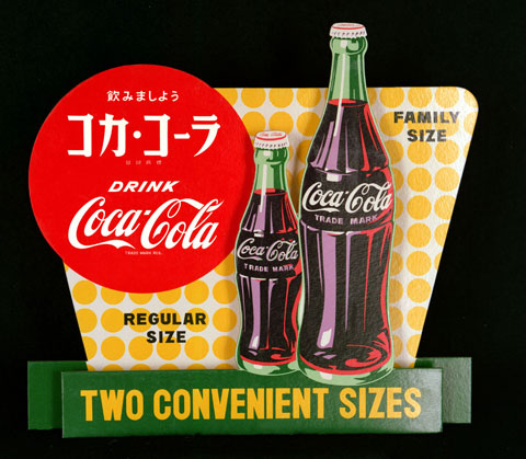
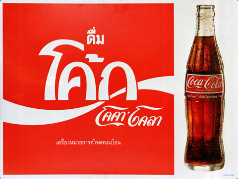
The major US and Japanese consumer goods brands shape the face of the globalized world. In every corner of the world you can now drink a coffee at Starbucks, eat something at McDonalds and buy Coca-Cola. Packaging is the most important medium for brand messages, as research shows that the lion's share of buying decisions are main direct in front of the supermarket shelves. Meaning a product's visual and tactile impression outweighs all other forms of advertising and is thus the brand's crucial manifestation.
So what happens if products are on offer worldwide? Does brand design become more uniform as a result of globalization? "No," says Thekla Heineke, creative director at Kakoii, an agency in Berlin and Tokyo that helps companies entering new markets. "International brand leaders also have to adjust their packaging to the specifics of local markets - that applies to premium products just as it does to the bargain segment."
Designing packaging for foreign markets is an open-ended learning curve for the designer and clients alike. Even prior strategic efforts by marketing departments, such as market research of analyses of target groups, does not suffice to completely communicate the specifics or idiosyncrasies of a local identity. Most corporations with multinational operations therefore include designers from the respective countries targeted in the process of developing a local visual idiom, or they send their own design team to do field research in the countries in question. In this way, they foster cultural education and intuition (i.e., crosscultural awareness). After all, one and the same visual code can be read differently from one culture to the next. If colors, shapes and names mean something different in a neighboring country, then a uniform design vocabulary will definitely not function in countries that lie further afield. Global players are especially well versed in the business of subtly adjusting things to the respective cultural background, combining the setting, packaging and other ad measures. But even they apparently have to be prepared to face the inevitable flops from the trial-and-error design process. As often designers first ascertain whether consumers ‘understand' their product following tests within small segments of the markets targeted. "Surprising misunderstanding often first emerge immediately prior to the market launch," reports Thekla Heineke.
Buyers' acceptance of packaging tends to be driven by emotions; as does the work of designers: "Quite a lot of decisions are made intuitively," Heineke explains. Starting with the best way to use foreign lettering: Not rarely these are deployed the way the designers think others would do it. Sometimes Europeans find something more "Japanese" if it looks "Chinese". Conversely, the Europeans are often astonished by how Japanese typographers use Latin letters.
The design psychologist also cites other reasons for designs failing - for example, while white is often associated with cleanliness in Central Europe, in some Asian countries it is considered the color of death. Likewise, certain volumes and packaging sizes are linked to numbers that are viewed as unlucky. In Japan, for example, you never get sets of four, as the number four is a harbinger of doom.
There are not only misunderstandings between continents that lie far apart, as there are country-specific design idioms even within Europe. In France, packaging design is definitely more playful, feminine and softer than in Germany, as the example of mineral water shows. In France, the preference is for images of ethereal models in rosé hues, while in Germany the ads hinge on a crescendo of waterfalls and the primordial nature of the forest. In East Europe, by contrast, there are new notions and standards for the choice of colors: "The ‘orange revolution' in the Ukraine in 2004 means that orange as a color has political implications, The same is true in the former Eastern bloc countries as regards red, which is connected to communism," Thekla Heineke continues. In general, in times of social upheaval and the repositioning of a national identity, there is a heightened sensitivity to colors, codes and symbols. For instance, the Russian market is defined by a growing upper class with greater financial resources who focus more on the expensive foreign brands. "That results in products for which there would be no market in Germany, e.g., a premium coffee for Russian men that is supposed to look Japanese."
In Germany, there are also clear ideas about what constitutes good packaging design and they are far more influenced by historical criteria than we might imagine. "The US post-War influence is currently ebbing," says Stefan Mannes, MD at Kakoii, "and we are even seeing a counter-trend." In Germany, the newly defined target group of high-income "eco-minded" consumers is at present one of the key reference points for packaging design, whereby the details are communicated in a way that differs from that in the United States: "The subject of healthy nutrition is pretty new here and also entails a strong rejection of fast food and brash and colorful US design concepts," Mannes explains. "Which is why you see reduced, elegant design for that market segment in Germany." Mannes believes the thirst for ‘seals of approval' and the emphasis on predicates such as ‘organic' is typically German. "In many other countries, it is much more usual for food to be ‘natural' and this tends not to be stressed in the packaging."
Globally speaking, new developments in packaging do not necessarily take the United States or Europe as the yardstick. Today, Asian influences are more important for the global stylistic mix. "Something really new is without doubt emerging at present from the design collaboration, from the reciprocal interpretation of different cultures," Thekla Heineke suggests. From the vantage point of design, she does not believe that our preferences and dislikes are becoming ever more similar: "Each political and social shift spawns new attitudes toward colors and shapes, and design thus remains exciting." Kakoii as a consequence usually advises clients to be more courageous in entering foreign markets: In Japan there are any number of products that could be easily sold in Germany without there being any need to adapt them," she concludes.
 Chinese Milk
 Russian Milk; Photo: © Claudia Beckmann, Stylepark
 Russian Milk
 Russian milk
 Italian milk for the spain market
 French cheese
 Foto © Birgit S. Bauer
 Foto © Birgit S. Bauer
 Swedish products
 Aus Israel; Photo: © Nancy Jehmlich, Stylepark
 Japanese Kitkat
 Swedish milk
 Swedish milk
 Swedish milk
 Russian and greek milk
 Australian and italian milk
 Swedish milk
 Russian milk; Photo: © Claudia Beckmann, Stylepark
 From Russia; Foto: © Claudia Beckmann, Stylepark
 From Russia; Foto: © Claudia Beckmann, Stylepark
 From Japan
 From thailand
