A change in perspective
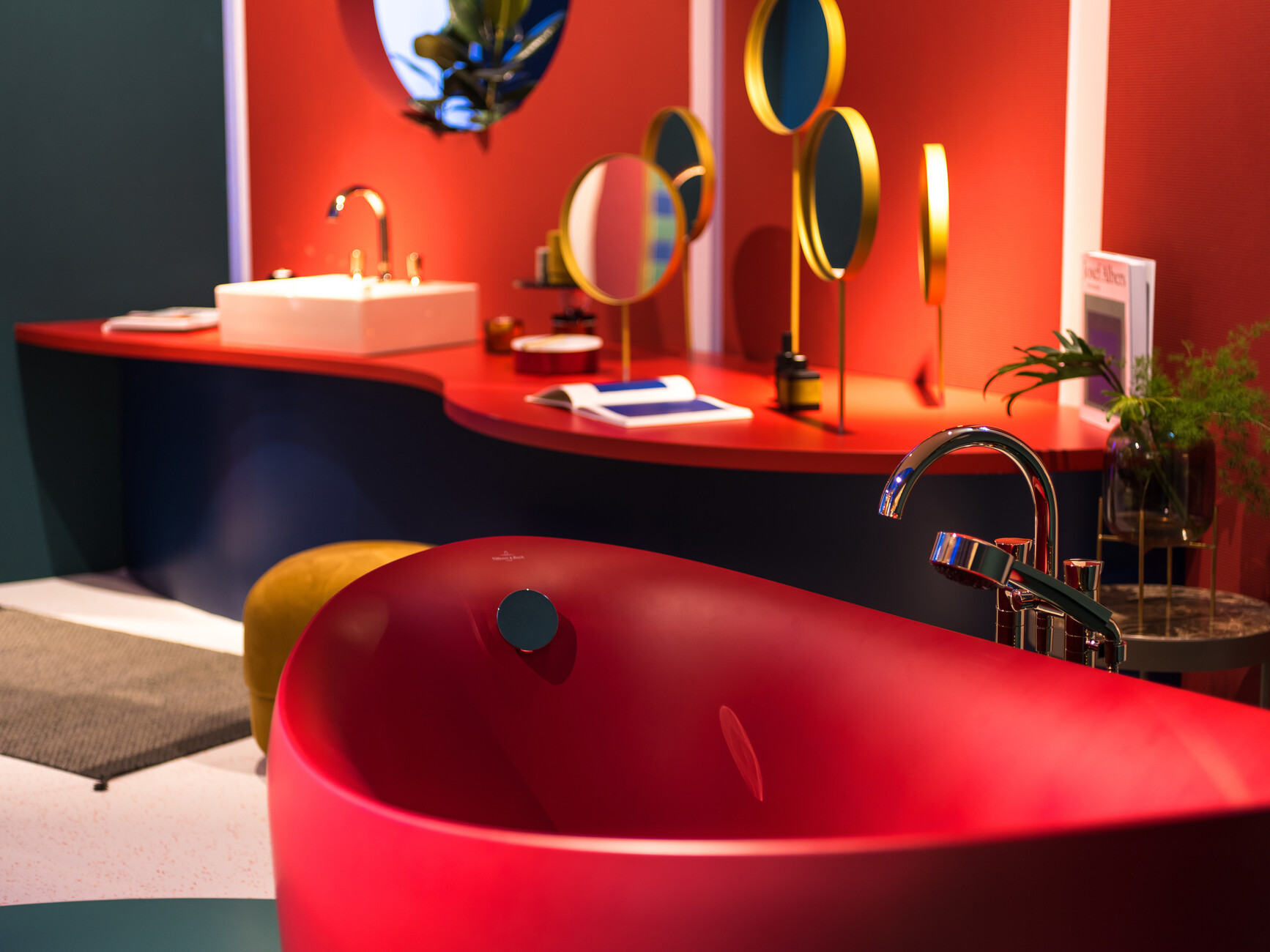
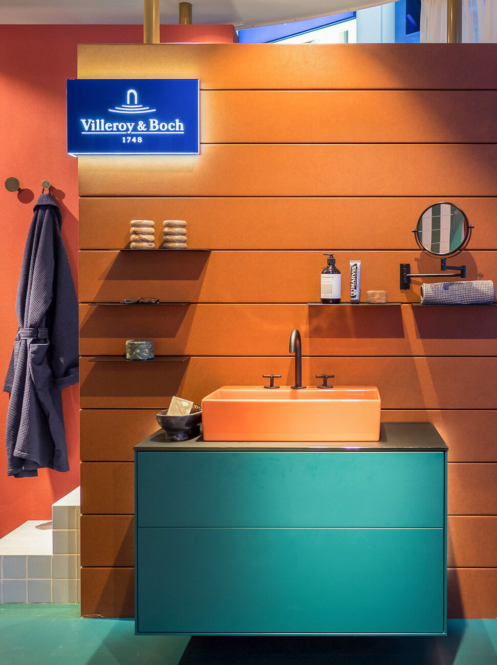
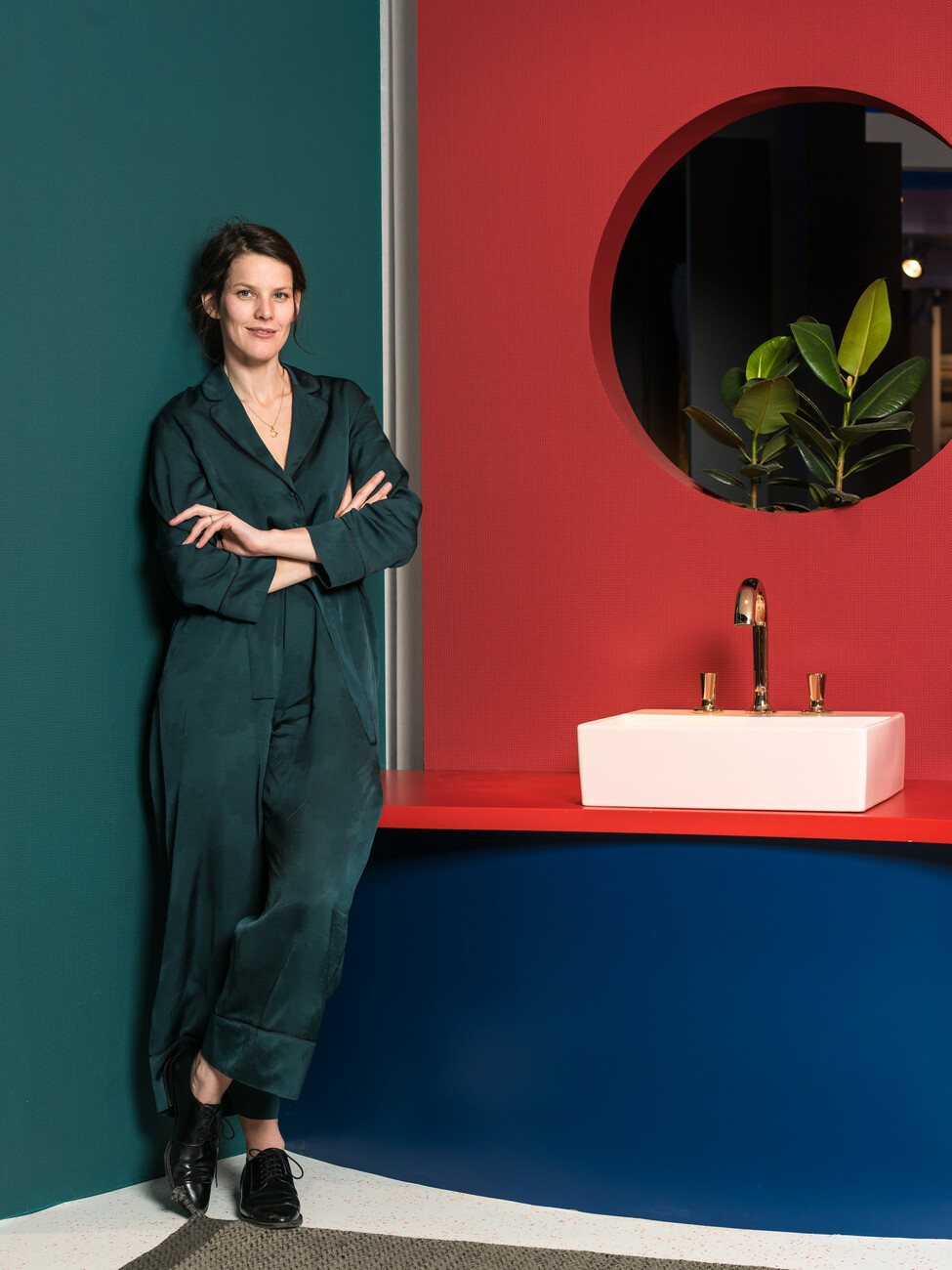
What exactly do we imagine a “women’s bathroom” to look like? Sanitary ceramics with rounded shapes and pastel colors wherever you look? And in this vision, does the “men’s bathroom” resemble an austere carwash, with dark colors and sharp edges? Gesa Hansen feels these labels are outdated. The designer has dared to take the leap into the present moment for Villeroy & Boch Bath and Wellness, and has presented the installation “His & Hers” in the context of her stand design for the sanitary fair ISH. She explains: “I find the division between ‘women’s bathroom’ and ‘men’s bathroom’ totally clichéd. I, for example, need much less time in the bathroom than my husband does.” Instead of drawing clear boundaries between the sexes, she has created a color concept that stands for connection and individuality. Users combine the furnishings, from accessories to storage space, according to their own habits. And the colors are anything but simple white: In the “Her” section, the Aveo New Generation bathtub glows in a bright claret, the countertop washbasin from the Memento 2.0 collection in powder rose, and the subway 2.0 toilet in dark emerald green. In the “His” section, the combination of a Memento 2.0 countertop washbasin in light coral and a Finion vanity unit in rich teal are showstoppers, while the dark blue Venticello toilet corresponds impressively with a wall in rusty hues. Decorative brass trim and cedar-wood surfaces provide delicate accents. “This was precisely about being loud for once and forgoing subtlety. Villeroy & Boch were incredibly brave very early on, and I felt like bringing their boldness for color back into focus once more,” says Gesa Hansen.
The fact that Villeroy & Boch dared to be bold not just in the colorful 1960s can be seen from the archive of the sanitary manufacturer from Mettlach: In the mid-1980s, photographer Helmut Newton snapped strong women with sanitary ceramic items on their shoulders for a polarizing advertising campaign for Villeroy & Boch. Thanks to Gesa Hansen’s broad color palette, everyone can decide for themselves just how brave they want to be when it comes to their bathroom furniture. For the washstand edition “Artis” and select bathtub collections she chose altogether 15 hues ranging from fresh green to frosty blue to bright yellow. The designer drew on the multitude of natural colors through the changing seasons of her chosen hometown of Paris as inspiration for the new color concept. “The new zest for color and a change in perspective feels good,” she says, summing up. With “His & Hers,” Gesa Hansen is continuing her long-standing collaboration with the highly traditional company – and does so with undiminished enthusiasm: “I do feel very passionate about it, especially because I always feel like part of the family in the Villeroy & Boch team,” she comments.


