Minerality for the Spirit of the Place
High-rises as symbols of the kind of format adopted by cosmopolitan metropolises are not Berlin’s style. Fortunately, it is other qualities that bring tourists from all over the world flocking to the German capital on the banks of the river Spree. Yet Berlin has problems recognizing these qualities, nurturing, and above all protecting them. Accordingly, around the time when the two German states were unified, the decision was taken to create a touch of high-rise feeling there – on Potsdamer Platz shortly before the Wall came down and then, after unification, on Alexanderplatz.
At the competition in 1993, architect Hans Kollhoff had sought to resolve the contradiction between the 19th-century Berlin perimeter blocks and standalone high-rises and proposed framing Alexanderplatz with ten-story podiums from which towers then soared up. His aim was to allow people to experience the high-density housing typical of Berlin, while surrounding the square with a family of high-rises which would become a hallmark of the city as a whole. He received much critical acclaim for the project, but his plans were scuppered by the recession. The boom that had fired up people’s imaginations about Potsdamer Platz and Friedrichstrasse had now been and gone and the investors decided to bide their time.
The types of architecture that Kollhoff had outlined vaguely in his urban planning design were reminiscent of US high-rises dating from the 1930s. In the process, he clearly put his finger on something: a high-rise can be beautiful, spectacular, fascinating. A group of such towers, however, thrown together arbitrarily depending on site conditions and the whims of the relevant investors makes for a dreadful impression, the kind to be seen from São Paulo to Kinshasa, from Tel Aviv to Shenzhen, but in Berlin, as well, all around the Kaiser Wilhelm Memorial Church. Accordingly, there is only one way to do things properly: to opt for a minimum consensus in terms of design and a rigorous approach to the relevant urban planning. This is the only way to make high-rises aesthetically palatable downtown. You only need to think of the Rockefeller Center in New York or the five high-rise slabs in Stockholm’s Hötorget district dating from the 1960s, both urban ensembles that can instantly be recognized.
A land-use plan that would have captured the idea failed to materialize, if only for a lack of political will. The investors had secured themselves the real estate in question but they had not taken advantage of the building options. The prefabricated tower blocks on Alexanderstrasse were not torn down and replaced but gradually modernized, and Haus des Reisens (House of Travel) was even heritage listed. Not even the few new buildings, including the execrable shopping center that was “Alexa”, were planned in line with the masterplan, for whatever reasons that might have been.
Twins with hybrid floor
Nowadays the mood amongst investors has picked up and the project developers are back on the scene, wanting to build the occasional high-rise. However, circumstances have changed. And although Kollhoff’s masterplan remains the guiding principle, it can only be realized in some areas; his building design is no longer a planning factor. Set-back top floors as a common feature are something that the investors have now rejected. They now insist on fully exploiting the footprint right up to the pinnacle of the high-rise. It is only the overall height over which the Berlin Senate retains final say. And it has now lowered that from 150 meters to 130 meters. The unique opportunity for a striking “urban crown” has been forfeited.
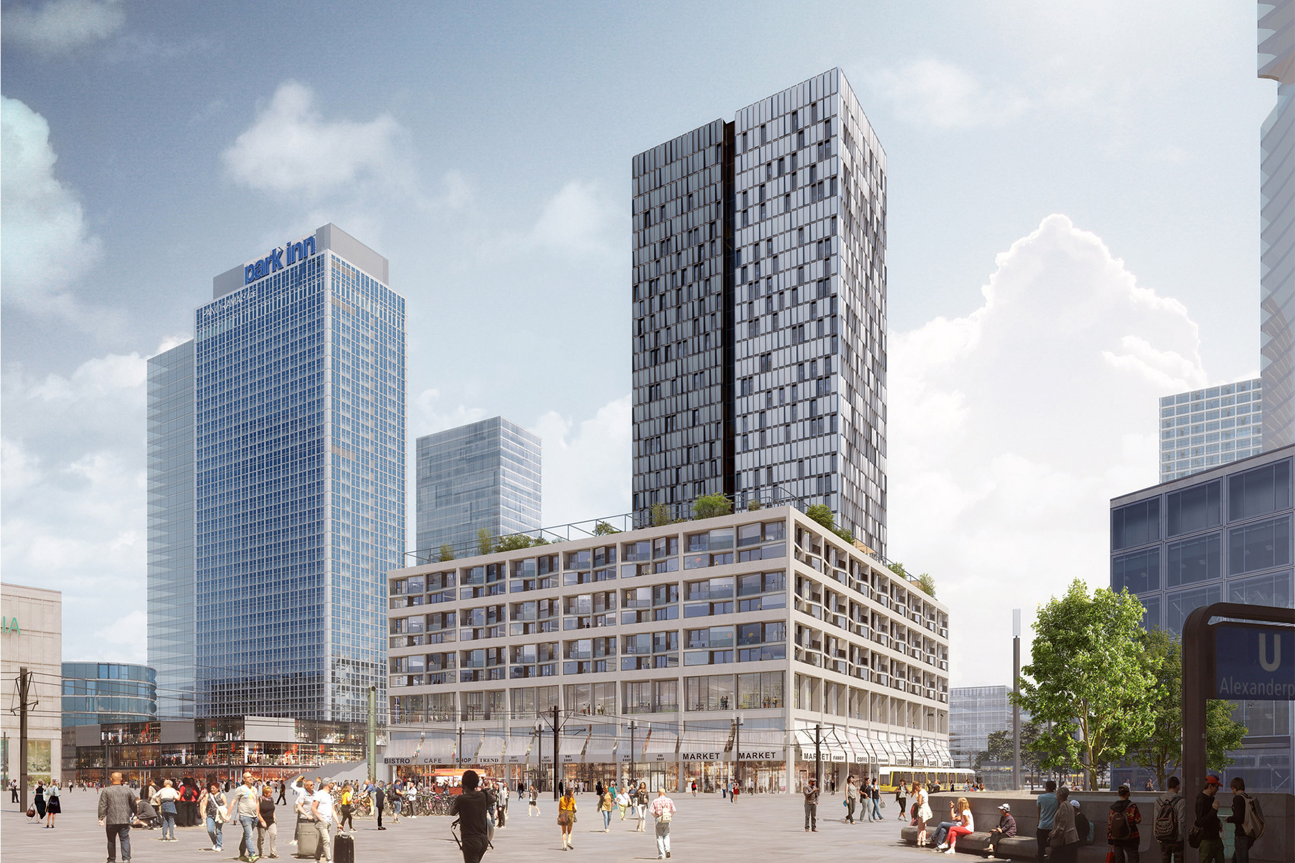
This was the point when Sauerbruch Hutton Architects stepped into the arena, with plans to design one member of the future high-rise family on the site designated as D3. Investor covivio had acquired the land plus the neighboring Park Inn Hotel dating from the East German era (which has now, contrary to Kollhoff’s plans, been left standing) and launched a competition. Sauerbruch Hutton emerged as the winner in the competition, beating Basle-based Diener & Diener in the final round.
The architects therefore filled the building site according to Kollhoff's master plan with a nine-storey base building, on the Alexanderstrasse side of which a tower rises up from street level. However, the permissible scale of use resulted in a rather wide high-rise building, which, in view of the reduced height of 130 metres, was all too clumsy in its proportions. Sauerbruch Hutton helped themselves with a trick and divided the tower into two parts by means of a vertical joint. The separation is further accentuated by the different façade design. The former "United Towers", as the working title had it, thus became the "Twin Towers". The investors' ideas for the use of Alexanderplatz have also changed. Instead of mono-functional offices and hotels, flats are now in demand - 308 residential units are to be realised in the block. The building law dates back to 2000, when there was no question of the compulsory quota of "affordable" flats that is common today, and so, as with Frank O. Gehry's Hines project next door, only privately financed flats will be built, which is not exactly the mix that the Senate's policy wants for the city and for Alexanderplatz. In this case, the flats are to be freely rented in different price categories. At least semi-public uses such as a daycare centre, a fitness centre and a club with a large roof garden are planned on the base building.
When it came to designing the Twin Towers, the spirit of the place came into play. The Peter Behrens’ designed buildings opposite, with their travertine façades, served as the inspiration for the “minerality” theme. Moreover, the six residential floors are grouped together into twos, visually speaking, meaning that it was possible to emulate the divisions of the floors and bays on the façades of the Peter Behrens buildings. With their projecting and recessed elements, and their loggias; the façades of the residential floors offer a varied appearance. Above the two-floor retail zone there is a “hybrid story” that can be used optionally for retail or co-working spaces. Office space is located in the high-rise. The latter’ will have a curtain façade clad with photovoltaic panels which will simultaneously protect them from the heat of the summer sun. There are two-story winter gardens for use by the offices and arranged as offsets on the layout at the respective corners of the buildings.
Something that becomes apparent overall is the way that the architects have been at pains to express the varied usages and to avoid the kind of monotonous façade that tends to be typical of projects of these dimensions. Maybe by the time the project is completed in 2025-6 the color scheme will become slightly more vibrant, in the way that we have come to expect from Sauerbruch Hutton. This would not do any harm and would cause the architects of the subsequent buildings to similarly start having thoughts about making the exterior of their buildings look attractive. With this in mind, the task of the Berlin Senate’s new Buildings Director Petra Kahlfeldt and her advisory board or “building advisors” is surely to realize as much as possible of the idea of Alexanderplatz an architectural masterpiece in the city.


