SALONE DEL MOBILE 2017
Salone, viewed critically 04: Funny and Glossy
Fun is actually possible all the time. Ingenious, sometimes amusingly ironic surprises, of whatever type, have always been welcome in Milan and are successfully deployed to grab the eye in the trade-fair wonder-world choc-a-bloc with stimulating products. This approach tends to get taken above all by younger, lesser known companies that do not worry about being overly serious and need not heed the set ways of the better-healed hell-bent on status seeking.
Moooi is the clear past master of the balancing act between the extravagant and the funny, the pleasurably different and the acceptable, be it placing a Chesterfield sofa on its back to create an item of lounge furniture that fosters privacy, placing little Origami birds on a perch to lighten things, or the “o-rocker”, a closed version of a Rhön cycle for you to chill out in. Images of insects blown up to huge proportions and opulently patterned carpets also do their bit to create a mood that blends the amusingly playful with the special.
Jaime Hayon is likewise repeatedly at the fore when the idea is to step out into the limelight with a nod and a wink, as he once again proved in Milan with his “Stone Age Folk” installation complete with clown-like marquetry for Caesarstone.
Marten Bass, the disrespectful apprentice
Which leaves one person who has always thought too much respect was damaging to the person and this year has conjured up something really special together with Lensvelt – who, as has often been seen in Milan, are decidedly joyful in their output, namely Maarten Baas. He loves donning the role of the playful enfant terrible, who in an act of self-liberation and de-perfecting now and again sets a design classic alight or refashions overly smooth items as if it were child’s play: such as with his “Clay” furniture made of lacquered industrial concrete.
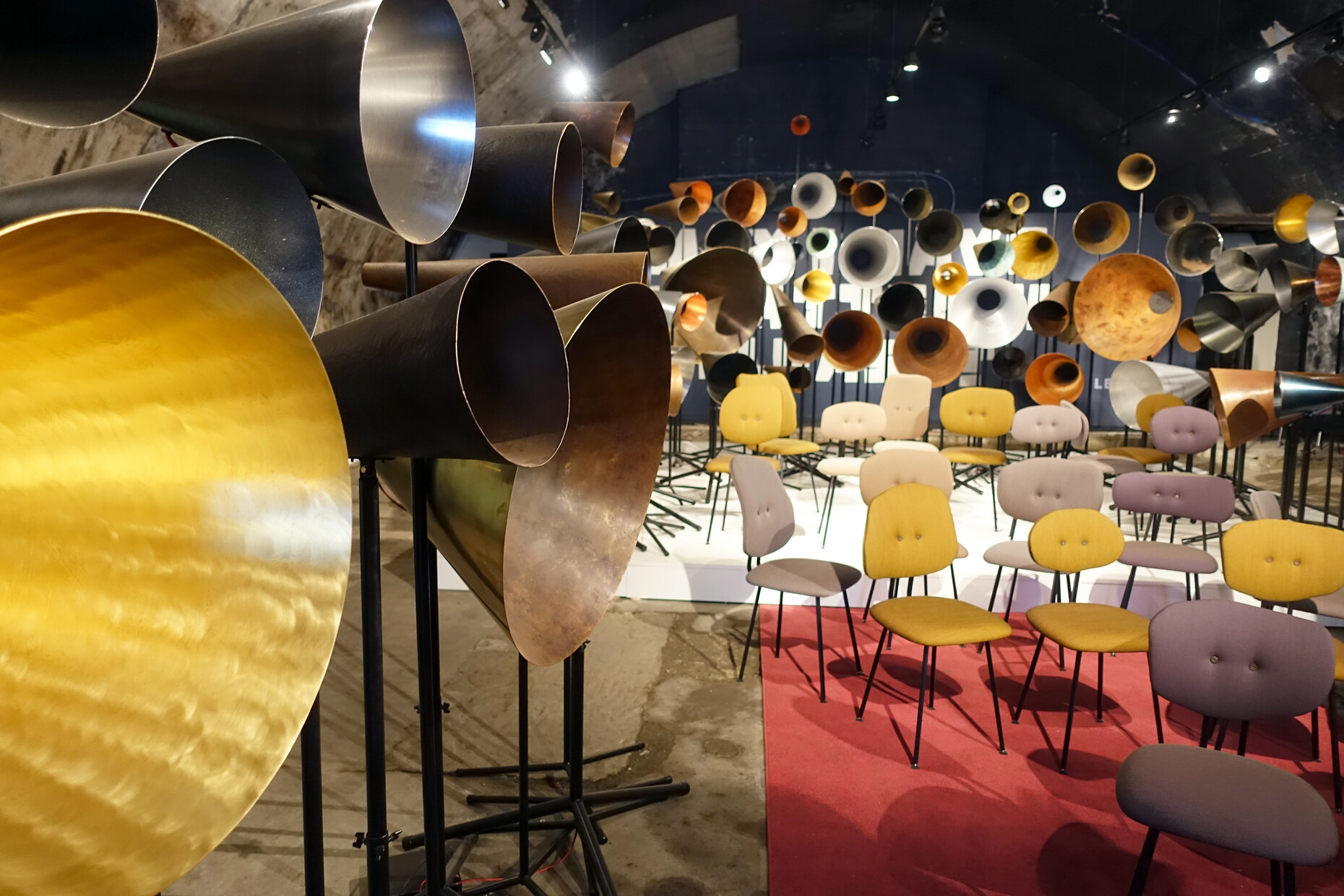
At present, somewhat away from the massive flow of trade-fair visitors, he has conjured up an installation in one of the old warehouse vaults under the tracks of the main railway station as part of the Ventura Centrale. Its very title already affirms that here we have a guy who really knows what counts: “May I Have Your Attention Please?” And thus hardly have you entered the cool concrete cave than you hear murmurs, whispers, sounds – from a veritable forest of megaphones, horn-shaped loudspeakers and funnels all around. Truly delightful.
Marten Baas has always had a foible for circus-like effects, which sometimes verges on devolving into the excessive. But this time he has managed to tame that stance of the permanently young revolutionary and swap it for a framework in which he has appropriately staged his novelties for Lensvelt – the Marten Baas chair 101 and the Marten Baas table. Indeed, the chair takes up his previous line perfectly, giving individuality a real chance in a sea of mass produced products, and he achieves this with differently cut backrests and colorful covers. The essentially plain design exudes the spirit of the Fifties and Sixties, whereby the customary is playfully offset by a comic-like shot of freshness, such as when one of the chairs looks at you with its two button eyes like some friendly alien. The chairs forever differ in terms of shape and color, and thus form a choir with as many different voices as the installation. This is very refreshing in the midst of all the seriousness, and is simply “funny” – and perfect for a company that coyly claims it vends “Non Design” and has as an alternative included a “Boring Collection” for offices in its program.
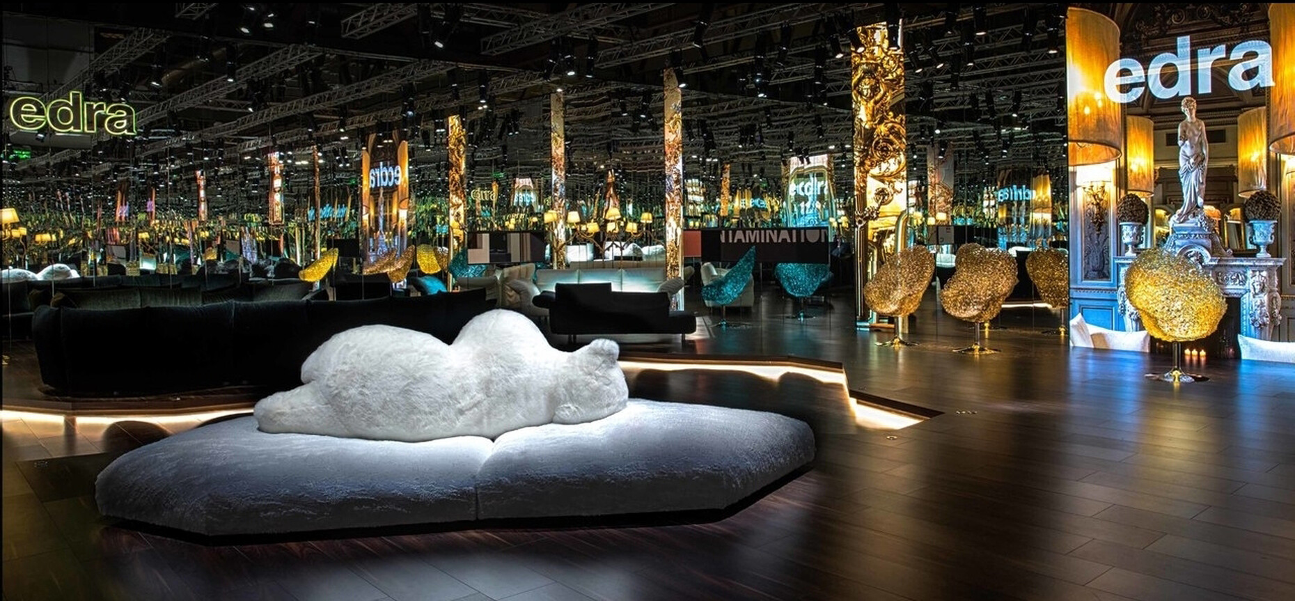
As consistently as ever and yet how very differently Edra plays the trump card of an ironic and zestful living room world that occasionally verges on kitsch – this time with a sofa on which by way of backrest optionally and depending on the color a stylized and 100%-harmless polar bear or a black bear lolls, along with a very gold glittering plastic armchair that is handmade. Yes, every home must get its gleam.
Glossed over
Gloss is one of those things. When it comes to sensuous lipstick lips, at present mainly strong matt colors are all the rage, or at any rate so the beautiful young women seem to suggest, and they should know. By contrast, lip gloss, or so they say, seems a bit cheap and tends to be preferred by young girls. The furniture industry has long since realized that fashion and modernity have been inextricably linked, at the latest since Baudelaire.
Kartell has for years now firmly and perfectly mastered the game of changing styles and collections. This year, the trade-fair presentation has been placed under the somewhat cumbersome motto of “ContamiNation”, especially is one considers “métissage” (neutrally read as “mixture”) to form the essence of design today and then combines this with just about everything and anything to be found in the multicultural field of design.
It is thus quite a surprise to be greeted on the booth not only by the customary wealth of novelties, but also by any number of very glossy surfaces. Okay, maybe this existed before, too, but didn’t quite catch the eye. At any rate, they now play a very striking seductive game with light, emphasizing highlights and shimmering reflections, be it with Philippe Starck’s “Cara Mosshart” armchair, on his “Ray Orrgray” table or on the “Be bop” chairs by Ludovica and Roberto Palomba. NB: It’s all a matter of polish, that creates a unique surface poetics. It’s up to you whether you actually like this or simply think like lip gloss it’s a version for young girls. At least at the Brühl & Sippold stand you can encounter “grace glossy” – an armchair with a refined structure and a seat and backrest both in glossy lacquered wood.
It’s hard to say for sure whether this attests to a new trend in lacquer or nor. But it is noticeable that at Hermès, which is dedicated to the ultimate craftsmanship, suddenly Japanese lacquer work is putting in an appearance – in the shape of two-tone round boxes or octagonal ones held by bridles and fine “Change Trays” courtesy of Pierre Charpin.


