Globalization has us all in its clutches. We’re all feeling the effects. Since the heavens at home have broadened into a global horizon the proximity of direct experience has dwindled, along with the media gaps as regards what we can comprehend or rely on. Who knows, perhaps the tear that runs through our own perceptions of the world is meant to be plugged by a wealth of information from all over the globe such as constantly washes into our daily lives through all manner of media and the Web.
Jasper Morrison, whom has just been elected Designer of the Year 2016 by the magazine “A&W Architektur und Wohnen”, is not only an outstanding designer who has created an astonishingly coherent oeuvre, irrespective of the jobs. He is, and this often gets forgotten, also a precise observer and analyst. With his exact self-descriptions, lucid essays and illuminating hypotheses he is forever pondering the design process and a globalized mode of production. He loves theorizing, he once confessed, and but prefers the work of a designer.
An Anglo-Japanese-Nordic-Italian mix
It may be attributable to truly Brit sobriety that he does not run the risk of falling for some techy, engineering-driven functionalism. The dowry he offers us clearly also includes an unerring instinct for what is necessary and essential, which he combines, and this is really rare, with a physical/tactile feel for the poignancy and elegance of the simple. If we were still to go by national characteristics, then Morrison’s design could be termed an exquisite Anglo-Japanese-Nordic-Italian mix that, it goes without saying, is composed of only the very best ingredients.

Making something better than what already exists
However one might describe the ratios in the mix, Morrison has repeatedly proven himself to be a master of modesty. His creed sounds as simple as his designs actually look: to make something better than what is already there. He has underscored this unpretentious stance with a concept he developed together with Naoto Fukasawa: the “Super Normal”. Not designer icons, so his hypothesis, but the countless things that are unobtrusive when we use them and have an anonymous design are the hallmark of real design.
It is no coincidence that Morrison does not wish to be a design hero, wants as a person to remain low key and prefers to concentrate on his work than on communicating it. At an early date he concerned himself with news and the mechanisms for how it is conveyed to us and circulated, and in 1987 developed and designed a news center for the documenta 8 exhibition.
A straightforward news box
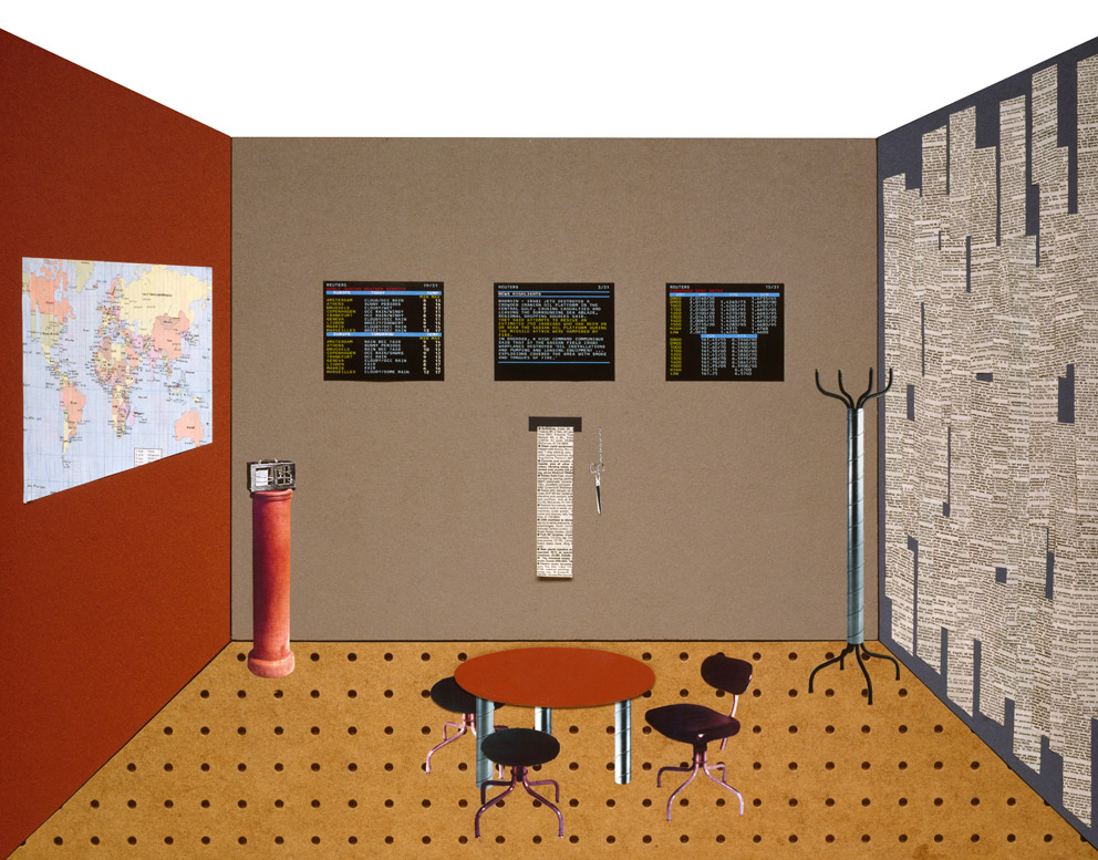
If you look at photographs of the “Reuters News Room” and try to remember the upper floor of the Orangerie in Kassel, stuffed full of paper, then what first catches the eye is the improvised simplicity of Morrison’s environment. It is a simple construction; the space seems more to have been collaged or the product of a DIY attempt than designed down to the last details – and yet was made by a man known for being precise throughout. In terms of media technology, today the ensemble has the feel about it of the office of a small local newspaper in a black-and-white Western, a room in which there’s the telegram desk, the typesetter’s box with its lead letters, and a simple rotary printing press.

In Morrison’s plain box three screens and a ticker unit are installed in the rear wall, whereby the latter constantly spits out news on endless paper. In front of this is a round table with a barrel-like base and around it three simple office chairs. A world map, a barometer, a radio, a coat stand in the corner, a library ladder – and a wall painted black opposite the world map plastered with any number of printed news items.
Ideas are something he tends to find out on the street
The news room that Jasper Morrison created for the design section of documenta 8, which was curated by Michael Erlhoff, is an early, little-known project as idealistic as it is political, and one where we can sense that he still sought to distance himself from clients and manufacturers. On founding his own company in London in 1986, Morrison initially concerned himself with a “revaluation of industrial processes”. In a discussion with designers, entrepreneurs and theorists on “Geo-Design”, and it was then published in the journal “Domus”, looking back he commented on his situation at the time as follows: “When I came out of college in 1985 I was strongly inspired by Memphis. I was in a very romantic, poetic frame of mind. Inspiration was found on the streets rather than sitting at the desk with a white sheet of paper. One was better off going out and walking, getting drunk, waiting to find inspiration the morning after when one’s brain comes back to life. I worked on many ‘found’ projects, things made from objects seen in the street, in the beginning. That made up for a lack of contact with industry – I didn’t have any industry to work with so I had to make up for that somehow myself.”
Among other things he found the “industrial process” of producing the news. His spying on the (then) brain of the information society was as much motivated by design as it was by politics. Knowledge may not exist independently of power, but that does not mean that the existing power relationships are impenetrable and must remain immutable. News items are neither objective nor are they neutral. Selecting them and producing them is a sensitive matter that in an age of global networks still rests on trust.
Looking behind the scenes
In order to render transparent the mechanisms that are at work in the production of news, Morrison transforms the recipient/consumer into the actor who looks behind the scenes. What sources are serious? Where should one follow up? Who filters swiftly and skillfully those items of interest for a certain circle of users from the immense volume of information fed into the system? Who makes the better headlines, who gets hold of the more interesting interviewees?

It is no surprise that heads of news desks often have the character of a racehorse or a wildcat waiting for prey, even if they tend to seem completely relaxed and as steady as a highway bridge across which juggernauts constantly thunder. Always willing to respond, they await the advent of the unexpected, which they readily embrace closely in order to kill and skin it with the routine of experienced hunters. The news is a shy beast and before it becomes news needs to be tracked down, captured and dressed.
Actively handling news
In a text published in the documenta 8 catalog, Morrison explains the intentions behind his environment: “The basic idea behind the news center is to contrast cutting-edge technology in TV news broadcasts with a collection of different, now seemingly primitive and outdated information media. Their diversity energizes the entire ensemble. They ‘round it out’ and give it a humorous dimension into the bargain.” Morrison acts as an artist and a designer. He highlights the asynchronous nature of the media available, the parallels between the “old” and “new” technologies, as this allows him to take a humorous tack. And he above all presents how actively we can approach the news: “The fearless approach to TV, coupled with the playful presentation of the room, encourages viewers to participate actively. Scissors are at hand, as is a ladder and thumbtacks for anyone to use. Viewers can choose to clear up the clutter or cover it with the news print-outs.”
A heap of wastepaper
In this way, passive consumers become critical users. Morrison consciously delegates his critical stance to everyone addressed by the information and news, namely all of us. He enables an experience for all our senses that mobilizes opposition in us. Especially if the plethora of information flowing simultaneously on all the different channels becomes a cacophony – or visibly a pile of wastepaper. Which it becomes anyway since paper is a swiftly spoiled commodity. “In the course of the exhibition,” Morrison commented, “the pin-board wall will be covered with an ever thicker layer of news. The radio and ticker units acoustically enhance the space. The hat stand is reminiscent of journalism in bygone days, the barometer and world map give the sense of a met office. The materials are in part very simple and emphasize the contrast between highly developed technology and simple techniques.”
A space for seemingly objective news thus becomes the stage for an information performance. Playfully, stock is taken of the profits and losses, the risks and opportunities for manipulation in handling “information” as material. The addressee turns into a user who can actively test the production and in the process ascertain how contingent and entropic the process of information processing is.
At the time, in his commentary Michael Erlhoff pointed to a self-reflective aspect of the piece. In Morrison’s environment, or so he said, the “toughest bastion of officialized design comes under attack”, namely the “evocation of professionalism”. This, Erlhoff continued, helped as “only long-standing members seem to possess the constitutive wherewithal – as a superb defense against all things new and all persons younger,” and not only in journalism. “As if professionalism was something you could own, a burden, the result of sweat and action, while it is actually only a cliché for securing your place at the table.”
The author spotlights the products, not himself
Unlike in the 1980s, when design sought to free itself from the old, we might view this differently today. Erlhoff also says of Morrison that he takes a “very English” approach to his work of “reorganizing the famed island professionalism and rejuvenating industrial processes.” Moreover, you only need to substitute “designer icons” for “professionalism” in order to discern in Morrison’s piece for the documenta his own tendency to leave the limelight to his own products. On the surface, Morrison strips the semblance of some professional approach to information down to the bones: “Press offices,” Erlhoff wrote, “are so impressive because of the gesture they contain of zeitgeisty action and communication. Jasper Morrison reconstructs that gesture and showcases it by quoting the glorious tradition of journalism with great precision, and, with the support of one of the leading press agencies, combining it with ultra-modern communications technology. The result is an image of a press office that calls for spine.”
Morrison undermines the emphasis on control innate in the gesture by taking a consciously dilettantish approach to reconstructing it, allowing the bastion to be invaded by doubts, criticism and humor. He thus turns the autocratic control center of the forever new into a theater stage where amateurs can act. The play that is performed amusingly revolves around the powerful impotence of the anonymous user.


