YOUNG TALENTS
Between Art and Architecture
Alexander Russ: The Baukunst Dynamites is a rather unusual name for an architectural office. What exactly does it mean?
Sarah Behrens: We both studied at the Stuttgart Art Academy and set up our own business straight afterwards. That immediately raises the question of a name. We thought The Baukunst Dynamites fitted because we see ourselves as an architecture label that operates in a network and seeks to develop freely. The name sounded like a sports team or a pop band to us and that gets across this idea of a team.
How is your office structured?
Ina Westheiden: The Baukunst Dynamites functions as the basis on which we then collaborate with other people. Depending on the task and what is required we bring in support from freelancers, interns or working students – say for competitions. Our studio is located in the Wagenhallen at Stuttgart’s Nordbahnhof. It’s an artistic environment with studios and workshops. We feel at home there because we also work in a very conceptual manner.
The idea of working as a team and collaborating on projects as opposed to the star architect who operates alone have become popular ideas with young practices in recent years. What role do such approaches play at The Baukunst Dynamites?
Ina Westheiden: Planning and building are such demanding activities that they can only be realized through good teamwork. That’s all the more so for a young architecture label. We originally started our first "Doppelgänger reloaded" project in Stuttgart as a group of five graduates. It entailed the extension and modernization of the Hölzel-Haus, the house artist Adolf Hölzel once lived in and which is now home to an art foundation.
Can you tell us more about the Hölzel House and how the project developed?
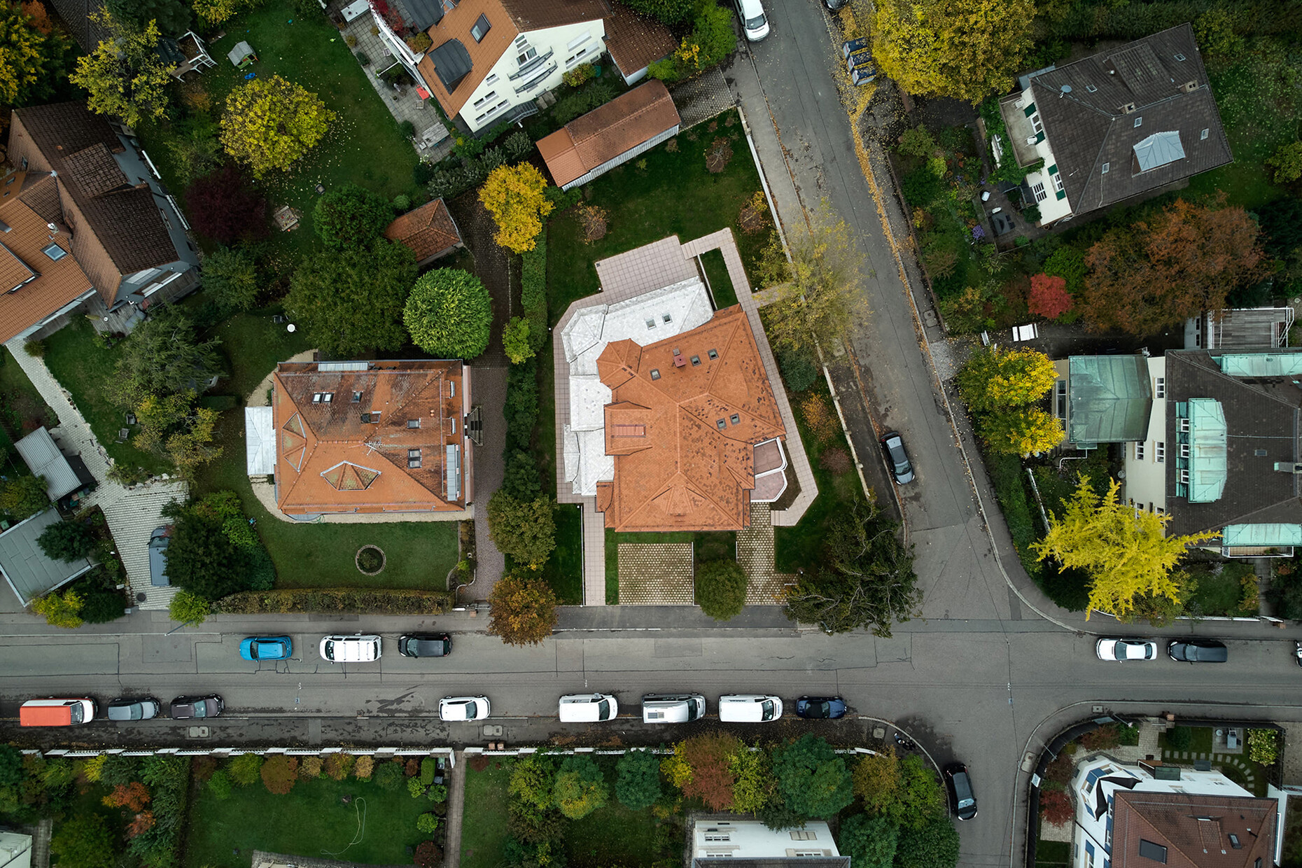
Sarah Behrens: The aim was to expand a villa in the south of Stuttgart to provide space for an art college. In addition, the building was to be refurbished and altered to enable wheelchair access. The foundation organizes readings, lectures, exhibitions, and guided tours here as a means of commemorating Adolf Hölzel’s artistic legacy. There are archive and administration rooms on the ground floor and an apartment for scholarship holders on the top floor. The exhibition rooms are accommodated on the first floor. Originally, there was a competition to design the extension open to graduates of the Stuttgart Art Academy. That was the context in which the five of us teamed up; we knew each other from uni and felt we could do a good job working together. We wanted to collaborate rather than compete against each other. In the end, Ina Westheiden and I saw the project through. This coincided with us setting up The Baukunst Dynamites.
Ina Westheiden: Initially there was a feasibility study in order to find out what was possible under building law. We had various ideas at the start that we discussed with members of the foundation and it became clear that the client was really serious about the project and wanted to work with us. And being an art foundation the client more than willing to consider unusual concepts. What we came up with was "Doppelgänger reloaded", a duplicate of the existing building that wraps around the Hölzel Haus in an L shape.
The project really is very unusual. Could you provide some more detail on the architectural concept?
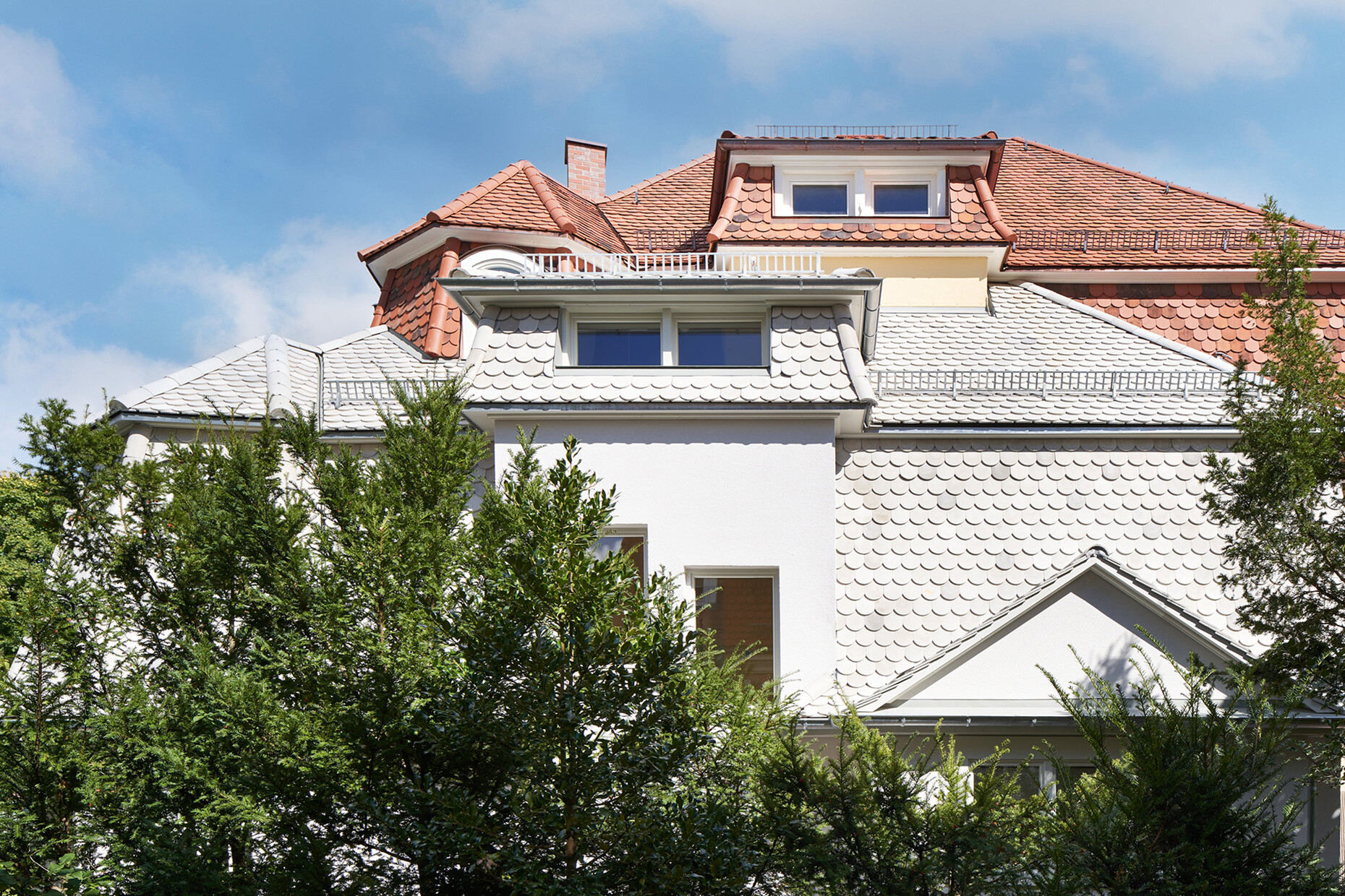
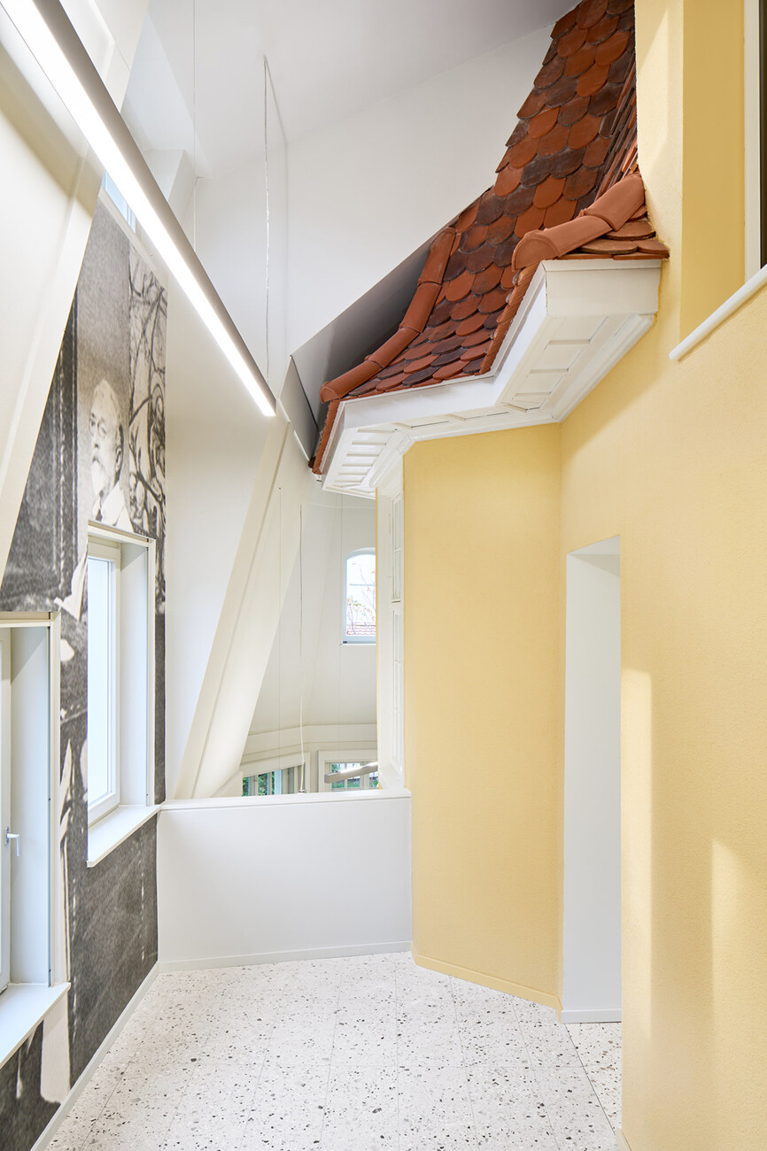
Sarah Behrens: We produced an exact copy of the existing building – exactly as we had got to know it. You see there are elements that don’t come from the original period because the villa was modernized on repeated occasions. Using the copy-&-paste method we duplicated the structure as a building segment and reinserted it in the appropriate place. Through the overlap and the permissible spacing, an annex has thus arisen boasting a timber frame and standing next to the old build. It also stands one storey lower to allow barrier-free access from the garden. Inside the extension comprises a two-storey air space in which the existing architecture, i.e., the facade and roof of the villa, meets the extension. And now this mundane building has suddenly been transformed into something special through this overlap of old and new. We wanted, on the one hand, to respect the old build, but on the other to enhance it.
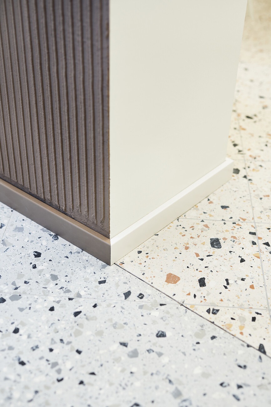
Ina Westheiden: We have kept the extension in decolored tones in order to make the difference between old and new visible. The roof, for example, therefore features hand-painted concrete tiles rather than the reddish plain tiles of the villa. It’s the same inside: You have the beige-brown terrazzo tiles of the old build contrasting with the black-and-white terrazzo tiles of the new. We also added pilaster strip-like projections on the wall and roof surfaces, which act as playful references to the spatial structure of the old building. You see it was very important to the foundation that the building be refurbished without ruining it. They wanted the layers of time to remain legible.
There was a similar concept behind your project "Wohnen mit Morris" where you modernized a small apartment in Stuttgart.
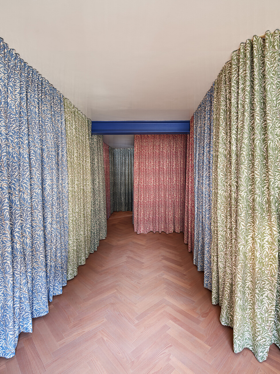
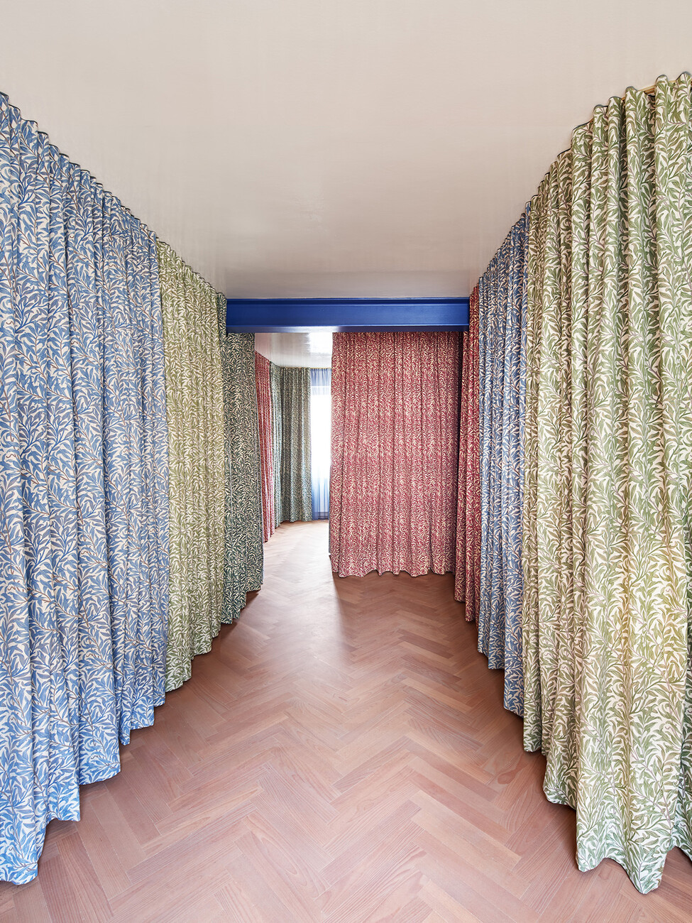
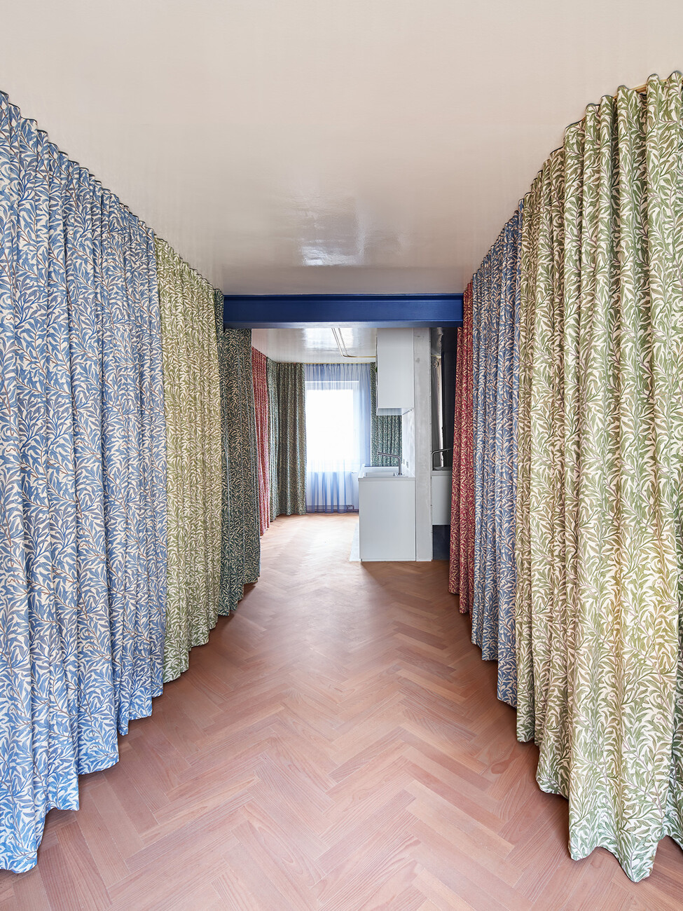
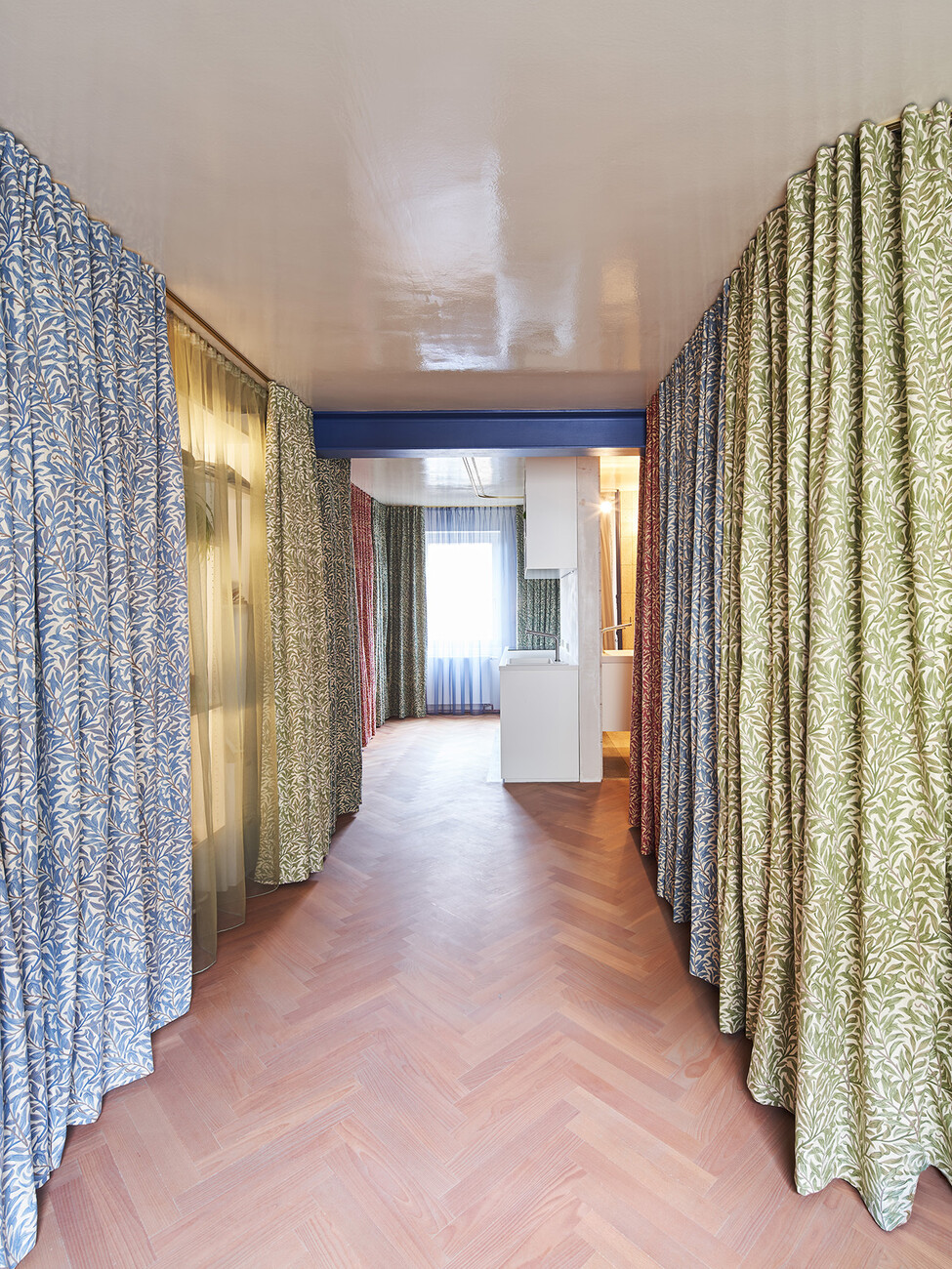
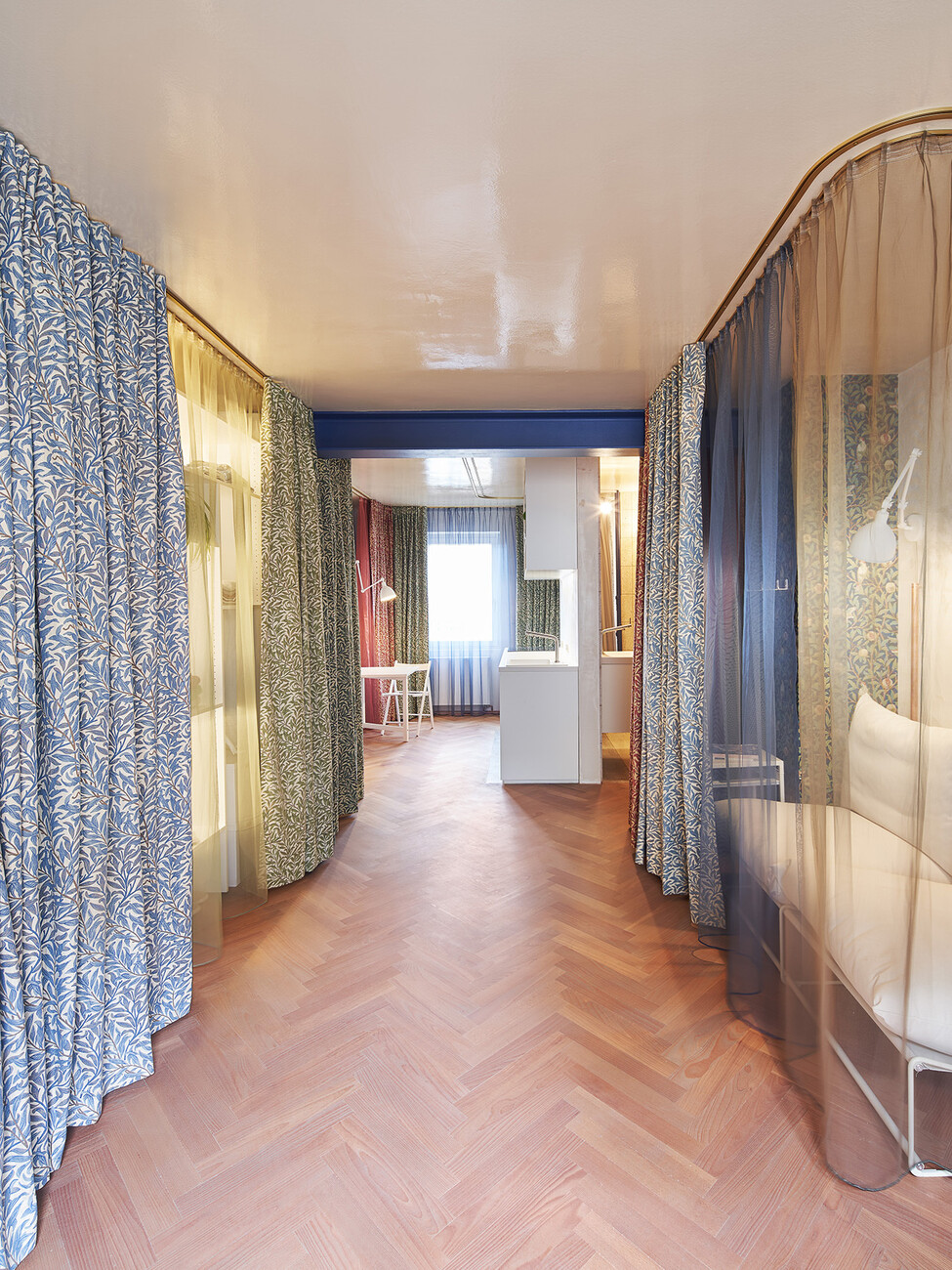
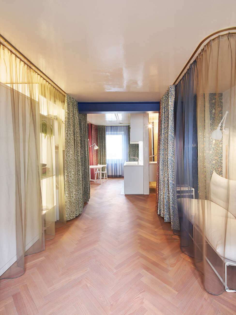
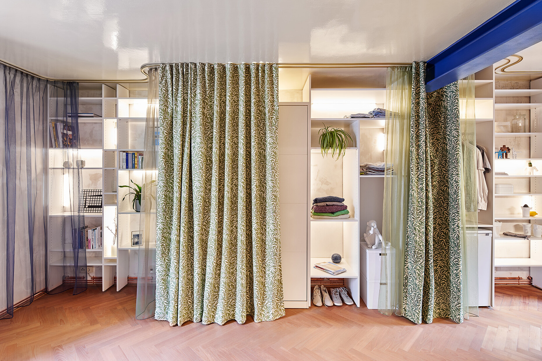
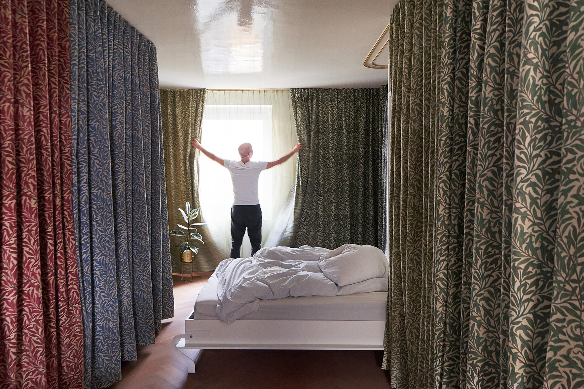
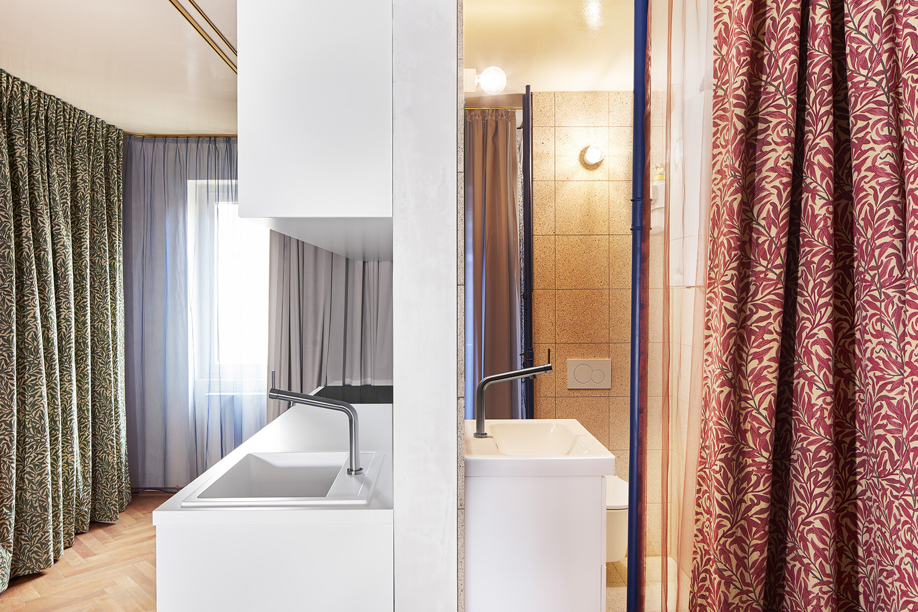
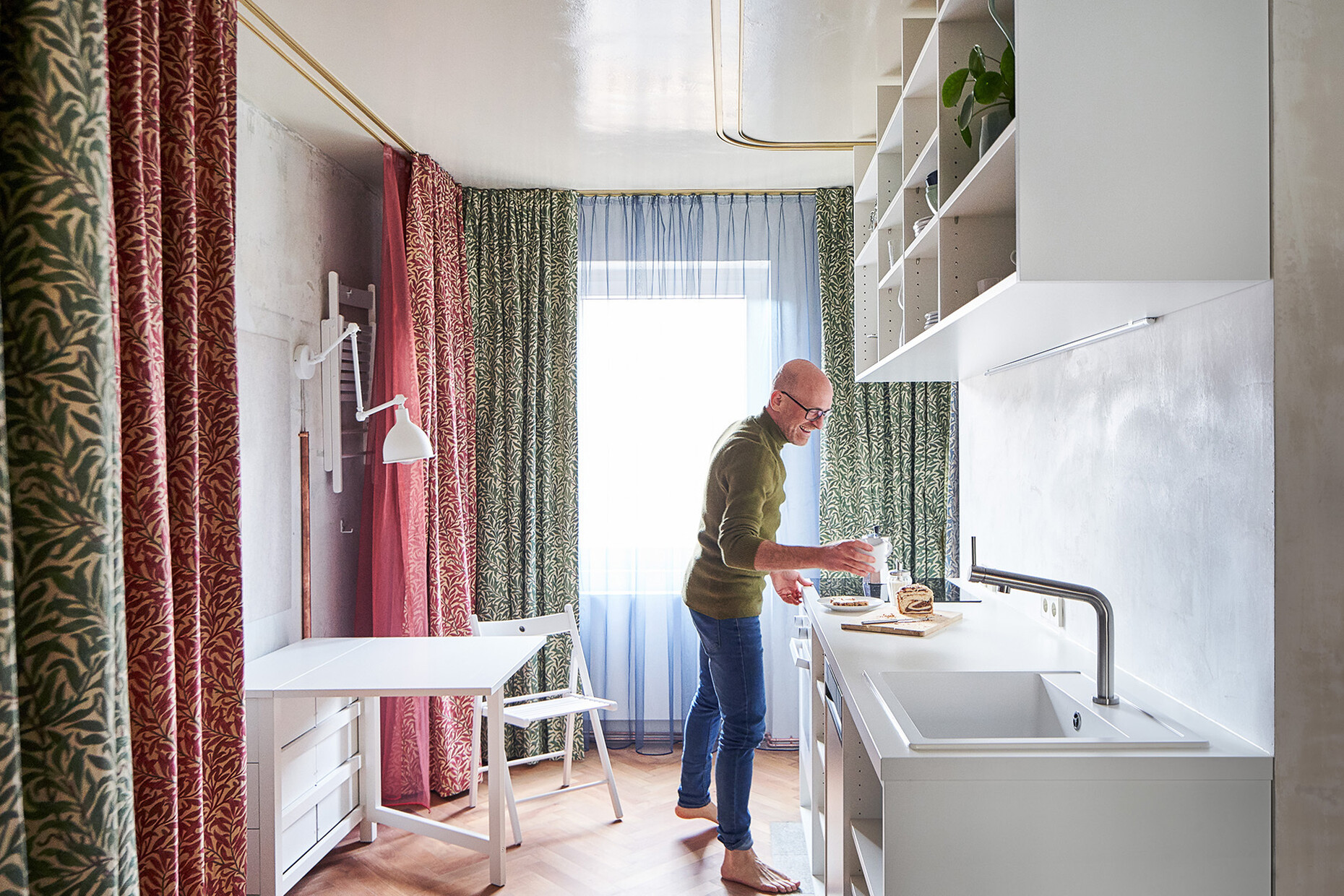
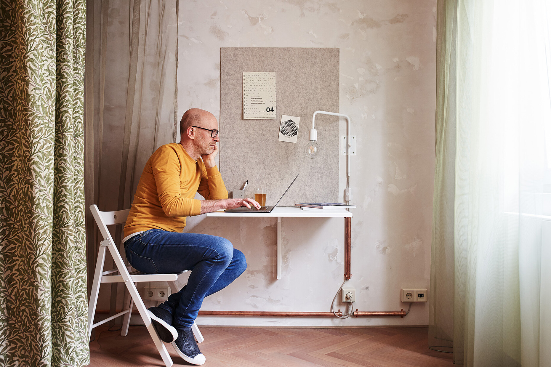
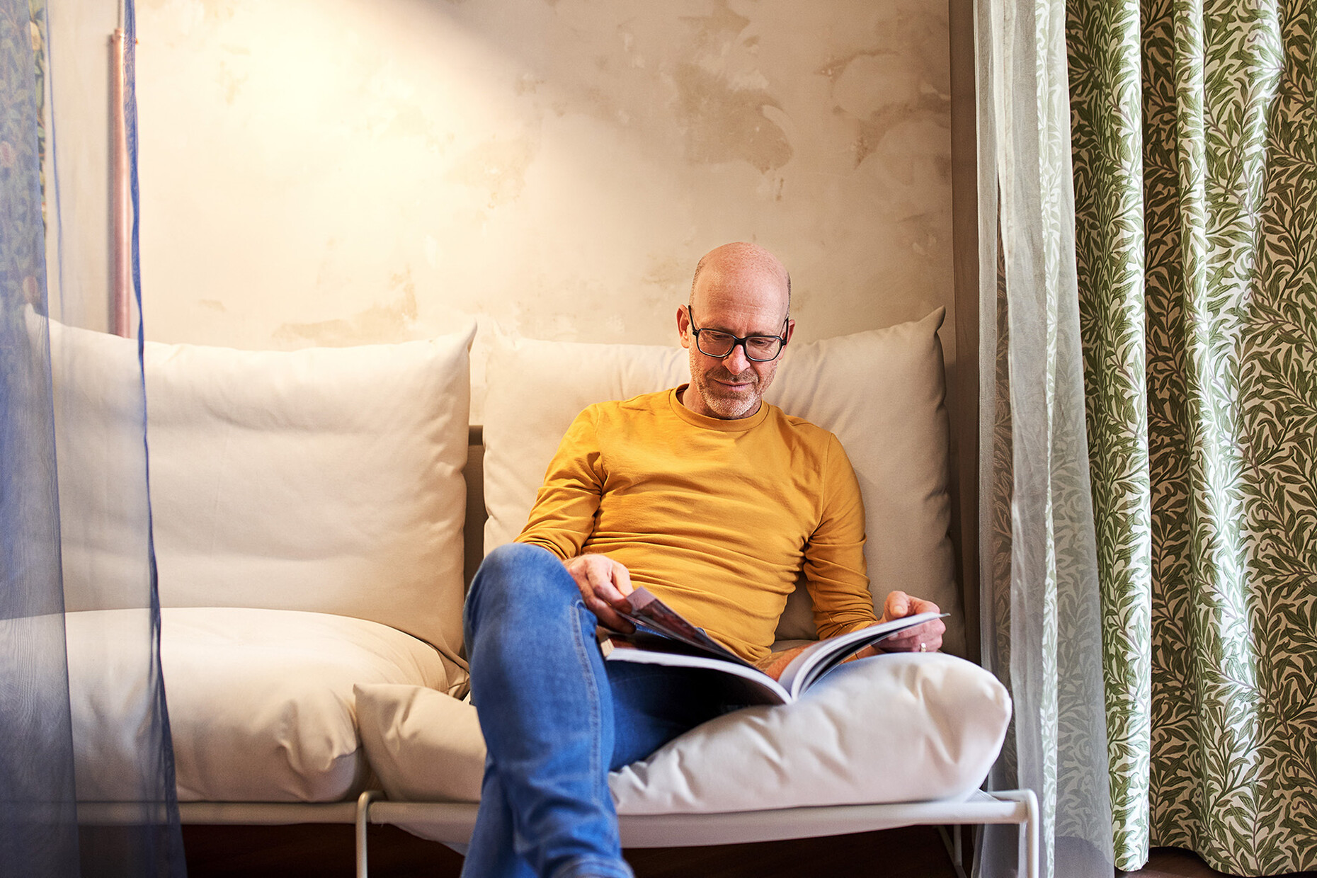
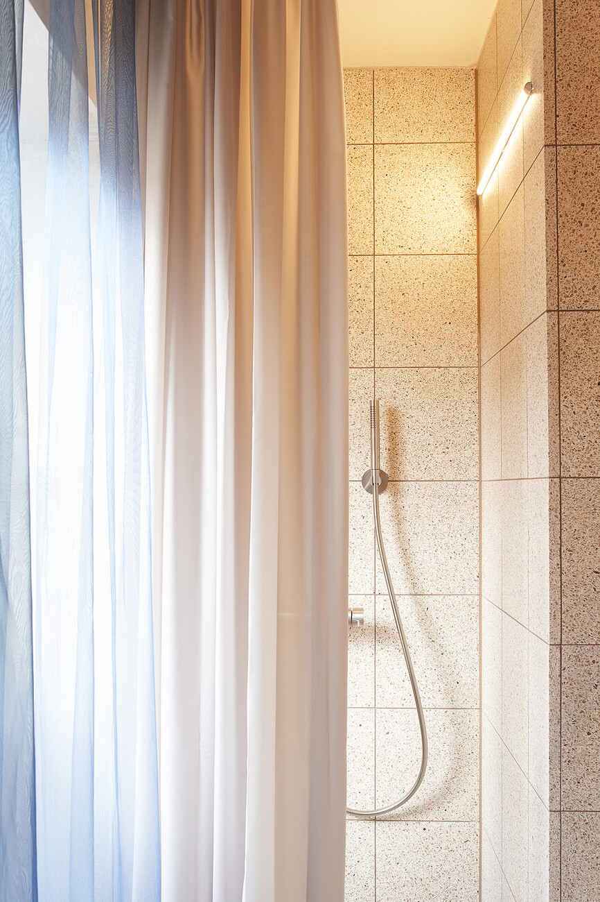
Ina Westheiden: Luckily in that case we also had a client who was keen to experiment and very open to our suggestions. And we wanted to work with our client to produce something that departs from the customary separation of daily functions within a home. So we converted a small two-room flat of just 36 square meters into an apartment with one single large room. The previous layout was a conventional one comprising several small rooms. Now the individual functions like working, living, cooking, eating, and sleeping can be arranged flexibly with the furniture placed in a layer along the walls. Moreover, there is a kitchen and bathroom element that can be placed freely in the room and which can be added to or subtracted from the living space by closing or opening the curtains around it.
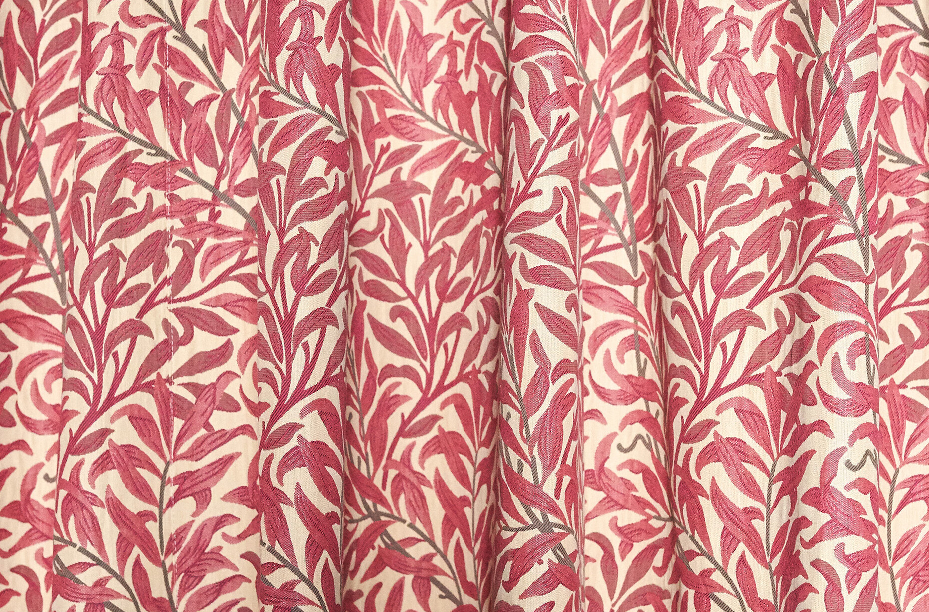
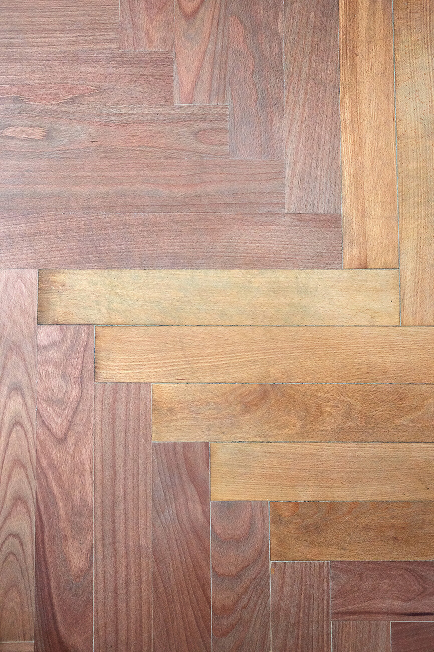
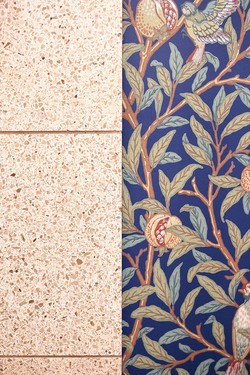
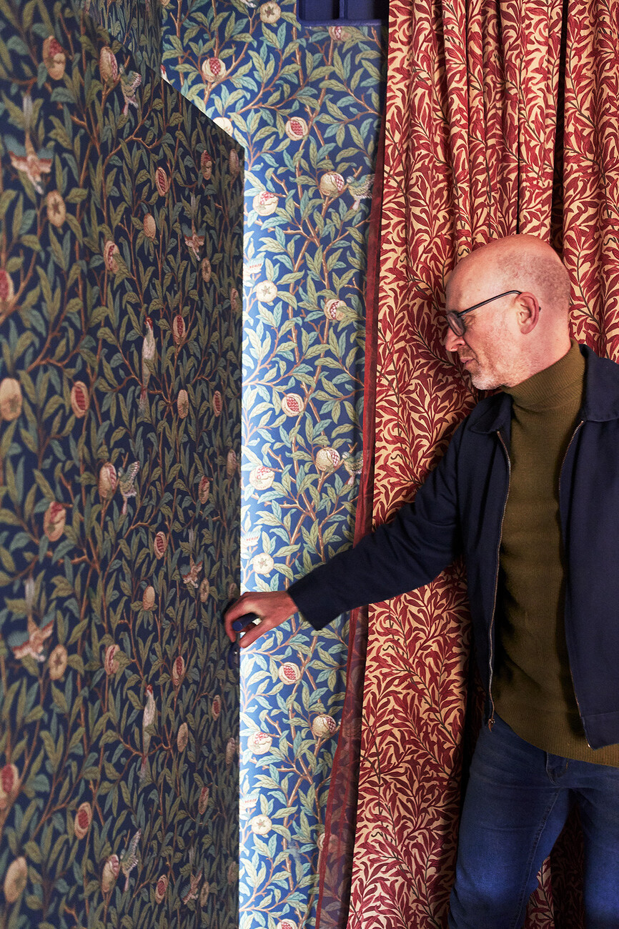
Sarah Behrens: The curtains also provide the name for the apartment, because among other fabrics we used "Willow Bough", a fabric designed by British Arts and Crafts pioneer William Morris. Thanks to this mixture of opaque and translucent curtains totally different spatial configurations are possible. Moreover, the apartment seems very much larger than it actually is. One reason for this is that the ceiling has been given a glossy, slightly reflective coat. The technical facilities have been surface-mounted and left visible to retain as much flexibility as possible. We have retained the old herringbone parquet flooring and the original terrazzo tiles. Together with the white furniture they make for an intriguing contrast with the decorative, highly colorful curtains. Then there is the "Bird & Pomegranate" wallpaper, again designed by William Morris, which we used to cover certain features like the front door.
You have also collaborated with the association Freunde der Weissenhof Siedlung e.V. and designed two installations for the estate.
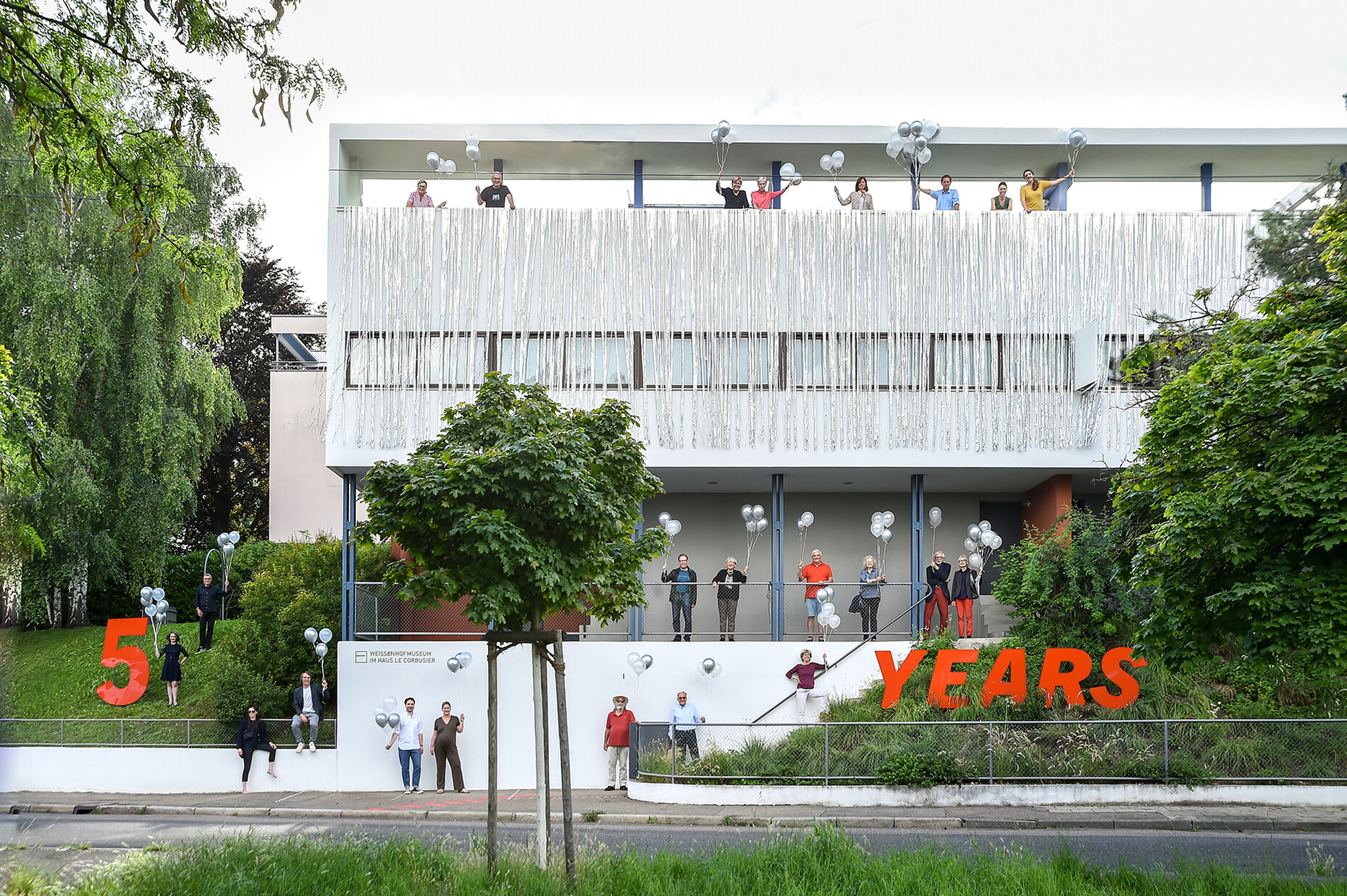
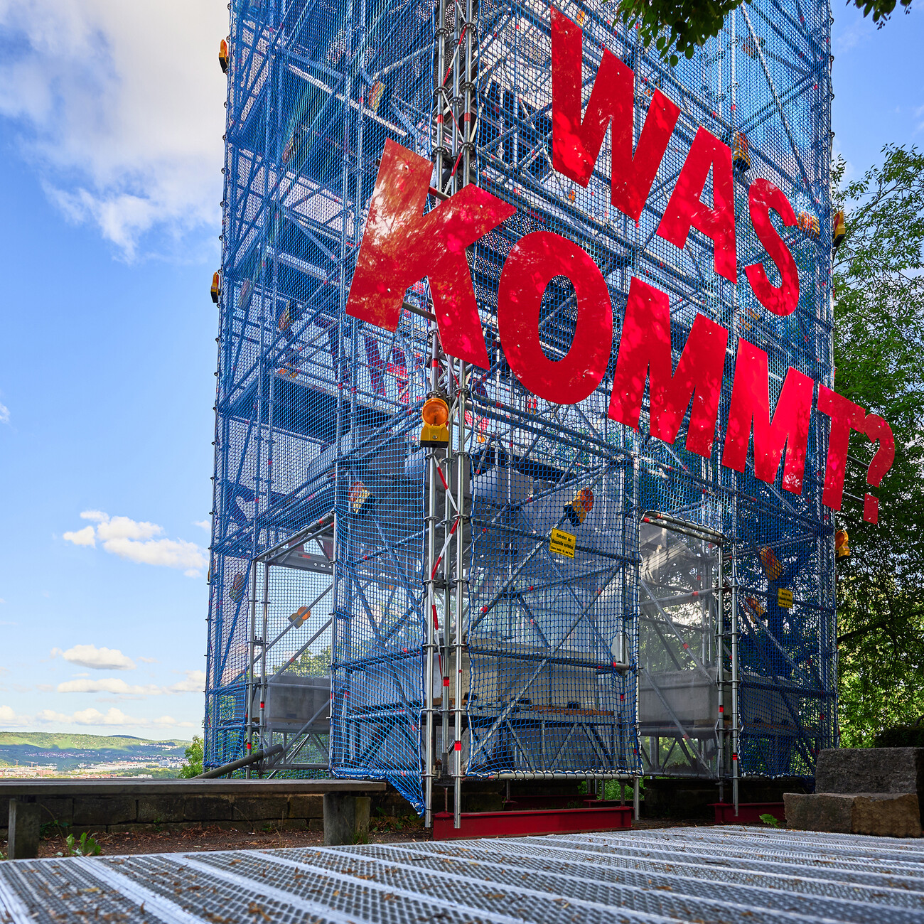
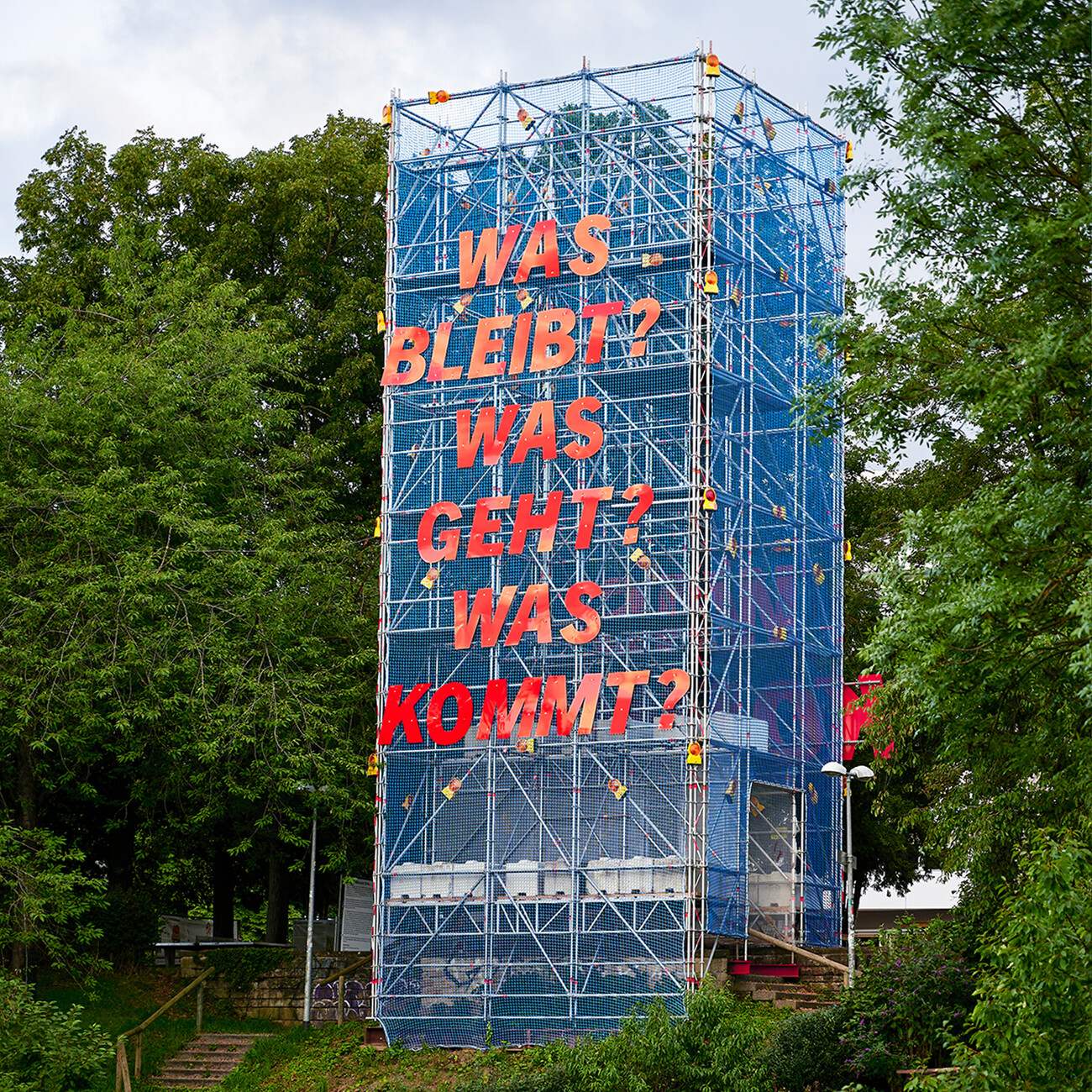
Sarah Behrens: The first project was an installation to mark the fifth anniversary of the Le Corbusier UNESCO World Heritage Site in Stuttgart. Here we installed a silver curtain on the facade of the Weissenhofmuseum and transformed the building into a large birthday card. The idea behind this was to playfully unsettle the eye and make people curious about the Le Corbusier building and eager to want to find out about its history. We conceived the second installation for the IBA 27 festival. Basically it was a tower of scaffolding covered with blue netting. And on it we placed large red letters to form three questions "Was bleibt? Was geht? Was kommt?" (What stays? What goes? What comes?). It was intended to draw attention to the influence of Stuttgart’s Modernist architecture and upcoming architectural developments at Weissenhof. The tower scaffolding was positioned on the slope near the Weissenhof estate so that it was clearly visible from the city center.
How did your contact with the association come about?
Ina Westheiden: When I left university, I worked in the Weissenhofmuseum and it was there I got to know the association. Naturally, it wasn’t clear at the time that we would one day do something for the Freunde der Weissenhof Siedlung e.V. It wasn’t until a few years later that we got in touch with the museum director and reminded her that we existed. Back then she already had the idea of commissioning an installation for the UNESCO World Heritage site on her desk and that’s how our first collaboration came about.
What projects are you currently working on?
Sarah Behrens: At the moment we are designing a holiday home for a young family in the Danube valley. Our approach there is also a very conceptional one. The family has an affinity with Japanese architecture, which we will probably pick up on. Right now everything is still a bit vague, but we are feeling our way into the task, bit by bit. What is certain is that we’re planning a star-shaped layout that opens up to the garden and closes on the street side. I imagine that references to elements of Japanese architecture will also play a role. We can’t reveal any more than that just yet. And we are also helping other offices with their ongoing projects, for example, in site management or with renderings. That’s where the team concept and working in a network come into play again. And sometimes you have to take on more mundane jobs so as to finance the conceptional projects.
