A Statement in Falu Red
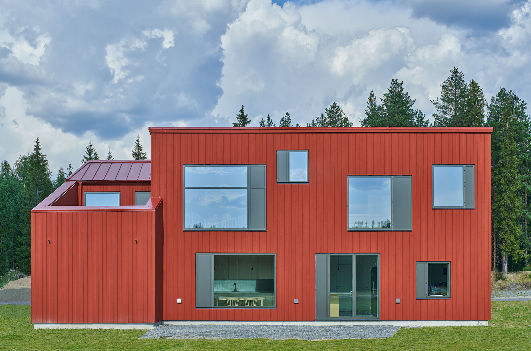
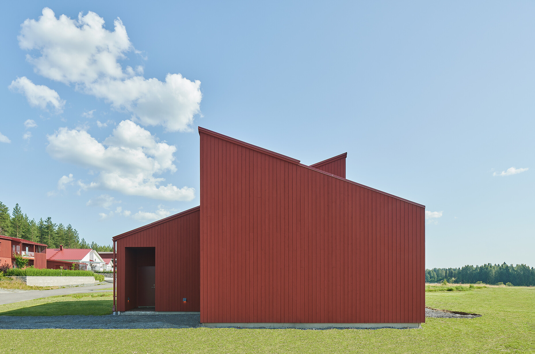
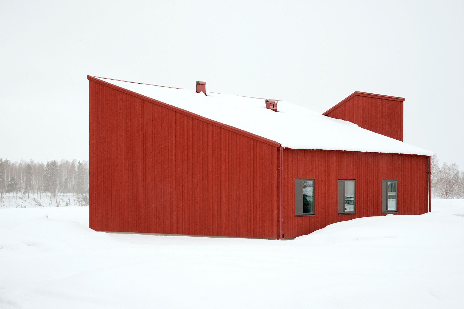
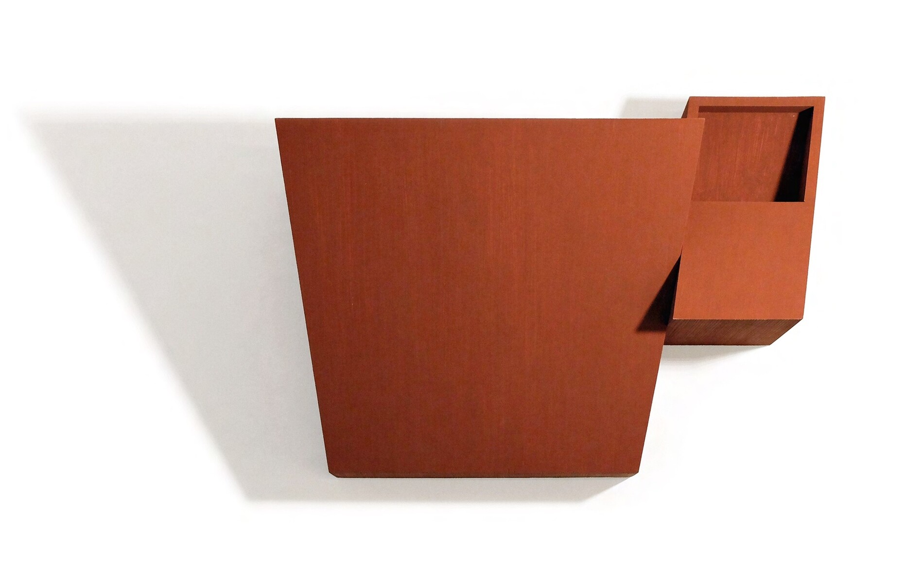
The weather records in the municipality of Boden in North Sweden tend to show average temperatures of -10°C in January and median highs of 17°C in July. All 12 months of the year typically feature damp weather. The building regulations for the detached house planned to stand on the banks of the River Lule were just as harsh as the climate – a maximum building height of 4.2 meter and a red roof. Mårten Claesson, Eero Koivisto and Ola Rune set about designing this brainchild of theirs in what they themselves described as a “pragmatic Scandinavian” way. In order to be able to top it with a second story, the architects opted for a shed roof. This ingenious solution granted them extra space on the upper story while still complying with the laws, because under the terms of the local regulations, with shed roofs what applies is the calculated average height around the house.
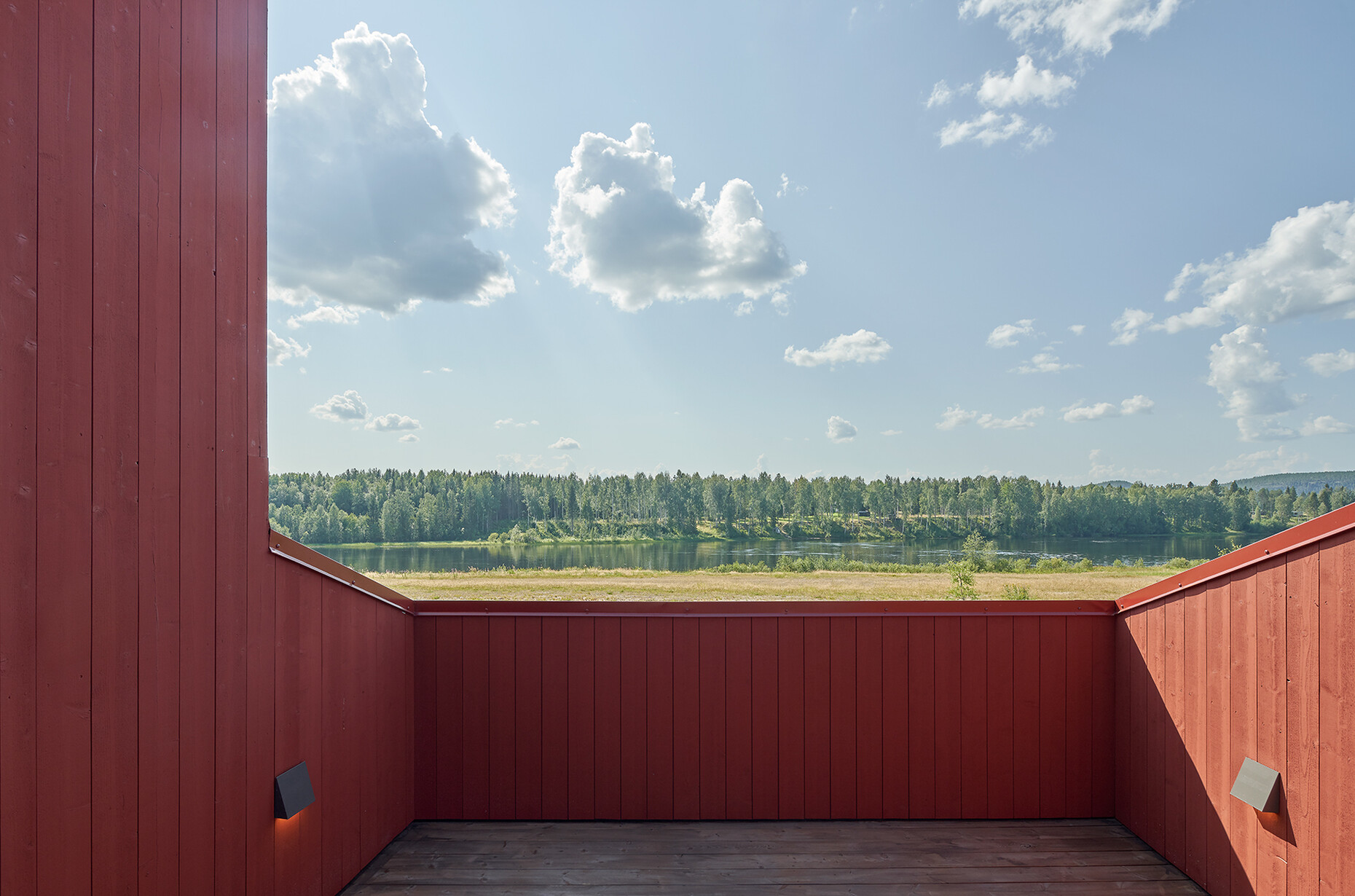
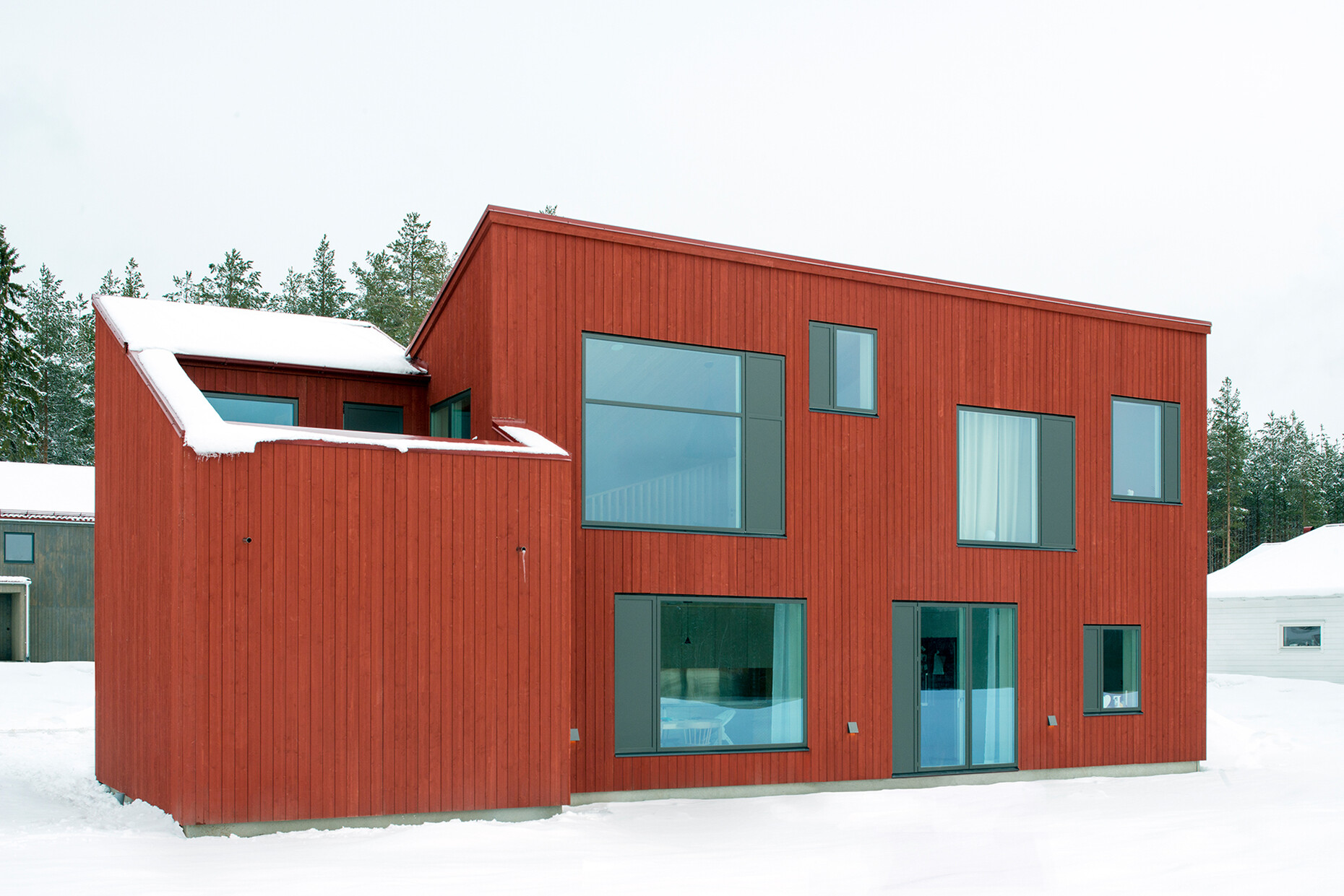
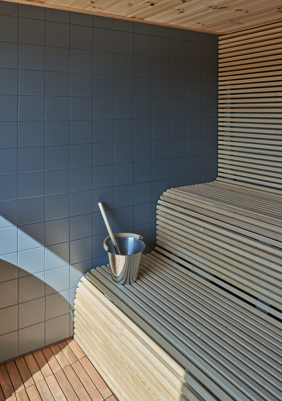
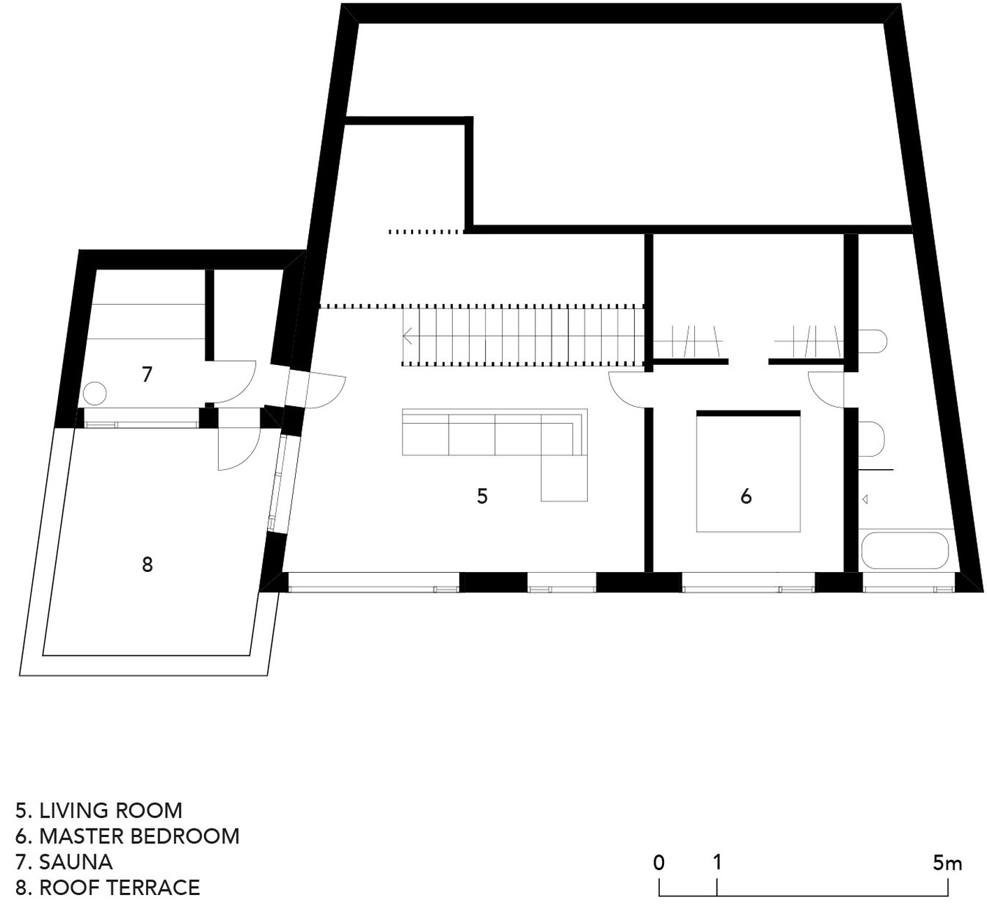
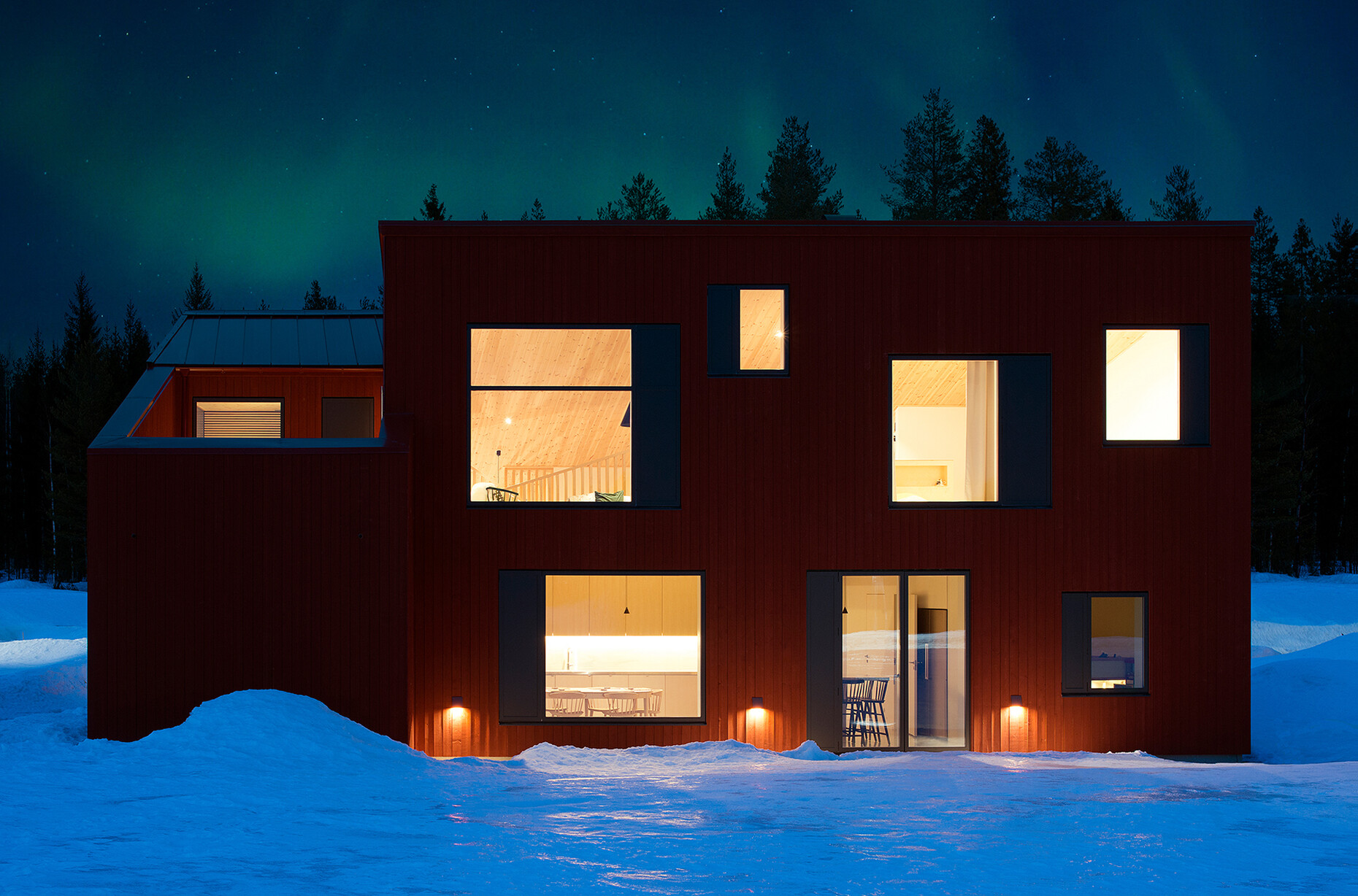
However, on its river-facing side the house will not only be higher, but also wider and trapezoidal in shape. On the one side, the architects have sited a second, smaller structure that will consist of the garage plus a sauna with a roof deck. Here, the shed roof again points upward, albeit in the opposite direction from the main building. This results in a house with an unusually sculptural quality, accentuated by the fact that the whole thing has been painted Falu red, something that is typically Swedish. In this way, Claesson Koivisto Rune have achieved the feat of making the kind of strong architectural statement that reveals itself as a study in understatement – very much in tune with the kind of good Nordic design that, in the trio’s opinion, “reflects the values of democracy.”
Claesson Koivisto and Rune first met back when they were all studying Architecture. The trio have been working together since establishing their studio in 1995. They adopt a multidisciplinary approach in their furniture and product designs for Boffi, Cappellini, Fontana Arte and Wästberg, to name but a few; added to which they are active in interior design, particularly for hotels, and even residential properties. However, the fact that they define themselves as an architecture practice is important to them, as Eero Koivisto stresses in the interview with Stylepark magazine, since their focus is always on space. “Even when we design a chair, we are thinking about the kind of space into which it best fits.” And the three have a similar approach to their work, be it in the field of architecture or design. After all, with a building it is also important to think about “all those little details,” as Koivisto puts it. As they see it, the difference is that unlike design, architecture is always limited to one specific location.
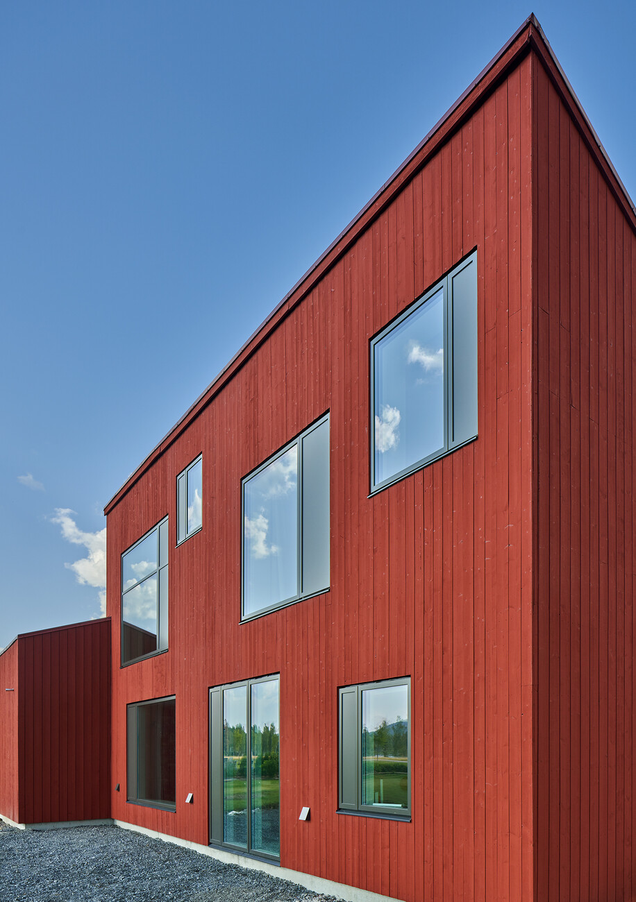
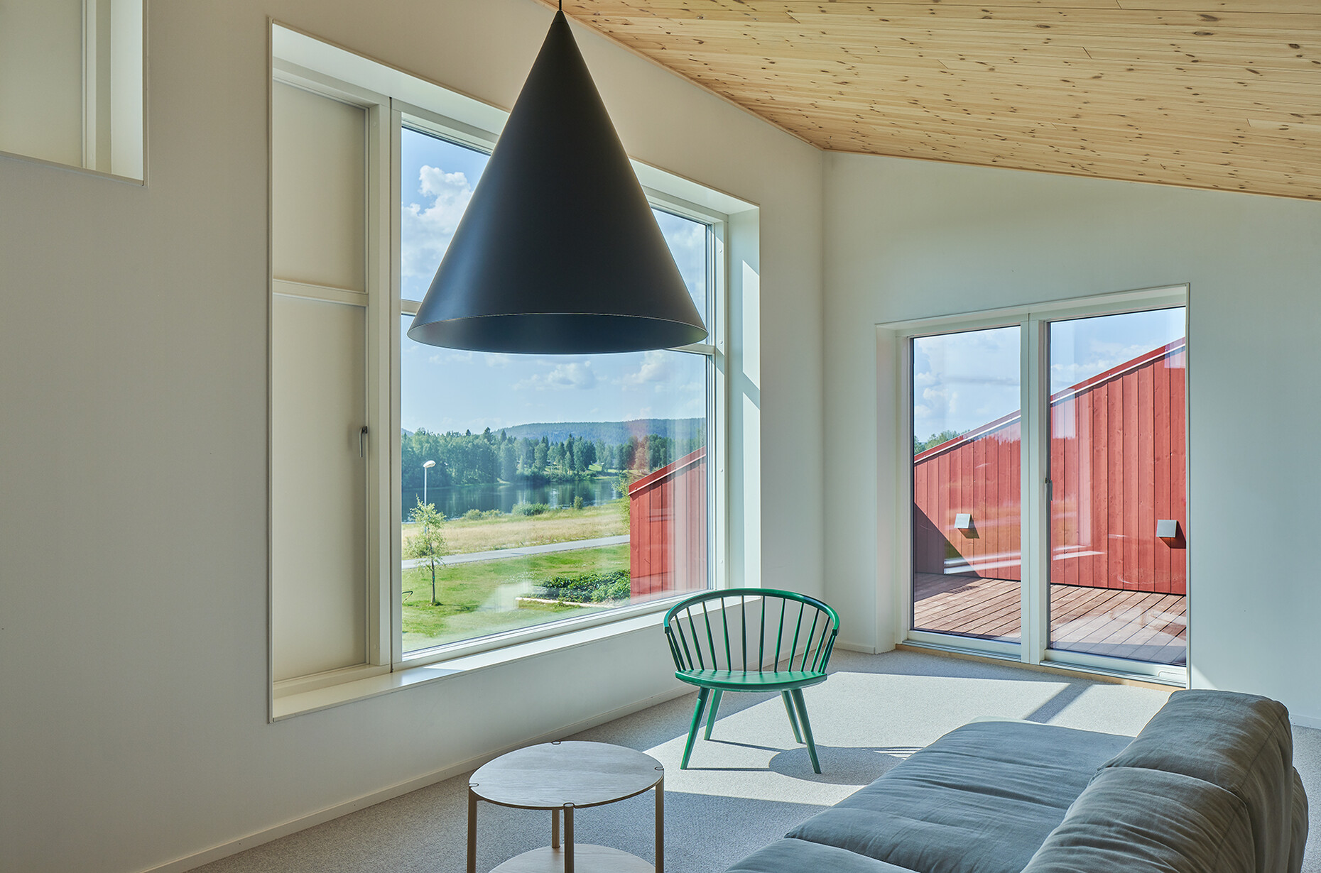
Simonsson House is a prime example of this, which with its façade design references its surroundings. A multiplicity of windows in various formats and distributed asymmetrically over the main façade relax the overall severity of the lines. Something that is particularly effective when viewed from outside at nighttime when it is dark. One particular feature: Each window consists of one windowpane and one nontransparent element. Viewed from the inside, these direct the residents’ gaze to the river. “Each different size and position correspond to the relevant internal function and to the best possible view from every room,” remarks Mårten Claesson. Here, the architects once again demonstrate their ability to generate value-added by taking an unconventional approach to restrictions. “The house was subject to a strict budget in terms of building costs,” explains Claesson. By fixing the position of all the panes of glass – with large formats this is far more cost-effective than double windows that open on both sides – we were able to save a considerable amount of money.” Instead of the glass window, the unglazed, narrow panels can be opened in order to air the rooms. Taken together and side by side the two become part of the same “window” unit in visual terms.
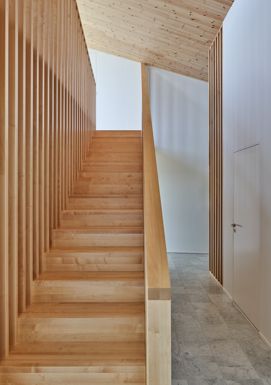
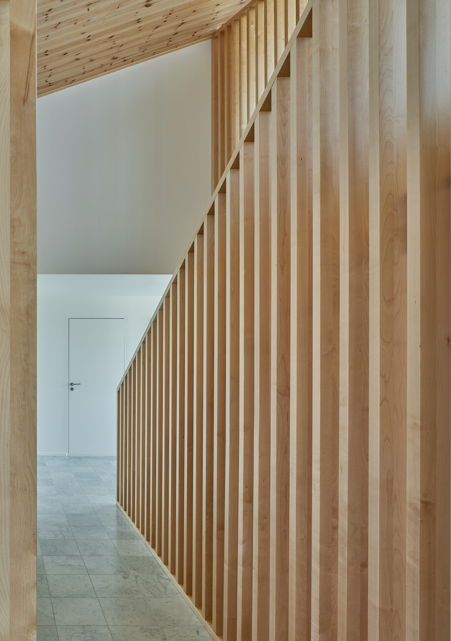
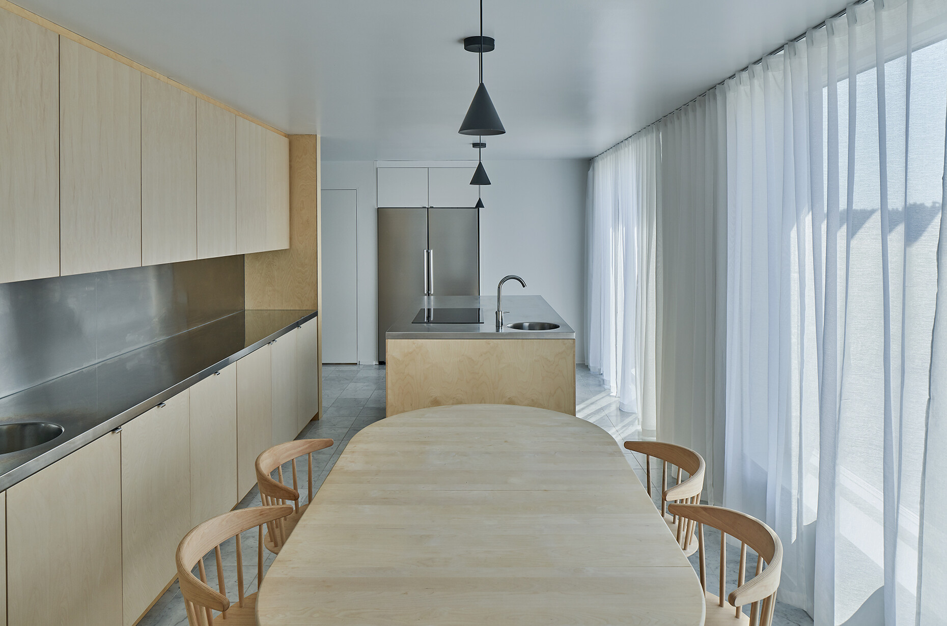
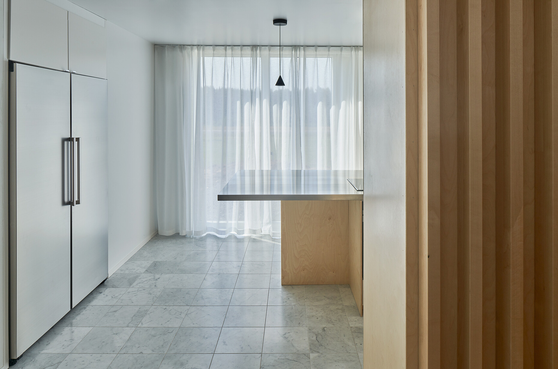
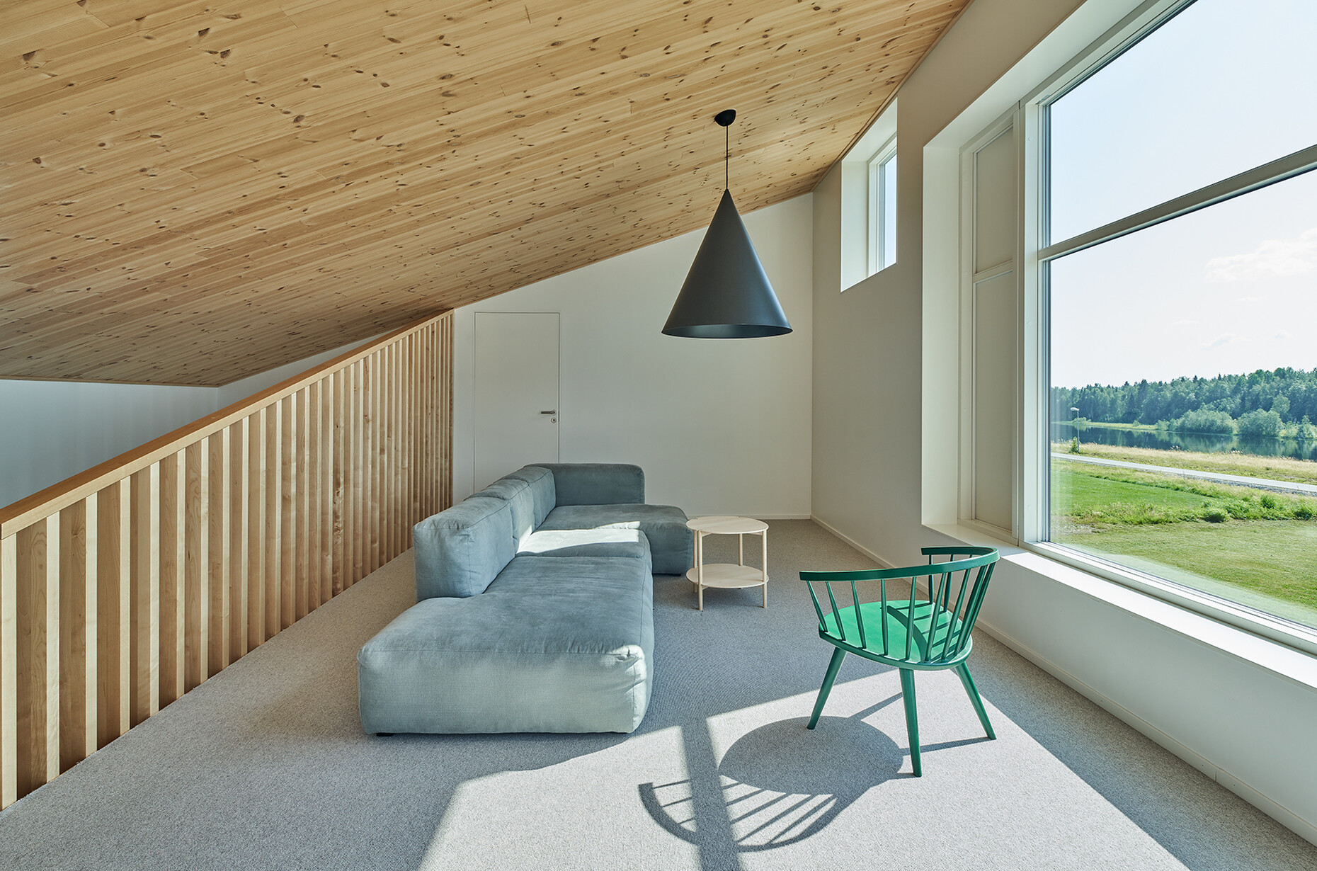
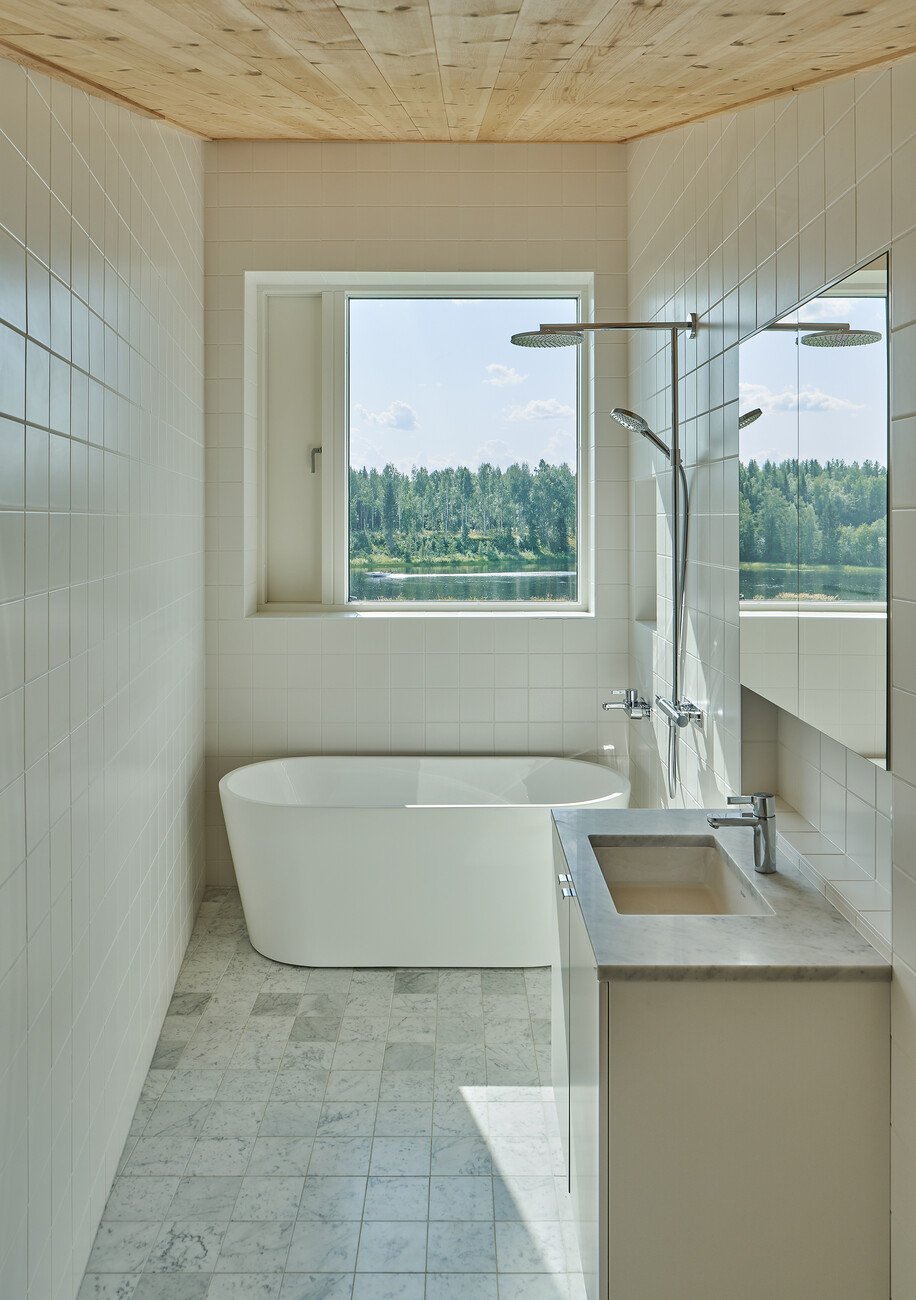
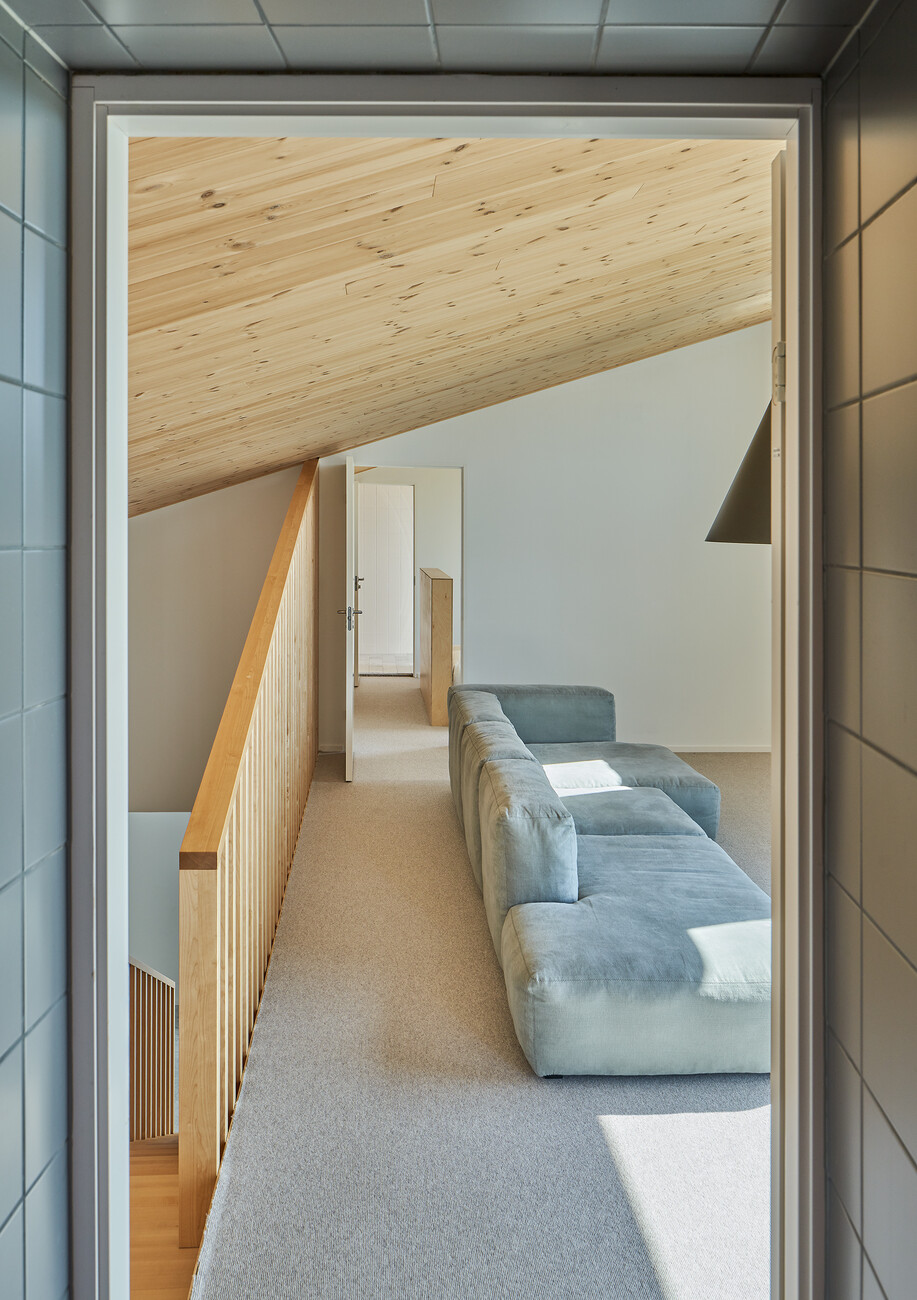
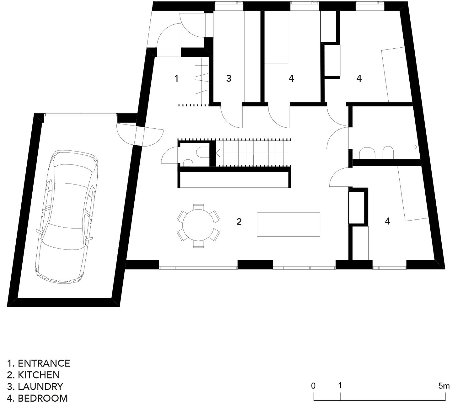
A family of four lives at Simonsson House all year round. The client runs a small local company selling game, a specialty of this northern region. His wife works at the local museum. Two preschool children, an electric car, a snowmobile – the kind of family that is typical of this region. Claesson Koivisto Rune designed the floor plan accordingly. There is a large open kitchen-cum-living-room with a dining area and a central island, plus three bedrooms, a bathroom and a utility room. Since it gives directly onto the porch, the latter can be used as a “boot room” – something essential in a region characterized by frequent rainfall. On the upper story, the parents’ bedroom, with its walk-in closet and adjoining bathroom, plus living space on the gallery floor complete the configuration. To match the house’s understated exterior, its interior presents an extremely tidy appearance. A large number of fitted cupboards in the kitchen, utility room and bedrooms organize all the residents’ utensils. These peaceful surroundings show off both the materials and the details of the house to their best advantage, with the staircase representing one of its especial highlights. The latter’s balustrade echoes the sloping lines of the shed roofs, their careful execution reminiscent of Japanese design.
In point of fact, during their studies all three of the trio, Mårten Claesson, Eero Koivisto and Ola Rune were awarded grants to spend time in Japan, where they had the opportunity to get to know the culture there. According to Koivisto, the Japanese and the Scandinavians share the same attitude to design. Something that is important to both cultures is understatement, is “not being too ostentatious, designing the kind of things that are inconspicuous and that last a long time.” With a total footprint of 220 m², Simonsson House was nominated in 2022 for the “Rödfärg” Prize, which is named after that shade of red that is so typical of the aesthetics of Nordic architecture and that dates back to waste products from the Falu copper mine. The pigments for the famous Falu red were originally made from fragments of stone and ore containing iron, mixed with water, flour and linseed oil. This naturally occurring color is famous for its excellent suitability for protecting wood and it is still produced in the mine today as “Falu Rödfärg”. As Claesson points out, when people drive through rural Sweden today, they might, even now, get the impression that it is still required by law to paint houses Falu red. However, this is not the case. “Nevertheless, the Swedes do love this color, it has become a kind of trademark. And it still works brilliantly as a contrast to the green of our forests.”
