Hardy Houses 2
Snuggling on the summit
Be honest: Who climbs a mountain and then doesn’t tell anyone about it afterwards. All the effort, all those moments of great happiness, they need to be shared! A few selfies get quickly taken of tired but happy faces up on the peak. No, if you climb a tough summit you need to talk about it. And quite a few of the buildings that are erected on summits look like so many proud conquerors of the world of mountains, sometimes with half the structure teetering dangerously over the precipice. Yes we can. With its shape, seemingly drilled into the mountain side, even the Messner Mountain Museum that Zaha Hadid designed, intended to convey ecology and sustainability, says one thing and one thing alone: Conquer the mountains!
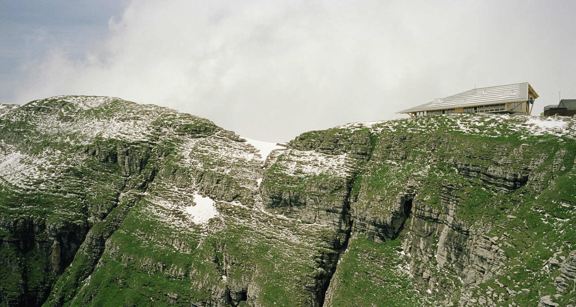
Swiss architects Herzog & de Meuron have eschewed such metaphoric subjugation. Given the spectacular panorama all around, their design for a mountain-top station and new cable-car cabin system in eastern Switzerland is instead an architectural exercise in modesty, indeed in invisibility.
On behalf of the Toggenburg mountain lifts operator, the initial remit back in 2011 was to conduct a concept study for the low-key development of tourism in the Obertoggenburg region. The focus of the study was a mountain with the wonderful name Chäserrugg; the way it is written might give you an idea of what it sounds like when spoken by a genuine Swiss. The Chäserrugg is the easternmost of the seven mountains in the Churfirsten range, its peak is 2,262 meters above sea level. Coming from the north it is a gentle giant, which slowly becomes bigger, but which to the south is a striking, almost 1,900-meter high rock face above Lake Walen. That may sound spectacular for residents of the lowlands, but in Switzerland it is just another mountain, and so although there had been a small mountain lift to the Chäserrugg since 1972, it attracted only a few passengers. At the top there was a make-shift restaurant in a small building that had originally been built as temporary accommodation for the workers building the mountain lift.
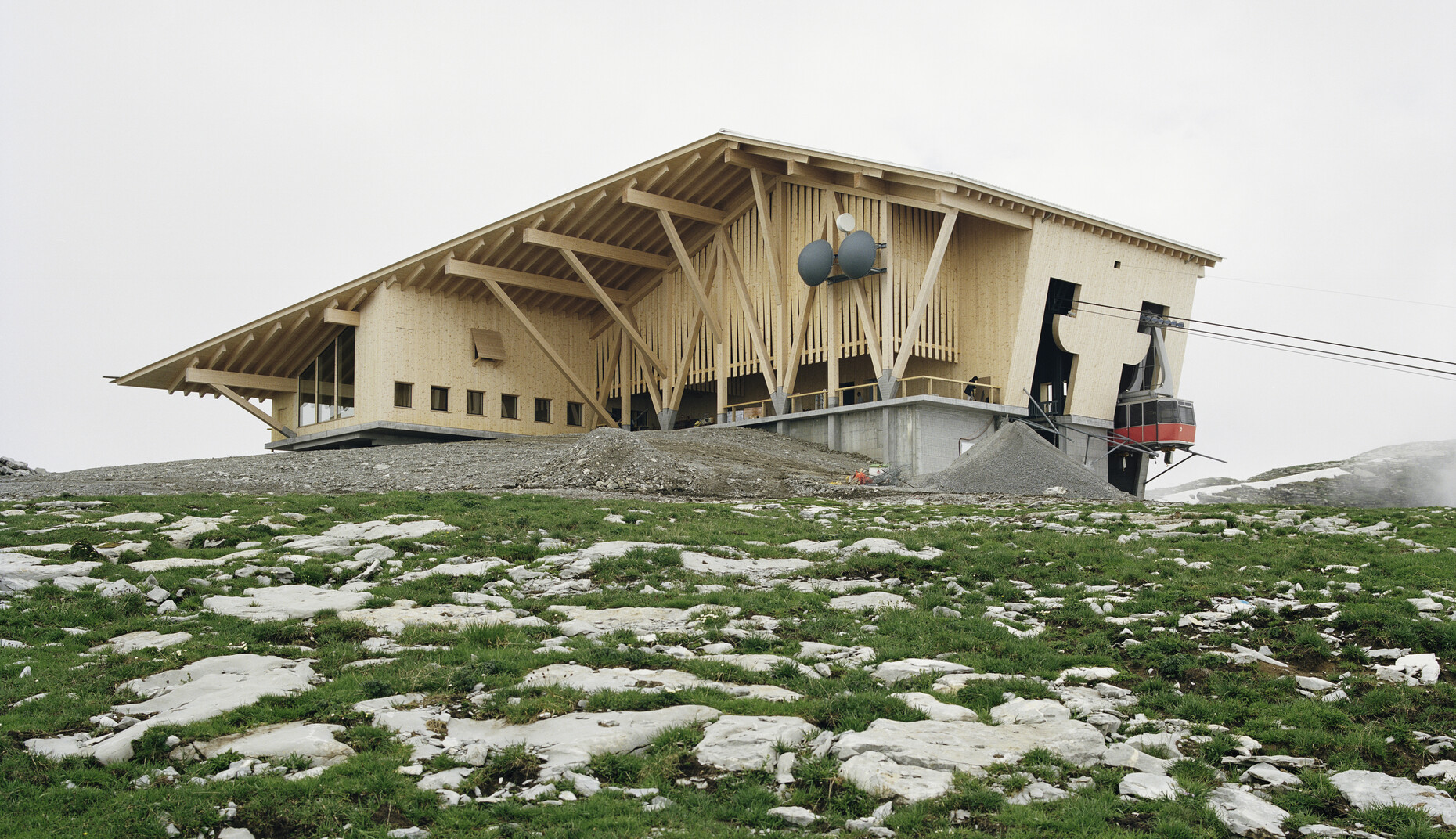
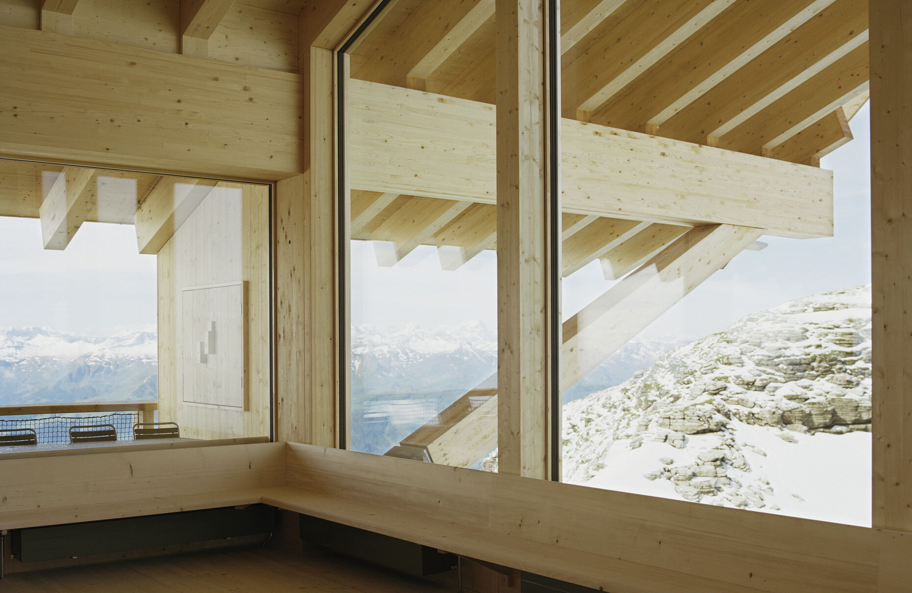
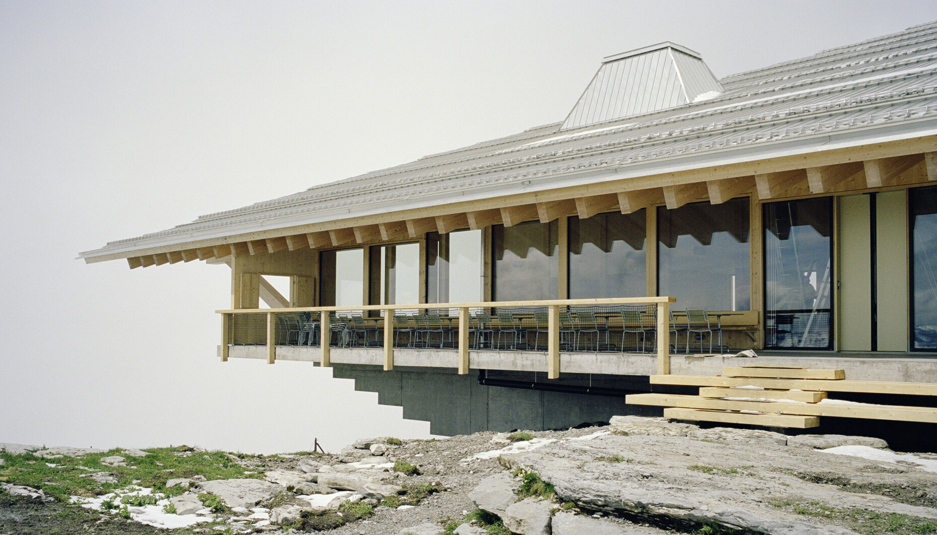
Of the old edifices at the summit Herzog & de Meuron preserved the funicular building, a pragmatic steel structure on a concrete podium. The old restaurant, however, was demolished, and instead a new transverse building, which juts over the mountain top sideways, added on the to the lift station. With a large window the structure opens out to the magnificent panorama to the south, where the mountain falls away steeply. On the outside, the old and new buildings were then clad in the same timber, a pleasant large roof covering both, such that they appear as one. The timber parts were made from domestic larch trees by local craftsmen in the valley and assembled on the mountain in the summer. The interior fittings were added the following winter. The architects were aiming for a holistic, sustainable approach, which treats all the resources sparingly: By way of example the erection crane was transported by helicopter, while all the other parts were delivered using the gondola lift during normal operating hours. For the concrete, the treated excavated material was directly processed into gravel aggregate.
The building’s expression is pragmatic and unpretentious. If anything it looks more like a large barn than a mountain-top station. It wears its timber roof pulled right down, like a large hat in cold weather. The timber supports are positioned close to one another, as if to indicate the heavy loads that have to be borne up here, especially when snow and ice cover the landscape and the building. On the inside the atmosphere and acoustics of the timber together with the obvious stability of the overall architecture occasion a sense of reliable safety. The three glass sides may well afford a spectacular panoramic view, but if you really want your breath taken away you have to step onto the small balcony in front, which at least protrudes slightly over the abyss. As if to strengthen the feeling of safety here still further, the roof comes right down over the balcony.
“With timber we tried to develop a language which suited Toggenburg, without falling into the trap of standard Alpine clichés,” says Christine Binswanger, who managed the project for Herzog & de Meuron. “We wanted to create a place that has character at any time of year and in any weather, to create an atmosphere for skiers who are in a hurry, as well as for walkers and other people in search of peace and quiet here.”
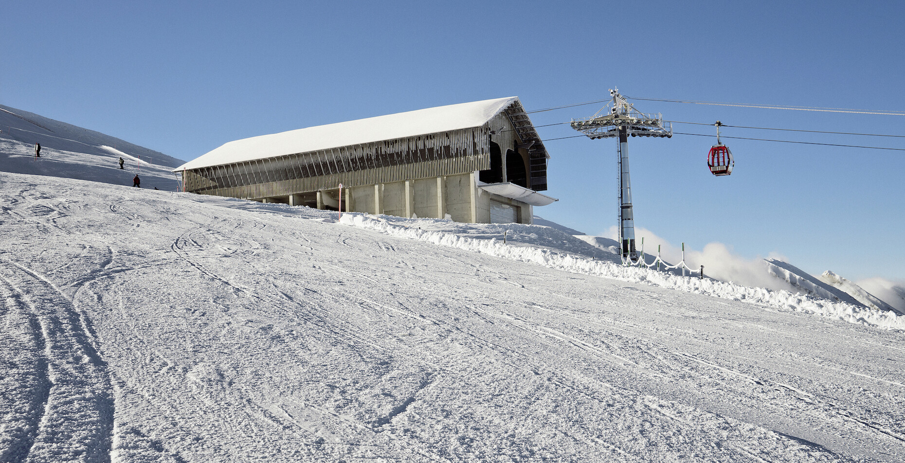
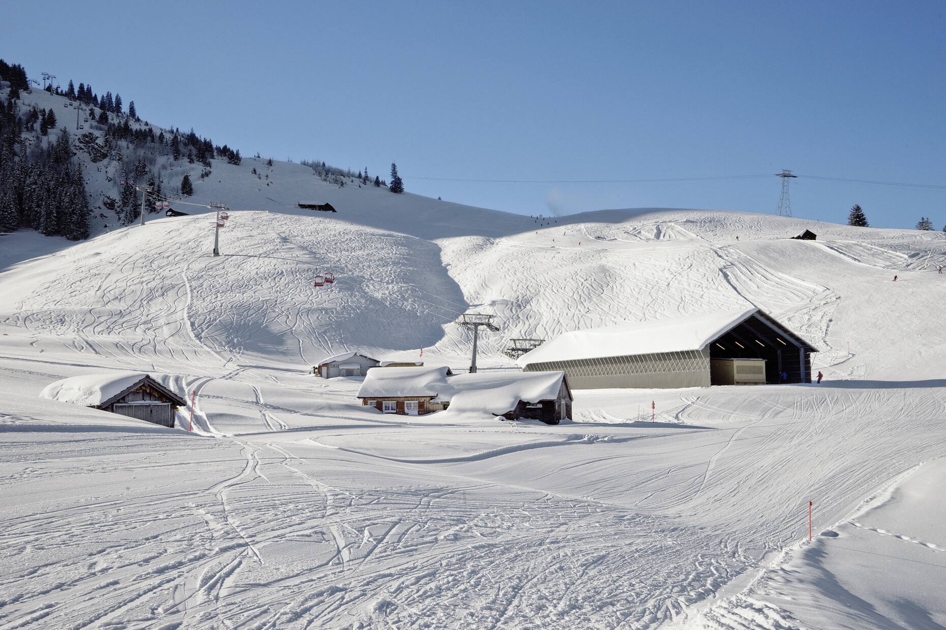
The second stage of the project was completed in January 2016: the cable car, which now provides access to the Chäserrugg from another side as well. Coming from Espel, it climbs via a midway station to an altitude of around 2,000 meters, thus finishing clearly beneath the new mountain-top station with its spectacular restaurant, and extends the skiing area by a few kilometers of piste. In terms of design the mountain and valley stations for the new gondola lift resemble the station at the summit: they look like barns, form which, surprisingly, gondolas emerge. This way, unlike otherwise standard stations with their high-tech aesthetics, they are intended to blend in better with the countryside and the types of building here, particularly in summer.
Both the mountain and the valley station for the new cable car system are steel structures on solid concrete foundations. Whereas the podium for the valley station lies flat on the ground, for the mountain station it was raised so high that snow groomers can be parked in it. The roofs and walls were covered with gray fiber cement panels, whose color and texture is meant to be reminiscent of weather-beaten timber stables.
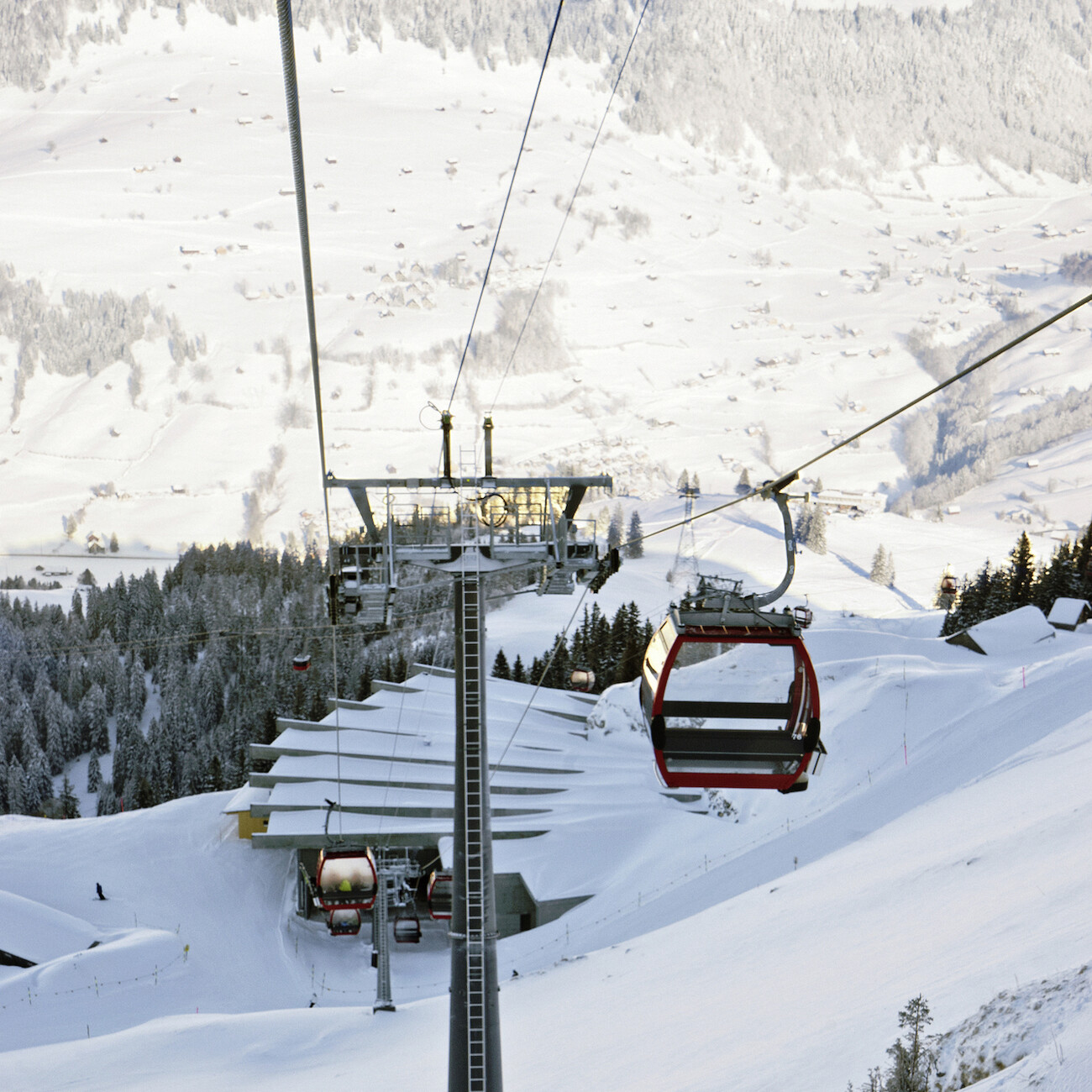
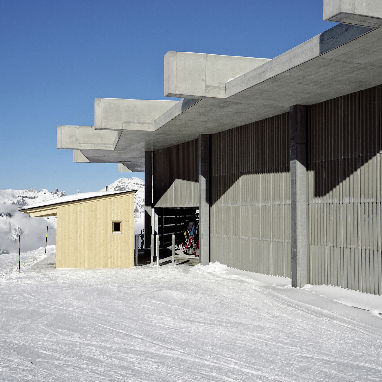
The design of the midway station differs from the two others. Here, the architects say, they took their cue from the avalanche protection tunnels used to protect lots of roads in the Alps: Raw concrete is predominant. The roof is suspended from fan-shaped beams visible on the outside and traces the slight kink the cable car makes here. Some earth and scree was scattered between the suspender beams on the roof and is also reminiscent of standard avalanche protection measures. Actually there are occasional avalanches here, such that in this case the design plays not only an aesthetical role but a functional one as well. Furthermore, the midway station can be sealed with doors, as when the lift is not operating all 78 gondolas are parked here.
With this architectural idiom, based as it is clearly on straightforward, rural types of building, Herzog & de Meuron continue what they already demonstrated in projects such as the Parrish Museum on Long Island (2012) and the Slow Food Pavilion for Carlo Petrini (2015) at the EXPO 2015 in Milan: a vernacular architecture with which they have recently even won the competition for a "Museum of the 20th century” in Berlin. It is an Architecture of New Simplicity, or even: Modesty and one could get the impression that Herzog & de Meuron are testing out just how far they can go with it. On the summit of the Chäserrugg, on Long Island or in the middle of the ”Kulturforum” in downtown Berlin. This is so modest it is almost particularly sensational.
