Tightrope act
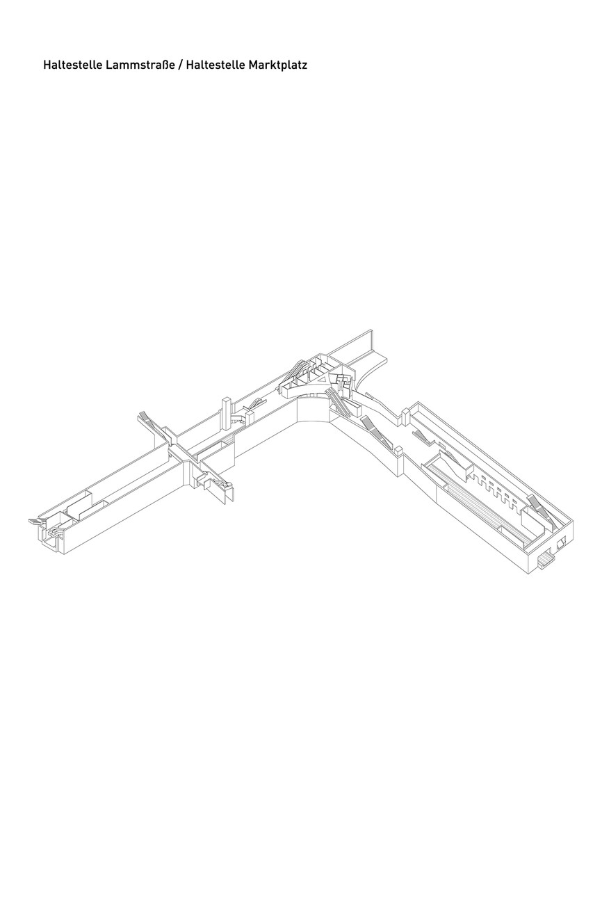
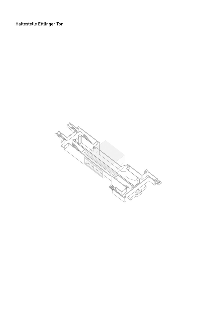
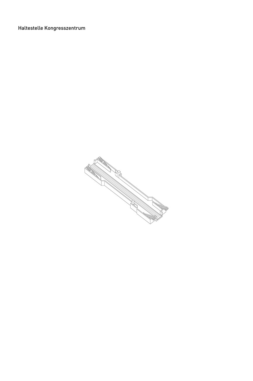
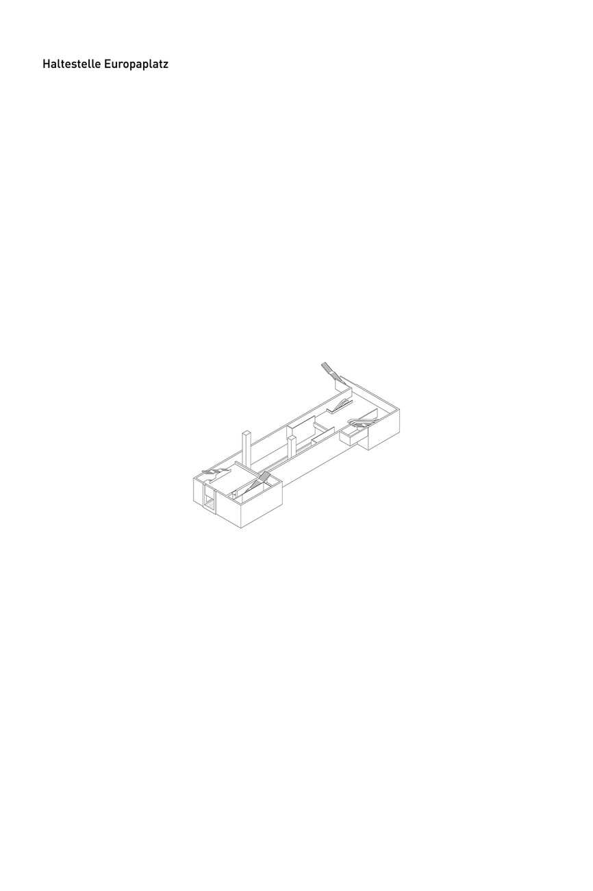
In 2002, a referendum in Karlsruhe cleared the way for a light rail tunnel with seven new subway stations. The aim was to make the city center more pedestrian-friendly, transform the central Kaiserstrasse into a traffic-free boulevard and optimize the transport network. On December 11, 2021, the light rail tunnel was finally presented to the public. The individual stops follow a uniform design principle, with a bright and reduced architecture. Large-format concrete blocks were used on the floor and up to half the wall height, while the upper wall surfaces and ceilings were designed as drywall structures with acoustically effective surfaces. The design concept for the subway stations was the responsibility of Allmann Sattler Wappner Architekten from Munich, who won a competition held for this purpose in 2004. The team also included designer Ingo Maurer, who died in 2019, and who created the lighting concept. We spoke to lighting designer Sebastian Utermöhlen from Team Ingo Maurer about the idea behind it.
Alexander Russ: Mr. Utermöhlen, how did the collaboration with Allmann Sattler Wappner Architekten for the subway stations in Karlsruhe come about?
Sebastian Utermöhlen: The whole thing goes back to a competition that Allmann Sattler Wappner Architekten won together with us as lighting designers in 2004. The construction took quite a few years, which is why we presented a design idea for the lighting design back then that left as much leeway as possible for the technology used.
Why is that?
Sebastian Utermöhlen: At that time, it was impossible to say how LED technology would develop. So there was a declaration of intent that would only become concrete when the interior of the seven subway stations was designed. For this, we designed a steel cable structure that would later be equipped with luminaires.
So you created a structure and left open how it would later be used.
Sebastian Utermöhlen: Exactly. At our production facility in Aubing, we built 1:1 models to test the design – for example, how the luminaires would be attached to the cables or the geometry of the cable loops before they connected to the luminaires.
What is the connection between architecture and lighting design in Karlsruhe?
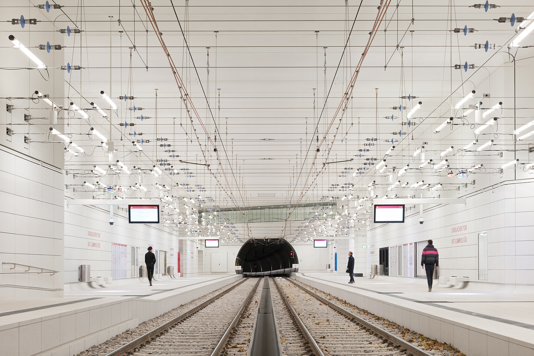
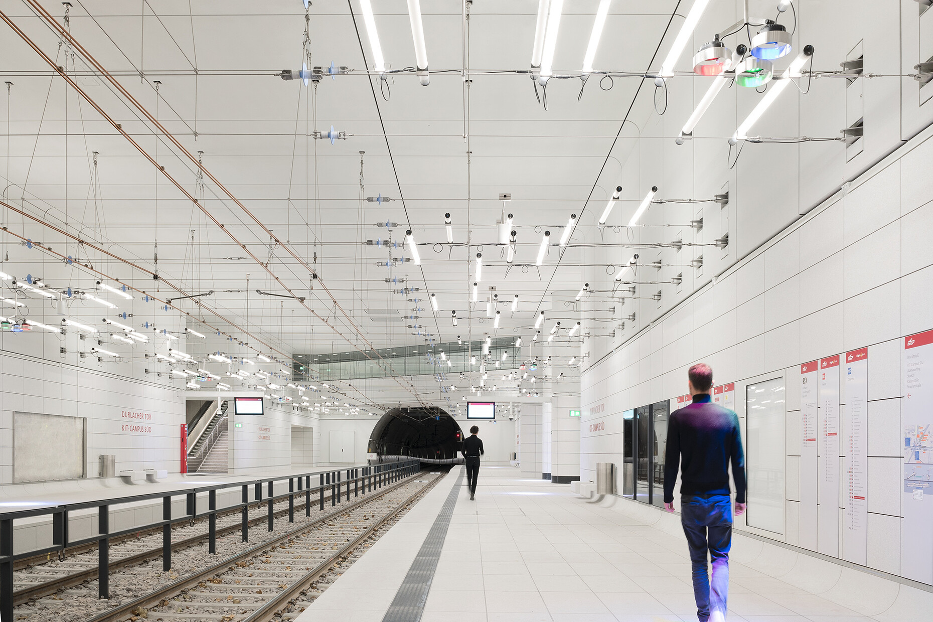
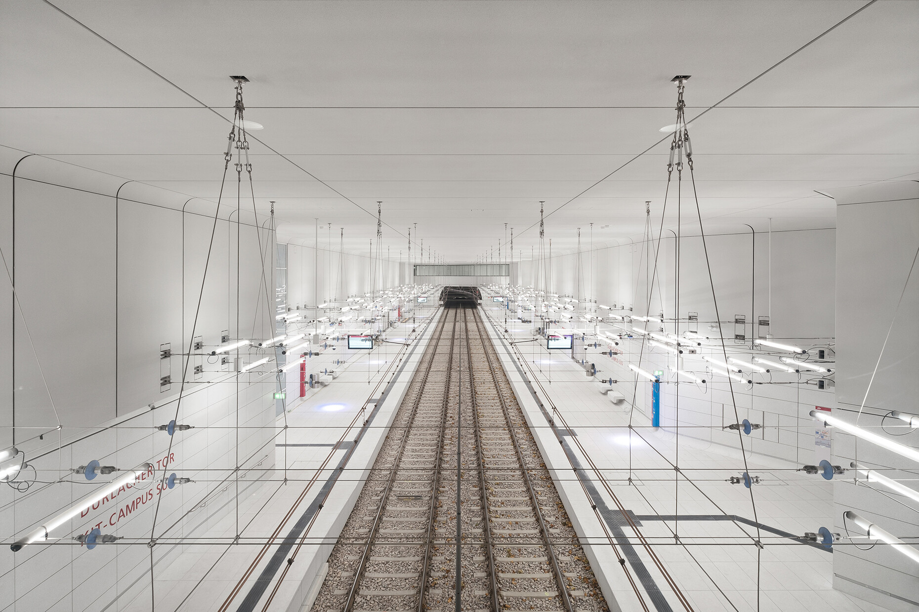
Sebastian Utermöhlen: Architecture always comes first, and that's why we see lighting design in this context as a serving medium. That means we look at what the architecture specifies and what concept the architects are pursuing in order to then respond to it. The concept of Allmann Sattler Wappner Architekten was to connect the subway stations in terms of design and to create meditative spaces that serve as a counterpoint to the architecture above ground. The floors, walls and ceilings were therefore to be as homogeneous as possible and have a bright, friendly appearance. In this environment, we then placed our so-called "rope webs" on which the luminaires were arranged. This is a steel cable construction in which cables, clamps, insulators and guy wires are routed as a kind of overhead catenary system. The actual architecture remains unaffected, however, as the cables float freely in the space and are not integrated into the walls or ceilings.
Where did the inspiration for the "rope webs" come from?
Sebastian Utermöhlen: From the overhead catenary system of the train infrastructure. The closer you get to a station, the more condensed it becomes, as the tracks converge there. It's a bit like Ingo Maurer's luminaire "bulb," for which he interpreted the light bulb as a symbiosis of technology and poetry. He has also worked with rope systems in earlier designs – for example, in his ""YaYaHo" luminaire. But the whole thing can also be compared to a composition in which the lights are placed on the ropes like notes.
What were the functional challenges in the spatial implementation of the lighting concept?
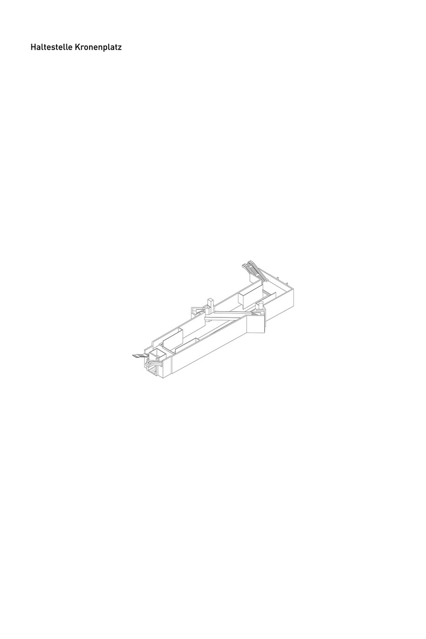
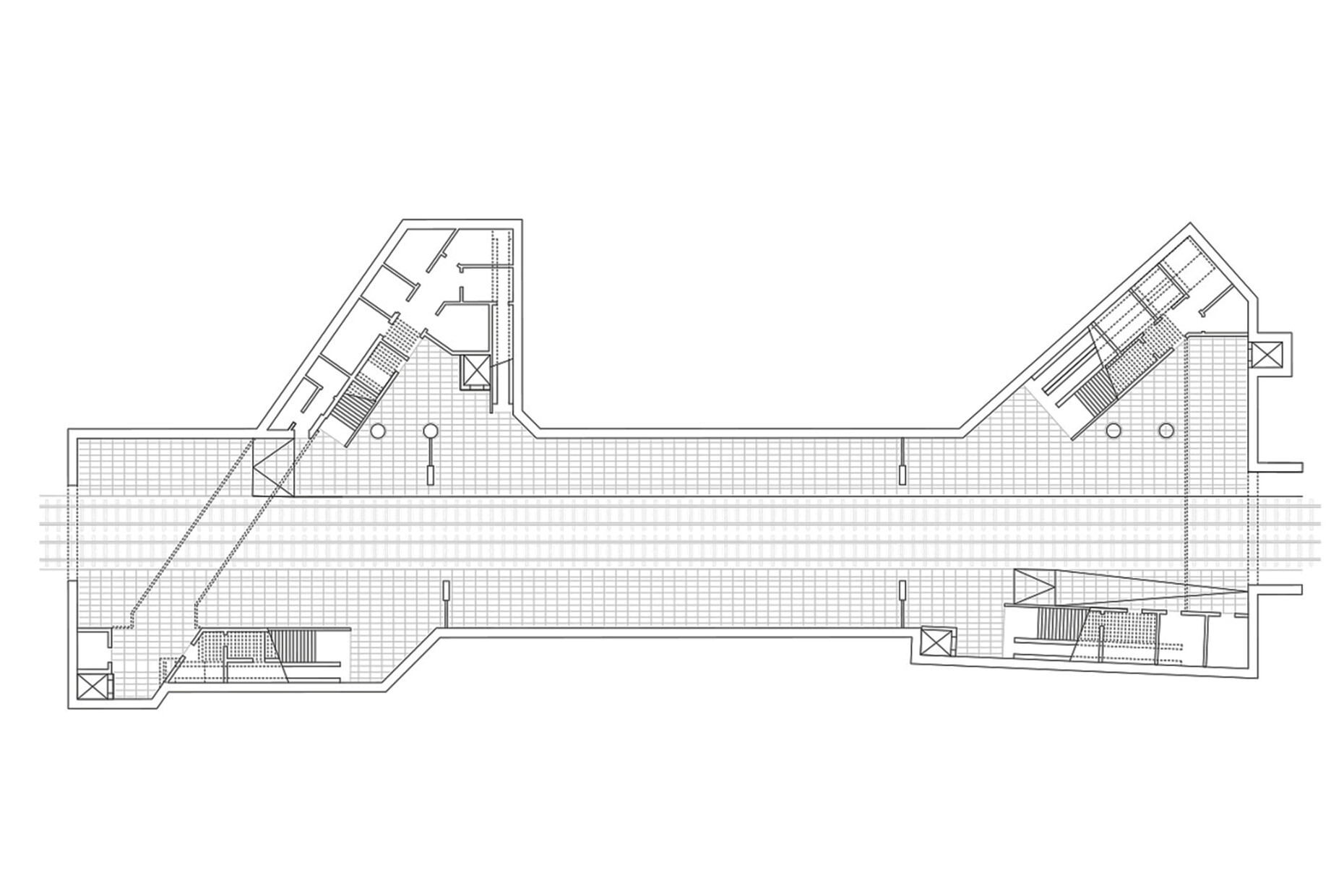
Sebastian Utermöhlen: After all, the overall structure of the buildings is usually already fixed in advance, as it is due to the conditions above ground. This affects parameters such as the room height, the location of the exits or the platform level – and all seven subway stations have different spaces. The rope concept has proven to be very flexible in this respect, especially with different room heights or angled geometries. When I work with a grid, it usually doesn't work out in the corners. Our concept, on the other hand, is adaptable – this also applies to the required uniform lighting of the subway stations, as the luminaires can be flexibly positioned on the cables and there are also two cable levels on which the luminaires are arranged in each case.
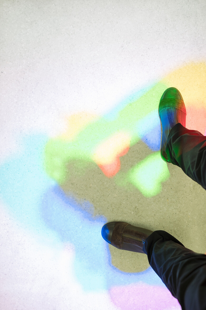
Another element of the lighting design is the colored shadows created by the luminaires on the ground. What's that all about?
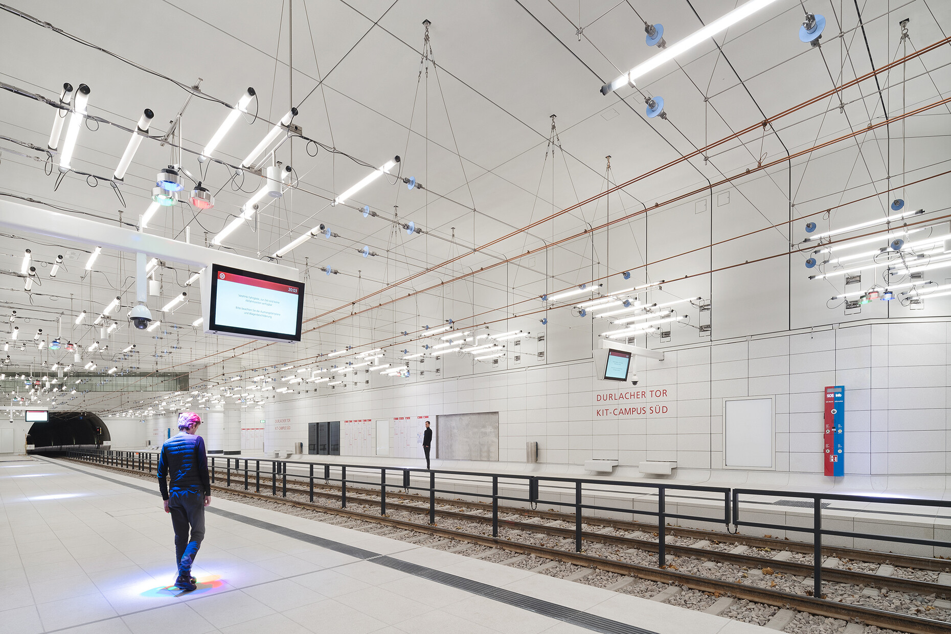
Sebastian Utermöhlen: The colored shadows were part of the design concept from the very beginning. Ingo Maurer was primarily concerned with bringing some color into the rooms in the form of light.
How does that work exactly?
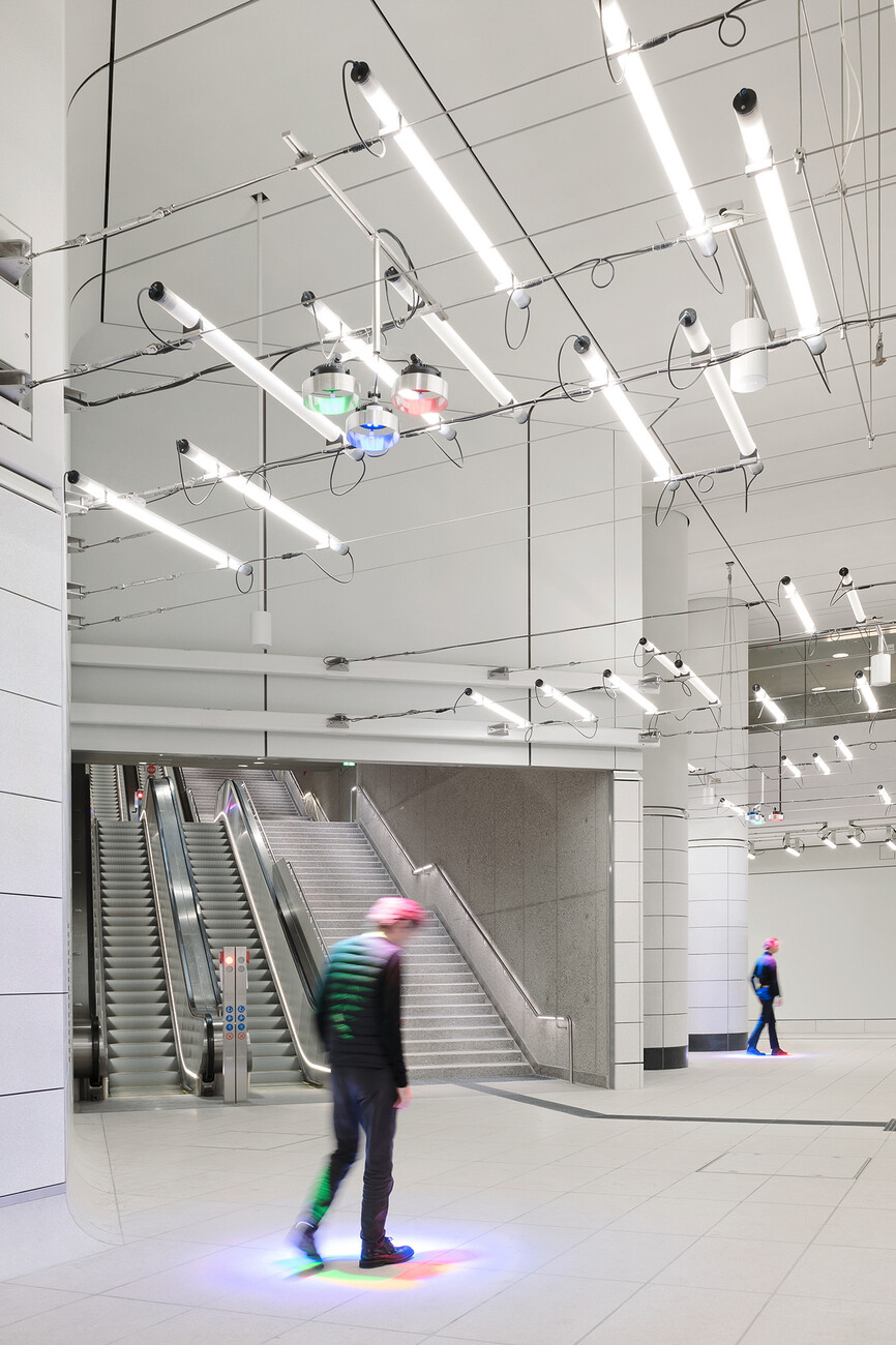
Sebastian Utermöhlen: When you mix red, green and blue light, you get white light. To do this, we placed three different and irregularly arranged spots on the cable system, which create white points of light on the floor. As soon as the passengers pass through these light points, they take away parts of the respective colors and the complementary colors then appear as shadows on the floor. The result is thus a play of colors that is staged via the passengers.
You also designed the respective mezzanines of the subway stations. What is the lighting concept here?
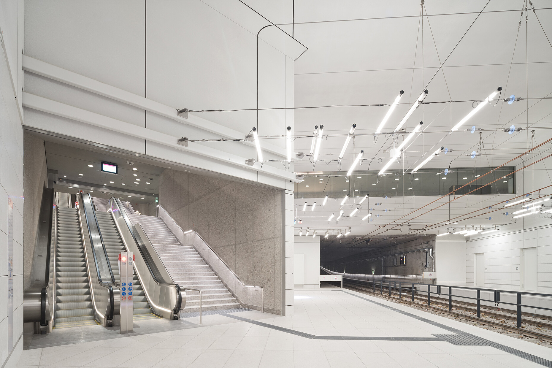
Sebastian Utermöhlen: The surfaces in the mezzanine floors are made of bush-hammered concrete and are rougher than in the platform area. The lighting responds to this with a free and at the same time directional light distribution. These are cones recessed into the ceiling, based on our "Light Cone L" luminaire. The luminaires are set back and the cones are angled inwards so that the light can be directed specifically. In addition, this results in light cones on the walls. There is also handrail lighting for the stairs, which creates a kind of light pedestal.
In the past, lighting design was a subordinate part of electrical design. Can you tell from the Karlsruhe subway stations and the collaboration with a famous designer like Ingo Maurer that more importance is now attached to lighting design?
Sebastian Utermöhlen: Yes, I would say that. In the old traffic buildings, it was often about efficiency and using as few light sources as possible. In the 1970s, that led to stations where there was a continuous fluorescent line with correspondingly monotonous lighting. And that was one of Ingo Maurer's great themes: to create spaces whose light is entertaining and creates a successful atmosphere.


