Double height
The story behind this top-floor apartment in Copenhagen begins in Noma. It is common knowledge that in creating his Scandinavian gourmet temples René Redzepi came up with more than just a simple restaurant. For David Thulstrup, who designed the Noma’s interior with a wealth of different materials it proved to be the perfect calling card. Perhaps they were between courses or had maybe just finished their dessert when one evening two guests at Noma sent the following request to David Thulstrup. They not only admired the award-winning cuisine, the entire place had inspired them, and would the architect consider visiting them; they wanted to convert their apartment. "They liked the walls, the floors, ceilings and wood, the entire look of Noma," recalls Thulstrup and smiles: "Yes, and they were still sitting in the restaurant when they contacted me."
In 2019, the two satisfied guests became clients. Thulstrup was commissioned to convert the existing apartment on Vester Voldgade in the middle of the city center close to the Town Hall into a two-storey penthouse apartment. The option of buying the loft above their current, somewhat gloomy apartment meant they were looking at an utterly new structure with much more daylight inside. "They really were up for a complete makeover," says Thulstrup admiringly. The architect is aware that not many clients are that brave. It was an excellent starting position and he "pretty much had a free hand," in other words carte blanche – which resulted in the final result being all the more consistent.
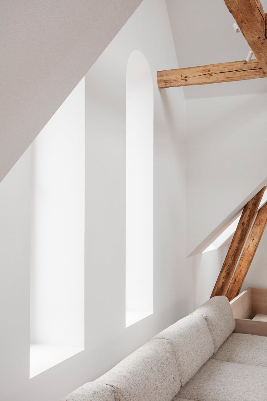
The construction work took around seven months, somewhat longer than initially planned yet fairly fast for a conversion in a house dating back to 1890. The existing apartment had potential but lacked definition altogether. In order to link the additional level with the existing floor and to create a duplex that is as open as possible Thulstrup completely and radically restructured the whole floorplan. Originally, the compact attics had been home to the maids. With their small dormer windows they only let in scant light. But the owners wanted bright living spaces with as much daylight as possible and this was to be achieved through a careful yet radical partial demolition and via horizontal and vertical openings extending over two storeys.
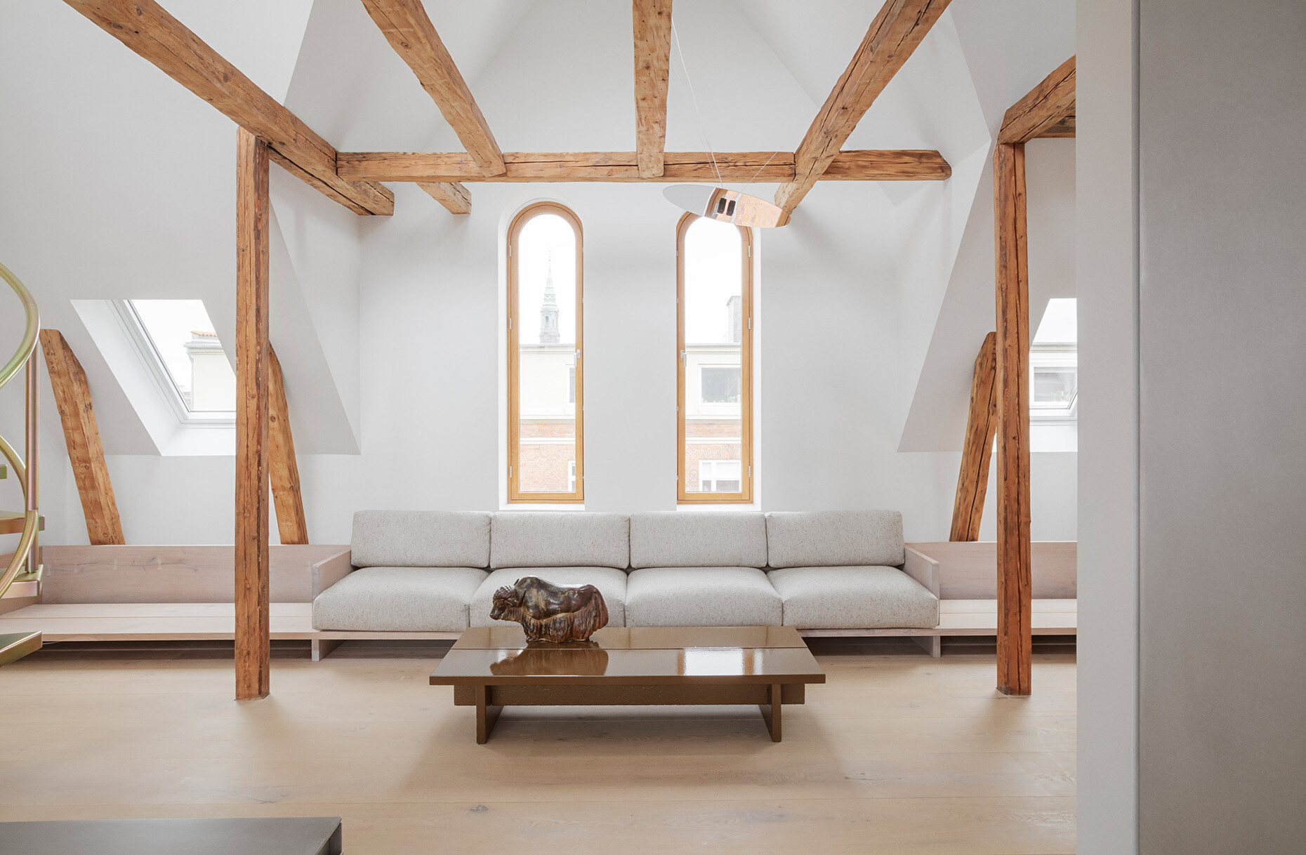
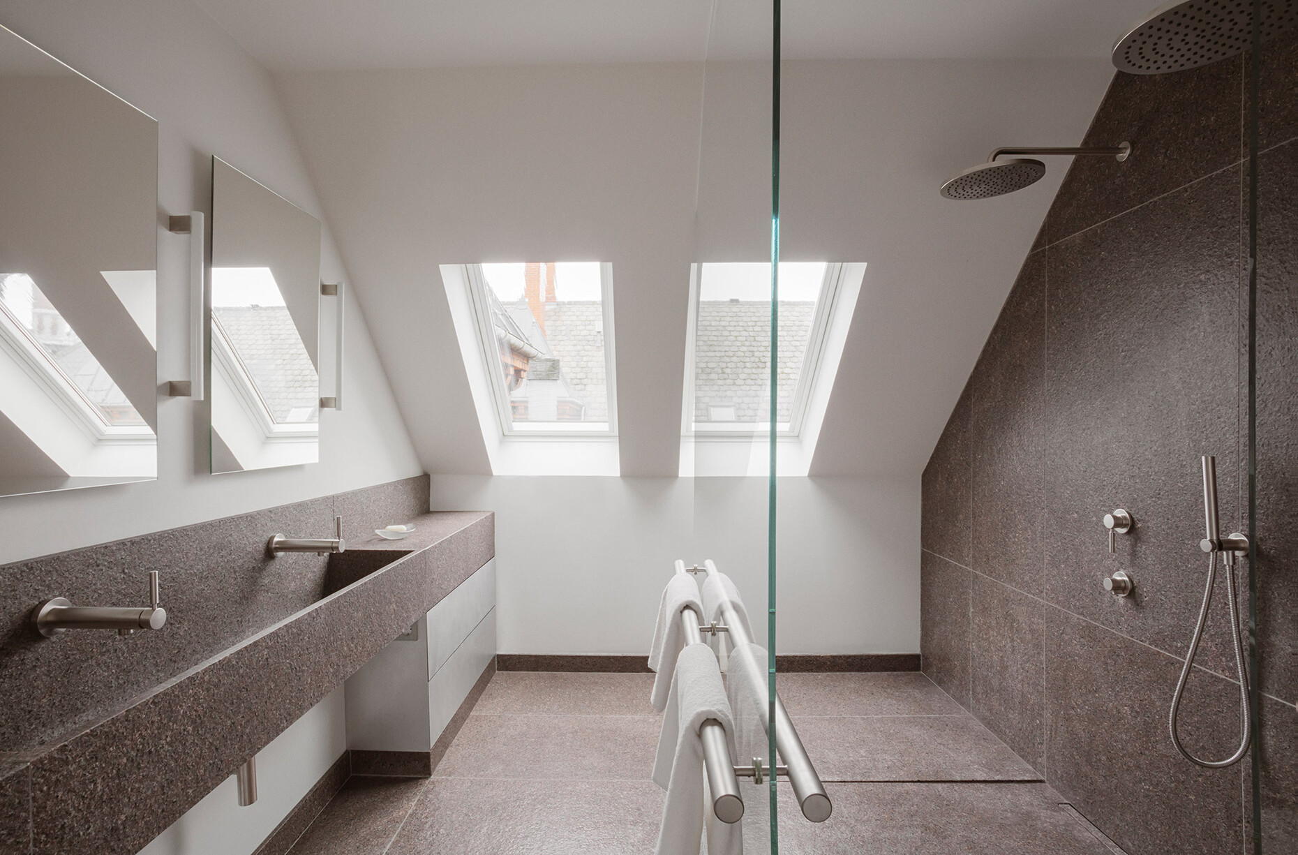
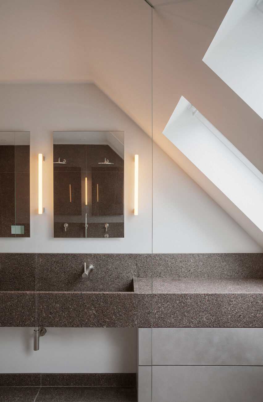
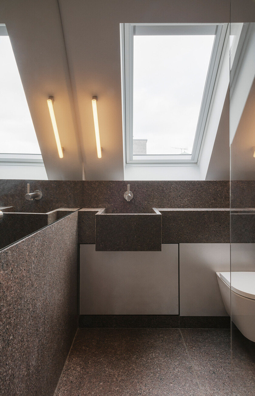
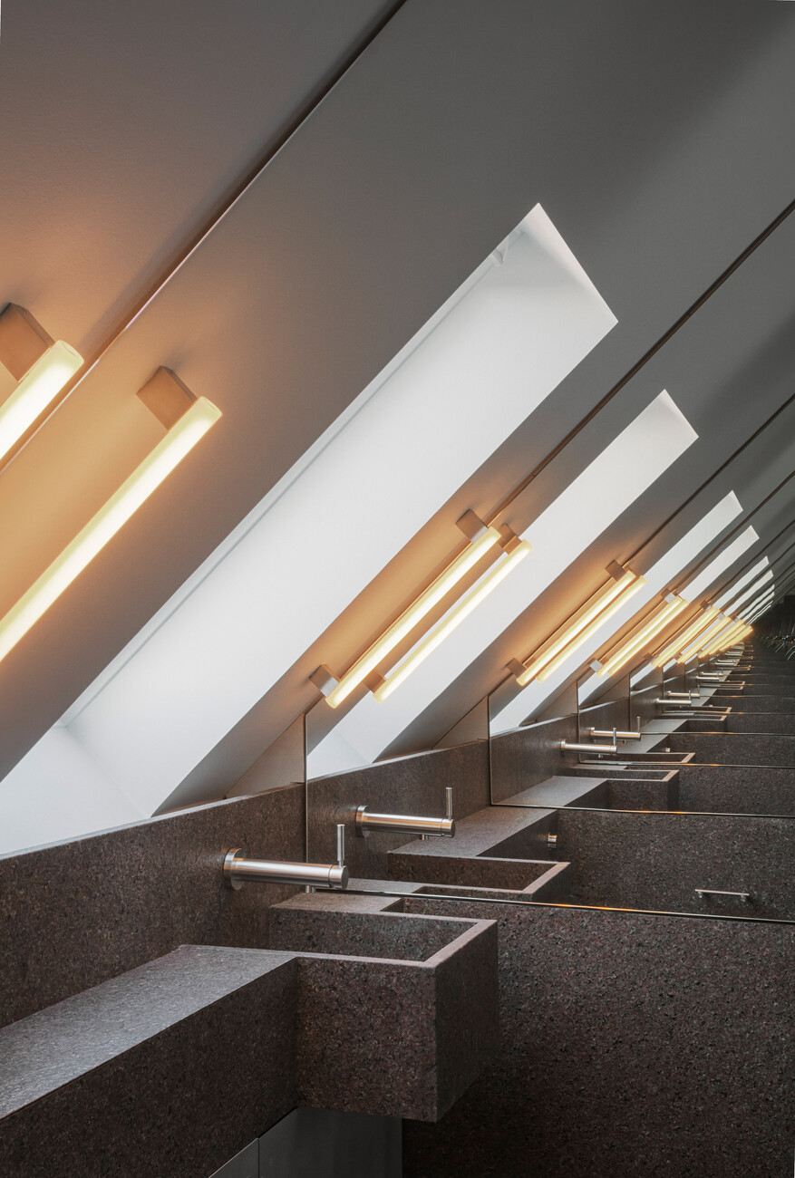
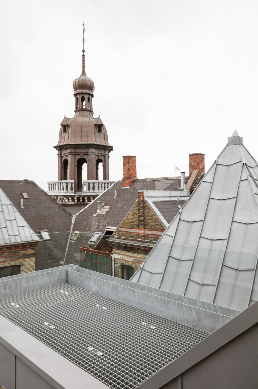
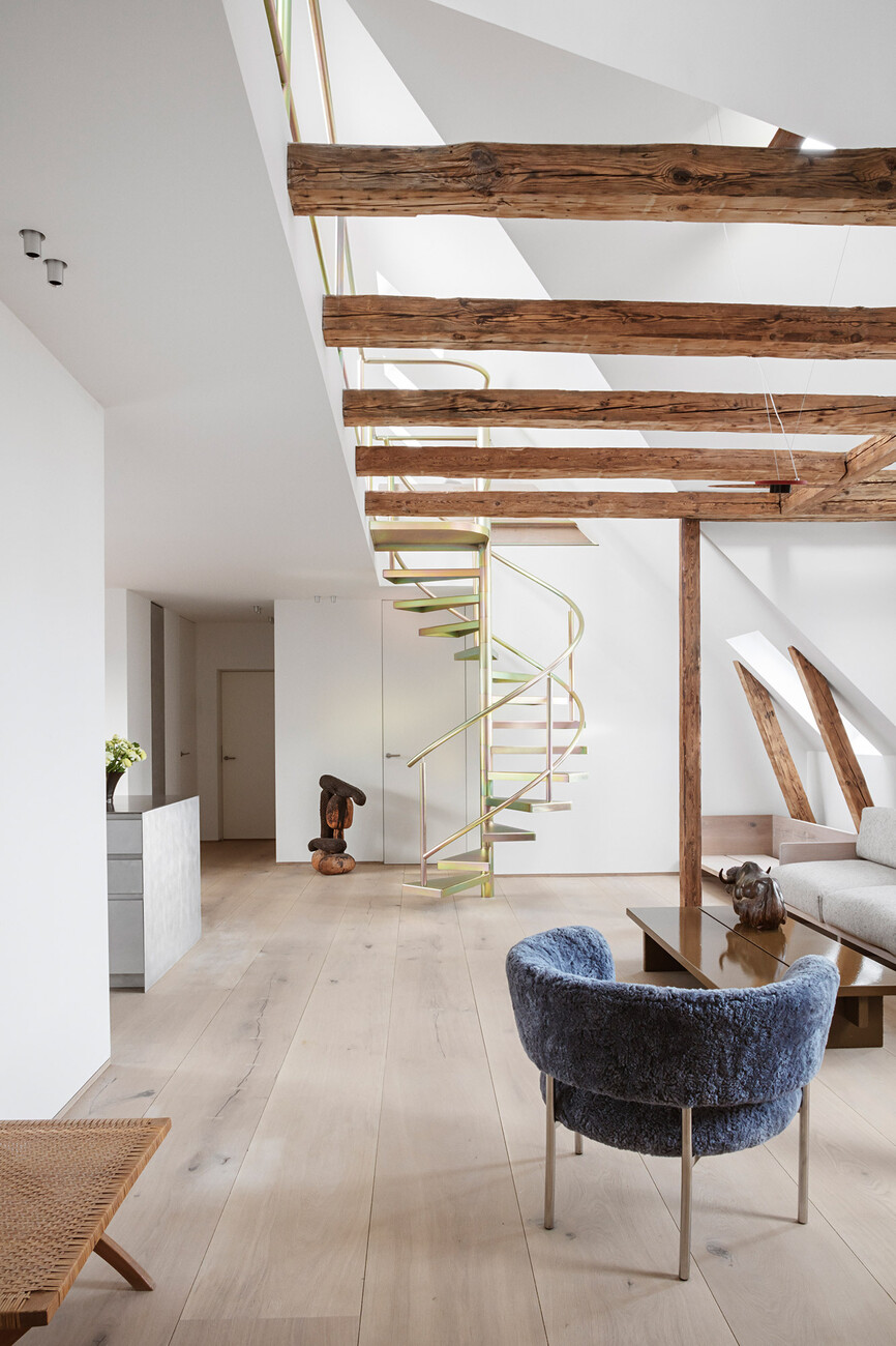
Today, the couple and their daughter have 150 square meters at their disposal though the apartment appear substantially larger thanks to the open spatial structure. The apartment has two new bathrooms featuring brown and pale pink granite, an open terrace on the roof and a long balcony right next to the kitchen and dining area that makes a wonderful location for dinners and parties with friends. A spiral staircase of yellow galvanized steel leads up to the top level casually flanking the double-storey main space with its open kitchen. With its purist counter tops by Reform of pale granite, hand-brushed aluminum and a sturdy worktop of stainless steel the kitchen does not seek to impress yet nonetheless makes for a subtle highlight. In the form of PLATE with its handle-free design David Thulstrup lends the kitchen a gentle, industrial character.
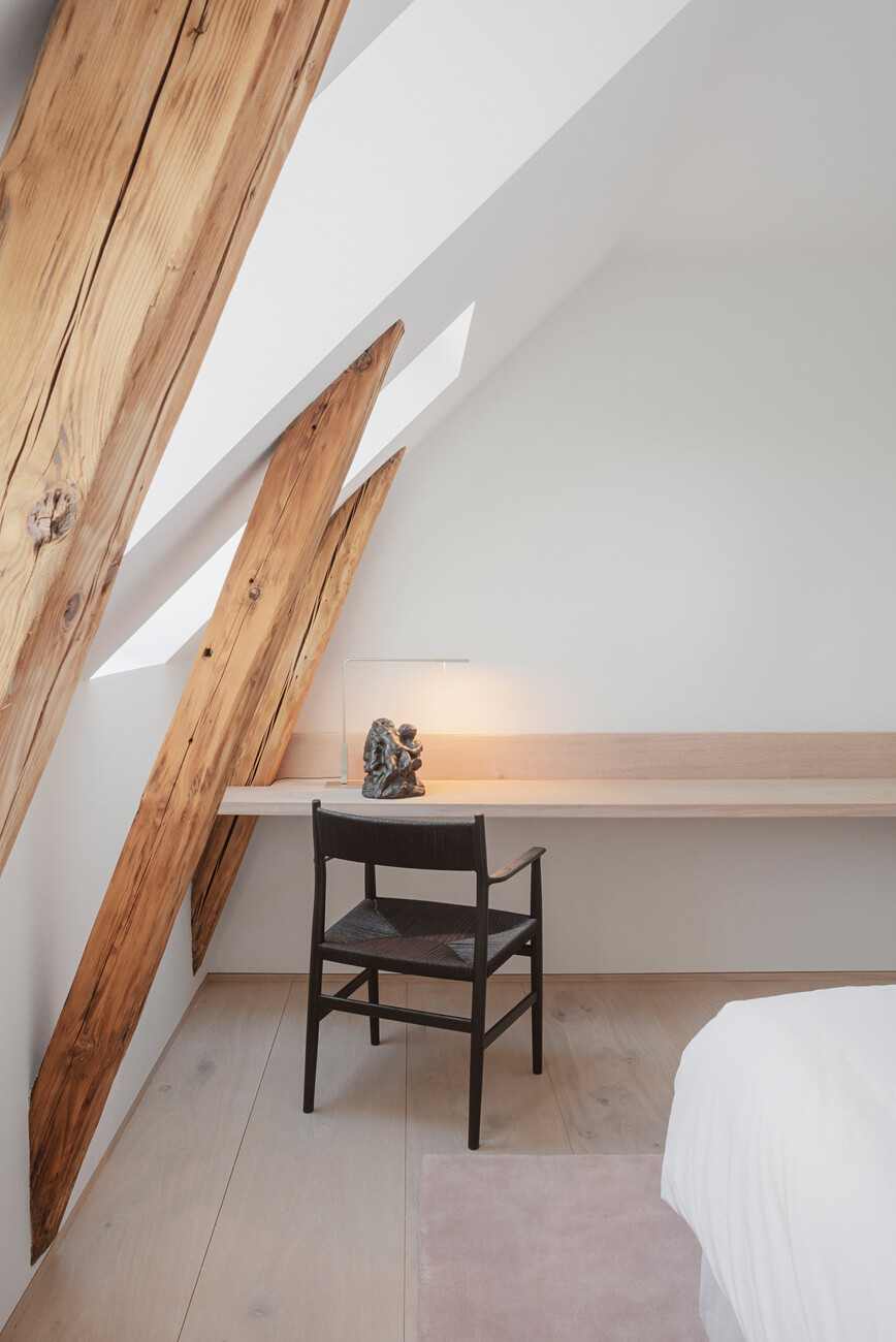
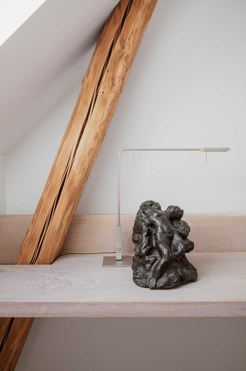
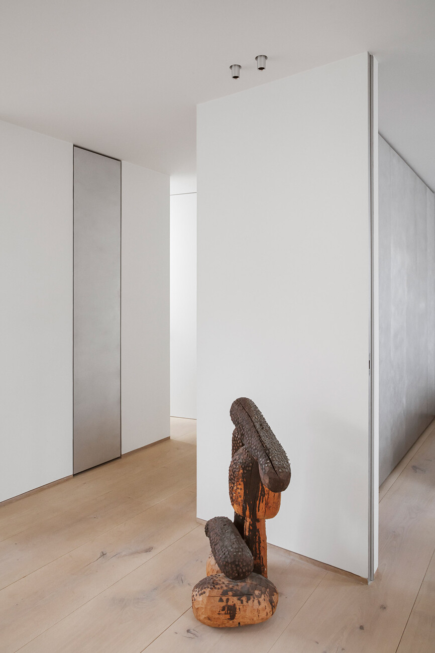
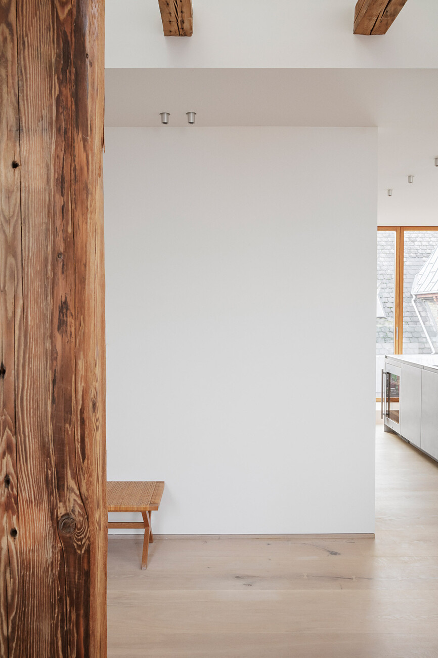
He was also able to express his passion for wood in this project in a number of ways. Exposing the historic roof truss makes the old oak beams and rafters stand out in the matt white rooms – a respectful handling of the existing structure. Thulstrup’s projects are based on the honesty of the material because he would like to "show things as they are." Simultaneously, he likes to contrast wood with other materials. "For me wood always needs a counterpart," stresses the architect. Which is why he combines wood with metal or wood with stone and sometimes old and new timber as with the roof truss that is over 100 years old and the oak parquet by Dinesen that the clients had so admired in Noma.
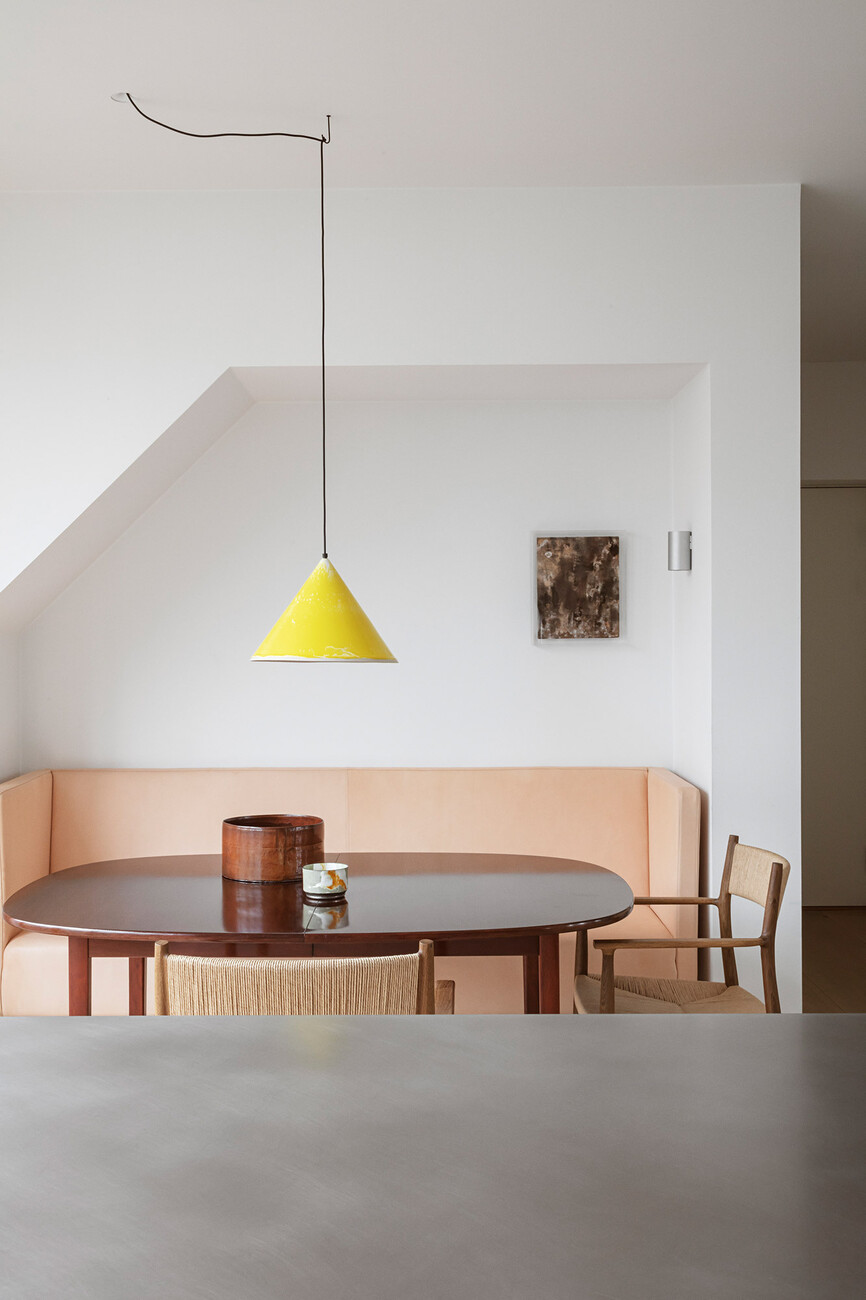
In order to avoid to spoil the restrained, almost minimal, uncluttered, Scandinavian character of their new home the couple also parted with some of their furniture: After all, it was to be the start of a new chapter. In some cases, new furniture was integrated into the layout as fitted elements so as to retain the open look. The custom-made bench opposite the kitchen with its pink cover of vegetable tanned leather fits perfectly beneath the sloping roof and harmonizes with the pale-yellow ceiling luminaire – one of the few color accents. For David Thulstrup, such fitted elements are an ideal way of creating cozy, intimate corners in large, open living spaces. After all, ultimately every residential project has to be one thing above all: livable.
