Lattice living
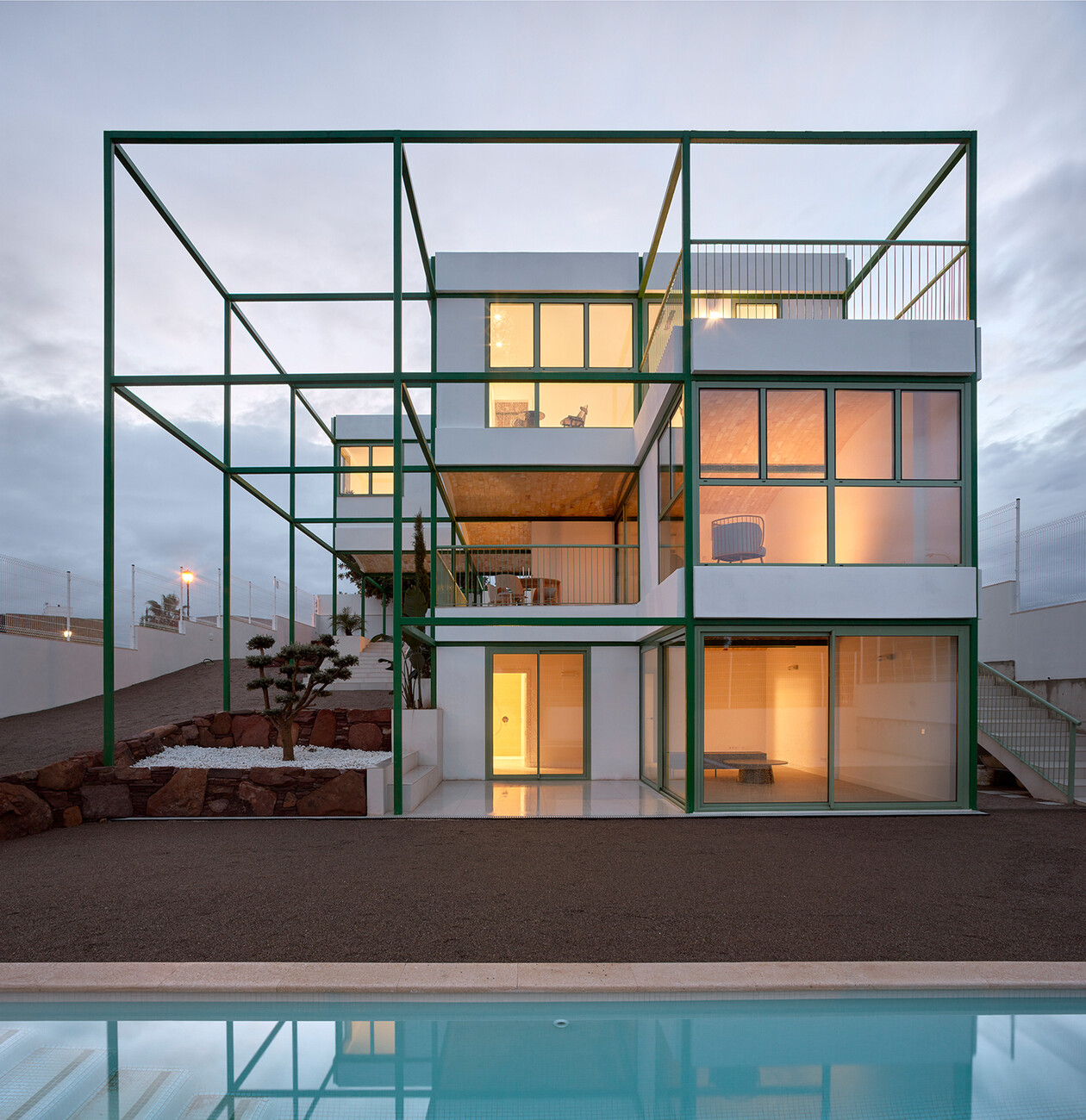
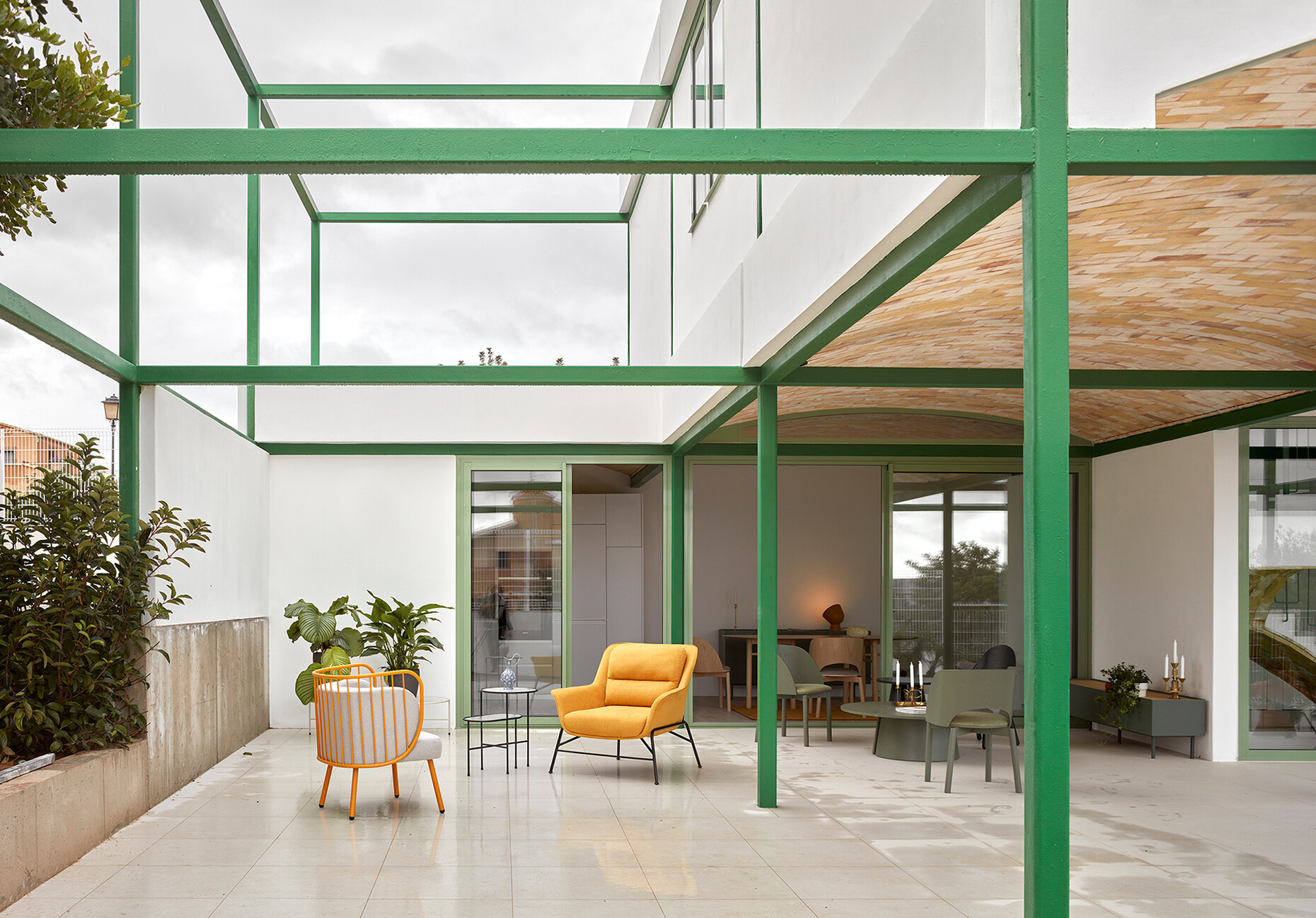
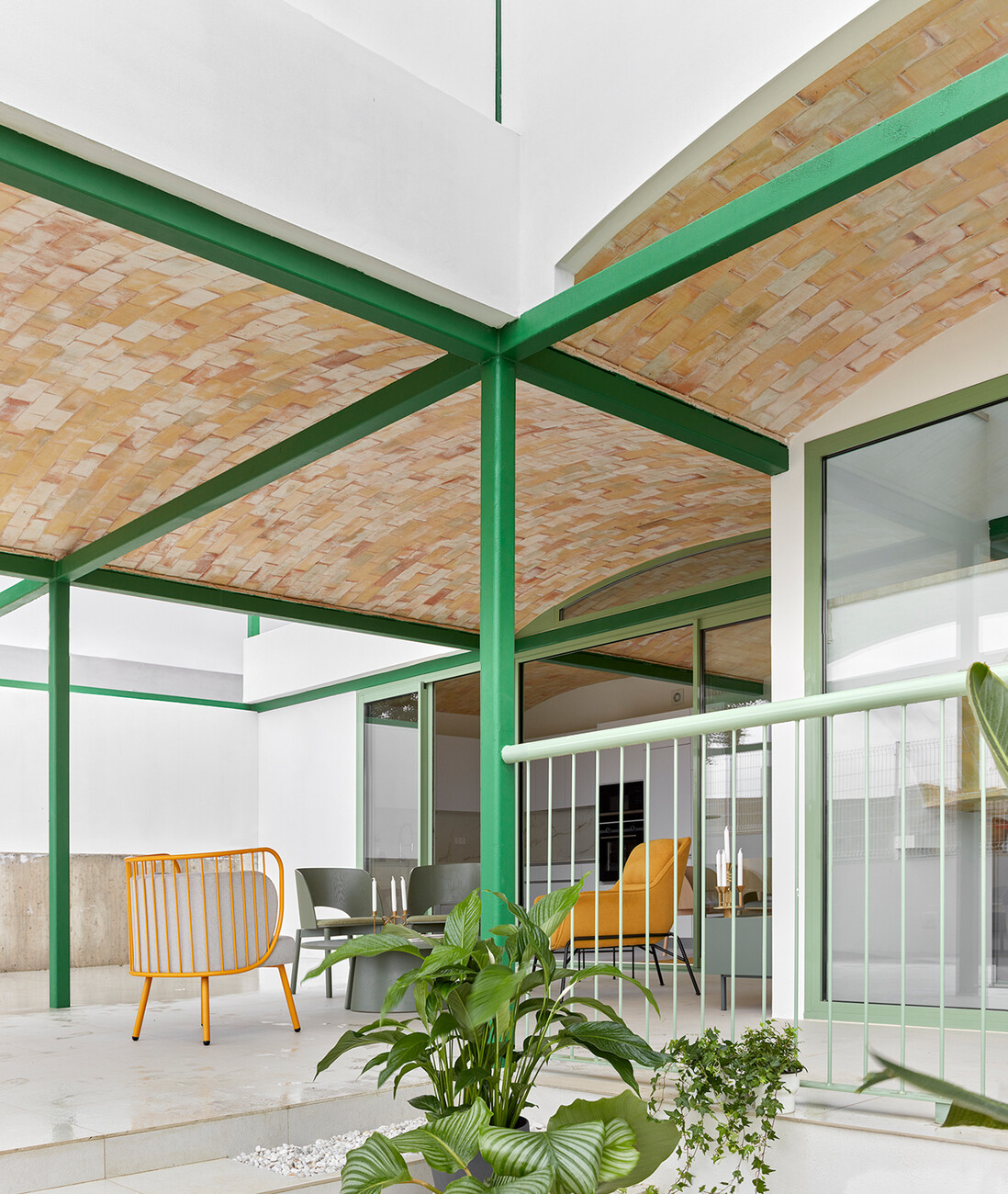
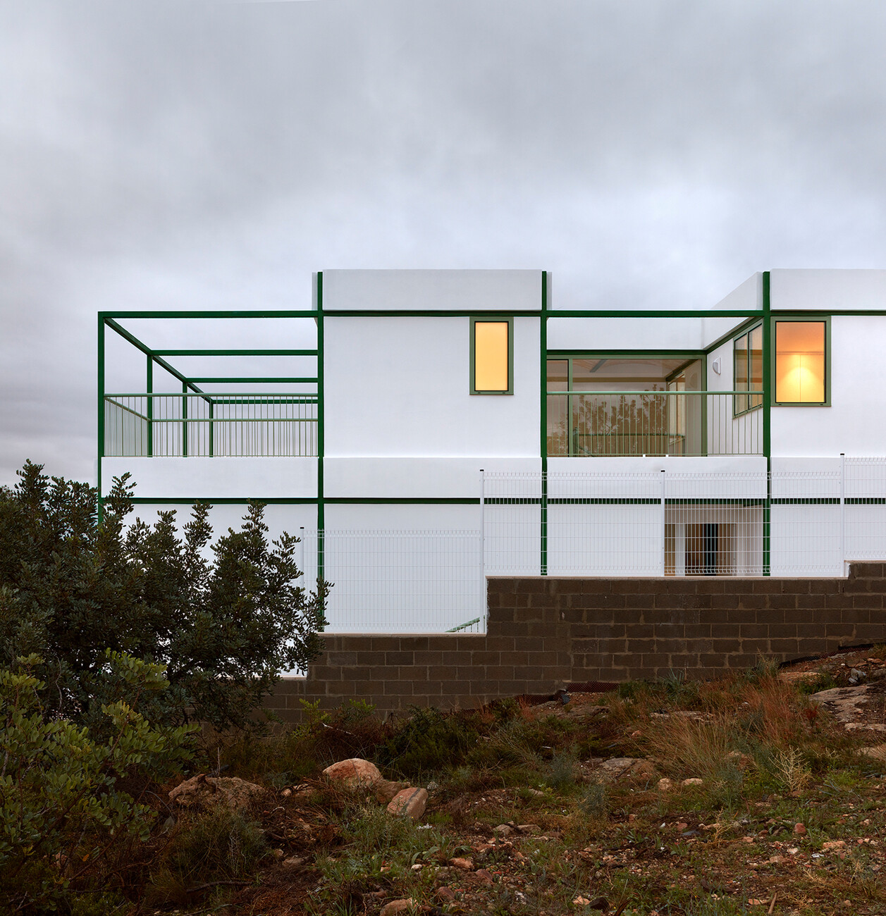
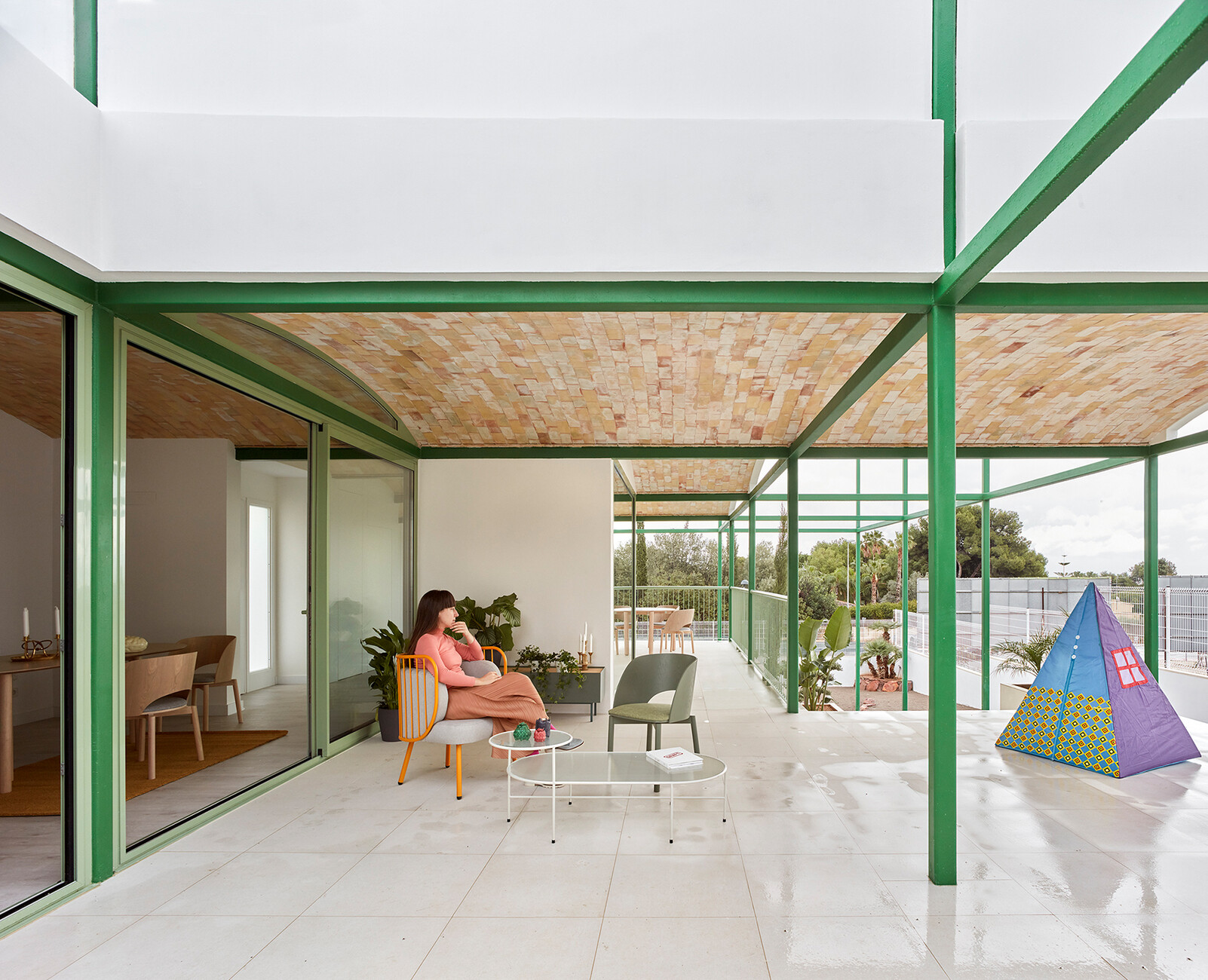
The green steel structure is somehow unsettling. It does not conform with what we are accustomed to seeing. Thank goodness. Otherwise, it would be all too easy to pigeonhole the detached house: A white cube that satisfies the cliché of a dream suburban home. But the house with the green frame is much more than you might imagine at first glance. Firstly, the building is intended as a prototype of a detached house. And secondly it relies on a system that allows different spatial configurations. So far so good. But Lara Lesmes and Fredrik Hellberg, who jointly run the architecture office “Space Popular”, have succeeded with just a few local elements in creating a spatial experience that avoids Modernism’s occasionally dogmatic attitude to life. And that makes it worth a closer look. The detached house is the first building to be completed by the two young architects from London. It is located in a suburb of Valencia: Nueva Santa Barbara, a neighborhood of detached houses for the middle class. The client commissioned the two architects to build a detached house in the medium price bracket but otherwise they were given carte blanche. Their approach was a combination of functionality and craftsmanship. Measuring 3.75 meters by 3.75 meters the green steel grid has a room height of just under 3.16 meters and mediates between the indoor and outdoor space. And it provides the constructional basis for diverse house and room configurations.
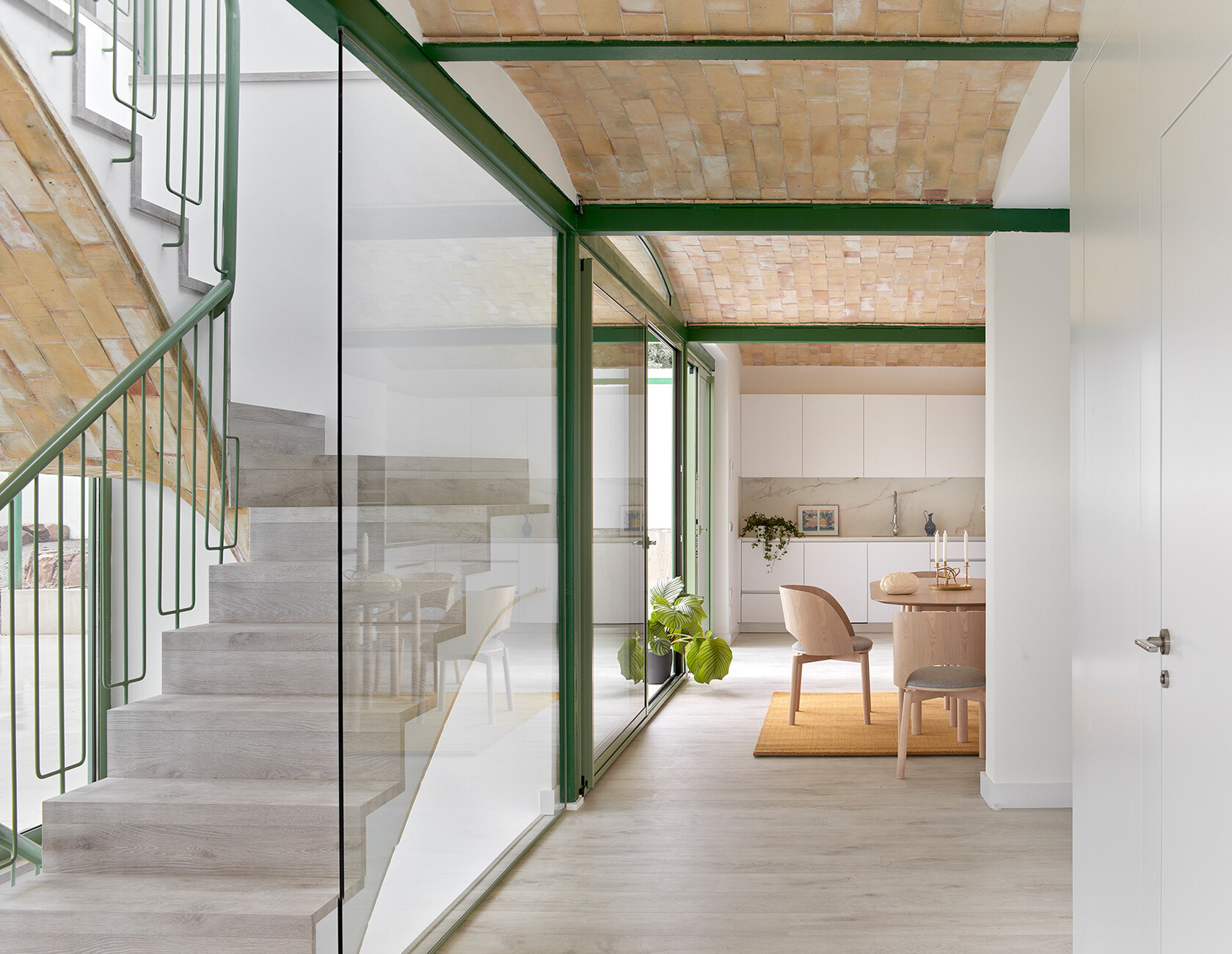
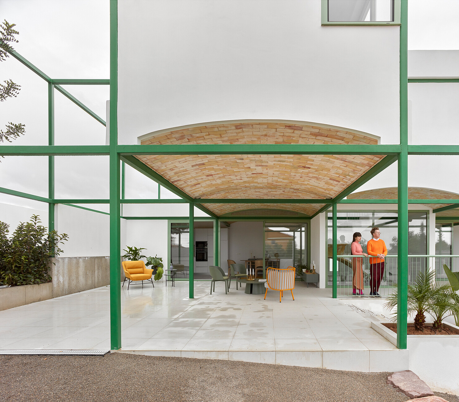
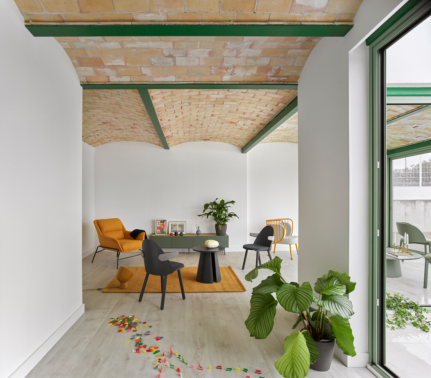
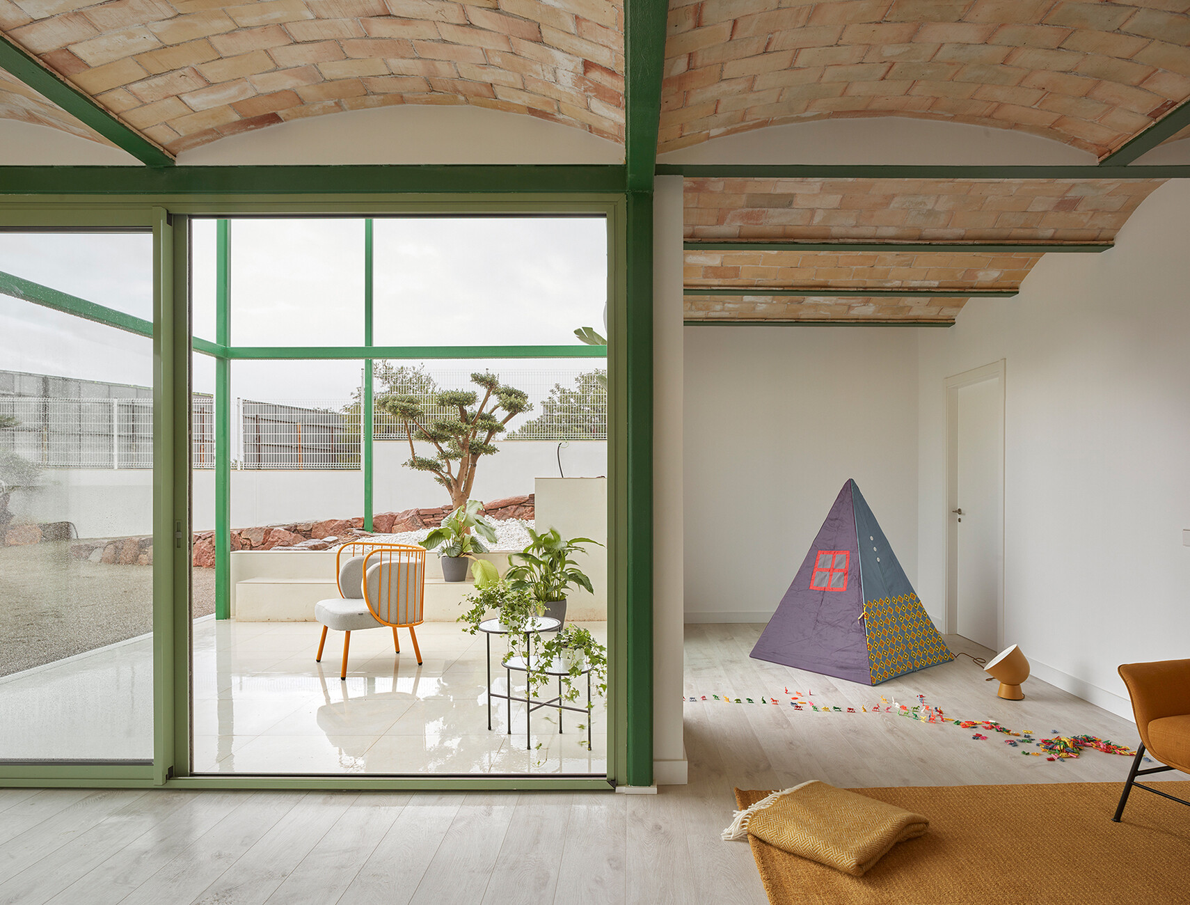
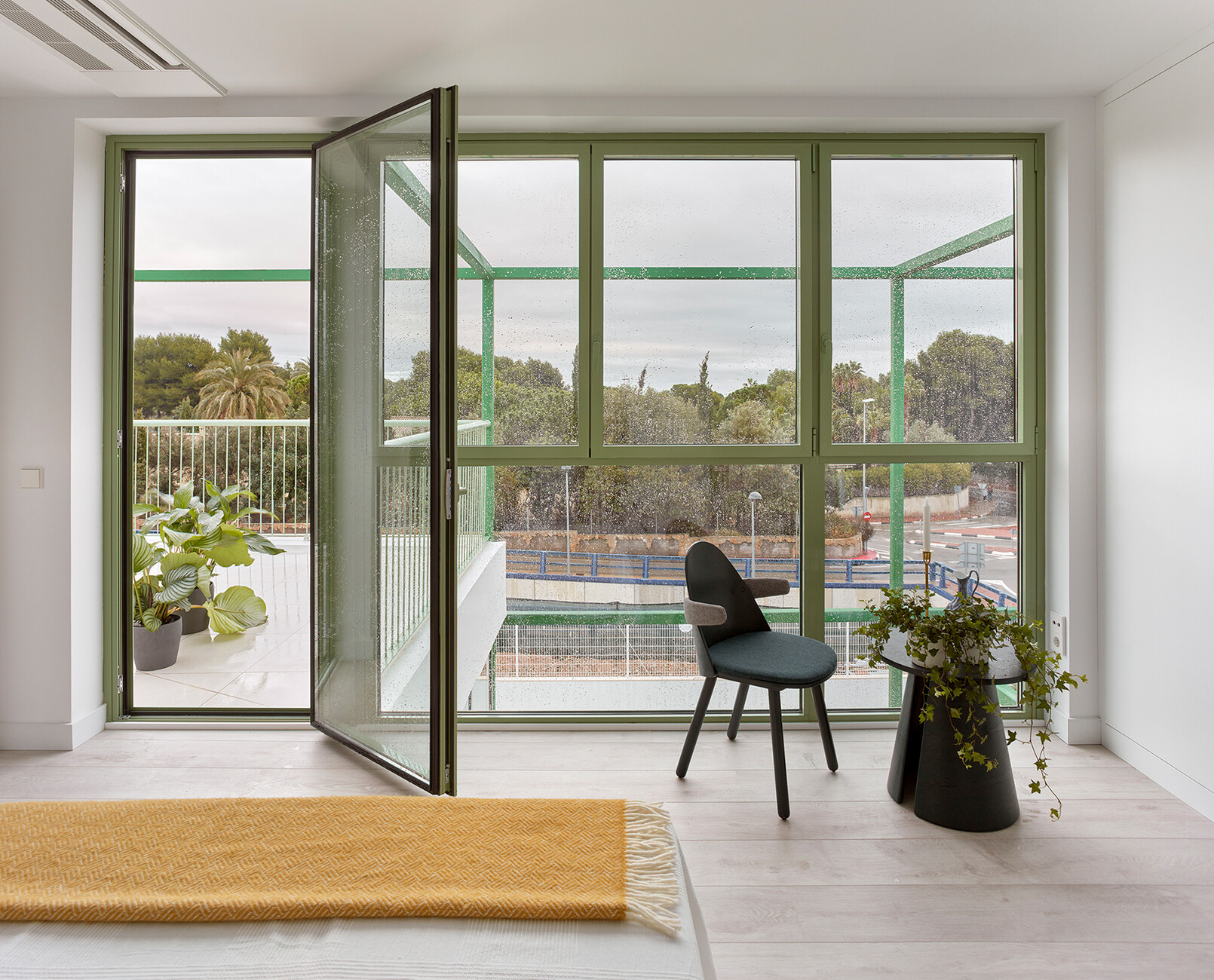
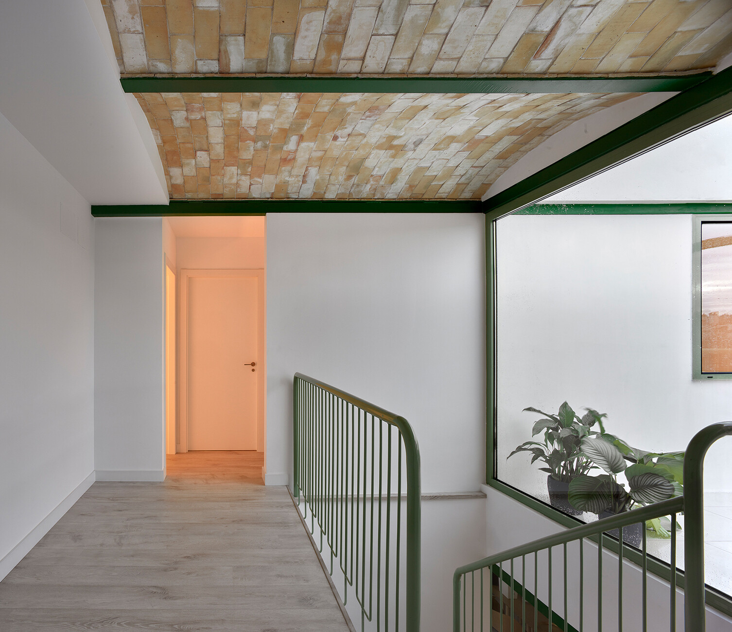
Moreover, the frame also proves highly practical should alteration work be done to the building as it renders a crane or scaffolding unnecessary. While the walls are filled with industrially-manufactured sandwich panels, when it comes to the ceilings Space Popular have opted for a traditional local element, namely brick vaults. “There are only three firms in and around Valencia still capable of providing this centuries-old technique,” explains Lara Lesmes. “And as they can be realized without formwork you also save resources.” The brick ceilings are left in all their raw beauty to create a light, airy feeling. The location of the house on a slope determines how it was structured: Across three levels the architects succeed in connecting the building with the topography of the site via steps and creating repeated references to the outdoor space – not only through the balconies and terraces but also through spacious windows. You enter the building via the ground floor, where the kitchen, dining and living areas are located. The bedrooms and bathrooms are accommodated on the upper floor, while there is an additional living area on the lower floor that is linked to the garden. The staircase at the center of the house provides access to the individual floors. Its green handrail and the green window frames merge visually with the green of the steel grid.
“While in our other projects, say for exhibition architecture, we were asked to create entire worlds, the interesting thing about this commission is that we don’t know who is going to move in to the house,” says Fredrik Hellberg when describing the project’s challenges. The new occupants should be able to personalize the house but at the same time you need certain features such as the brick vaulted ceilings and the omnipresent space frame that lend the house a special character. With just this handful of design elements that are as striking as they are flexible the London-based architects have successfully created a modular house that is nonetheless not a standard product. Nor would that have fitted in with Space Popular’s design DNA, because as Lara Lesmes explains “ideally, we seek to create an impressive spatial experience relying on existing resources.”
