Arch friends
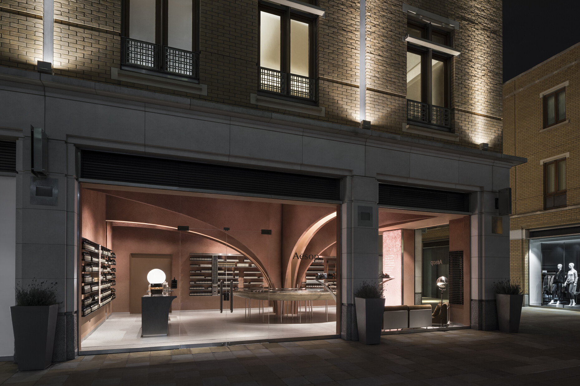
Things have gotten more civil at the Duke of York’s headquarters. Since 2008, the large Classicist main building of the former army barracks, just a stone’s throw away from elegant Sloane Square and chic King’s Road, has housed the famous Saatchi Gallery. The complex’s other buildings have been converted into luxurious homes and commercial premises. And this is where the latest London branch of Australian cosmetics manufacturers Aesop has just opened its doors to the public.
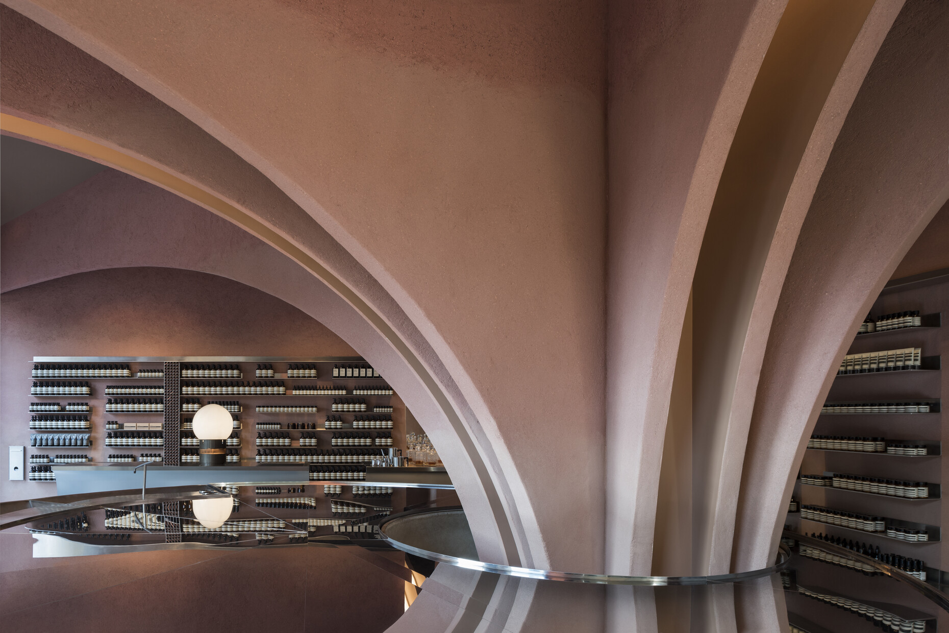
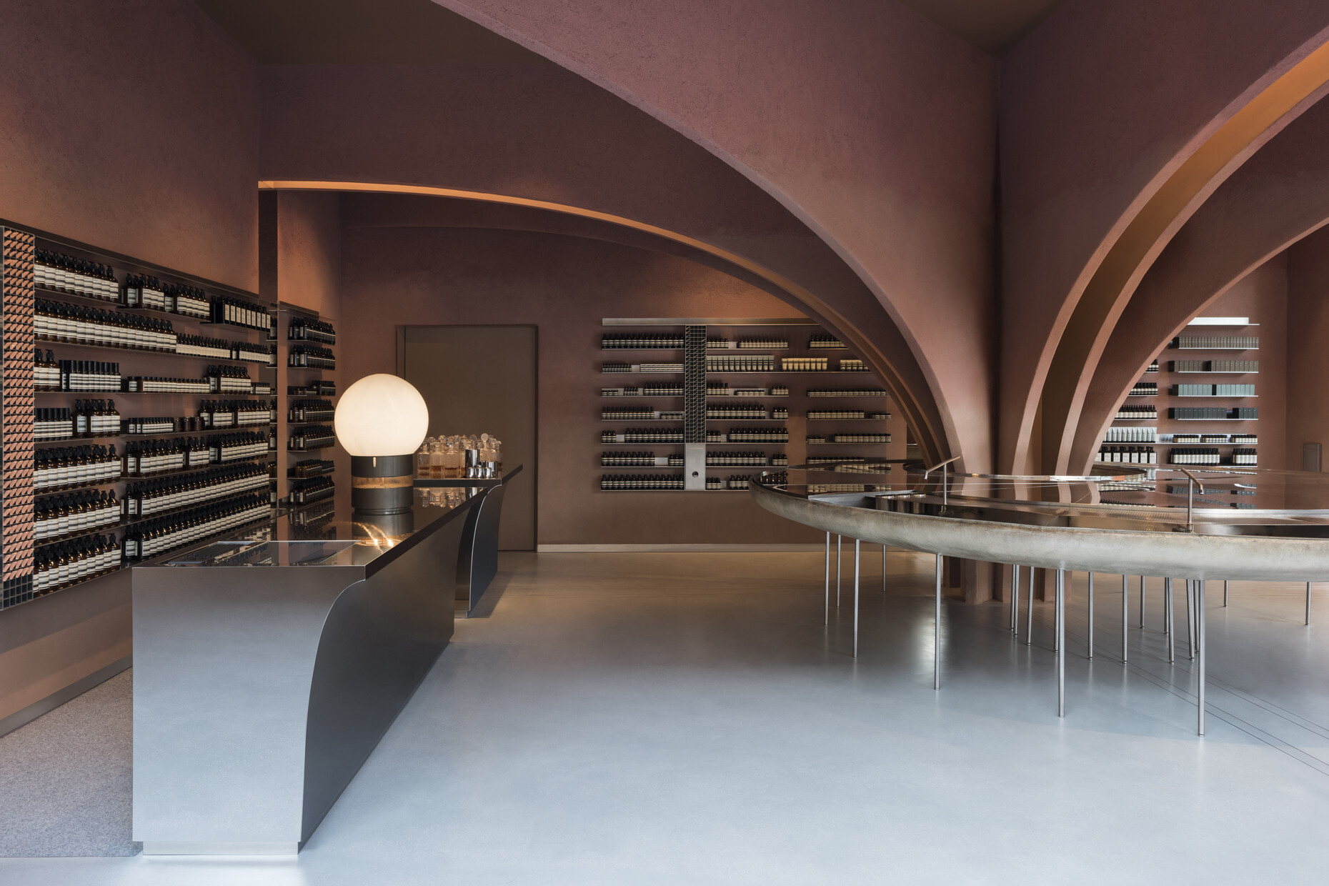
The architects of Norway’s Snøhetta office were entrusted with designing the shop’s interior: Indeed, this is now the seventh store they have fitted out for the label, which so stands out for its affinity with architecture and design. In doing so, the architects took a pillar, standing on its own in the center of the premises, as their starting point. They installed half-arches radiating outwards from this feature, and thus lent the store the appearance of a vault. Walls and arches were rendered in iridescent red clay plaster – maybe alluding the former occupants of the complex, the British Army, and their red parade uniforms? Perhaps, however, Snøhetta are also referencing the color of London’s ubiquitous red brick. The matt red is contrasted by fixtures in high-grade steel. The washbasins, typical for Aesop’s stores, are placed in an especially succinct way: A reflective metal washstand made of steel and fiberglass wraps round the central pillar. (fap)


