ISH 2019
Smart Revelation
As the ISH 2019 shows, the bathroom is set to become the focal point of our everyday lives – as a spa, place of encounter and sanctuary of bodily hygiene for a society in need of recuperation. Are we soon going to be receiving our guests between the bathtub and bookshelf? It’s eminently possible! After all, the scenarios presented by some of the companies exhibiting at the world’s leading trade fair for HVAC and water offer unimagined qualities that tempt us to spend more time in the bathroom. The sanitary area is losing its intimacy – the bathroom of the coming years, maybe even of the coming decades, expressly wants to be seen.
Antonio Lupi’s colorful-transparent designs and washbasins make this clearer than anything else. The Italian manufacturer stages water as the source of life with the aid of “Christalmood,” a synthetic resin first introduced at Salone del Mobile 2018. And the products are – show stoppers! They are presented on the fair stand alongside “Utrecht” armchairs by Gerrit Rietveld, who in 1935 created the design that was so far ahead of its time it only found its way into mass production in the late 1980s, when it was manufactured by Cassina. Flashbacks, with which we are of course familiar from the realm of furniture design, are abundant at this year’s ISH. For example with Ideal Standard: Here, Ludovica and Roberto Palomba were tasked with reinterpreting a classic designed by Paolo Tilche in 1972. The new “Conca” collection by the Italian designer couple has a considerably more slender silhouette than the original – a qualitative accomplishment that ever more manufacturers (be it Duravit, Toto or Villeroy & Boch) are eager to attain nowadays, following Laufen’s introduction of its “Saphirkeramik” material.
In the meantime, the inventor of the most filigree of all bathroom ceramics is already onto the next level when it comes to design. Amsterdam-based studio Marcel Wanders has just made its “New Classic” for Laufen ready for market. Typically for Wanders, the product series is opulent. It features washstands reminiscent of tulip blossoms and borne by delicate, curved wooden legs, complemented by ceramic mirror frames. These are joined by the matching fittings inspired by pillars. The opposite end of the spectrum is provided by Konstantin Grcic’s series “Val,” which offers utmost minimalism and has now been expanded to include a range of compact washstand solutions for small spaces. And Patricia Urquiola has also added to her product series “Sonar.” The range’s new pièce de résistance is a free-standing oval bathtub made with Laufen’s high-tech material “Marbond” and featuring an integrated fittings panel and optional storage dish. Furthermore, “Sonar” now includes additional washstand base units as well as a tall storage cabinet. A stand concept by Zurich’s Fuhrimann Hächler Architekten provided the impressive backdrop for all Laufen’s innovations.
Saving the world, one lavatory at a time
On the upper floor of its stand, Laufen proved that design can go beyond the mere creation of shapes. The innovation bears the name “Safe!” and is currently also being presented as part of the Milan Triennial. A cooperation between Laufen, the Swiss water research institute Eawag and the Austrian design studio EOOS has seen a toilet developed that discharges feces and urine separately. The occasion for the project: Studies have shown that the high level of nitrogen in waste water attributable to urine poses a serious danger to the environment. Bioreactors are to filter nutrients from the urine and neutralize drug residues and hormones. The substance that remains is a flawless concentrated fertilizer that has been dubbed “Aurin.”
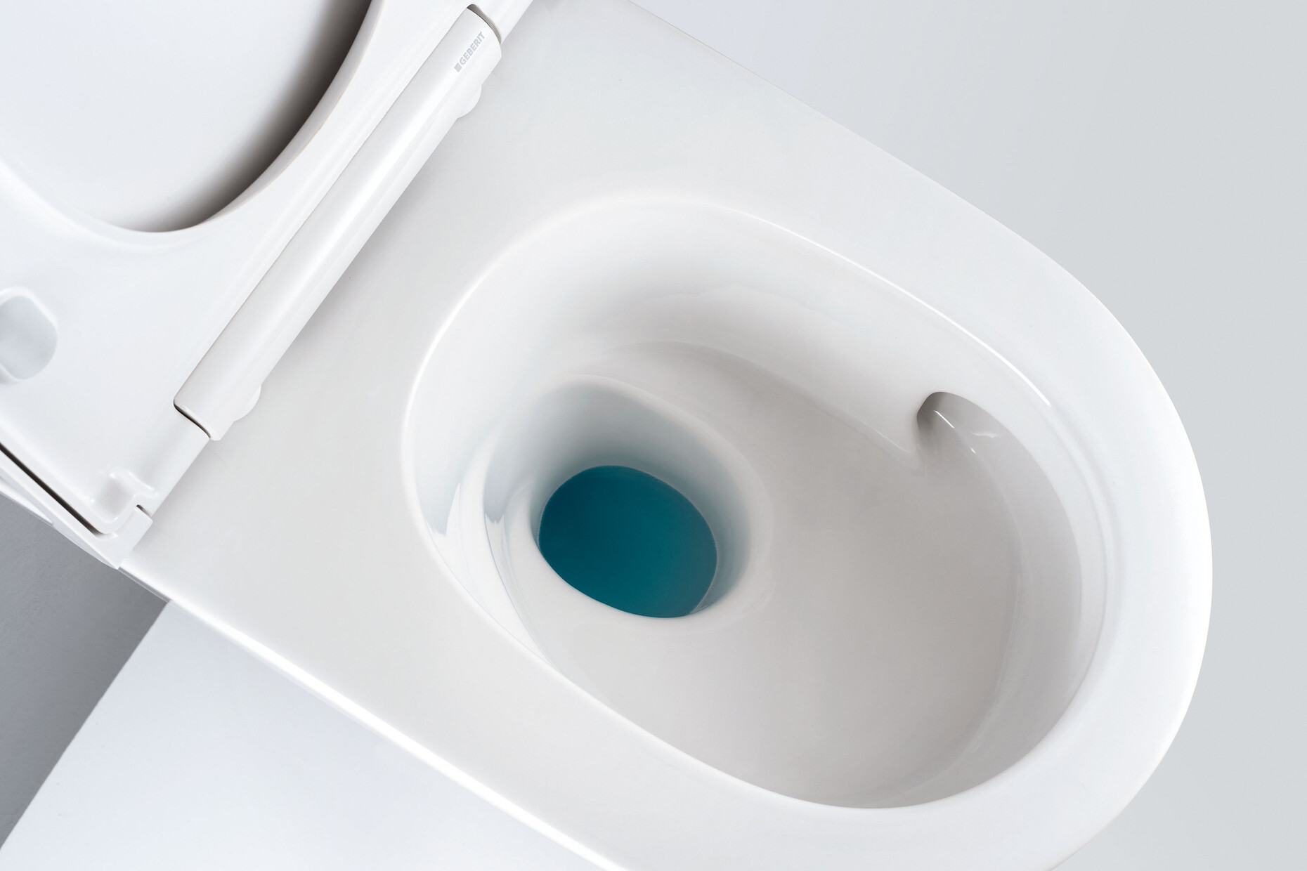
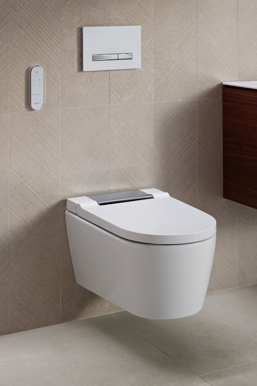
Most other WC offerings at the fair were dedicated to the topic of the shower toilet. Almost every notable exhibitor had one in its program. The reservations about engineered toilets are waning – the manufacturers can attest to this, and so does the heightened visitor interest at the ISH. However, the jury is still out for the companies as to whether the better solution is integrating technical features into the ceramic or opting for the attachment variety – discreet vs. bulky. Geberit opted for an in-between solution: The design of “AquaClean Sela” is so compact that its technical component is hardly noticeable. The electricity and water connections are integrated into the ceramic, while the shower nozzle itself rests on the basin. In passing, the producer has also completely overhauled flushing technology. The rimless toilet is flushed from the side, quietly and thoroughly, with a circular swirl of water.
Geberit has also definitively spruced up its bath program “ONE.” Parts such as the connections and siphon disappear into the on-the-wall installation and are covered by a maintenance panel. The collection includes a washstand, available free-floating or with matching unit, a wall faucet, a mirror cabinet that can be integrated into the wall, as well as a wall drain for the shower and a storage box. The previously mentioned toilet flush technology is also part of “Geberit ONE.” The ceramic is held by hidden screws and can be lowered or raised by -1 to up to +3 cm. This ensures all ages will be seated comfortably.
In general, adaptability to all kinds of user preferences was the overarching motto of this year’s ISH. Bette provided what was possibly the greatest selection with 500 different combinations of colors and finishes, among others for its new glazed titanium steel washbasins “BetteCraft.” Ideal Standard was offering its ceramics in fresh new hues, as was Ceramica Globo. And Dornbracht introduced its “Meta” tapware by Sieger Design in new varieties from soft green and pastel pink to dark gray and dark brass matt, alongside its standard chrome, platinum matt and black looks.
Smart and delicate throughout
The combination of customizable products and smart technology was the name of the game at this year’s fair. Take for example Gessi: With “Architectural Wellness” the Italian company showcased a ceiling-installed rail system that combines various rain showers with lighting and music. The light has been developed together with Artemide. The controls are integrated into the mirror wall as a touch display. The system was first presented in Milan in 2018. While such offerings border on the gimmicky, they may well gain increasing acceptance in coming years. Ideal Standard, for example, is testing out a touchless faucet with display and integrated soap disperser for the object range. Yet giving it a whirl, the device does not appear very intuitive. There seems to be some catching up to do. Grohe missed the mark and had us doubting the sense and purpose of an exact temperature controller on the top of its “Plus” fittings. At Duravit on the other hand, we found ourselves catapulted into a new age. Instead of a digital display, the control knob of the fittings series “D.1” emits a softly pulsating LED light. Tapping it makes the water stop or start, while the color of the light indicates the water temperature, which may be adjusted with rotating motions. “Favorite temperatures” can be pre-stored and called up via “QuickAccess.” The design is by Matteo Thun and Antonio Rodriguez. The actual water outlet is elegant with an ultra-flat shape and available in chrome or matt black surfaces. Alternatively, users may opt for an analog control lever.
Once upon a time, candlelight on the edge of the tub sufficed to get us in the ultimate relaxation mood, but nowadays it seems only a video screen will do. At least that’s what Hansgrohe envisages: With its “RainTunes,” the Black Forest-based fittings manufacturer is ushering in “a new era of showering.” Seven different atmospheres may be selected using an app. An LED wall then “plays” a sunrise, for example, while water, sound and scent are also coordinated for the morning shower experience. The “RainTunes” app can be combined with other smart home applications, such as “Philips Hue.” An entirely new range of showerheads and taps forms part of the system: “Rainfinity” includes a wall-installed head shower that may be tilted and which can emit a range of different water jets; there is also a ceiling-mounted version, various hand showers, and a shoulder shower. Those who don’t want to switch to app control can also operate the shower using a fixed wall switch and rotary knob or with the aid of Bluetooth switches, which may be positioned as desired. Further controls in the same look also allow users to play music while in the shower.
Sculpture and experiment
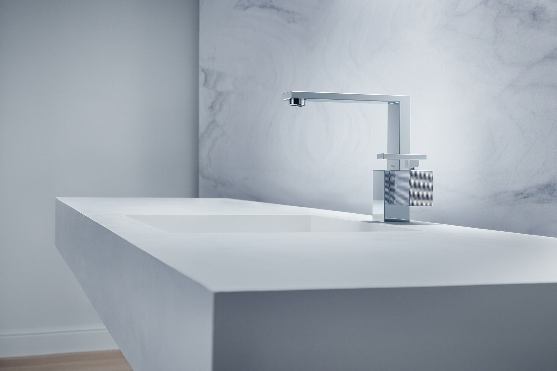
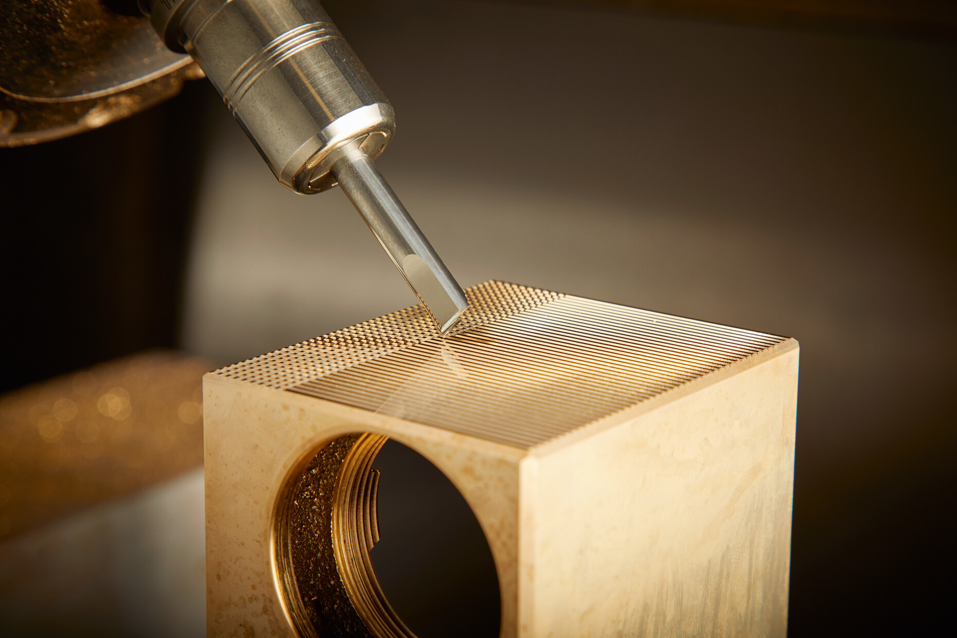
At the next stand along, Axor impressed audiences with its new high-end fitting “Axor Edge” by Jean-Marie Massaud. The French designer put the company to the test and had it produce fittings whose surfaces boast unparalleled precision. The technology required for their production originates from developments in astronautics design and had to be installed especially on a vibration-inhibiting floor in the cleanroom of the production site in Schiltach. During the presentation, Massaud explained: “The collection is in no way decadent; it is elegant like a gem,” which is then also reflected in the fine structure of the flacon-like mixer cartridge. “Edge” too is expressly customizable, is sculpture and architecture. The range of fittings is faintly reminiscent of Frank Lloyd Wright’s “Fallingwater” (1939), as well as of Rietveld – which presumably isn’t deliberate yet remains baffling. Because once more, new design features old references.
Oddly exempt from the development boost are bathroom furnishings. Only Burgbad was offering modular furniture that aims to combine dressing area, bathroom and make-up stand. Yet the major highlight on offer from the producer from the rural German Sauerland region was without a doubt the furniture collection by Stefan Diez and his team. The signage at the Burgbad stand read “Please do not touch.” Shown as a prototype at the imm Cologne a mere few weeks ago, “rgb” has made considerable progress and positively shone in Frankfurt. Glass furniture that casts colorful graphic patterns onto the walls, stone panels that appear to float weightlessly – we’ve never seen anything quite like it.
What such experiments crucially show is that we can now re-think our concept of what a bathroom can be. Just as VitrA bathroom is shaking up classic bathroom furnishings with the wooden tables and freely placed washstands of the “Plural” range, making the bathroom a morning and evening meeting place. Many of the ISH novelties make us want to try them out. Yet while they are convincing, they leave a decisive question unanswered: What will a future look like in which bathrooms will unfortunately only measure a few square meters? With a view to the current rapid urbanization, we would like to see some new ideas in this respect, too. Alape showcased a compact washstand with seamless fittings and storage, and Bette had a bathtub offering the greatest possible space on an optimized, trapeze-shaped footprint with “BetteSpace.” Yet there were no concepts or collaborations with interior designers on show that turn even the smallest or narrowest of bathrooms into an oasis. Or is it time, now that we have already integrated kitchens into our lounge areas, to bid farewell to our inhibitions and assimilate the bathroom into our living rooms, too? Some exhibitors are already implying as much. Long live the loft!


