REVIEW – SALONE DEL MOBILE & MILAN DESIGN WEEK 2022
On the center lane
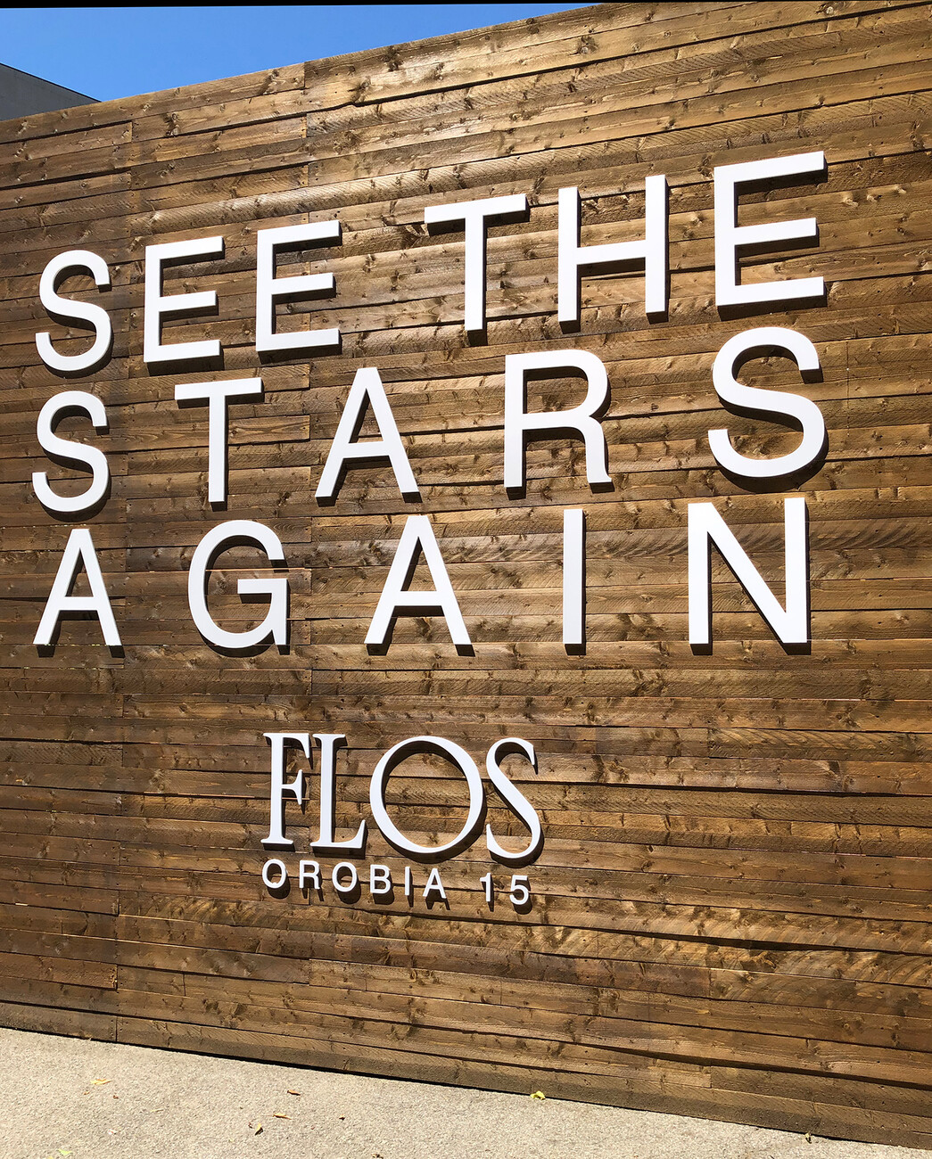
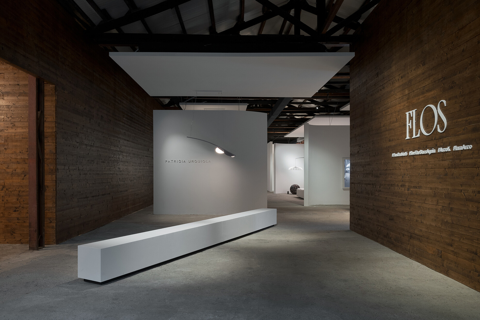
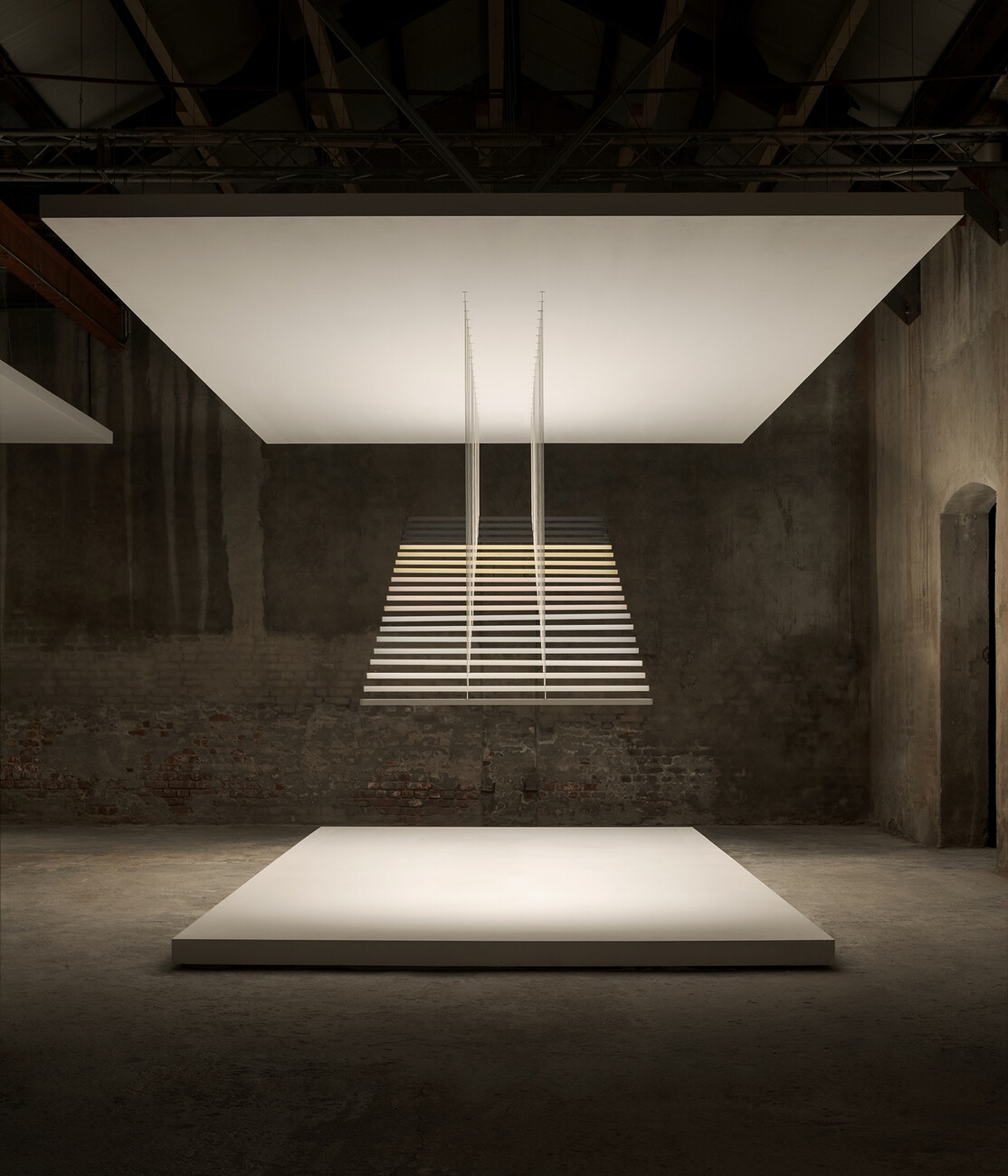
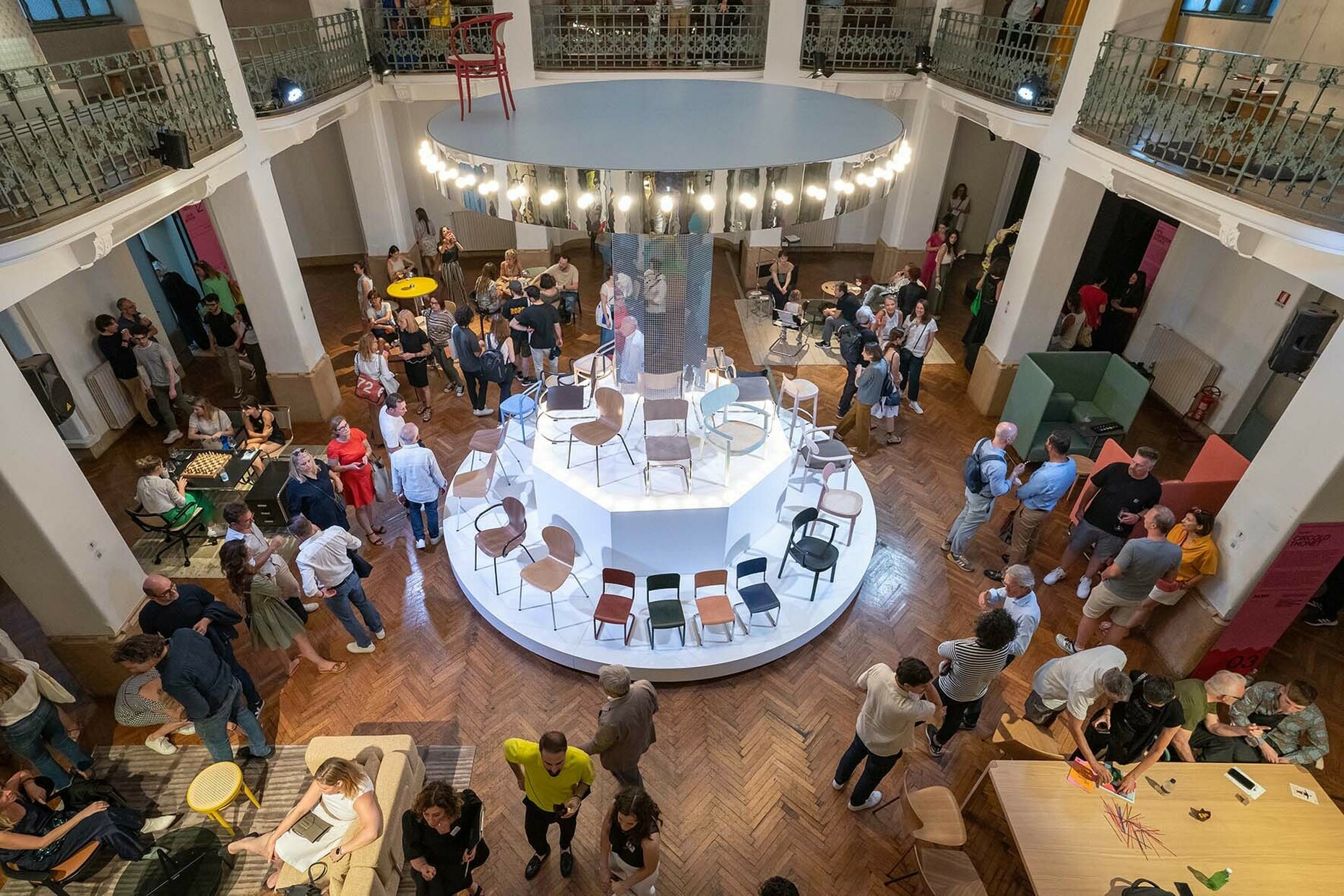
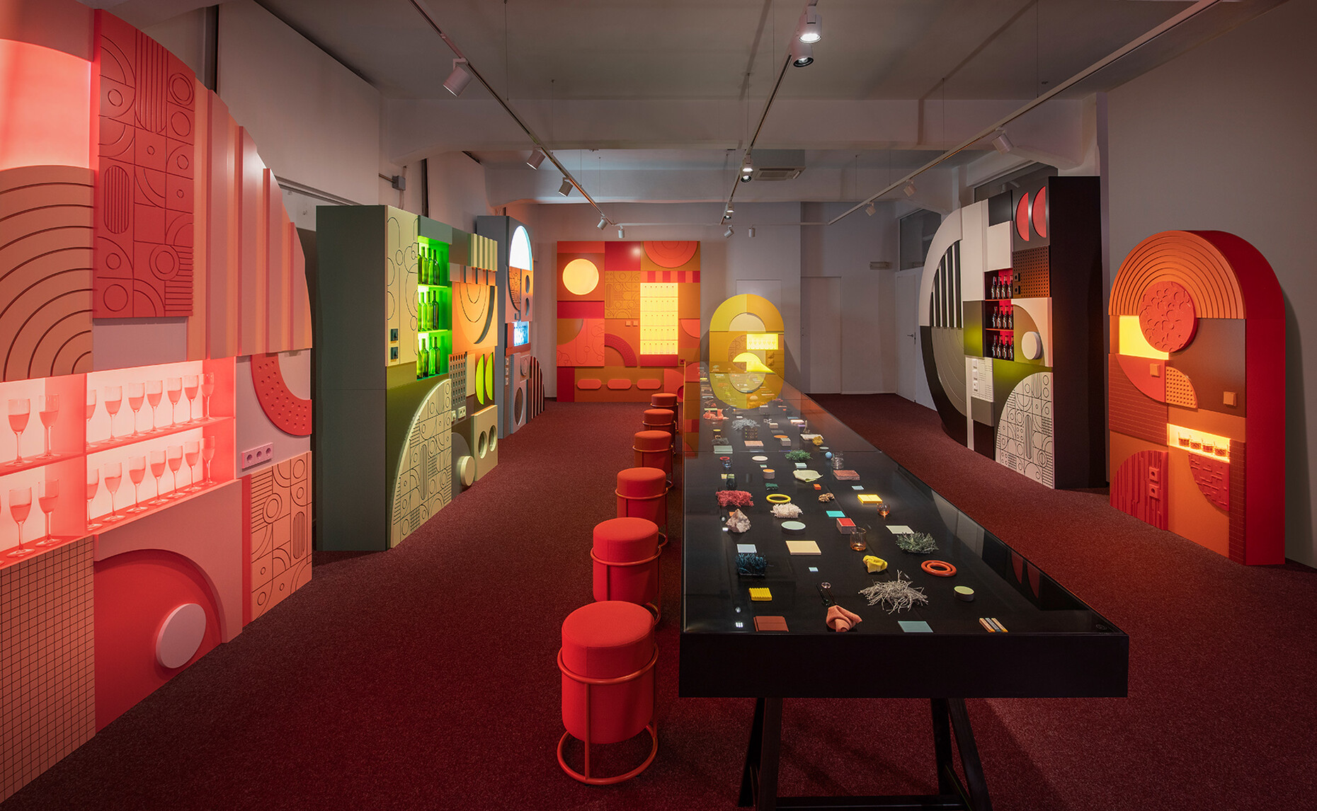
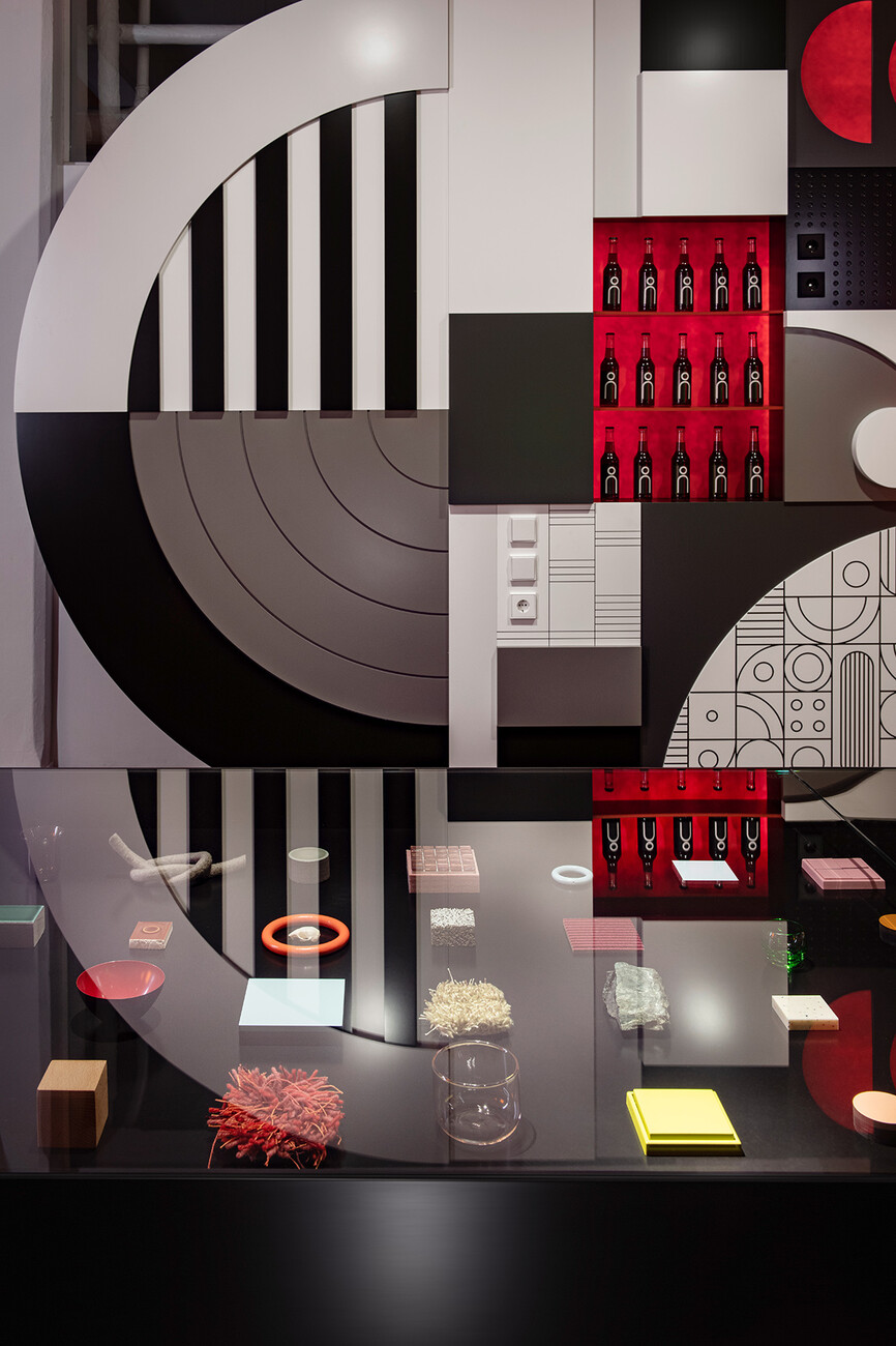
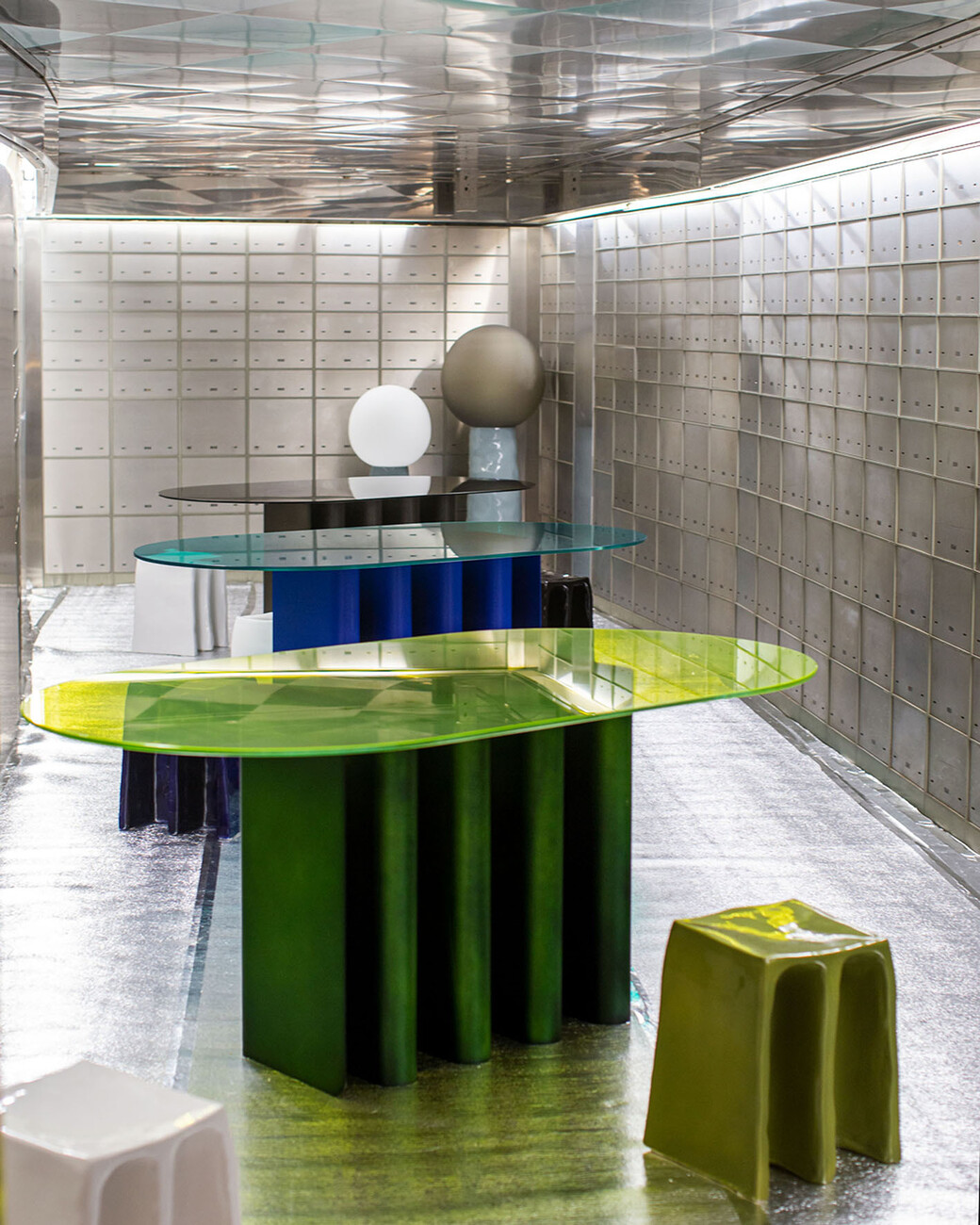
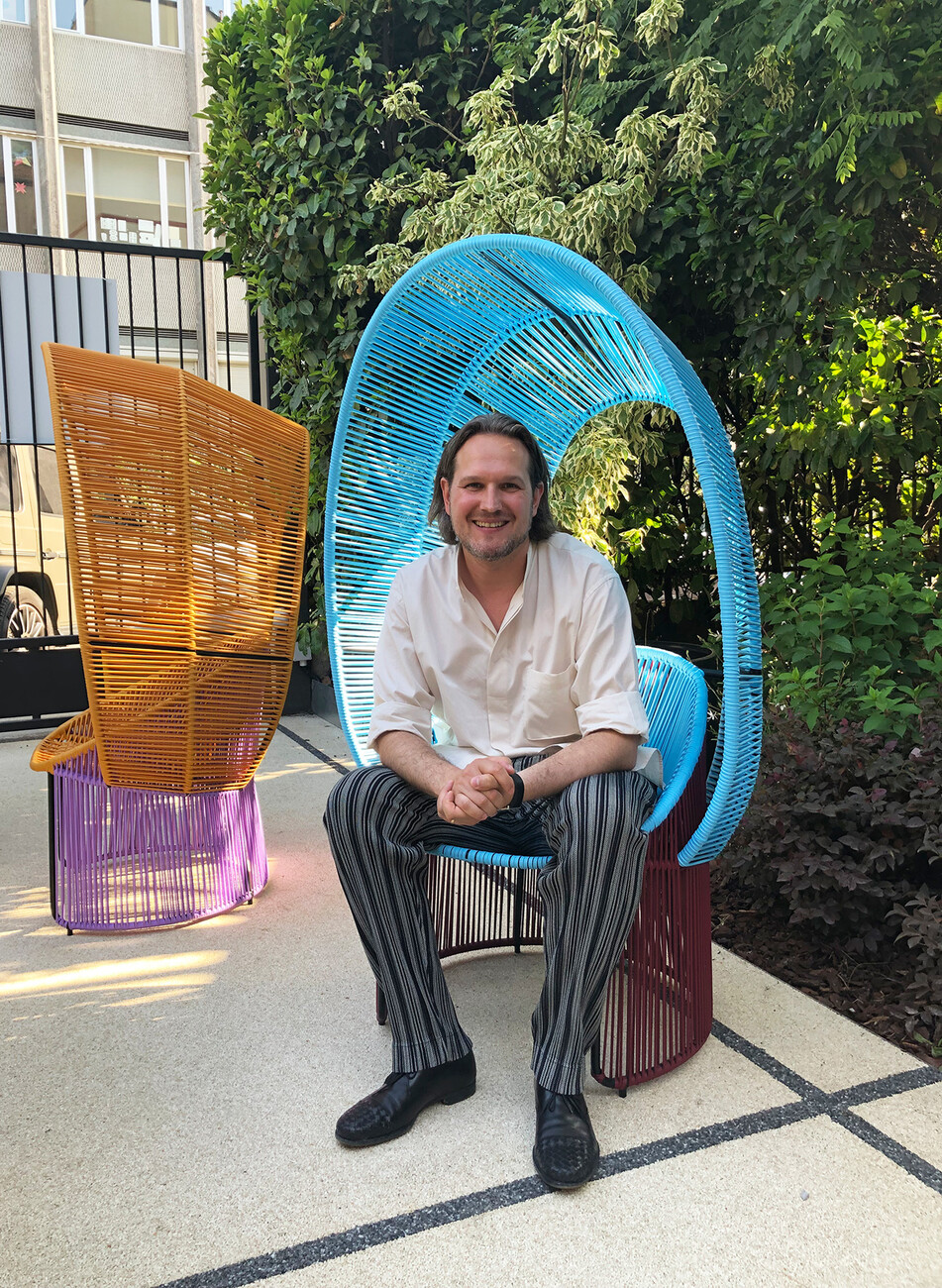
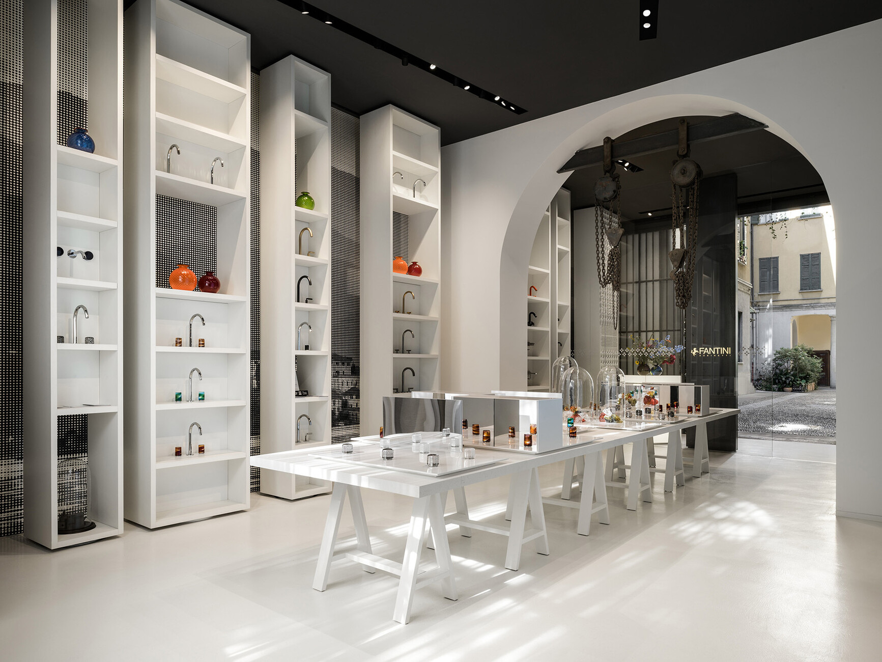
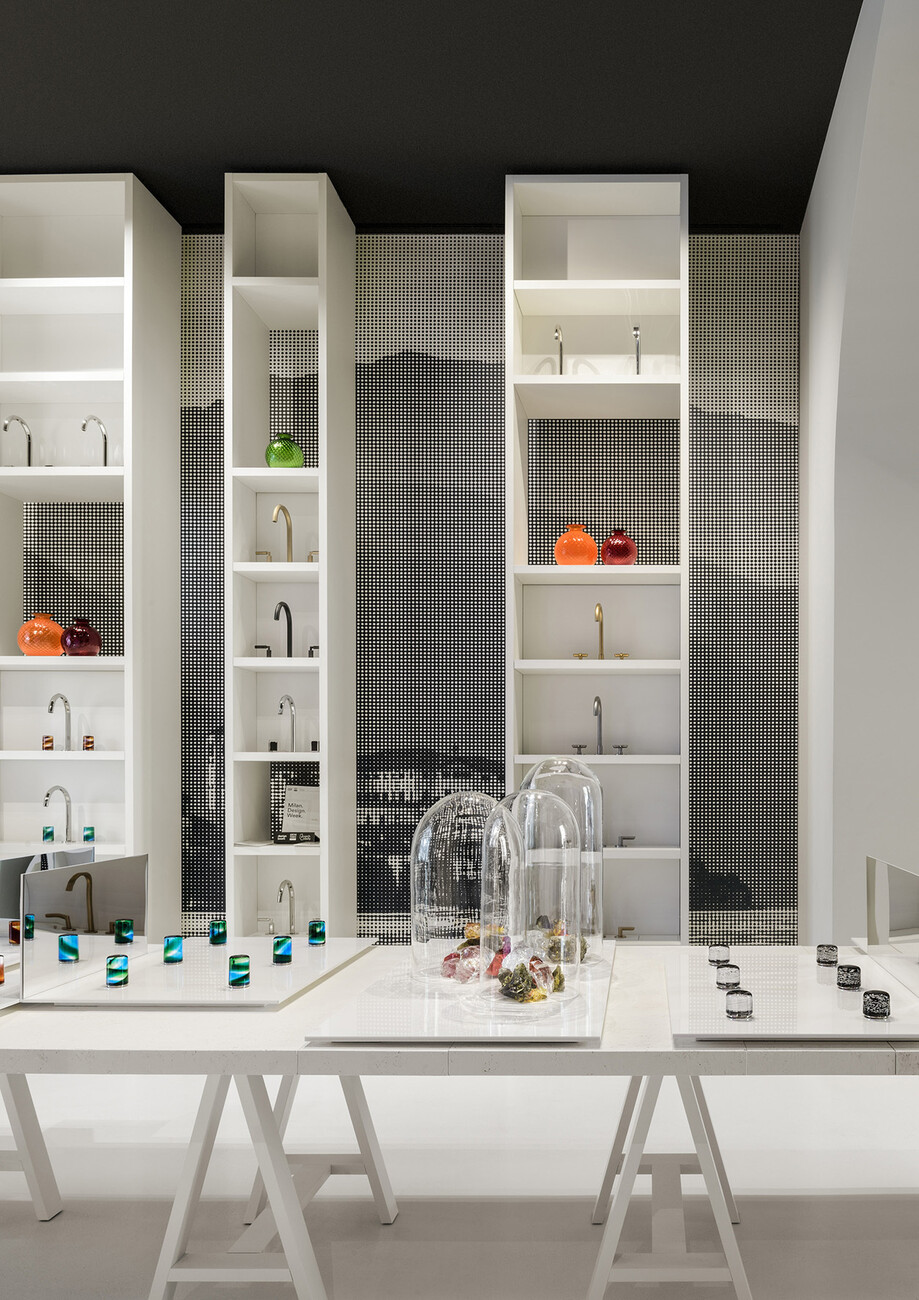
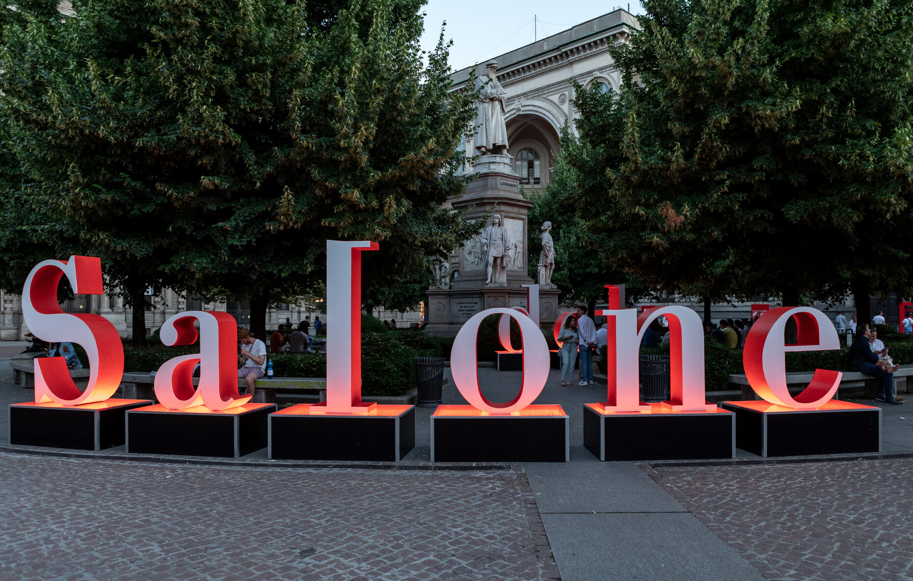
"See the stars again" was the title of the entrance to Flos' presentation at Fabbrica Orobia, near Fondazione Prada. Curated by design studio Calvi Brambilla, the large industrial space offered a lavishly furnished haven emblematic of a wish many of the visitors to the Salone del Mobile and Milan Design Week most certainly had: To find oases in these uncertain and challenging times where reunion, creativity, and inspiration could be celebrated. The very start of the 60th edition of the Salone del Mobile at the Teatro alla Scala, namely a concert by the Philharmonic Orchestra conducted by Frédéric Chaslin and a ballet by Roberto Bolle, was special. On the subsequent voyage of discovery around the city (and thanks to the June date with unusually summery temperatures) many lovingly designed settings were to be found. The examples range from the "Giardino Segreto" by Ames, where one was allowed to take a seat on Sebastian Herkner’s new “Cartagenas Reina Chair”, or the “Circolo Thonet”, likewise courtesy of Herkner and where he staged the manufacturer’s design classics in combination with the novelties on a carousel in the historic rooms of the Circolo Filologico library. Or there was the delightful, florally decorated Walter Knoll installation by the Ippolito Fleitz Group, which featured a gravity-defying installation by artist Janet Echelman. At Jung and Pulpo, things got clubby: Pulpo transformed the rooms of a former bank into a unique setting with lighting effects, artificial fog and neon glass – a real highlight was the specially outfitted vault in the basement. Jung created a walk-in mood board in the form of the “Farbdurst” installation by design studio raumkontor; it used bright color combinations to draw attention to the functional details in the space: Switches and sockets. Fantini conjured up a museum-like world for the new “Venezia” Murano glass doorhandle collection masterminded by Matteo Thun, Antonio Rodriguez and Venini, which ideally underlined the unique aesthetics of the material.
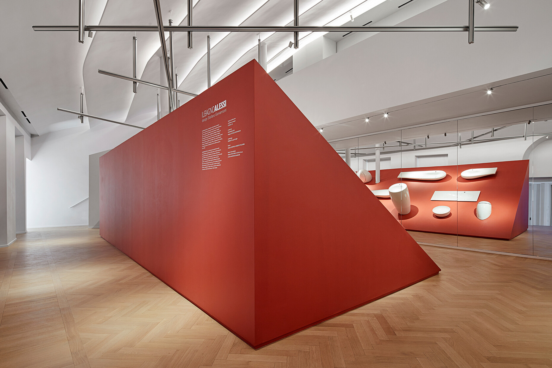
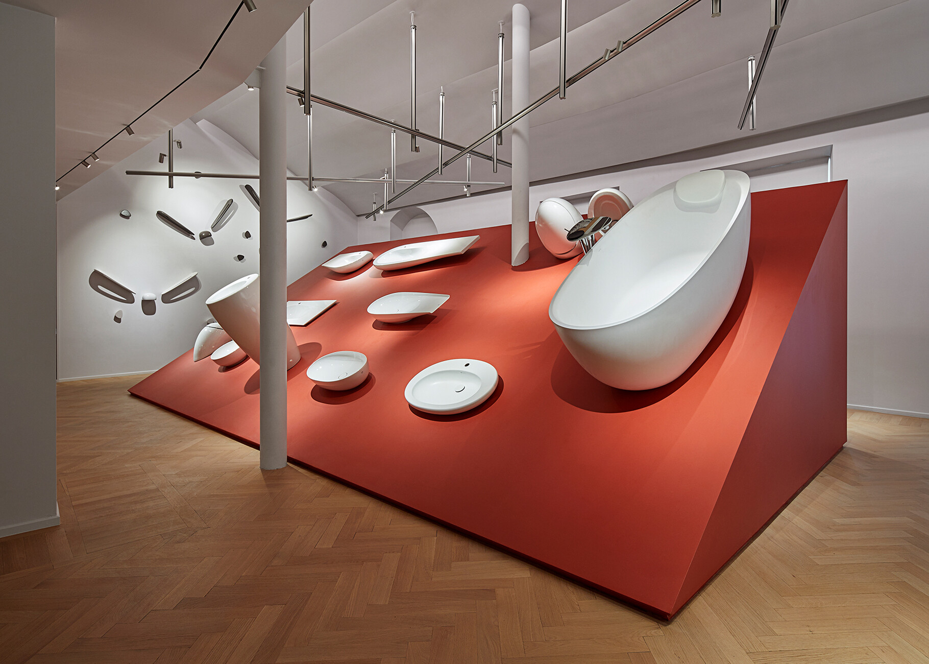
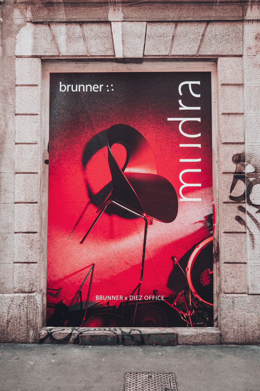
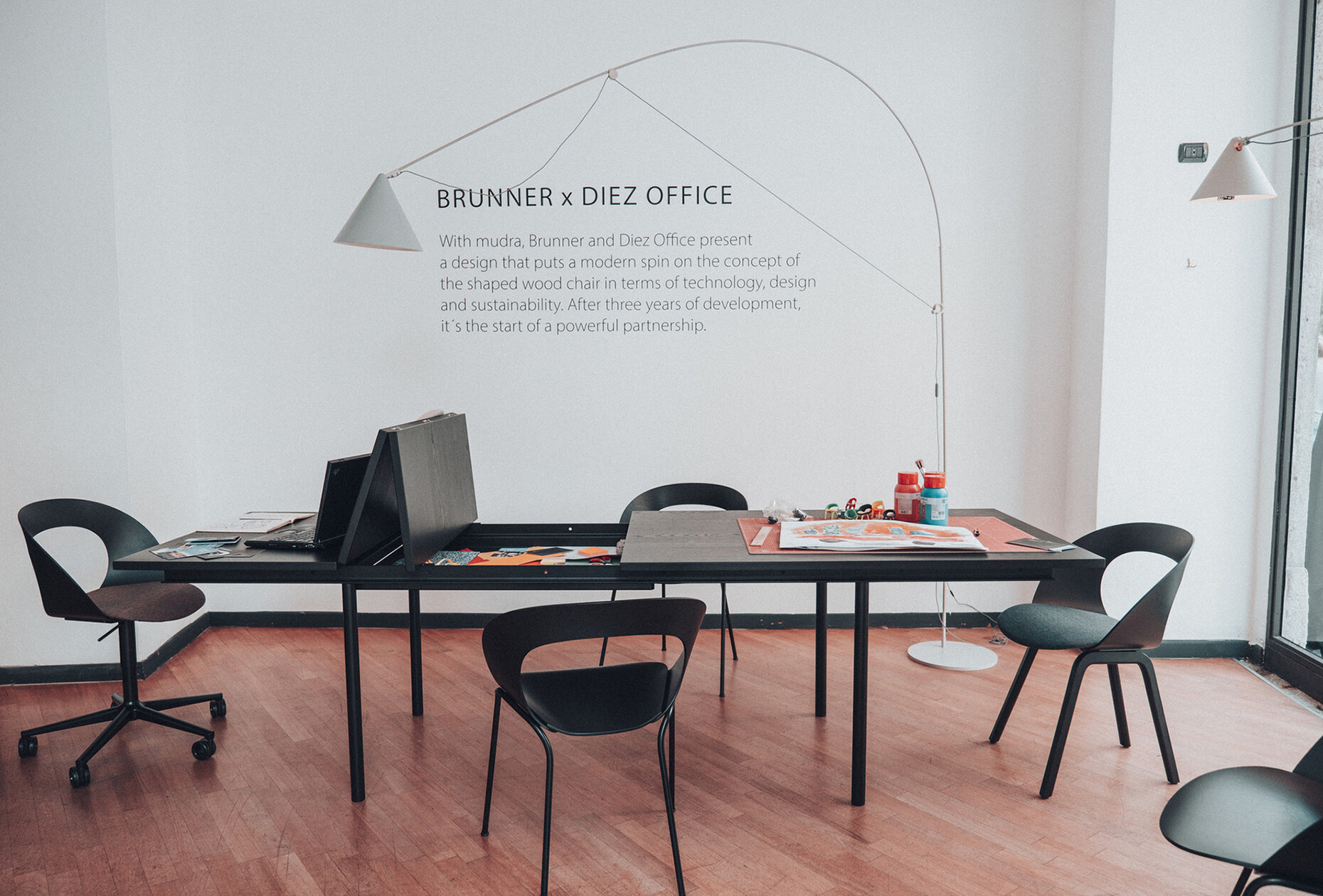
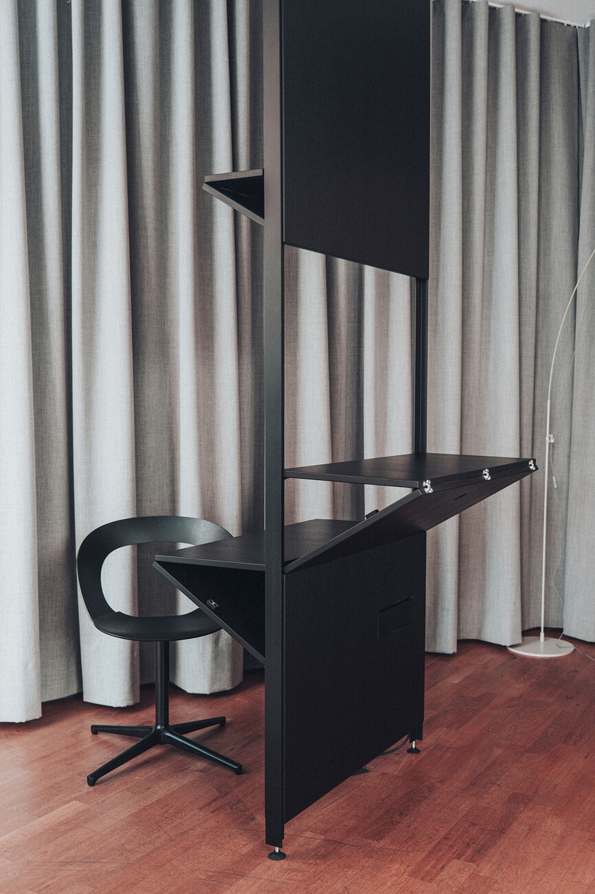
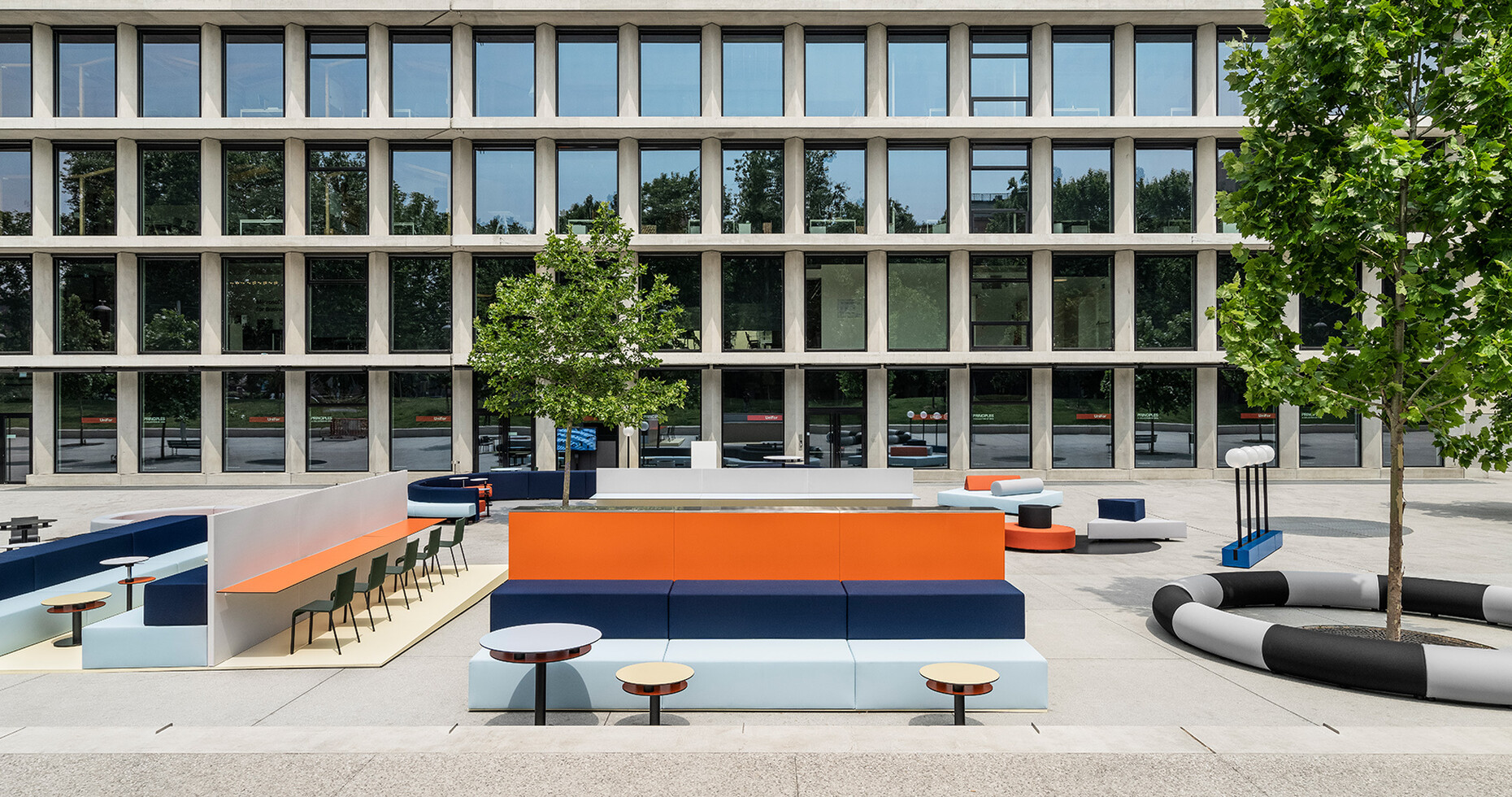
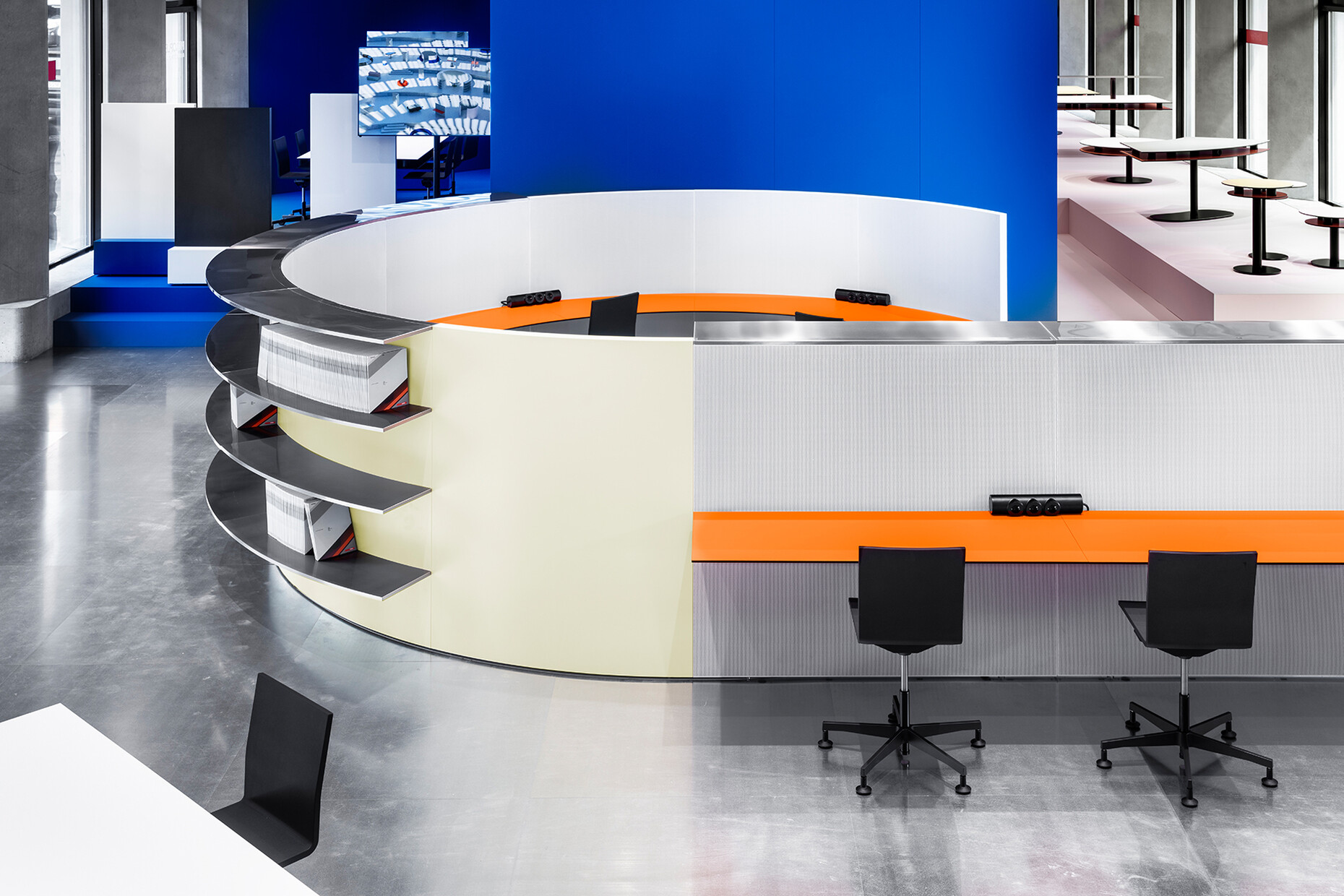
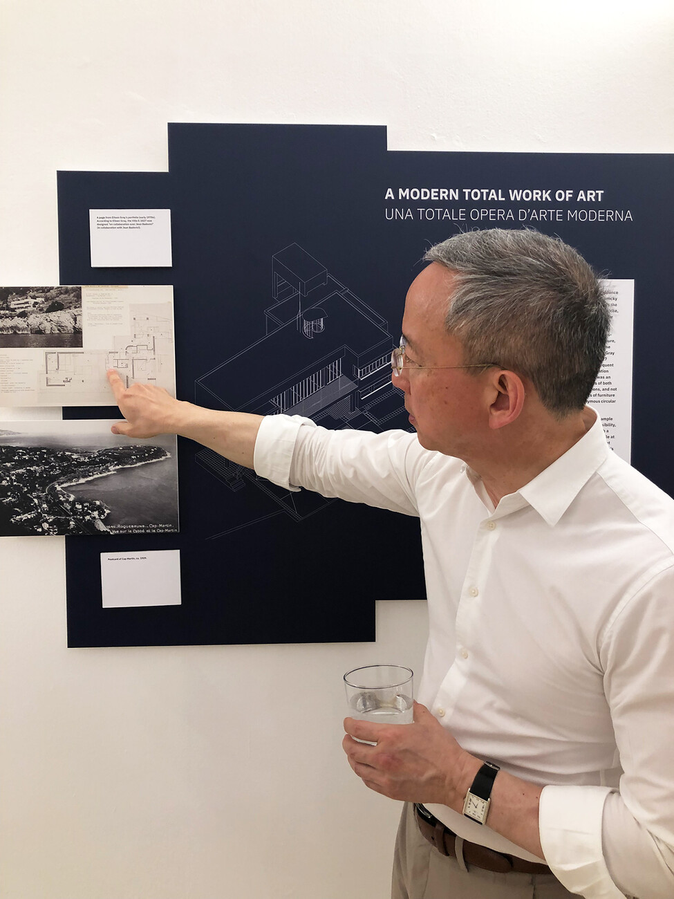
Laufen once again demonstrated the great versatility of its showroom and, in cooperation with Studio Lys, created a stage for the latest advances to its “Il Bagno Alessi” collection by Stefano Giovannoni. Thanks to modern sapphire ceramics, the models have become significantly more slender just in time for the collection’s 20th anniversary. They were also complemented by wooden bathroom furniture, highly artistic ceramic tiles by Monique Baumann, and LED lights that could be set individually. The dynamic perspectives in the showroom were inspired by the work of architect Claude Parent, which is why the red stage was positioned at an angle to and in front of a large mirror. Digital backdrops by Snøhetta into which various products were embedded, rounded off the installation. In the courtyard of the building, the climate-friendly “Lunar Lander” toilet by Viennese design studio EOOS could be viewed. In front of and in a building by Herzog & de Meuron, UniFor, for its part, presented the “Principles” office furniture line designed by OMA and thanks to which open office spaces can be flexibly furnished. The system was originally developed for the new Axel Springer Verlag building in Berlin. Brunner presented “mudra”, an all-round chair by Stefan Diez that underscores the current formal and ecological potential of bentwood technology. Cassina showcased its “Modular Imagination” collection by the recently deceased designer Virgil Abloh, which makes it possible to combine cuboids in two sizes to create individual seating and storage surfaces. ClassiCon, meanwhile, looked back at a creative titan of the early 20th century and created a life-size walk-through installation of Eileen Gray’s Master Bedroom, which she designed way back when for her E.1027 house. The project was curated by Peter Adam, Carolina Leite, and Professor Wilfried Wang – the latter led guided tours of the exhibition. Another eyecatcher was the reconstruction of the furniture designs Swiss architect Peter Zumthor created for the company Time & Style: Originally conceived by him for his own studio and his architectural projects, selected furniture items have now been realized using Japanese materials and production techniques. Worthwhile insights into research were also provided by the AMDL Circle and Michele De Lucchi on the “Satellite Stations”, current architecture, and the Produzione Privata collection.
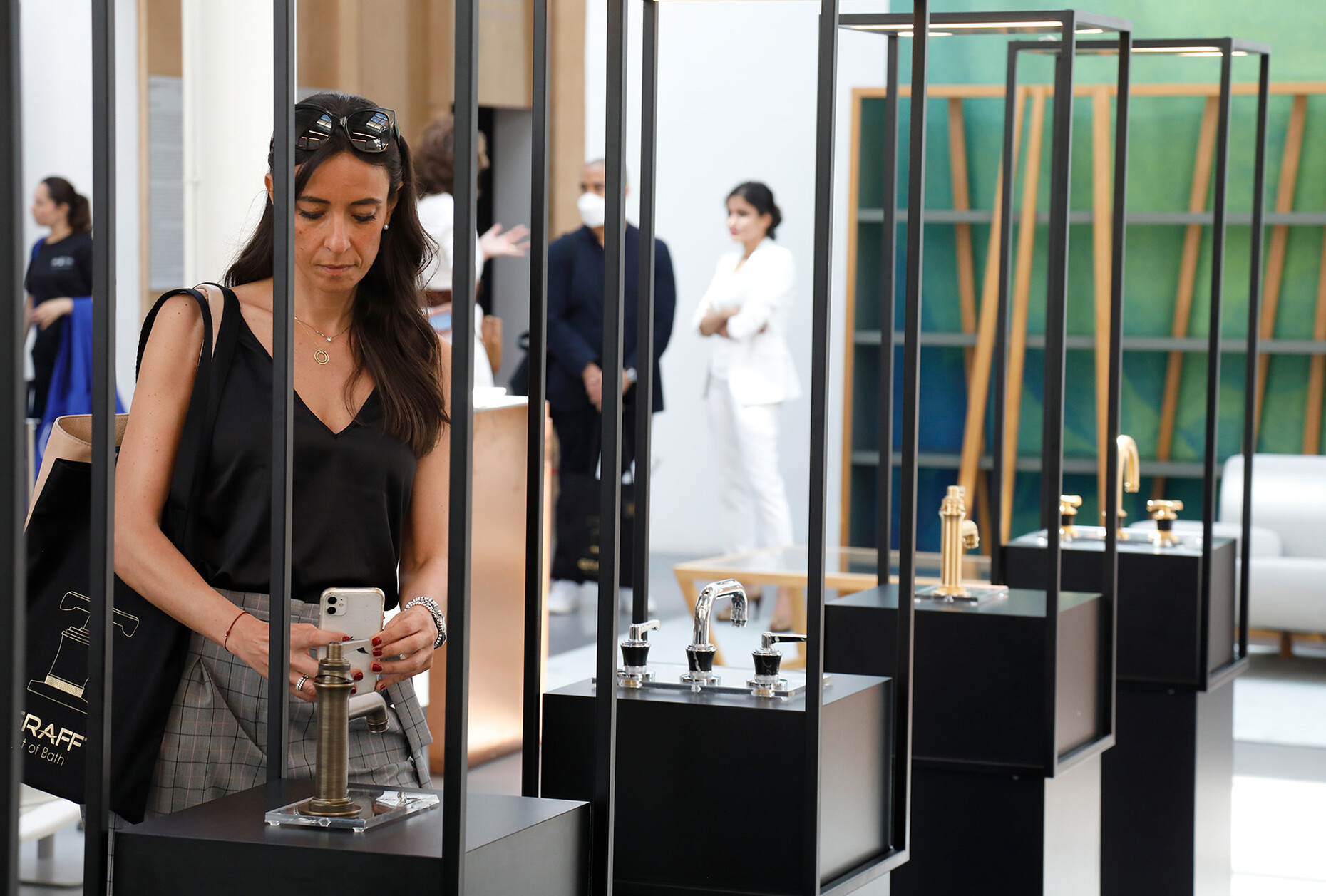
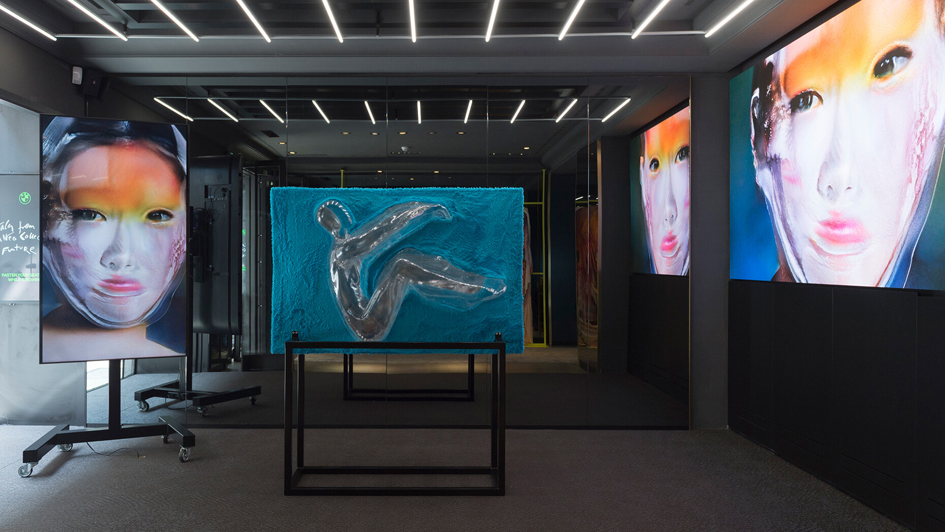
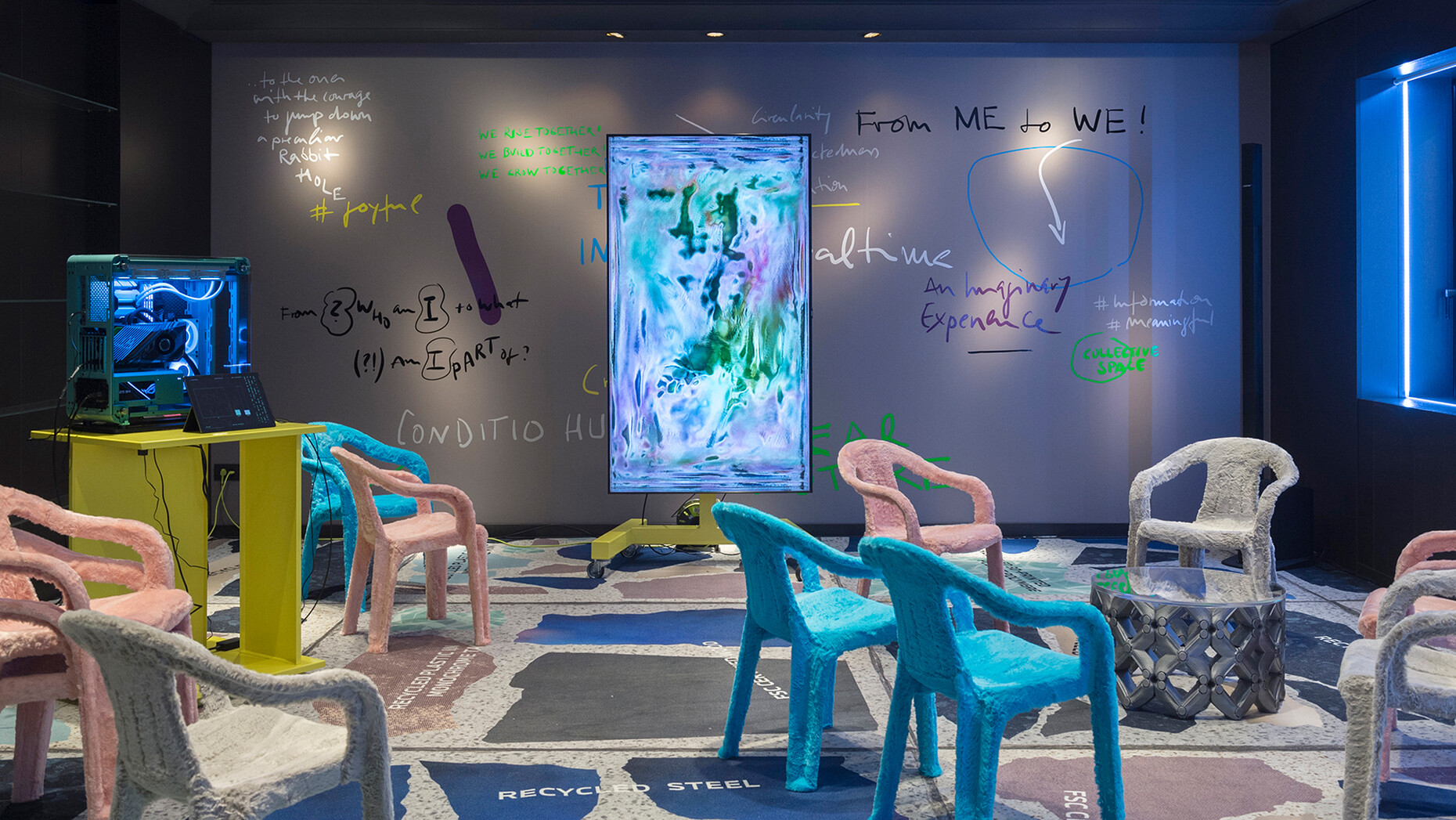
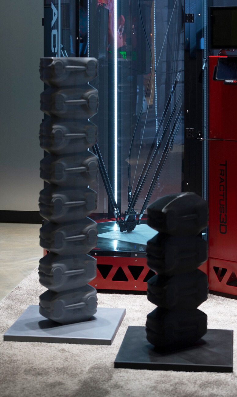
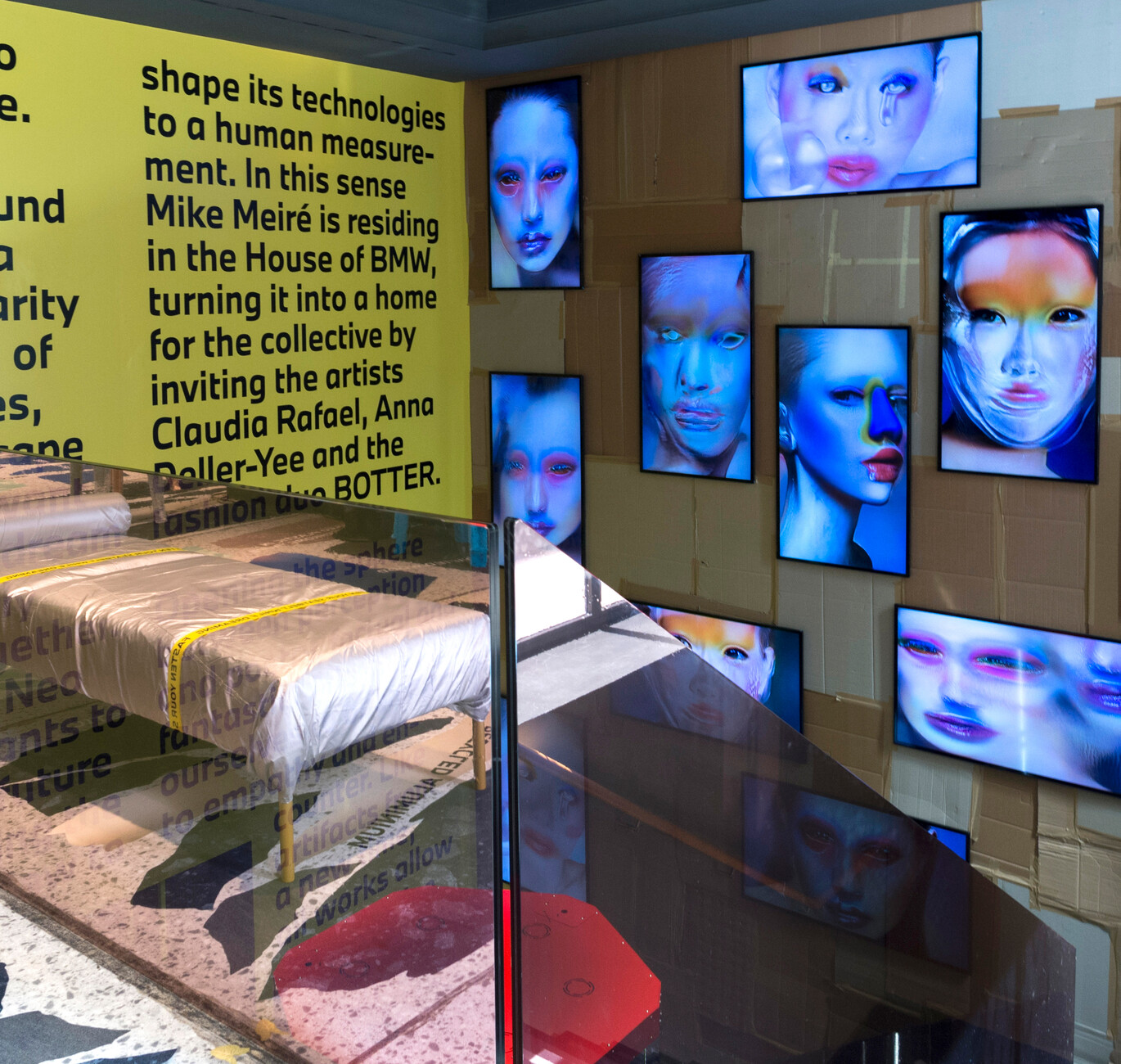
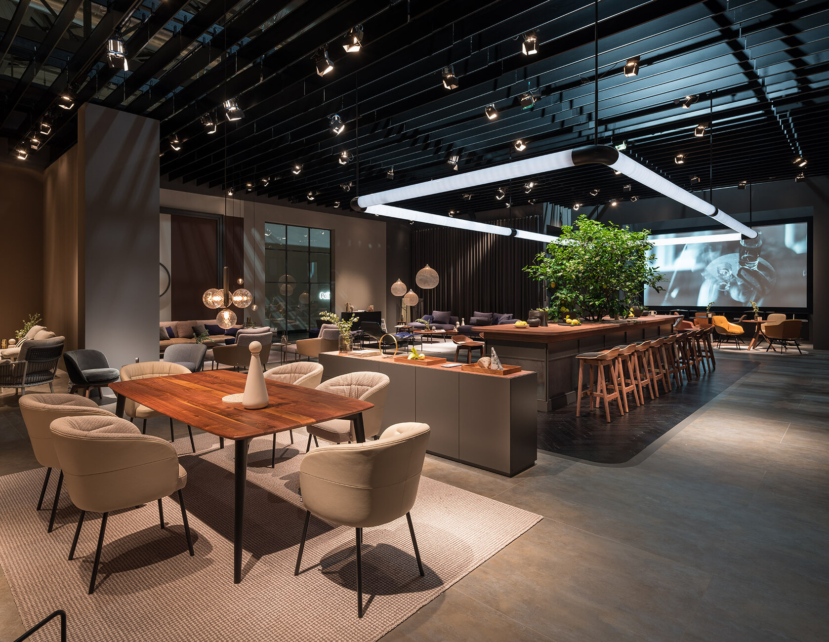
The visitorexperience was at the forefront of many of the elaborate showrooms, for which the products were harmoniously integrated into the respective scenography. BMW took a radically bold step: for the “House of BMW”, Mike Meiré, together with Rushemy Botter, Claudia Rafael, and Anna Deller-Yee, curated a space that addressed technological developments, digitization and the circular economy without presenting a life-size automotive design study. Instead, Meiré created a Pop-like space for installations, performances, workshops, and discussion formats. BMW’s sustainable vision car, the “i Vision Circular”, was unceremoniously translated into an abstract sculpture, produced by a 3D printer. Faucet and shower system manufacturer Graff dispensed with its own space altogether and exhibited its new “Vignola” collection in the café of the ADI Design Museum, which gave visitors the opportunity to combine an excursion into the history of design with one into what it is like today.
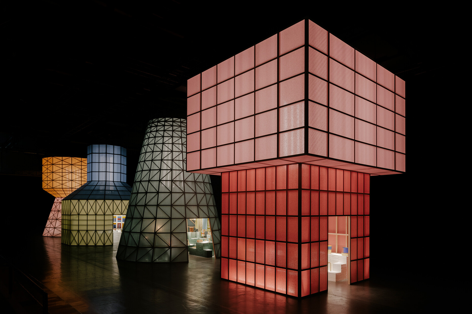
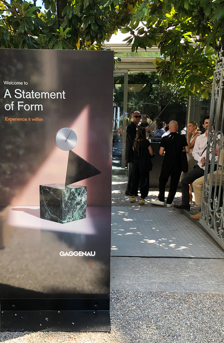
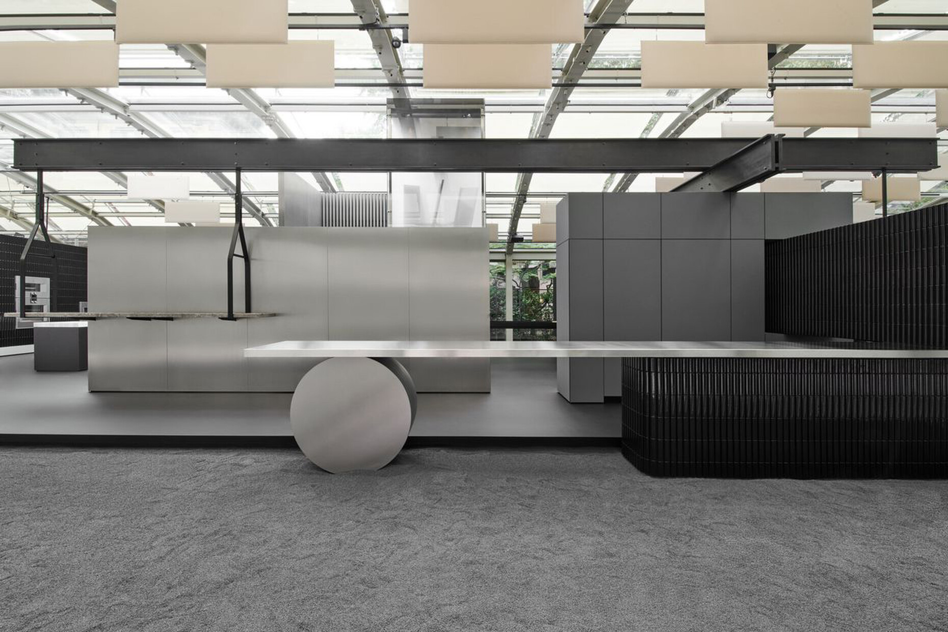
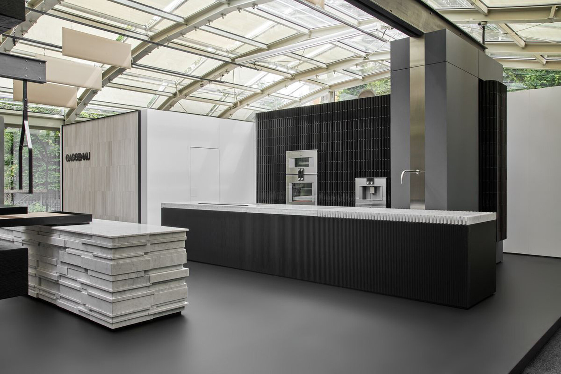
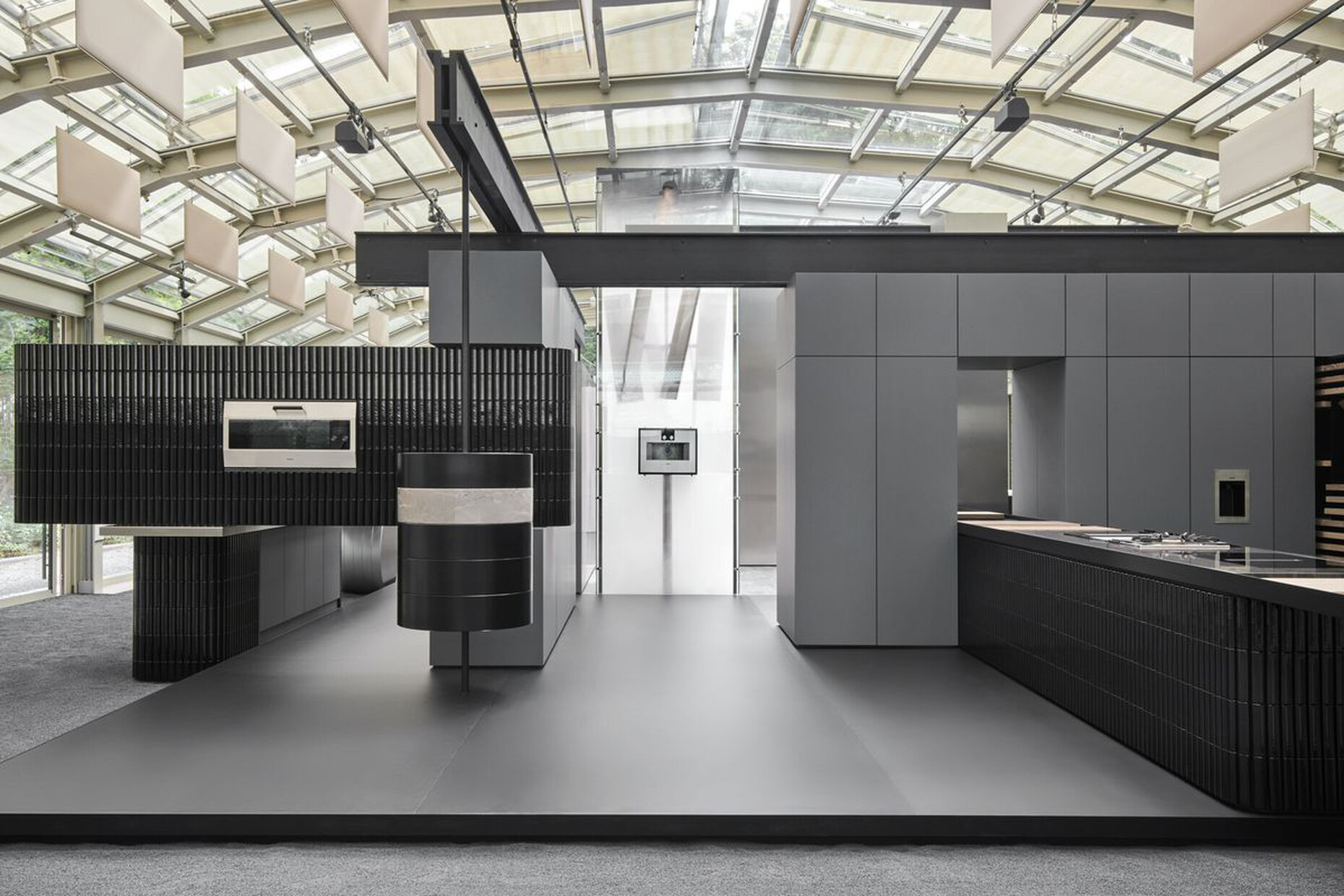
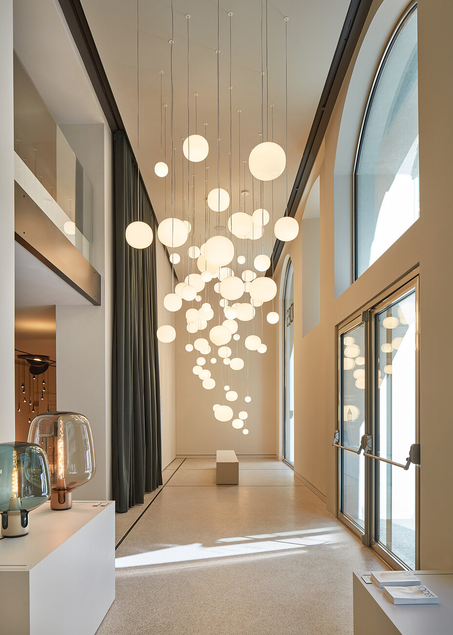
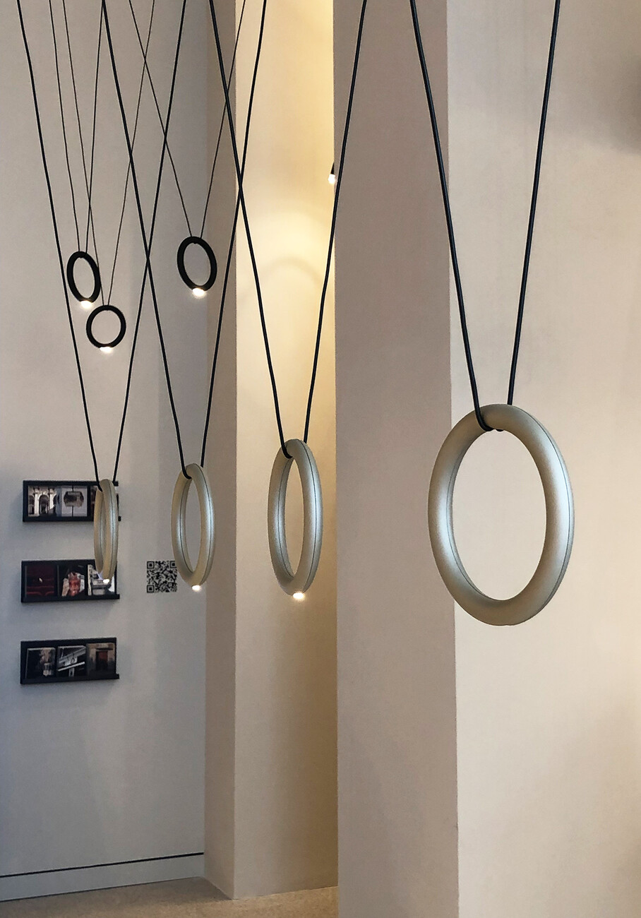
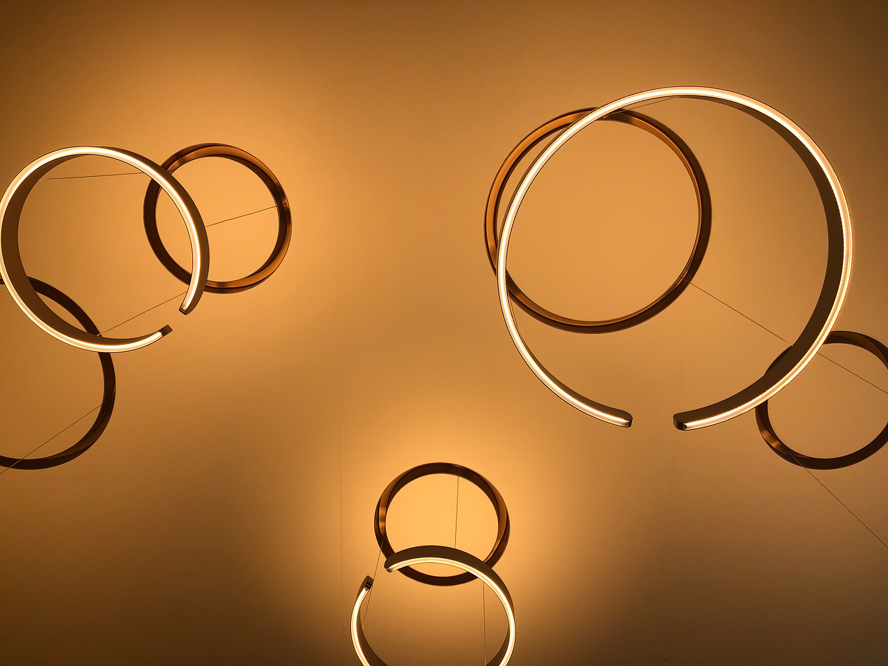
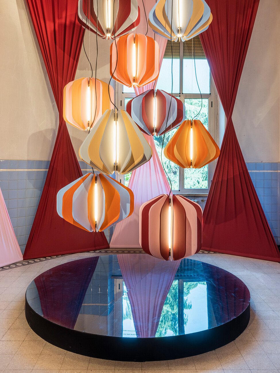
The Milan Design Week certainly did not forget culinary experiences: Gaggenau’s “A Statement of Form” installation in the glass pavilion of Villa Necchi Campiglio, created together with marble mastercraftsman Salvatori and ceramics specialist Kaufmann, became a popular meeting point thanks to live cooking by three-star chef Christian Jürgens. There Gaggenau kitchen appliances could be experienced in live action. As expected, Hermès created an outstanding show: This year, the products were presented in four meter-high water towers, made of a light wood structure shrouded in colored paper and that shone from the inside. Occhio underlined how varied lighting can be with the new “Mito gioia” table and reading lamp series, the brainchild of founder Axel Meise himself. At the same time, the lighting manufacturer had an “electrified” version of the “Mito cosmo”emerge rise impressively from the ceiling in the passageway to the secluded inner courtyard. Also worth seeing were the cluster-shaped installations by Lodes in the form of the “Volum” collection designed by Snøhetta – the light diffuses evenly in all directions, creating a soft, yet uniform atmosphere, as was the minimalist, ring-shaped “Ivy” pendant luminaire by architect Vittorio Massimo. In such a relaxed setting, it was all the easier to tarry a while and discover the new products. And there were plenty of them, because due to the pandemic, in recent years only rarely have companies and creative minds had the opportunity to present their output . Whereas in the past the typical answer to the question of which models were new in the showroom was a single-digit number, this time the response was often: “All of them”.
Research and practice
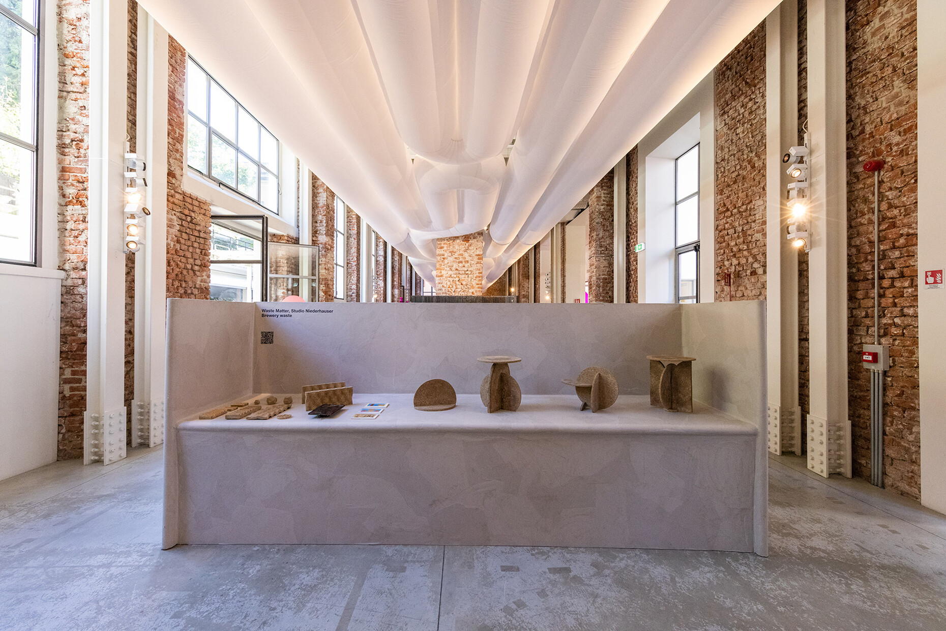
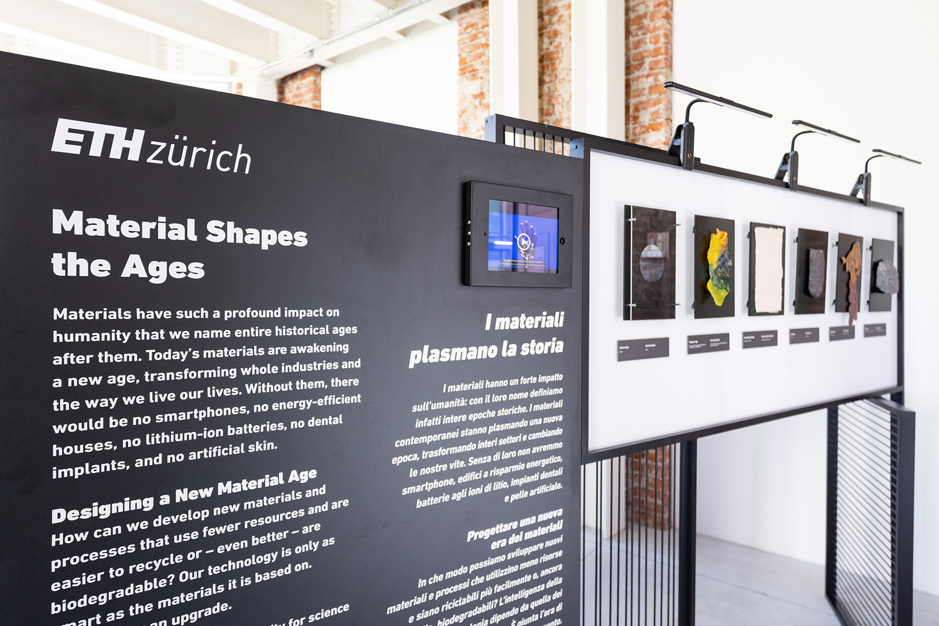
While the manufacturers' showrooms tended to focus on lightness, enjoyment, the fun of encounters, and the desire for new products , the experimental platforms in the city offered insights into research for more sustainable production, such as the use of industrial waste materials. In the “House of Switzerland”, students from ETH Zurich displayed, among other things, cast wall elements made of fly ash as well as 3D-printed steel foams that can be used to clean up crude oil spills in the sea. In the form of “Wastematter”, Studio Niederhauser presented research that uses the malt residue from beer breweries to form a robust material that could replace plywood or chipboard. Parallel to this, Beyond Space and Organisation in Design made use of 10,000 square meters of a former industrial complex for the new Certosa initiative and offered numerous stimuli for thought. Such as the designer collective Envisions, which is working on a recycled yarn made from textile waste that is supposed to meet the highest industrial standards.
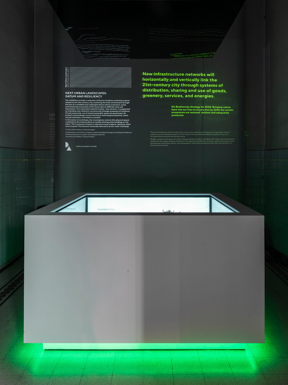
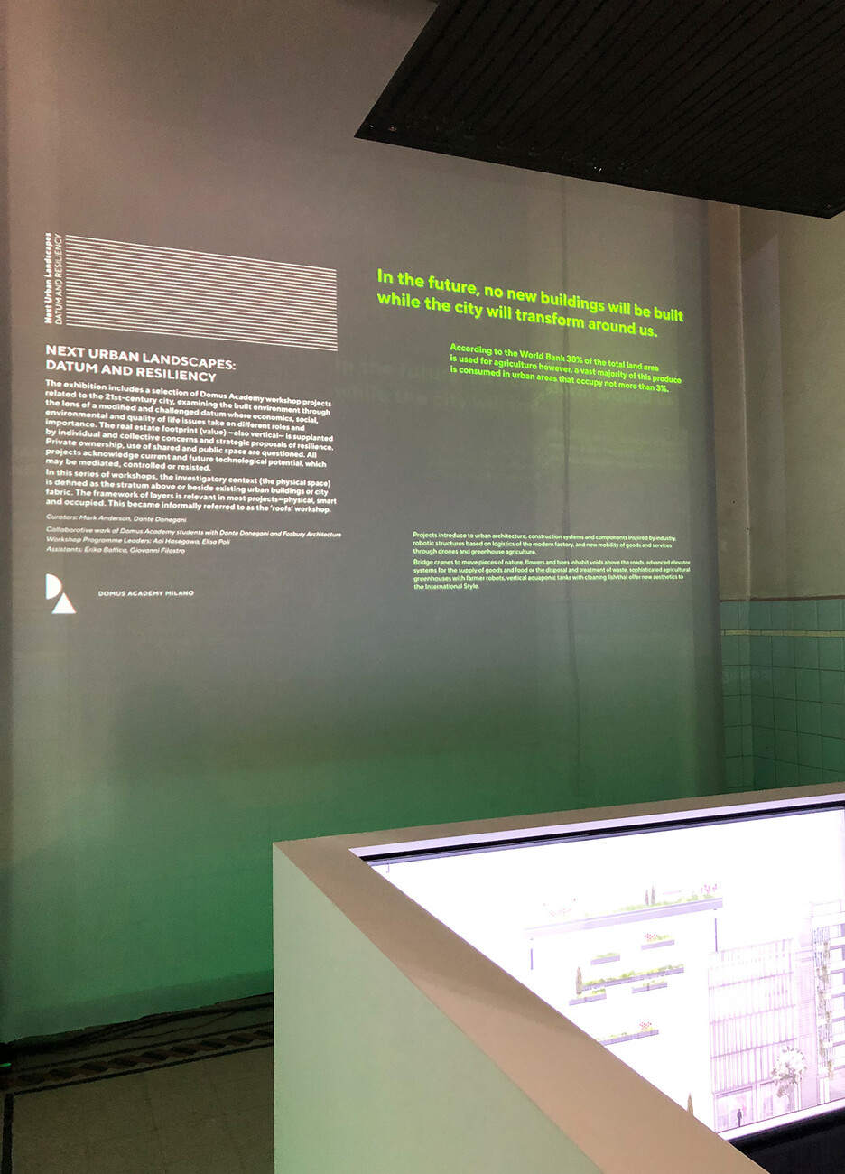
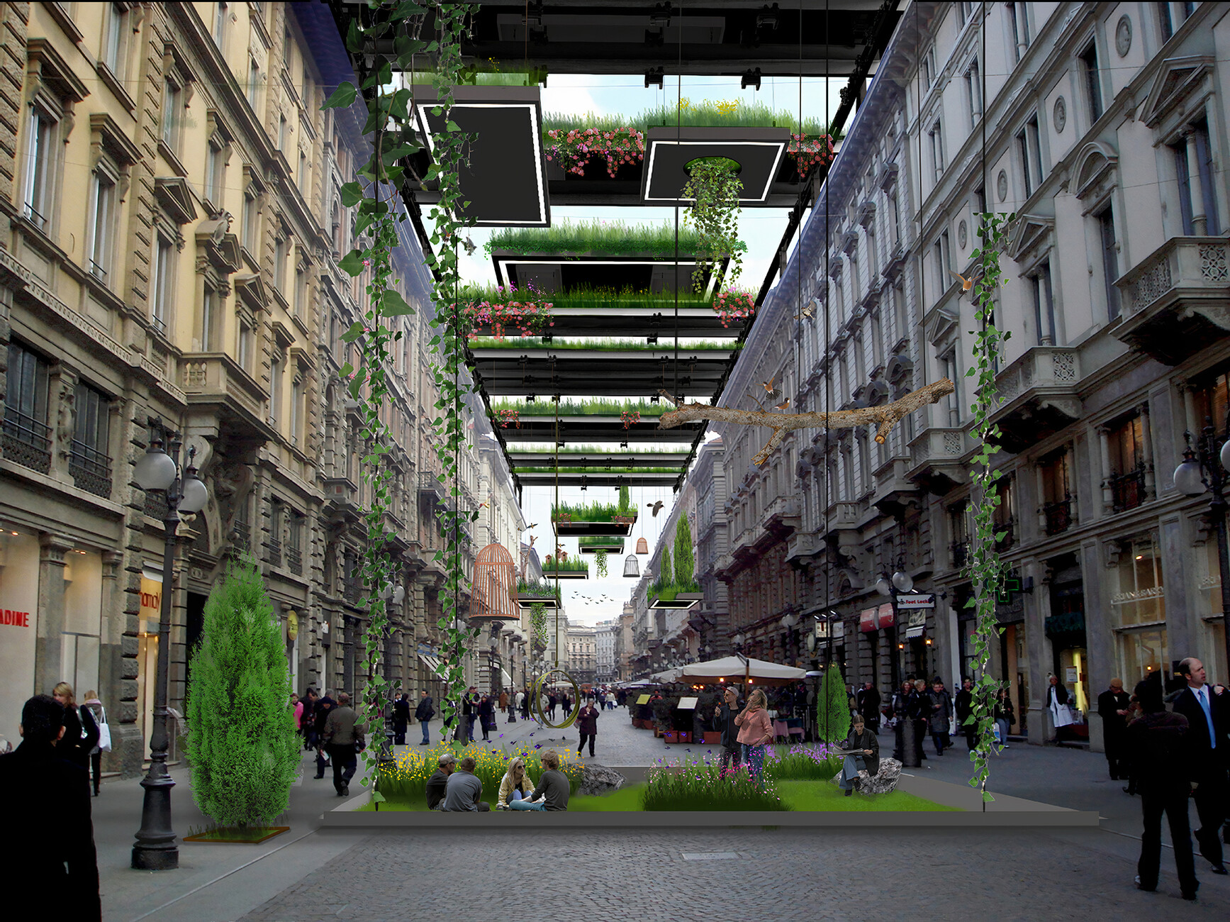
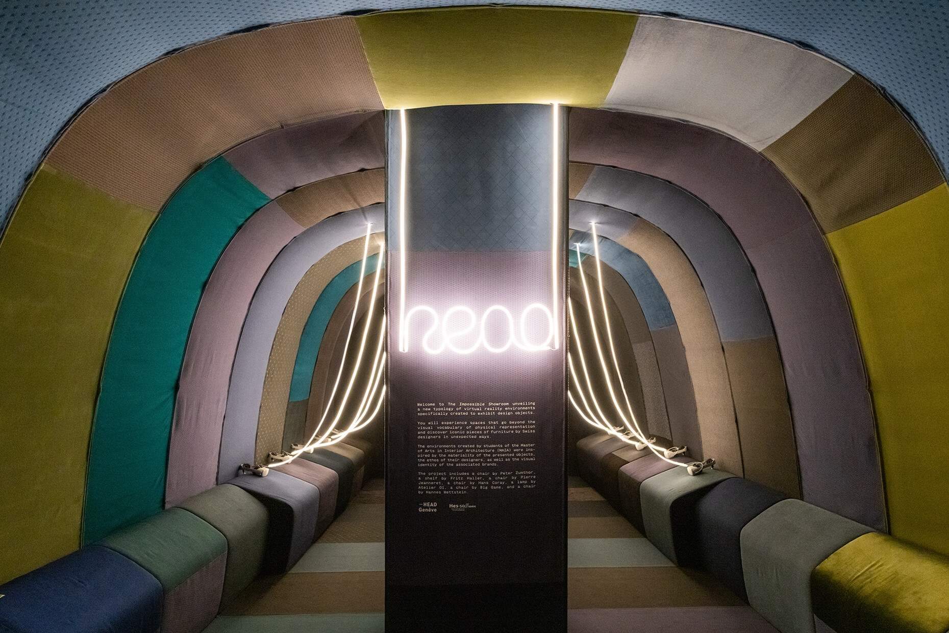
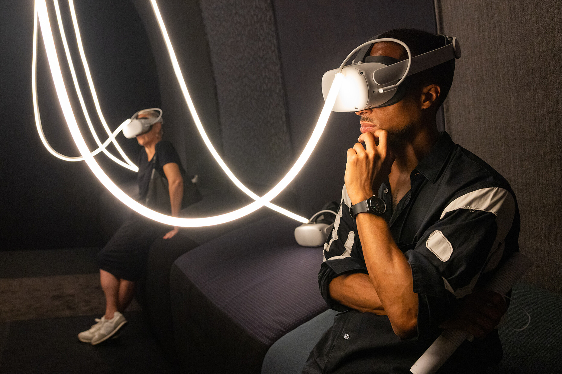
The question of whether product design can contribute to controlling yourown digital data was also addressed by students such as those at Domus Academy in the form of ”Data Cleaning Rooms” - spaces where data linked to mobile devices can be visualized in order to better manage them. The rooms are likewise meant to provide tools to secure your digital footprint. With “Avoid”, Kiel’s Muthesius University of Fine Arts and Design offered a hoody and a fanny pack by Anna Ulmer made of copper shielding material that protects against facial recognition while also blocking RFID, NFC, Wifi, Bluetooth and radio waves. The smart textiles boast an integrated jammer that prevents eavesdropping of mobile devices. There is of course the desire to be offline, on the one hand, the use of virtual space for information and entertainment on the other: As in “The Impossible Showroom” by students from the Geneva Haute école d'art et de design, where furniture classics by Swiss designers could be explored in abstract representations using VR goggles.
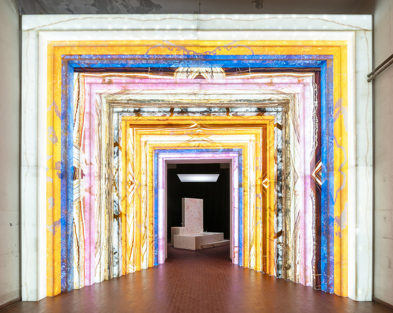
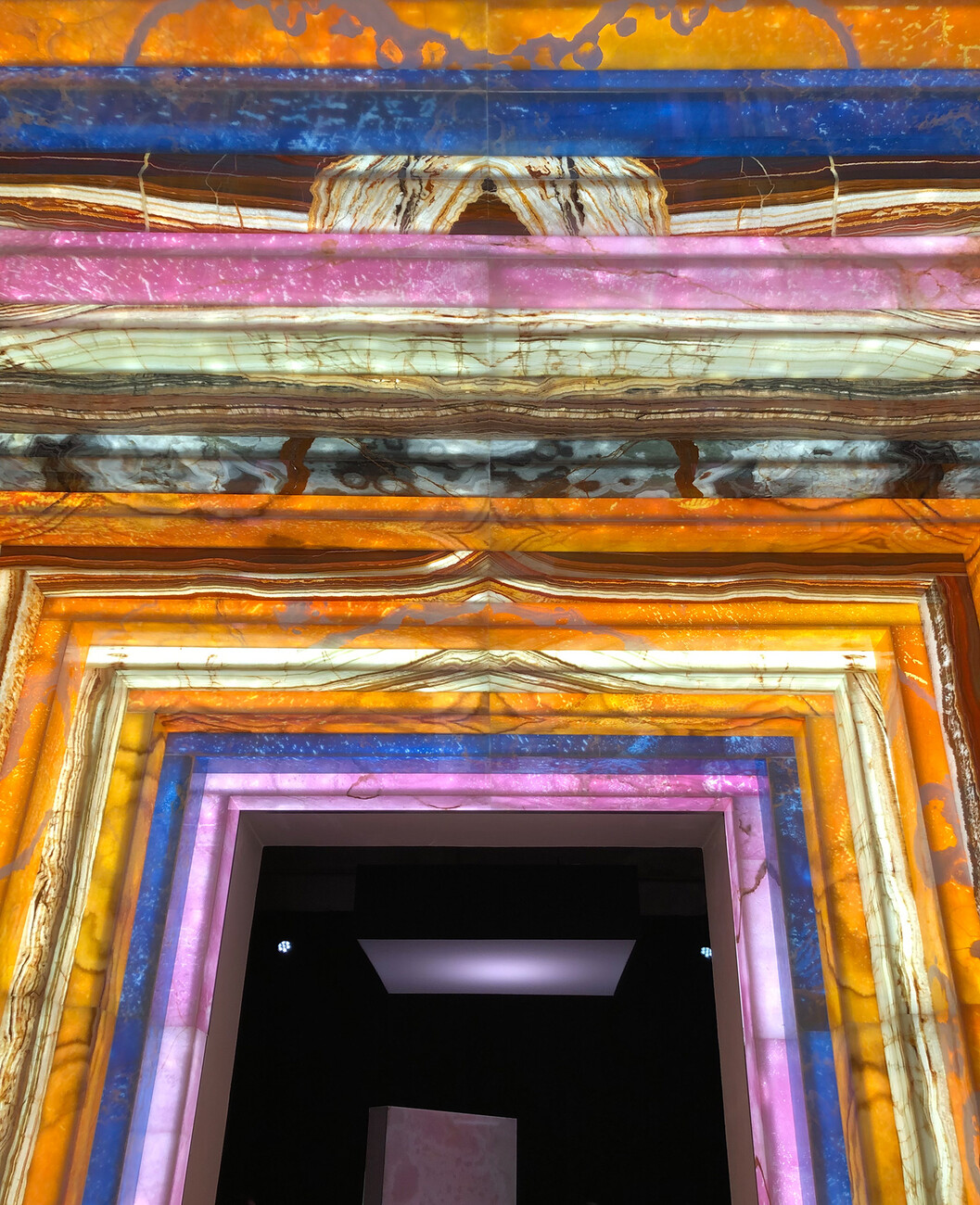
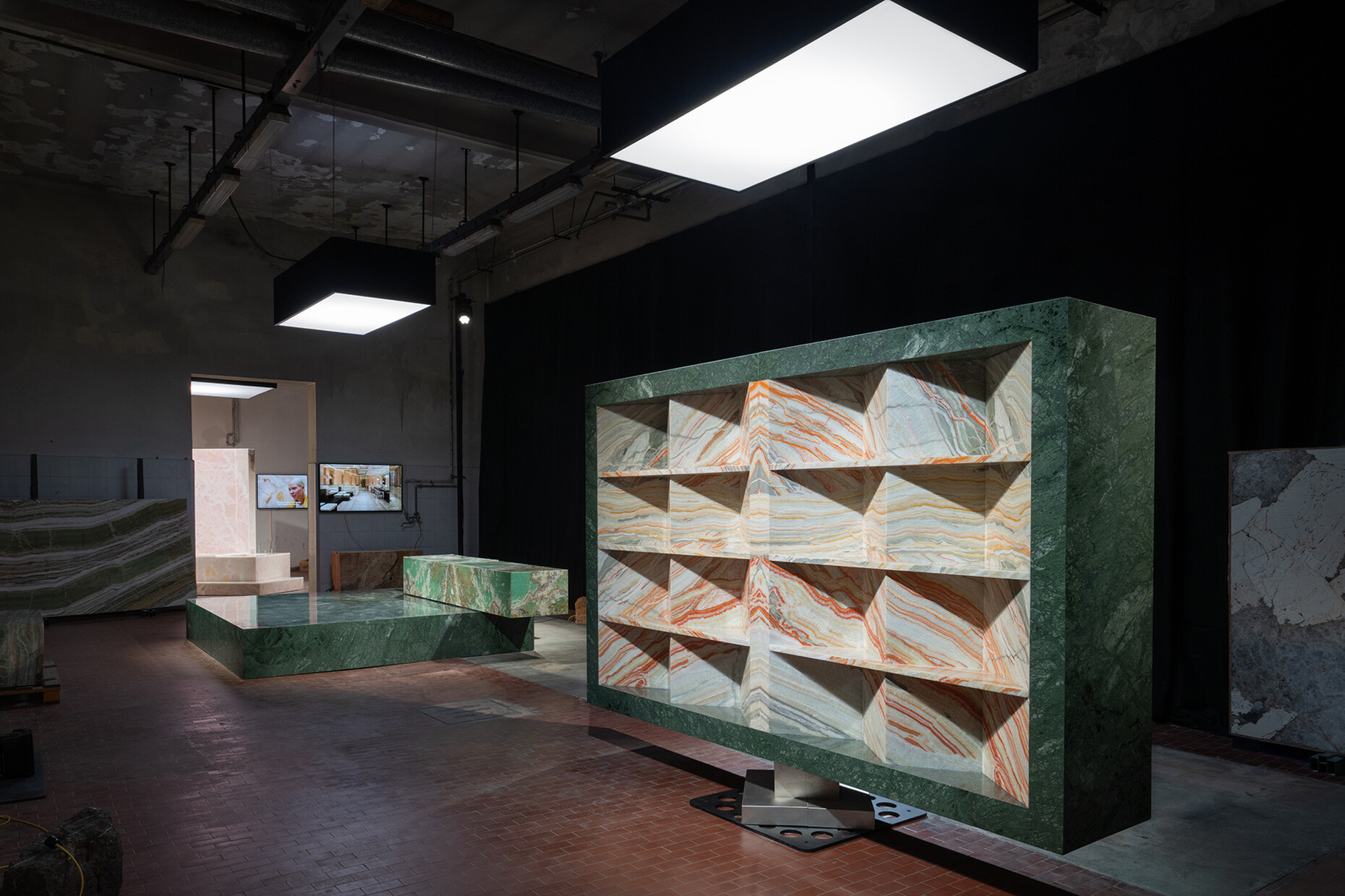
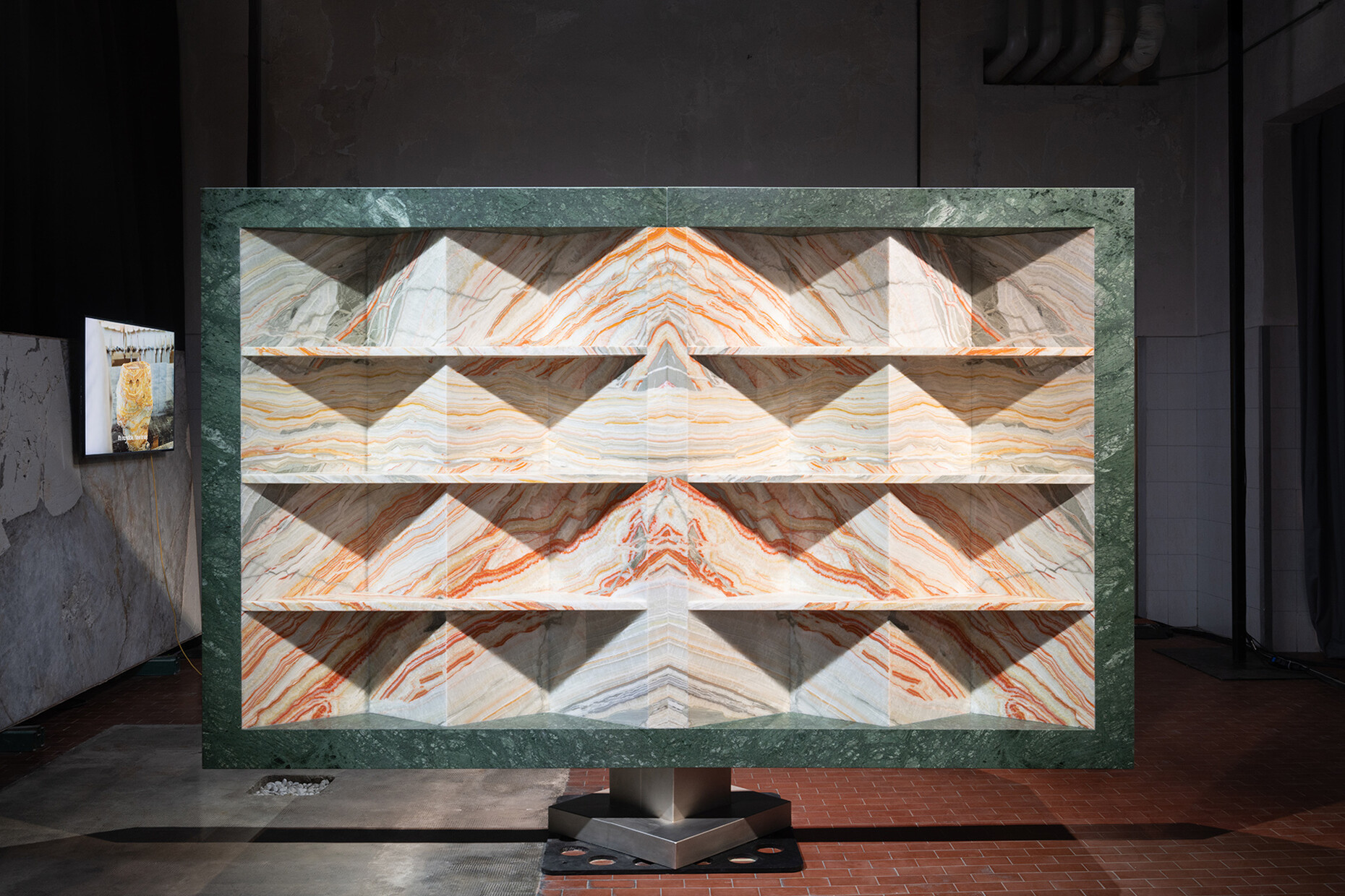
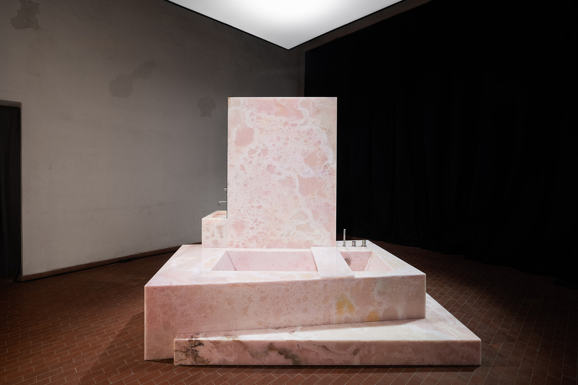
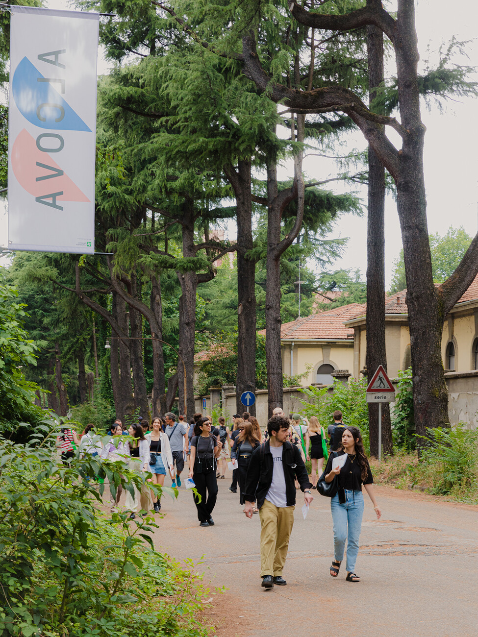
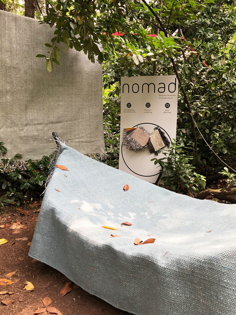
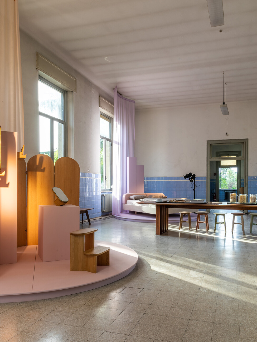
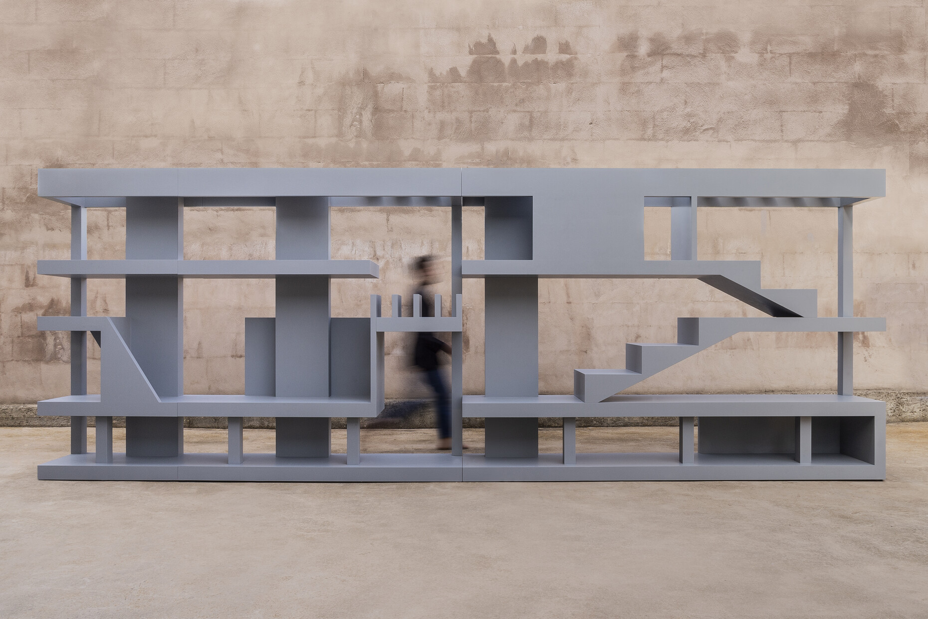
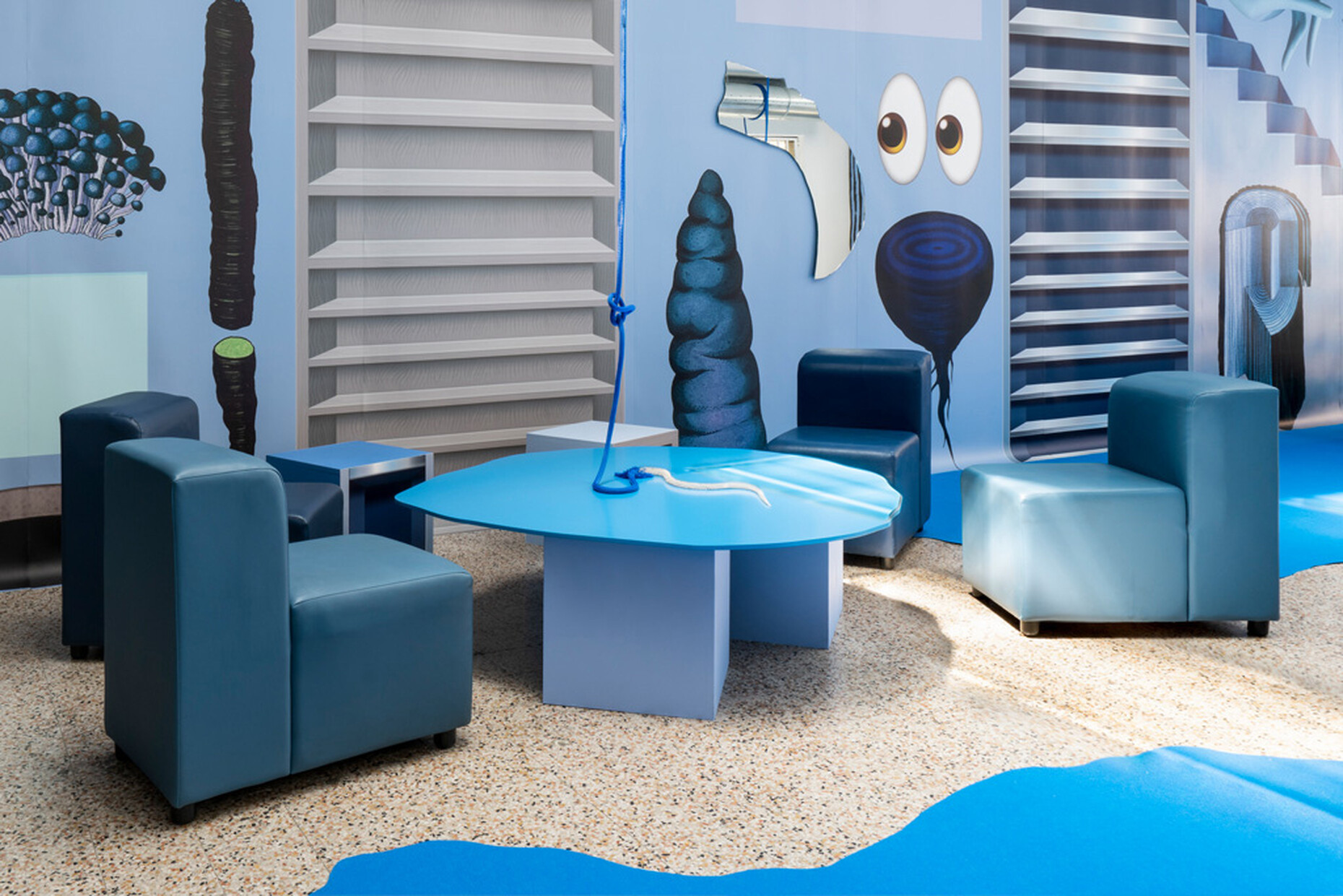
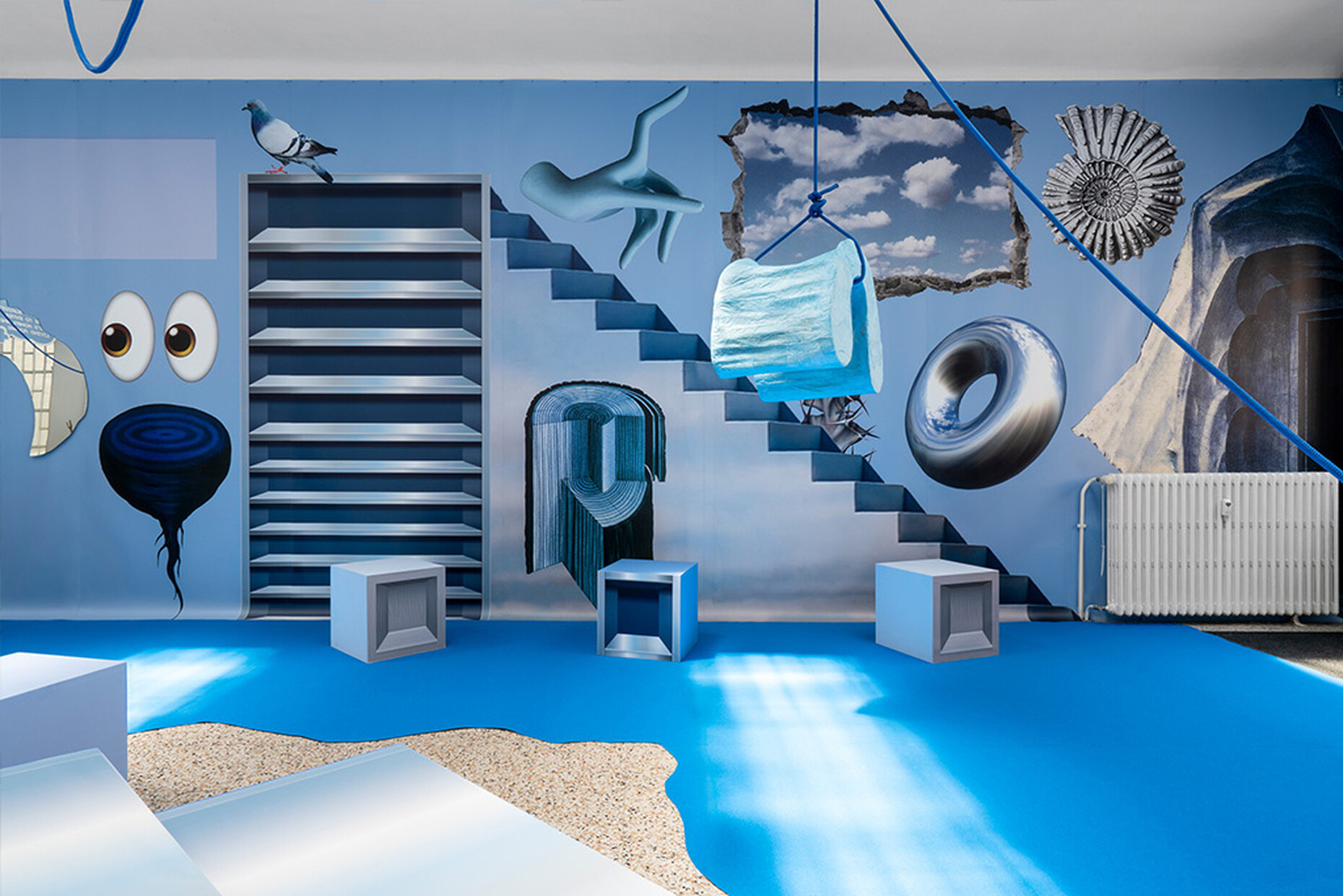
On the Alcova platform, the site of the Centro Ospedaliero Militare di Baggio, following last year's premiere another section was opened to the public for the duration of Milan Design Week,: The project by Valentina Ciuffi and Joseph Grima offered plenty of space for creative experiments as it was spread over four vacant buildings as well as across the spacious, park-like grounds. The product presentation by manufacturers such as Nomad, Zeitraum and Laufen was also to be enjoyed in this unique setting. SolidNature, for example, presented “Monumental Wonders” in cooperation with OMA and Sabine Marcelis: It was an impressive installation of home elements such as a free-standing bathroom made of pink onyx. David Pompa also created tubular luminaire elements from volcanic stone. The numerous presentations outside the trade-fair complex allowed a clear glimpse of the current trends in interior design, as did the Salone del Mobile: voluminous upholstery, altar-like tables and archetypal stools, armchairs with high backrests, modular systems as well as outdoor furniture, which in terms of aesthetics and craftsmanship can hardly be distinguished from indoor models. Many of the projects were interdisciplinary and blurred the boundaries between architecture, design, arts, and crafts. An effect that was also evident in the installations “You don’t want space, you want to fill it” by Matylda Krzykowski and the exhibition “Ceci n'est pas un mur” (“This is not a wall”) by Konstantin Grcic and Galleria Giustini/Stagetti, for which he created two limited editions, the “Wall” and the “Daybed”. Formal essentiality, the greatest possible flexibility, and naturally authentic materials sometimes contrasted with maximum comfort, solid stability, and personal retreat options.
Difficult change in direction
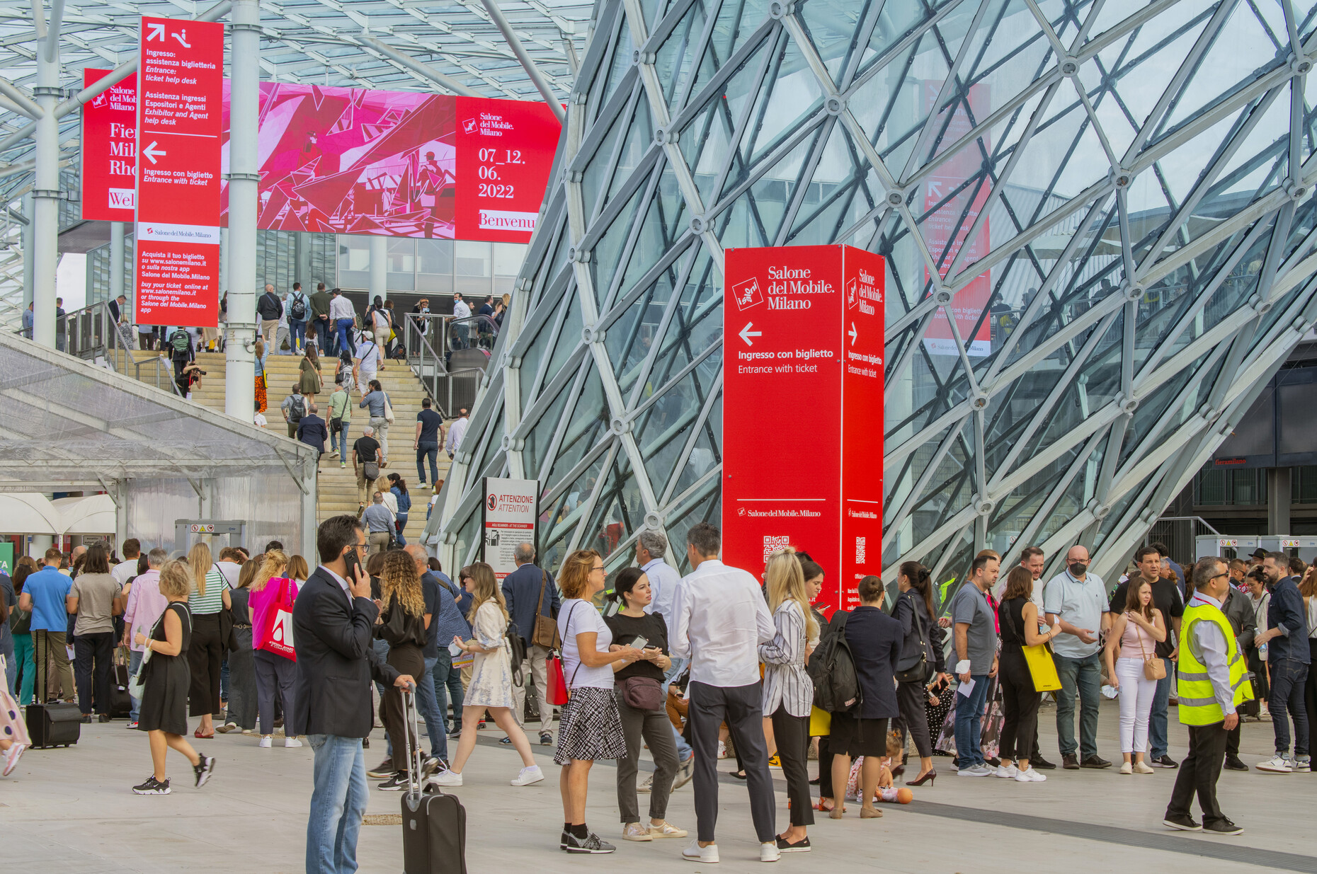
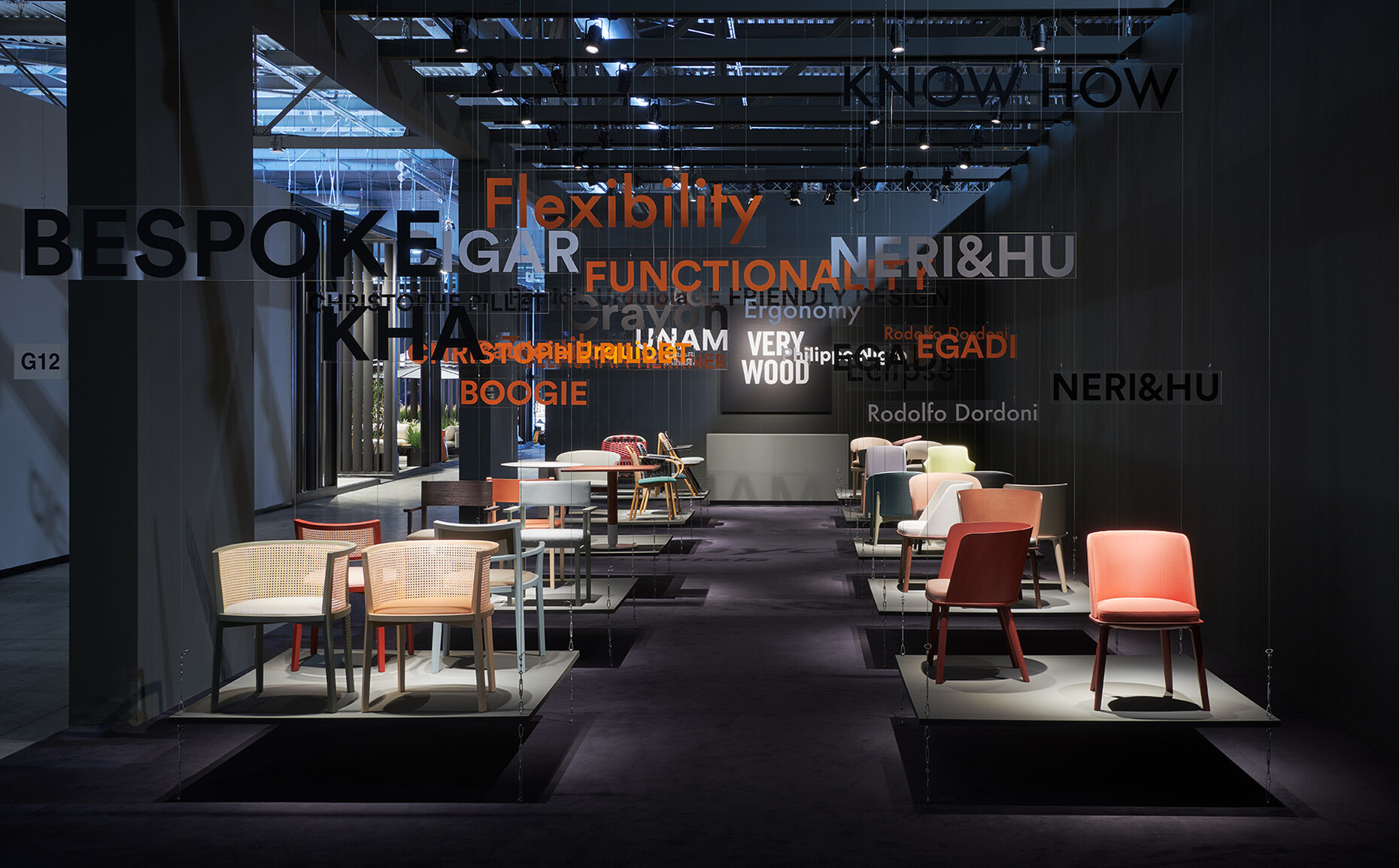
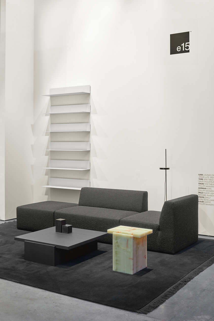
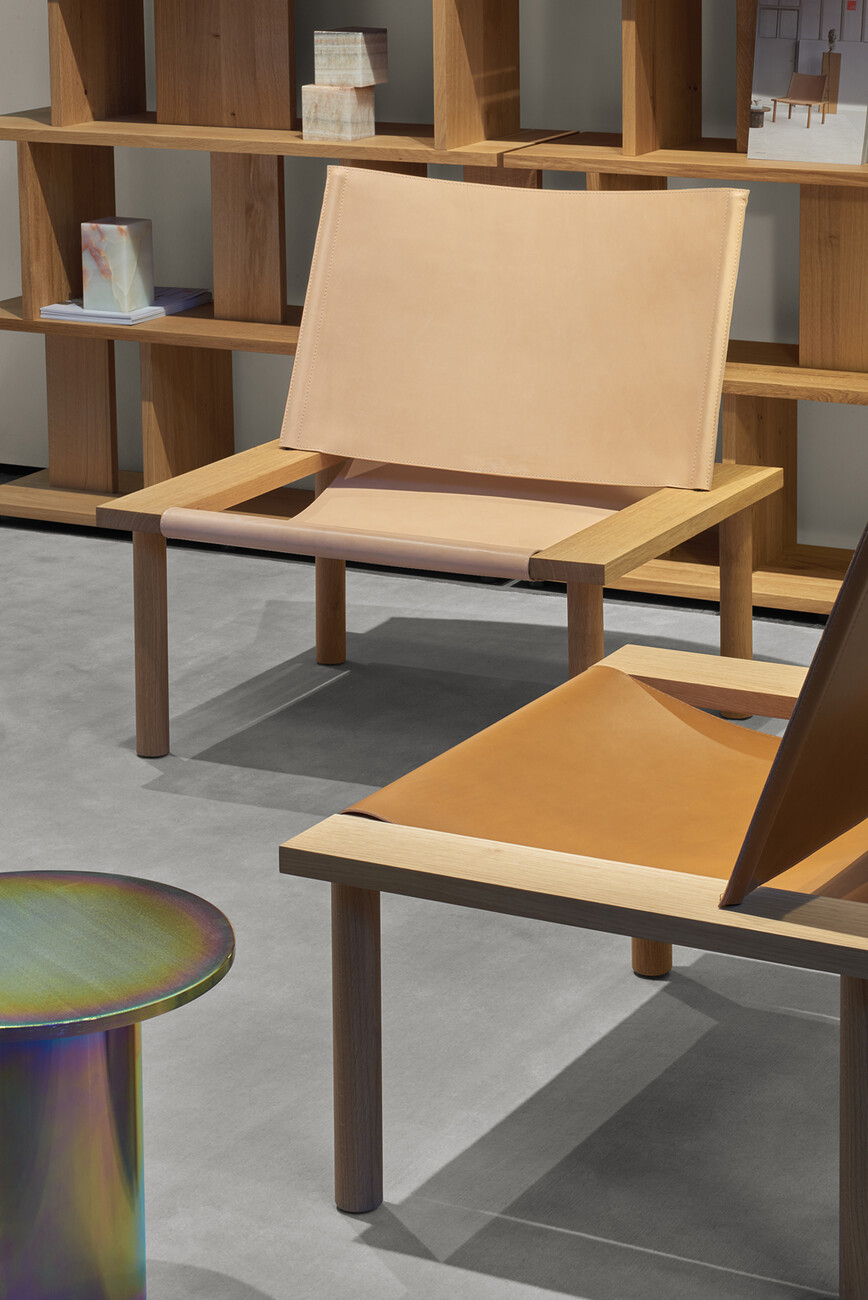
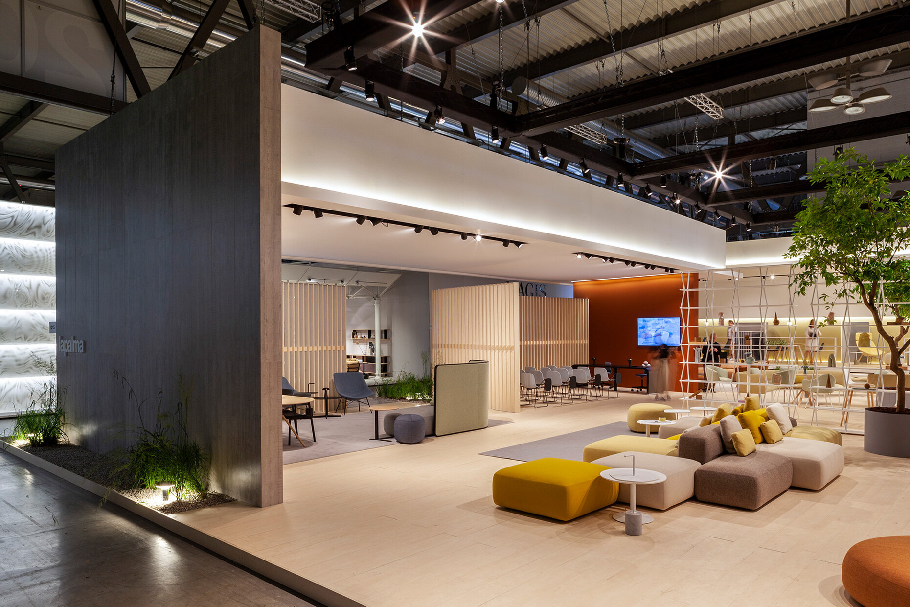
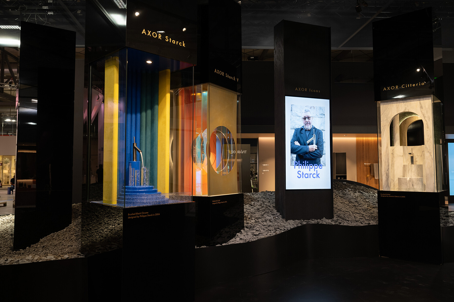
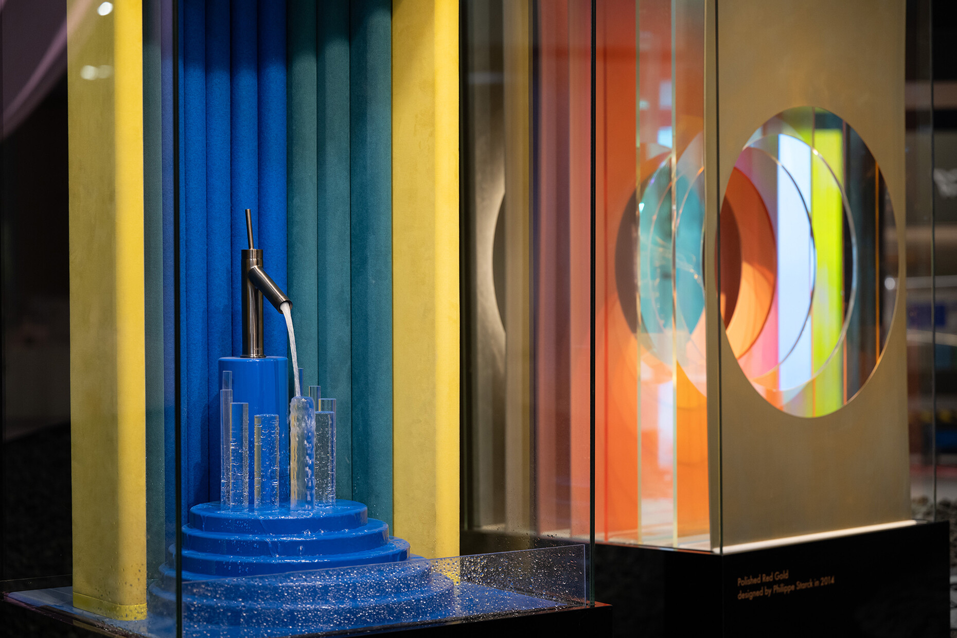
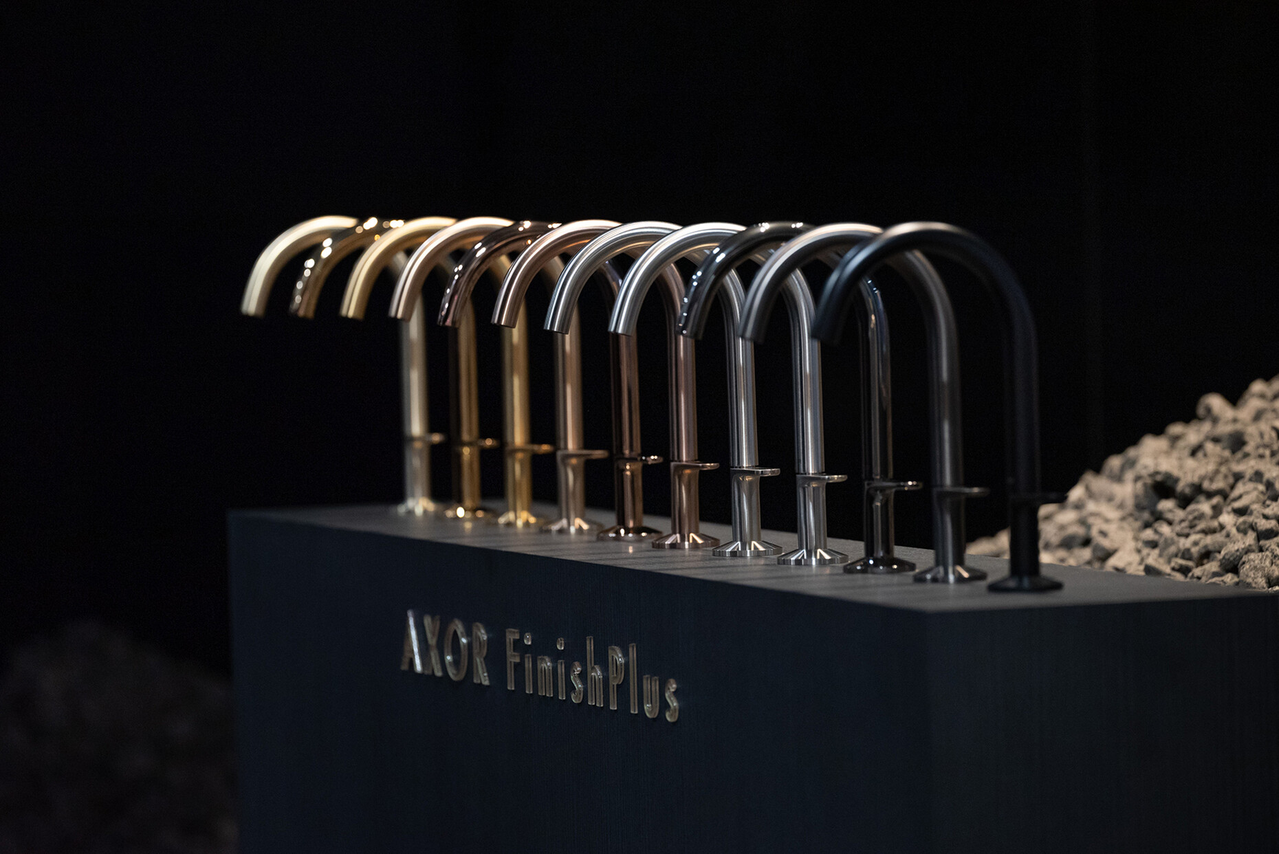
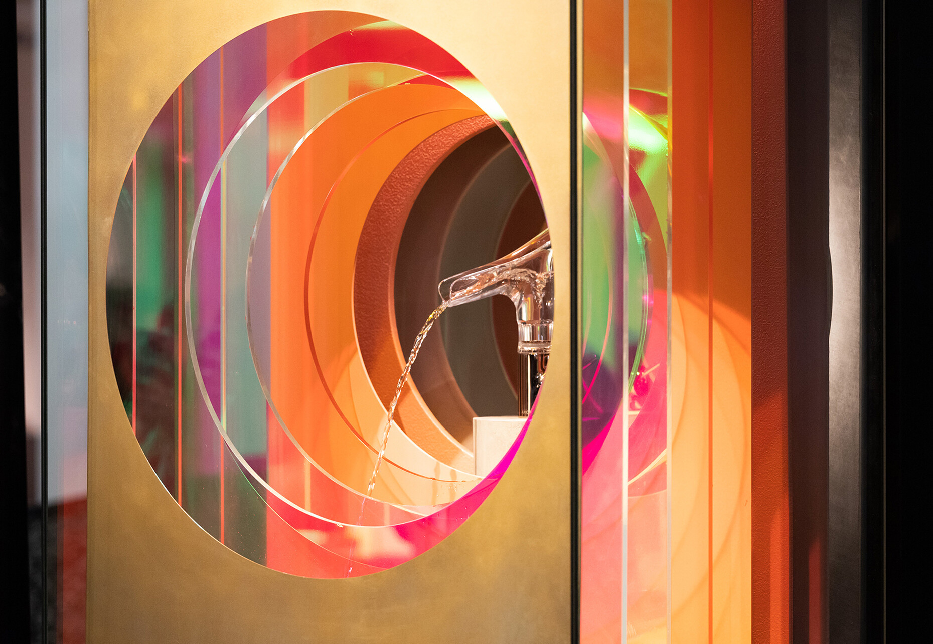
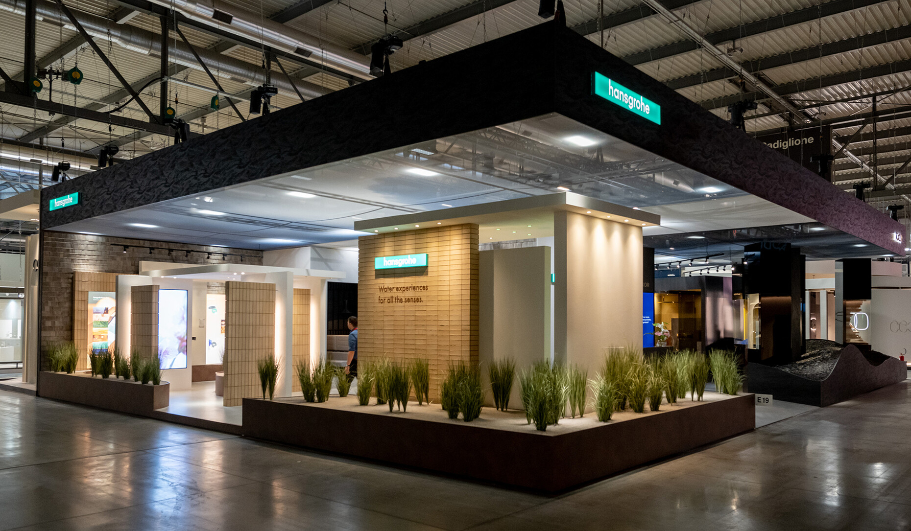
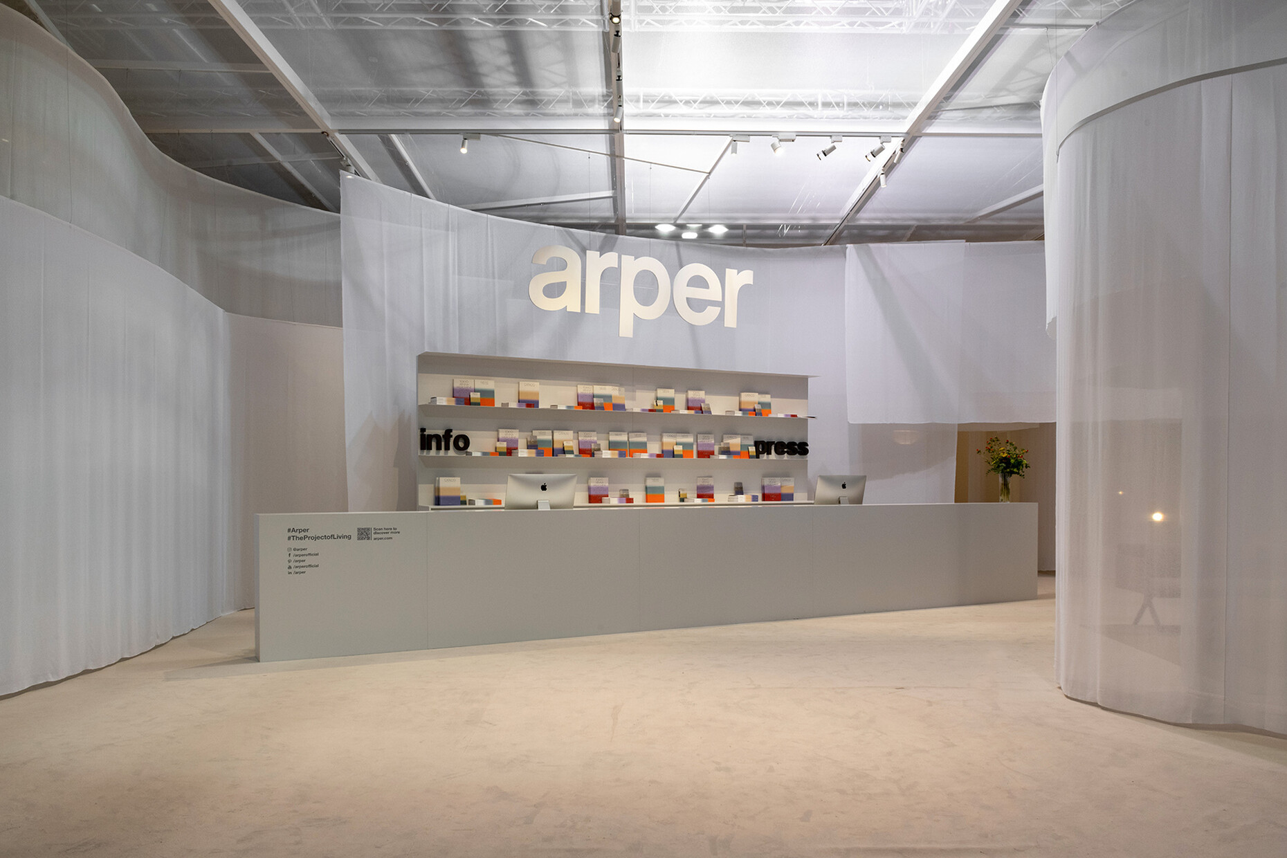
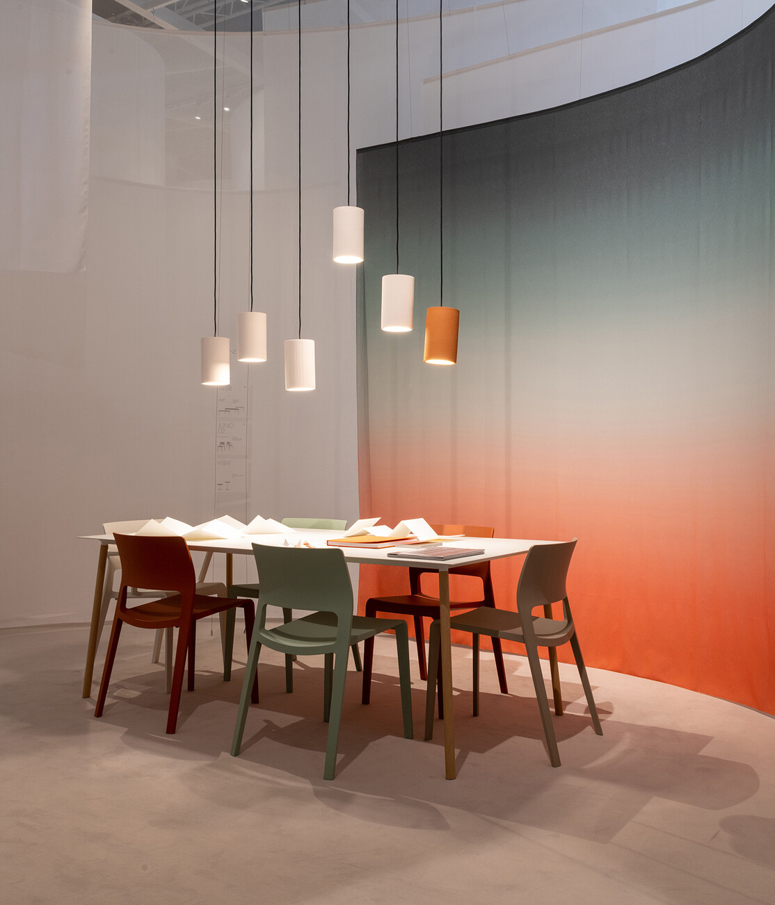
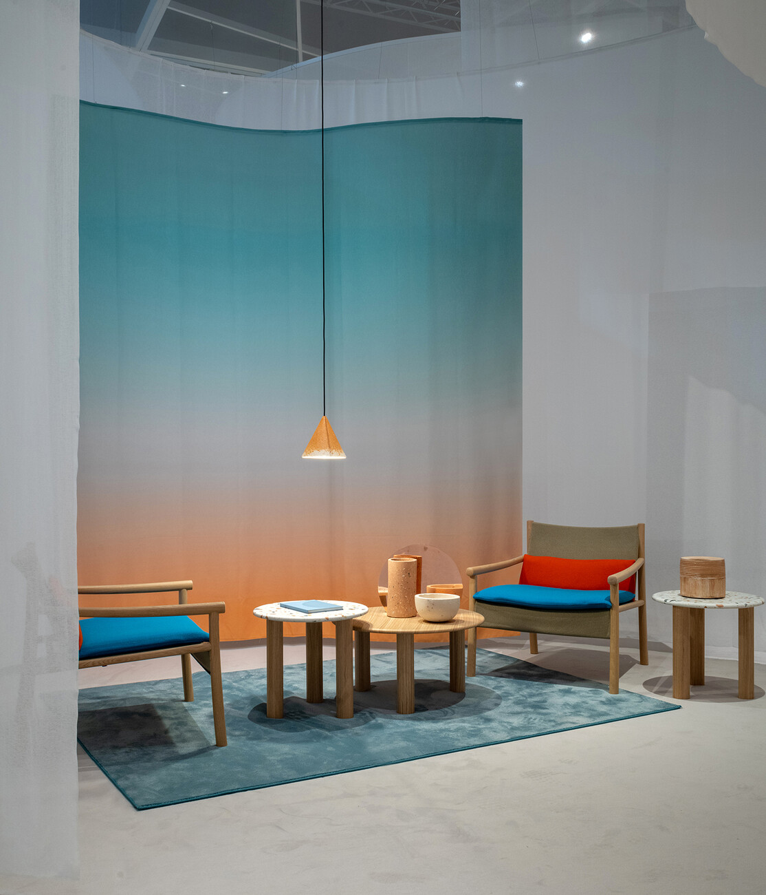
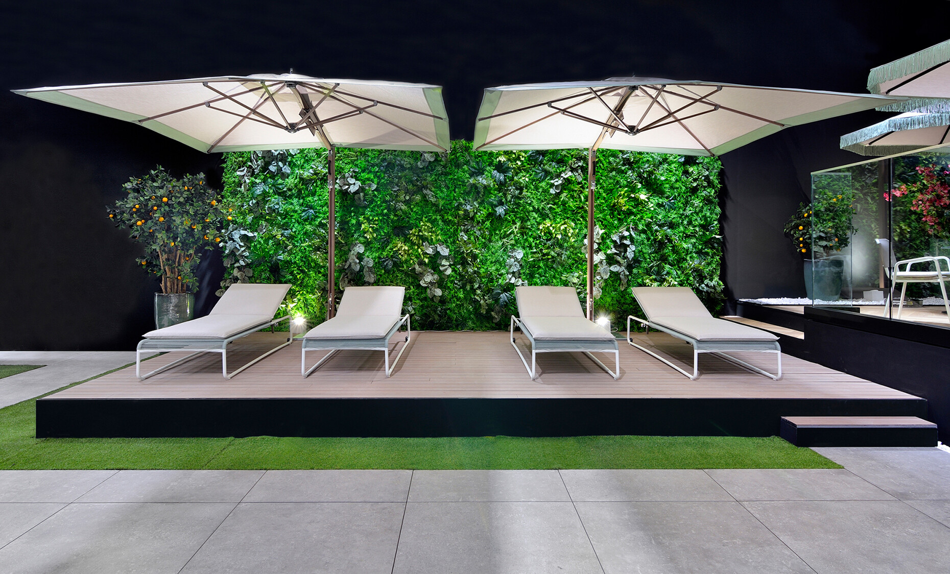
At the Salone del Mobile, many of the booths seemed to suggest that we have reached a fork in the road as regards the direction the industry can and wants to take in the next few years: After the consistently sustainable concept of the supersalone by Stefano Boeri last year, carpets had completely disappeared from the aisles of the halls and from many booths, but the established manufacturers’ product show stands once again grew wide and extended far upwards. Rarely was a structure as sustainable as Arper’s, which consisted entirely of fabric strips. However, there was a compromise to be made, as the nature of the floor of the area allowed a carpet to move back in. Despite the return to the pre-pandemic dimensions, when walking through the halls only a few booth concepts were really inspiring. Among the notable ones were no doubt Flexform, Rolf Benz, and Tucci, which used numerous plants and a sheltered atmosphere to create the impression of gardens and terraces, while Pedrali, Sancal, Magis, and Fermob demonstrated a feel for color and great attention to detail. Axor created elaborate mini-worlds that not only ideally reflected the theme of the products, but also the respective design of the fittings in an abstract sort of way. That said, Very Wood demonstrated that simple means can also be effective: Buzzwords such as “functionality” or “flexibility” and the names of the designers of the current collection were printed on Perspex panels and hung one behind the other above the booth, thus serving to visually draw you in. Mattiazzi had an image of the production process spread across the entire wall, giving visitors the feeling of being visually immersed in it. Lapalma’s new Artistic Director Giuseppe Bavuso also opted for a surprising change of concept, turning his back on the previously rather somber, cool presentation in favor of a bright, harmonious and warm office and living atmosphere. E15 not only used the material onyx for a unique version of David Thulstrup’s “Tore” side table by, but also presented “Ilma” by Jonas Lutz, a lounge chair perfectly made of wood and leather, for which he interpreted the classic typology of a sling chair.
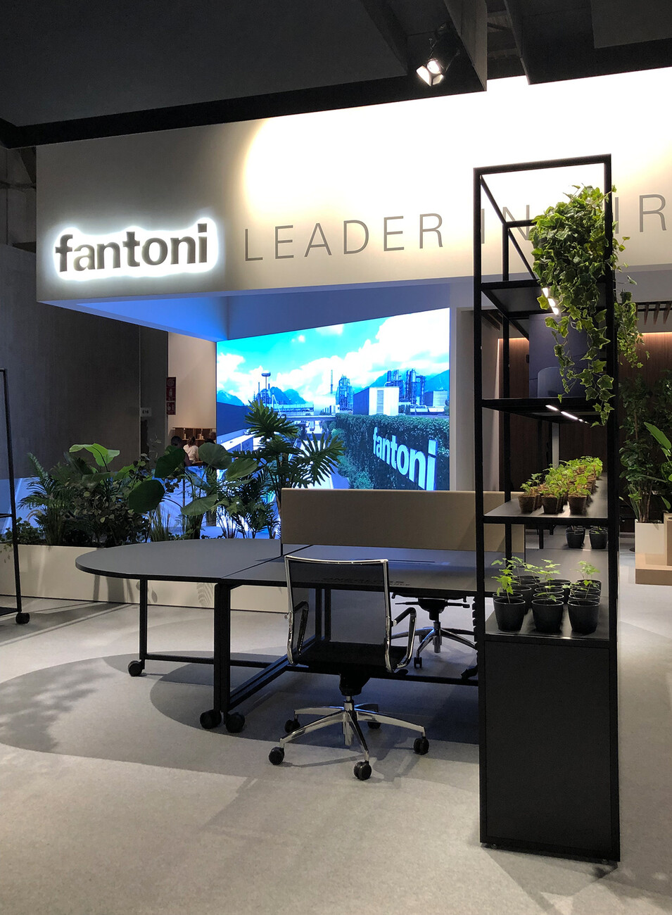
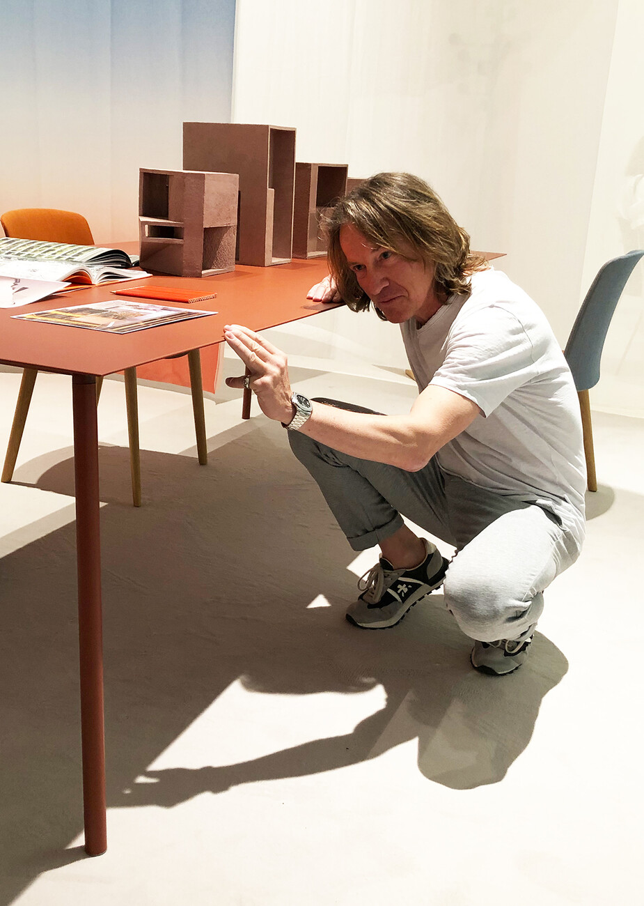
In terms of trends, the “Bow Coffee Table No. 6” by Guilherme Torres for ClassiCon, “Mellow” by Bonaldo, “Ukiyo” by Monica Armani for Tribu, "Ghia" by Altherr Désile Park for Arper or “Materic” by Piero Lissoni for Porro, among others, all entailed archetypal tables with a massive base, for example in the shape of a truncated cone. The impressive tops were usually made of marble or onyx. Large seating worlds without visible feet and large cushions were also on show, among others, in the form of “Jeff” by Patrick Norguet for Pedrali, “Duo Maxi” by Rafa Garcia for Sancal, or as a re-edition of “Le Bambole” by Mario Bellini for B&B Italia. In collaboration with Gensler, with the “Atelier” collection Fantoni showed just how sophisticated flexible workstation systems can now be: Starting from the bookshelf, tables, cabinets or mobile castor-based pin-boards can be flexibly positioned at will here and rooms thus demarcated. Moreover, no fingerprints are visible on the matt finish. Architect Peter Kunz presented the sheer essence of a table for Arper with “Onemm”, whose top is made of folded sheet steel that is a mere one millimeter thick. The legs come in two heights, are made of oak or steel, and can be swapped at any time. Consisting of only five flat-pack components, resource-saving logistics are also a given. The fact that Kunz has thought the table through down to the last detail is itself evident from the pleasantly muffled sound you get when placing something on the tabletop.
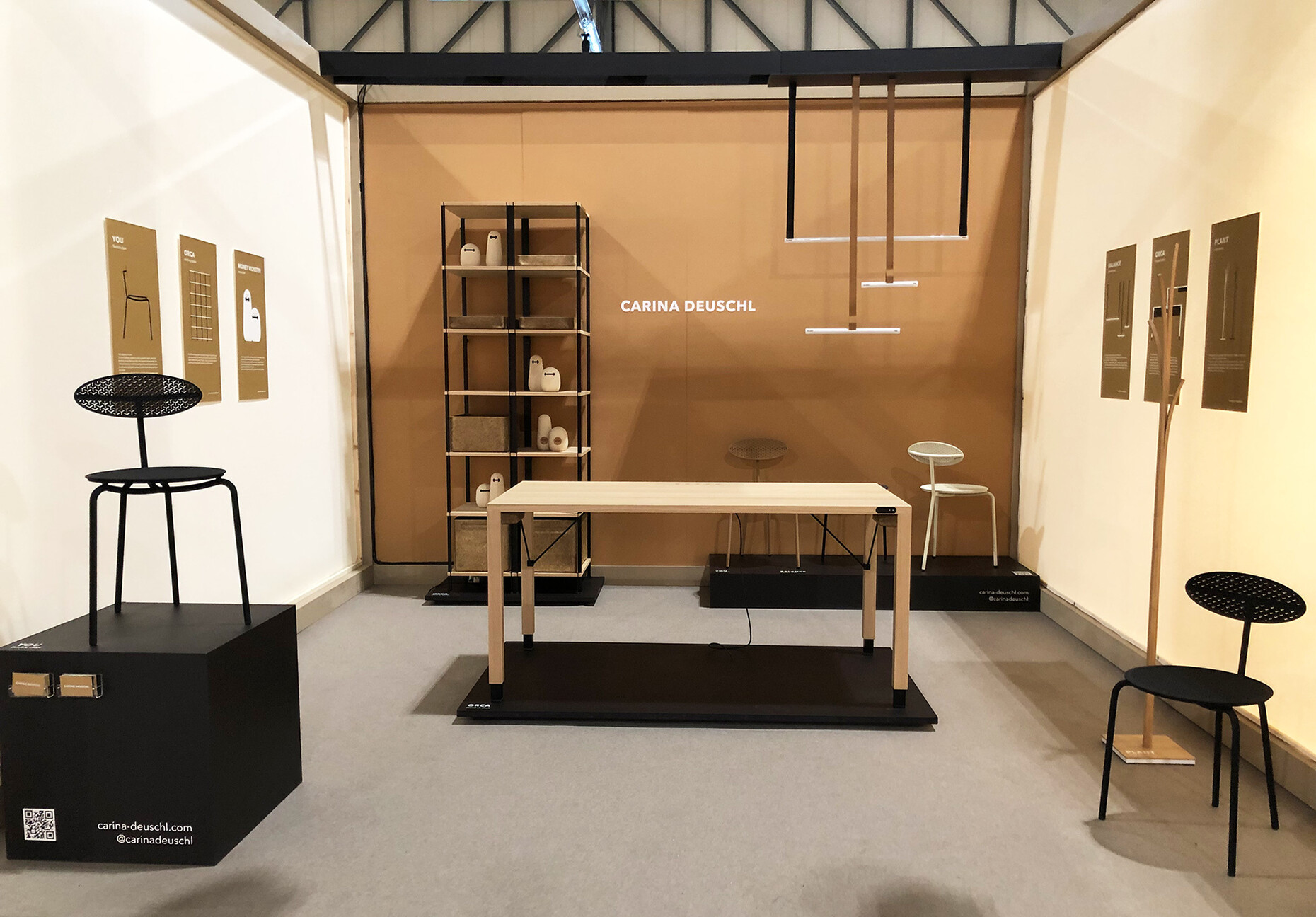
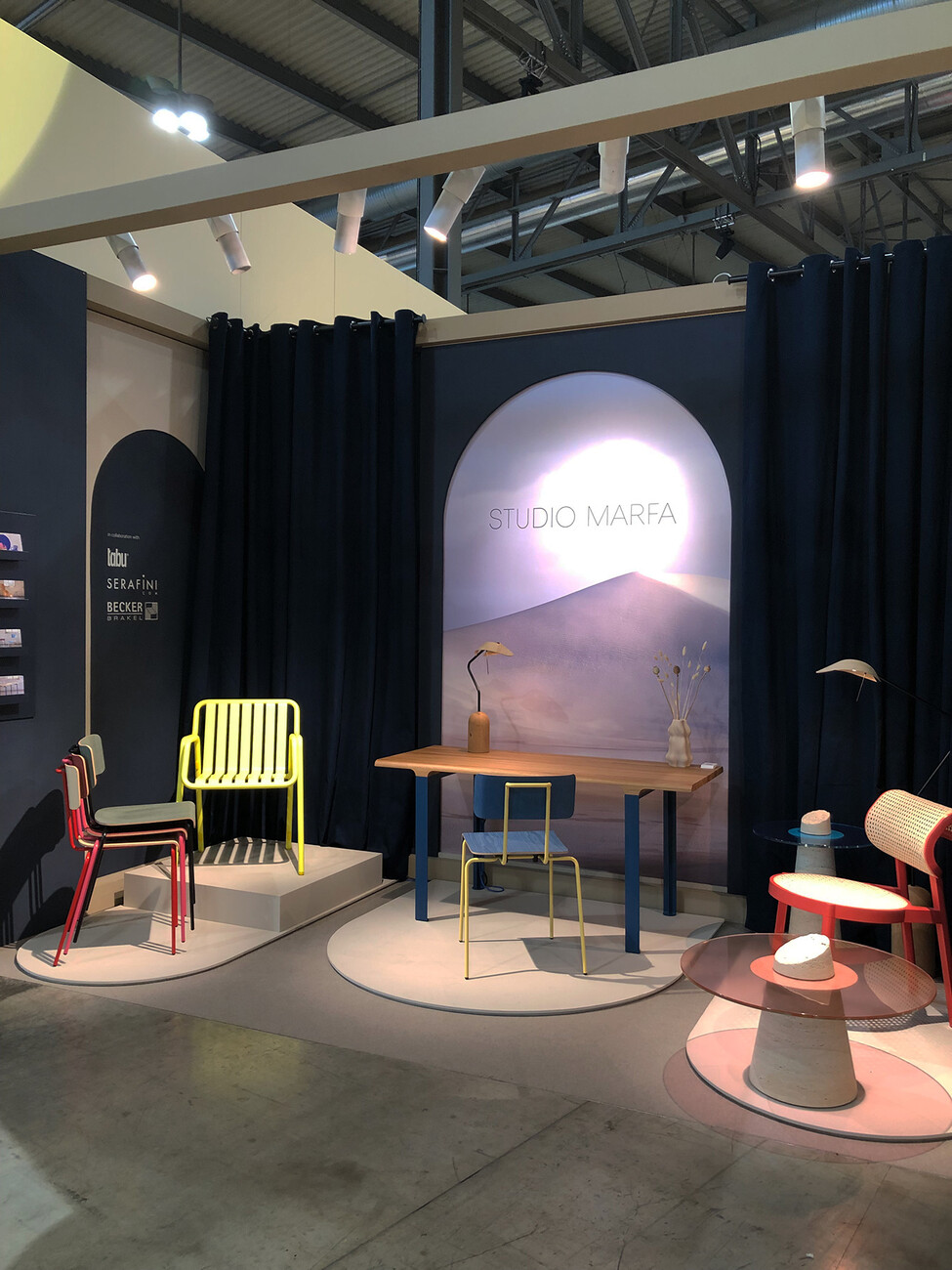
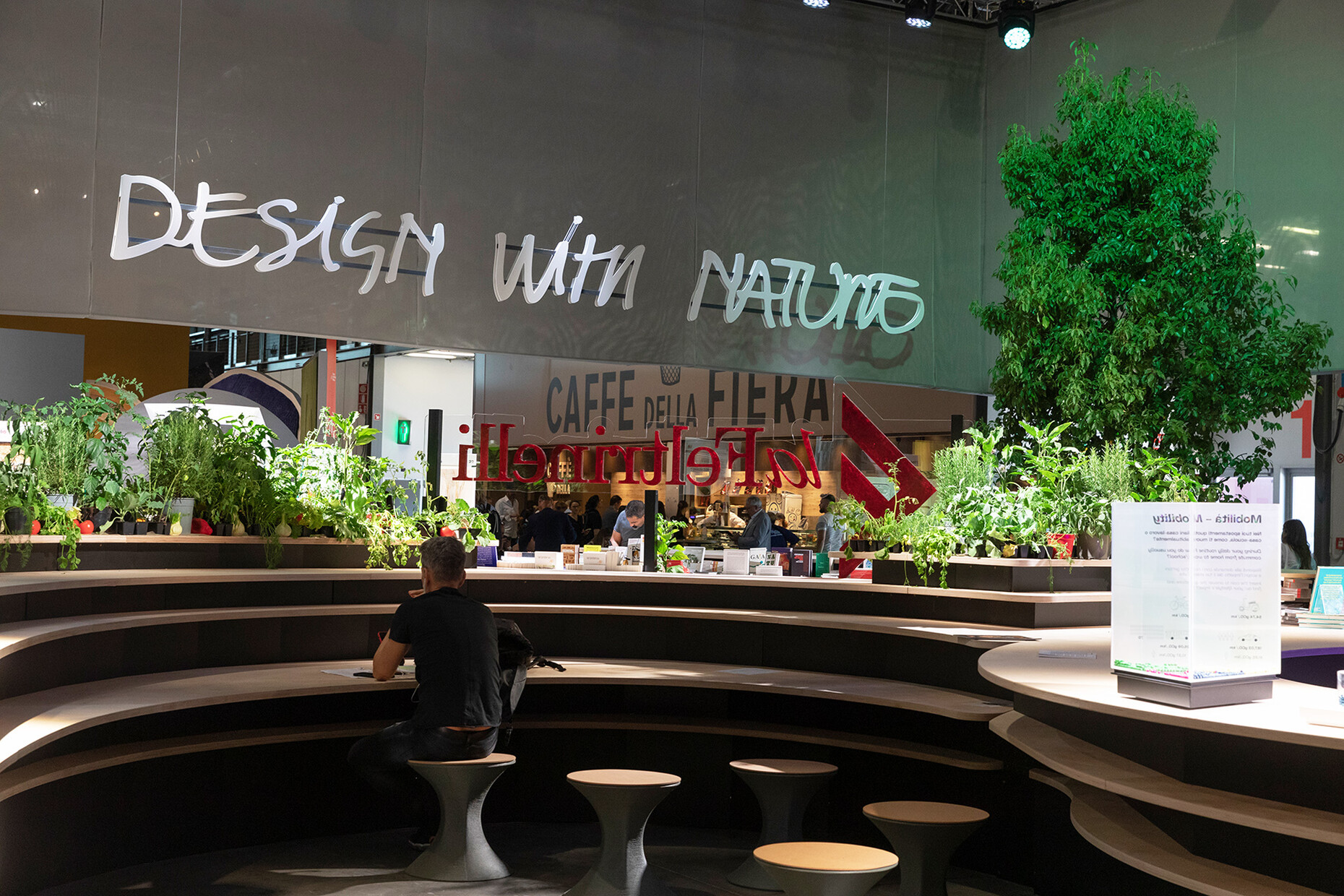
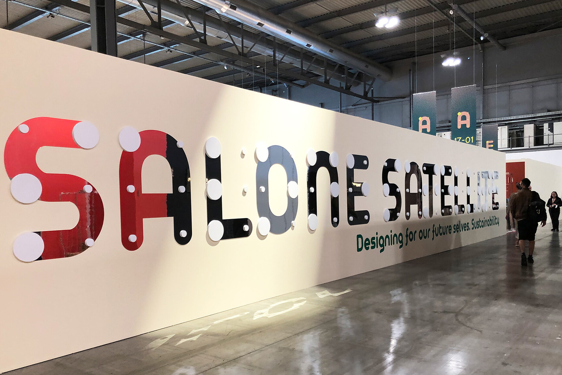
In addition, two of the most interesting areas at the Salone del Mobile were the 23rd edition of SaloneSatellite and the installation “Design with Nature”. Founder and curator Marva Griffin gave the young designers a special gift this year after the pandemic-induced break of the SaloneSatellite and together with her team offered them a spacious prominently positioned area in Halls 1 and 3 for product presentations, lectures and interaction between the disciplines. Under the motto “Designing for our Future Selves / Designing for Our Tomorrows”, in addition to numerous material experiments and product prototypes, many of the products already exhibited professional manufacturing that could easily be transferred to larger-scale production: Prima examples are Carina Deuschl’s extendable table “Orca”, the magnificently crafted wood for the “s/m-w” table by Anna Arpa, the flexible telescopic “Tara” table lamps by Simon Schmitz, or the “Miami” outdoor collection by Florestan Schuberth and Janis Fromm for Studio Marfa.
Rethinking products for everyday use was just as important to the young designers as was striking a new balance of function, comfort, sustainability, and aesthetics. For example, the “No-More-Less” project by Francesco Feltrin and Francisco Rojas Miranda culminated in a chair made of oak, wool and cotton whose seat can be adjusted to three different heights and angles. The 11th Salone Satellite Award was won by designer Lani Adeoye for “RemX”, a prototype for a walking aid made of sustainable materials, which liberates the medical product from its clinical aesthetic. At the same time, Mario Cucinella’s SOS School of Sustainability at the SaloneSatellite itself forged a link to the “Design with nature” installation he co-developed: in Hall 15, the site provided food for thought in the form of an ecosystem straddling 1,400 square meters and devoted to a more sustainable future for design and architectural practice – such as in the form of urban mining as well as correspondingly advanced home spaces and the influence of our way of life on a positive ecological change. In addition, along with 116 exhibitors S. Project returned to the Salone del Mobile.
Road-testing the Future
So what conclusions are to be gained from Salone del Mobile and the Milan Design Week 2022? It seems as if, after the confusion of the pandemic and the increasingly noticeable effects of the climate crisis, as well as in view of the ongoing war in Ukraine, creative minds and the industry are searching for the right path to take given the many issues of the day. They are testing the limits of materials, functions and concepts to achieve a holistic approach that can be both ecological and economic, and that takes the human needs for design into account in these times of upheaval. There are still few clear solutions, but many exciting approaches that are worth pursuing with zest. After the rapid change of lane last year, the ongoing switch over to a thoroughly sustainable concept is something that many manufacturers and with them the Salone del Mobile cannot yet fully make, but having changed into a middle gear between yesterday and tomorrow, it is certainly easier in the long term to head swiftly for the future. The realization that interdisciplinary and personal interaction is of immense importance for the development of the industry was abundantly evident. Digital spaces for communication and presentation save time and help with conveying things. However, there is still a need for real platforms such as the Salone del Mobile, the SaloneSatellite and the Milan Design Week, if things are to grow, spaces where the products can be experienced with all the sense and not just the eyes, and where random inspiration is possible alongside focused brainstorming.
