The Impact of Colours
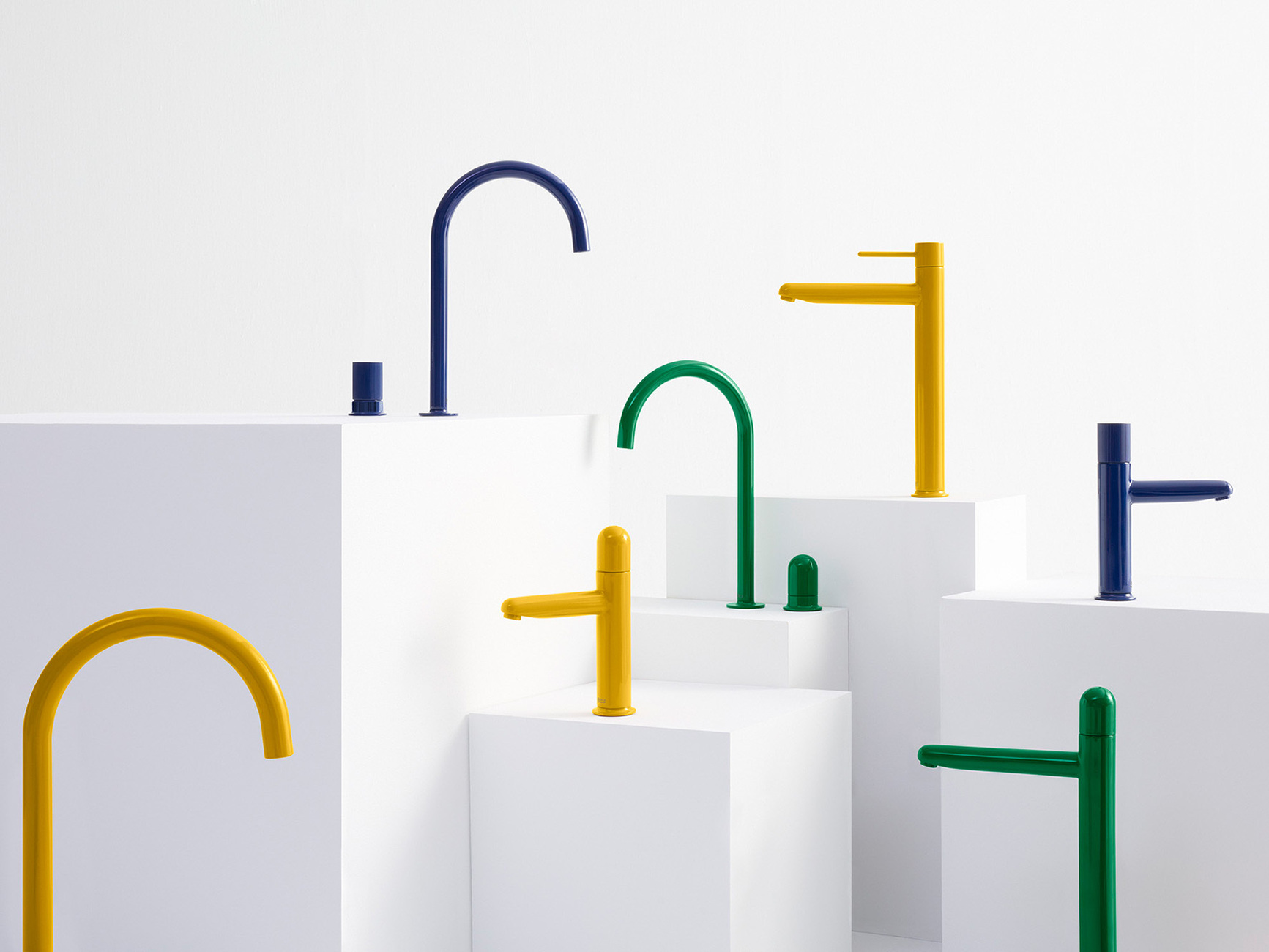
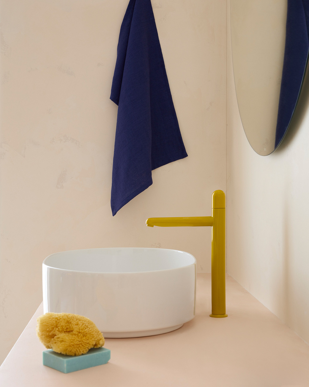
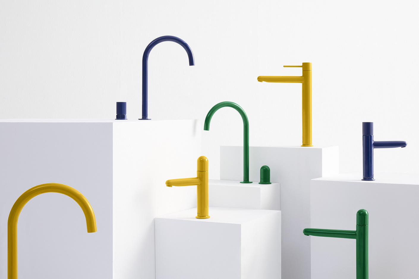
Earlier this year, Roca launched a range of faucets called Nu. When the Spanish manufacturer first approached designer Inma Bermúdez, it was quite unexpected: "It was a very nice surprise for my partner Moritz Krefter and me, because Roca is one of the biggest brands when it comes to bathroom products and ceramics." The first thing you notice about the collection is the colour. Roca launched the range in six bright colours, in yellow, blue and green. When asked how they decided on these exact shades, Inma Bermùdez sums it up: "It was clear to me that if we went for colour, we would be super bold. I didn't want pastel colours, but very saturated colours, not matt but shiny - and super loud". In fact, the idea for colour came from her perception of Roca as a Mediterranean company. She was inspired by images of Mediterranean houses in summer, not only in Spain but also in Greece, with their white walls and coloured doors or windows. There was also the colourful mosaics in the houses of southern Spain, dating from the Modernist period of the last century. "As these colours are rooted in our culture, we feel very comfortable with the choice," says Inma.
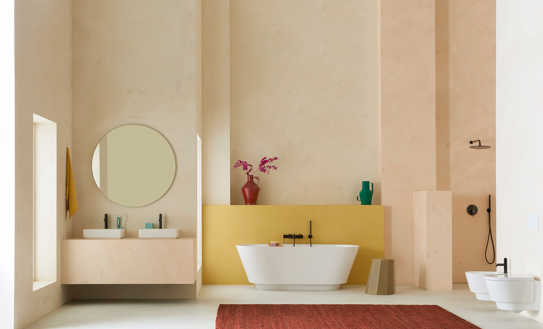
With the "Nu" collection, Roca aims to offer a wide range of options, allowing you to choose the one that best suits your project. Interior designers, architects or clients can choose between three bold colours or the more subtle alternatives in white, black and chrome that emphasise the shape.
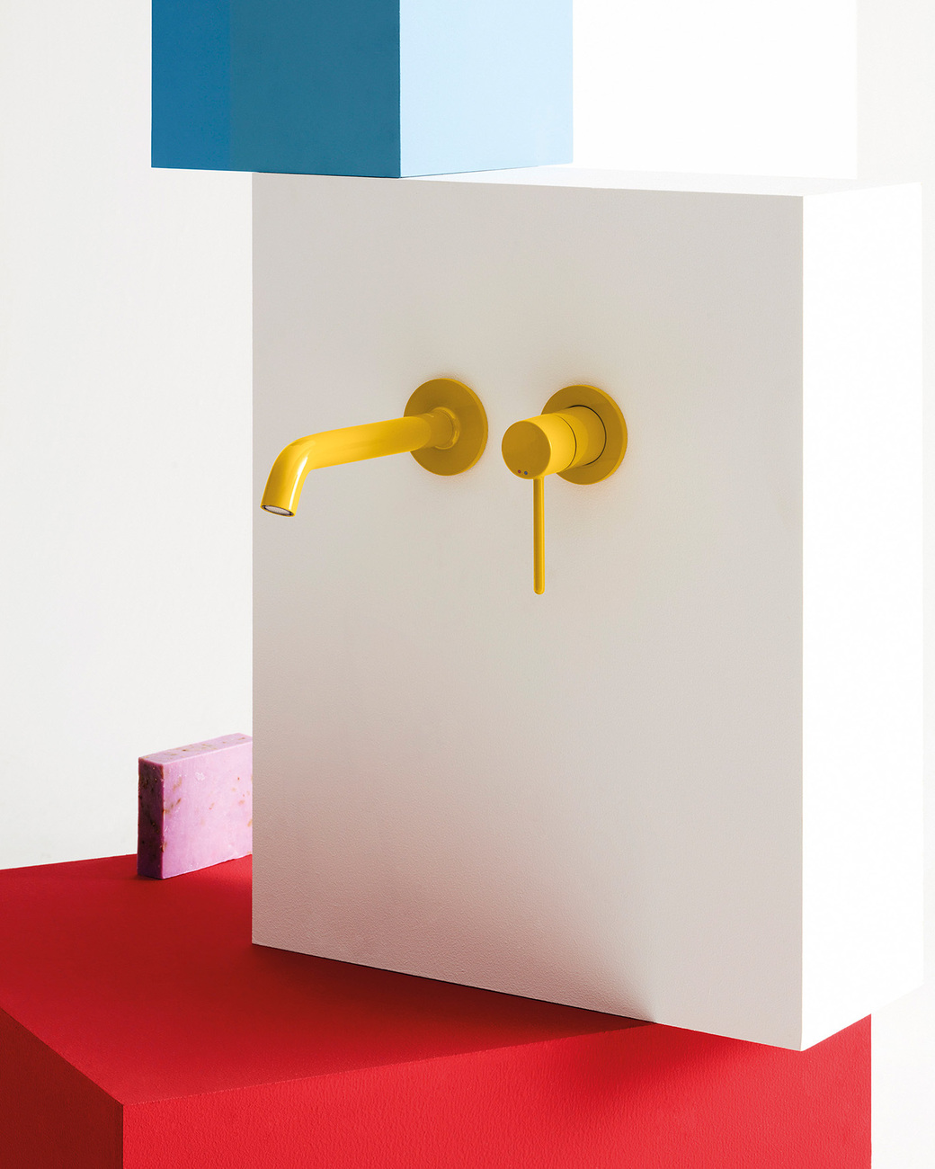
As the entire collection shares the same body with the same cartridge inside, everything looks connected. However, there are variations in the handle, called "Pin", "Stripes" and "Dome". As with the colour scheme, the range is also versatile in terms of shape.
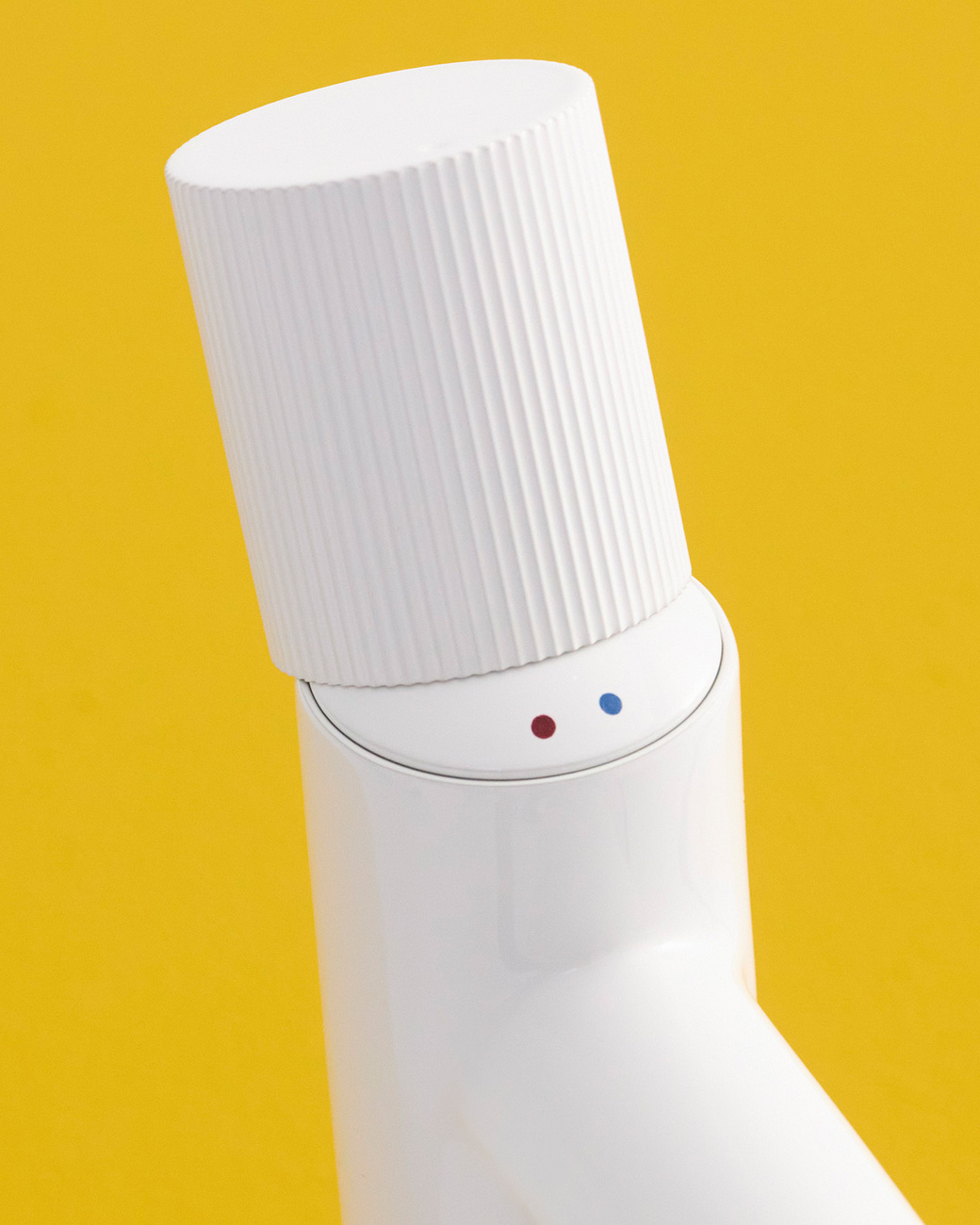
But there is more to the design that creates a positive user experience: The two signs indicating the water temperature are placed under the handle. When opened, a smile appears. Inma Bermúdez remembers how it came about: "Actually, the smile came out of the design process, it wasn't intentional, it was a wonderful surprise for us. We knew that our design would not allow us to put the blue and red points for cold and hot water on the handles. We put them underneath the handle and then discovered in our renderings that the dots and a little black line formed a smile. When we got the first prototypes, the distance between the two dots was just perfect and you could really see a smile. It's very important for us to be able to have that kind of communication with the product."
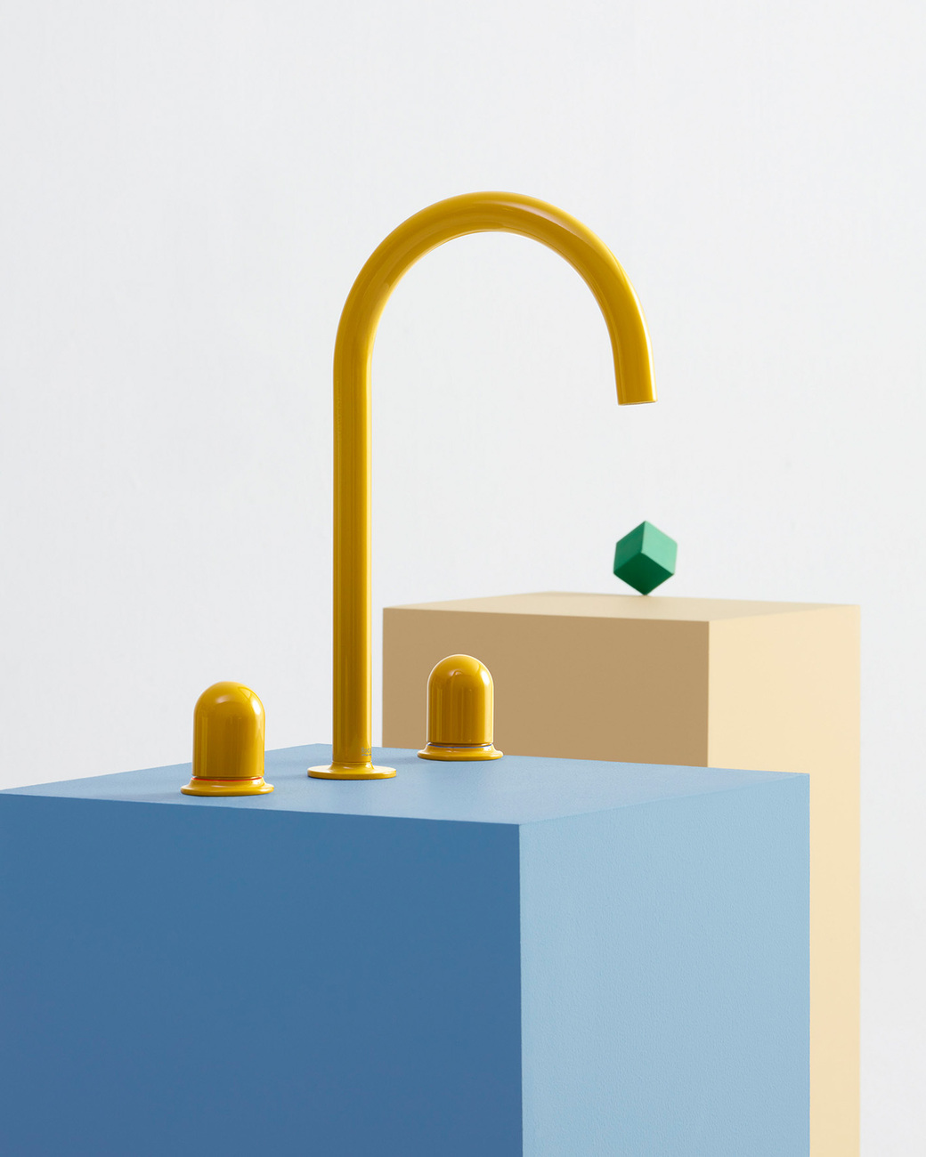
Designing faucets is a complex task because they are very technical products that don't leave much room for revolutionary concepts. The idea of the design was therefore to strip away everything superfluous and to get down to the essentials. The elegant shape of "Nu" comes from the very thin body and the slender aerator. The spout ends in a sphere that is not 360 degrees and therefore forms a unique and quite iconic shape with a certain softness. Through its pure form, "Nu" also corresponds with the new collection by Andreu Carulla. As the designers are close friends, their collections are a perfect match. "Tura" is a very clean, architectural collection to which one can add a statement with "NU" while maintaining the clarity of its design language. This certainly underlines the versatility of Roca’s collection – and brings new accents to the sector. (eb)