Featured
Natural cycle
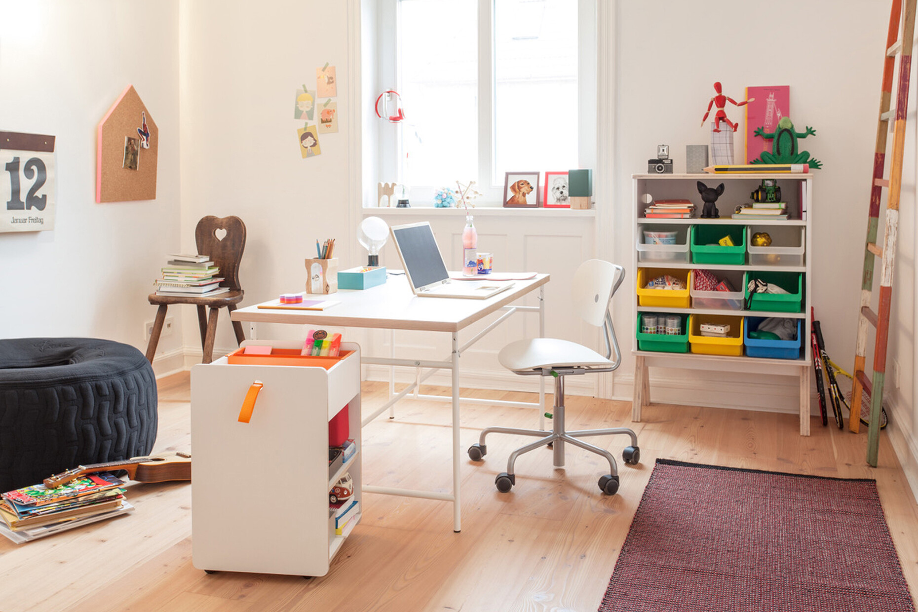
Richard Lampert is one of the individualists among the furniture manufacturers. With his firm, which he founded in 1993 in Stuttgart, he strives to produce furniture in line with the motto “As little as possible, as much as necessary.” The uses for his furniture are not set in stone: Many of his products work both in the office and at home regardless of whether they are tables, chairs, armchairs or shelving. Lampert also includes children’s and outdoor furniture in the company’s program. Though the portfolio includes a variety of typologies and products stemming from various epochs originally, and embraces design classics created in the 1950s and 1960s through to the latest creations by young designers, the collection has a distinct and uniform line that reveals the company founder’s philosophy.
Alexander Russ: As a result of the Corona pandemic the topic of working from home is omnipresent. Lampert’s products have always had a highly hybrid character and represent a kind of interface between home and work. How are you finding the current development?
Richard Lampert: Naturally, I didn’t predict the fact that COVID-19 would accelerate the development of remote working, but I’m profiting from it. In the same way that I had no way of knowing about the run on the classics when over the course of time I opted for some designs by Egon Eiermann, Herbert Hirche and Paul Schneider-Esleben. I am concerned with the quality of the design and whether it is still relevant today. Originally, I didn’t want to produce old designs but rather to work with current designers on developing new contemporary products. It was thanks to chance more than anything that I discovered the “Eiermann desk”, for example, and because I find it impressive, I included it in the collection. At the time I didn’t know a lot about Egon Eiermann except that he had designed the Gedächtniskirche in then West Berlin and the Olivetti building. It was the same with Herbert Hirche, I just happened upon him, like so many other things when you have set your mind on a certain course. In Hirche’s case it was after a night on the town (laughs). But it was never my intention to produce the entire portfolio of a designer or architect or to acquire kudos by being associated with a certain name.
That said, certain developments did come about such as the trend to produce re-editions or the hybrid furniture mentioned at the beginning. So, you had a good nose for those trends.
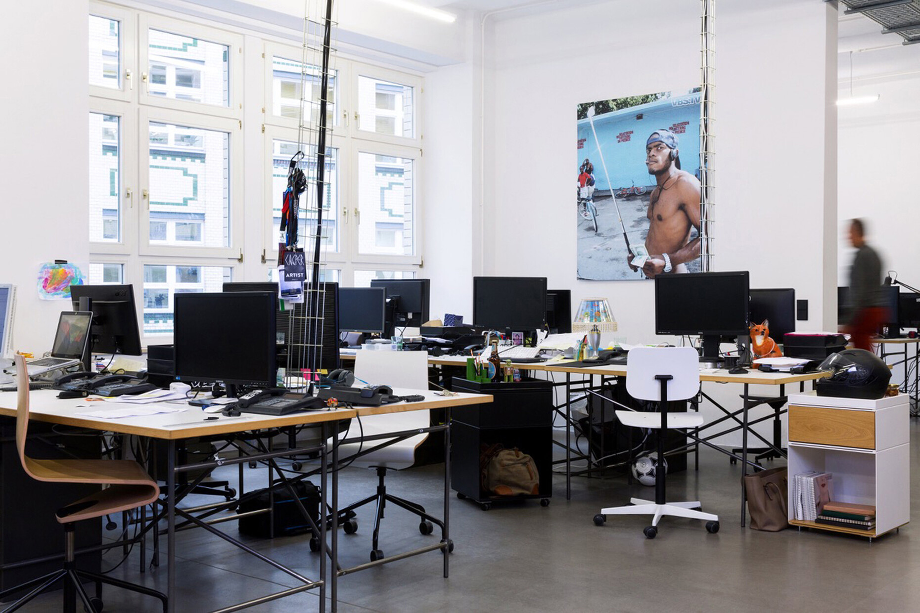
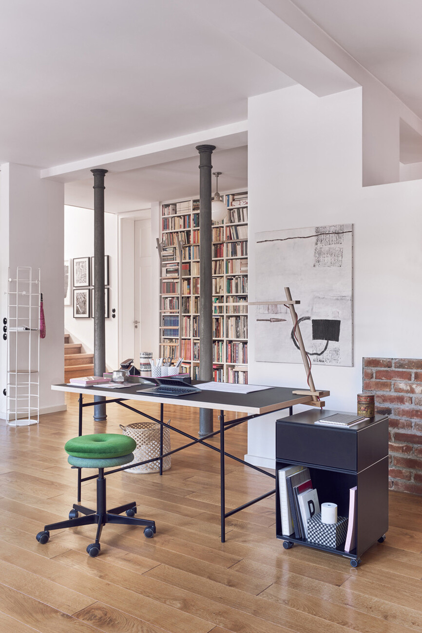
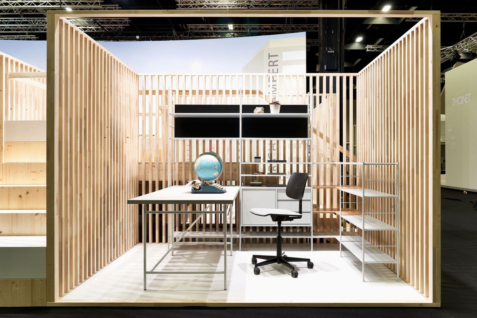
Richard Lampert: It is certainly an advantage to have a good nose for things. But when I’m deciding whether to include an item in the collection, fashion trends don’t play a role. I am always on the lookout for something special that is a clear fit for my collection. It should be a product that stands out from the rest – even though it might only have some minor feature that makes it different. And then you have the market side: Is there a niche that still has space for it? But sometimes you really get things wrong (laughs). While searching for the concept that would underpin everything and before I set up my firm in 1992, I came across the furniture of Donald Judd. At the time he was looking for producers and I was to take on the production. I was then forced very reluctantly to turn down the offer because, ultimately, I am also keen to manufacture furniture that is highly functional. Judd’s furniture is fantastic but the products are art objects rather than designs that address issues like comfort and ergonomics. And to come back to the topic of home office: Of course, the Eiermann desk works just as well in your own home as it does in an office setting. But in the end I don’t think that this is the decisive factor. To my mind what makes the Eiermann desk so successful is the fact that it’s an archetypal minimalist configuration. A table frame could not be made from much less, but at the same time it is unpretentious and low key almost like an Arte Povera design. Another factor for the table’s success is undoubtedly the fact that it can be taken apart easily and it sells at a relatively low price.
It is quite a balancing act to create affordable furniture of a high quality that also boasts a good design. How do you manage that?
Richard Lampert: It truly is a balancing act and a constant challenge. Like most of my colleagues I don’t produce myself. The trick is to find the right supplier for the requisite amount, quality and price. And there are specialists for everything: For example, working with tubular steel is not the same as working with sheet steel. The same goes for solid wood, multiplex or high-quality coated plywood panels. Yet I still manage to stick with my original idea and produce most of my furniture in Germany. And at a fairly reasonable price that I can then pass on to my customers.
You just mentioned that you included the Eiermann desk in your collection above all because you liked it. Are there other criteria? What was the case, for example, with the “Hirche DHS10 shelving”?
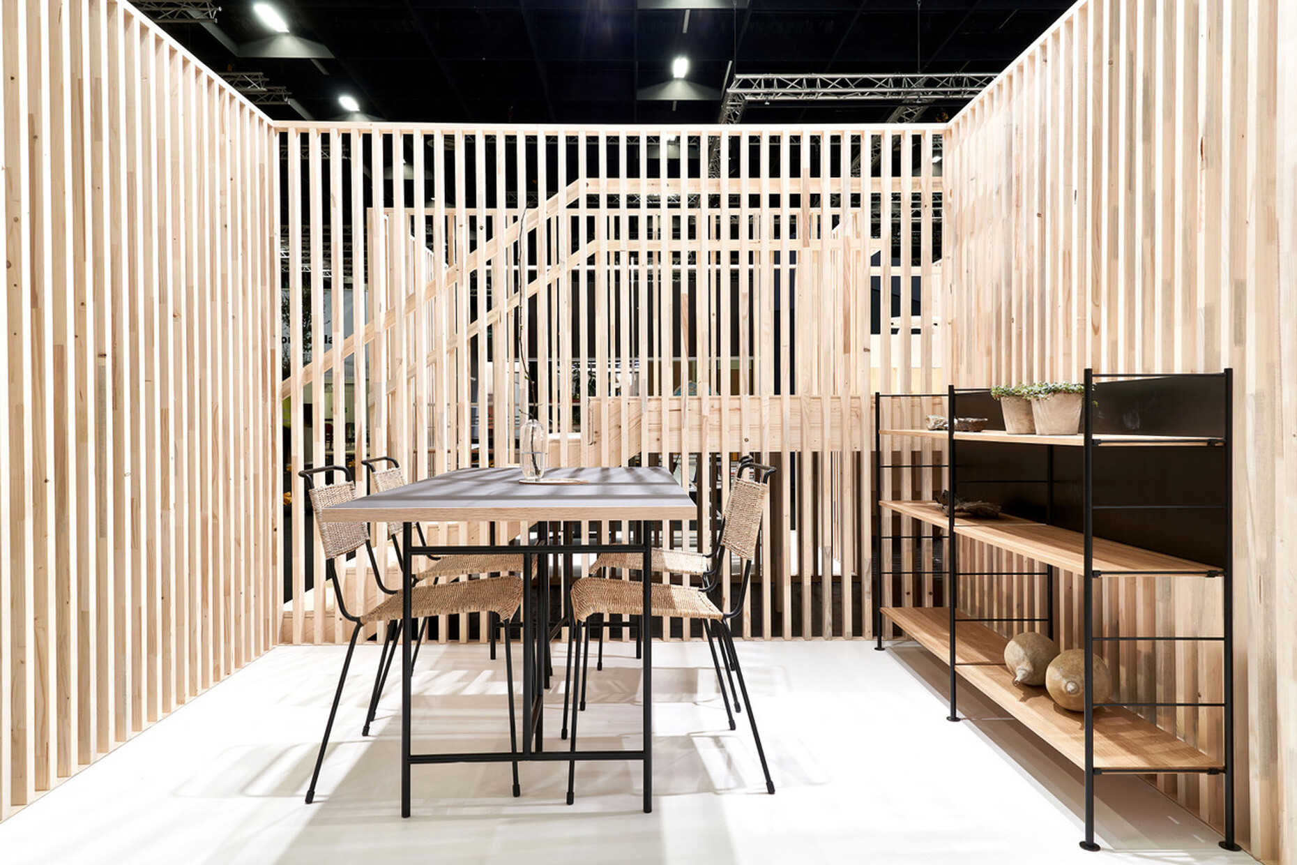
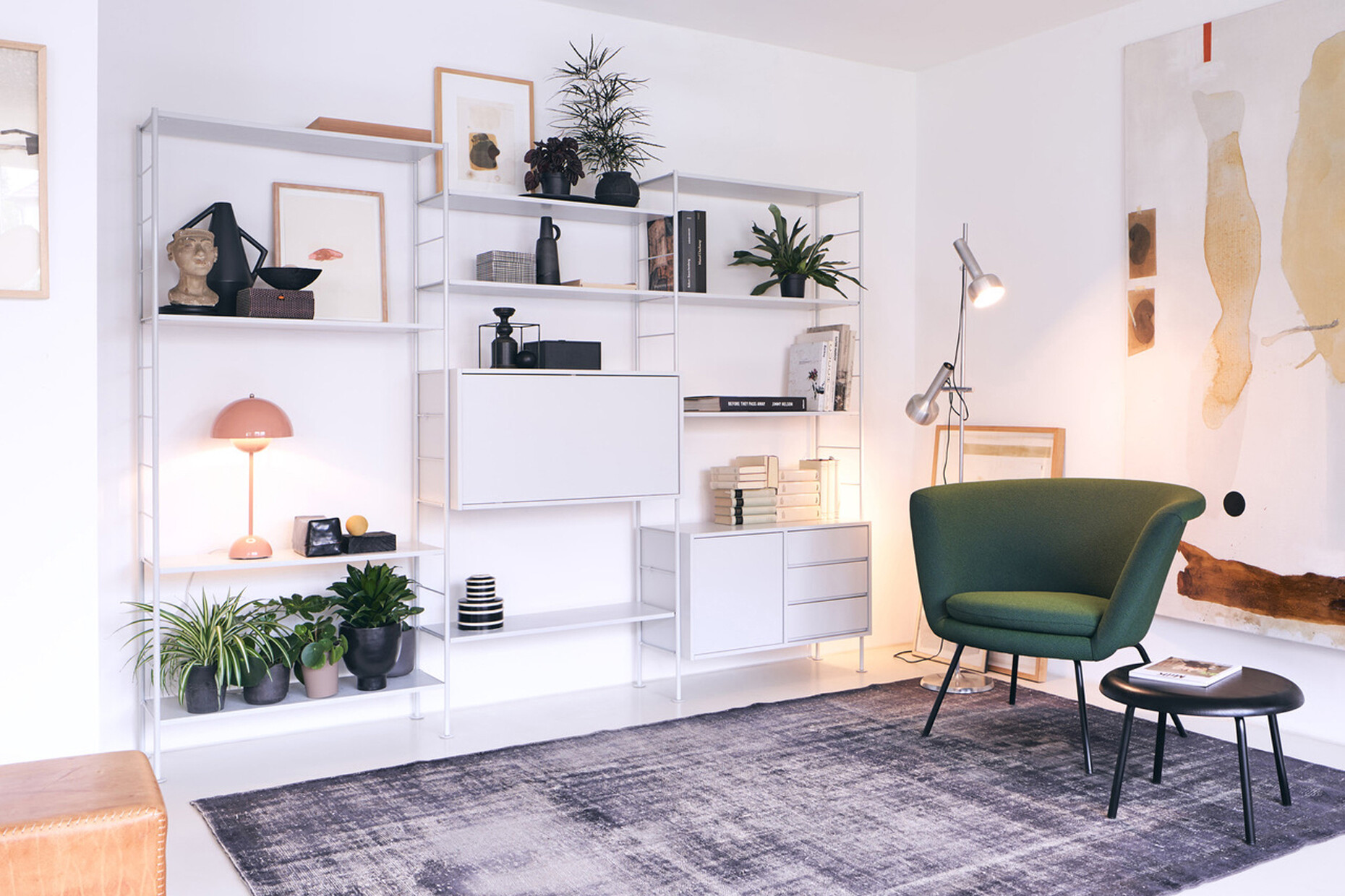
Richard Lampert: For some time in addition to the “Eiermann shelving” I had wanted another shelf system based on a modular design in my collection. Naturally, first of all I asked myself what did not yet exist on the market and the answer was: ladder shelving that could also be freestanding. Originally, I looked for a young designer to come up with something of the sort for me. But then I discovered that as early as 1954 Herbert Hirche had designed the very system I wanted! And as Hirches’s design works equally well in the home as it does in the office it goes well with my other furniture. And then there’s another aspect for my collection: A classic insurance company or a bank would not buy it. I make niche products for people interested in design and who are able to appreciate a consistent collection. In the office sector it tends to be primarily young start-ups, architect, graphic designers, event agencies and creative offices that are looking for just such furniture – unconventional and successful hybrids suitable both for the home and office.
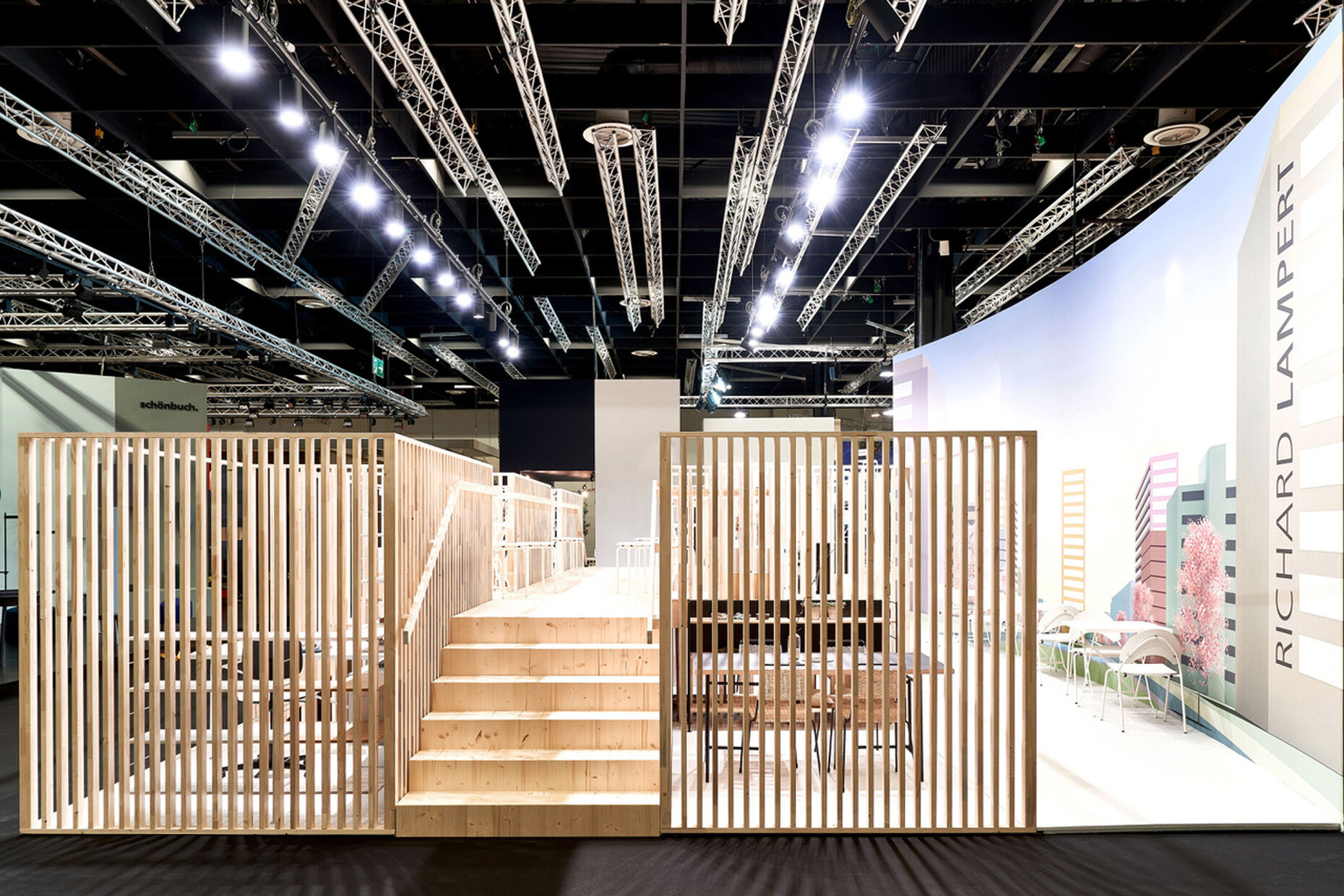
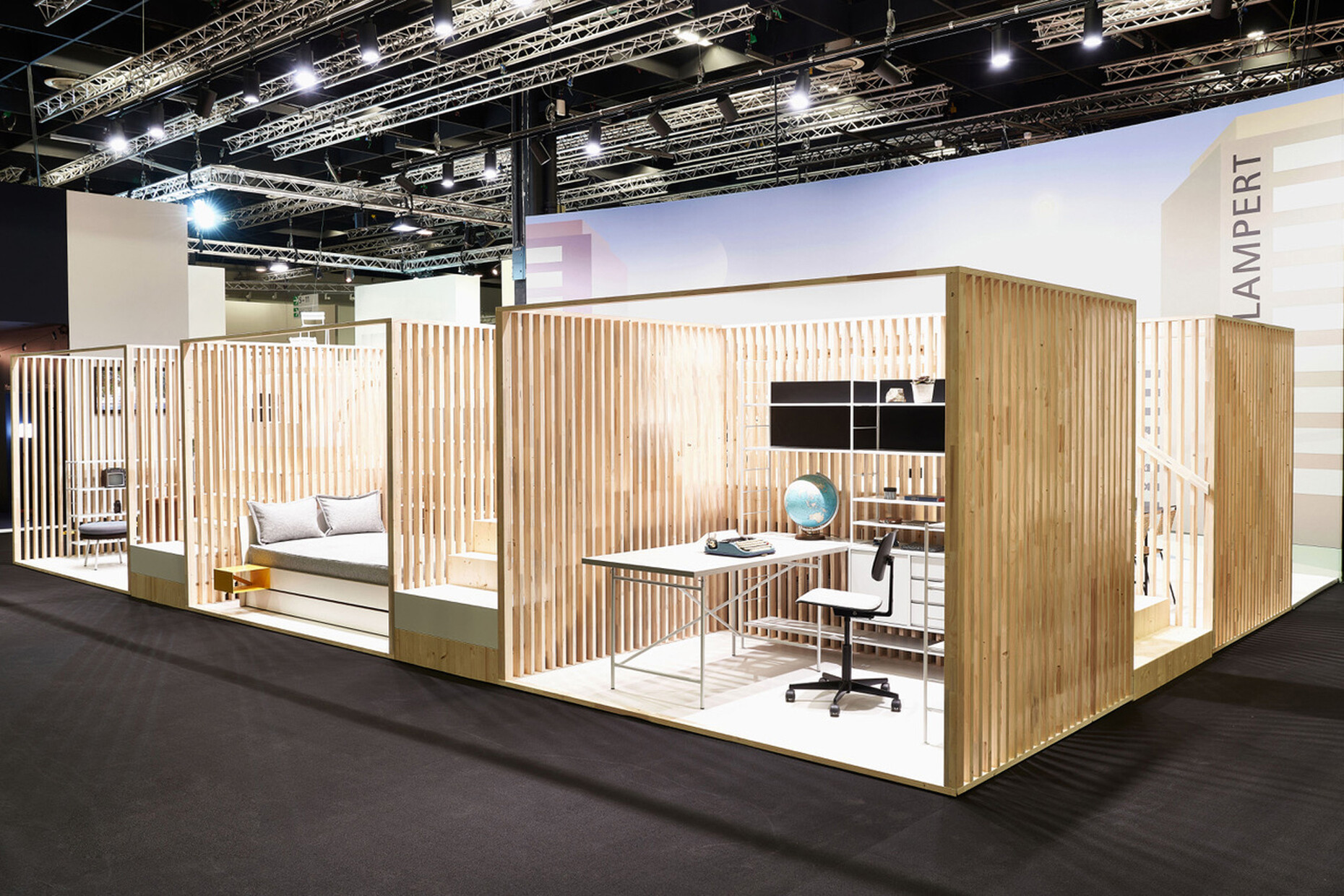
But evidently the topics of New Work and remote working from home did not pass you by completely unnoticed. For imm cologne 2020 you addressed the whole thing in the architecture of your exhibition stand with a reference to an iconic scene from the movie “Playtime” by Jaques Tati. The film protagonist stands on a gallery and looks out and across an office world of cubicles. The question this poses about privacy and openness in office architecture is more relevant than ever, after all.
Richard Lampert: It was Alexander Seifried, who has designed my exhibition stands and some of my furniture for years, who came up with the idea of Tati’s “Playtime”. This view of the cubicles jelled perfectly with my desire to also show my furniture in small spaces and in display cabinets but also in small rooms – be it in the office or at home. But as space at the exhibition is somewhat restricted we worked with wooden slatting that allows views through and transparency. Moreover, as in the Tati film there was an elevated passage from which you could look down onto the exhibition cabinets.
How did visitors respond to it?
Richard Lampert: Something happened that neither I nor Alexander Seifried had anticipated: People showed a preference for the gallery, using it to get away from the hustle-&-bustle of the exhibition but also to enjoy a different perspective. You might say everyone wanted to be the protagonist in the film. Another effect was that the exhibition cabinets clearly demonstrated that the furniture shown in them also work in very small spaces. That took even experienced retailers by surprise.
We have talked a lot about the design classics of your collection. However, it should be mentioned that you also work with young designers from inside and outside Germany such as Alexander Seifried, Bertjan Pot, Steffen Kehrle to name just a few.
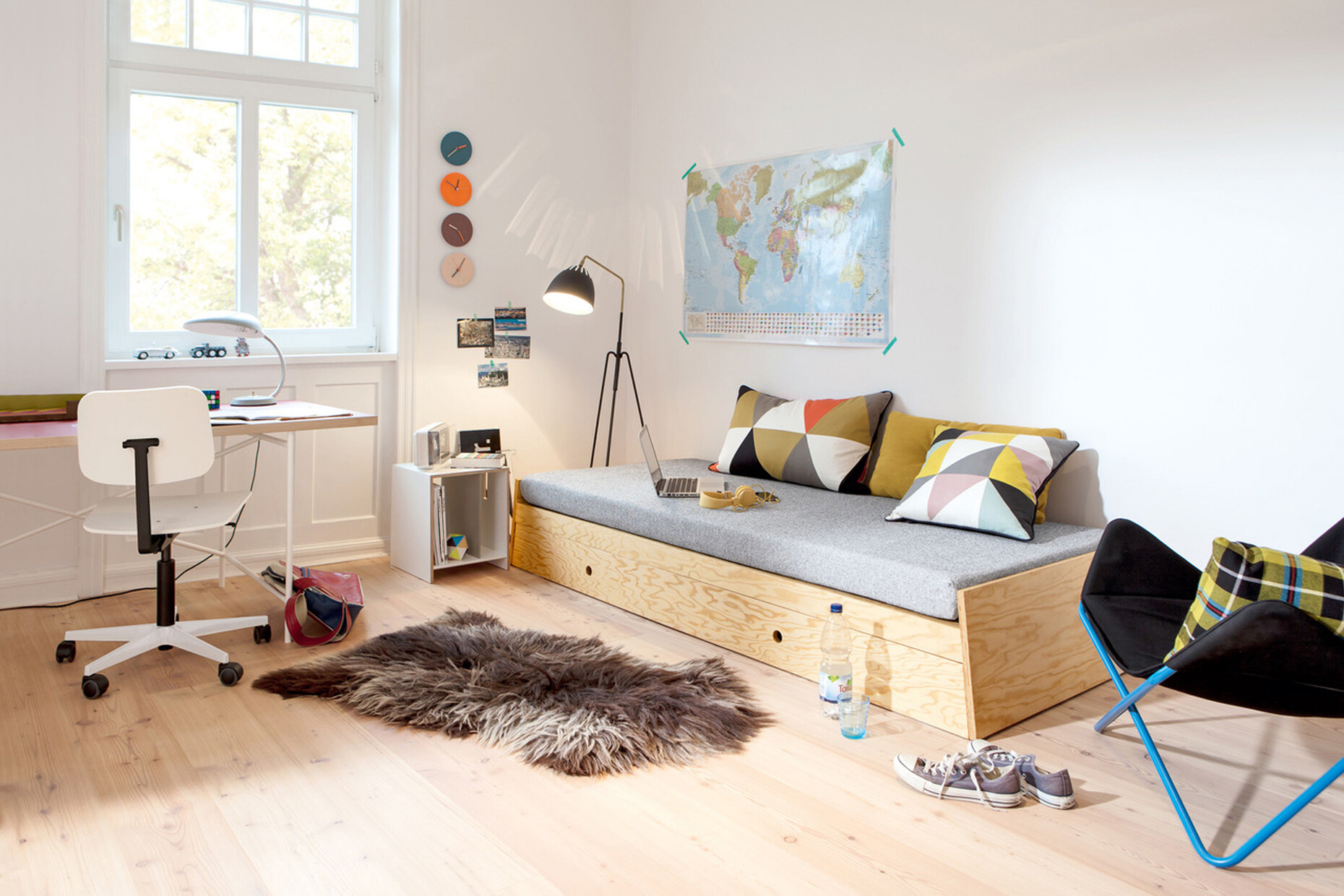
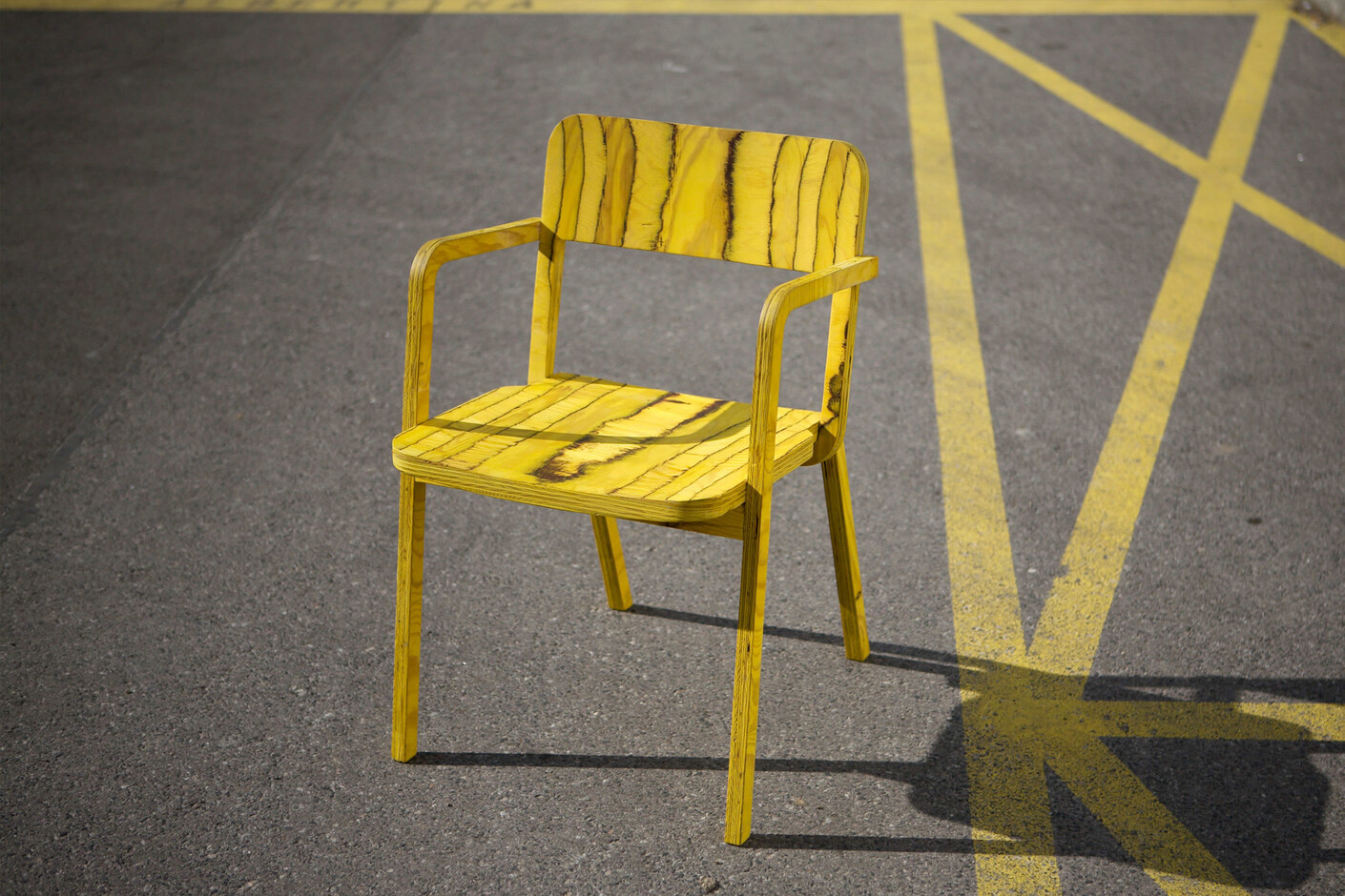
Richard Lampert: Well, “young” is relative (laughs). A designer needs a few years of experience under his or her belt for a collaboration to work well. One thing that interests me in this context is how you can get a fresh look at certain typologies. One good example of this is the stackable beds that I wanted to free of their 1960s “youth hostel look”. So, it was convenient that Alexander Seifried had already worked on this topic and was able to eliminate functional weaknesses. For example, in our version you don’t get frames cutting into your thighs and the beds can be used as a fully-fledged double bed or a single bed. Rather than a drawer Alexander Seifried had the idea of a sack that not only functions as storage but can also serve as an armrest or backrest. Collaboration with a designer typically works like this or in a similar way. It is only seldom that I see a design that immediately grabs my attention as happened with the “Prater Chair” by Marco Dessi. At the end of the day, there is a story behind every product. Every development through to mass production is different and it’s a challenge every time.

