SALONE DEL MOBILE 2018
A touch of new objectivity
Sadly, money and taste certainly do not always go hand in hand. Not that a lack of style must be detrimental to your success. The most striking example in this regard is probably the person who is currently the most powerful man in the world and whose prosperity is derived not least from various over-opulent and decidedly over-dressed high-rises in Manhattan. And his huge apartment in the Trump Tower with its boastful marble, gold panels, and styled furniture reminiscent of the Camorra residences in the TV series “Gomorrha”. Can it be a surprising coincidence that in recent years the furniture industry has once again been forcefully emphasizing a new form of opulence and has been wooing clients with massively-dimensioned heavy furniture?
Unlike the US president, whose future remains uncertain, the neo fin-de-siècle that simply oozes velvet and brass definitely seems to have reached its sell-by date – even if with the chaise longue he has created to round out his “Vuelta” series for Wittmann, Jaime Hayon manages to come up with a special highlight. So where are things heading? At the moment there does not seem to be anything like an answer to this question. Rather, the furniture makers seem to be somewhat perplex – perhaps there’s simply a slight lack of courage. No one wants to be the first to head in a new direction only to find it a dead-end. Nevertheless, people everywhere seem to be of the opinion that the solution cannot be to go on riding the velvet-and-brass wave. The initial trend vacuum this has given rise to could turn out to be a stroke of good fortune from the design point of view, as a whole series of manufacturers and designers have suddenly remembered a classical virtue. They are busy trying their hand at innovative industrial design and instead of opulent materials or mirrored and ornamentally framed inventions emulating a past long gone are now revisiting functions and putting technological advances firmly at the center of things.
Stand of the art
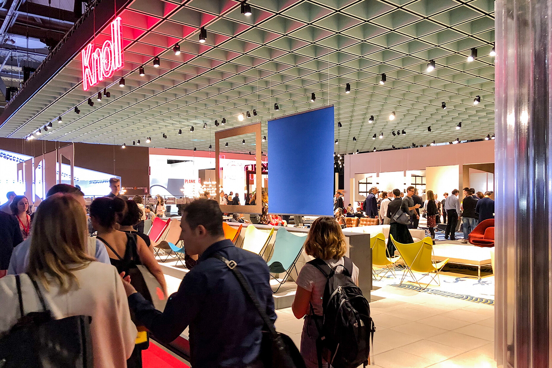
This trend is also particularly evident when it comes to the architecture for some of the booths in the trade-fair halls. In Hall 20, two of what are at present the world’s most important architecture offices designed the stands for Knoll International and USM. The ephemeral architectures of OMA (Rotterdam) for Knoll and by UNStudio (Amsterdam) for USM simply cried out to be directly compared. Remarkably, both designs attempt to forge a link between the strictly Modernist-functionalist tradition of the two companies and state-of-the-art goods presentations. The results could hardly have been more different: UNStudio made use of the iconic USM Haller modular system to create a standard architecture that with a whole array of gleaming chromed struts creates veritable Op Art-like effects. By contrast, the OMA design for Knoll was chunkier, referencing the architecture of the New Bauhaus – starting with the completely open-plan footprint through the paneled ceiling to the walls clad in tropical woods. OMA quotes these elements designed in the 1950s and 1960s by way of exemplary solutions (such as Marcel Breuer’s grid ceiling for the Whitney Museum in New York) and with the booth demonstrates the ongoing validity of such approaches. The Dutch architects combined it all with wall dividers made of transparent corrugated PVC, alluding to its own work.
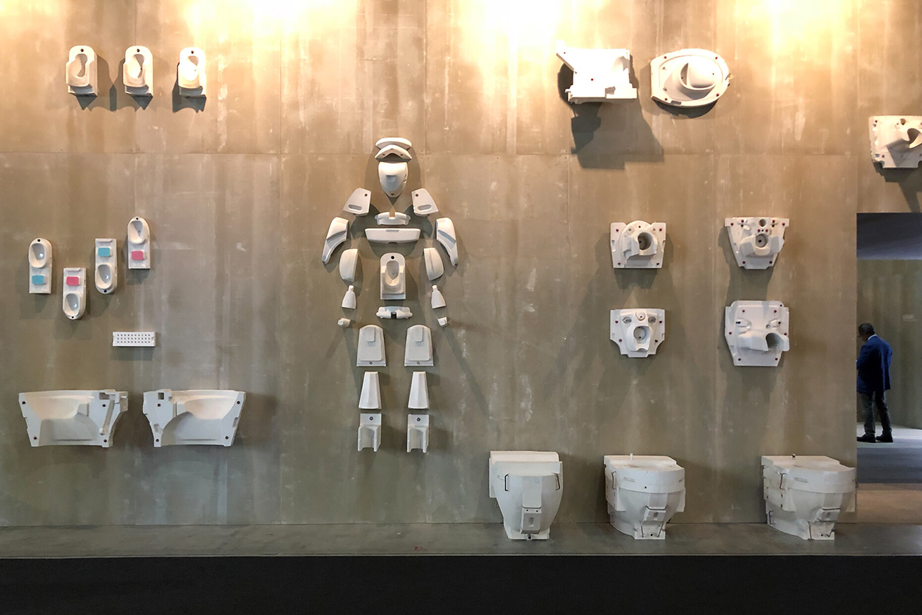
In Hall 24 ceramics specialists Laufen boasted a booth designed by Swiss architects afgh/ Andreas Fuhrimann Gabrielle Hächler – the preference for fair-faced concrete manifest there has strong roots in modern Swiss architecture. On two of the outer sides, industrial high-bay shelfing elements presented some of the long-standing company’s molds for classical and current products, while the two other sides displayed white ceramic products against naked concrete walls as playful reliefs. Inside, the concrete contrasted with the cells, each in a vivid color, in which the different product series were on show. The only superfluous item: the somewhat silly toilet-bowl fountain in the center of the booth.
Downsizing
The three new modular sofas presented at the Salone are all representative of this focus on revisiting the design tradition of Central European Modernism. They are all well-devised seating, resting on concepts that seek to offer meaningful alternatives to what is currently available. The sofa systems come courtesy of three of the most celebrated contemporary designers: Layer's Benjamin Hubert, Konstantin Grcic and Alfredo Häberli.
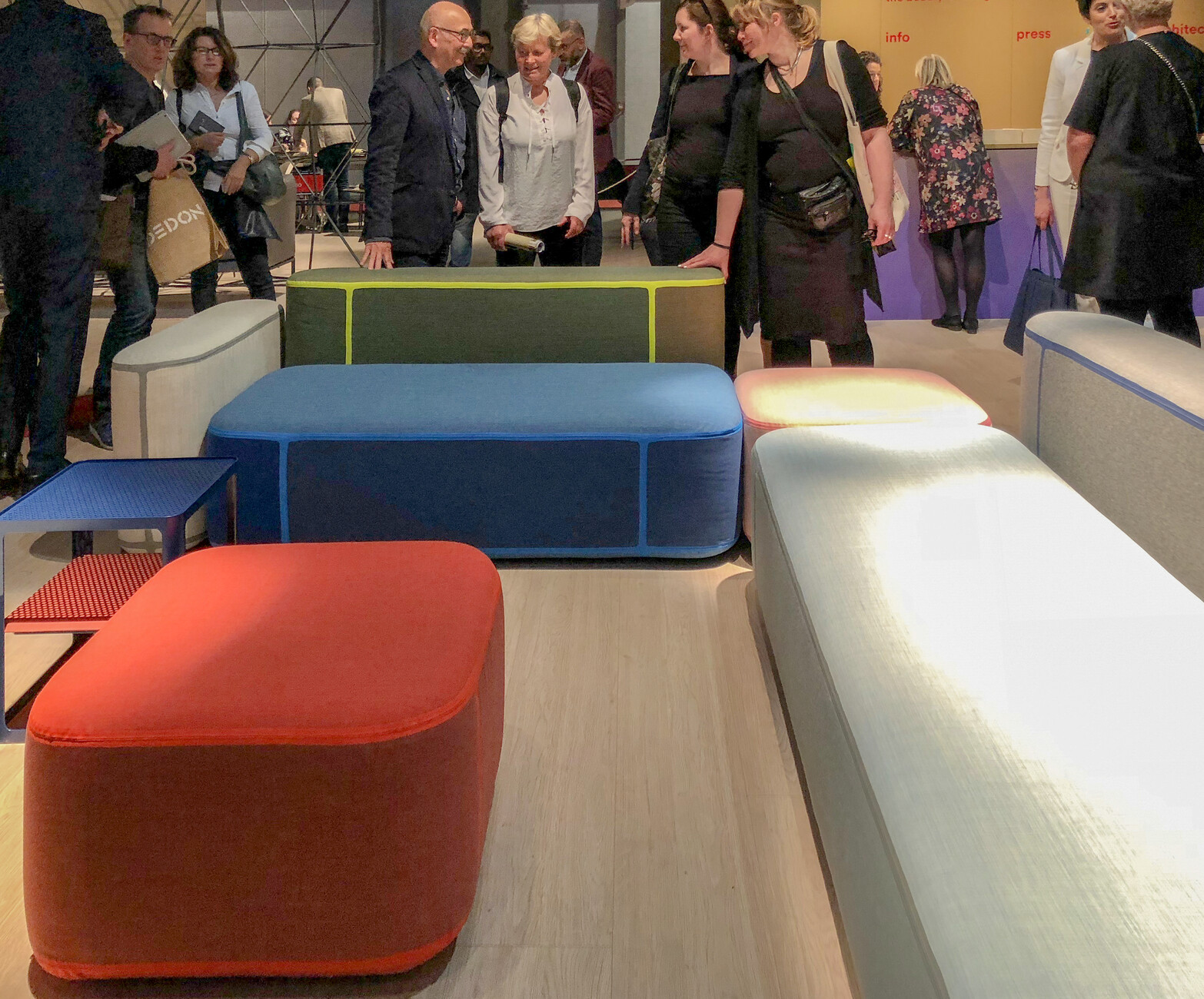
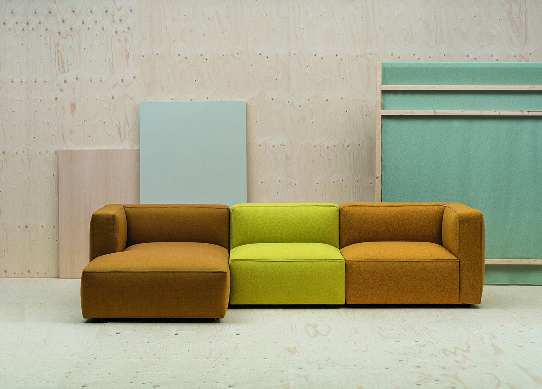
Hubert, one of the most striking figures in the under-40s generation, has achieved not one but two things with “Tape” for Moroso. First, he has dreamed up a decidedly beautiful collection of well-proportioned upholstery elements that can be freely combined to form differently sized seating, reclining and backrest modules. Second, he has developed a sustainable product: This property is directly related to most striking stylistic characteristic of “Tape”, the polyurethane strips that function to glue different pieces of fabric together to form upholstery covers; it is a technique otherwise used for waterproof weather-resistant clothing. This is aesthetically appealing thanks to the color and material contrasts, but above all means far smaller pieces of fabric can be used than is the case for customary covers and thus far fewer offcuts. The prototype on show at the fair was, sadly, not convincingly finished, something that will hopefully have been corrected by the time it goes into mass production.
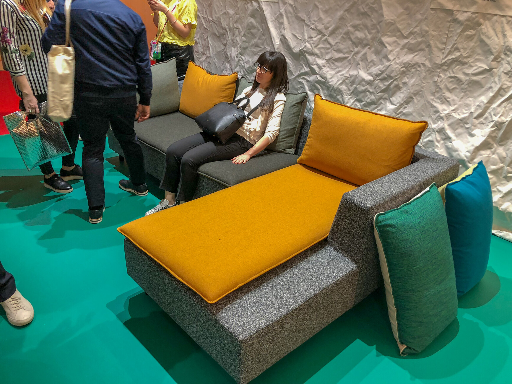
“Barbican” by old master Konstantin Grcic for Established & Sons references Brutalist architecture – and not just by its name: the item can be structured either as a single-piece récamière or in two parts as a corner settee, and features a design that relies strongly on the sculpture-like concrete sculptures of the 1960s and 1970s. In addition to the compact, block-like shape, there’re the obligatory covers with their mottled greys. Only the color of the low upholstery for the seat and the backrest cushions can be chosen. It can be used to create contrasts, but the overall color impression is impervious to the choice. And, finally, for Valencia’s Andreu World Alfredo Häberli has created the modular “Dado” sofa, a very rectangular, calm design, where the refined ingenuity is to be found in the details: The forward seams on the seating upholstery are double-stitched and backed by a lining in contrasting fabric that sparkles when someone sits on the cushions and the split seams spread open.
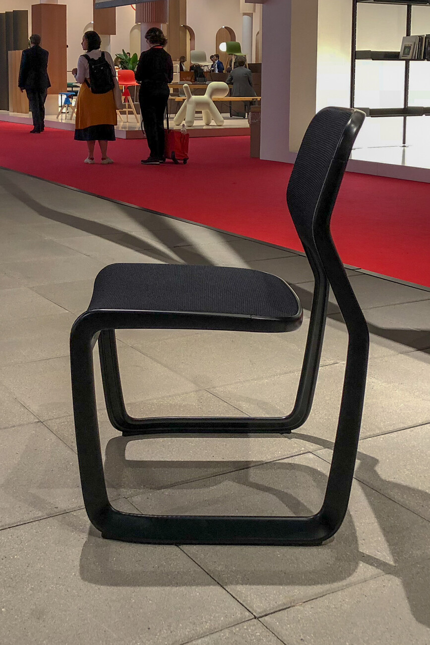
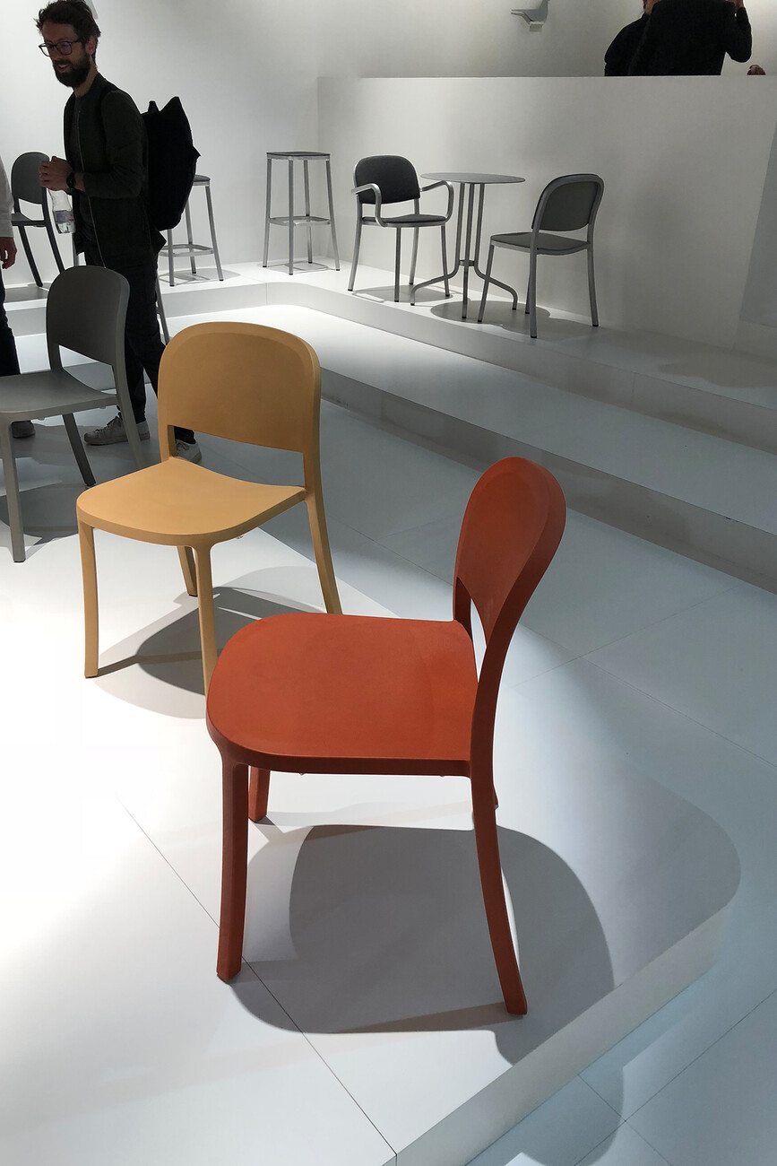
Among the new chair designs there are also some that attest to an approach which has strong roots in the tradition of industrial design. Pride of place here goes to Marc Newson’s “Aluminium Chair” for Knoll, which stems from a clear inquiry into the potential of the cantilever even if the result is untypically heavyweight. Last year, Emeco presented Jasper Morrison’s “1-inch Chair”. Morrison had deliberately reduced the thickness of the aluminum, although this made the chair difficult and expensive to produce. Emeco is now fielding a plastic version of the chair that it says will cost less than 200 euros. And that’s not all: The new material actually makes the design look possibly better than it did with the aluminum frame. For the colored plastic lends the design a uniformity that the metal version perhaps lacked somewhat.
Storing content
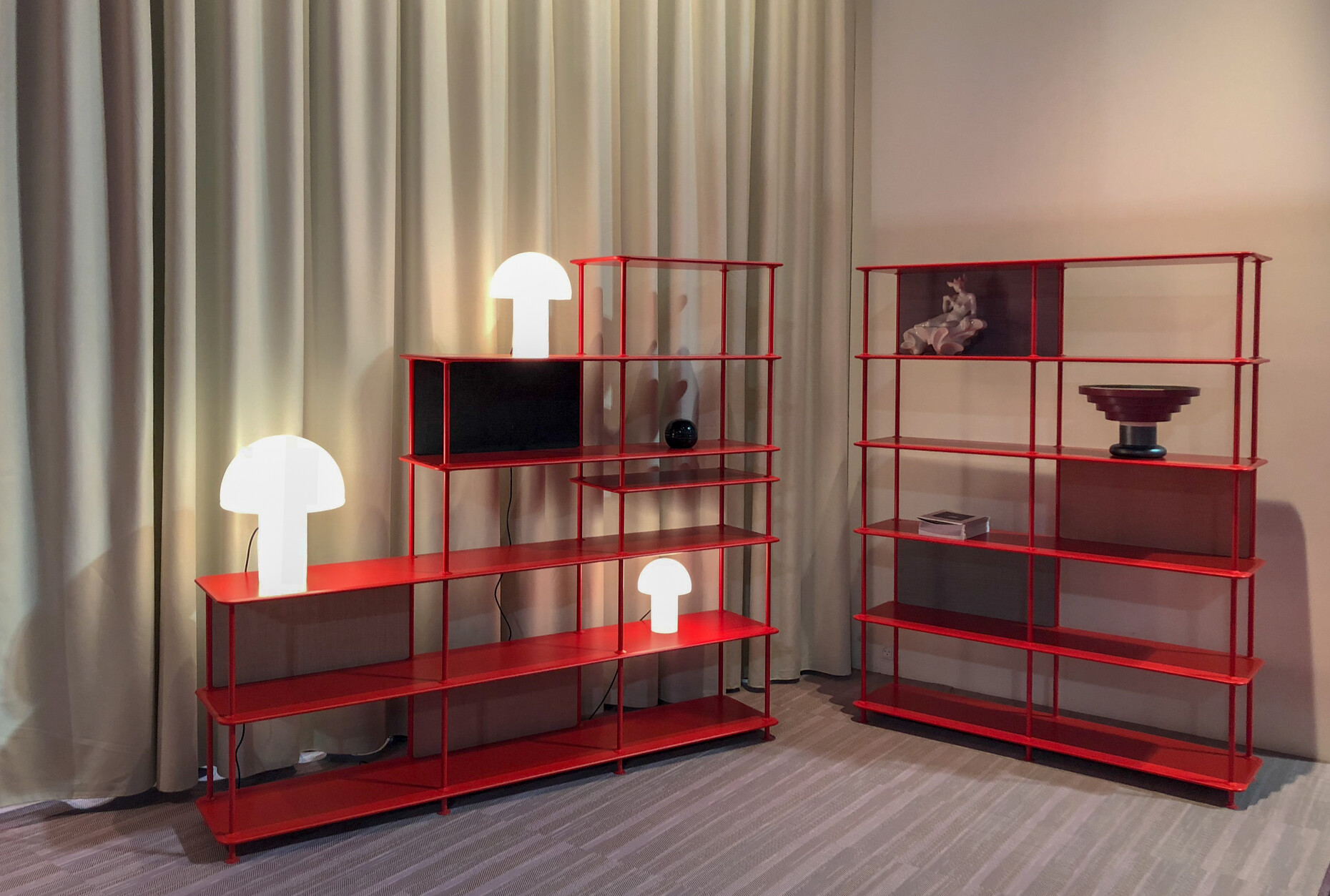
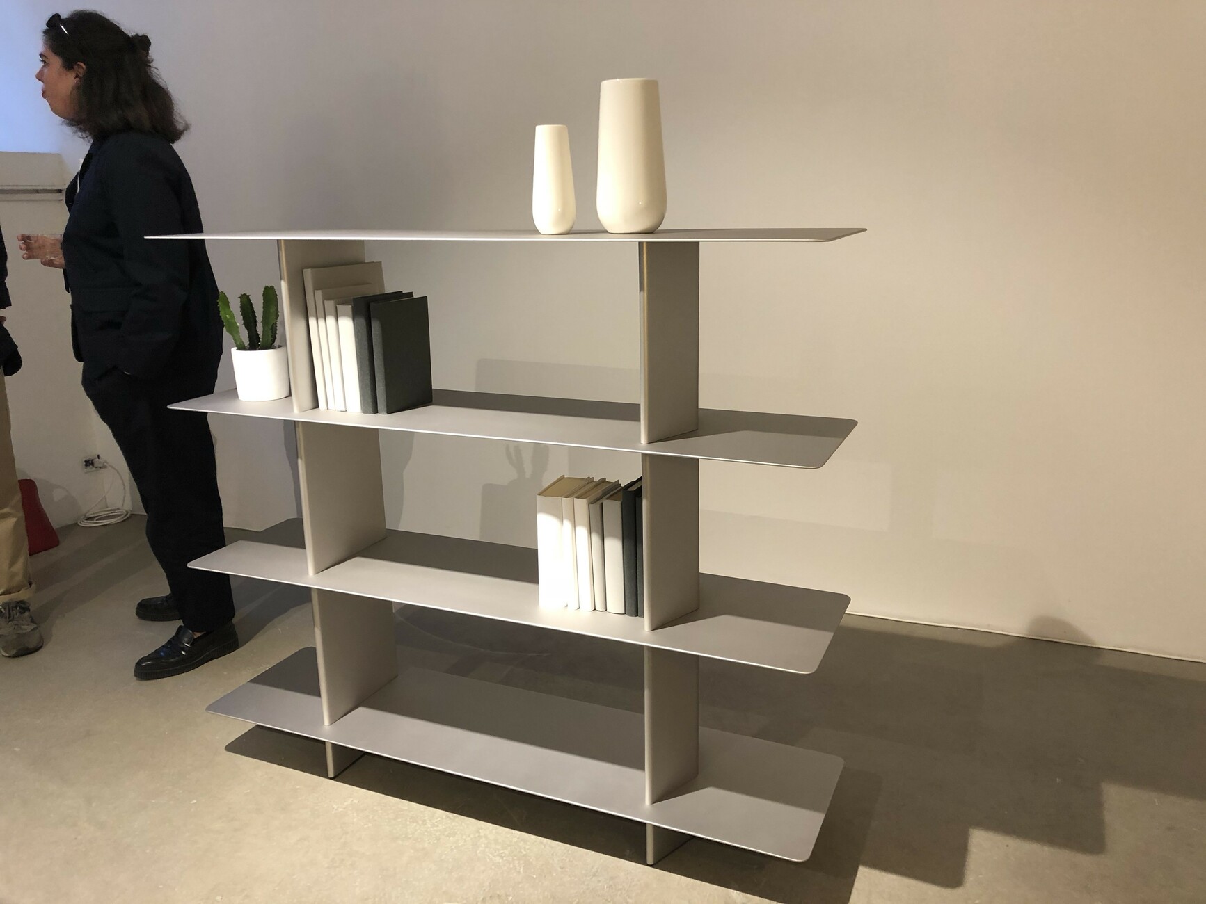
A few years ago, Interlübke presented a shelving unit for homes that resembled a printer’s type tray: The idea was to display objects instead of tucking them away. An innovative product, so one thought, as in future Ebooks would make bookcases superfluous. Others seemed to have taken a similar approach. And thought wrong, as we now know. Shelves and shelving systems are booming again, as this year’s Salone impressively demonstrated. In particular, metal shelves are highly popular among the manufacturers in 2018. Stefan Diez evidently paved the way with his “New Order” for Hay. Take the “Free” standalone shelf system that Jakob Wagner has developed for Danish makers Montana, which is likewise a metal structure available in many colors. The rounded edges and narrow columns that connect the shelves ensure it exudes a sense of lightness. And the shelves can be closed on one side with fabric-covered tableaus if so desired.
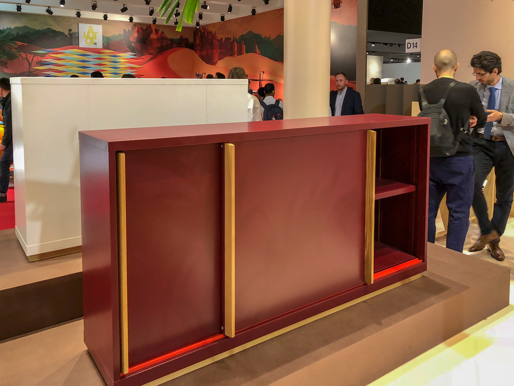
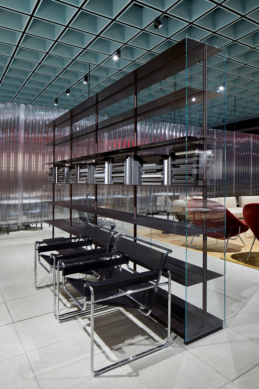
A completely different albeit at least equally refined interpretation of this idea: Piero Lissoni’s “Red Baron” for Knoll. Made of steel and anodized aluminum, the unit was evidently inspired by the triplanes of yore. The feel of the materials gives the unit a solidity that is even emphasized when it boasts a chestnut frame or glass fronts. Metal’s sculptural qualities are especially beautifully foregrounded in Jun Yasumoto’s shelfing family “Piani”. It is somehow reminiscent of Konstantin Grcic’s design for the “Pallas” table 15 years ago. Grcic himself has a metal storage system on show at the fair. His “Chess” cupboards, which he developed together with Magis, are based on a mass-produced workshop furniture system that has been “pimped”, as it were, with wooden elements for residential and office purposes.
Returning
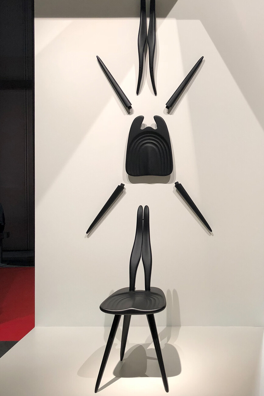
The topic of re-editions remained on the agenda at this year’s Salone. Molteni has re-issued Gio Ponti’s D.859.1 table, the next item of furniture by the designer of the century. The monumental table may not quite possess the poignancy of the D.156.3 armchair re-introduced last year, but is perhaps all the more marketable as a consequence. Zanotta has been especially diligent as regards re-editions: it has re-included various items in its line to mark the 100th anniversary of Achille Castiglioni’s birth, first and foremost his marvelous “Albero” plant stand. Likewise, two pieces by Carlo Mollino have been brought out again: “Carlino”, a delightful small lectern from the 1930s and “Fenis”, a chair sculpture dating from 1959.
