Signs of the time
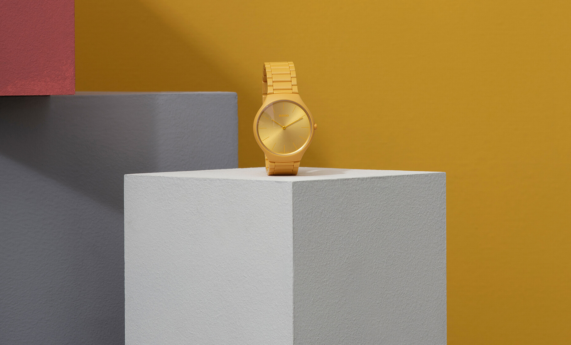
The first year may be over but we are still in the early 2020s, a decade that went by many names in the last century. While here in Germany it was christened the “Golden Twenties” in France, Italy and England people speak of the “crazy” or even "roaring” Twenties. It remains to be seen which terms or images will remain in our memories. Founded 1917 in Lengnau, Rado, which started out as Schlup & Co. explored these and similar questions at an early stage: How do you describe, interpret and shape time? They have always engaged creative minds from art and design to answer such questions. In 1987, shortly before he died Andy Warhol created images of a wristwatch. They depict the Rado “Anatom” in the artist’s signature garish tones and Pop Art style. And 2019 saw the launch in color of the “True Thinline Les CouleursTM Le Corbusier” a nine-part series that exploits what is possible with ceramic and stands for an interdisciplinary approach. “Rado has always sought its inspiration outside of the watch industry,” says the company that can claim to having won a large number of design prizes and itself hosts design competitions for young designers.
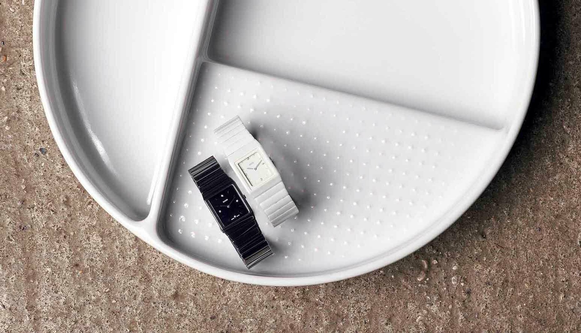
One of the awards was won by the redesign of “Ceramica” created by Konstantin Grcic in 2016. The German industrial designer reinterpreted the austerely geometric models to create a monochrome, minimalist timepiece that comes either studded with diamonds or with silver-colored details. A few years earlier, the same watch appeared much more subtle. While designer Jasper Morrison described the watch as having a “sporty and slightly digital character”, Rado believes it reflects the recession that was very dominant then (2009). “The ‘R5.5’ mirrors the times for which it was developed but also the simpler, more low-key style that was gradually asserting itself,” explains the long-standing watchmaker.
Time for something new
For the reedition of the “True Square”, Rado commissioned no less than four designers and designer teams: Formafantasma, YOY, Thukral & Tagra and Tej Chauhan each came up with their own novel take on the ceramic timepiece with the square face. And while their individual designs are very different, each toys with images of the future and past. And whet our appetite for what is to come.
True Square Undigital
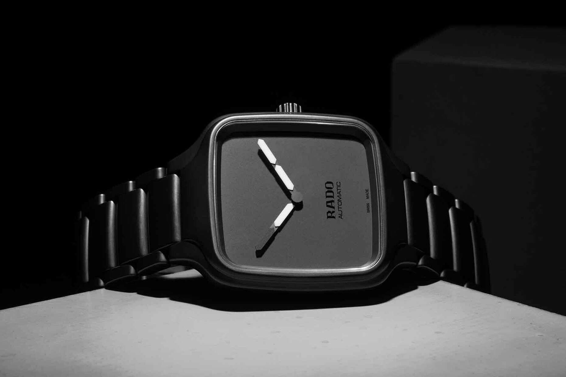
An analog watch in a digital look was the aim of Naoki Ono und Yuki Yamamoto. The creation by the Tokyo-based product designers from YOY seeks to create an antipode to the increasingly digital nature of our world in which products normally morph from the analog into the digital. The white hands of the Undigital watch form a stark contrast with the rest of the watch which is in black; they are reminiscent of the bars used in digital watch displays. With this feature the young Japanese designers have produced a humorous interpretation of this Rado classic. Founded in 2011, the studio normally designs home accessories, furniture and luminaires. But their previous designs also included a wall clock. With this wristwatch – it boasts a case and strap made of ceramics – they have now produced an object that is very close to the wearers and according to Yamamoto feels comfortable next to the skin.
True Square Formafantasma
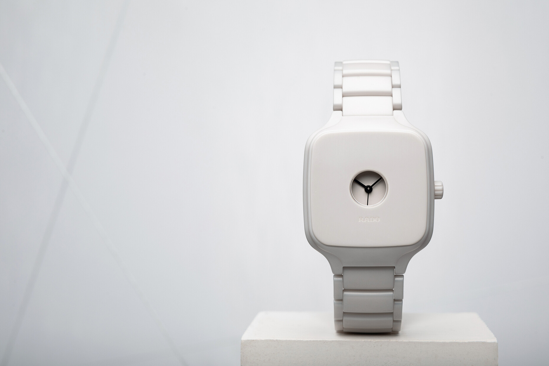
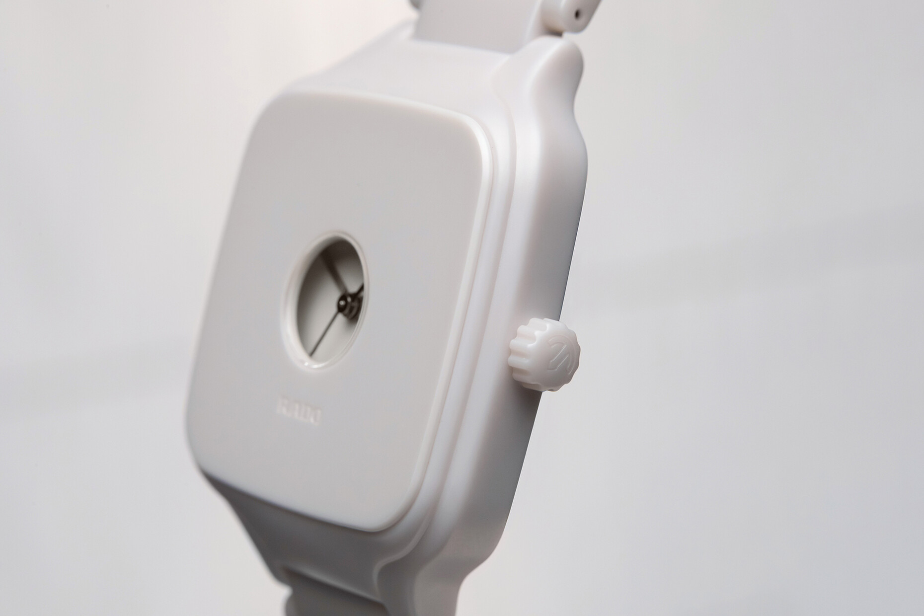
Andrea Trimarchi and Simone Farresin, two graduates from the Design Academy Eindhoven, made a name for themselves early on through their unusual experiments with material. As Formafantasma the two Amsterdam-based Italians have so far created tableware from food, luminaires from cow bladders or hot-water bottles from fish skin. For Rado they have designed a watch made of ceramic, a material that is central to Rado’s work that was once used in medicine and space travel, and boasts special material qualities: hard, light, scratch-proof – and in this case extraordinarily elegant. In design terms “True Square Formafantasma” recalls classic pocket watches. In the center of the square face with rounded edges there is a small, round window revealing the black hands. A classic timepiece that could also pass for jewelry.
True Square Tej Chauhan
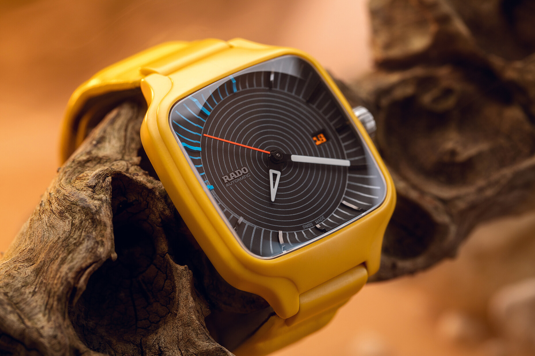
In his collaboration with Rado designer Tej Chauhan (he who has already designed a white car tire with a sneaker sole) came up with a very unusual twist. A glance at the “True Square Tej Chauhan” catapults the observer into the past and the future at once. “We wanted to strike a balance between something contemporary and something traditional,” says Chauhan who divides his time between Helsinki and London. Pop culture and science-fiction movies provided him with the inspiration for a bright yellow housing and a circular patterned face with blue and red details. While like all the other fresh interpretations in the series it was realized in ceramic Chauhan wanted to create a tactile sensation for the strap and had it made of a soft, supple quilted leather. And in a nod to the long history of the company a small window on the rear provides a glimpse of the watch’s movements.
True Square Over the Abyss
Typically, the Indian artist duo Thukral & Tagra focuses on painting, sculpture and installations. The two develop richly detailed, surreal landscapes and objects that appear to float completely unconnected from time and space and are intended to depict a vision of the future. This is also the case for their watch design for Rado entitled “Over the Abyss”. For the Swiss firm, Jiten Thukral and Sumir Tagra, who are based in Delhi, came up with a colored face featuring motifs from their ongoing current series of paintings entitled “Dominus Aeries”. With the hands they wanted to create a reference to the world’s different time zones and something unique when the wearer reads the time. Essentially, the dials generate ever-shifting patterns across the watch fac. This makes the watch a playful object that constantly offers something new to discover.
