RETAIL
Flexible Shelf
Anna Moldenhauer: Mr Dunkl, why does a furniture store's architecture now have to be able to do more than just underpin product presentation?
Jakob Dunkl: Department stores always have to be able to do more than fulfil a core purpose alone, also with a view to history. Harrods department store in London and the Galleria Vittorio Emanuele II in Milan are shopping meccas that could both have been simpler, cheaper and more rational. The classic "Potato Field-IKEA", a building constructed on a field at a motorway junction, doesn't involve much architectural ambition. The approach to the building in Vienna was completely different: IKEA used the idea of “being a good neighbour” as a guideline. This was remarkable, because being a good neighbour makes a very radical demand on architecture. But the concept was very well received by the local population: Instead of questioning such a large-scale project, the citizens as well as their various initiatives and the city could hardly wait for it to be finished. There's even a “fan club” for the building on a social platform. It's very rare indeed that citizens love a modern building that much. This makes us extremely proud, however, as does the positive response we get from professionals. I think that if, as a brand, I'm a good neighbour, it rubs off on the company's corporate image in general. Visitors tell each other about the great views from the roof terrace or from the restaurant. People come by just because of the building. In the past, it was considered to be enough to erect yellow and blue boxes somewhere in the landscape, but today you have to do a much more than that – if for no other reason than to make your own employees happy. There are many aspects to making such a decision.
Why did you choose Vienna'a Westbahnhof for the project?
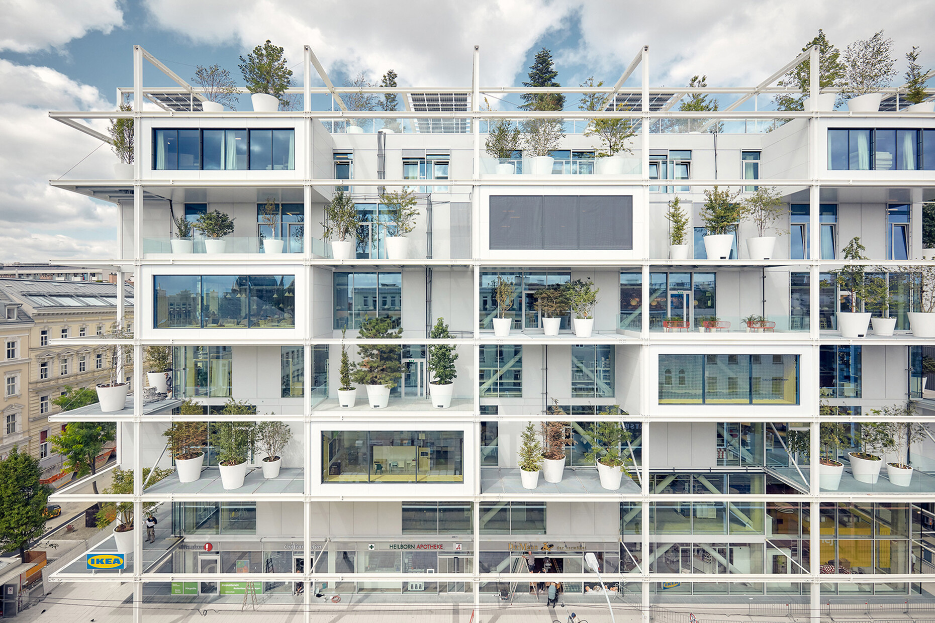
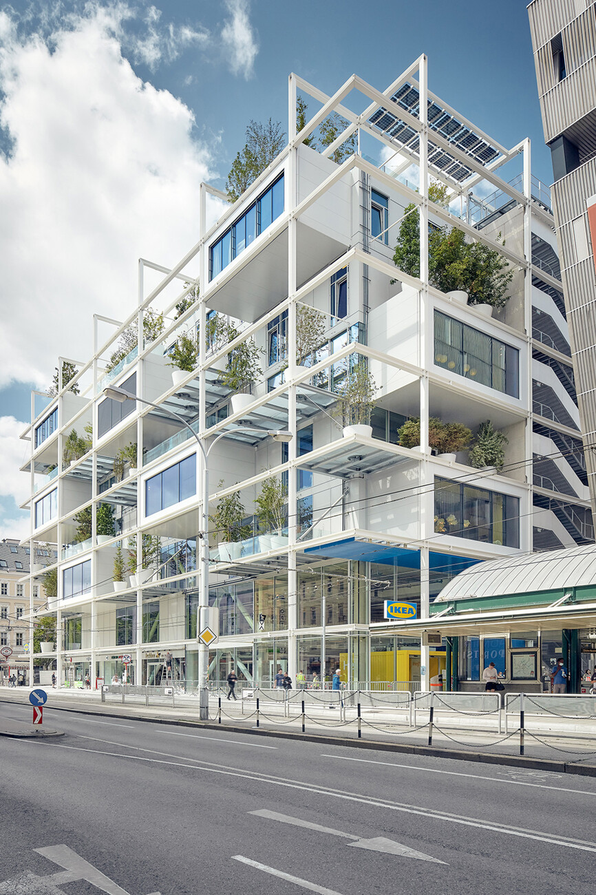
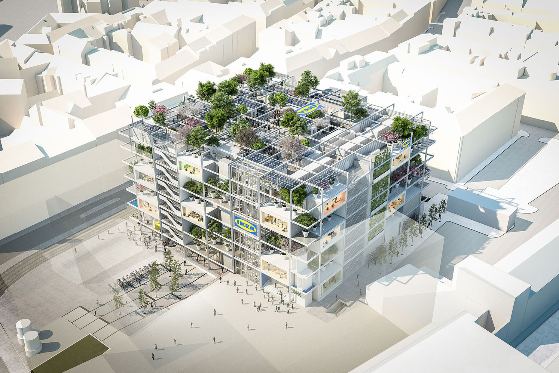
Jakob Dunkl: IKEA chose the site and held a competition for the design of the building. The original plan was for a building on pillars, above the tracks, which would have provided 750 parking spaces on several parking decks. The City of Vienna rejected this and chose a nearby, approximately 60 x 70 metre building site instead, upon which a Gründerzeit building stood. The existing building had two small courtyards, where each space was separated from the other by a brick wall – a completely unsuitable site for the proposed land use. We usually try to preserve existing buildings as much as possible, but in the course of a project like this we assumed a role in changing the large company's orientation, so that in the end demolition was the right thing to do. The important thing was that if we put a new building on this site, it had to be valid for the next few decades. Our project is quite simple in form, with the shell consisting only of ceilings, supports and crossbeams, similar to a classic IKEA shelf. This structure is flexible and can be used for other purposes in the future. Thinking about something like this is now essential.
You fought for every centimetre during construction: The concrete ceilings are only 30 centimetres thick, and a multi-layered flooring system was dispensed with in order to gain more space. On the other hand, the walls of the core building were moved in by over four metres to create a usable outdoor zone. How does this all fit together?
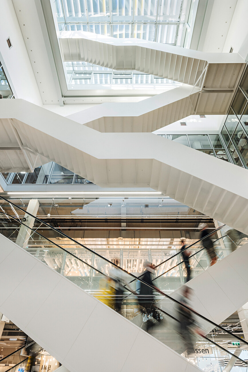
Jakob Dunkl: A very good observation. In the team we discussed what it means for us to be a "good neighbour" through the use of a building. This could be by giving citizens the right of co-determination, but also by making the building a little smaller within the urban space to allow people more light, air and sun. Trees in the façade are also unusual – green façades are increasingly discussed, but the number of buildings with trees in their façades is still comparatively small. The site also has a certain gross floor area limitation. We then had the idea to build one storey more than our competitors, which allowed us to move the facades back 4.30 metres on all sides. This also has advantages for the users, because instead of airlocks and pressurized stairwells, you're out in the fresh air more often when you walk through the building. The space is thus used more efficiently. On the south side, where the tram runs, the city also stipulated the creation of a 4 x 4 metre arcade area. Instead of a half-closed arcade, we created an open version, which immediately makes a different impression. The whole shell itself is rather simple.
Goods are delivered inside the building via a truck hub – how did this factor influence the architecture?
Jakob Dunkl: Turntables are common in loading zones, because without them it would be more difficult to get the trucks to their respective loading bays. Thanks to the use of an interior turntable, we were able to increase efficiency and make the entrance gate narrower. In addition, the turntable protects passers-by outside the building from problems caused by exhaust fumes. It's also safer for everyone that the truck drivers can always drive forward, both when entering and when leaving the building.
Why did you decide on mixed use on the lowest levels, including a hostel and other shops?
Jakob Dunkl: On the one hand, mixed use underscores the desire to be a "good neighbour", while on the other hand the City of Vienna wanted to integrate existing shops into the new concept. IKEA also supports a hybrid mix in the building, as it helps make everything more vibrant.
An underground line runs under the site. How did you deal with this challenge?
Jakob Dunkl: You're absolutely right, the underground was a big challenge. The line runs diagonally under the site, and the existing building was already there when it was constructed. The loads, including pressure exerted by the groundwater, had balanced each other out for decades because of this construction. In order to demolish the old brick building without disturbing this balance, we had to dismantle it piece by piece and pour a concrete floor slab as we went along. Then, when enough weight had been built up, another piece of the old building could be demolished. We weren't allowed to start any new construction on the site until this was done, which made the demolition process difficult and lengthy.
Why was the question of a parking area not an issue for you?
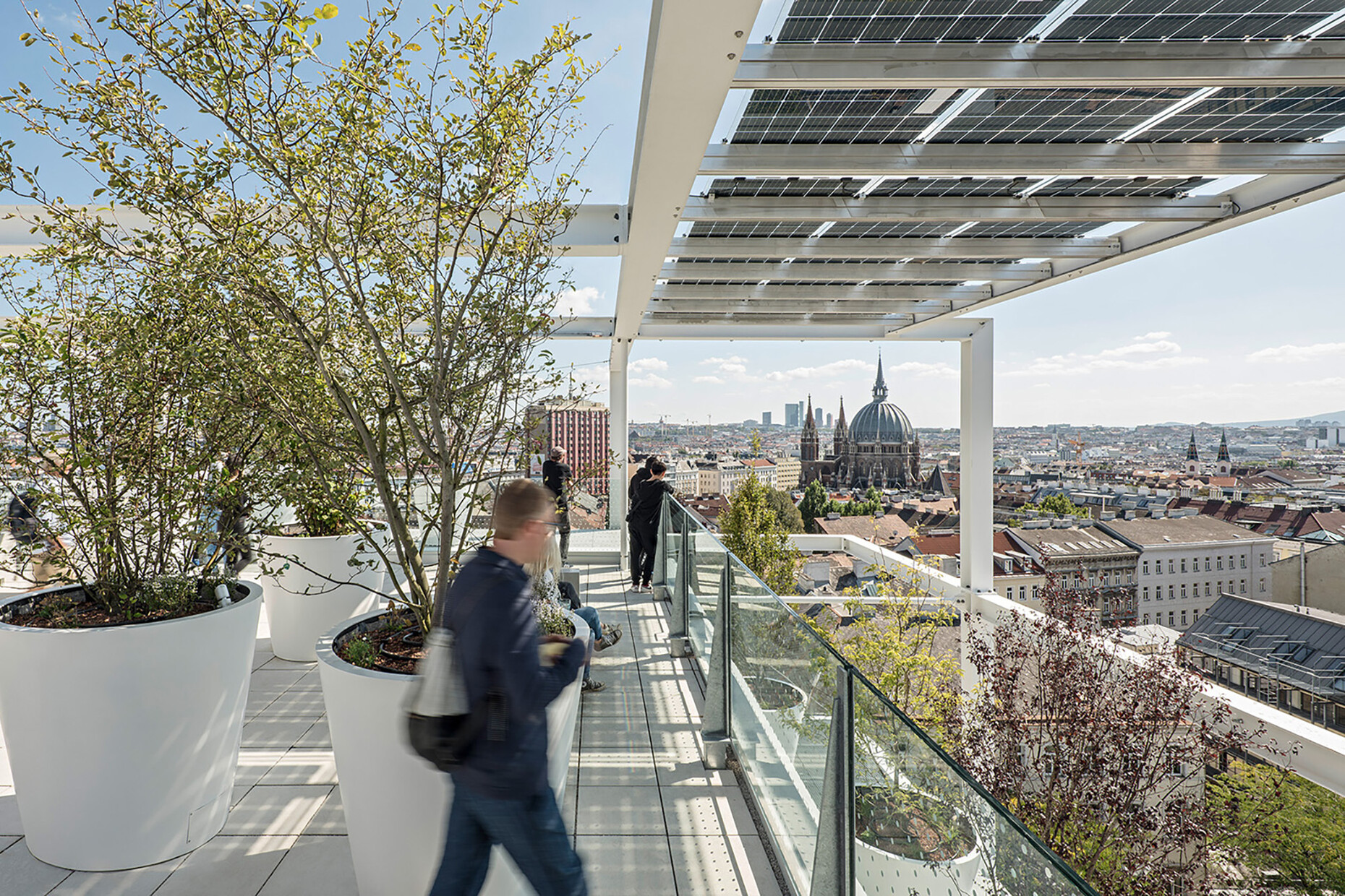
Jakob Dunkl: That wasn't our decision to make. Absurdly, the Viennese building code requires the construction of parking spaces for new buildings, because the current Reichsgaragenordnung (federal parking regulations), which was introduced by Hitler to boost mobility, is still in place today. IKEA thus had to pay a fine for failing to put in any new parking. Incidentally, the push to do without parking spaces did not come from Sweden but from Austria. IKEA's expansion manager spent three years persuading the board of directors before it was possible to build a car-free IKEA. Two important core aspects were agreed upon with the city of Vienna: Being “car-free” is stipulated in the urban development contract, as is the building's hybrid use with its freely accessible, 2,000 square-metre roof terrace. I still find it remarkable that it was possible to keep so much space free for the public despite all the building services. And it's proved to be very popular.
The building has already been awarded the British BREEAM sustainability certificate and the Greenpass, among others – how difficult was it to actually put these requirements in place?
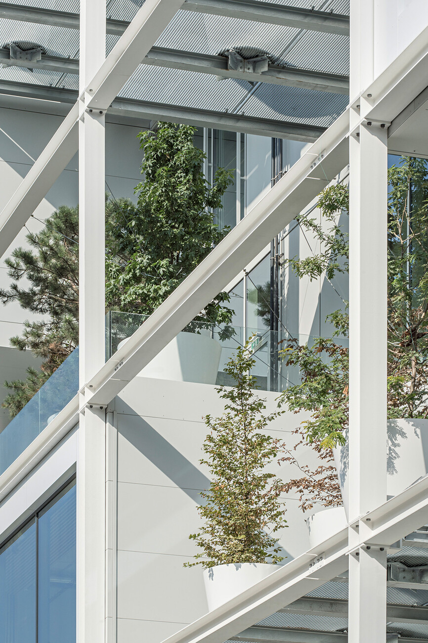
Jakob Dunkl: Not particularly difficult. Such shopping meccas usually have huge entrances to draw customers in. But in doing this, you heat the area in front of the building in winter and in summer large quantities of cooled air can escape. Our entrances are very compact airlocks where hardly any energy can escape the building, and by not having ceilings with a multi-layered structure, both the cooling and heating can spread out in both directions. We can effectively influence the microclimate in many places, also thanks to the greening of the façade. Compared to the existing brick building, we now have a positive difference of two degrees. With our structure of grates and trees, we provide so much shade that the building doesn't heat up so much in the summer, and photovoltaic panels complement the system.
What criteria did you use to select the plants?
Jakob Dunkl: To decide which plants could be placed on the building, we carried out wind simulations, among other things. In addition to the technical factors, there were also emotional factors: Both the landscape architecture firm Kräftner and their colleagues from Green4cities were inspired by landscape parks in southern Sweden, the home of IKEA. We wanted mixed varieties, very colourful and lively, as well as some conifers so that there is also a bit of green in winter. Furthermore, it was important to us that the plants don't look too perfect, in order to bring a certain looseness into the overall picture. The first thing we had to do once the project started was the planting, as the plants first had to get used to life in the big pots before they could be integrated. At the time we were in lockdown due to the pandemic, so we had video conferences with the nursery. The 1.2 million euros for trees, special troughs and an irrigation system was a huge cost factor and I find it remarkable that IKEA didn't try to cut any corners on this.
The pots and an integrated irrigation system were also specially developed, weren't they?
Jakob Dunkl: Yes, the pots are custom-made. While discussing costs, we proposed making them square, which would have been less expensive. But luckily the project planner from IKEA opposed this and was in favour of the more "friendly planters" with their round shape. The result is much more harmonious.
Critics of green facades often say that greening buildings shades the rooms too much and also attracts vermin. What's your take on this?
Jakob Dunkl: How sterile do urban dwellers want their cites to be? Our building increases biodiversity in the city and makes it easier for swifts and bees to thrive and flourish here again. Trees can develop wonderfully when placed on a building; they don't grow taller, but they do become more voluminous. You can see how wonderfully they help create a pleasant atmosphere at the city's Hundertwasserhaus.
Do you plan to transfer what you've done here to other countries, as a kind of case study?
Jakob Dunkl: That's certainly a desirable goal, but so far IKEA hasn't said anything about this happening. We think our buildings could do with a second sphere, a second “aura” that helps to better regulate the distribution of energy. Balconies as parts of buildings used to only be an architectural feature on buildings where wealthy citizens lived, but now they're also used on office buildings. There's no reason not to add them to retail buildings as well. And IKEA has always been progressive, for example founder Ingvar Kamprad's idea of having restaurants in department stores – because hungry customers tend to buy less. The need to get some fresh air while shopping is a similar idea. And in evolutionary terms, it's also much more logical for people to be out in the fresh air more often instead of being shut up in a building for long periods of time.
