Fluid Spaces
Munich-based interior designer Stephanie Thatenhorst says in an interview that from the very outset everyone involved in the construction project collaborated “simply wonderfully”: the client, the team of the architectural office jacob&spreng, the respective tradesmen, pur natur, and herself. “In a way, everyone is dependent on everyone else; so far our working together has proven to be a great experience on the whole, with collaboration taking place in a very respectful atmosphere and on an equal footing.” And as she and her team were involved in every aspect of planning, it meant they could tell an “individual and highly personal story”, as with the other projects involving Thatenhorst. “Typically, we have a direct and very close connection to our clients,” says Stephanie Thatenhorst, adding: “No matter whether it is a private or commercial project, somehow it is always also ‘our own baby’ and that’s how we treat the whole thing.” She says it’s very important for her to immerse herself in the client’s story and to “reinvent the property”. Her designs are characterized by a high degree of individual subtlety. On the one hand, the works are patently tailored to the respective spaces – and thus also the client’s wishes – but simultaneously they reveal a certain style and specific preferences for a mix of materials and colors across various epochs.
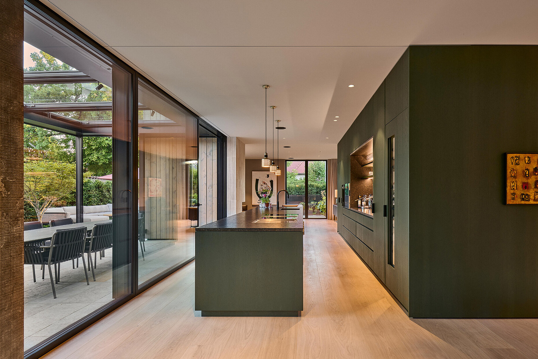
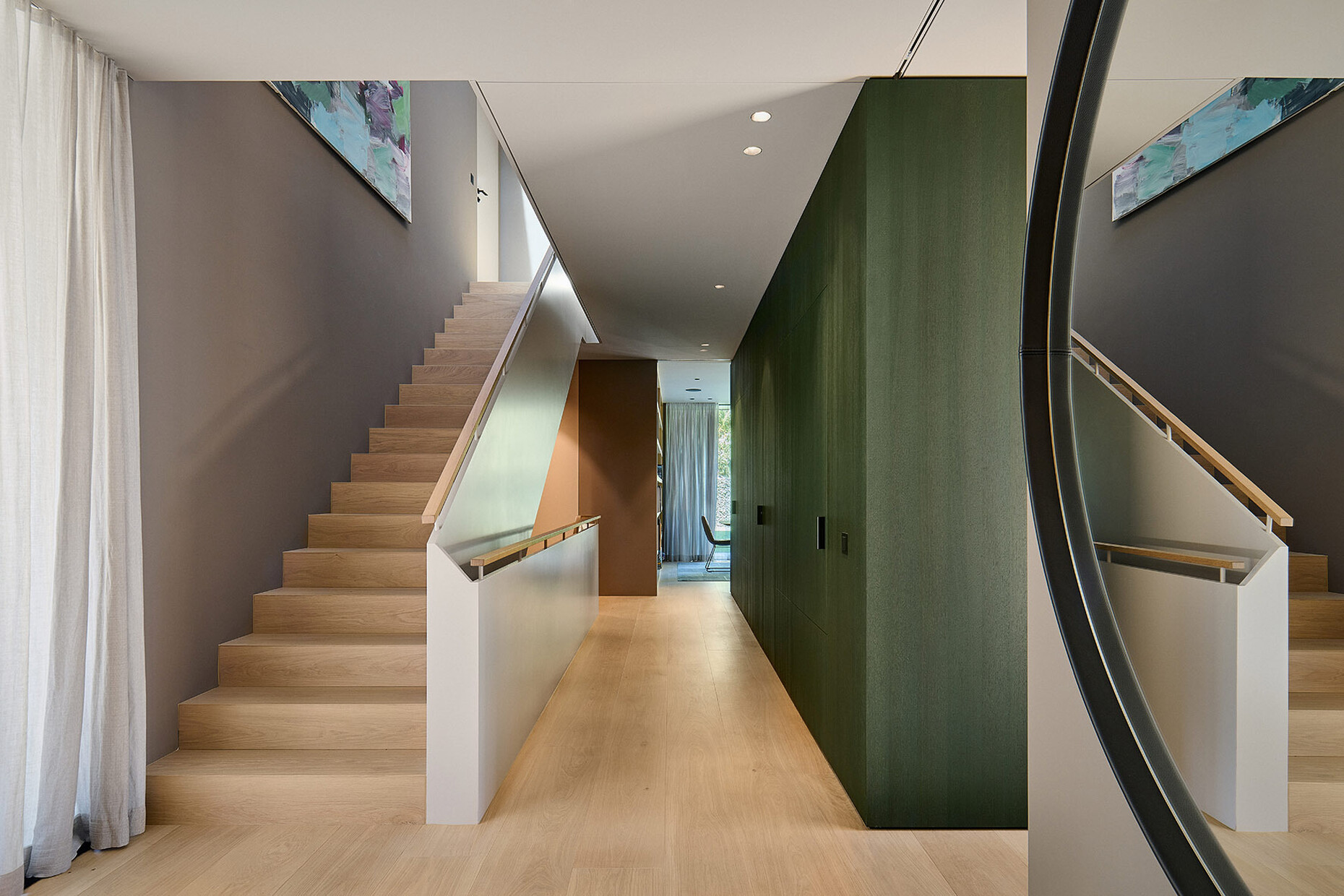
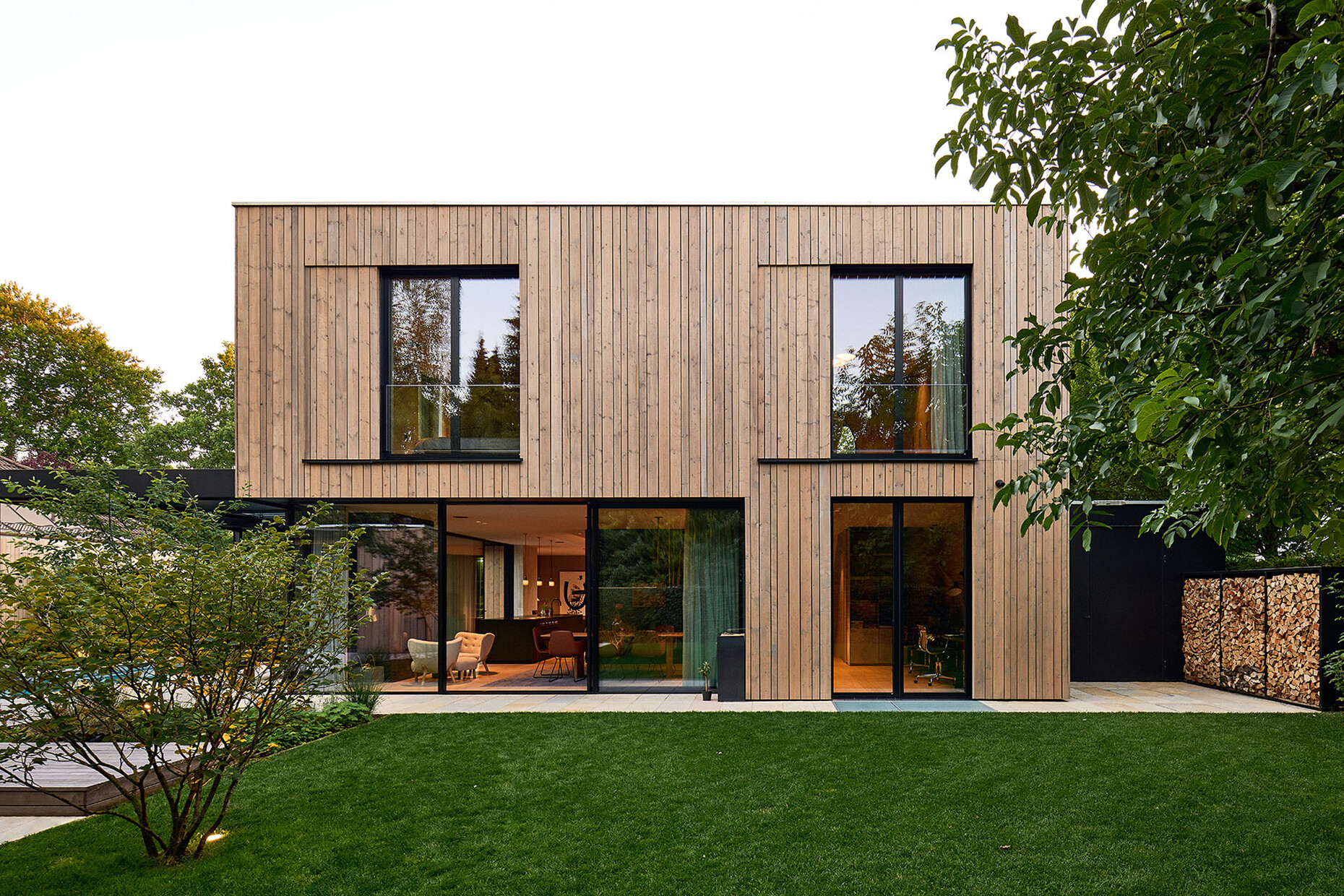
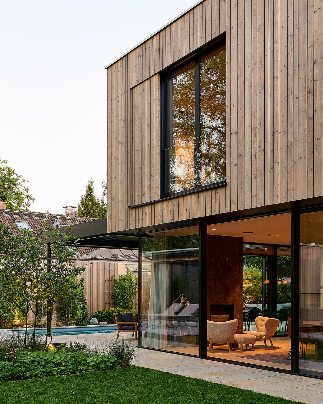
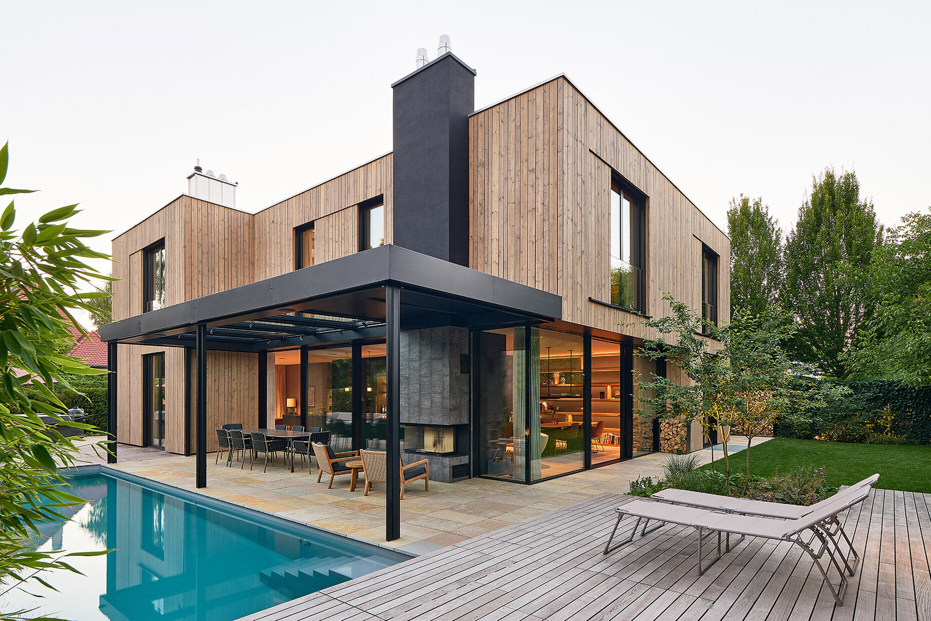
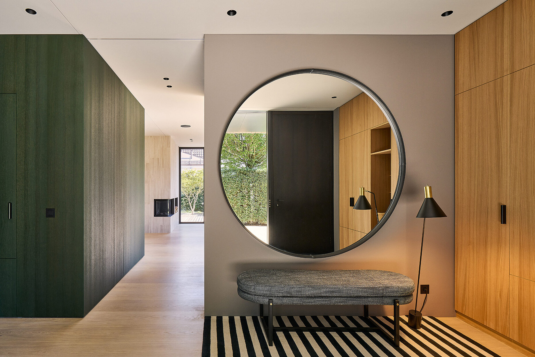
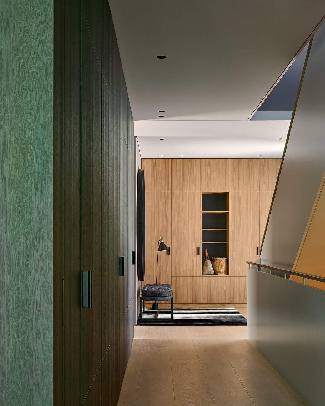
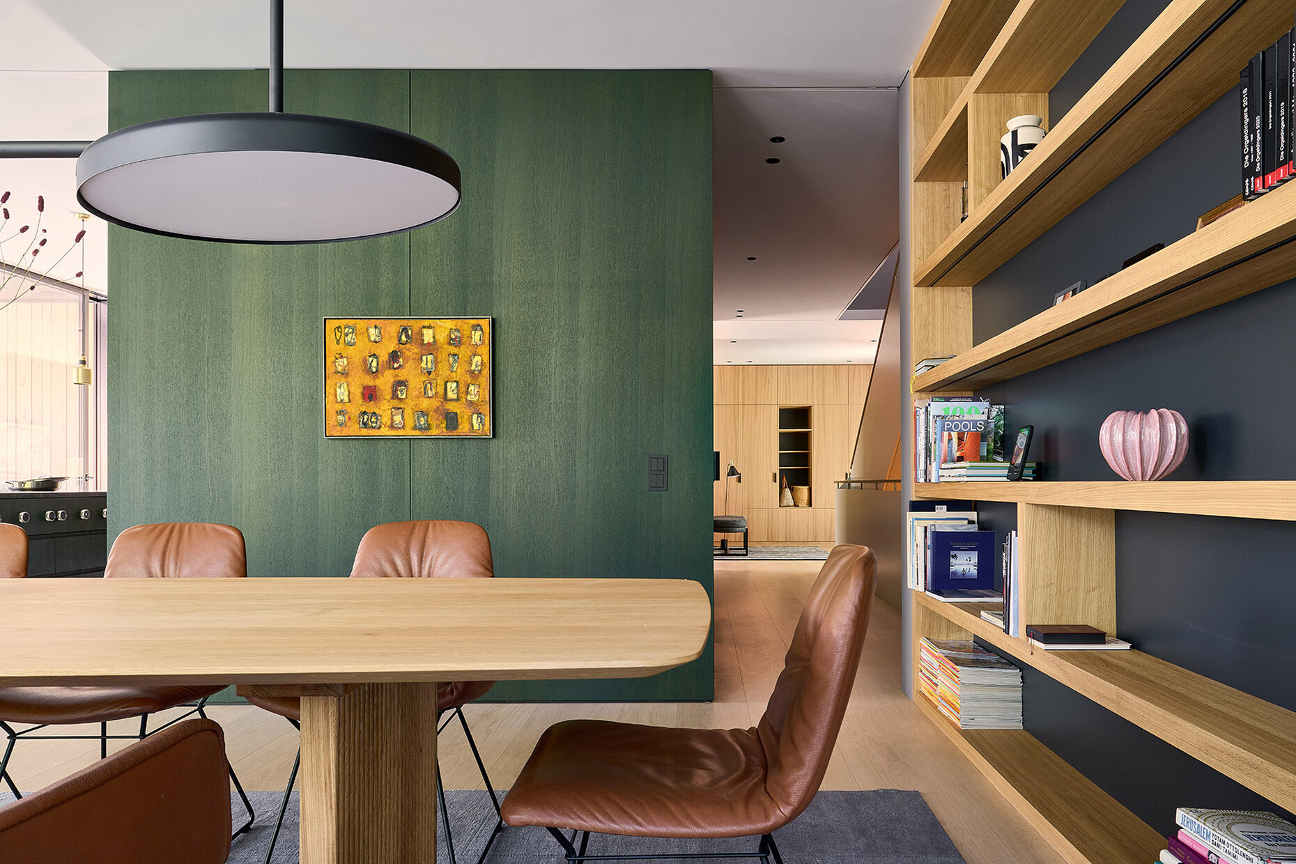
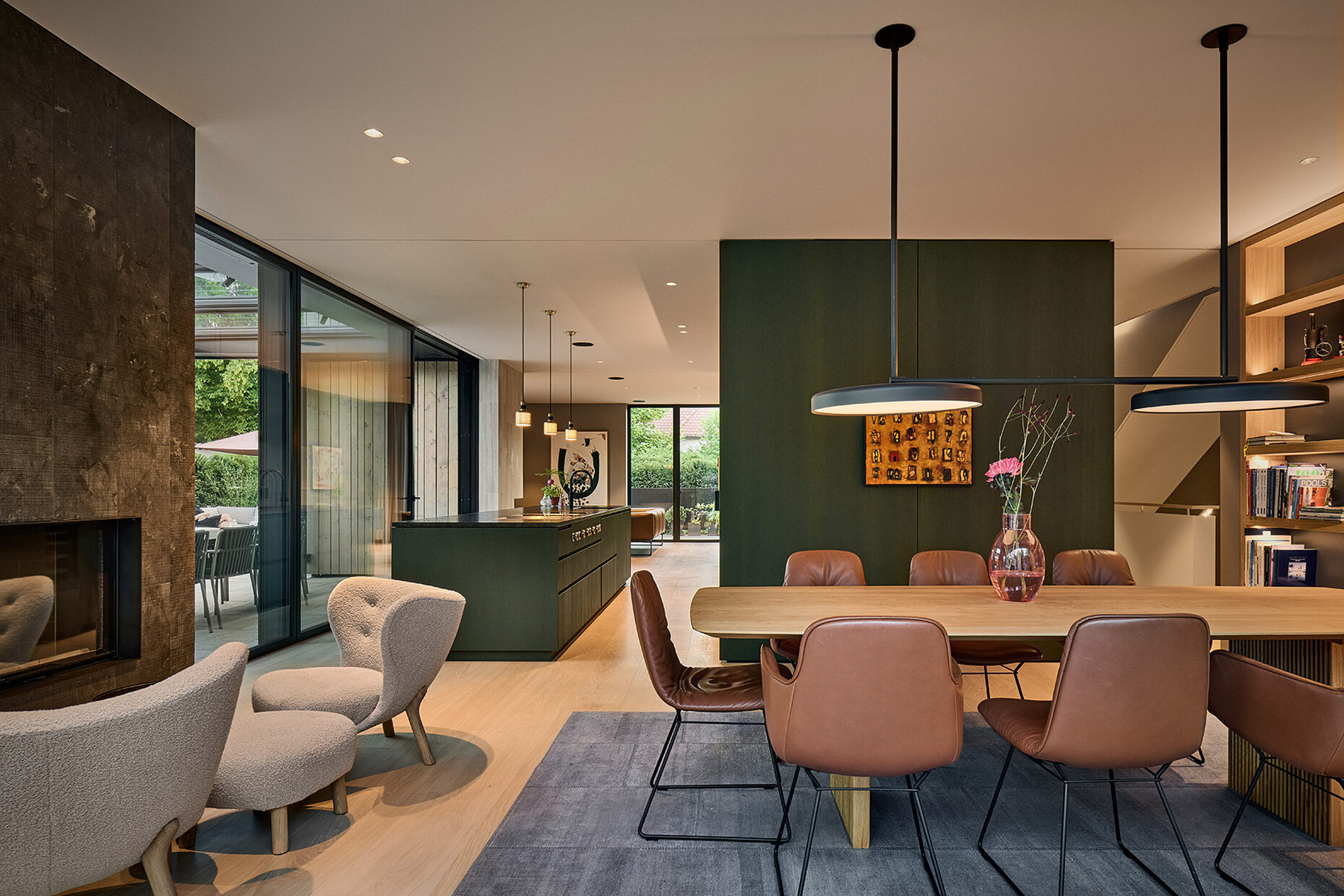
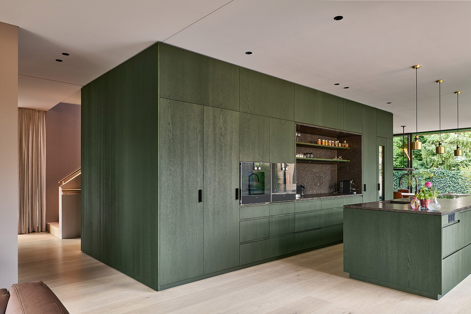
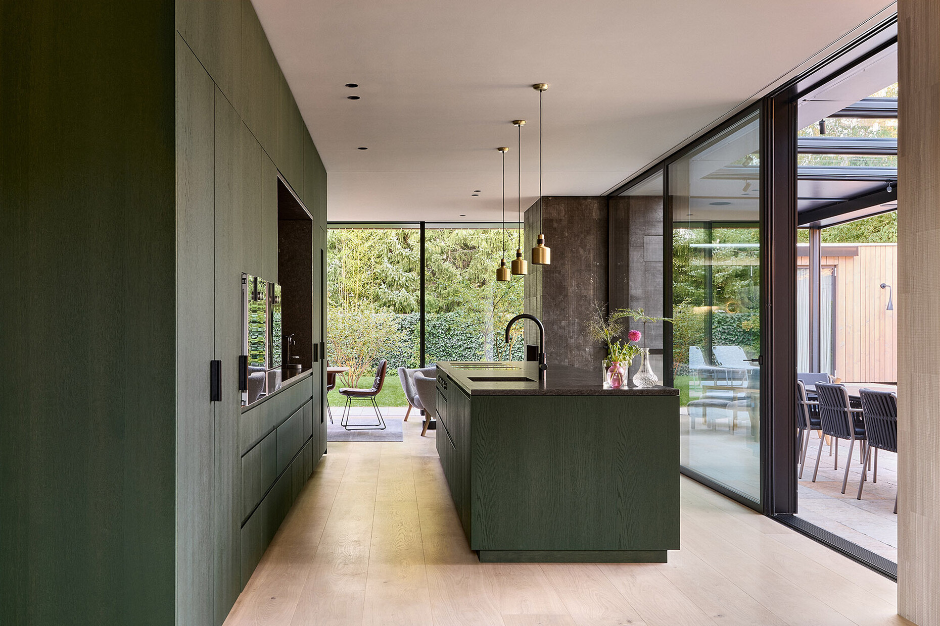
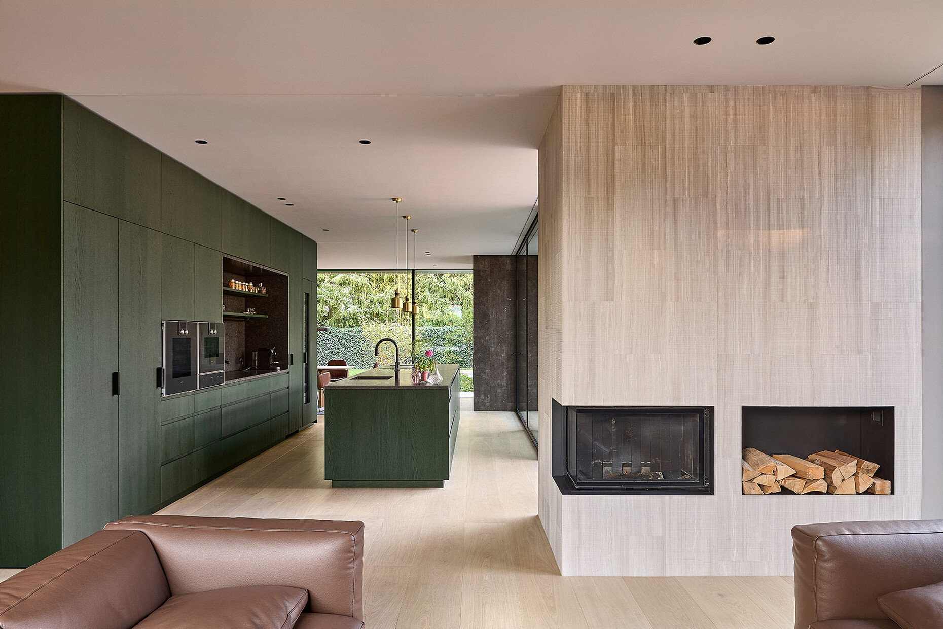
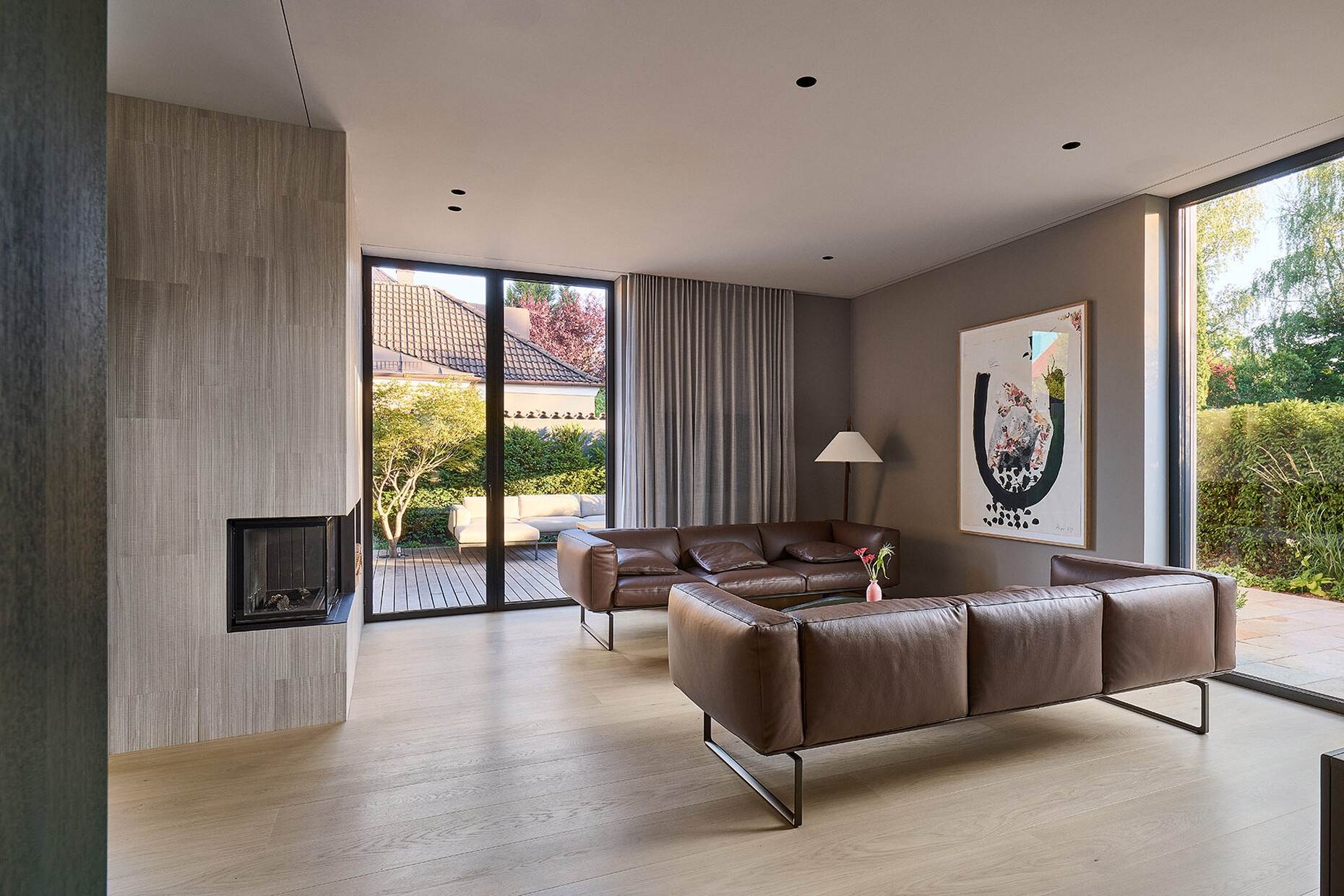
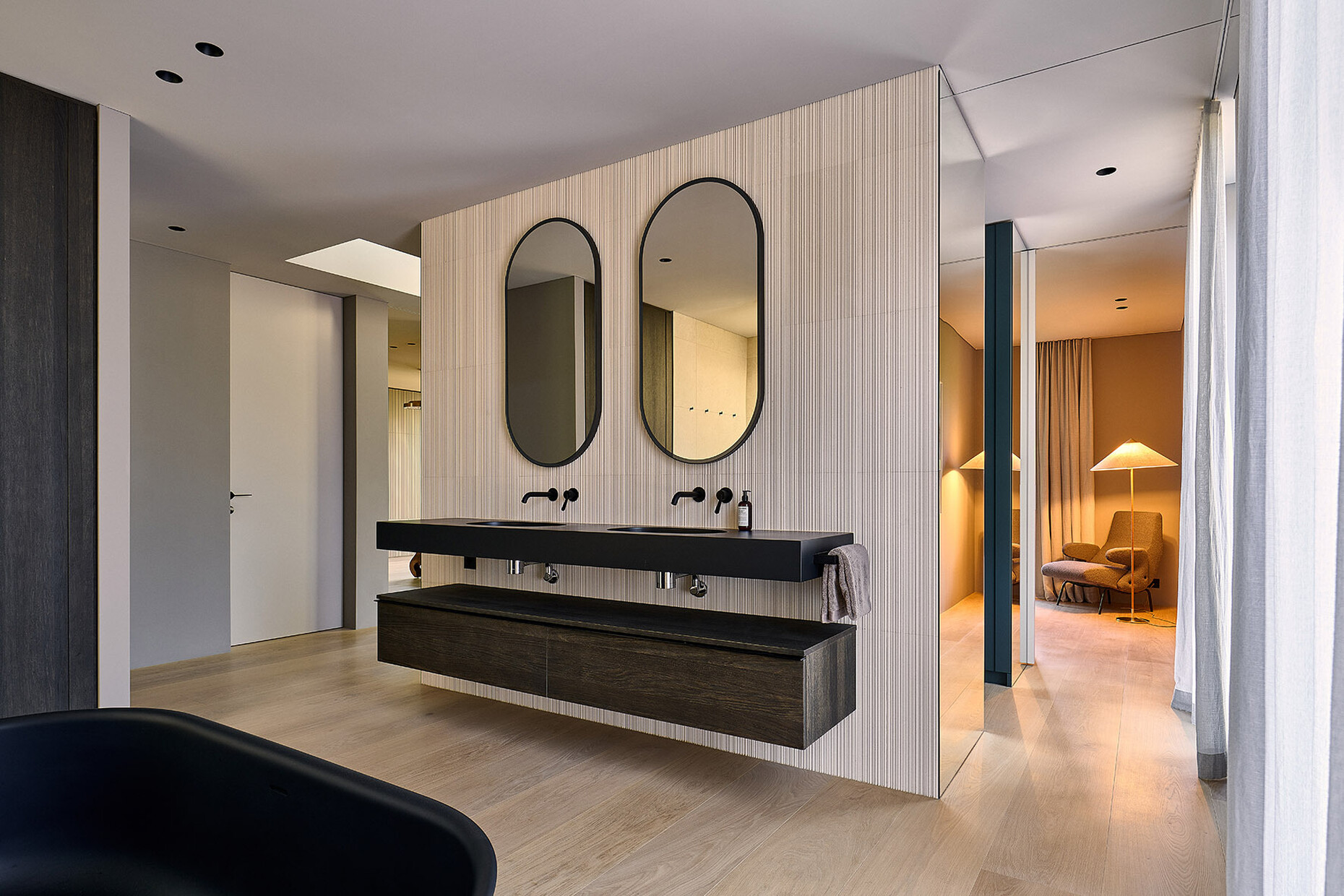
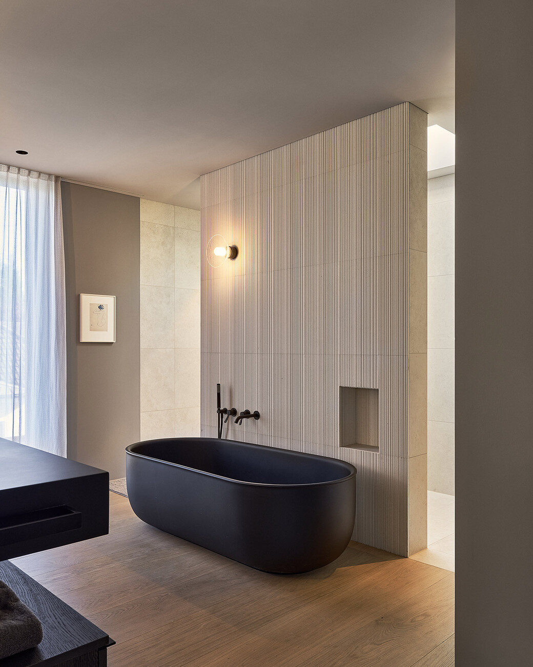
This is also the case in Munich Herlaching: The team headed by Bettina Spreng and Christoph Jacob has integrated the two-storey house into the fabric of its surroundings in a way that makes sense, having the roughly 16-meter-deep structure recede about five meters from the street. A metal-clad incision in the wooden facade emphasizes the entrance that leads into a well-organized interior structure. An axis opens up the house both in depth and height: All the rooms can be reached from here, while a staircase leads to the upper floor but also down to the basement. Adjacent to this, the architects have placed a spacious central area on the ground floor that accommodates the cloakroom, elevator, toilet, and pantry and also represents a suitable transition to the generously proportioned living and dining area. The large space flows around a kitchen island. Stephanie Thatenhorst says: “The architects’ designs were finished and we didn’t want to alter anything because it was all perfect.” Floor-to-ceiling window fronts provide access to the garden and pool via a terrace. The upper floors contain the private bedrooms, while the basement is spacious enough to accommodate wine storage, a fitness and hobby room, and a utility room, as well as all the necessary technical equipment. The entire interior design, including the choice of material, is the work of Stephanie Thatenhorst, for whom the analog remains important even in our digitalized world. In particular, when it comes to looking at materials and their impact, she and her team work with mood boards and material samples: “Since the feel of a material is so important, I always insist on actually holding samples, and I like being able to show them to clients.” In this specific case, dark colors were employed that interact subtly with the expansive windows and produce an “almost Zen-like spatial feeling”. As the interior designer says: “We want to work with natural materials that exude a strong sense of tranquility.”
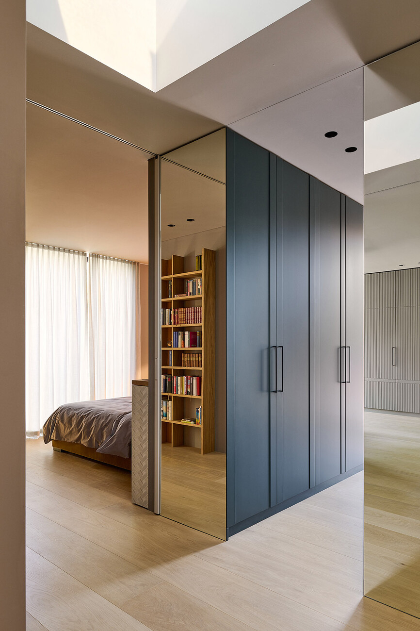
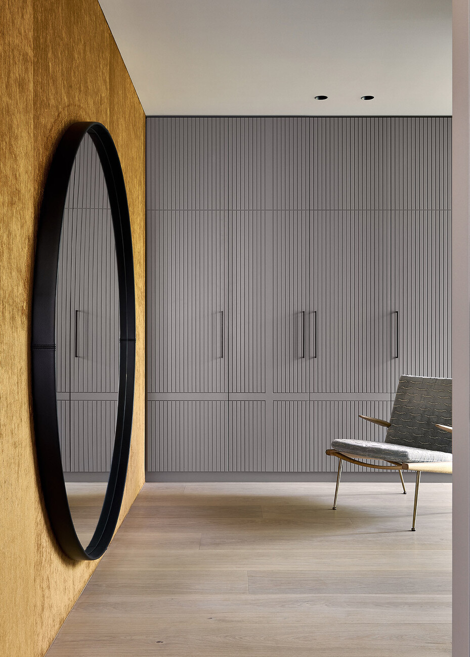
As such, the naturally light oiled oak planks from pur natur were ideally suited for the floorboards and stair treads. “We feel what makes this project and the three-layer boards used here so special is the combination of the very calm ‘Select’ variety of oak with the special surface treatment of the floor: The extremely elaborate process involving multiple oiling and sanding stages produces a velvety feel and preserves the wood’s natural color,” explains Steffen Männle, Head of Sales and Marketing at pur natur. “The products fit perfectly into our concept,” agrees Stephanie Thatenhorst. She was won over by the variety of color pur natur offers, while another factor that persuaded her to opt for this product was how easy it is to care for. This brings us back to the productive cooperation between everyone involved in the construction project: “The client was looking for regional manufacturers and came across pur natur while researching domestic premium flooring. Being able to communicate directly with people, but also the sampling on site and wood selection at pur natur allowed us to understand both the project and its requirements and find the right solution,” says Männle. He adds: “The high quality of workmanship was crucial for this project. For the stairs, for example, we developed a special solution that allowed us to join the steps so that the seams are not visible, and simultaneously to avoid the drawbacks inherent in classic mitered joints.” The saying that architecture is only as good as its client is more than just a platitude: “Our clients came up with pur natur as an option and we were very happy with the result,” says Stephanie Thatenhorst.
