Striking interaction
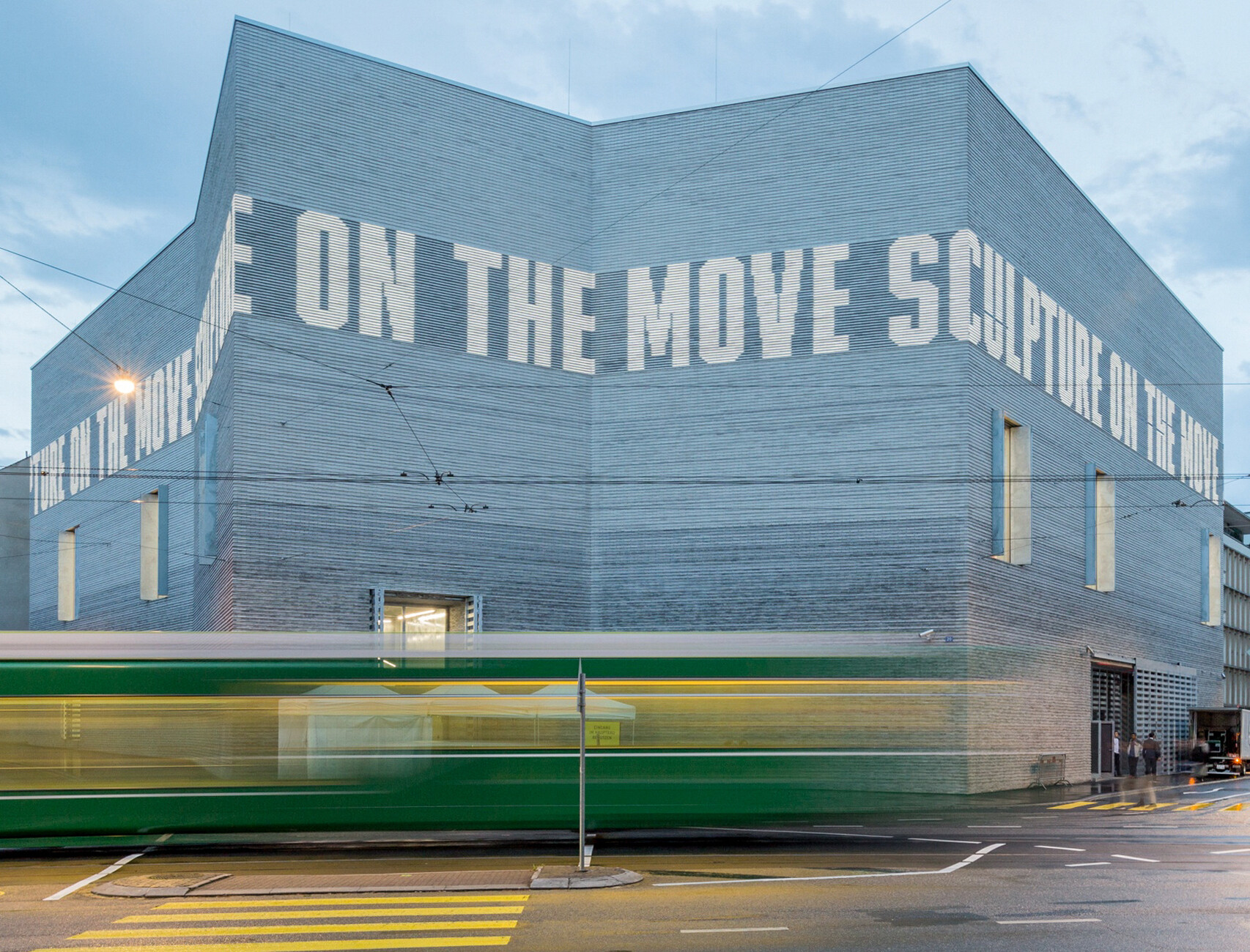
Solid and angular, like part of the nearby mountain range – that is what first comes to mind when looking at the new Kunstmuseum Basel building. This weighty impression is intentional: For the layout, architecture studio Christ & Gantenbein took their inspiration from the rectangular main building from 1936, which Paul Bonatz and Rudolf Christ based on Italian palazzi. The two buildings now face each other in central Basel and are linked via an underground passageway, enabling visitors to move easily between the exhibitions. In order to emphasize the industrial appearance only few vertical window and door openings were inserted, which can be closed with hot-galvanized-steel shutters. Thus the new Kunstmuseum Basel building presents itself as a cooler, modern version of the main edifice and establishes a dialog between tradition and present for the world’s oldest municipal art collection.
Handmade clinker bricks with a color gradient of light to dark gray form the façade of the five-story structure, with the darker rows close to the ground giving the impression of a firm anchoring. The narrow D91 and D11 bricks, which Petersen produced specially for the cladding, subdivide the building into horizontal bands. Owing to the omission of expansion joints between the projecting and recessed brick inlays, the surface appears to be one continuous piece and creates delicate silhouettes depending on the incidence of light. Then, in the evening, 12 meters up above the ground a large LED light frieze wraps its way around the building. The brightness of the individual letters adapts to the respective outdoor light situation by means of sensors. In order to be able to position the LEDs in the closed shell, Petersen produced hollow bricks. The special thing about the frieze is that the LEDs are recessed, meaning they are themselves not visible. (am)


