initiated by evoline
Tom Geister
Sep 28, 2013
Adeline Seidel: Over the last few decades, the spaces in which we work have fundamentally changed – from the boss’s office with its anteroom, to the cellular office, to the open-plan office space, right through to functional landscapes. How has this transformation changed the architecture of office buildings?
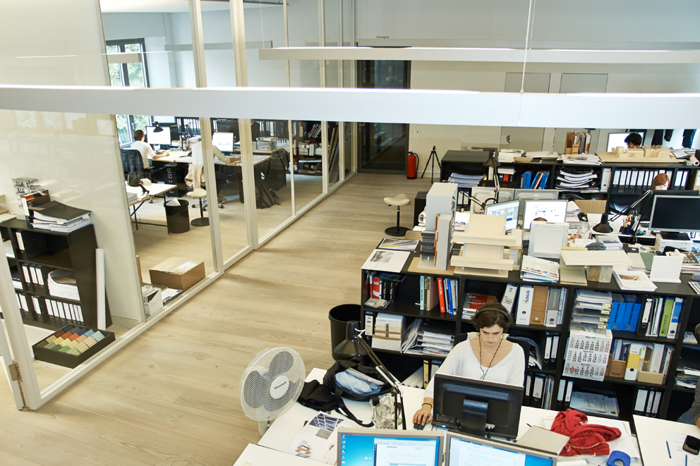
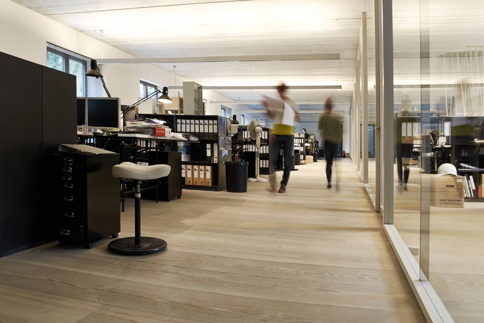
Tom Geister: You might get the impression – because people like to look at it this way – that over the past ten to 15 years there has been a development from the cellular office to the open-plan office layout and on to larger-scale structures. From our experience, though, we can say that, in reality, this is the case only in certain circumstances. If you take a look at the to-ing and fro-ing and the back and forth trends in layout requirements as formulated by the users, then you actually arrive at a form of architecture that serves the purpose for all office structures – regardless of whether they are based on cellular, combi or open-plan layouts. When it comes to our planning, this has the effect that we create structures of “perpetual flexibility”, which means that we look increasingly closely at the “more consistent” structural elements of our architecture. These might be façades, for example, or conference rooms, corridor spaces or elevator foyers; basically anything that, at the end of the day, remains constant and unchanging.
But is the design of an office building not formulated differently depending on the developer in question? For example, an office for the Federal Environment Agency will differ from the main administrative headquarters of the ADAC automobile club, which in turn will be different to a building realized as an investment project with unknown users.
Tom Geister: There are similarities between all of them – or at least it appears that way. For example the need to be open to all office and workplace structures and to be able to react flexibly to changed requirements. Spatial differences are created in the details only – albeit in accordance with the structural and work-sociological context. This gives rise to a certain level of variation in office depths and sizes, which in a ministry are dependent on the rank of the individual employee. However there is a significant difference between an investor-developer and an actual user, namely that with an investment project the final internal layout of the office spaces remains open. In order to best cater for the hard-to-predict needs of a future user, the investor in the “Cologne Oval Office” complex, for example, wanted all stories to offer versatile, flexible usage options within the basic floor plan of the level. For this reason we decided on three cores. Between each core, the floor plan is optimized once for a cellular office, once for a combi-solution and once for an open-plan office. For these flexible office building typologies, it is particularly important that every entrance – or here, every core – has its own identity and constitutes a clear “address”. This is not only for the purposes of representation and orientation, but also to provide the employees with their own, individual point of access to their working day and thus create a form of identification.

With this form of office building, access may play an important role as a consistent element, but a developer who wants to then use the office complex himself will probably not be satisfied with just a “good” entrance when it comes to offering a pleasant working day.
Tom Geister: For a client like this, the structure offers very different spatial design possibilities, alongside what is now virtually the “normal” requirement of “perpetual flexibility” in the use of the office. One example is the headquarters of the ADAC automobile club in Munich. Here we’re talking about a large-scale complex with around 130,000 square meters of gross floor area, but every employee – for the sake of security – enters the building at a fixed point, namely via the central hall. From this hall users can access the relevant core elevators and staircases via a large gallery to get to their departments. This entrance hall is certainly an important element of the company culture, and not just because of the security requirements. It is the focal point of the building. The decision to base the catering areas off it makes the hall a part of the working day for every employee – like a marketplace that is crossed and frequented several times during the day. The hall is thus also a place of work, albeit in a different form. This is where informal meetings take place, where people bump into colleagues or make private phone calls. These are also activities that shape the working day but cannot simply be slotted neatly into office typologies.
What means can be used to create an atmosphere in which the office worker feels at ease and in which the time he or she spends within the company – regardless of the activity performed – is perceived as pleasant?
Tom Geister: This can be achieved by giving the control back to the user, regardless of all the building’s technology and all its energy concepts. By this I mean enabling users to decide for themselves and change spatial situations by means of simple interventions. The user should be able to open windows and control the available sun protection – regardless of whether this is appropriate for the energy balance. For the Kreditanstalt für Wiederaufbau development bank, we developed an overall concept together with the engineers that maximizes incoming daylight, minimizes the energy required for ventilation, heating and cooling yet at the same time gives users access to the components. We have high windows, so as to avoid the need for artificial light as much as possible. At the same time, externally fitted sun protection with light control minimizes the amount of heat entering the building. The double façade is adjusted by motorized flaps such that when the windows are opened manually no drafts occur and significant heat loss in winter is avoided. Although everything is automated, at the same time all the controls can be individually overridden. The automation of buildings is necessary, but users only accept it when they can influence it. After all, it is very important to the user whether one can turn “this stupid knob” or not. It is often details like this that dictate whether a user loves or hates the architecture. And as far as workplace furnishing is concerned, here we try to gain more influence once again – by developing furniture ourselves, for example. It can often be difficult to find products that match our design and usage requirements, and this applies in particular when it comes to the creation of special zones, by which I mean architecturally consistent elements like foyers, kitchenettes and conference rooms.

The innovation cycle of technical installations is many times shorter than that of architecture. In the space of 40 years we have seen the typewriter replaced by the computer and made obsolete by laptops and iPads, while the overhead projector has been replaced by the digital projector and this, in turn, by the Smart Board. In many cases, though, we work in buildings that are more than 40 years old. How, when it comes to planning today, do you tackle the “updatability” of workplaces?
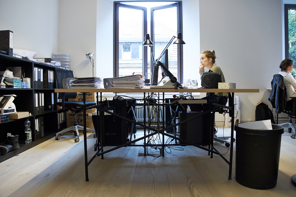
Tom Geister: Although this might not answer your question directly, I’d say that as an architect I would be happy to design the technical hardware myself, because at the end of the day it has a considerable influence on our architecture. One need think only briefly that nowadays we need to cool offices down – not only because the sun shines into them, but also because this is where people sit together in close proximity and their computers, screens and printers are constantly heating up the space. This, in turn, leads to more building technology. In actual fact people should design computers that cool down, instead of heating up. If the hardware were to function “better” in this regard, then I could save a great deal in investment and running costs in my architecture. I would also like to design the way in which the dock points and cables are arranged at the device, where they are positioned and what they look like.
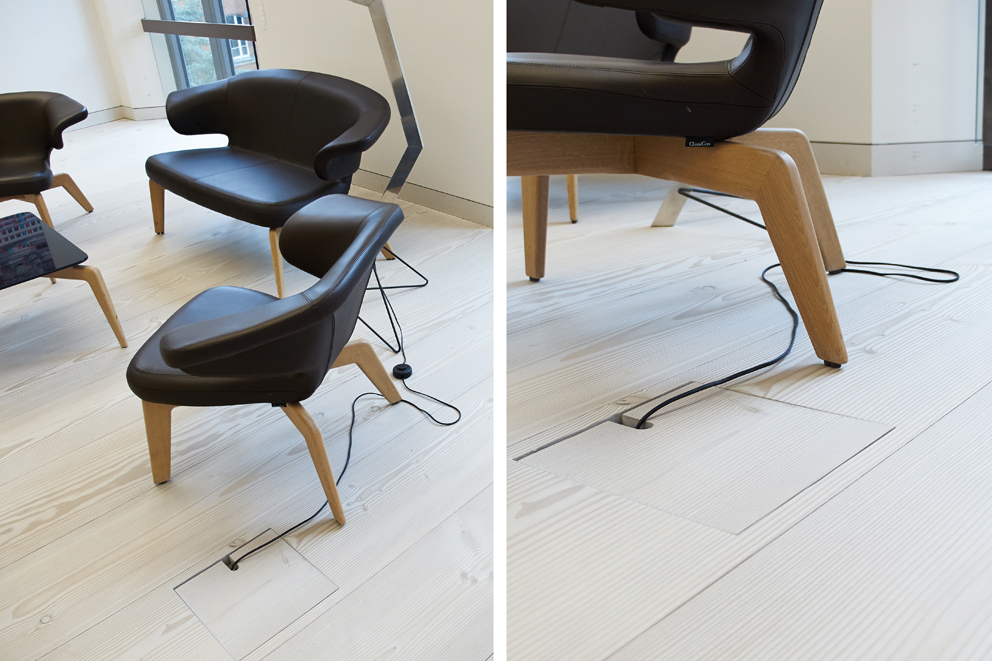
Despite the fact that we are so dependent on electrical power, these functional elements are given little creative attention. But going back to your question: We always thought we would have fewer cables in future. And what’s happened? There are ever more, and we even carry them around with us, just to make sure we are ready to work anywhere and everywhere in our mobilized working world, with a laptop or smartphone. So cable ducts and hollow floor elements will remain part of the architecture and we would be well advised to allocate sufficient space to them. I can well imagine, precisely given the current debate on the potential for spying in networks and clouds, that for security reasons companies will place greater emphasis on internal networks in the future – a sort of “anti-cloud”, if you like, or a type of “network island”.
How does the possibility of being able to work flexibly at various locations change the way spaces are used?
Tom Geister: Ideally, as a user you try to seek out those light and spatial parameters that you feel are best suited to whatever you are dealing with. Sometimes you need daylight; sometimes constant artificial light is better. On the other hand you might find you can focus better in dark spaces with a reading lamp, while sometimes you need a lot of light for concentrated work. Sometimes personal wellbeing requires a view out into nature and you might be drawn to the window, whereas at other times you might want seclusion and therefore prefer a windowless room. These differing needs cannot be catered for automatically in every office space. Thus for the ideal working environment this gives rise to a certain breadth of offerings with regard to various types of spaces; after all, architecture cannot be changed in its entirety at the touch of a button. This requires a certain amount of activity from the user – and thanks to mobile end devices and new work cultures, it is also possible once again to use architecture actively

How does that affect you personally? What has changed in your workplace?
Tom Geister: I increasingly see my physical work areas as territories. Previously the physical territory – aside from exceptions like meetings – was limited to the room that is my office. These days our meetings sometimes take place in the ice cream parlor next door, or in the taxi on the way to the station. My personal favorite for meetings is our library. Of course people keep coming into the space to get a book, so you’re not entirely undisturbed, but the issues we discuss are not that confidential. In reference to our discussion, I wouldn’t say that the library follows the logic of unspecific and thus flexible spaces. Although it has first and foremost a very particular function, this perhaps makes it highly flexible in terms of real use. The same applies to other locations too. The train is not designed to be a place where I work: the space is actually far too small, there’s always somebody passing by and it’s noisy. Yet I’m quite happy to be in an “offline world” there, to put on my headphones and to be able to tackle the piles of data that have mounted up in the meantime. These very specific locations, which were once taken to the extreme in terms of their functional design – such as the seat in the train carriage and the library – are being subverted once again by our world of work, and are thus reinforced at the same time. It is quite wonderful to be on a train and be able to travel, work and watch the landscape rush by at 250 km an hour. And it is quite wonderful to be in the library, surrounded by knowledge that you get the urge to dip in to, even if you’re dealing with quite another topic. These locations have a certain aura which – at least the way I see it – have a positive effect on the substance of the work.
So your ideal office would be a combination of very specific locations, of locations with character?
Tom Geister: Yes, but not only that. Sometimes it’s also very relaxing to be in a non-specific office workspace, in which the air and the light are right, the coffee tastes good and I can simply sit at the computer without having to set myself up in some way beforehand. The only condition is that there must be no obstacles to finding locations for a little tête-à-tête, to seeking out spatial environments that lend themselves to informal meetings, or specific spaces like a library. In all these spaces, the architecture and the specific formulation of spatial situations play an important role, namely, they must create closeness and establish a spatial connection. What sort of a life is it if I go home in the evening and all I can say is that I spent the whole day staring at my screen and didn’t leave my cell?


individualisation 2.0
The work landscape of the future The average German employee works 38.25 hours per week with 30 days of paid holiday. His overtime...
› to the article |

A house for networked scientific endeavor
If the world of work is organized more in terms of networks than hierarchies then it has completely different requirements in terms of architecture, technical infrastructure...
› to the article |

Total turnaround
|

Danes love their community
|

Life beyond the desk is becoming ever more important
For over 22 years Raphael Gielgen has concerned himself with office development and design. As head of the consulting section at office furniture makers “Bene”...
› to the article |

Offices are like Grand Prix racing
Tanya Ruegg, Creative Director at architects’ firm “Camenzind Evolution”, and Stefan Camenzind, founder and MD of the same, masterminded Google’s office worlds – and emphatically changed how we view...
› to the article |

Thick walls guarantee flexibility
"NL Architects" have transformed a 1970s office high-rise into a place that caters to current office workflow and lays the foundations for future changes...
› to the article |

The updatable office
|

Light – to each according to their needs
Today, a working environment without light is simply inconceivable. Yet only rarely can the lighting be adjusted to individual...
› to the article |

The joy of having power sockets in trains
Office work today is highly dependent on there being power available and access to data networks...
› to the article |


