Architectural twin
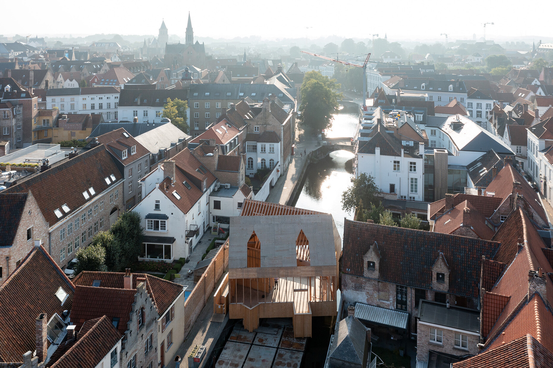
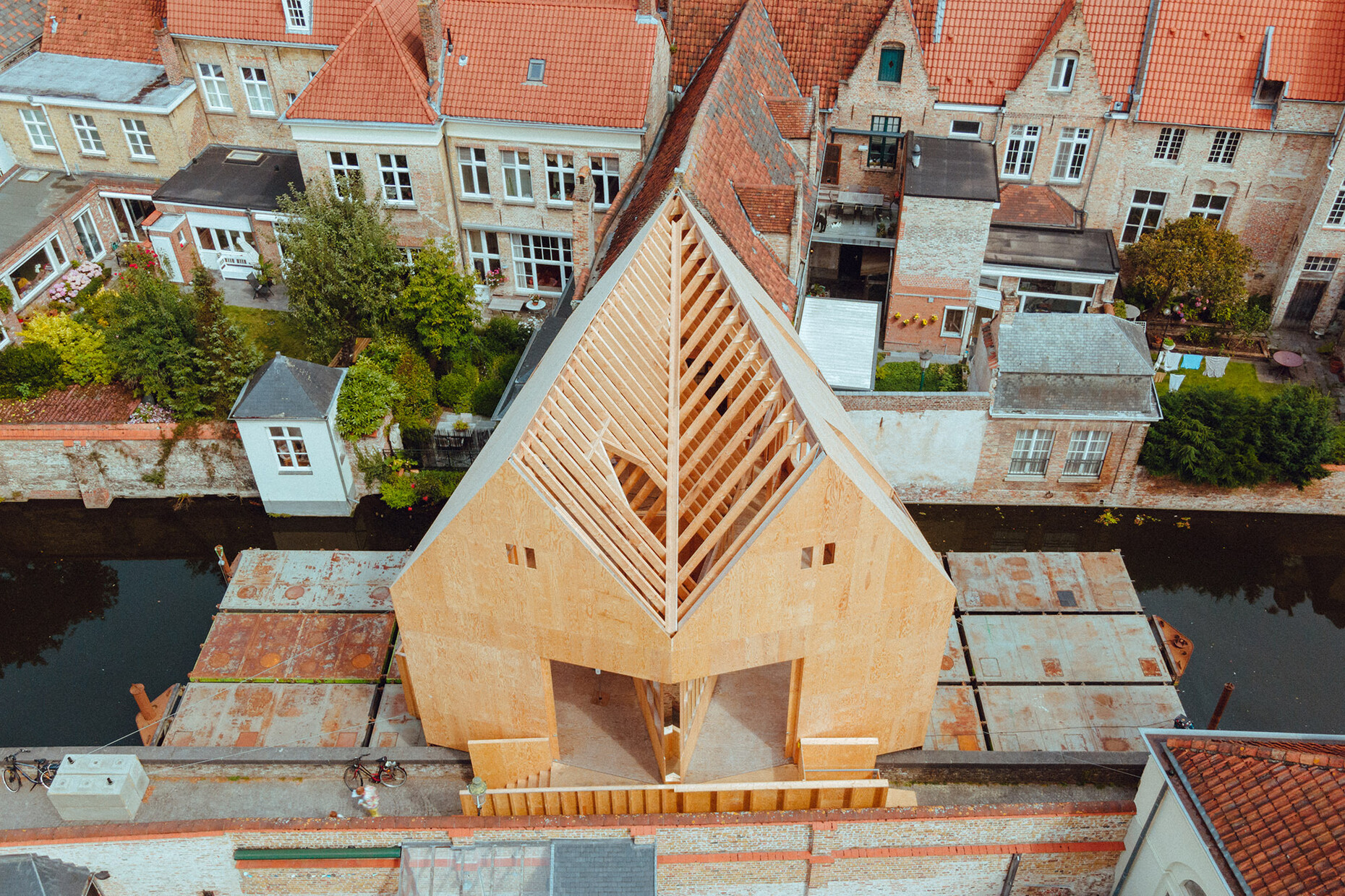
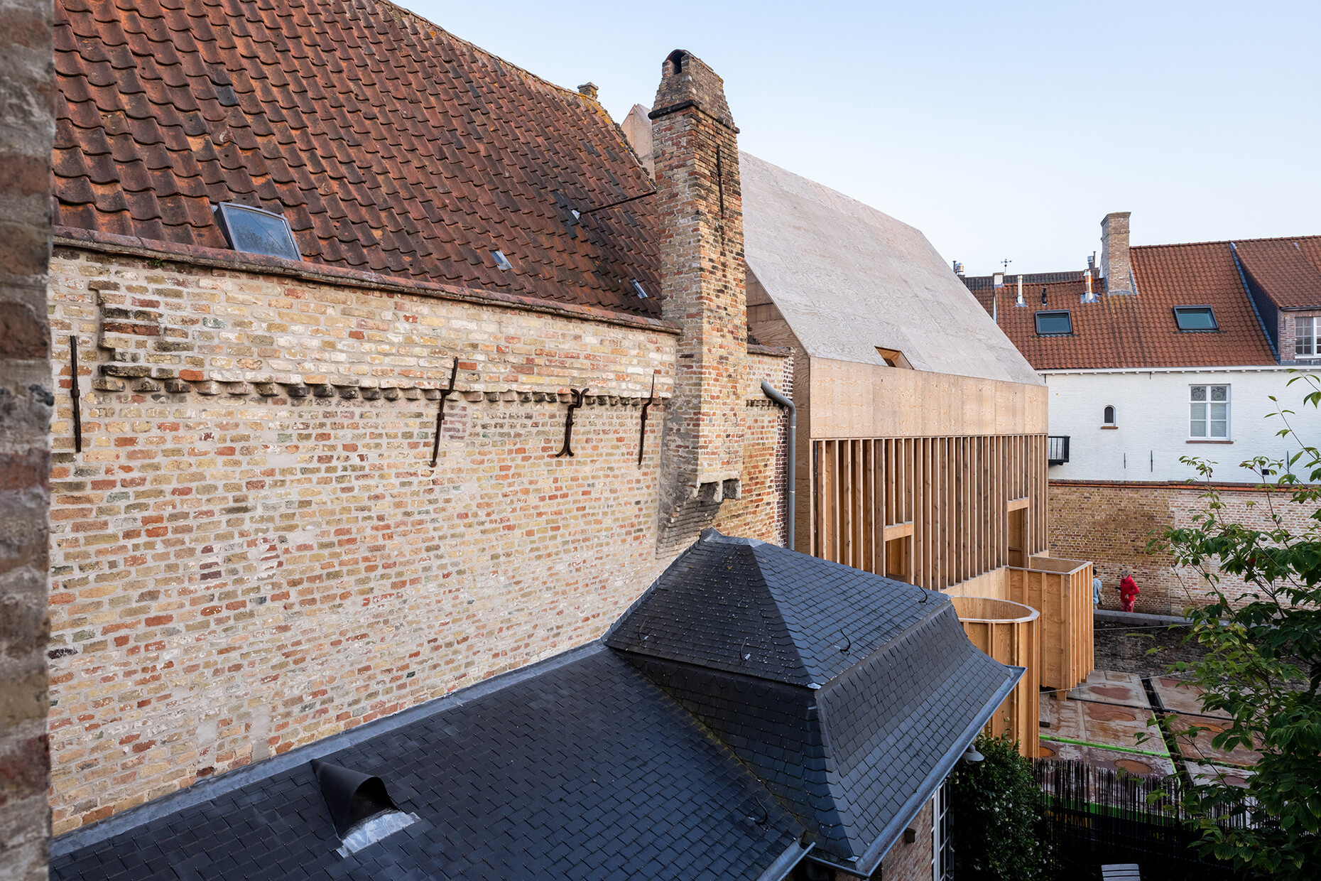
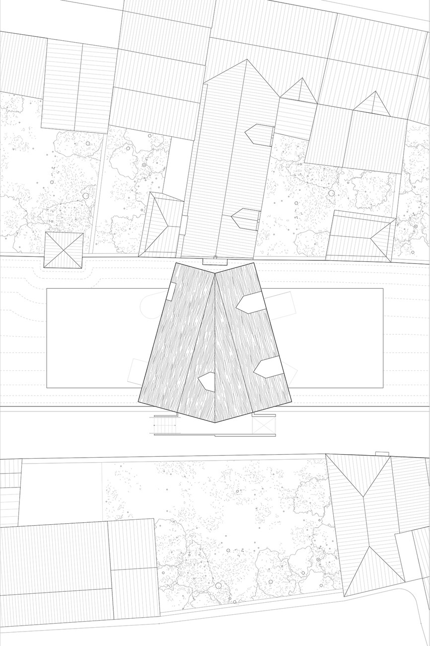
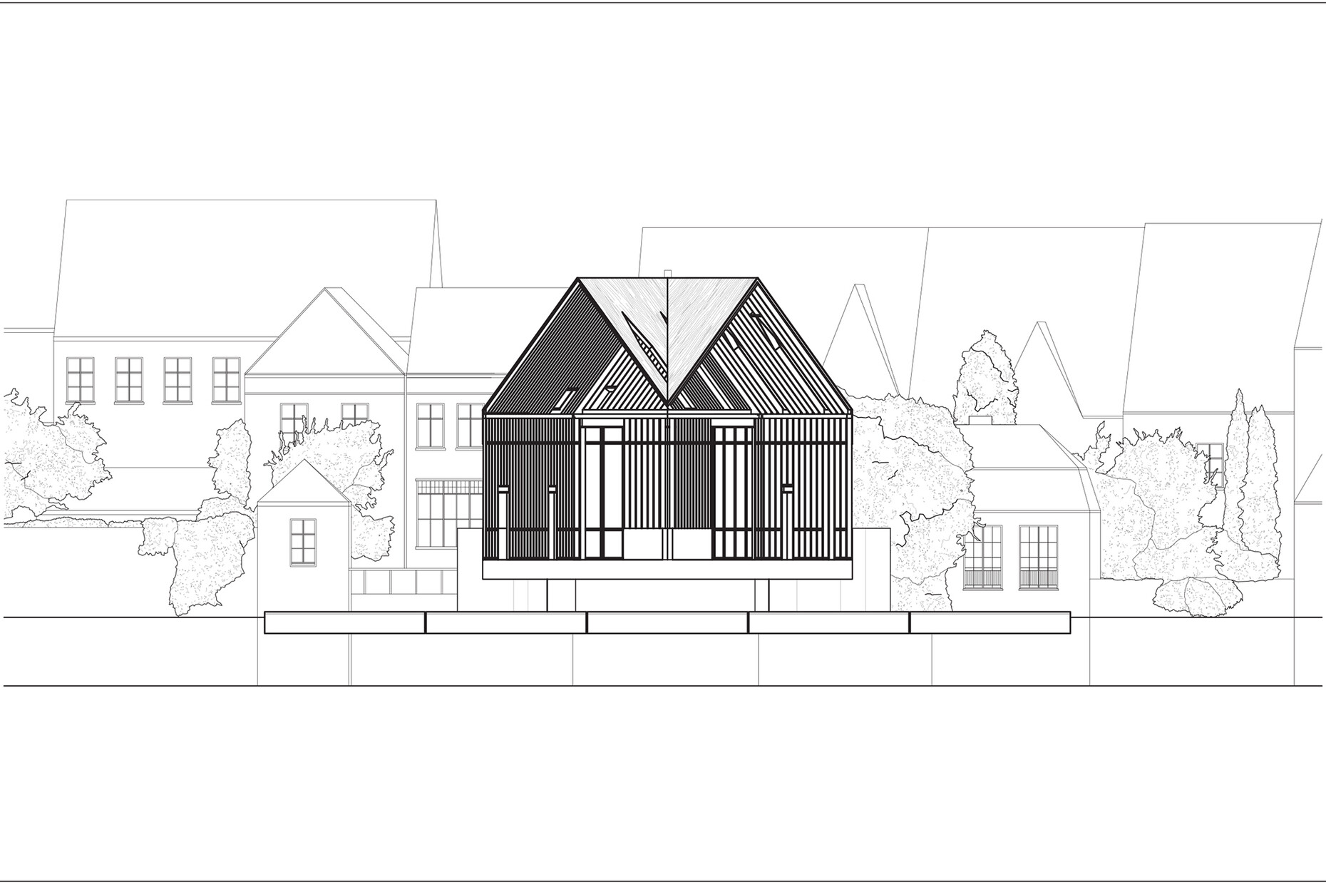
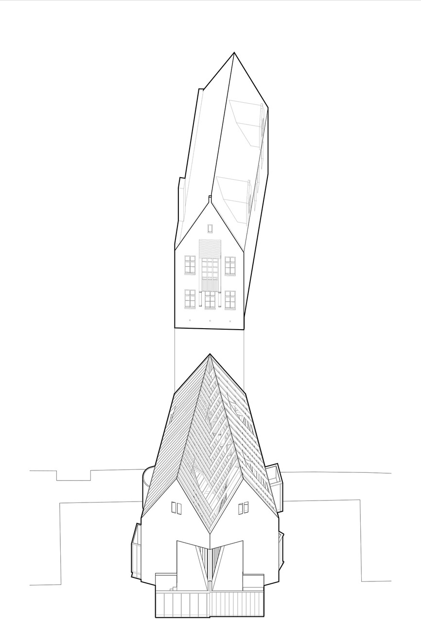
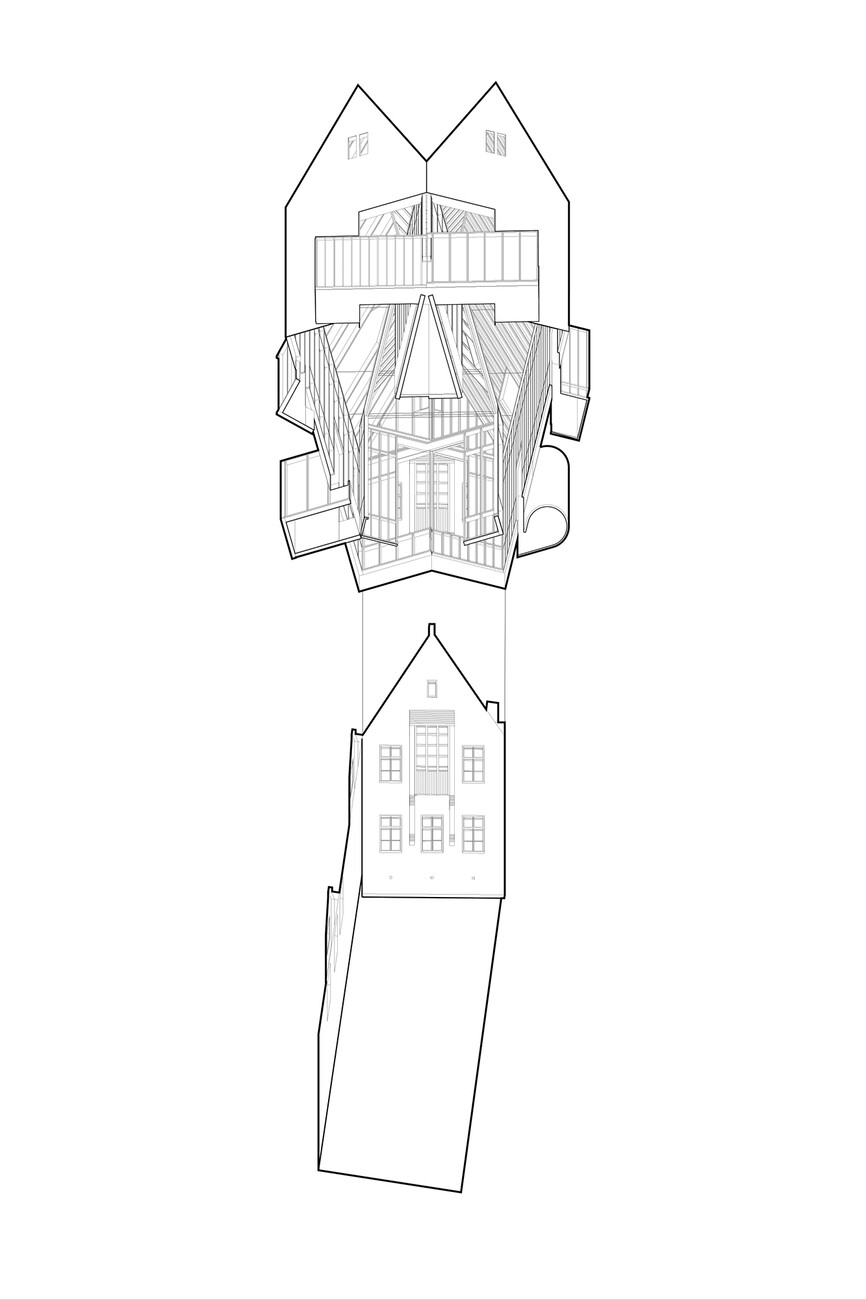
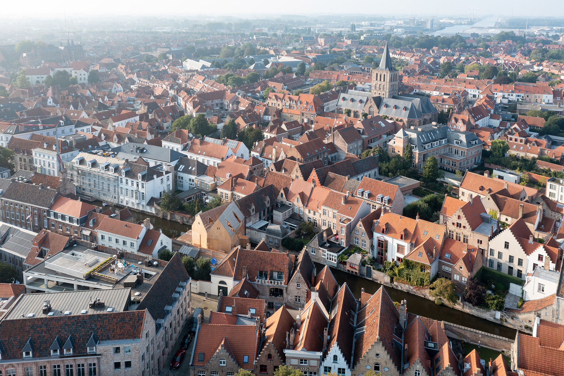
"Diptycha" in ancient Greek means "folded twice". From this derives the term diptych, which is two connected two-part relief panels or paintings that can be unfolded. With the "Brugge Diptych", American architect Jon Lott of Para Project has designed an event space that translates the idea into architecture. The venue was last year's art triennial in Bruges, which was dedicated to the theme of "urban trauma." For this, Lott conceived a wooden double, which he juxtaposed with a canal house from the 15th century.
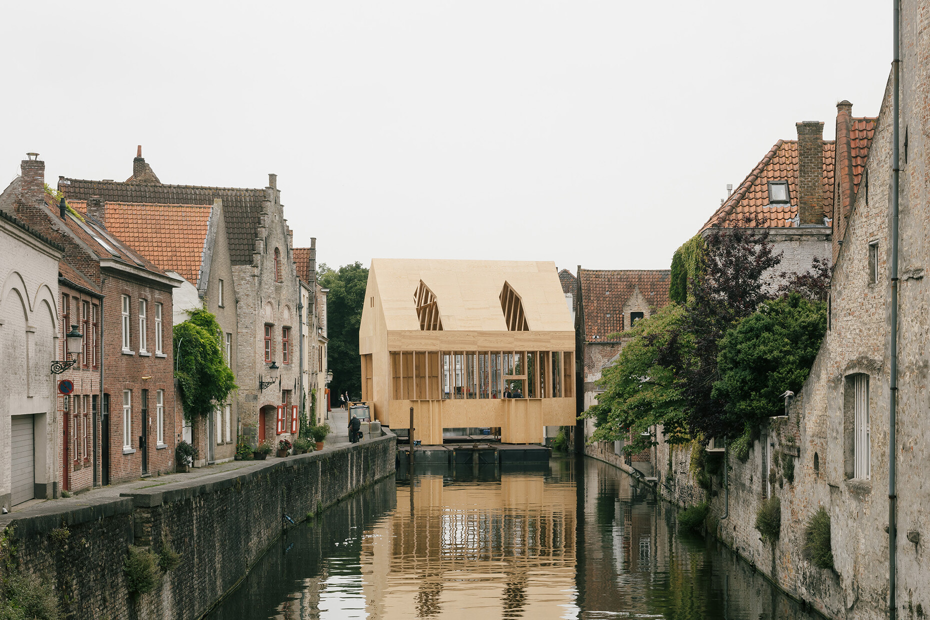
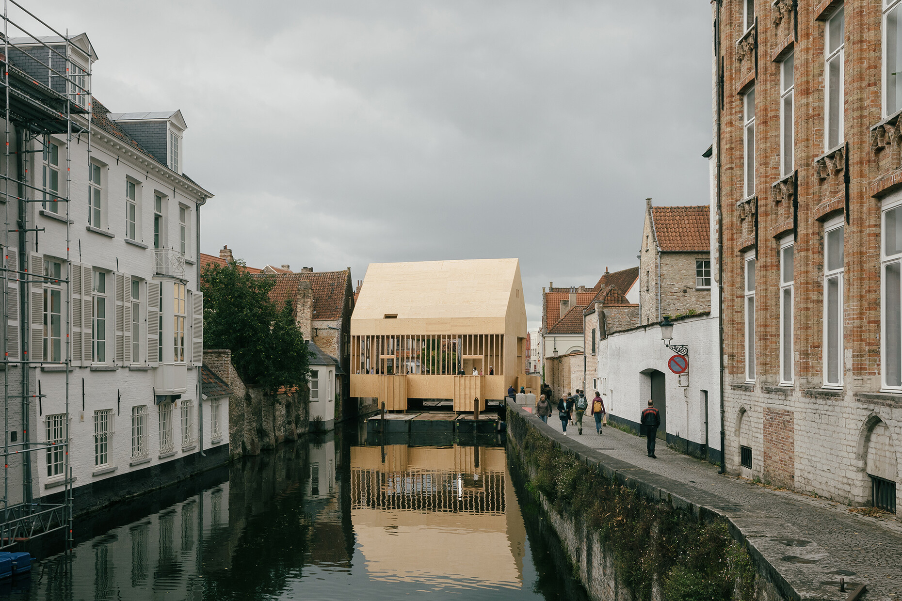
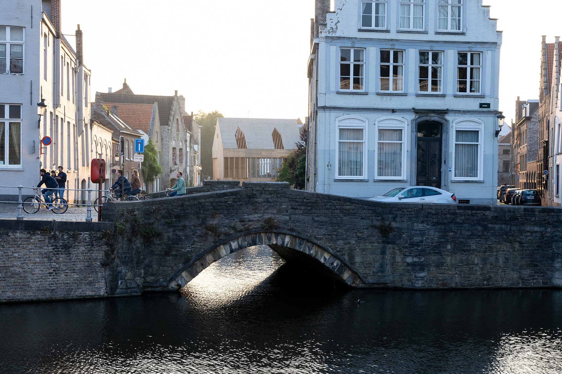
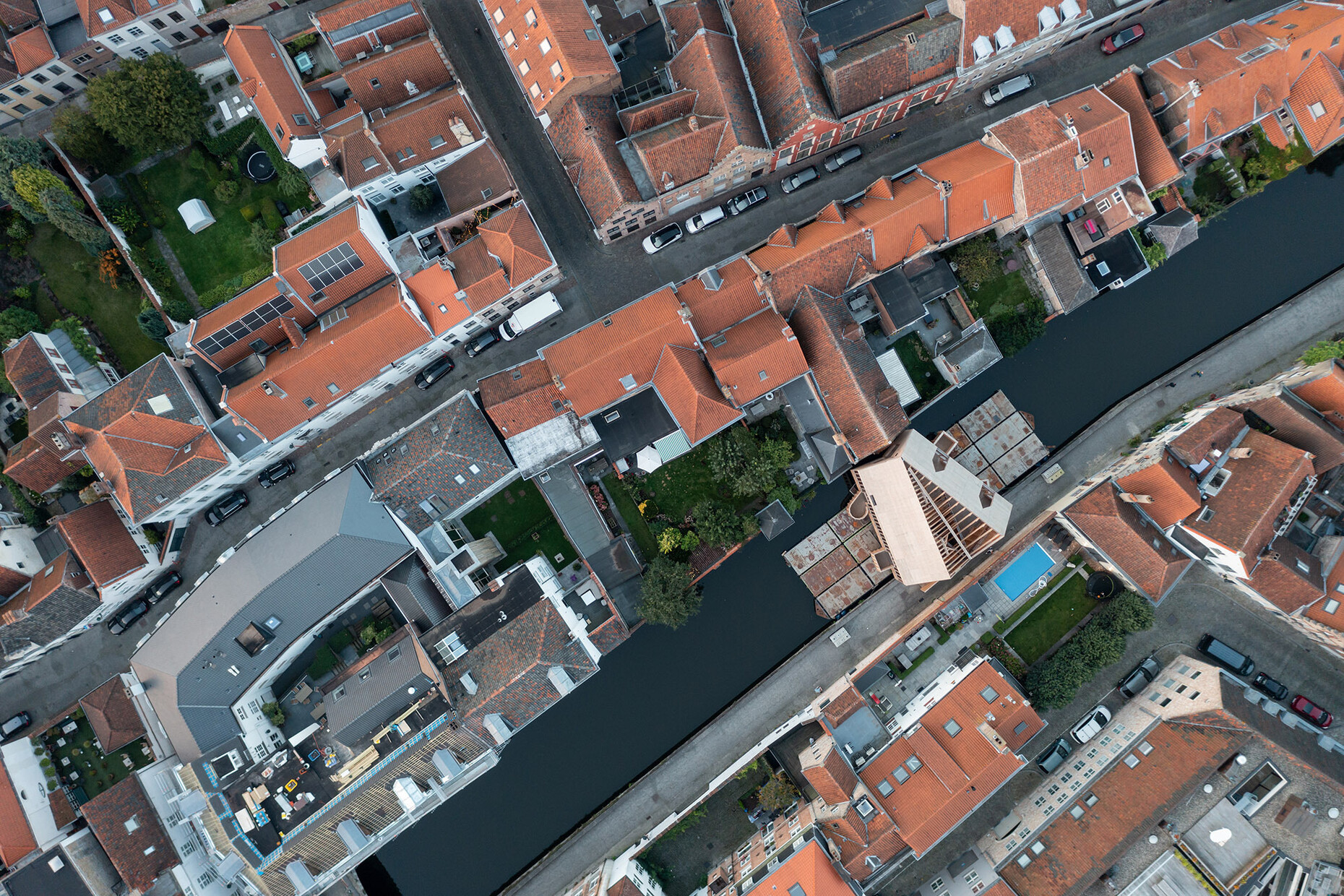
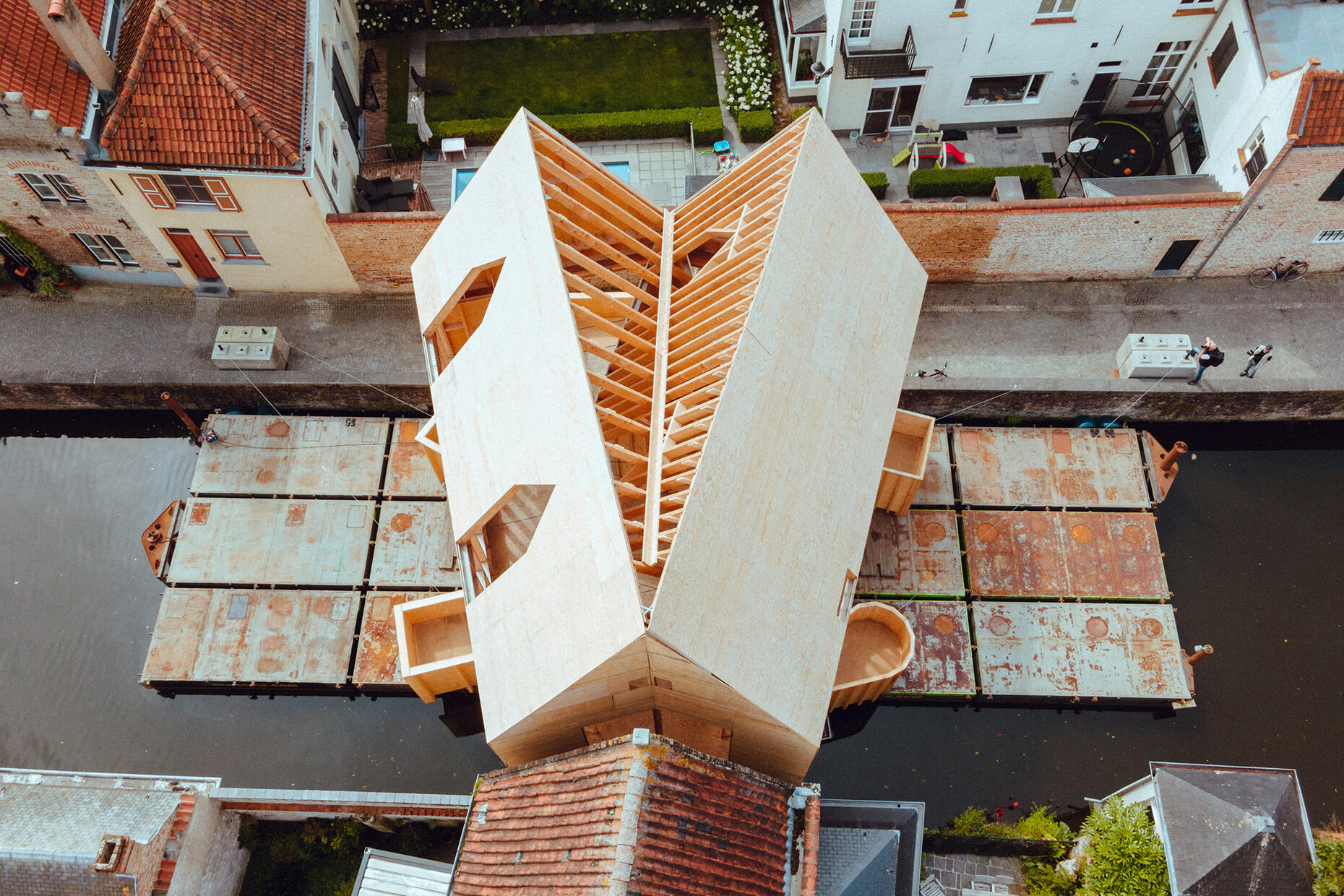
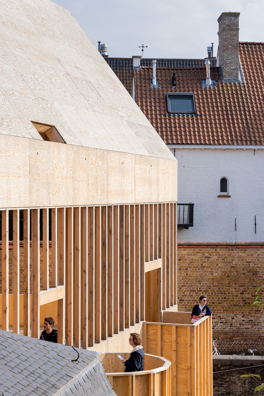
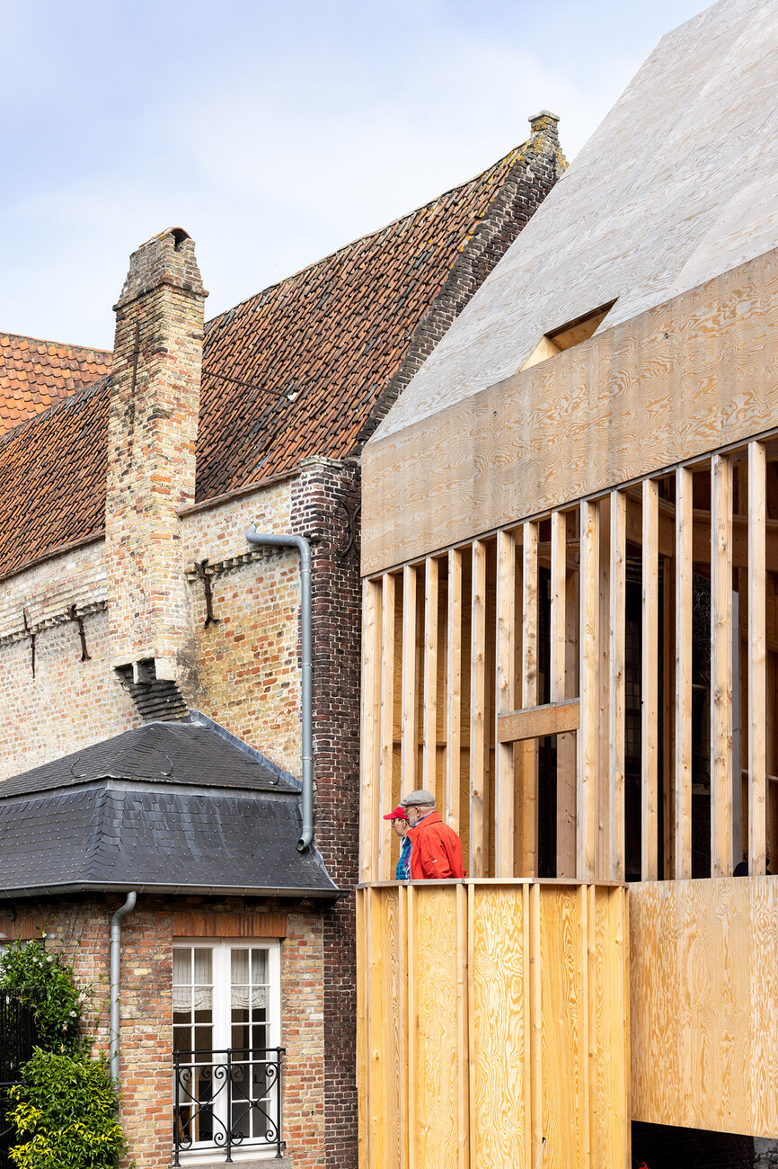
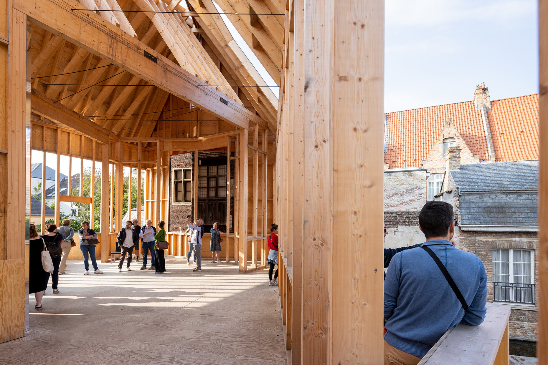
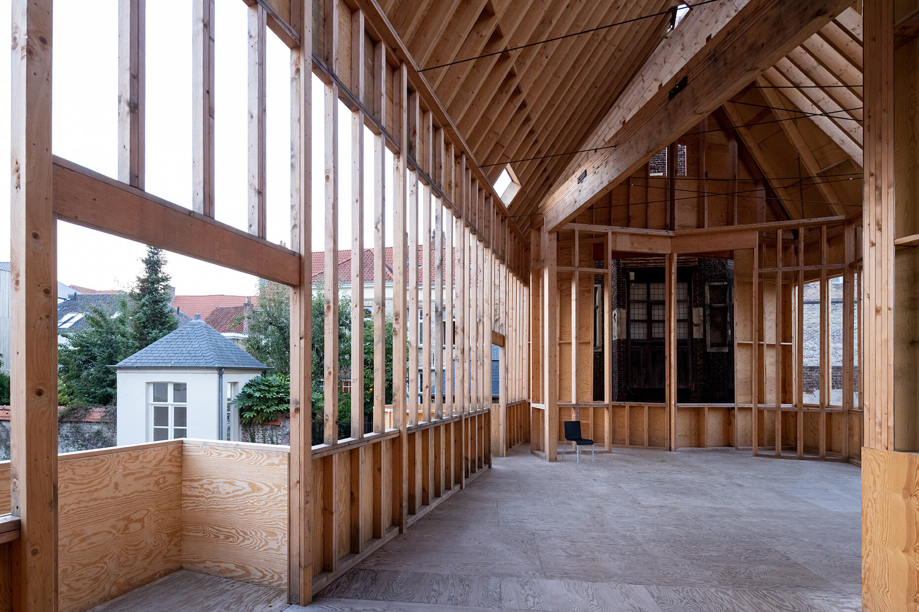
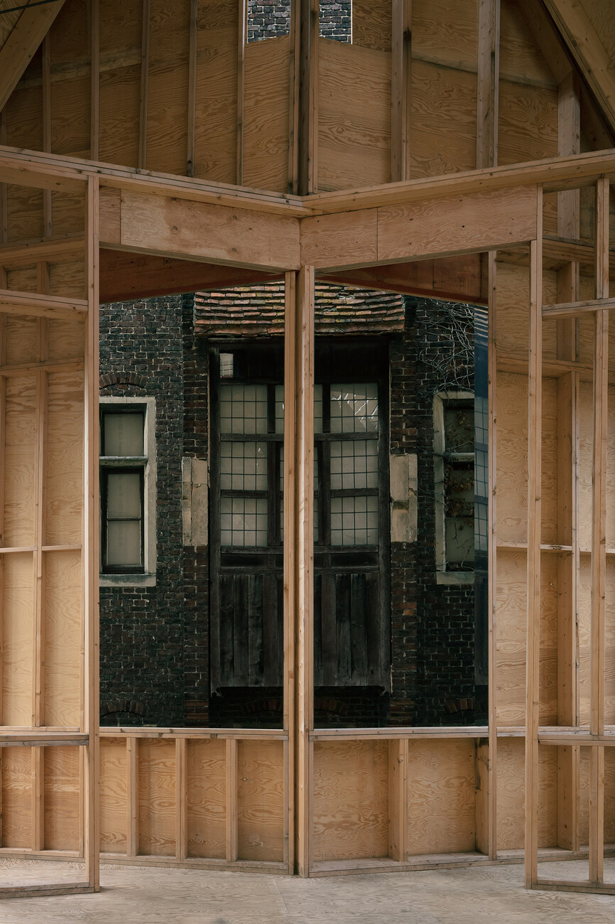
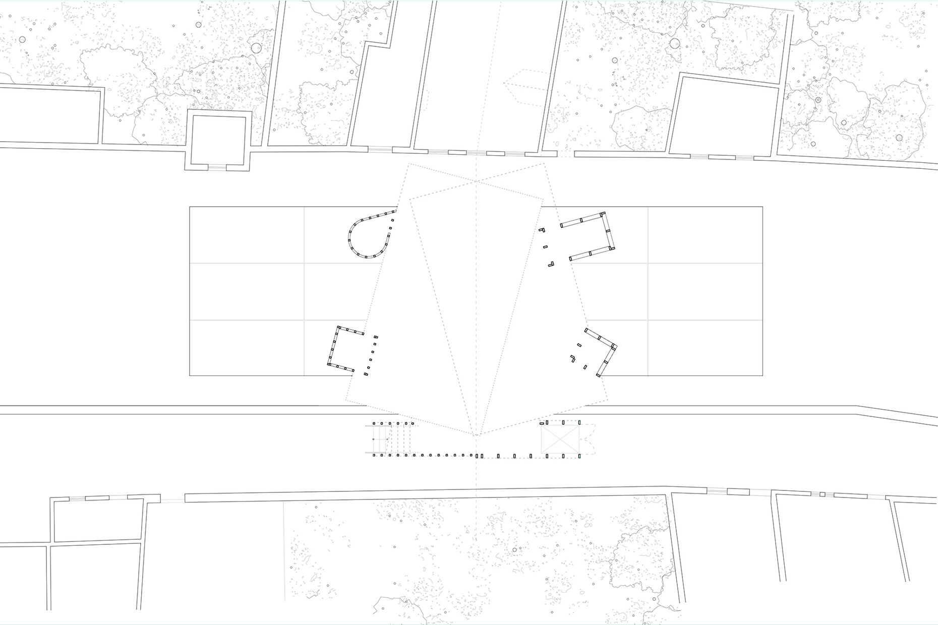
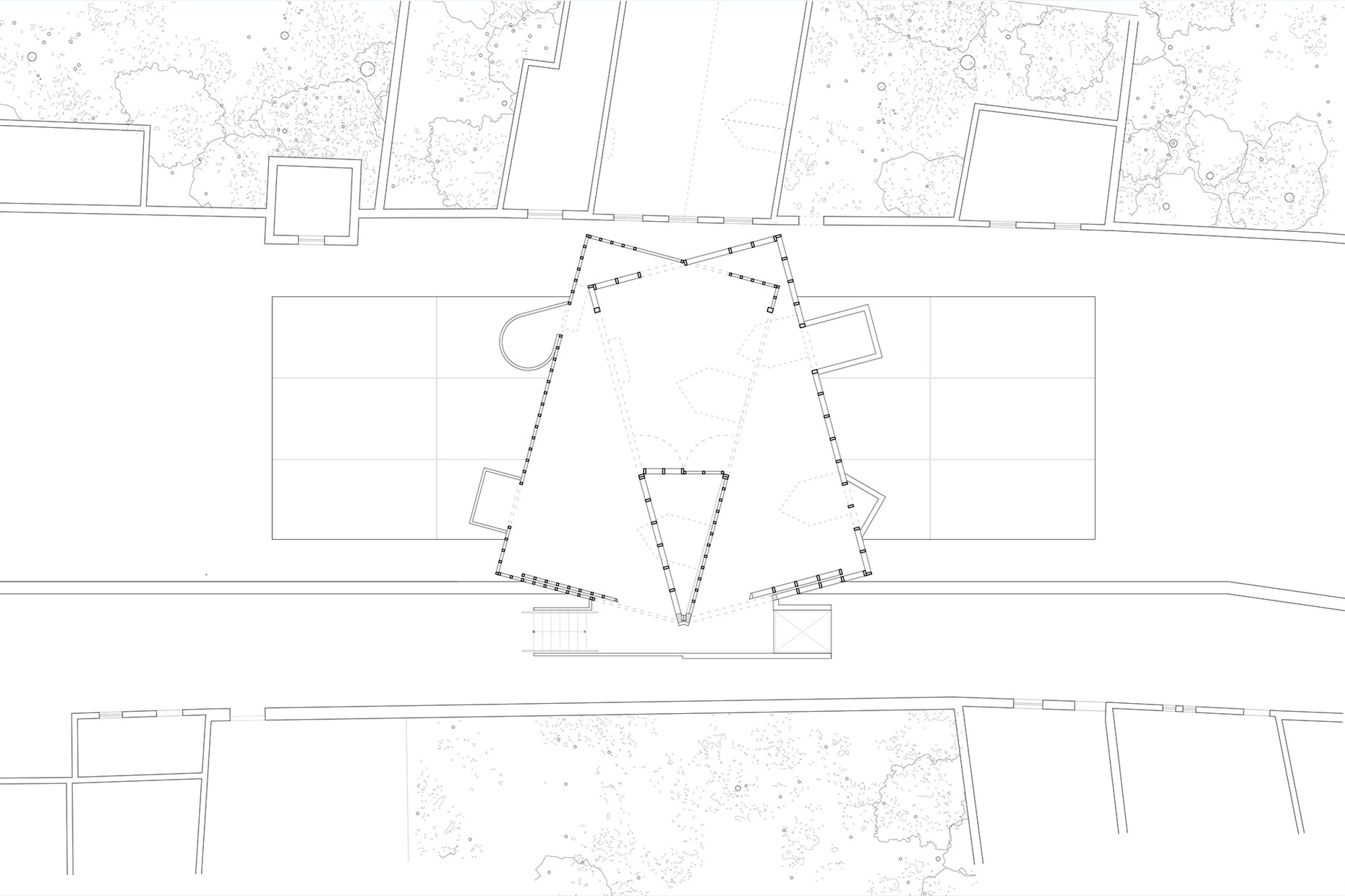
With the "Brugge Diptych", the architect pursued a revelation of hidden spaces by addressing the question of what lies behind the scenes of the stone facades of the medieval center of Bruges. To do this, he took the cubature of the houses and defamiliarized it in his wooden twin, dividing the building in half to reveal its interior. In addition, the "Brugge Diptych" spanned one of the canals and offered a view of the UNESCO World Heritage Site in the form of vistas and small wooden balconies. The interplay of proximity and distance was also functional, as the wooden twin had to float on 15 interconnected pontoons for reasons of monument protection. A narrow gap separated the old from the new, which, despite all the approximation, did not connect with the historic city.
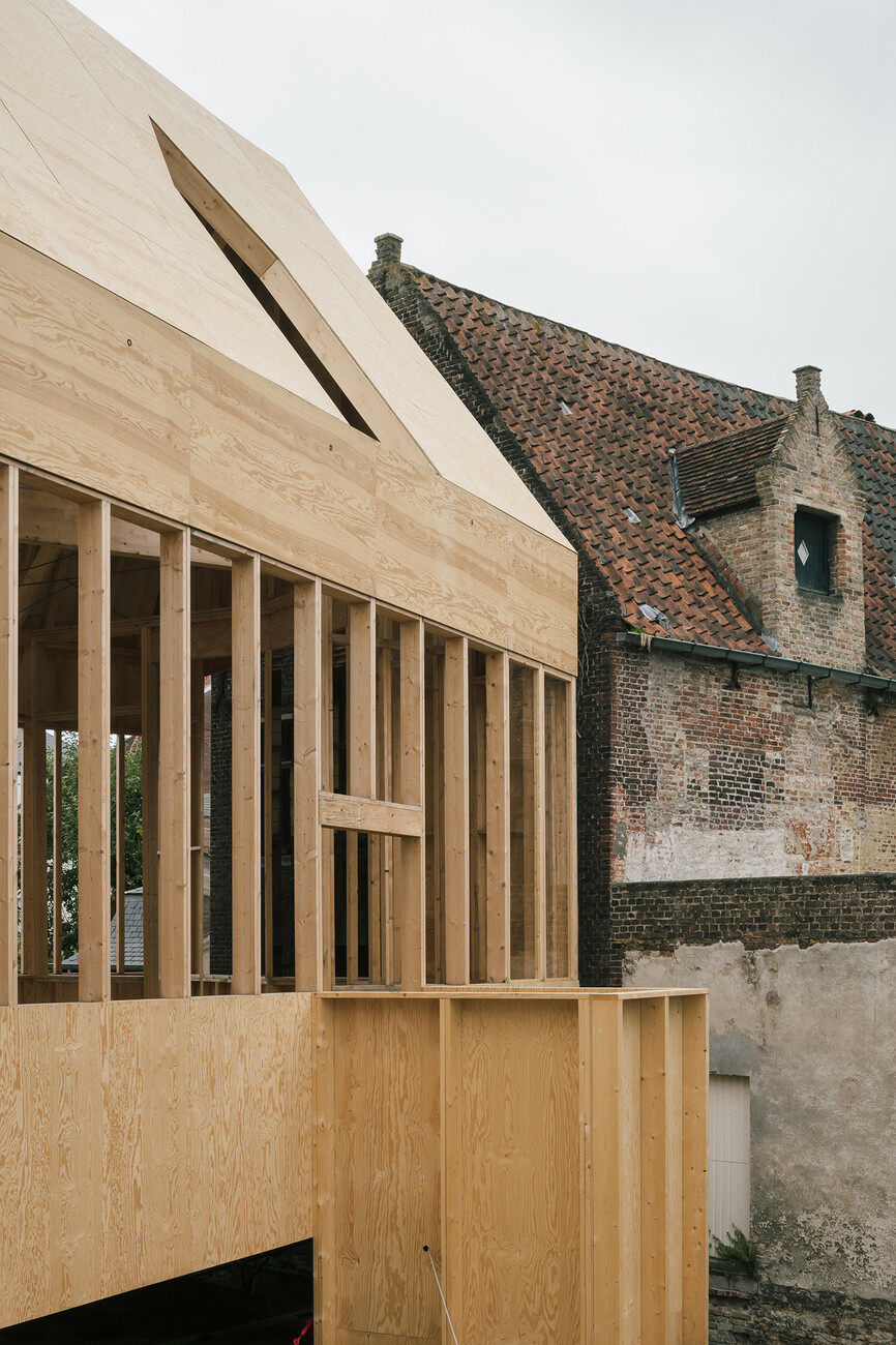
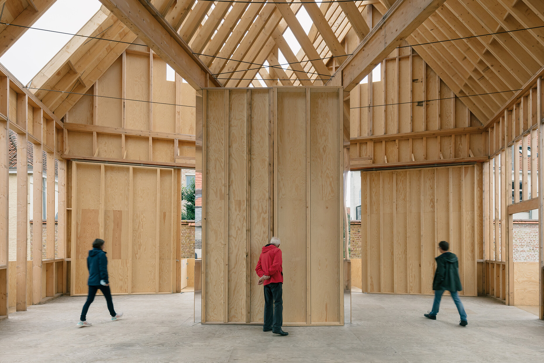
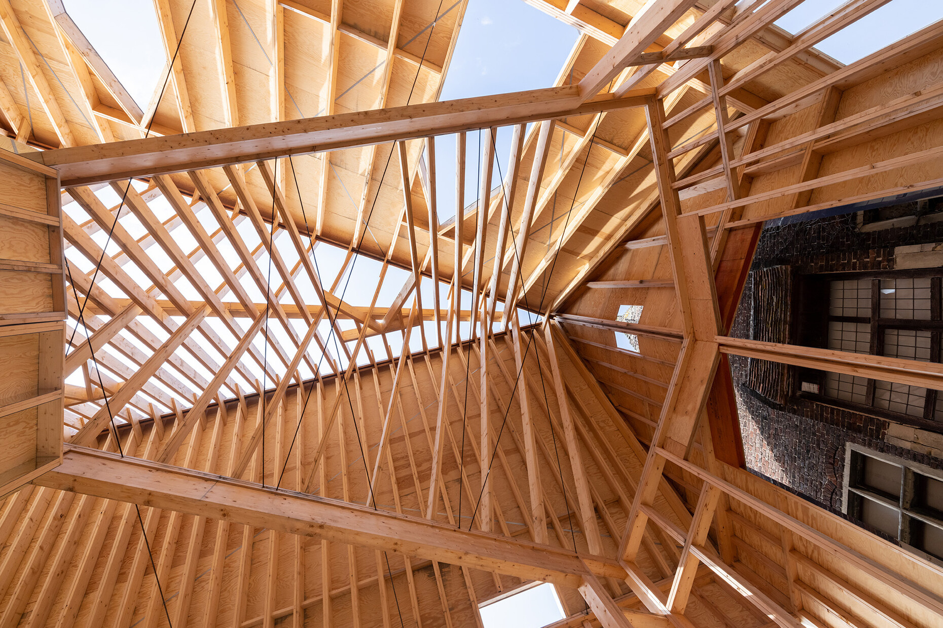
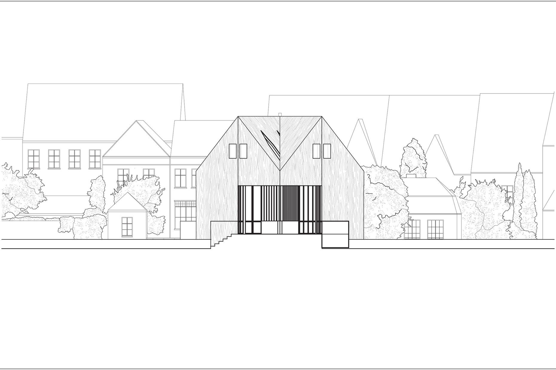
In the formulation of the façade of the "Brugge Diptych", which is partially clad in plywood panels, Lott once again picked up on the historical inventory by depicting the dormers of the canal houses as abstract geometries on the gabled roofs. At the same time, the material provided the greatest possible contrast to the stone layers of the historic city. Inside, the architect exposed the wooden construction, which made the separating room segments directly readable in the clash of the two roof gables. The complex geometry of the roof structure also functioned as an analogy to the complex interlocking of historical layers – a theme that the "Brugge Diptych" took up in its interior and played back into the urban space.
