On home ground
Hitherto, Stylepark’s offices have scattered across several levels of a late 19th-century building in downtown Frankfurt. This has often led to complications in communication among staff: Colleagues working on different floors would frequently not see each other for days on end, and staff would have to go via a public staircase to access some of the office spaces. The Stylepark team could sense a need for a work environment in which the architecture supported, rather than hampered, interdepartmental cooperation and networking.
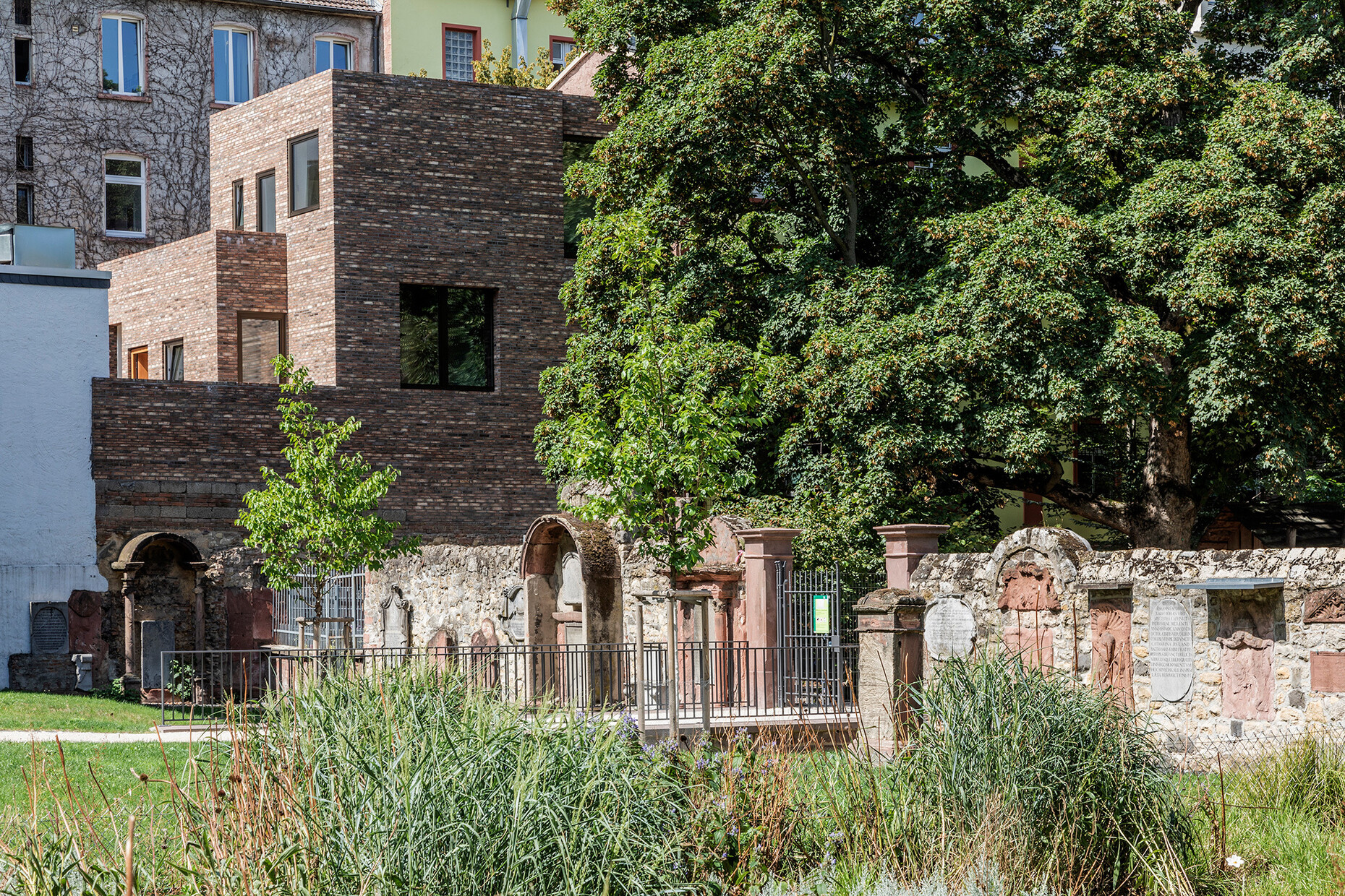
The situation has now been remedied in the form of an extension that makes it possible to accommodate all workstations on the ground floor. Furthermore, Stylepark’s founder and director Robert Volhard decided to take the opportunity to create residential space in the city center too. The plot available for the new build was challenging to say the least: It lay enclosed on all sides within the courtyard of the existing building, adjoined to the rear by a historic, heritage-listed cemetery wall. This forms part of the former churchyard of the Peterskirche, once the most important cemetery in the city and the burial place of the parents of Goethe, no less. Naturally this wall, which is several meters high, could not be broken up by windows, so the ground floor of the new building had to be illuminated almost exclusively by means of courtyards.
For this challenging commission, Robert Volhard approached Frankfurt-based architecture firm NKBAK. Nicole Kerstin Berganski and Andreas Krawczyk, the founders of NKBAK, are not only two of the most interesting young architects in Germany but have also collaborated with Stylepark on multiple exhibition projects already. Nevertheless, these works were always of a temporary nature. “We had already worked with Nicole and Andreas on an award-winning stand design for Schneider Electric at the Light + Building fair, and on an extraordinarily beautiful exhibition at the Audi Urban Future Award,” says Volhard, explaining his choice, “so I was then very keen to work with the pair on a building.” NKBAK represented the ideal contact for many of the client’s requirements. “I had the idea of creating a building inspired by modern Japanese architecture. Nicole and Andreas, who had both spent several years working for SANAA, fleshed out this architectural notion,” says Robert Volhard, outlining the common ground on which the partners based the project. Working with different ceiling and floor levels is also characteristic of the projects by NKBAK, Volhard enthuses: “What was also important for me was that the new courtyards would bring plenty of light and air into the rooms and also make them pleasant places to spend time. As a team, we would frequently use the former courtyard for shared meals or barbecues, so I wanted to ensure that was still possible. I also wanted there to be plenty of lines of vision into and through the rooms to give a sense of space even within this limited area.”
Taking this list of key requirements as a basis, NKBAK developed a complex structure consisting of a one-story connecting element between the old and new buildings and a three-story wing shifted to the rear edge of the plot. Between these two new elements and the old building lies the greater of the two new courtyards. The new build at the rear has been shifted back considerably on one side due to the neighboring development. Here, the architects have incorporated a small courtyard on the ground floor and staggered the new build into the two stories above it, which lends it ample plasticity and vitality from the Peterskirchhof churchyard.
One key issue in the design was how to deal with the heritage-listed cemetery wall. The new build appears to extend almost seamlessly from it, even though the wall is of course not a structural element. “When we started out, we thought very carefully about how to design the new building in deliberate contrast to the historic wall,” says Andreas Krawczyk, describing the design process. “Eventually though, we found it was essentially more inspiring to incorporate the color and structure of the existing wall into the facing of the new build and to extend it.” But where would they find bricks similar to those in the 19th-century wall? “At that moment when we decided to build a brick façade, I knew immediately that the material had to come from Petersen Tegl,” says Robert Volhard. The small Danish manufacturer still molds its bricks by hand and fires them with coal instead of gas in the old-fashioned way. Hence the facing of the Stylepark extension boasts the same lively interplay of colors as the bricks in the historic cemetery wall. What’s more, the bricks were laid in three different heights in order to pick up on the irregularity of the old brickwork. Through this fine detailing on the building, the architects’ and client’s passion for the material shines through – along with an awareness for quality reminiscent of Japanese craftsmanship.
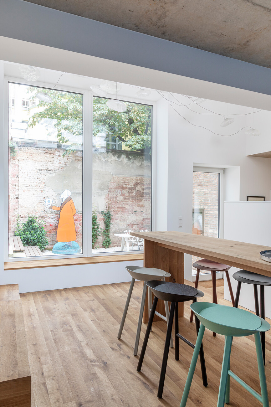
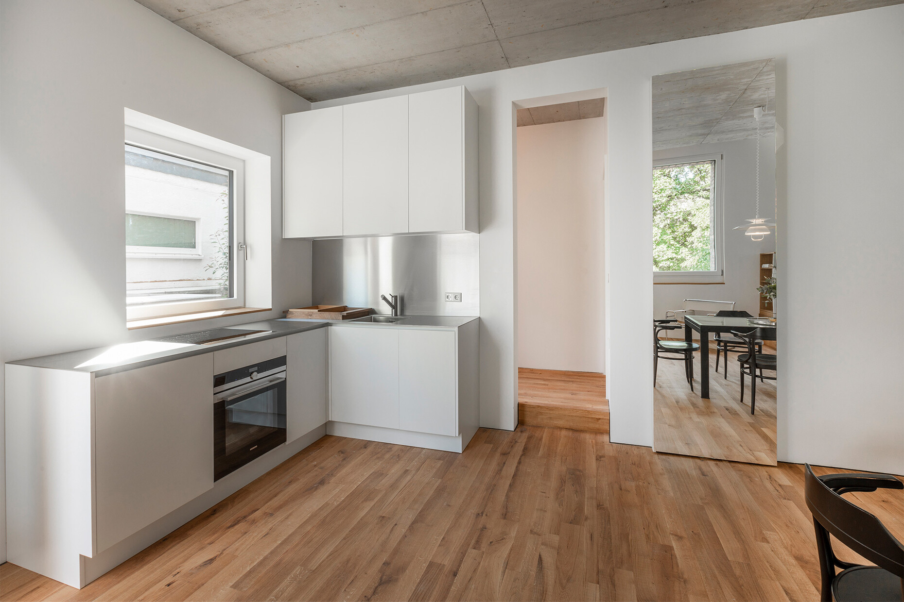
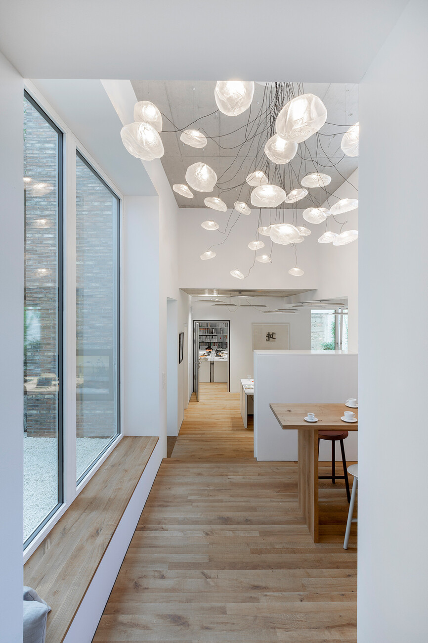
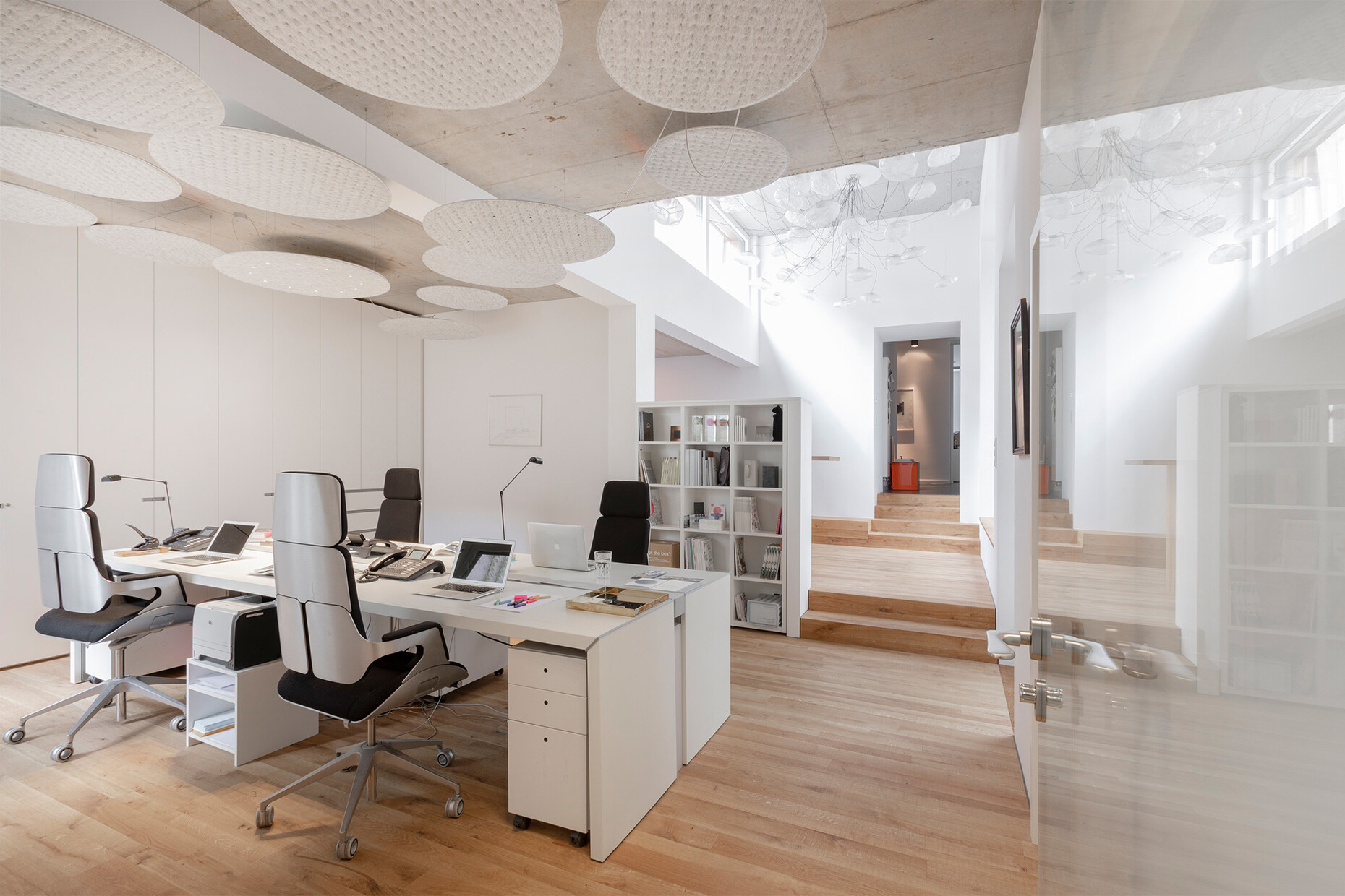
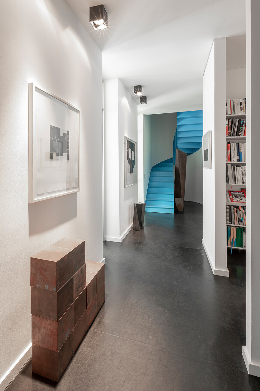
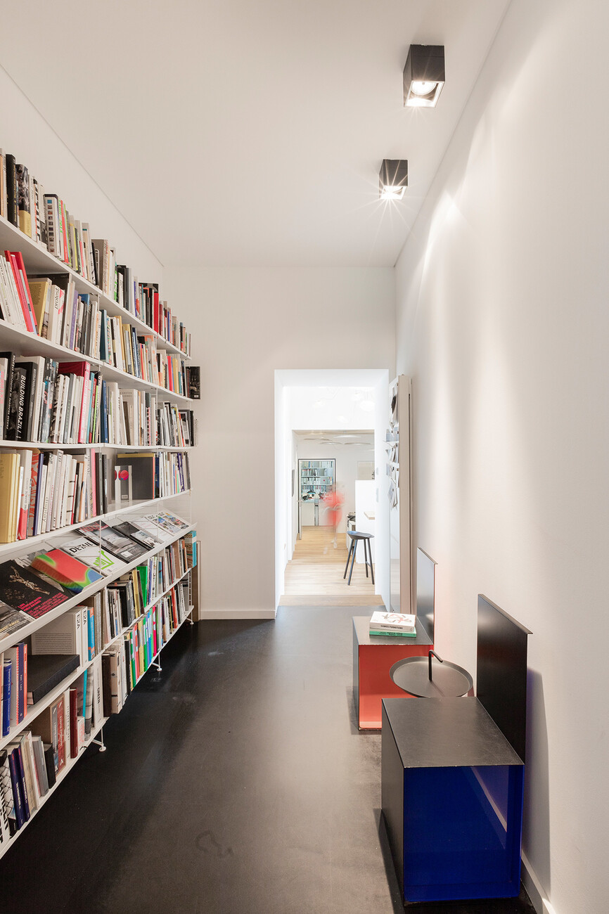
The interior spaces clearly demonstrate the meaning of the concept of “spatial experience”, which plays a key role in the work by Nicole Kerstin Berganski and Andreas Krawczyk. The one-story connecting structure, for example, which hosts not only multiple workstations but also the new lounge area, is an elongated room that is effectively broken down into different areas by two differing ceiling heights and floor levels. Through windows oriented towards three different points of the compass, the architects have achieved a huge spectrum of lighting ambiances. These design principles are continued in the two apartments on the upper floors. Here too, NKBAK manages to break up the apartments simply with differing floor and ceiling heights and almost entirely without dividing walls. Thus, despite the very limited floor space, the impression is one of breadth and spaciousness. This is enhanced by the private outside areas belonging to each of the two apartments. They are more than just mundane balconies; rather, they create a veritable private outdoor refuge for residents.
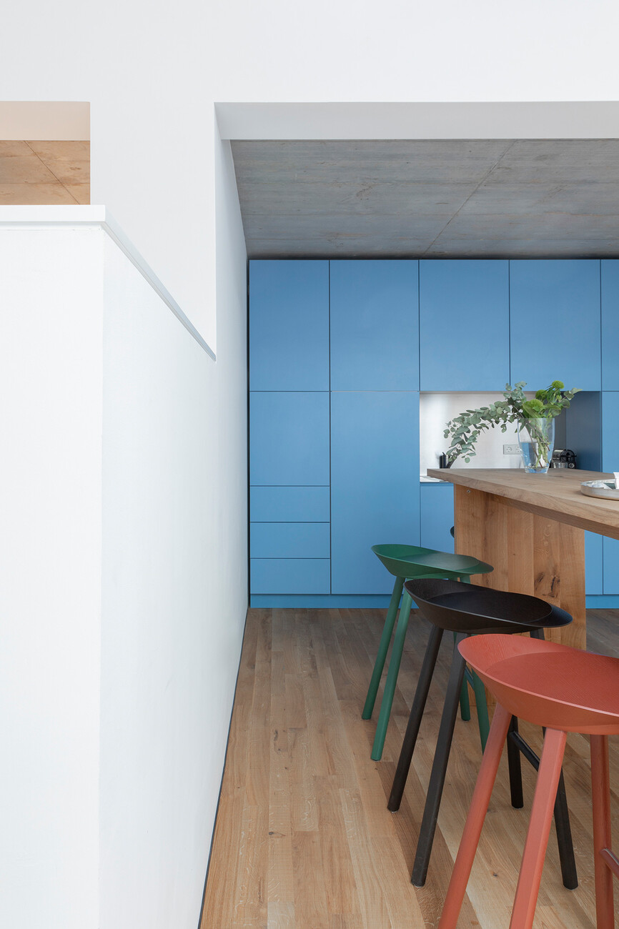
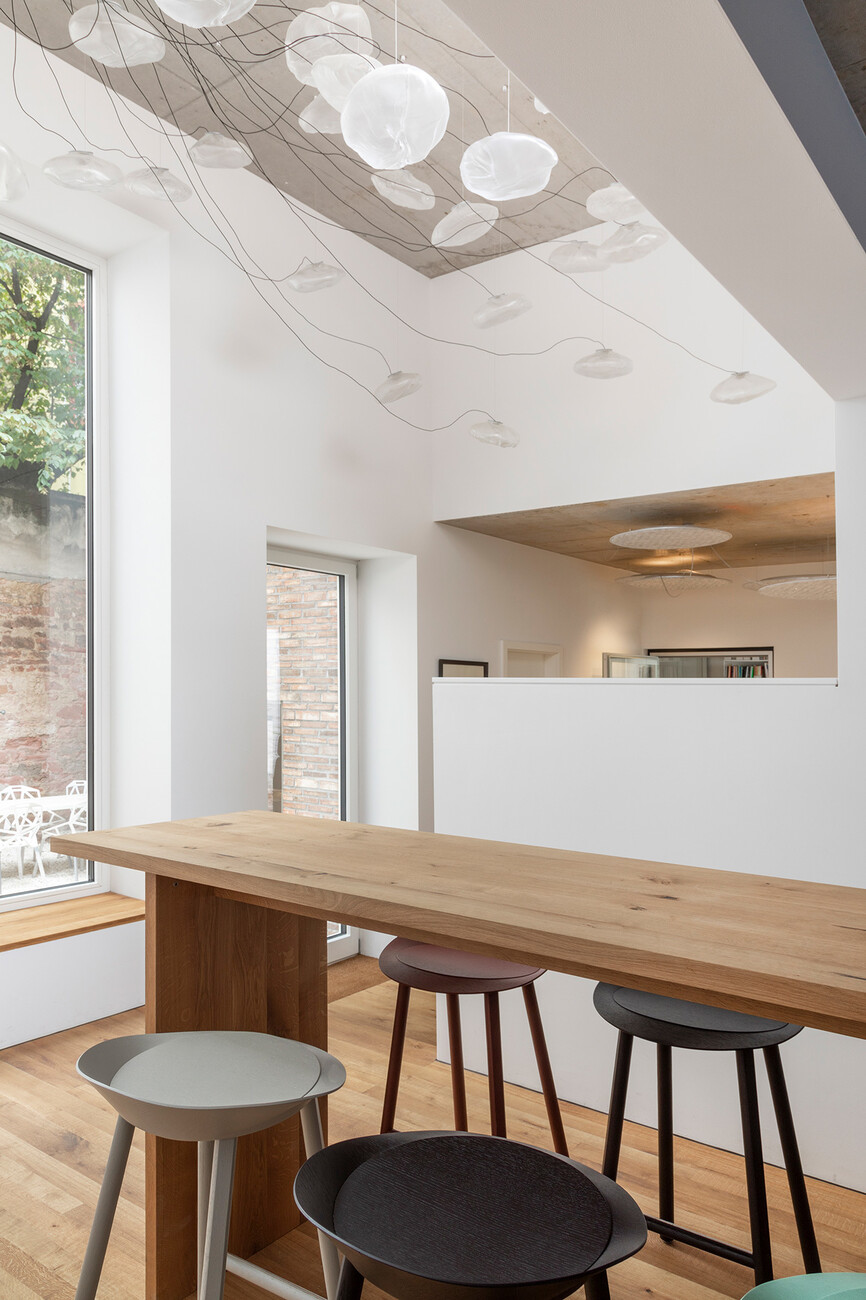
As for the external structure, in the interior it is less the spectacular gestures and more the keen sense of nuance that defines the new building. Here too, closer inspection reveals the obsession with quality among all those involved. Hence, for example, the rough-cut oak planks were manufactured and installed by an Austrian joinery, which boasts Pritzker prizewinner and detail fanatic Peter Zumthor among its clients alongside NKBAK. In the lighting and the furniture too, both client and architects chose carefully: Under the high ceiling in the common lounge area, 32 lighting elements from the “73” series by Bocci have been installed, and the extravagant “38” lights in the small courtyard also came from Bocci. Meanwhile, light and concentration at the workstations are ensured by the combined lighting and acoustic elements “Lighting Pad R” from Nimbus, while the “Annex Ceiling” lights in the two apartments came from Serien Lighting. The cupboard elements in the office were supplied by Interlübke, and the classic designs from String were installed as a shelving system. The table and bar stools for the lounge area came from e15. “The new office spaces are not just a visual delight – they foster internal communication and team spirit while supporting focused and inspired work.”, enthuses Franziska Michaelis, Board Member of Stylepark.
The effort and talent that has gone into the project has not been lost on outsiders either. All those involved were delighted and proud to receive confirmation that the new Stylepark building has made it onto the shortlist for the DAM Prize 2020. The eventual winner will be chosen next January. What’s even more important than any award, however, is the fact that the Stylepark team now has the perfect place in which to work.
