SUSTAINABILITY
Fresh and functional
One might say that the founders of Office S&M have a penchant for color – but that would be an understatement. Catrina Stewart and Hugh McEwen may use color tones with good sense and balance, but they nevertheless make clear, bold statements. In some designs they transform window frames, heating pipes or tile joints into eye-catching details, while in others they clad entire buildings in monochrome fronts. For this renovation on the ground floor of a Victorian townhouse in the London Borough of Islington, color was assigned a very particular task.
Spirited standards
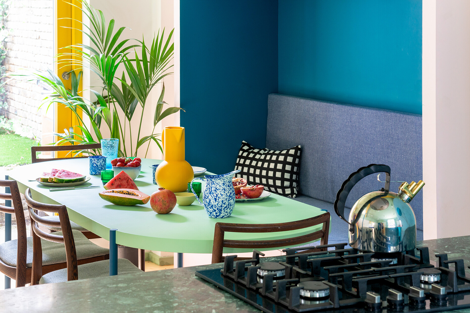
On the lower level, the design provided for two bathrooms, a utility room as well as a kitchen and dining area. To ensure the floor plan remains as open as possible, the architects removed unnecessary walls and divided up the space with a central, elongated island comprising the hob and worktops. This results in both visual and functional division of the space into cooking, work and eating areas. Yet the communal space was designed to meet far more than merely functional standards: The previously dark, confined rooms also had to be made family-friendly and welcoming.
“Office S&M was invited to create a space full of surprises and pleasures for every member of this four-person family,” explains the planning duo. Here, there are plinths for climbing, tiny spaces to crawl into, and soft surfaces in which to nestle. A mix of blue, yellow, green, pink, red and petrol blue is designed to have a fresh and calming effect and also provides for depth and dynamism in the interior. While the result appears playfully simply, it is nevertheless built on a carefully considered concept of colors, shapes and materials.
Milk bottles, Memphis, and multiple use
The architects’ client Tamsin Chislett is the co-founder of an online platform that aims to reduce waste and support designers by means of a clothing loan system. Such principles are now also reflected in her home. “We chose materials that had a previous existence and a history,” say the planners, hence the bathrooms boast surfaces made of old milk bottles and chopping boards. The terrazzo in the kitchen, meanwhile, was created from marble chips and offcuts, and even the pendant luminaires are made of recycled brick material. Multiple usage is a factor in the furniture, too. Designed by Stewart and McEwen themselves, the items often serve more than one purpose, whereby, for example, a canopied seating niche combines an upholstered bench and various storage solutions. It is both a dining space and a relaxed nook to retreat to. The colorfully painted staircase likewise incorporates cupboards, while the differently colored mirrors distributed throughout the space divert the sparse light of the ground floor and create intriguing visual axes.
With the colorful, building-brick-like modules reminiscent of the Memphis Group or the work of Mexican architect Luis Barragán, the architects have pursued the aim of creating spaces that are simultaneously different and yet interconnected. At the same time, they are intended to convey a sense of enclosure and reflect the buildings in the surrounding urban space. The result, within a limited space of just 55 square meters, is simultaneously an urban playground and a playful urban space.


