NEW WORK
Breaking the Grid
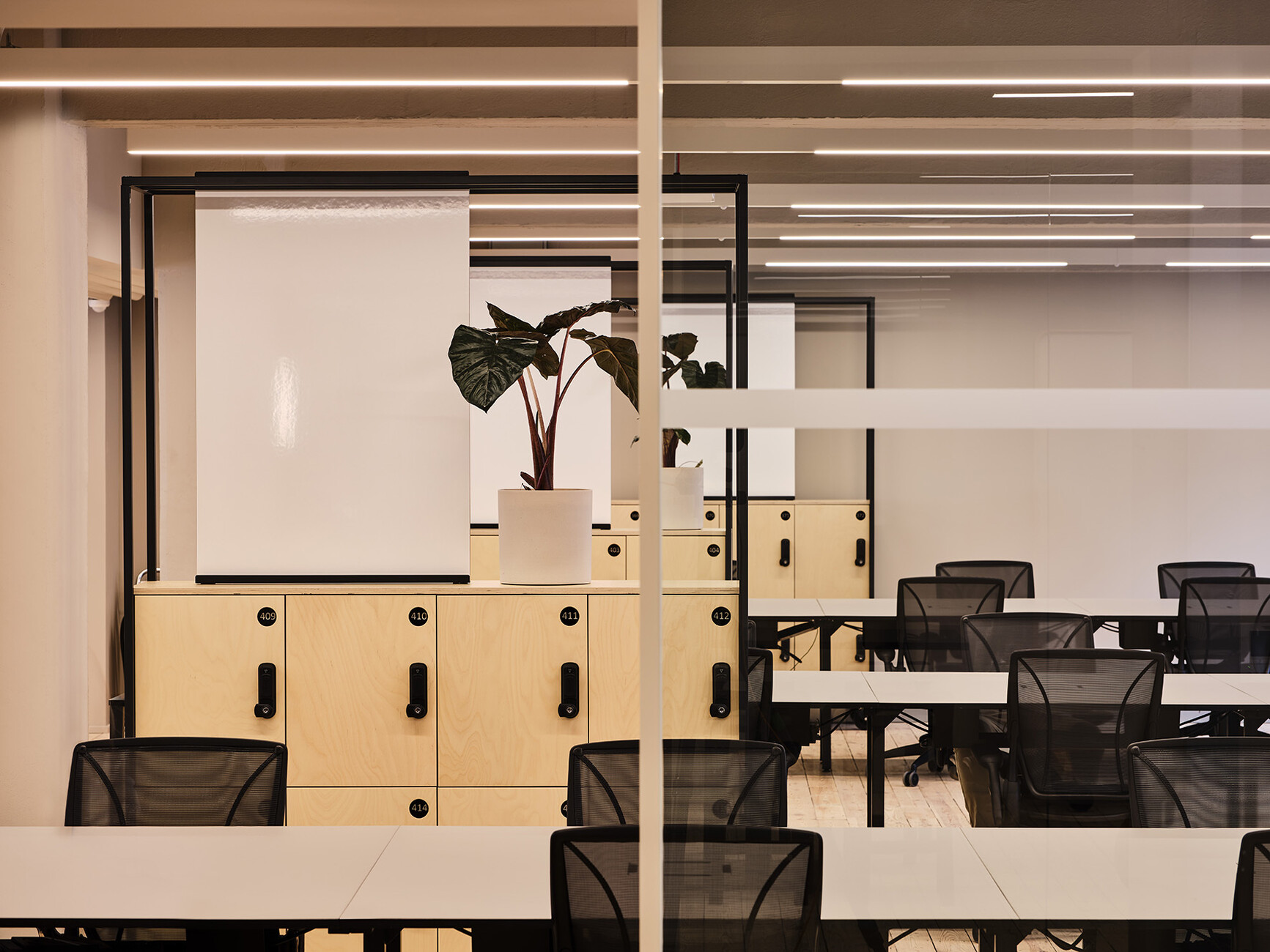
Nobody has yet come up with a suitable term for those cozy, comfortable, avant-garde shared working spaces but there are, by contrast, many trailblazing examples. Despite – or perhaps because of – the pandemic, the boom in serviced co-working facilities remains unbroken. The Office Group (TOG) also continues to grow – with this British office provider, which is located between Oxford Circus and Great Portland Street, recently opening its 42nd branch. In the wake of the old “Kontorhaus” (office building) in Berlin, further locations in Frankfurt and Hamburg are scheduled to follow. Flexible working to a high standard following the principles of the co-working model is attractive for companies of all sizes – from freelancers to large corporations, with the latter usually immediately renting more than one floor for their employees.
TOG founders Olly Olsen and Charlie Green once again turned to the creative team at Note Design Studio when it came to handling the concept and interior design of “Douglas House”, which opened recently. Back in 2019, the collective headed by Johannes Carlström and Cristiano Pigazzini transformed “Summit House” in Holborn into a flexible working space for the Group. In this instance, minimalism meets an apparent harmony between caramel, deep red, and shades of green of the kind that would doubtless appeal to the aesthetics of the filmmaker Wes Anderson.
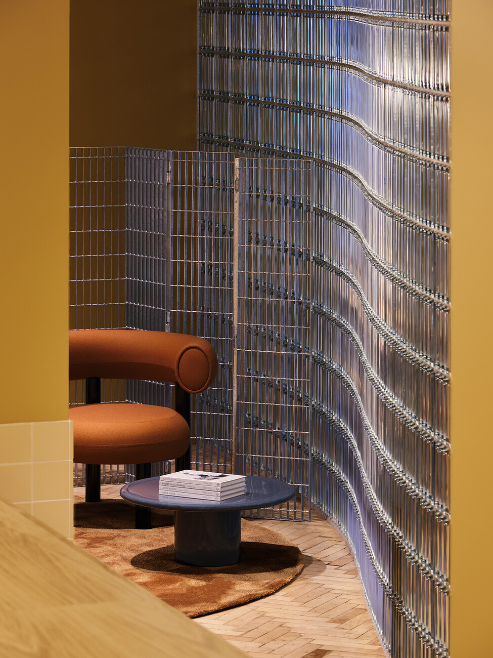
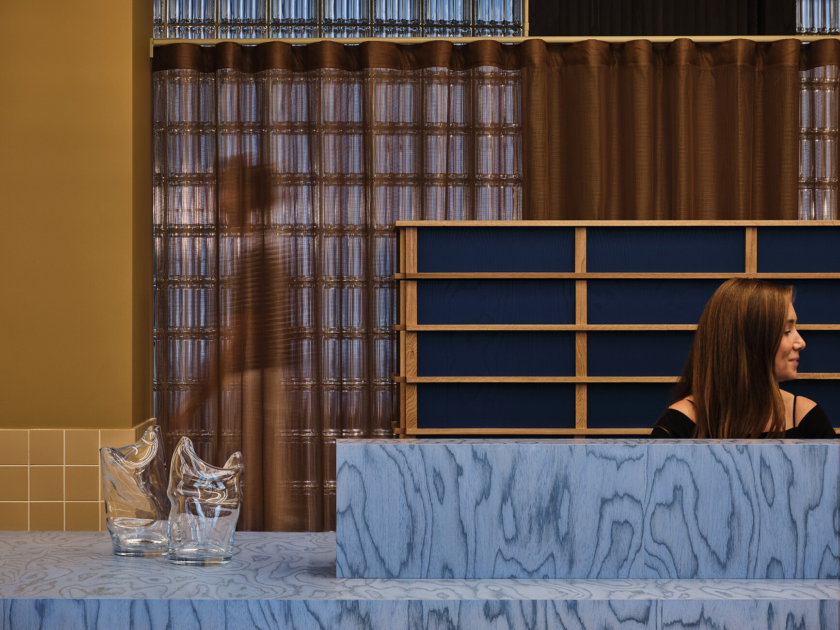
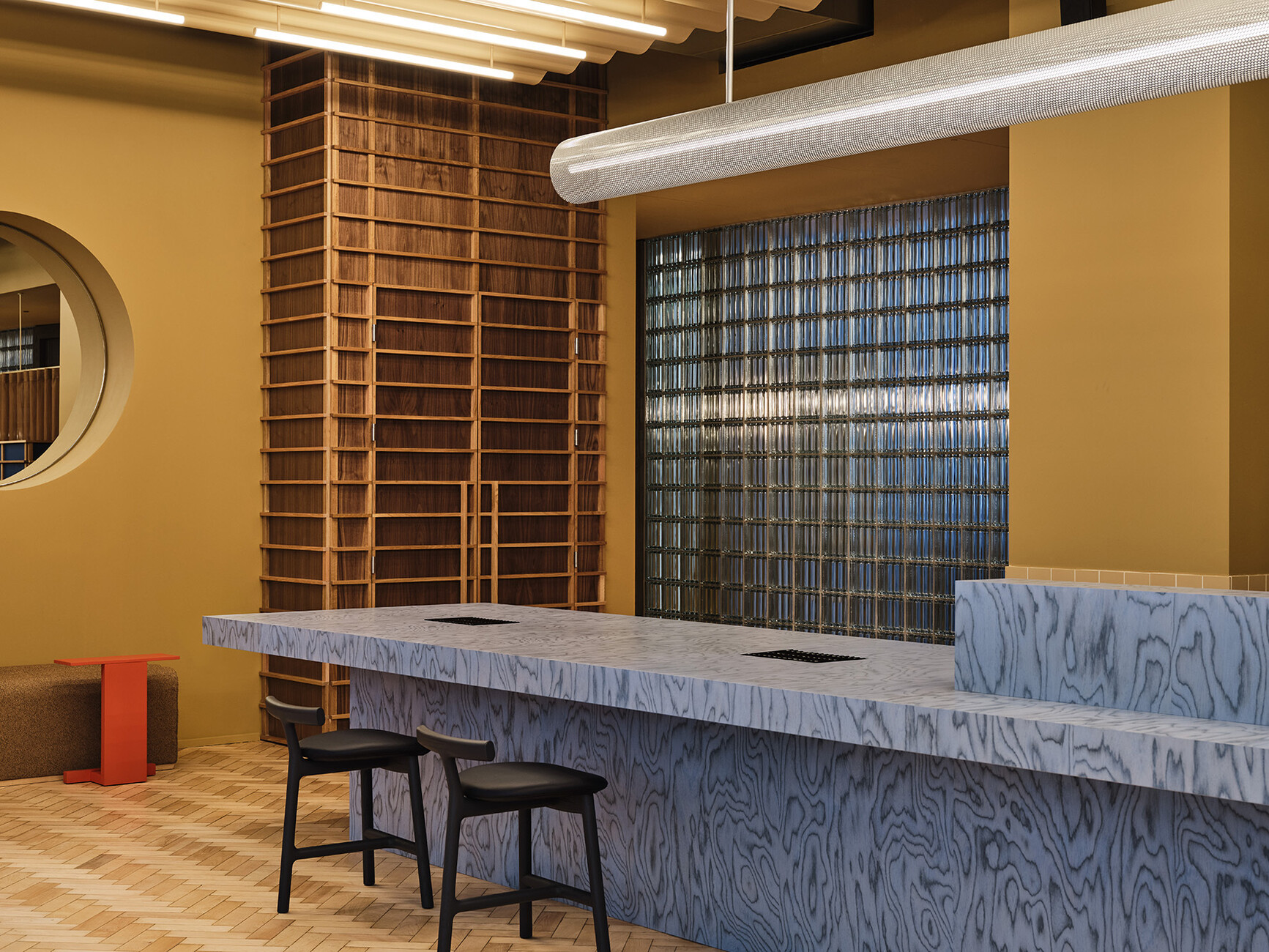
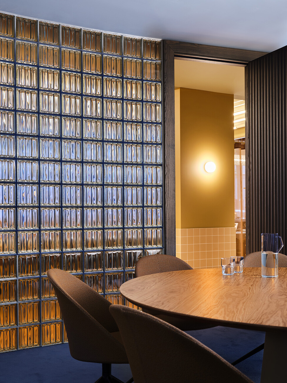
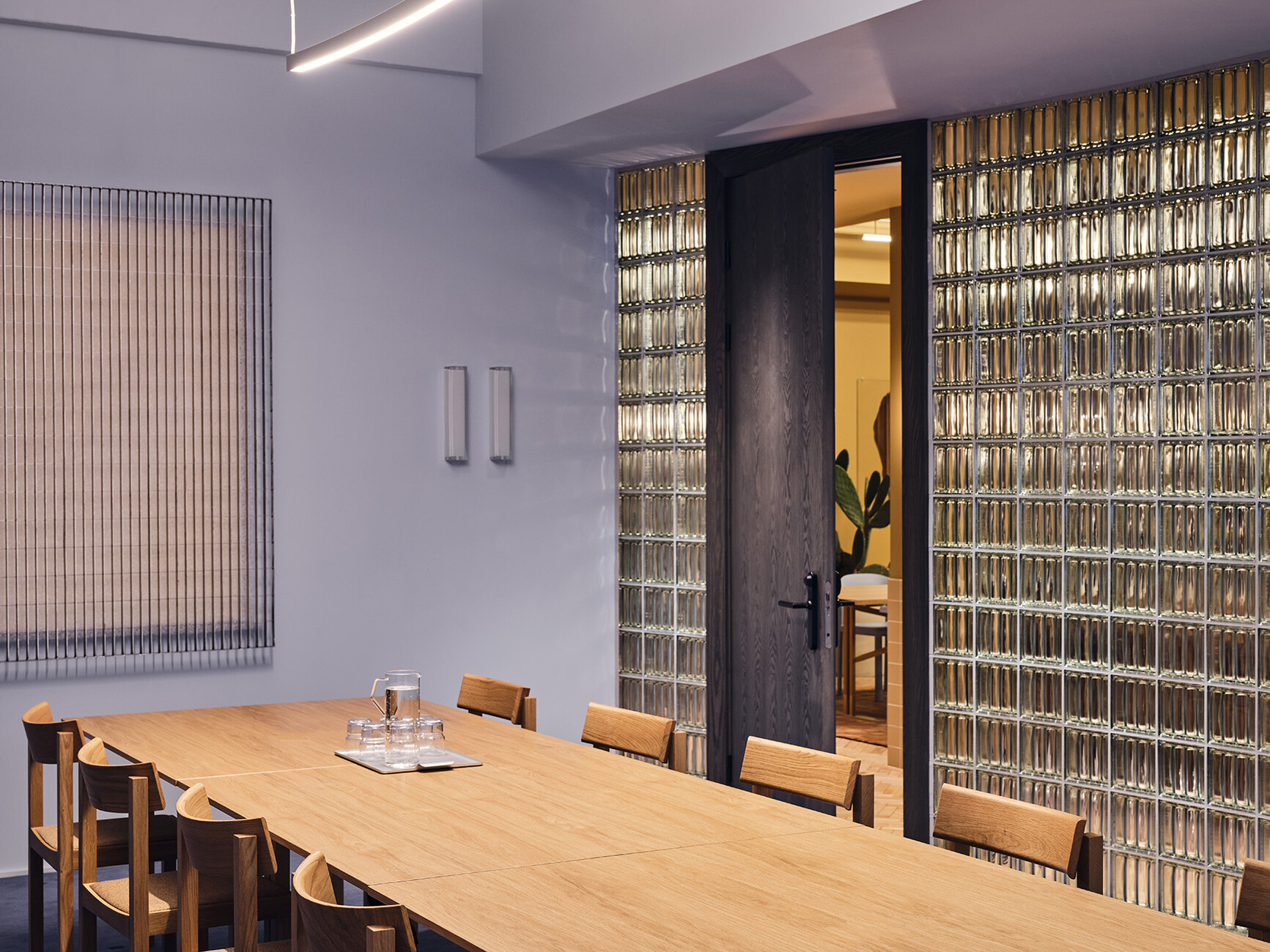
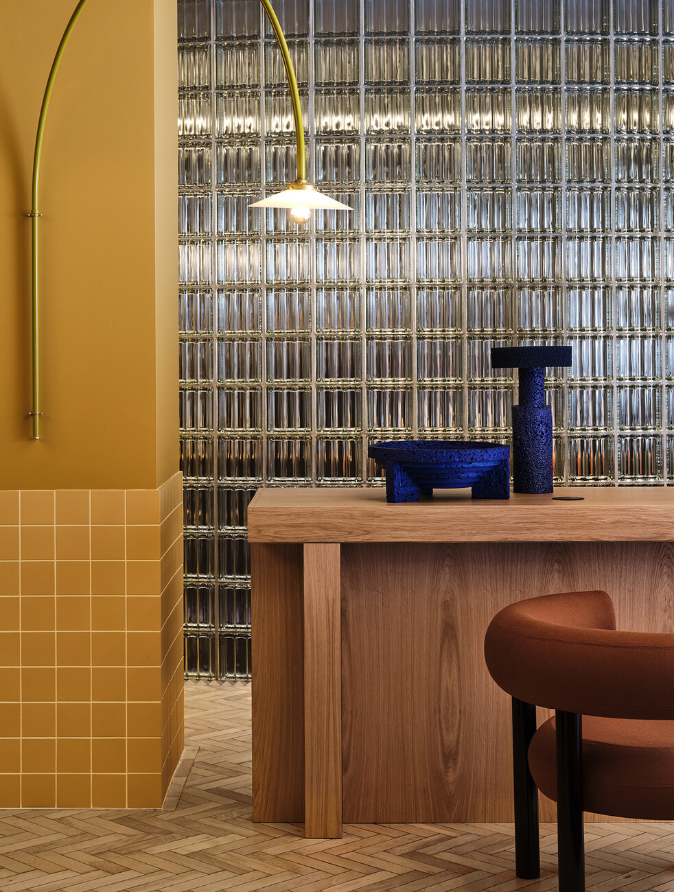
While in the case of the historic Art Deco building dating from the 1920s, Note Design Studio’s approach hinged primarily on using Nordic understatement to elevate the premises to new and radiant heights, the six-floor building on Great Titchfield Street presented the designers with new challenges. The existing structure dating from 1933 possessed a radically functional look. A strict pattern characterized the façades and the interiors. “It was our intention to break up that pattern,” is how Carlström explains the overall approach to converting the brick building, which is over 90 years old, into forward-looking premises for The Office Group with interiors that tell of a different time,” explains the architect. The old substance was redeveloped respectfully, historic details and elements refurbished. To create an organic shape in the long corridor an undulating wall made of glass bricks dyed pale blue forms a counterpart to the strict pattern. The conference rooms are located behind this. Where four staircases divide up the ground floor into three zones the hope is that the undulating glass wall will make for a new connection with these segments of space.
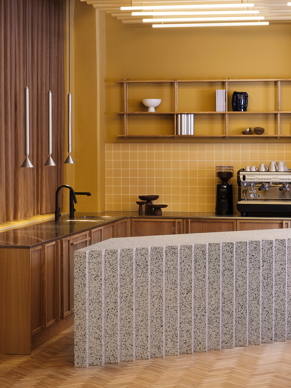
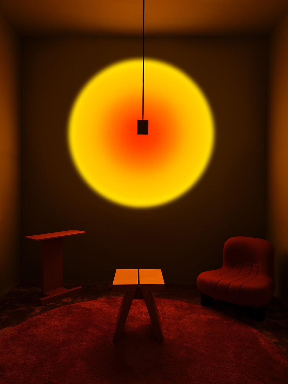
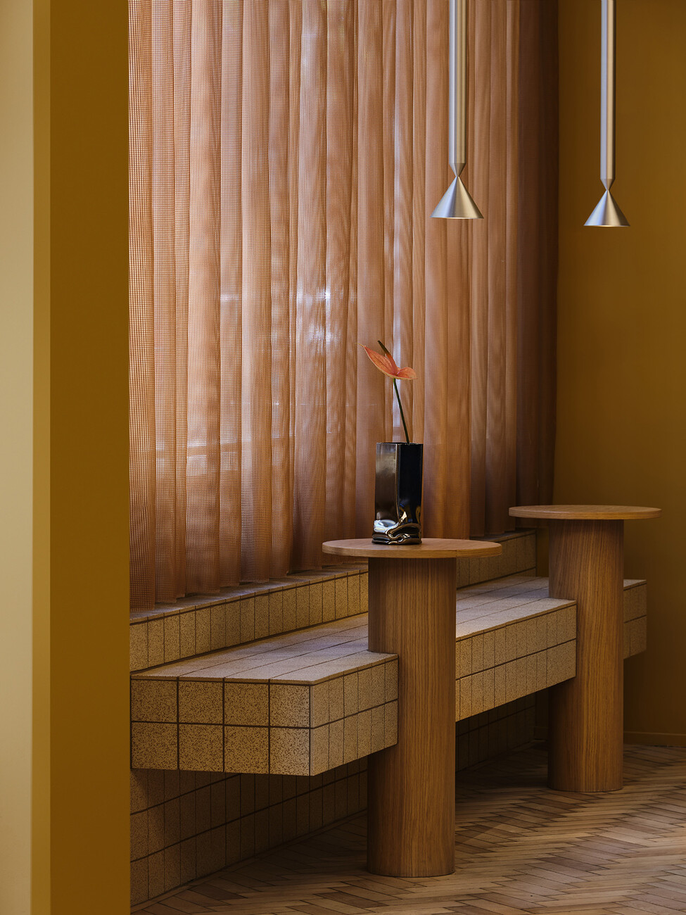
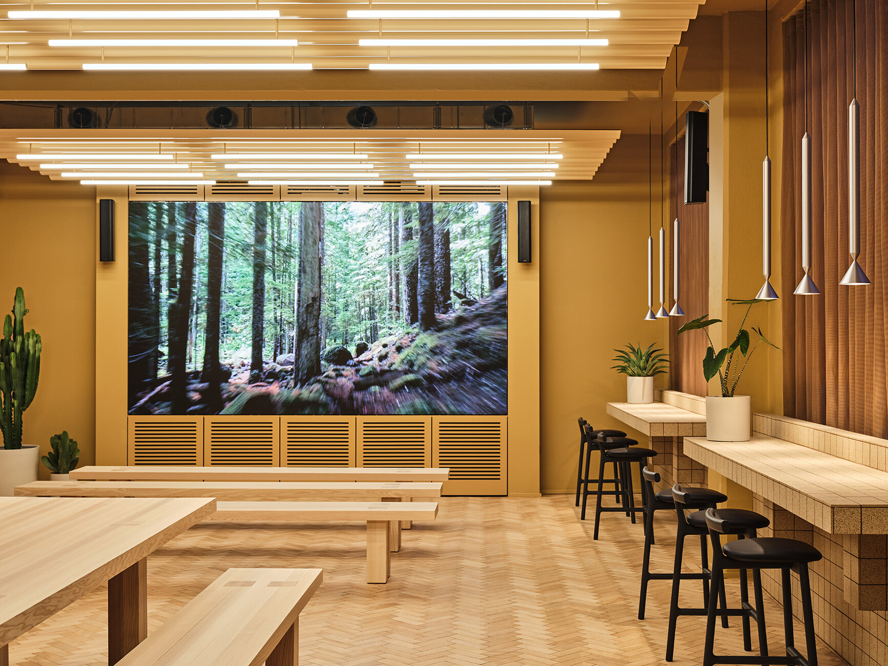
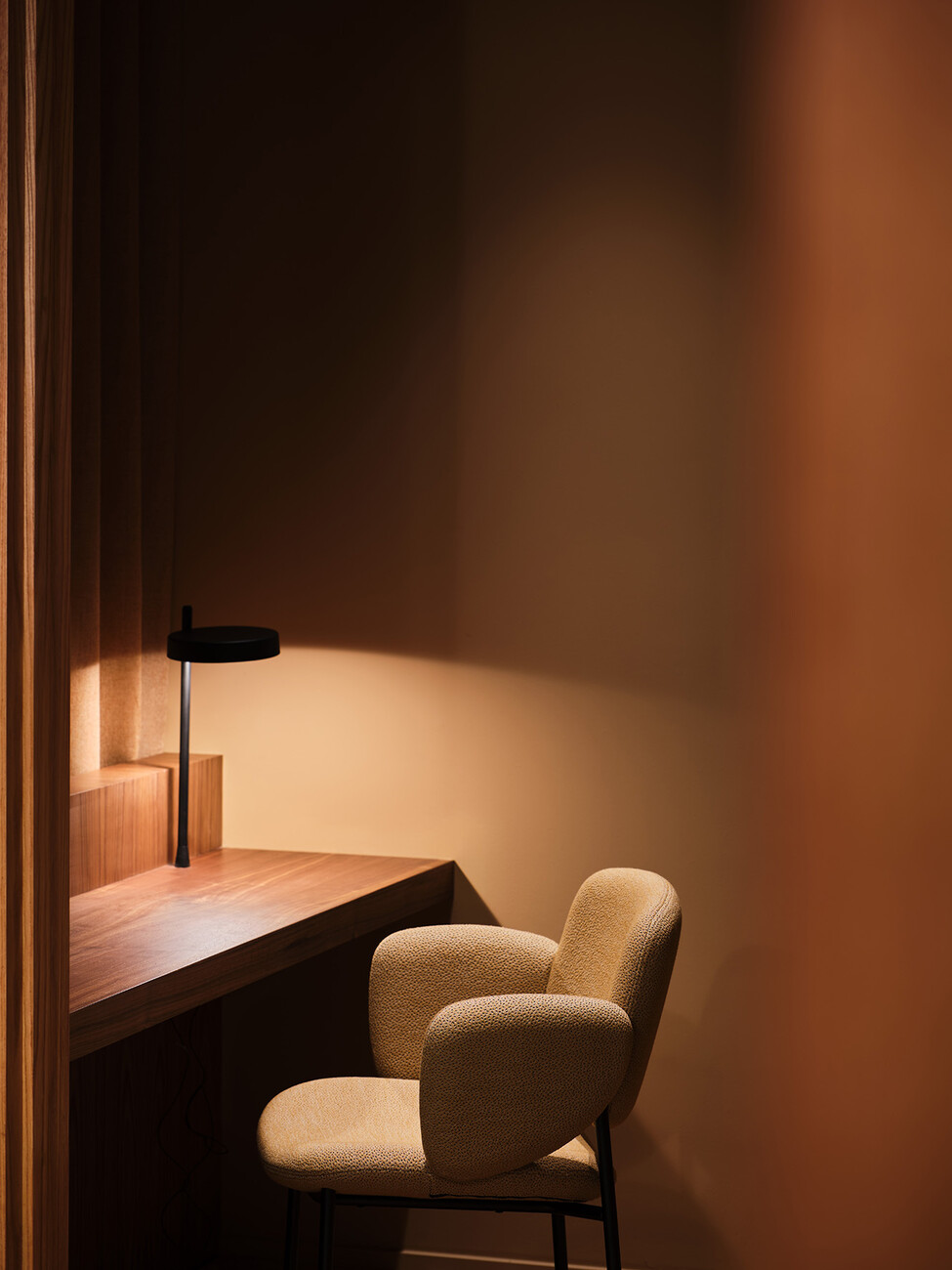
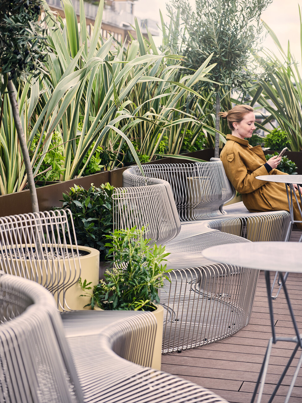
The Nordic designers set out to come up with a contrast not only for the unobtrusive brick façade and the pure symmetry of the many lattice windows as their interior aims at breaking up the monotony of everyday office life. The intense color design seeks to activate all the users’ senses. Monochrome seating in international Klein blue or in signal red are paired with graduated worlds of color in warm tones such as wood, nut brown, mustard and ocher. On each one of the six stories individual energizing locations offer opportunities for the exchange of opinions and quiet rooms to which staff can retreat, the kind of rooms that promote concentration. The focus is always on the emotional qualities of a particular room.
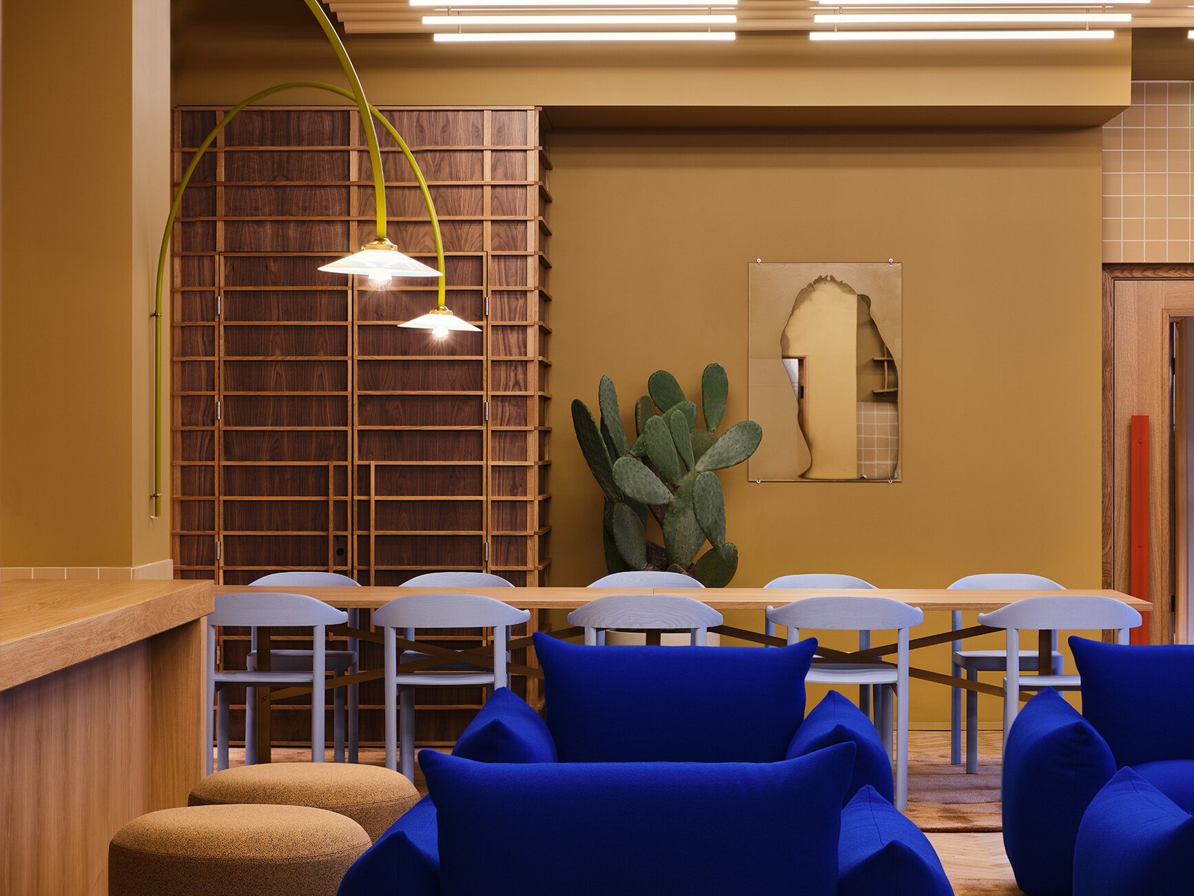
And if Note Design Studio tends to prefer Scandinavian and particularly Swedish furniture manufacturers and designers for their projects, the furnishings in Douglas House draw on an impressive diversity of items from all over Europe. For this project new products are mixed up with timeless classics, guaranteeing that the look is always stimulating. One example: the stacking ottoman “Drop” by French designer Pauline Deltour for COR in sandy beige, excellently offsets the “Marenco” armchairs which come in a brilliant shade of ultramarine blue and have been made by Arflex, an Italian manufacturer of furniture, since 1970.
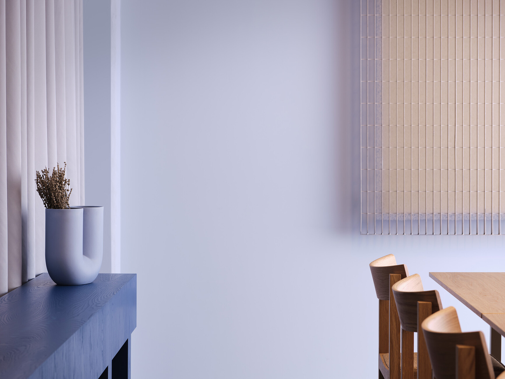
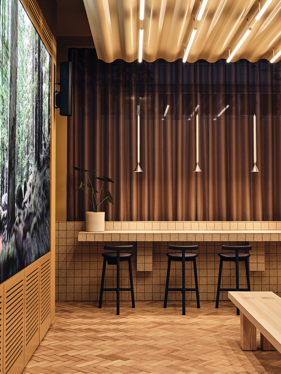
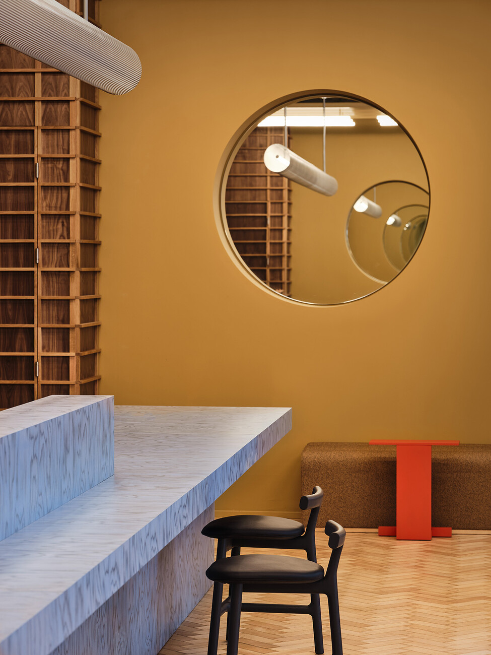
The pale blue solid wood chairs are from the collection “Curv” by Swiss designer Jörg Boner for a German brand, Stattmann Neue Möbel, the “K65” bar stool is an Artek classic by Finnish furniture designer Alvar Aalto. And the sculpturally sweeping curved wall lamp by Belgian design duo Muller van Severen was manufactured by Antwerp-based label Valerie Objects. A whole string of custom-made products such as the many fixtures and fittings complete this wild ensemble. It is more like a canvas to be painted on, is the way that Carlström describes the selection process. “Every stroke of the brush counts and makes its own impression. We proceeded in a similar manner in our choice of furnishings – extremely carefully. The fact that this bold concept actually works is demonstrated right at the reception where there is a particularly eye-catching piece – the counter boasting a powder-blue wood veneer by Alpi from the first Memphis collection, as if introducing a touch of Ettore Sottsass.
