New British Wave
Where is it actually stated in writing that a city has to love its river? Lisbon, for example, would have good reason to hate the River Tagus. Or is it unforgiving to blame it for the tsunami triggered by the devastating earthquake of 1755, which destroyed some two thirds of the city and cost approx. 50,000 inhabitants their life? King Joseph I, who by chance was out in the countryside the day disaster struck, subsequently developed uncontrollable claustrophobia, and had an extensive tent complex erected as his seat of power in the hills of Ajuda. For generations the Portuguese lived in fear of their river; after all, the monster wave could return.
It would take over 200 years for the city to reconcile itself gradually with the river it had previously surrounded – with poor living quarters and seedy docks, albeit with some particularly beautiful bridges as well. These, however, stand on particularly high supports, as if to ensure the maximum distance to the water beneath. Expo 1998 was the first clear signal that the ramshackle and underused industrial plants on the banks of the river should once again be made a focus of urban development, an exclamation mark behind the many minor endeavors that had been previously been shouting out “Back to the River.”
Revitalization along the Tagus River
Early October saw the opening of yet another step towards the revitalization of the banks of the Tagus: the new extension to the Museum for Art, Architecture and Technology (MAAT), which was designed by the British architect Amanda Levete. It is located in the neighborhood of Belém, quite a distance away from the still extremely popular Expo grounds. Yet tourists also know the area as it is home to the Royal Palace, the vast cultural center made in 1993, and because of the quite sensational pastries “Pastéis de Belém” which were allegedly invented here and which have enjoyed huge success for more than 150 years.
Belém was largely left unscathed in the 1755 earthquake, but is also clearly cut off from the riverbank. This is due to a busy railroad line and a far busier, four-lane expressway. Only here and there is there a dark pedestrian tunnel or a tiny little bridge to the other side.
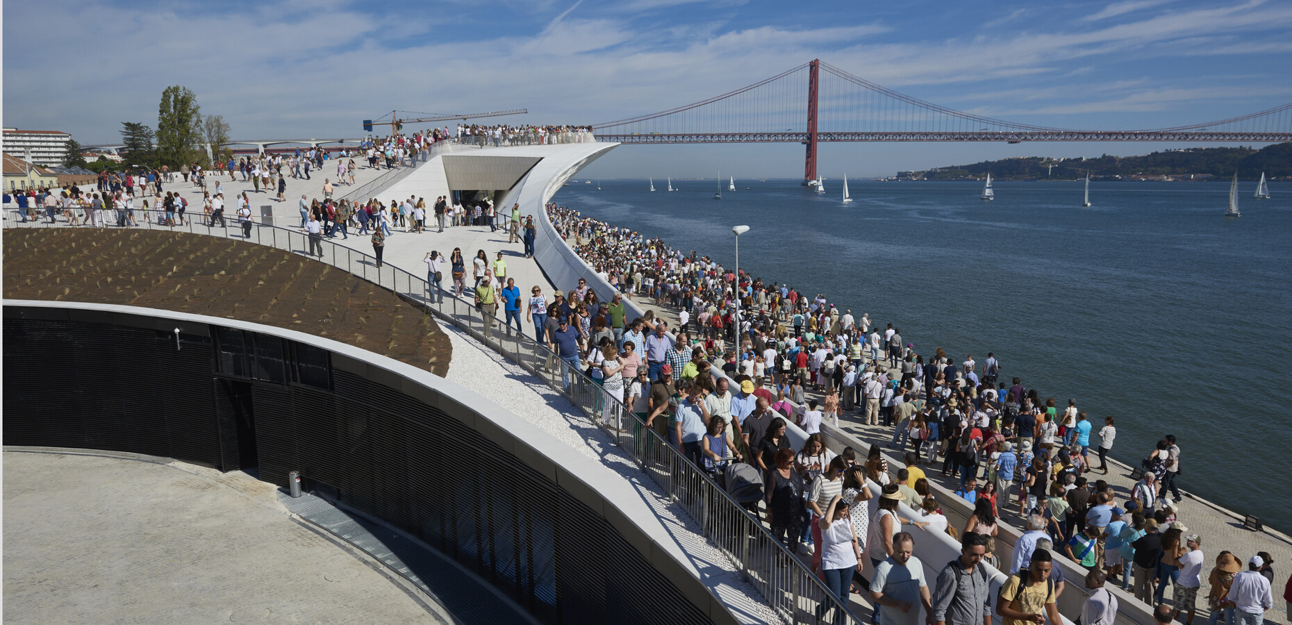
The local populace would appear to love the new facilities on the riverbank. On a mild, sunny October 5, the country’s national holiday and the day of the official opening of the MAAT, more than 22,000 visitors, a new record, availed themselves of the free entrance in order to get an idea of the new building.
Constructing in a difficult location
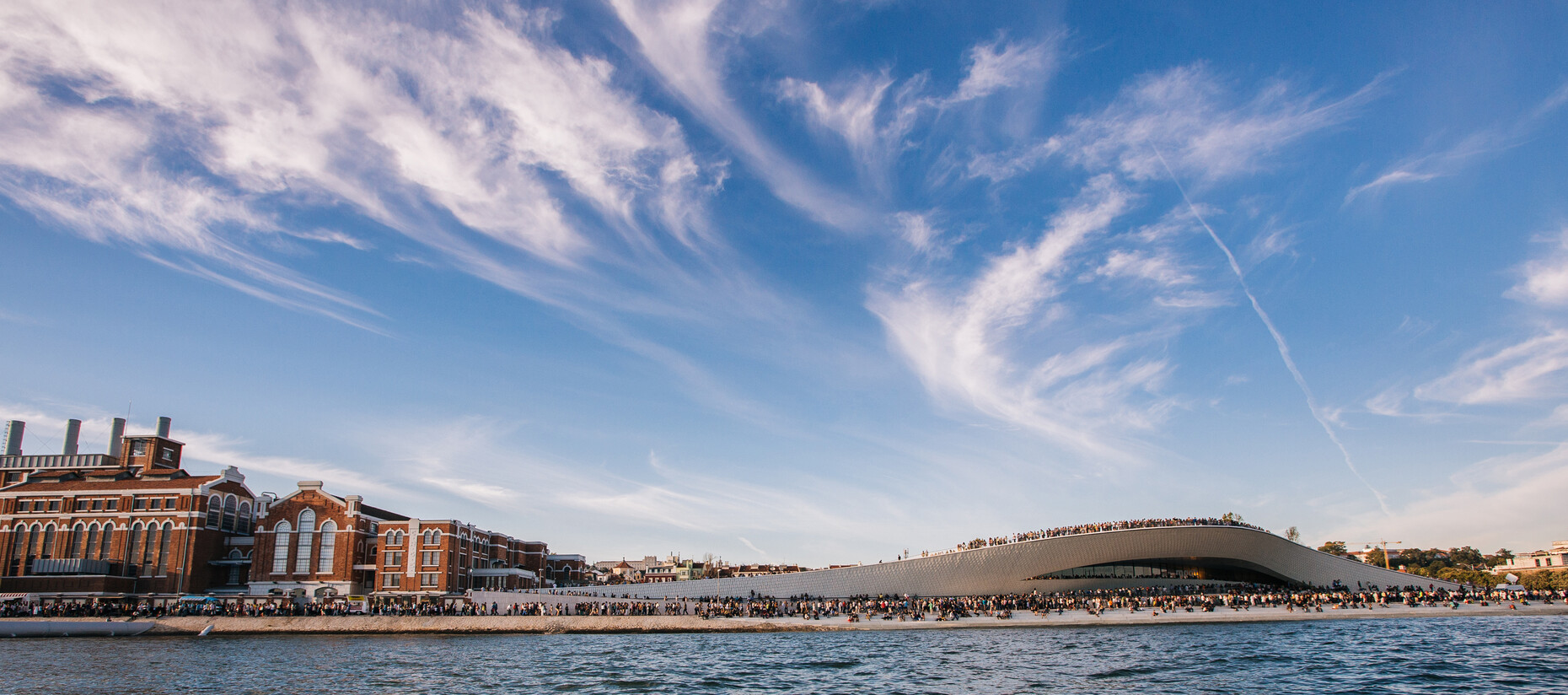
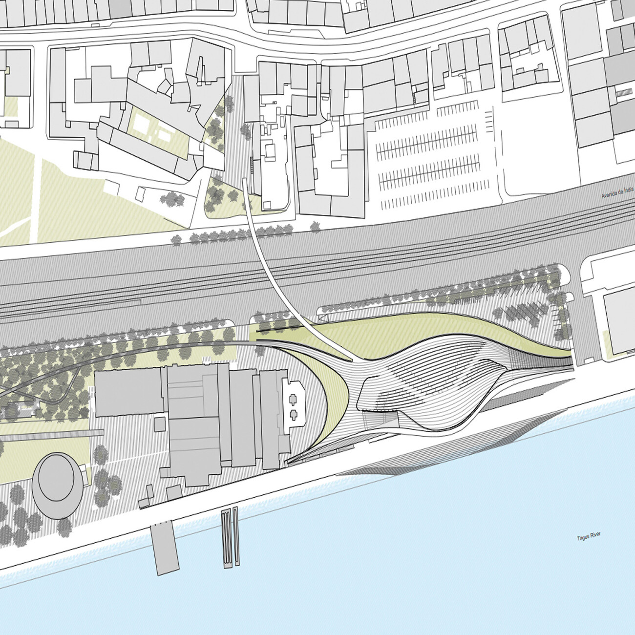
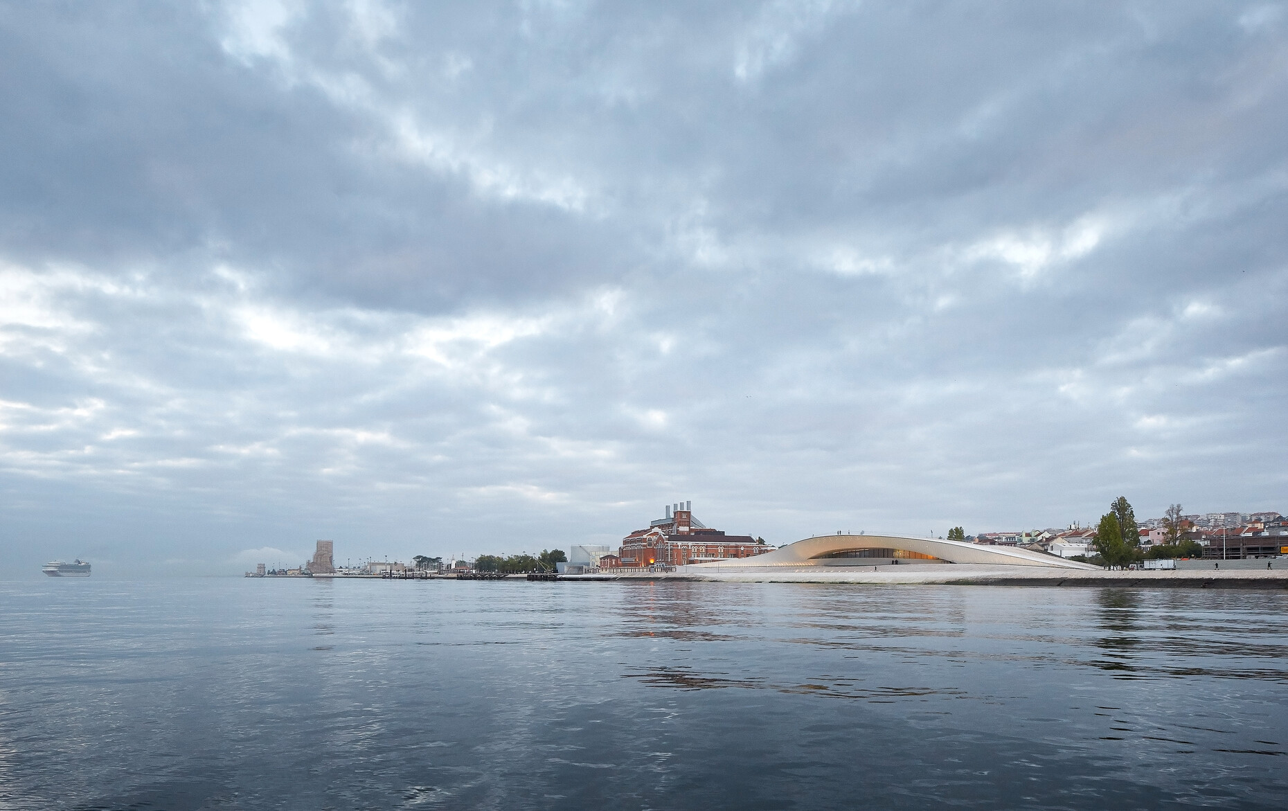
The new structure is in fact in a difficult place. At the rear there is the railroad line and expressway, at the front the public promenade and the river, directly next to it the old thermoelectric power station – a beautiful, red brick historical industrial structure, with steel girders and large ribbon windows, which from 1908 until 1951 was repeatedly extended and as such, like a construction encyclopedia, presents elements from Art Nouveau to Classicism. The building was one of Lisbon’s main power stations until it was decommissioned in 1990 and initially turned into the Electricity Museum. It belonged to energy corporation EDP, which in order to help pay off debts, and under pressure from the EU, was privatized in 2011. EDP had already set up a charitable foundation, which runs the museum, and also financed the EUR 20 million new building.
Wanted: a new landmark
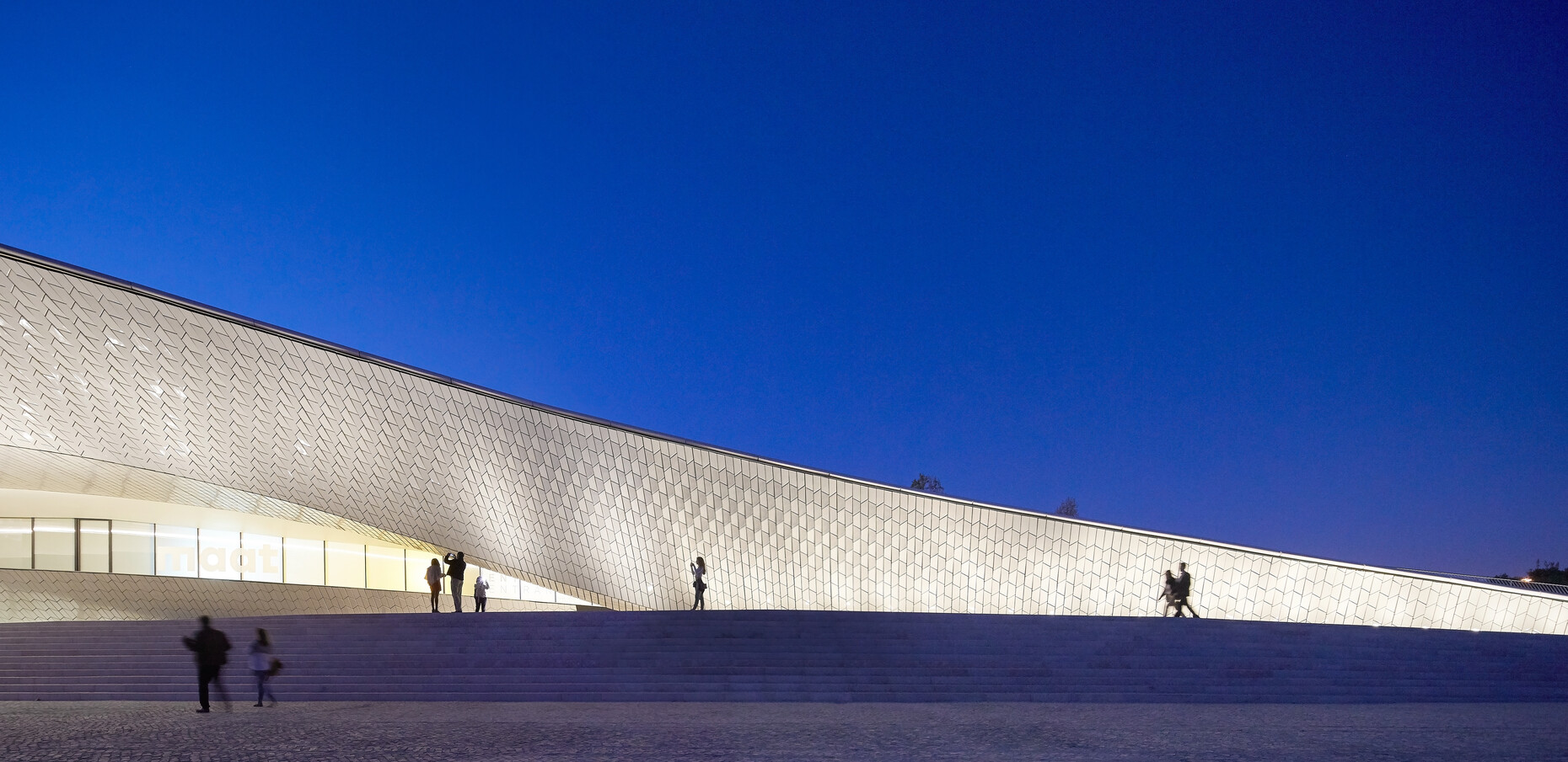
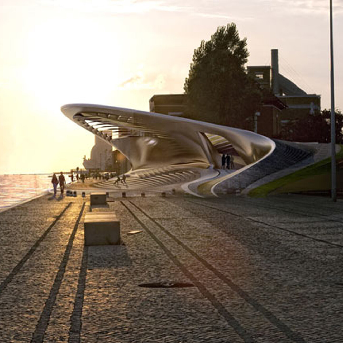
When the international architects’ competition for the extension was announced in 2010, the brief was clear: A new landmark was to be built on the bank of the River Tagus, an iconic building like the Guggenheim Museum in Bilbao or the Tate Modern in London, even if the layout in Lisbon was to be far more modest. As a visible sign for the city’s return to the riverbank, on the one hand, but without doubt for EDP and its foundation; after all, from being a state-owned company they had morphed – with Chinese stakeholders – into one of the most financially powerful players not just in Portugal’s cultural scene. The design submitted by Amanda Levete mastered the brief best, as it duly conjured up a landmark with a small layout and on a slender budget. She bends the riverside promenade upwards like a sea serpent, positions the best side clearly and exclusively towards the water.
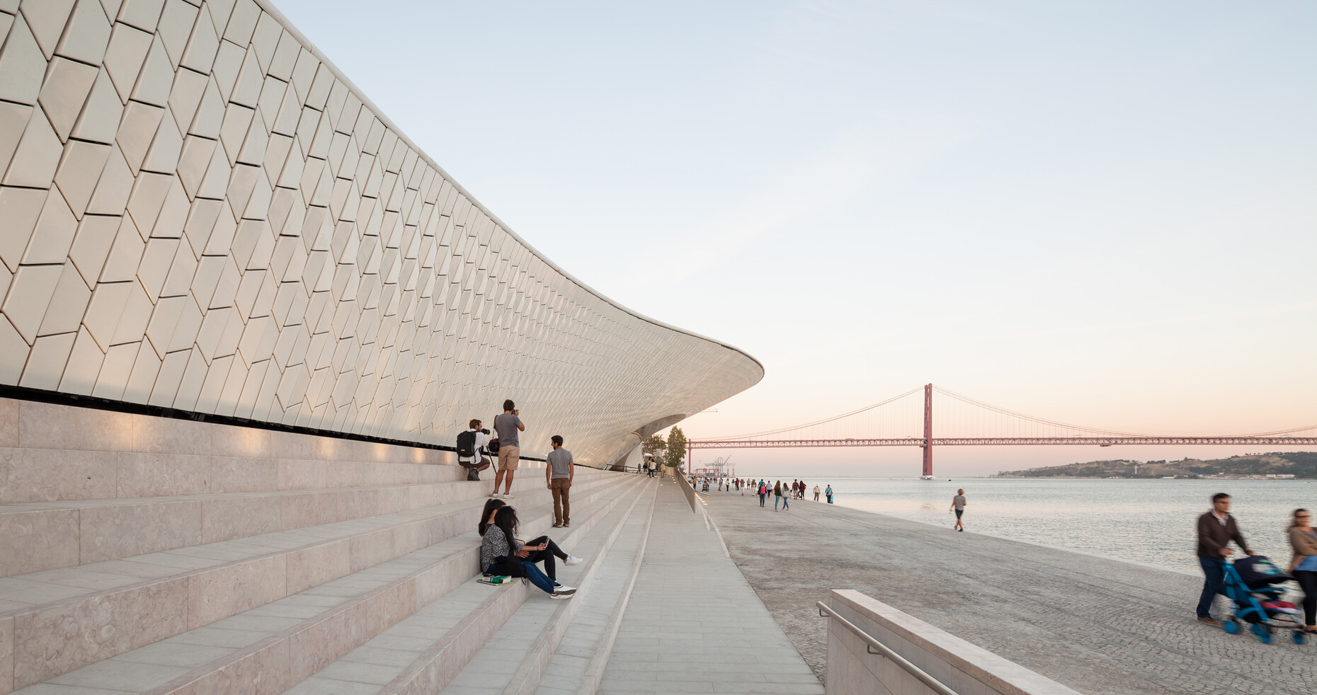
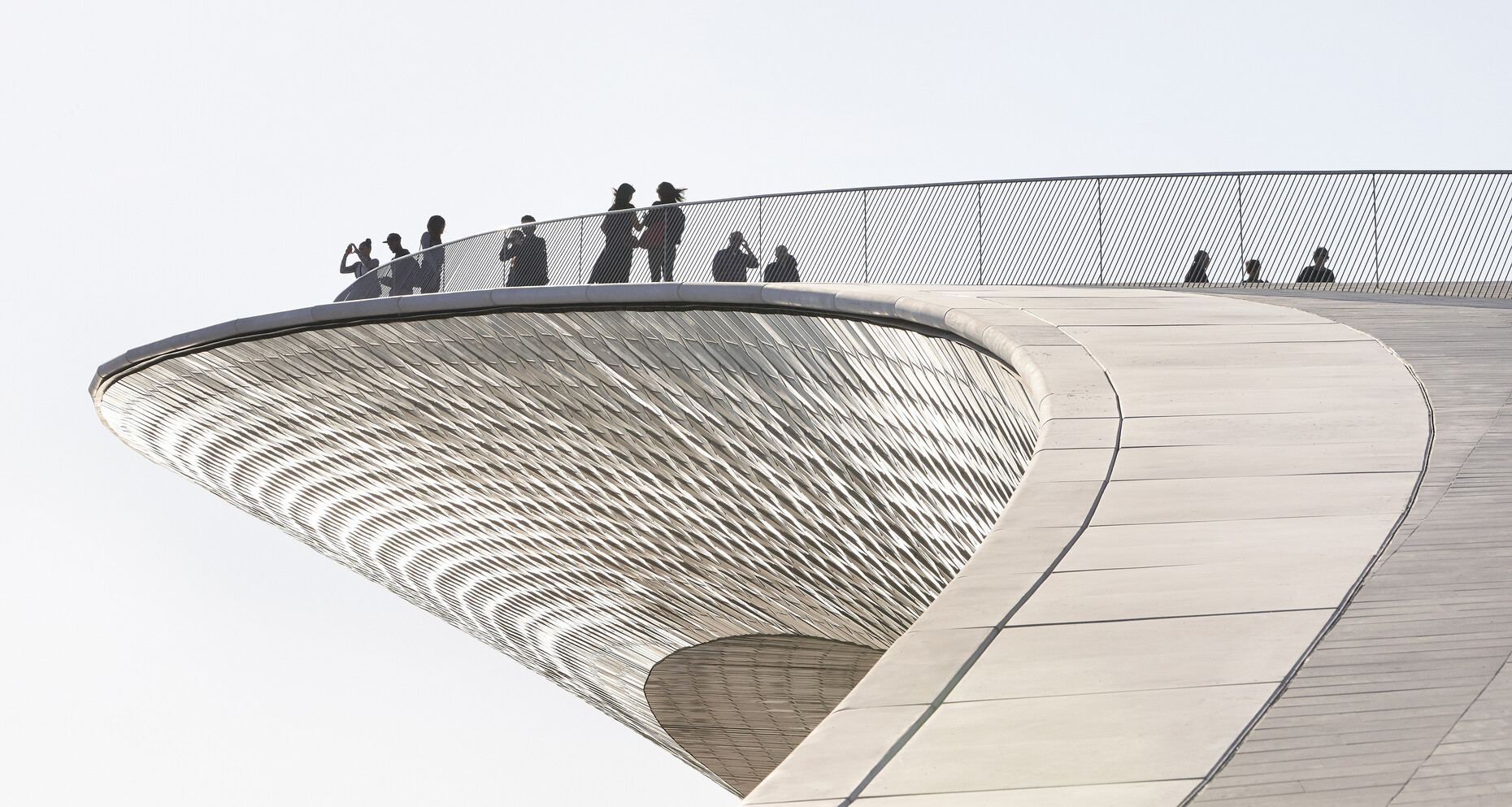
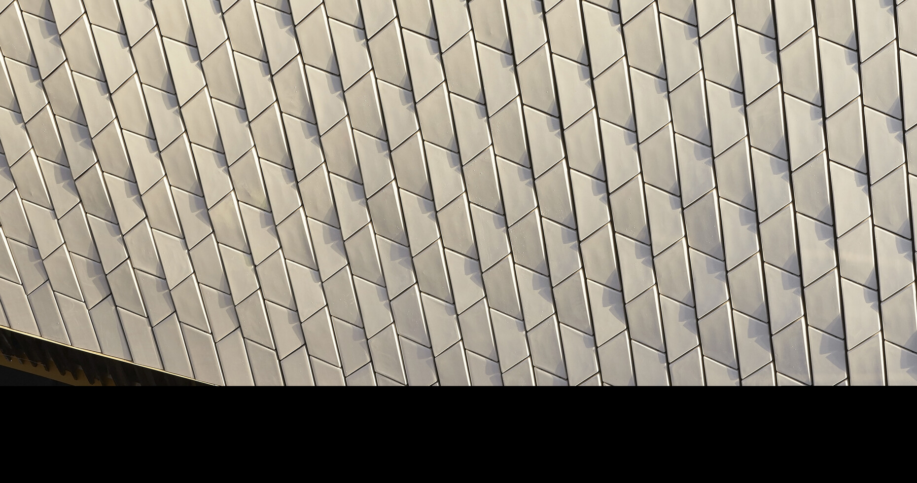
Overlooking the road, the rear side is a pragmatic delivery zone with parking spaces and a few very straightforward doors and gates. The curved side overlooking the river, on the other hand, boasts a façade made of 15,000 3D ceramic tiles, which can be seen as a reinterpretation of the Portuguese azulejos tradition. With its gentle curve, the roof of the building at the same time creates a new, publicly accessible part of the river promenade. You could see quite a lot of things in this buildings shape: a man-made hill by the water, a dune, an eye, a giant snake – or a threatening tsunami wave from 1755. Most importantly this gestrure gives rise to a vivacious balcony above the main entrance offering a splendid view of the 25th of April Bridge and the Christ the King statue on the other bank. During the opening ceremony an incredible number of photos and selfies were taken, with children being pushed out of the way, so that people were able take a better self-portrait.
Signature architecture is here to stay
Nowadays, and certainly long before Zaha Hadid’s sudden death earlier this year, you will often hear that signature architecture is passé. If that were the case, Amanda Levete’s building may appear to be from a different age. But that is by no means the case either. Levete herself is the best proof there is of the continued existence of architecture that has a tendency towards extravagance or even eccentricity. The Brit imbibed star architecture from her early career days on, working first for Will Alsop and then for Richard Rogers, before in 1989 becoming a partner in Future Systems, where she stayed until Jan Kaplický’s death in 2009. She then self-confidently dropped the name Future Systems in order to set up her own studio, with which she by all means continues the formal and material idiom of Future Systems.
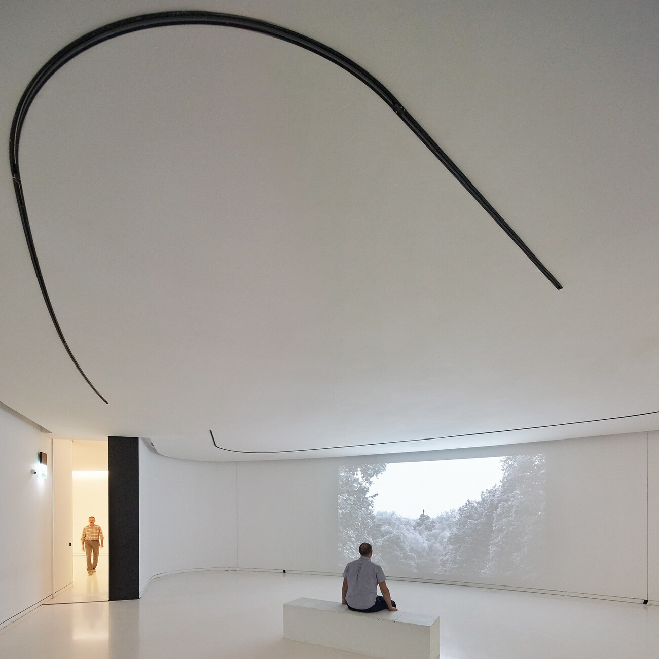
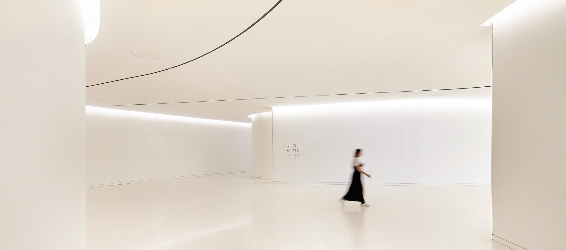
Nevertheless, her structure in Lisbon has to contend with similar problems as lots of designs by Hadid, Calatrava or Gehry: Building the flowing forms that are wanted is relatively expensive, which for the most part is at the cost of the details in, but primarily the quality of the interiors. There is evidence of this in the MAAT as well. Having left behind the façade with its 15,000 3D tiles shimmering in the bright Portuguese light, you find yourself in a dark, relatively straightforward, albeit elaborately shaped building, the realization of which is at best low-cost. You only have to look at the ceiling above the oval main room or inspect fittings, floors, and walls in the foyer more closely.
Glittering façade, dark rooms
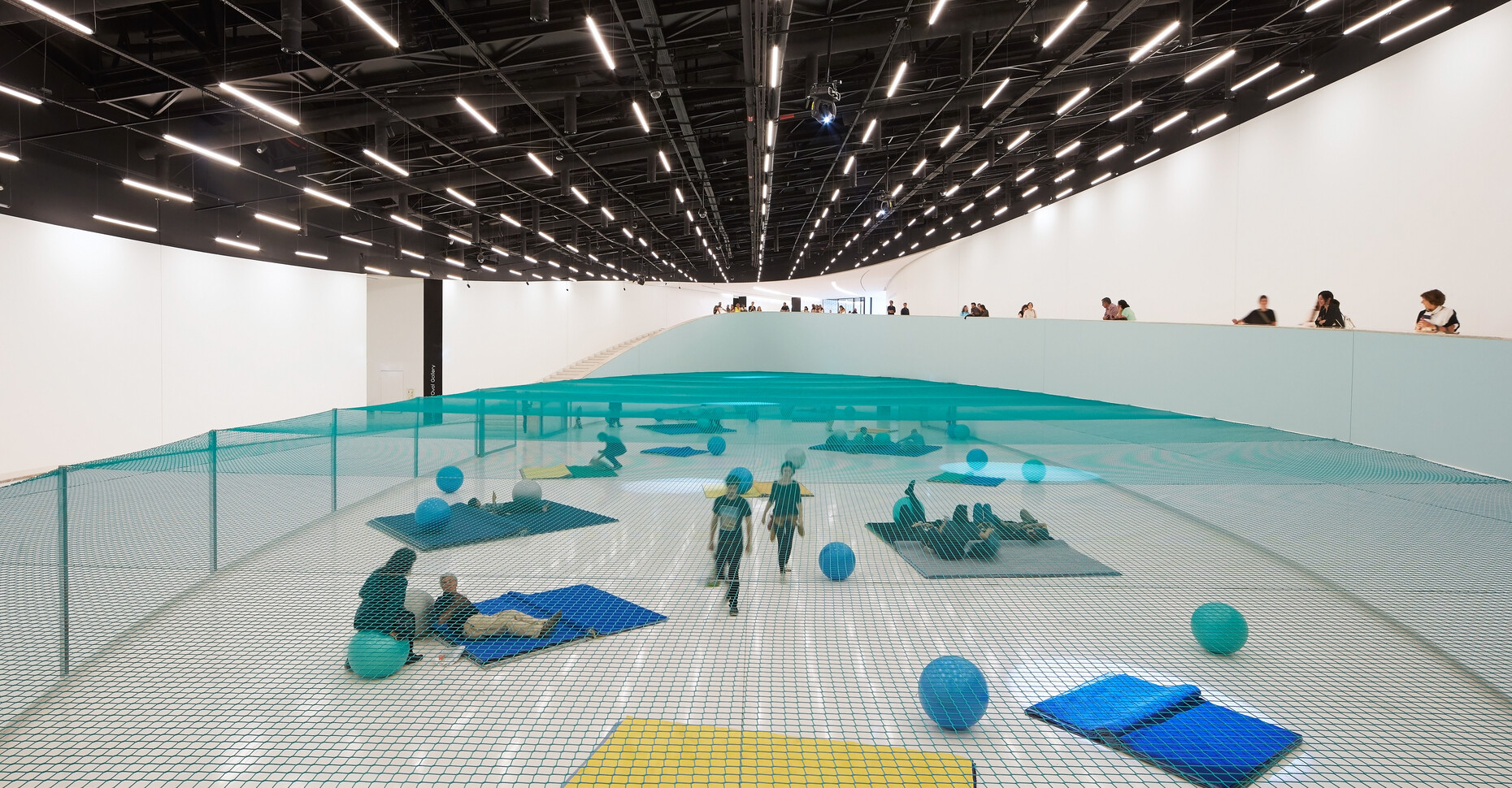
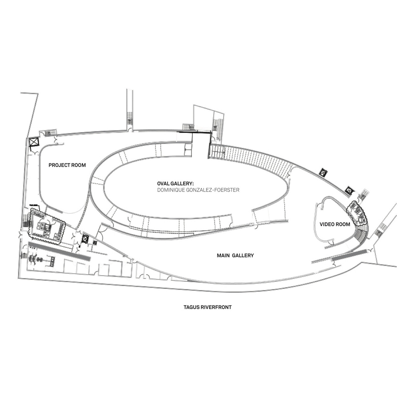
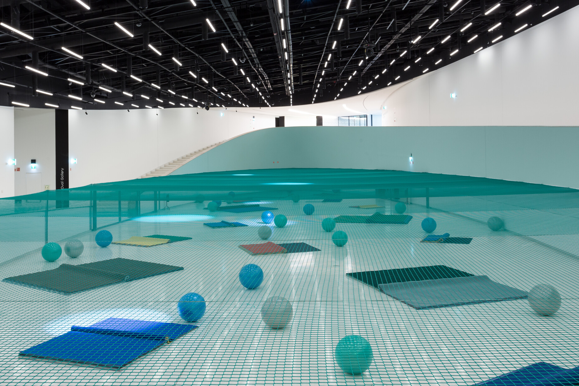
Because the entire roof is accessible or greened, natural daylight only penetrates the building through a small glass wall by the entrance. A cheerful diagram by the architect demonstrates how sunlight is actually intended to be reflected twice by the surface of the river and the reflecting tiles, and then “transported” inside, none of which is in evidence, at least during the opening ceremony. Stepping into the foyer from the bright sunshine, the interior seems pitch black. From there a curved walkway in the form of a gallery leads initially around the main exhibition space and then down a wide staircase. This is the Oval Gallery, some 1,200 square meters in size. It sits there like an eye in the middle of the footprint. So far so good, particularly because for the opening the French artist Dominique Gonzalez-Foerster fitted a highly entertaining installation there that had been designed specifically for this space: “Pynchon Park” is meant to represent an enclosure or laboratory set up by aliens, in which human behavior is investigated. Every so often, visitors can have themselves shut in the main space, which is portioned off by mesh, to play with large plastic balls and a sort of gymnastics mat. From a raised position in the gallery this can be very well observed, photographed, and filmed – somehow nowadays everything seems to be geared to people particularly wanting to photograph one another.
Curved spaces
The three other exhibition spaces suffer, however, from the main space being curved. Though the Main Gallery boasts a further 1,000 square meters, it has no straight wall. The triangular Project Room is curved through and through; the Video Room at least has a relatively flat projection surface. Perhaps there is no need for this in the new MAAT, as the historical spaces in the old building are exceedingly rectangular. Perhaps in practice the opposites complement one another admirably, something that will be seen if the new museum director Gadanho can come up with a program geared as specifically to his institute as he did for the opening.
The building itself is not yet ready, as the architect emphasized on several occasions at the opening. The new footbridge, which will link the museum directly with the city, has not yet been built. It is meant to be ready in spring 2017 and will be more than just a minor detail for the building, as the path that now leads over the structure will then fork again in the direction of the city. Furthermore, there are already plans for a campus, which will embrace further buildings by Alejandro Aravena, Aires Mateus, as well as a restaurant by Philippe Starck. As yet, however, there is still no indication of what it will all look like.
For the moment, though, you can sit on the riverbank, where right in front of the main entrance high seating steps lead down to the water, providing one of the rare opportunities in Lisbon to dangle your feet in the water on this side of the river. You will probably remove them again pretty quickly, on account of the spectacular jellyfish swimming around in the water, but the public spaces around the building are actually the design’s great forte: The balcony atop the edifice and steps in front of it create plazas of particularly high quality. From here you can watch the passing boats, on which people stand and photograph the building – or themselves. And next to you there are people sitting who in turn photograph the boats or laboriously contort their bodies such that at least a corner of the spectacularly curved, shimmering façade of the MAAT is visible on the selfies. Incidentally, the shimmering effect is thanks to a special ilmenite additive in the tiles, which refracts the light. Do people actually know that the 15,000 tiles, reminiscent as they are of the great Portuguese azulejos tradition, had to be made in Spain, because in economically still weak Portugal no company could be found to do the job? We live in strange but nonetheless photogenic times.
