Data medium
Having a building’s decorative façade provide information about it is a largely premodern notion. The disappearance of historical decorative forms was accompanied by the disappearance of inscriptions revealing the creator and construction period or sculpture programs, which symbolize the building’s purpose. Users and use no longer define a typology and ideally should also be adaptable. The Modern Gallery of Saarland Museum in Saarbrücken, which the architect Hanns Schönecker realized in three construction phases between 1962 and 1976, is a perfect example of this attitude. Now, architects Kuehn Malvezzi from Berlin and Frankfurt-based artist Michael Riedel have added an extension to the museum whose façade – designed as a typographic artwork – takes up premodern concepts in a highly ingenious manner. Specifically, Riedel addresses the democratic process as a precondition for the actual building process and in so doing returns the client, use and building history back to the architecture’s exterior.
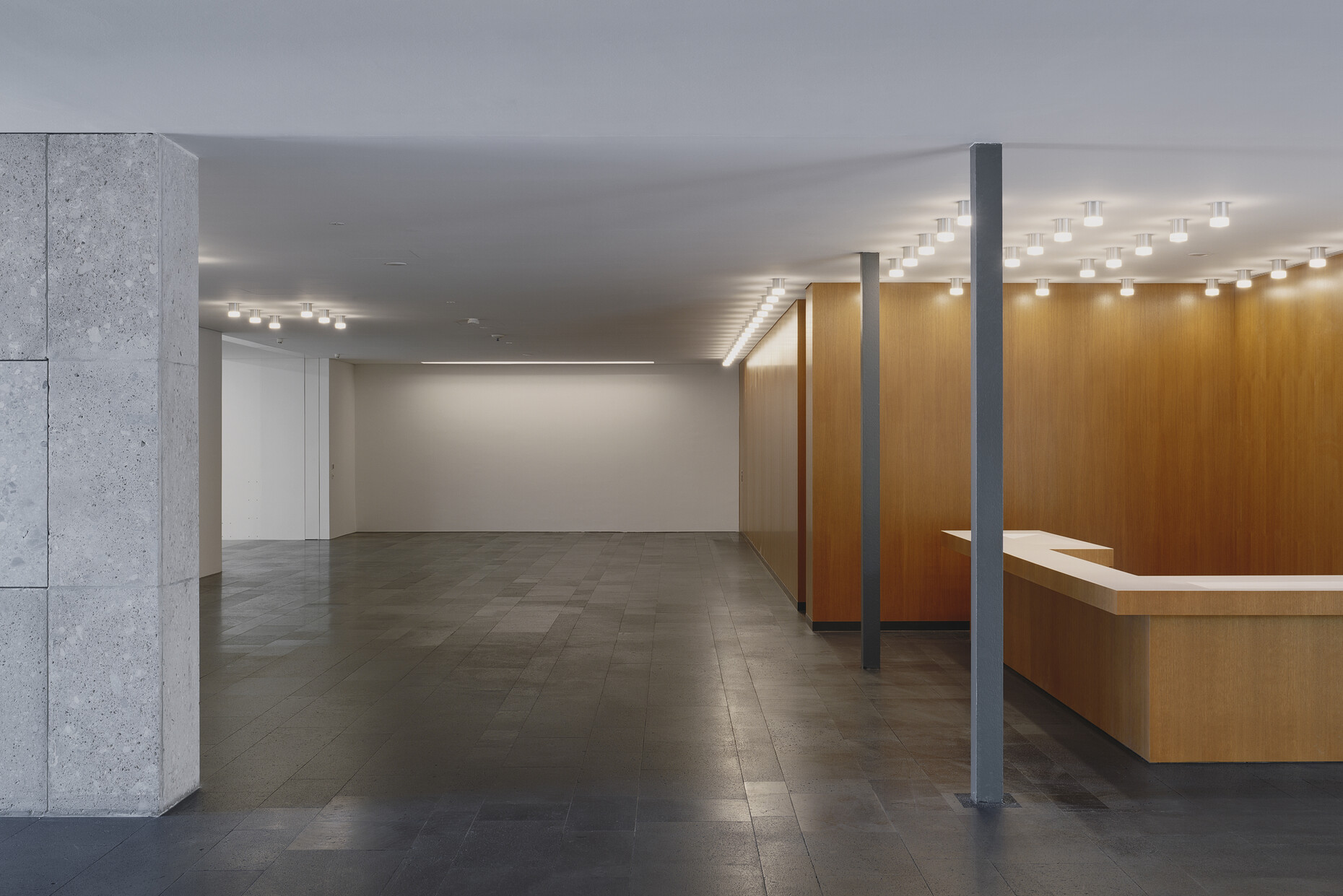
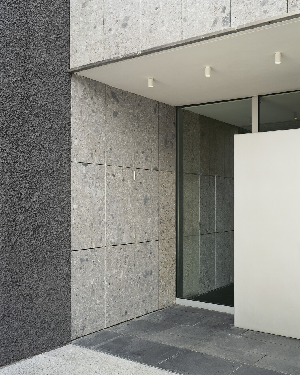
The fascist dictatorship and its cultural policy were decisive for Schönecker’s building in the postmodernist style in two regards: Firstly, the gallery was to accommodate a collection amassed in the initial post-War years, which focused on those artists ostracized by the Nazis as “degenerate.” Secondly, it was to form a contrast to the state theater just a few meters away, a monumental Nazi building in the Neoclassical style. Nothing here was to recall this self-glorifying and propaganda architecture. Instead, Schönecker created an ensemble of square-shaped pavilions of varying size and height, which he embedded in the River Saar’s floodplain. Strip windows and a façade cladding of nagelfluh (a kind of naturally occurring pebble dash) characterize the appearance of the casually arranged ensemble. The point of reference is not the adjoining city, but nature.
Later, too, we find amazing parallels between the history of the construction of the Modern Gallery and the architectural history of the Federal Republic of Germany. For the extension that became necessary soon after its completion, the architect and gallery director planned to tear down two neighboring Wilhelminian villas. But the zeitgeist had changed. Local protests prevented the villas being demolished and they were subsequently converted for use by the museum. Yet not all the space required could be created this way. Once again, an extension was to alleviate the situation. In 2008 the Cologne-based architecture studio Twoo Architekten got the commission for the new building. With their design the architects directly cited the square shape of the Schönecker building with its pavilion cubes. They added a further cube that, although larger, was perfectly matched in its proportions. Unlike the existing building that is largely accessed in the horizontal, the extension was to be organized vertically around an atrium that would simultaneously serve as a new foyer. However, the elaborate glass façade the architects planned would have exceeded the budget and led, in addition to other differences during ongoing construction work, to a falling out between the client and architects. In 2011 the building site was abandoned.
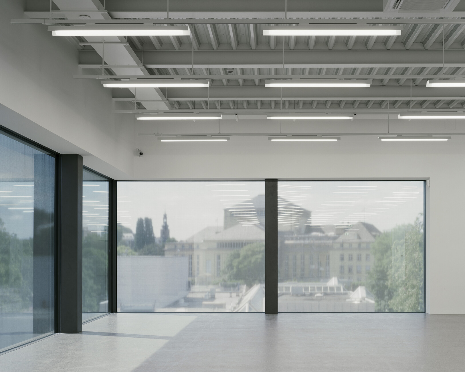
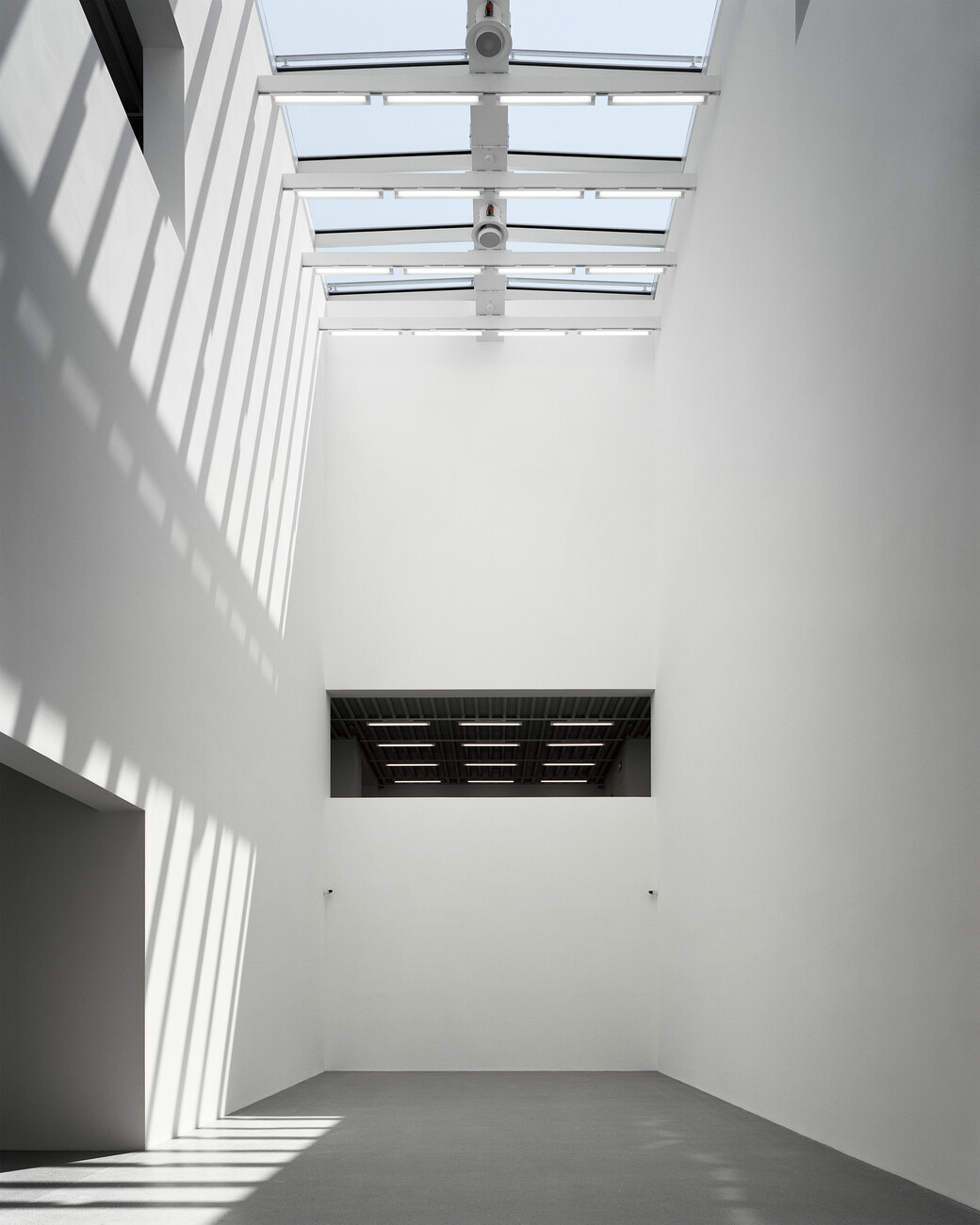
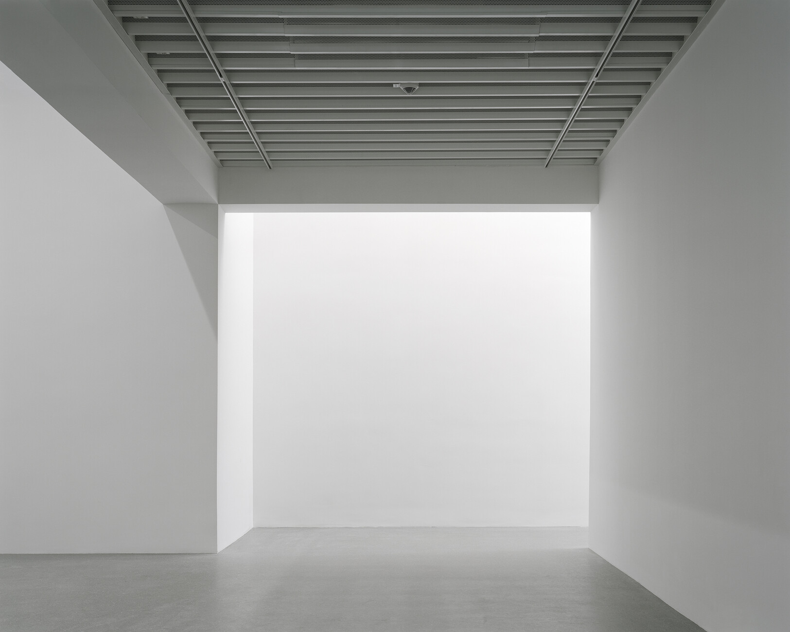
2013 Kuehn Malvezzi and Michael Riedel got the commission for the completion of the extension. They impressed the jury with a concept that not only meant the project could be completed within budget, but also enabled several of the client’s wishes regarding space allocation that had emerged in the course of building to be met without abandoning the spatial concept envisaged by Twoo Architekten. They rejected the plan to create a new main entrance and have the entire gallery accessed through the new building; instead, the entrance pavilion realized by Schönecker retained its function. Now the atrium originally planned as a foyer serves instead as an exhibition room, which thanks to its height of 14 meters offers an extraordinary scope of presentation options. It is flanked by eight additional rooms on four levels.
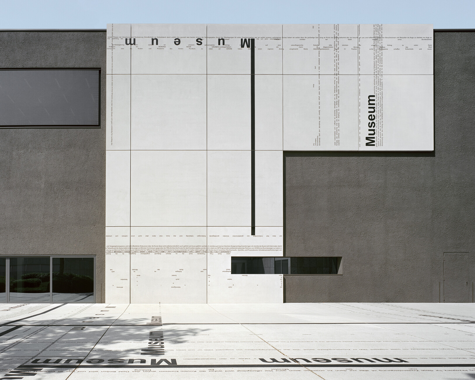
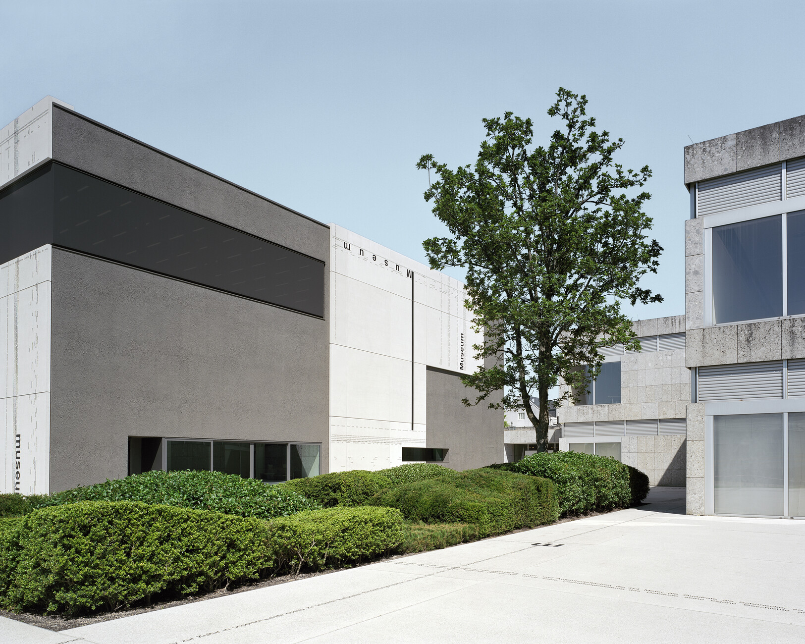
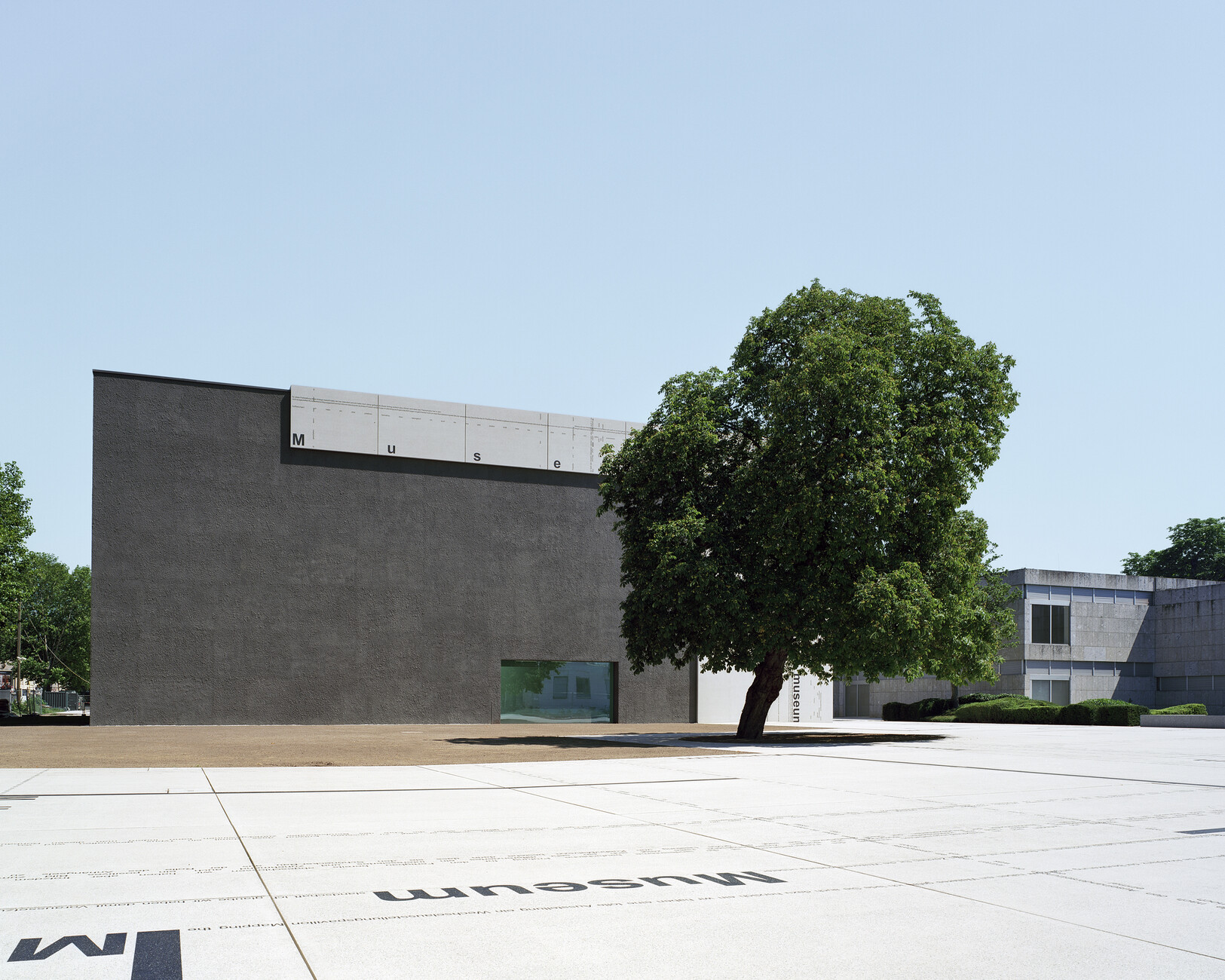
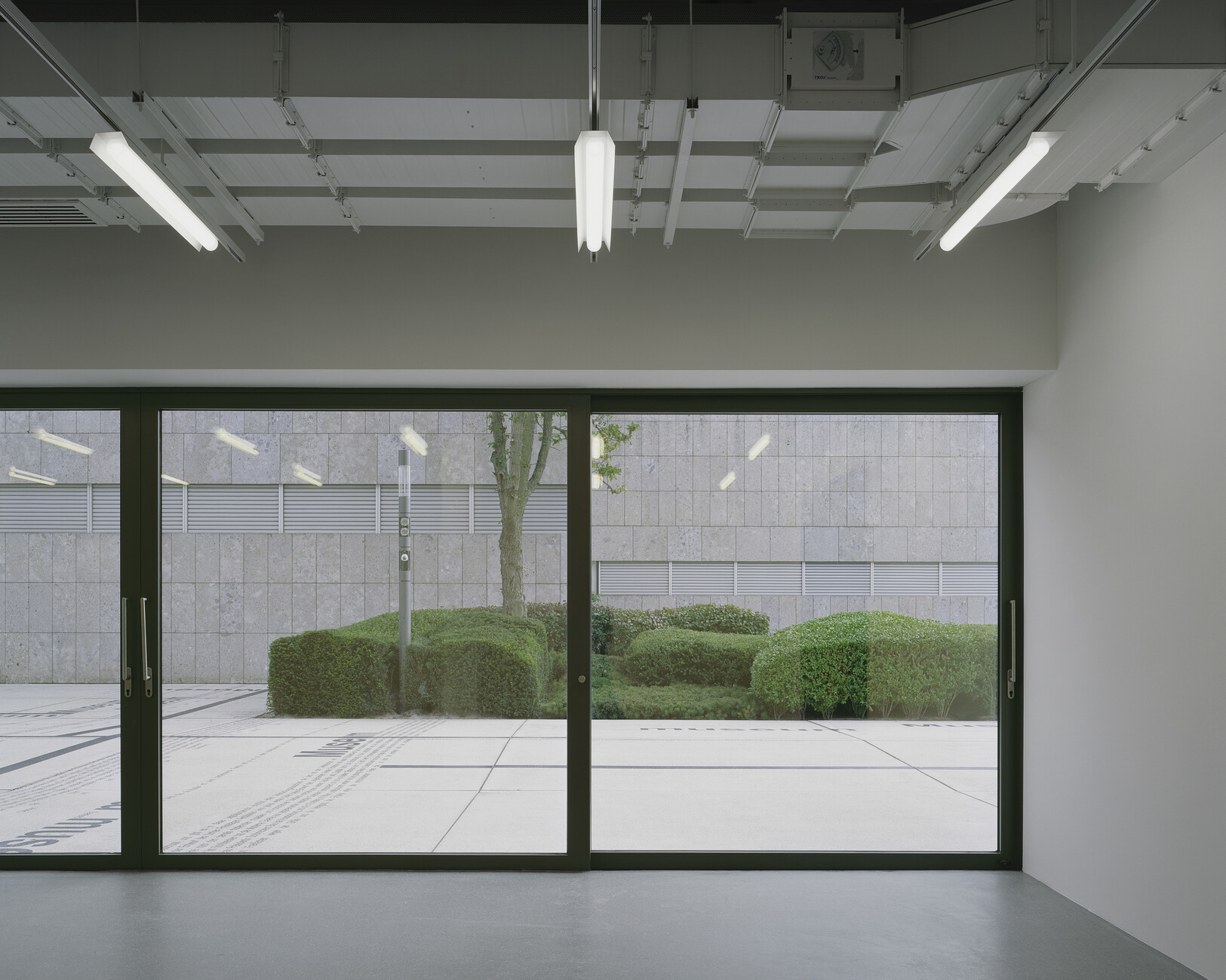
Without a doubt, their redesign of the façade is the most striking alteration that Kuehn Malvezzi and Michael Riedel made to the original plan. While Twoo Architekten wanted to lend the pavilion a curtain façade, a solution in the spirit of modernism, the new version distinguishes between the actual outside walls, which are clad in gray nagelfluh, and a “facciata,” an artistically designed ashlar facing, which is used to front parts of the new building. Yet architects and artists also continue this ashlar surface across several adjoining exterior spaces. As a result, a two-dimensional element is transformed into a three-dimensional structure, which also extends to the immediate surroundings and integrates the building via the open spaces into the urban fabric. Superimposed onto the horizontal and vertical ashlar surfaces is a typographic artwork by Michael Riedel based on the transcription of a debate in Saarland’s state parliament held on April 22, 2015 – in which the resolution was taken on the now completed extension. As such, the artwork becomes a medium that conveys similar information to the classic ornate representative façade: It provides information about the client, artist, function and construction period.
