The pile just refuses to get smaller. There are still books stacked up on the desk. At the top it is the color that is enticing. “My Mind is Racing” is the title of a book with photographs by Jory Hull. What thrilling hues! What electrifying shapes! And these numbers! Even on the cover they catch your eye. A 77, in sharp, angular letters, black at the bottom, gray at the top, is resplendent against a garish green. In the top left there is inset door opener and in the sill beneath the door two thick side pipes. It’s quite obvious, Jory Hull photographs cars, not any old ones, but racing cars. And not simply just racing cars either, but details of their paint work: Numbers, lettering, color combinations, stripes and emblems, that are applied to doors and fenders, and decorate hoods and exhausts, which with the interplay of color and shape emphasizes the cars’ immobilized but boundless power visible.
The pictures were taken by the New York photographer, who in a short foreword to the book, which was produced in collaboration with Feroz Galerie in Bonn, admits to having been fascinated by the design of these racing cars and “the modern hieroglyphs” even as a small child. Whether the wheel arch of classic British Racing Green Lotus with start number 24 and the bright red and white hood of a Corvette 427 with the 3D number 55 cause motor racing enthusiasts’ hearts to beat faster or whether, in the dark mirror on the hood of a Porsche 356, a veritable toad (“le petit crapaud”) with arms folded surprisingly appears – the images tell of a time when racing cars were still mechanical works of art and their bodywork more than just space for sponsors’ names.
Jory Hull
My Mind is Racing
Designed by Jory Hull, Kehrer Design
28 x 24 cm, 80 pages, 60 color illustrations
English, hardcover
Kehrer Verlag Heidelberg
EUR 39.90
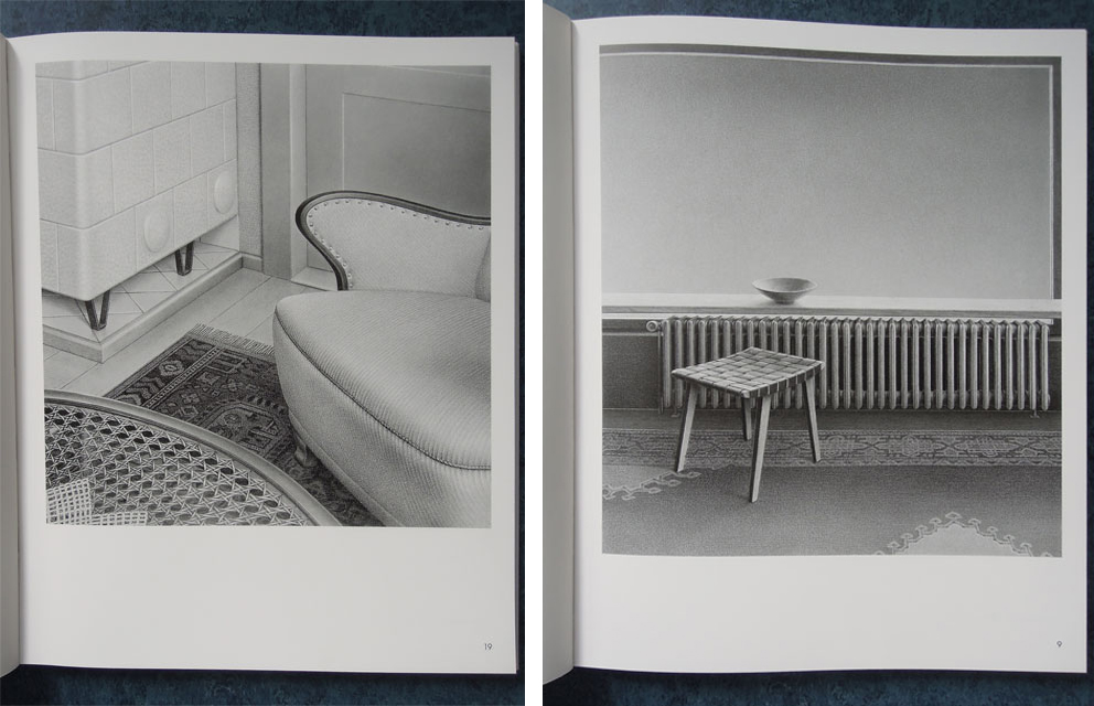
A book with drawings by Astrid Brandt, which, entitled “inwendig auswärts” (inwardly outwards) she showcased in 2013 in the municipal gallery in 2013, makes a totally different impression. In this case the pencil alone reigns, and with it a sensitive gray in infinite gradations and textures. Self-confidently, indeed audaciously, no less, Astrid Brandt turns the history of art upside down and lets the history of drawing in the 21st century begin “with the capturing of an image on Schoellershammer 6G paper”. This was a shock for photography, for which in drawing after all a particular form of competition had emerged. And that is not just said lightly. Executed with alarming care and always devoid of people, Astrid Brandt’s familiar and strange representations of spaces and constellations of things, prove this in an impressive way.
One needs to study these unconventional drawings closely, repeatedly allowing one’s eyes to wander inquisitively across them, one must allow them to impact visually and mentally, to unfold their hallucinatory effect and sample their confusing sense of order, before they release their unwieldy charm. They way they play with the way we see things defies being put into words. “Bambi”, for example, which dates from 2002, features, cropped, a wide window. Presumably early 1960s. On the window sill there is a bowl, in front of it a ribbed radiator, parts of a patterned carpet and on that a stool strung with belts. A sad animal, caught in space and time? In “Weight Watcher” from 2001 a somewhat corpulent armchair on a carpet crowds the space between door and tiled stove, in front of a curved segment of a coffee table with a solar plexus beneath a glass top and laced cloth. Can furniture cope with a diet too? And in “Mezzaluna” from 2011, the folded-down Perspex top of adhesive tape dispenser cheekily depicts a crescent moon – over locking mechanisms from files, which seem to be sluggishly sliding across the table like crocodiles.
Brandt dislikes referring to her drawings as “still lifes” or “interiors. She prefers to talk of tableaus, because a tableau portrays “the extract of an action”, which “is spellbound in an unexpected standstill between the moments”. Though things that do not appear in the picture are almost as significant as those that do. The observer sees something, but knows nothing about it. Something is singled out from the world, has become out of time, without one being able to say, what the tantalizingly bland things, which have left their everyday world and seem to have outgrown any purpose, could mean. If one also considers that the setting in which one of the tableaus puts us (which could also be allegories), never existed beyond the picture, one notices how subtly Brandt combines recognition and alienation. Her ingenious compositions, whose titles, furthermore, lay a trace, which our imagination willingly follows beyond what is normal, allow the peculiarity and dignity of the deceptive reality shine through.
Astrid Brandt - inwendig auswärts
Drawings from 2000 to 2012
Copy by Annett Reckert and Andreas Bee.
Hardcover, 72 pages, 41 illustrations,
Ed.: Städtische Galerie Delmenhorst,
EUR 19
MORE on Stylepark:
N minus X – literature forms, part 1: piles of books that deserve to be ignored no longer.
(15 January 2014)


