Architecture That Keeps Your Eyes Wide Open
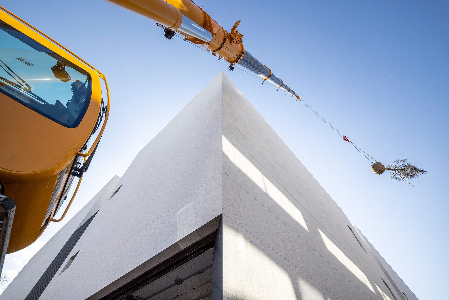
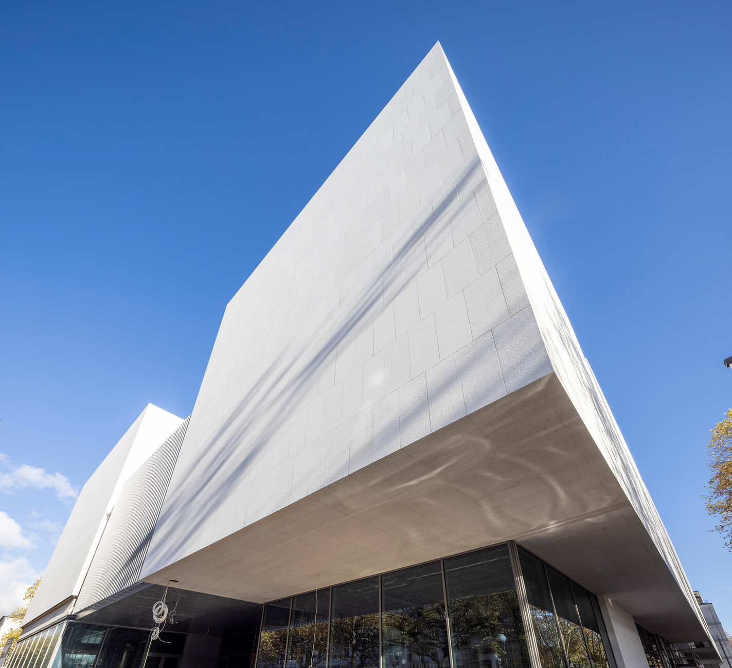
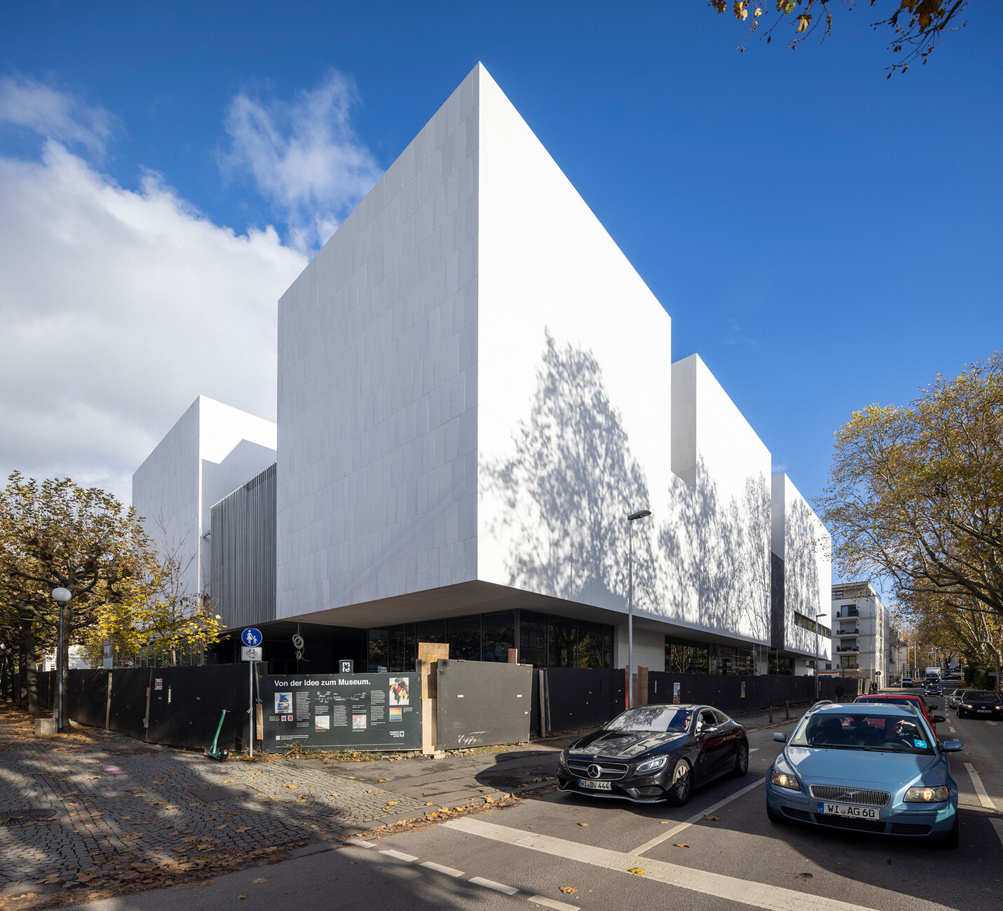
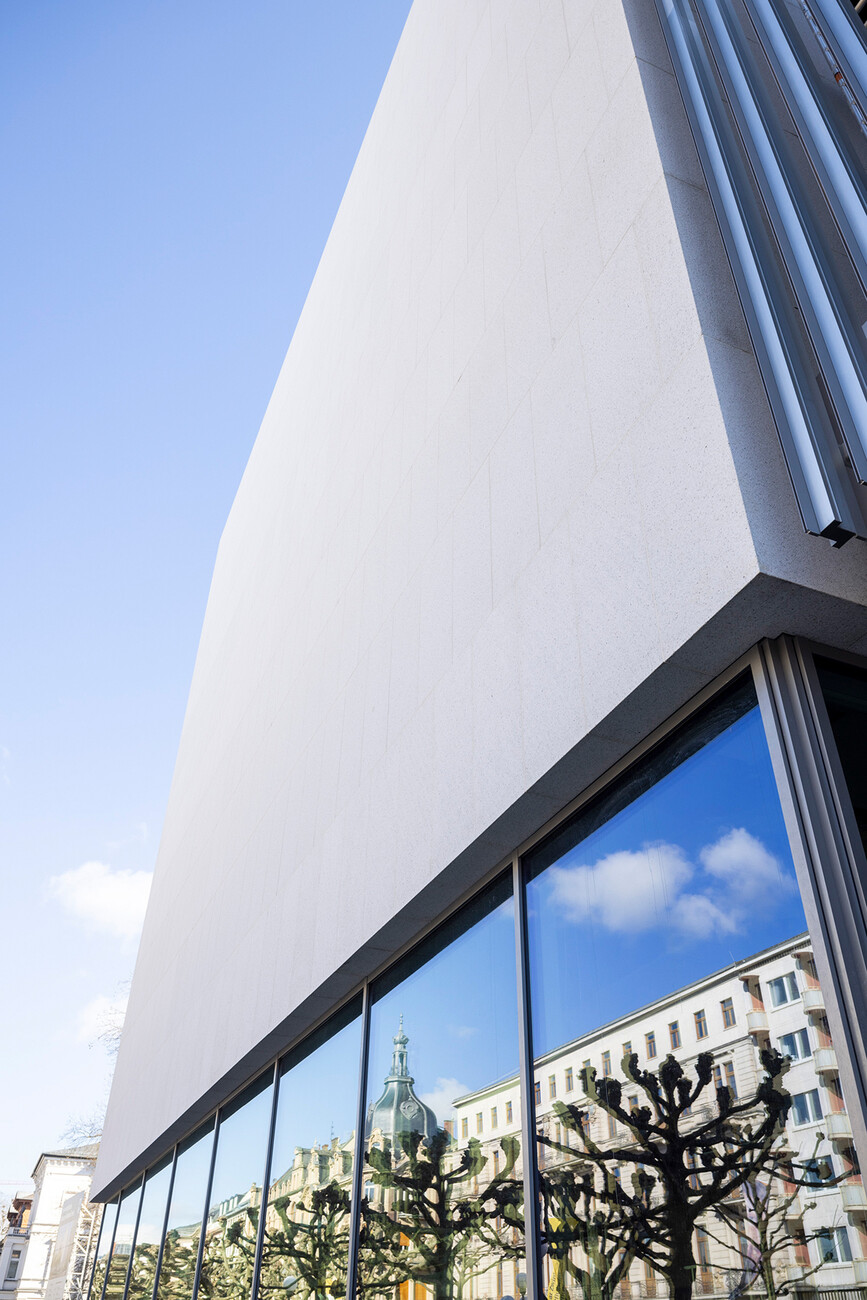
On the day I visit the building site heavy clouds hang over the city. But when the sun does emerge it makes the 6,000 square meter façade of whitish-beige granite sparkle. After all, the stone was purposely given a coarse finish to enhance this effect. And as if that wasn’t enough the joints have also been coated with quartz sand – creating an even larger surface area that glitters when the light catches it. This glittering effect together with the ensemble’s composition of cubes has already earned Museum Reinhard Ernst (mre) the nickname “sugar cube”, even if it has not yet been officially opened and is only just on the verge of completion. A glittering façade is not necessarily the first image that springs to mind when you think of a museum building. Nor are the tons and tons of “Bethel White” granite stone quarried in the U.S. in Vermont the only special architectural or design feature of this future exhibition building in Wiesbaden.
Reinhard Ernst’s activity as a collector is closely bound up with his life as an entrepreneur. It was while on business trips that he first became acquainted with the museums of the world, and he was particularly taken by abstract art. What he missed during his visits to these museums were seemingly trivial things that intimate the kind of people who occasionally spend time in these rooms filled with art: places where you can sit and rest, for example, natural daylight, but also good room acoustics to counter the echoing sound in the exhibition halls. In short, especially in older museums it was often the case that not enough consideration was given to the visitors. And interestingly, this in turn meant that often not enough consideration could be given to the art itself, which after all requires recipients to be fully appreciated. This sort of thing will be quite different in mre, promises Director Oliver Kornhoff: “Our message is: Come as you are! You don’t have to whisper reverently here or make a point of tiptoeing around.” One reason for this is the use of a special sound-absorbent rendering for the larger exhibition galleries – a material that is otherwise employed in large open-plan offices. The museum and its art are to astonish people but not to stir any false reverence.
Reinhard Ernst was keen to have Fumihiko Maki realize this project: The architect’s oeuvre comprises dozens of buildings around the world is decidedly people-centric and he has ample experience of designing art galleries and museums. Indeed, Museum Reinhard Ernst is the tenth exhibition space for Maki, who lives in Tokyo where he also has his office, Maki and Associates. After buildings in China, Japan, India, Canada and the USA, the mre is his first museum and at the same time his first building in Germany, with Frankfurt-based schneider + schumacher being appointed to handle the general planning. And even when the Covid-19 pandemic and later the Russian war of aggression against Ukraine led to skyrocketing prices for raw materials and transport, Ernst stood by his original plan and didn’t resort to substituting alternative materials or any replanning. The fact that it’s been possible to continue building with the focus firmly on the art and the visitors is down to the financing: Although mre is located on land belonging to the city both its construction and its future operation will be financed entirely from own funds and with the help of the Reinhard und Sonja Ernst-Stiftung foundation. There are also two aspects that are both to be welcomed and are noteworthy (not only) for a private museum, namely ticket prices and opening hours: Admission for children and young people will always be free and during the week the museum will open as early as 8 a.m. for visiting school classes and childcare groups.
At first sight mre seems larger than it actually is. In fact, its eaves are actually a few centimeters lower than those of the neighboring Museum Wiesbaden – Landesmuseum für Kunst und Kultur, as Kornhoff explains. By its very nature the building stands out clearly from the surrounding houses and buildings. Nevertheless, incorporating the historical surroundings was a major factor in the design, says Michel van Ackere of Maki and Associates: The granite, for example, references the lime sandstone of the surrounding buildings in both color and substance, but is simultaneously more durable. Similarly, the location between downtown Wiesbaden on the west side and the wide, green lawns with residential areas and institutional areas on the east side is also taken up in the architecture: “mre is situated is located at the point where these two differing zones intersect and reflects both of them. In keeping with its mission, the museum building covers an impressive 9,000 square meters and clearly defines the line of the street to the west and south.
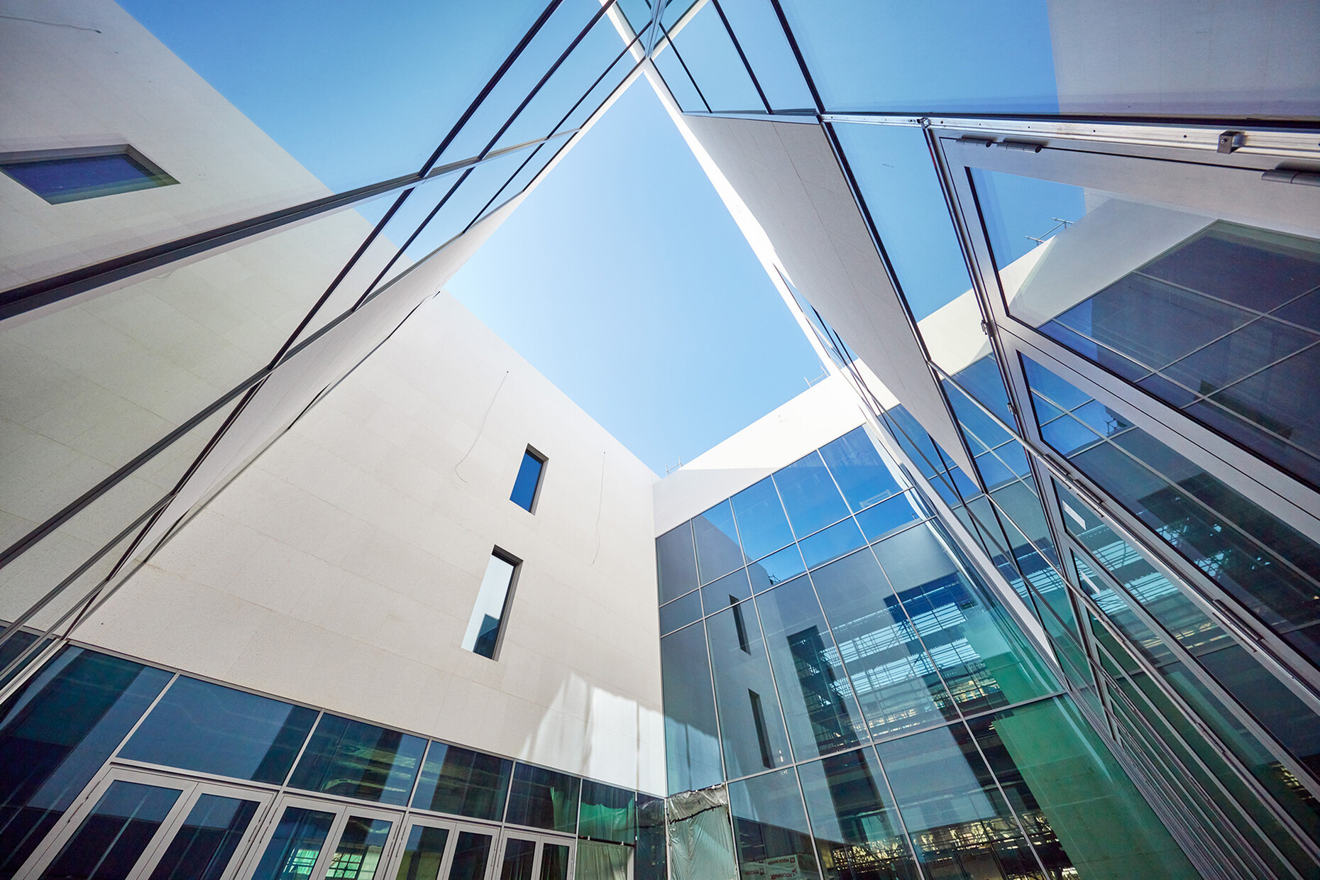
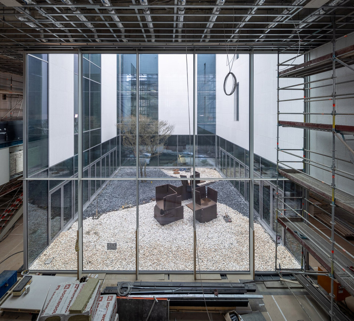
At the same time its volume is divided up into four smaller blocks that take up the scale of the villas.” From the outside there is something monolithic about the building albeit it interrupted by the wraparound glass frontage, for example, of what is to be the museum store. The fact that it appears accessible and friendly when viewed from the inside becomes apparent when you walk round it. A ramp ensures that the museum can be entered easily by those with poor mobility and there are no fences or walls outside. Instead, lavender is currently being planted around the building. And if you look more closely you realize that the joints of the granite slabs in front of the entrance only end inside – such details are important both to Maki and Ernst, the idea being to create a visual continuity between the inside and the outside that is continued through the numerous glass elements. Standing inside you can look out at the glazed inner courtyard around which the four cube-shaped elements are grouped. The courtyard not only ensures ample daylight enters the museum it also doubles up as an additional exhibition space – for a sculpture by Eduardo Chillida and for the Japanese maple that will continue to grow and will at some point reach the upper levels of the museum. More art will be on display in the foyer. There visitors enjoy free admission at will be able to view works from the collection as well as works that have still to be completed. Derix Glasstudios in Taunusstein are currently producing a work by Katharina Grosse that measures 60 square meters. For the artist it was the first work she has executed in glass and is intended to truly capture the essence of her large-format painting. It will be employed both as a partition but also enable people to look into the future color lab where workshops for students are planned. Here, too, untypically for an art museum, the emphasis is once again on sunlight: As a result, the multi-layered glass will shine in the light and cast its color shadows into the room.
In terms of design the mre also sets out to allay visitors’ apprehensions vis-à-vis art. In addition to the architectural projects such an overarching undertaking will soon include a whole raft of educational services, that are of course optional. “Art is admittedly inexhaustible,” says Kornhoff. “But our visitors can decide for themselves how much they want to see and experience. We don’t want anyone to feel they are being bullied.” On the contrary, the museum would like its visitors’ experience to be: “I already have everything with me that I need to experience art.” The top two floors will, in future, accommodate both the permanent and the special exhibitions. Here the floors of wood and terrazzo have still to be laid. No one exhibition gallery is like the next. With a ceiling height of 14 meters the highest of the halls has an almost religious feeling to it; daylight enters via a skylight, which in no way detracts from the wall-filling paintings due to its height. That said, there are also lower ceiling heights, expansive spaces for large presentations, cabinets, and a balcony from which visitors can look down one story to the floor below. “The architecture keeps your eyes wide open,” comments Kornhoff. That such architecture requires sophisticated structural engineering goes without saying. A considerable amount of steel holds the different room heights together. In total, no less than a third of what was needed to build the Eiffel Tower has been used here.
Given this substantial amount of raw materials did sustainability aspects play a role in the planning? Yes, says Michel van Ackere, the architect from Maki and Associates who is overseeing the construction. However, he says in this instance a conscious decision was taken not to apply the practice’s usual criteria for the environmental and social sustainability of a project. “We were aware that Germany has strict building codes in place that already incorporate sustainable practices into building specifications and render secondary accreditation standards superfluous.” Moreover, the storage and display of artworks requires air-conditioning, “that extends far beyond people’s normal comfort range and limits the use of natural light. These stringent requirements together with the museum’s open, free-flowing floor plan prevented us from implementing many of the typical energy-cutting measures.” However, he says numerous measures were taken to reduce the carbon footprint such as maximizing the amount of light entering naturally, limiting exposure to the sun by installing overhanging building fixtures and special glass windows, not to mention installing large solar panels on the roof, sourcing hot water heated by a hot spring, roof greening and planting greenery around the building, as well as largely the use of natural materials.
For Maki and Associates, the social component is considered equal to the environmental one: “Socially sustainable architecture is loved by its community and this quality helps buildings achieve a long, robust life,” says van Ackere. He argues that longevity must be one of the pillars of sustainable buildings given the resources that are needed for the construction, demolition and replacement of buildings. “We hope that the exterior design which is modern but related to its setting, the open and spacious interiors, the abundance of natural light, the careful attention to detail, and the use of high-quality materials will result in staff and visitors from Wiesbaden and beyond feeling a bond to the building and the care devoted to it for many years to come.”
Fumihiko Maki does not build overwhelming architecture, although his houses can certainly convey an overwhelming spatial experience. For him, it should be neither about an effect nor about the architect's ego. Instead, Maki is guided by an insight into people which he has gradually developed in the course of his lifetime, as he explains. The deduction he makes is very simple: People are all very similar. And they are all very different. In an art museum both these two characteristics combine.
