Lava lamp with a peephole
The cube at the end of Milton Keynes’ Midsummer Boulevard would certainly have pleased Alison and Peter Smithson, the “parents” of British Brutalism. After all, with the pure geometries, exposed ventilation ducts, and clearness of construction, space and usage of their design, Stefanie MacDonald and Thomas Emerson of 6a architects reference the Smithsons’ architectural concepts. It is a simple, large form, a genuine cube, in short: a box with a circle.
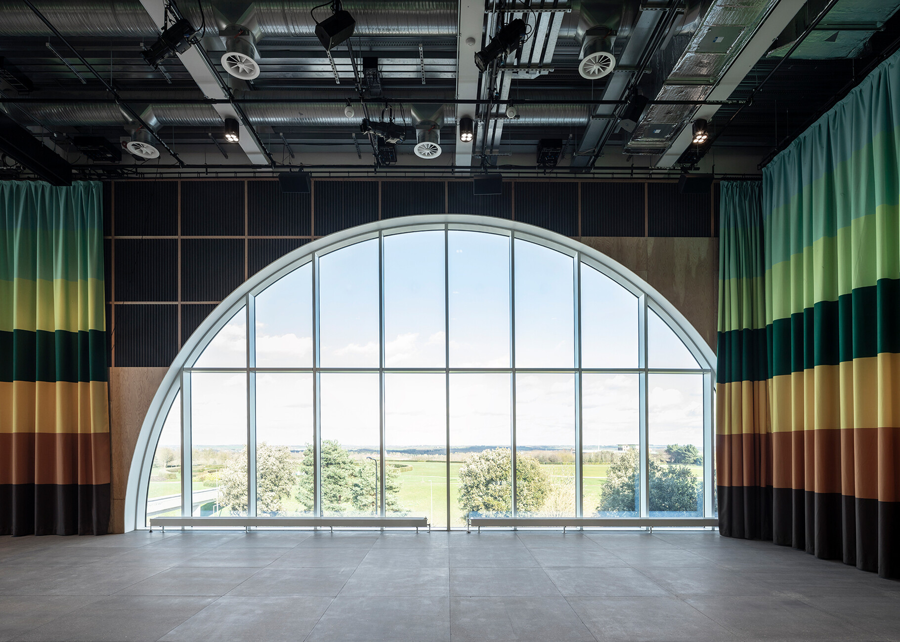
Like Adam Caruso, Peter St John and Tony Fretton, Emerson and Macdonald belong to the circle of the Smithsons’ intellectual successors – and they are among the most intelligent up-and-coming talents of Great Britain’s current architecture scene. The northwestern façade of the new gallery has just one window, but its sheer size lends the structure its character – a twist that is typical of the pair’s architecture. With its single bull’s eye, the square metal box gazes out into the bordering park landscape, challenging onlookers to themselves take a closer look. The window could pass as an oversized spyhole at a peepshow, if the sky wasn’t reflected in the glass.
Milton Keynes, one of the new towns built around London after World War II, is characterized by the grid-like layout of its streets. Architect Derek Walker optimistically gave the planned city its shape in the late 1970s, while others such as James Stirling and Norman Foster filled the grid with buildings. And now 6a are continuing this grid in their building, cutting into it with a circle that subtly alludes to the English garden city: They understand their enormous extension building as a synthesis between city and park. Fittingly, and provocatively, the arts center building was inaugurated on March 16 with the exhibition “The Lie of the Land.”
With its steel-frame construction clad in corrugated stainless-steel façade elements, the Milton Keynes Gallery with its striking staircase tower reflects not only its surroundings, but also daylight. This is why the arts center can look like it is melting in the setting sun like “a lava lamp.” In the Guardian, Tom Emerson describes it as having the appearance of “a tie-dye T-shirt.” It is the façade that lends the hefty structure its lightness. In contrast, with the new entrance the architects draw on the colors of the existing sandstone and terracotta building.
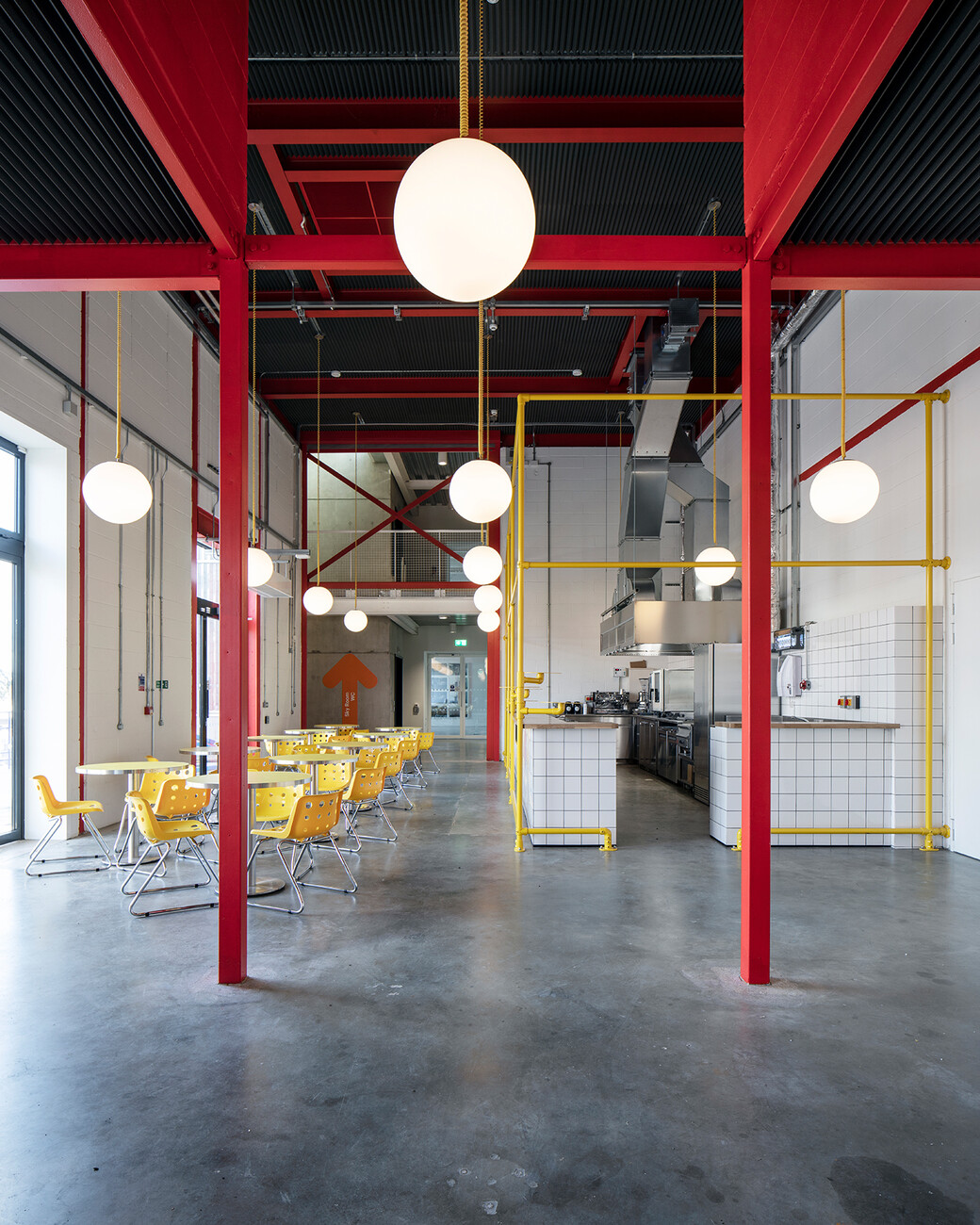
6a architects have added five new exhibition halls with liberating ceiling heights of between six and nine meters to the existing structure built in the late 1990s. The “Skyroom” houses an auditorium with 150 seats and standing room for up to 300. While behind the shimmering façade the white cube space is dominated by polished floors and jazzy accents in yellow (furniture) and red (load-bearing structure), the long drapes in the “Skyroom” feature far more colors. Pastel green, mint, meadow green, moss, honey, ochre and dark earth are stacked tone on tone here – the colors of the Buckinghamshire county landscape. For the adjoining Campbell Park, Stefanie MacDonald and Thomas Emerson developed the “City Club” concept together with graphic designer Mark El-khatib and the artists Nils Norman and Gareth Jones. It is a landscape for reflection and play, in which sculptures function as guideposts and lanterns, signs, and all other outdoor furniture are designed as artworks.
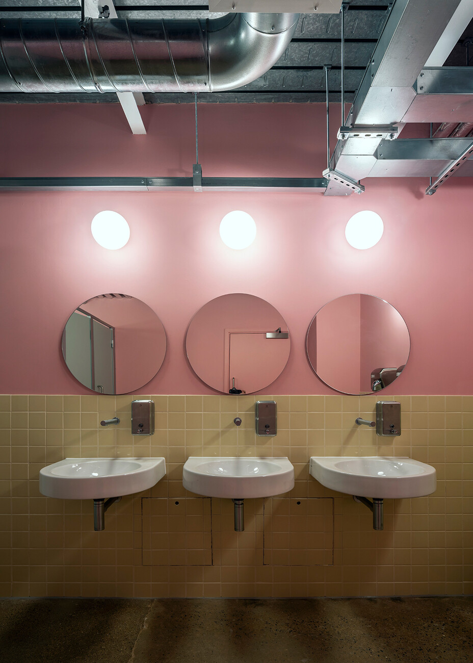
The Milton Keynes Gallery greatly profits from the considered handling of its existing structures. While it resembles a machine at first glance, on the inside it reveals itself as an architectural stage for art and the everyday – some newspapers have praised it as a “revelation.” While the white cubes are spaces dedicated solely to artworks, 6a have managed to give sideshow spaces, such as the café, access spaces and even the toilets a unique look.


