You don’t have to be called Molloy and be a figure in a novel by Samuel Beckett to be addicted to the somewhat compulsive passion for wanting to fight chaos with well thought-through order– as hopeless as the undertaking might ultimately be. None of this affects good old Molloy, though. In the eponymous novel he puts a lot of effort into thinking up a system that allows him to move his 16 favorite pebbles for sucking from one of his four coat pockets to another, without him having to suck the same one twice in a row. Now we are in no way intending to compete with Molloy here, after all, our relationship with chairs, tables, and sofas is nowhere near as intimate as Molloy’s with his sucking pebbles. However, instead of picking out one thing here and another there, should we not nonetheless make him our role model and likewise put one thing after another into four different bags? For the moment, of course, as proceeding in this way does involve a certain arbitrariness. But isn’t a sense of order always precisely that: arbitrary? So let’s just see what happens. Just how enlightening it is will be revealed.
Theater bag: Great opera
The bag itself is small, but refined. It is embroidered or made of particularly high-quality material. What it collects comes from the “powerhouse of feelings” known as opera, and is at times mixed with sensations one is familiar with from fairgrounds. Some of it seems dramatic, some cheerful or even melancholic.
Nowadays presentation and dramatic effect are everything. Almost everything, as at the end of the day what is needed is a, to a greater or lesser extent, successful product that is worth presenting in the first place. Even if , given the wealth of things that impact on them in four days of Milan, observers are in danger of foundering, they repeatedly ask themselves if the balance between fact and fiction was successful this time, and if so, to what extent. On the one hand in 2011 it was clear that, as ever, the sector really does its utmost when it comes to showing their superiority with ideas that are as extravagant as possible. On the other, there was no overlooking a certain restraint – not only in terms of throwing opulent parties. Despite an unflagging desire for orchestration there were traces all over of an attempt at sobriety – which some aficionados immediately mistook for emerging boredom. After all, they are here to be entertained. It would definitely be wrong, in view of, if anything, minor corrections, to instantly talk of greater insight. Nonetheless, in the financial crisis, which is still not completely over, the scissors of economic reason were used to trim many a wild urge. Anybody who enjoyed design culture rather than a fairground atmosphere certainly appreciated that. In concrete terms it means wherever a lot of effort went into the presentation the product was the focal point. One can now say that trade fairs per se are fixated with objects. But even the number of surprising new products, traditionally one of the Salone’s sources of energy, seemed, inasmuch as it could at all be quantified, if anything to be declining. The manufacturers know all too well that what ultimately counts is what you can also sell.
Things kicked off with a masked ball. Verdi, what else. “Un ballo in maschera” – this really was pulling out all the stops. It was hosted by Driade in via Manzoni. Inside chairs, tables and glass vases paraded, and when the guests were not circulating in the not unimpressive rooms, they were lounging in Fabio Novembre’s “Nemo” masked chairs in the garden. In an interior courtyard arias were sung – live, not recorded – to the sound of which masked acrobats demonstrated their art like statues that had come to life on their pedestal, and costumed couples danced. The spectacle was indeed somewhat decadent, with a touch of the neo-feudal about it. As you strolled through via Monte Napoleone afterwards, deserted at night, more traditionally crafted valuables on furniture miniatures sparkled in the shop windows, the Campana brothers carefully accentuated vases made of Murano glass, and on the road the latest Citroën models were parked, though their link with furniture remained cryptic.
The next morning the spectacle at the trade fair grounds was nothing special. Kartell, as always one of the presentation highpoints, had transformed its stand into the sort found at fair grounds, complete with neon sign. Everything was nonetheless very orderly and in its proper place: From “Wonderwheels” and “Gost goods” to “The Chairs Arena”, there was a good assortment of chairs and tables. At Edra, even if in terms of design the stand was hardly different from last year’s, one was meant to feel as if on had been swept away to a “wonderland”, and by means of projections, Foscarini got the designers to talk about their works themselves. From which we can conclude: In cases where even the presentation cannot escape a certain sobriety, the miracle remains the ultimate message. Or indeed the opera. According to Alexander Kluge, the most productive parts of the mind “are in reality concentrated feelings”. The rest was trade fair constructions and technocracy, with the occasional bit of country style, ethnic kitsch and improvisation thrown in. as such there was once again something for everyone, from sober product presentation to industrial-looking rear courtyards, which use the longing for craftsmanship to be able to outshine it better.
A bag for practical aspects: On shells shall you sit
This bag only contains chairs and in part is made of recyclable material. Somehow the things that collect in it are very practical. Sometimes thy overlap with those chairs that belong inn the “universal” category. However, the fact of the matter is that in most cases practical things are not just suitable for everyday use, but also well to very well designed, regardless of whether they are fresh or elegant, more ecological or surprisingly sporty.
Only a few new chairs also took ecology into account when it came to aesthetics. Those that did all came across as a bit ideological; after all, nowadays anyone knows that a chair that has been produced ecologically need not necessarily look like one that has. In the past, was a straightforward wooden chair not ecological? Or a wicker chair for outside? At first sight Philippe Starck’s “Zartan” for Magis, for example, of which there are to be other versions (it is still at the project stage) serves the need to exhibit one’s clear conscience: Its shell is brown, proper, renewable. As far as one could see, this is nonetheless an exciting design. Or take “Green” by Javier Mariscal (Mobles 114), the seat of which is made of 100% recycled material and which, when it has finally served its purpose, is completely recyclable. Its shell has been noticeable folded into shape, and in this case too a seat has been assembled on a frame.
Taking together chairs such as “Zartan”, “Green”, Jasper Morrison’s “HAL”, Alfredo Häberli’s “Jill” (both for Vitra) – and even “Osso” by Ronan and Erwan Bouroullec (Mattiazzi) and “Chassis” by Stefan Diez, which do not quite fit in the picture, all these designs revel the use of seat shells on an – in some cases variable – base frame. As different as they might be in terms of shape, material, and function, all these chairs represent the continuation of a typology that began with the 3D shaping of plywood, continued in the 1950 “Eames Plastic Side Chair” and in part takes up elements of the 1940 “Organic Chair” by Eames and Saarinen.
Alfredo Häberli’s “Jill” in particular is a fine example of a successful reinterpretation, even if, as with the “Organic Chair”, at the end of the seat the “open” shell does not immediately look commanding on all frames. The chair is nonetheless a great success, with even the patented process used to manufacture the shells proving to be an elegant solution. The veneers on “Jill”, the thickness of which decreases the higher they are, are bent like a ribbon until they meet in the middle of the seat, by which means a flexible shell is created. The contour and opening also form two self-contained lines that emphasize the sculptural aspect of what is now a 3D shape. Furthermore, thanks to its flexibility, the shell is extremely comfortable. With so much history involved it is not surprising that the base frames for “Jill” – made of tubular steel, wire, aluminum or wood – are based on historical predecessors.
Jasper Morrison is going down a similar road with “HAL”. As a system, though, the chair seems less uniform. This is particularly evident in the cantilever version with armrests, which looks like a different design. Even “Mesh” by Tom Dixon (Magis) follows the trend to shells, even though with his “seating cage” made of fine wire mesh, which at the top is turned over like a collar or the brim of a hat, he is taking a totally different path in terms of construction and aesthetics. As is Tokujin Yoshioka (Moroso) with “Moon”.
Anybody who had thought that with regard to the lounge chair there was no longer much going on, was in for a surprise. Among others, Vitra demonstrated just how wide the spectrum can be. With “Grand Repos” there was not just one form of comfortable sitting by Antonio Citterio, as always made with wonderful precision, on display, there was also a more sporty one by Konstantin Grcic. Given today’s hybrid home collages one should anyway not be too hasty in reserving one’s “Waver” for the patio or youngster’s room. The chair is one thing for sure: unconventional and original. Like a para-glider in his harness the user hovers in a fabric-covered seat, which at the top exceeds the height of the frame and at the front is suspended in the tubular steel frame by means of straps. With the “Catifa 70 Soft” by Lievore Altherr Molina, Arper also boasts a new, more classic recliner in its range, while at Walter Knoll, Ben van Berkel has upgraded his somewhat futuristic single recliner to “MyChair Lounge”. And even the new version of Patricia Urquiola’s “Biknit” (Moroso) no longer presents itself as a lounge chair but as a recamière, with its reclining area made of thick, braided plaits she is nevertheless reinterpreting the good old outdoor recliner for the living room. It remains to be seen if sports and leisure will continue to inspire new ideas in the future as well.
Luxurious but different: fancy some style?
Now things are becoming stylish and luxurious. But only slightly. Naturally, the bag is carried by a servant in livery, who opens it as soon as we wish to put something into it. The bag itself is made of plastic, however.
“Style” does not really feature in current design. If we are given the chance at all to allude to historic designs, without exception they originated in the 20th century. “Modernism as our Antiquity” –this is certainly a relevant issue in design as well. And yet: Every so often we get to see a glimpse of the 18th century spirit. Not always as subtle as in the work of Inga Sempé, but predominantly as postmodern playing with forms and materials. Relating to a single style nowadays is synonymous with mixture, remix, a kind of historical sampling.
In places, Dedon, for example, opts for a refined colonial style, and if the furniture in the new collection by Hermès does display a consistently modern design its materials and hand-crafted appearance reference a pre-modern era. As superior and exclusive as the saddler’s work may appear, it is equally nostalgic. No longer as new as it once was, “Babel” by Marcel Wanders (xO) is a completely different kettle of fish, celebrating, as it does, a revival in post-modern irony. This chair/table ensemble looks like a cross between a crafted wooden chair from a tavern and the furnishings in a feudal salon. This impression is reinforced by the contrast between black and clear Plexiglas.
However, there was something more important than such singular sights as these: suddenly all these sofa landscapes with covers made of superior fabrics and all these modernist interiors seemed strangely out of place. All at once this worthy kind of luxury and its cultural roots assumed the dimensions of a style that has become historical overnight. Nothing but antiques, that are still being produced today. After all, our era is the sum total of several different eras. And perhaps what best demonstrates the fact that something is being set in motion here is the fact that Cassina boasts the “LC1” by Corbusier, Jeanneret and Perriand as part of its collection “I Maestri”, now also available in “Villa Church”, a blue satin version (originally produced in 1928 for the interior of the Villa Church), and “UAM” in a natural linen color (this was how it looked in 1930 at the Union des Artistes Modernes exhibition). The fact that modernism has remained an incomplete project is perfectly clear from the fact that the LC classics are now also available as an outdoor version, covered with a special polyester fabric that is coated with PVC and, according to Cassina “perfectly imitates the indoor model’s leather covering.”
A bag full of universals: usable everywhere
The fourth bag is a strange thing. It is not in itself universally usable, though what we have collected in it is. We had already classified part of it under “practical”. However, its universality goes beyond this.
The trend for designing a chair as a “system”, based on a seat shell and, in certain circumstances, offering various different versions, is unmistakable. Alongside “Chassis” by Stefan Diez, a universal model with replaceable seat shells by the office furniture manufacturer Wilkhahn (see Stylepark News & Stories dated April 6), which was on show in Milan at the Spotti stand, and “Jill” by Alfredo Häberli, it is primarily “HAL” by Jasper Morisson, that consistently goes down the path of the multifunctional chair. HAL comes in a “four-legged” version with wooden or metal legs, with runners and as a cantilever; it is available with various shells, with and without upholstered covers that can be stretched over its plastic shell. As its press release states, “‘HAL’ is a universally usable range of chairs, designed to cater to all kinds of different requirements in an appropriate and contemporary manner. A broad selection of base frames, colors and optional seat coverings can be combined with its flexible and comfortable plastic seat shell.” Forgetting the mystery of why this chair in particular goes by the name of “HAL” – perhaps, after all, it is as versatile as the omnipotent computer in Stanley Kubrick’s “2001 – A Space Odyssey” – one thing quickly becomes clear: with universals of this kind the furniture industry has introduced a kind of platform strategy. This cuts both development and production costs. But will it work? The chances are not bad.
“Tip Ton” by Edward Barber and Jay Osgerby (Vitra) turns out to be less a system and more a principle of movement. Who could have imagined only a few years ago that such a restless soul would enjoy such a brilliant career. Yes, “Tip Ton” is a chair that it is impossible to sit still on – even if you wanted to. From its normal position it leans forwards, stopping in a position where it slopes forwards nine degrees. This is due to a special kind of runners. Whereas, until now, only office chairs have been able to achieve this with the aid of complicated tilt mechanisms, for this chair it is a piece of cake. Users’ pelvises and backbones are straightened and their circulation improved. And all of this in the shape of a good-looking, low-cost, robust plastic chair. The universal quality of “Tip Ton”, therefore, is its function. It can be used almost anywhere: in schools, libraries, cafés, at the dining table or in home offices.
Does not fit into any bags, but does fit onto a circuit
Our bags are now full. To conclude with then, let us put in a pile anything that does not fit into the four bags but that was, nevertheless, important and exciting.
With “Avus”, a small club armchair for Plank, Konstantin Grcic has, once again, lived up to his reputation as an individualist who knows how to nurture his idiosyncrasies and to capitalize on them. I came across hardly anyone at the fair that didn’t find the chair confusing. And on the basis of visitors’ own modest tastes it is hard to get a handle on its concept. This only starts to become apparent to those familiar with Grcic’s predilection for cars and car design, who can remember the kind of racing cars driven in the early 1930s in races such as those on the Avus in Berlin. And if, for example, you look at the driver’s seat in the a-type “Union Grand Prix” car or the “Mercedes W 25” – the first “Silver Arrow” dating from 1934, an eight-cylinder with 354 HP that led the field at the time, allowing its competitors no chance whatever, – then similarities with Grcic’s design do become apparent. The upholstery guarantees good lateral support and has been inserted into the ABS shell like the driver’s seat was into the racing car’s bodywork. The cover mounted above the shell, with what looks like cooling fins and running along a fine line in the middle, lends the whole thing a dynamic look reminiscent of the aerodynamic covers on the back of the historical racing cars. Only Konstantin Grcic has the nerve for this kind of thing. With “Manzù”, Alias also takes its orientation from the world of automobile design, once again with the same backward glance, but less impressively and innovatively. Pio Manzù’s “history project” is a lounge chair with puff whose shape calls to mind the flat, leather-covered seat shells boasted by sports cars in the 1960s.
Despite all this sportiness even our legs were beginning to let us down after all this charging around. Even if not for good as with Molloy, with whom we share the view that as far as distribution is concerned, our solution is not perfect either. And so, with four well-balanced bags plus a few other, very dynamic bits and pieces, we headed for our homeward flight. Ciao Milano! See you next time.

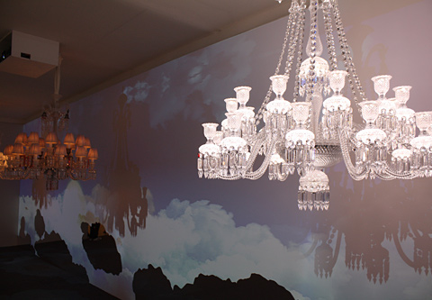 Candleholder Zénith Comète by Baccarat
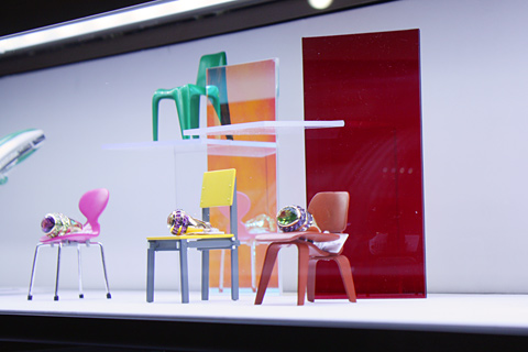 Shop window decoration of Jeweler in Via Montenapoleone
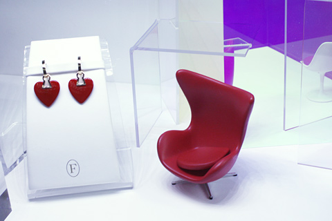 Jeweler in Via Montenapoleone
 Armchair by Campana for Edra
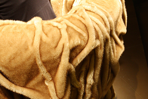 Armchair by Campana for Edra
 Installation by Tokujin Yoshioka with his armchair Moon in the showroom of Moroso
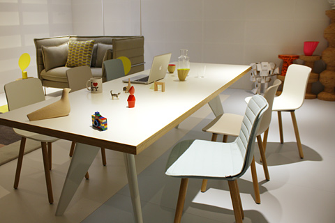 Chair HAL by Jasper Morrison for Vitra
 Chair Jill by Alfredo Häberli for Vitra
 Chassis Installation by Stefan Diez for Wilkhahn in Spazio Spotti
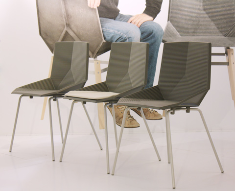 Green by Javier Mariscal for Mobles 114
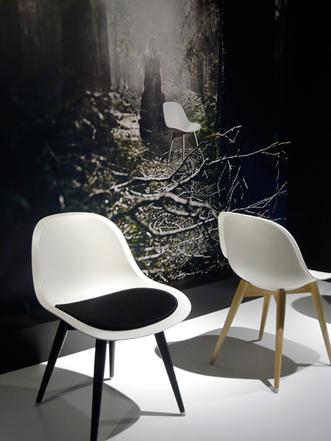 Imprint by Johannes Foersom and Peter Hiort-Lorenzen for Lammhults in Superstudio
 At Casamania with chair Martime by Benjamin Hubert
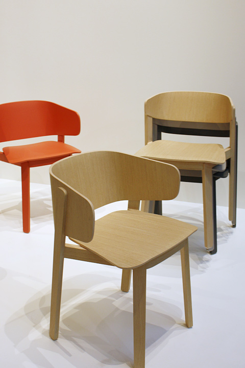 Wolfgang by Luca Nichetto for Fornasarig

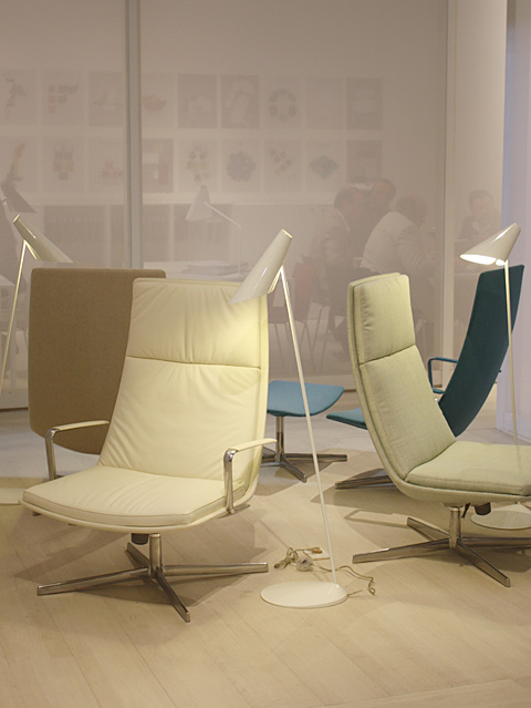 Catifa Soft by Lievore Altherr Molina for Arper
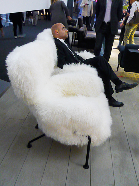 At Cassina
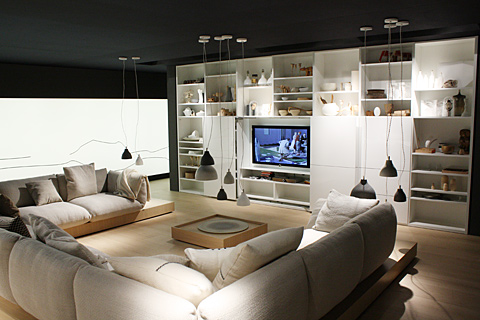 At Cor
 Nub by Patricia Urquiola for Andreu World
 At Dedon
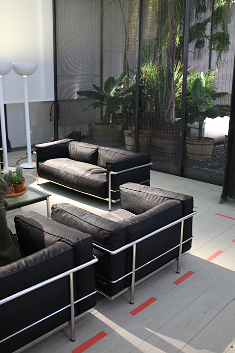 LC3 Outdoor by Le Corbusier for Cassina
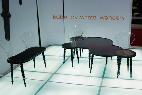 Babel by Marcel Wanders for xo
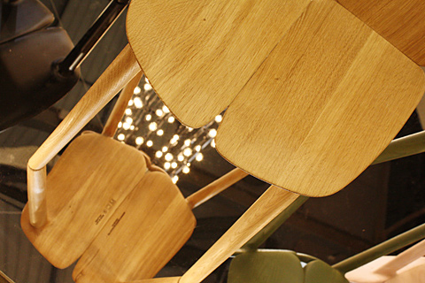 Osso by Ronan & Erwan Bouroullec for Mattiazzi
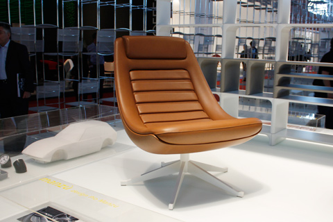 Manzù by Pio Manzú for Alias
 Avus by Konstantin Grcic for Plank
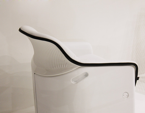 Avus by Konstantin Grcic for Plank
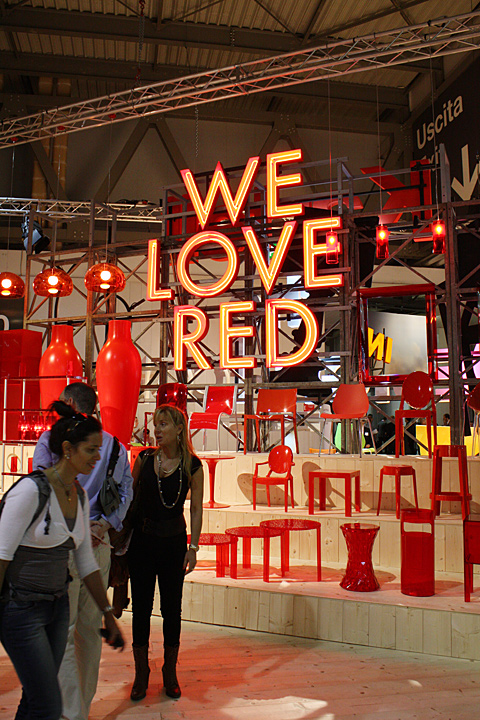 Product installation by Kartell at the fair in Milan, all photos: David Giebel, Alejandro Mosquera, Dimitrios Tsatsas, Thomas Wagner, Stylepark
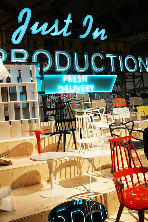 Booth by Kartell
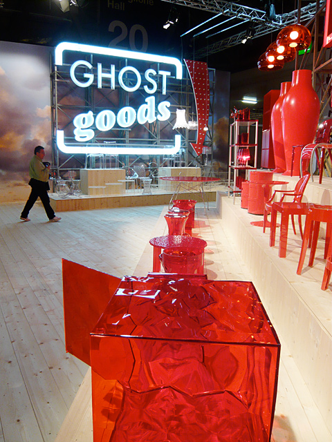 Booth by Kartell
 Booth by Kartell
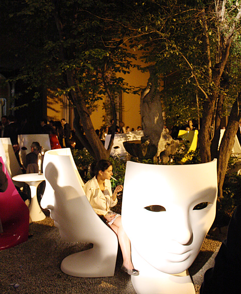 Masked ball at Driade with Armchair „Nemo“ by Fabio Novembre
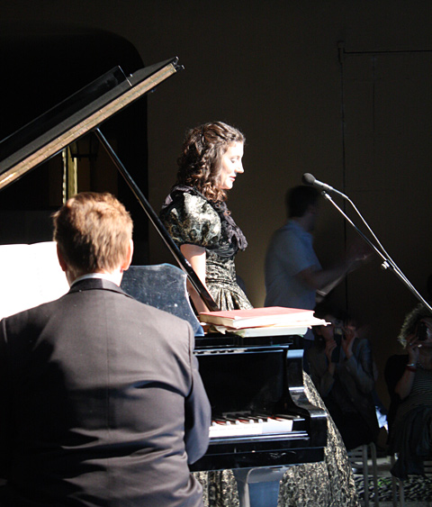 At Driade
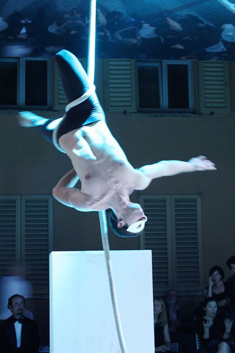 Performer at Driade
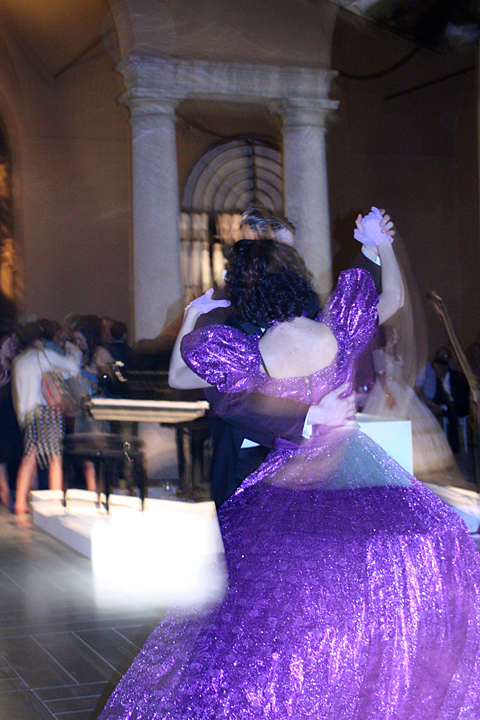 At Driade
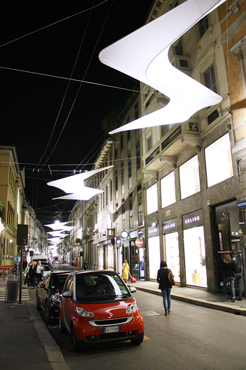 Installation by Ora Ito for Citroën in Via Montenapoleone in Milan
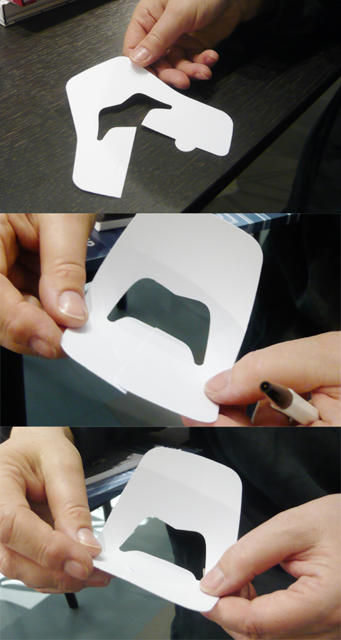 Making of Jill by Alfredo Häberli
 Stuhl Zartan by Philippe Starck for Magis
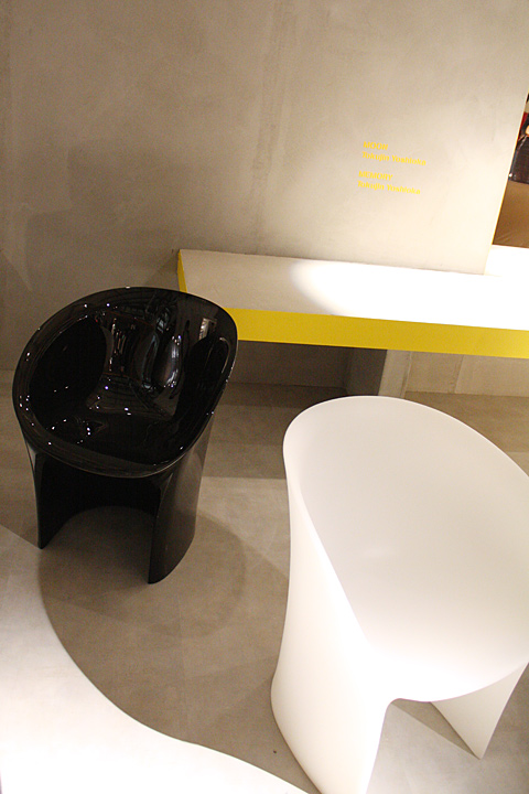 Moon by Tokujin Yoshioka for Moroso
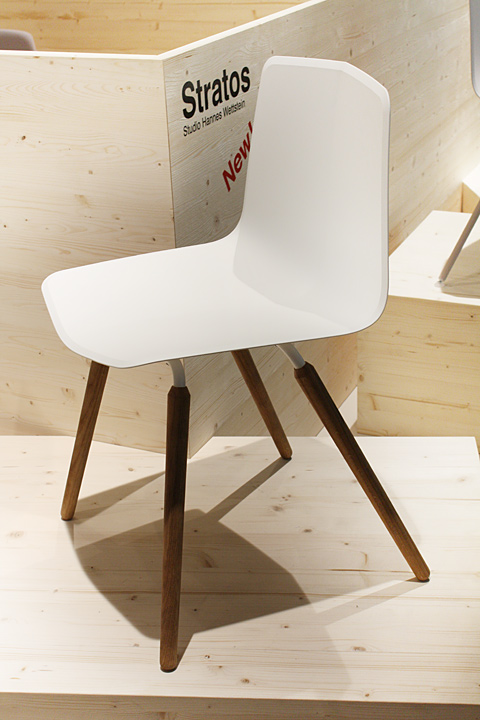 Stratos by Studio Hannes Wettstein for Maxdesign
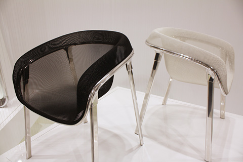 Mesh by Tom Dixon for Magis
 Leo by Stefan Diez for e15
 Grand Repos by Antonio Citterio for Vitra
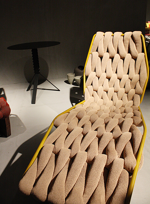 Biknit by Patricia Urquiola for Moroso
 Shrimp by Jehs and Laub for Cor
 Waver by Konstantin Grcic for Vitra
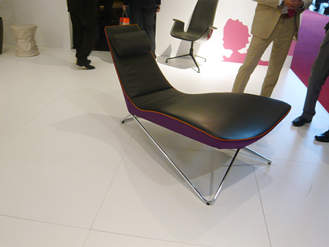 MYchair Lounge by Ben van Berkel for Walter Knoll
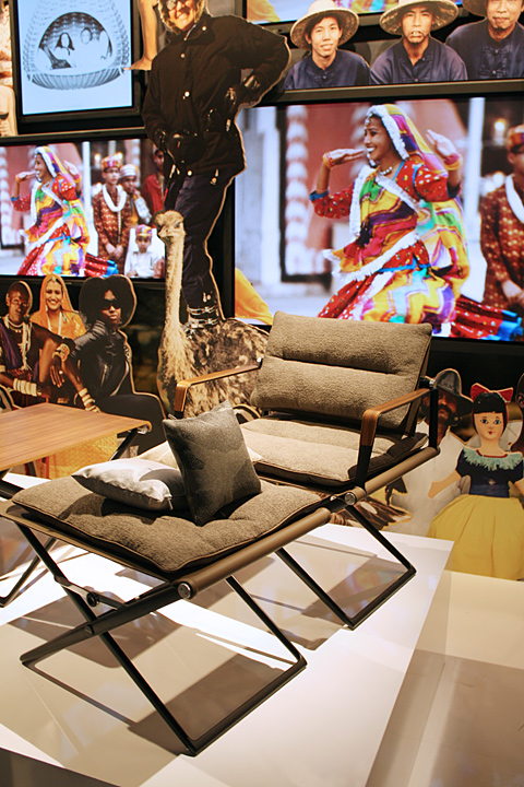 Folding by Jean-Marie Massaud for Dedon
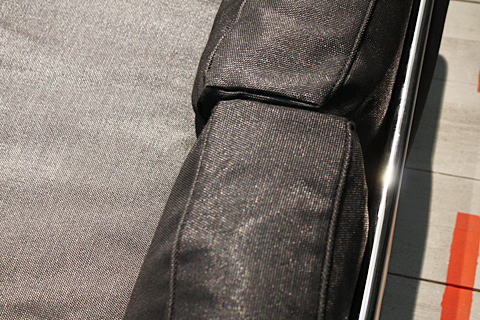 LC3 Outdoor by Le Corbusier for Cassina
 Tip Ton by Edward Barber, Jay Osgerby for Vitra
 Osso by Ronan & Erwan Bouroullec for Mattiazzi
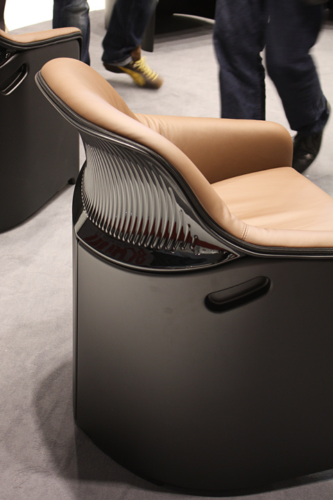 Avus by Konstantin Grcic for Plank
 Avus by Konstantin Grcic for Plank


