Swiss elective affinities
It is picture book Switzerland, which embodies the country’s image like no other – Lake Lucerne against the backdrop of the towering Rigi mountain massif, the Grosse Mythen and Kleine Mythen mountains. And the project at hand is so hackneyed that it might come from a cheap novel – a chocolate factory. That said here in Ibach, in the Canton of Schwyz, Max Felchlin AG and its staff of 140 really do produce some of the best chocolates in the world. When in 2014 the company was in need of a new corporate headquarters and customer center a competition was launched, which was won by Zurich-based architecture practice Meili, Peter & Partner, who came up with a design that does justice to the poetry of the location but without denying its character as an industrial building.
On its lower floors the new building continues the typology of the administration building. Here the architects demonstrate their precise architectural language – and it is firmly anchored in the tradition of modernism, and which has earned the office its excellent reputation. Onto this they installed a top story with ample glazing throughout. This story not only rests on the new building but also on parts of the neighboring warehouse, and in addition crosses the service road. However, what really makes the building so sensational is the roof Meili Peter has created for it. It is truly a roof landscape whose dynamic shape seems to share an affinity with the mountain panorama. The three large-format skylights tower up like peaks in their own right, dropping down steeply on the one side and gently on the other. It is a masterpiece of joinery that the architects have created here together with local artisans. Inside, the conical ceiling rises up over the training rooms and patisserie where trainees can try their hand. Here confectioners and clients from all over the world can learn how to work with the Max Felchlin products. The top floor also houses a large dining room and recreation room where employees and guests can eat, drink and relax while savoring a view of the incredible landscape.
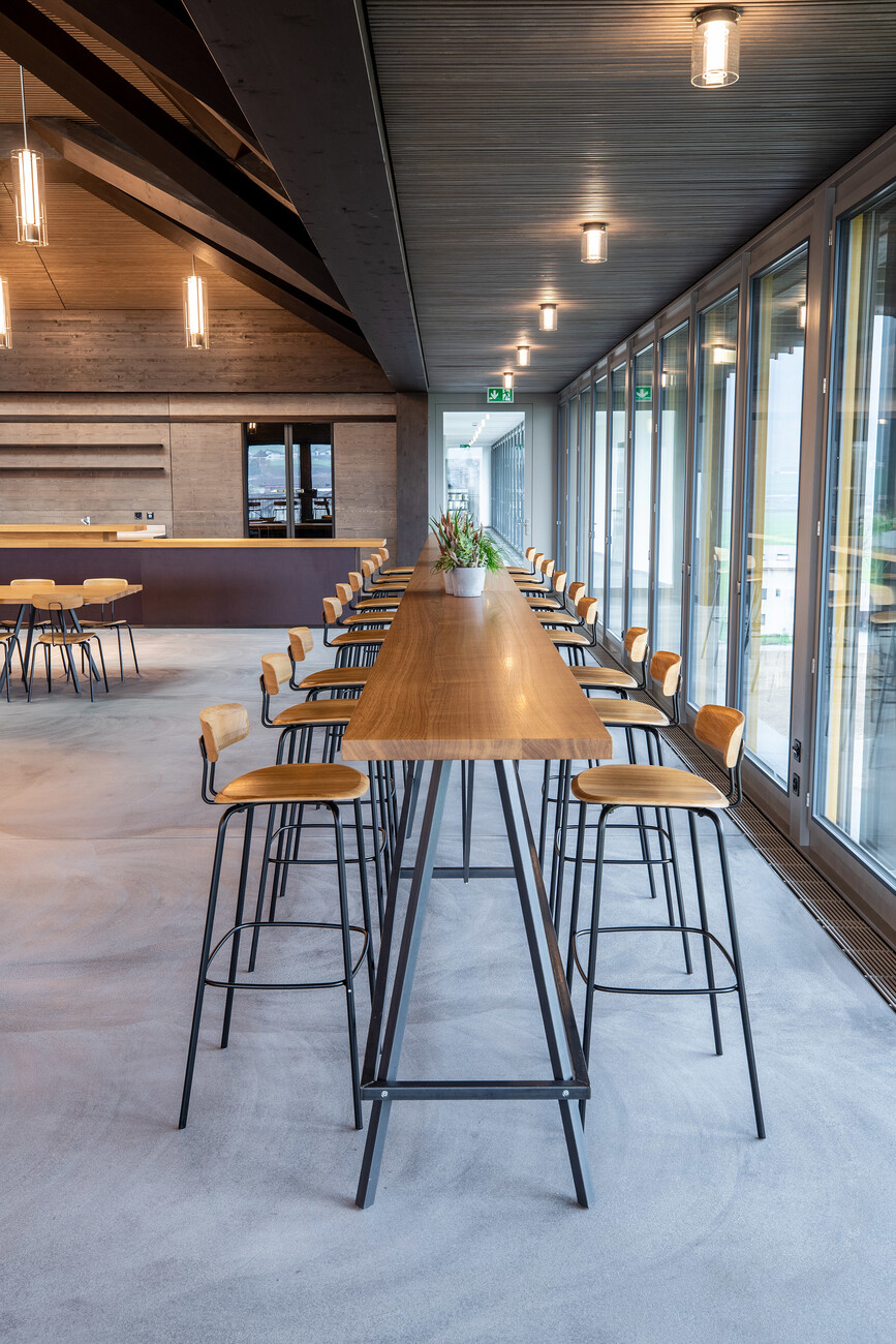
When it came to outfitting this space, one criterion the architects and client applied when making their choice was that the furniture should have its roots as clearly in modernism as the architecture itself. In addition, the furniture was to equally express both craftsmanship and reflect that poetry conveyed by the dynamic roof landscape. Which is why they opted for chairs and bar stools from the “Okito” series by Zeitraum. Like the roof the seating designed by Julia Läufer and Marcus Keichel derive their lightness from an extremely efficient use of material and quality joinery expertise. Wood and metal parts are joined using only a few well-concealed screw connections. In their graceful daintiness and clearly legible design that is equally the result of cutting-edge know-how but also traditional craftsmanship and experience the seating and roof structure reflect the same mindset. Furniture and architecture bond here, a connection that is every bit as harmonious as the relationship between the architecture and the countryside surrounding it.


