As with every Biennale and this year too, there are two main focal points that are under the aegis of the chief curator who is responsible for the entire show and is free to make decisions as he sees fit. At most Biennales, the Arsenale with its famous, 316-meter-long exhibition hall, the former Corderie, is the principal venue for major, spectacular spatial installations. While the Giardini, which also house the national pavilions, are home to the second center of the show, entitled “Fundamentals”. “Elements of Architecture” and “Monditalia” are the two main exhibitions that Rem Koolhaas has located at these two epicenters.
“Elements of Architecture” is very much his own brainchild and features a wild collection of components and spatial principles, such as toilets, windows, corridors, suspended ceilings, elevated floors, ramps, stairs, and the like. This transforms the central pavilion into a kind of architecture museum of building parts and their history. It would be fascinating to have the possibility of putting this show on permanent display somewhere as a kind of introduction to the elements of architecture.

“Monditalia”, by contrast, is based on an idea by Koolhaas, but was in fact realized by a whole host of independently acting teams. Curators, academics, artists, designers, scenographers and journalists were given the task of creating a piece about Italy, about the history of the country’s construction, culture or crime, which is permeated by corruption, neon lights, sex (Pompeii! Capri!) and a great deal of Berlusconi-mania. Italian affairs at their best. Each chosen contributor was allocated a space and a small budget – now the idea was to go and do something with it. As was to be expected, the result is incredibly diverse, on balance chaotic and very time-consuming for visitors to see.
That Italy is playing such a major role at this Biennale is a first – and ultimately an asset. Previous Biennales by contrast tended to place a strong focus on the problems of the world’s megacities, getting high on their explosive-cum-exotic chaos with a pleasant shudder as opposed to painting a vivid image of the local conditions. If 41 teams put their heads down to study Italy in detail, the result will be a tangible impression of a country that has long since ceased to be the cultural powerhouse of Europe, yet continues to be interesting enough to enchant more than just lovers of Antiquity, Renaissance and Baroque.

Those 41 stations reflecting Italian affairs are accompanied by 82 screens, which radiate the full force of Italian post-War cinema. Think Visconti, Pasolini, Rossellini, Bertolucci, Antonioni, Fellini, Moretti, Godard and many more – such names, such abundance! And yet, the films made in and about Italy are only a bit of background noise to the exhibition. For let’s face it, who would be able and indeed willing to watch them, on this torturous tour of Italy, which follows stations on a historical road map, beginning in the south with the calamitous situation of the refugees off the Lampedusan coast and ending in the north with Armin Linke’s wonderfully laconic films about the completely insane tourist industry in the Alps?
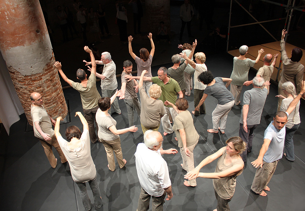
And that’s not all: In addition, on six stages that have been set up in between the different stations, visitors get to see dance, theater and musical performances of the Biennale’s other sections. Only the Art Biennale remains untouched – and the Hollywood stars, who are set to flock to Lido for the International Film Festival at the end of August, are of course not expected to take a detour to this cross-media extravaganza. So on balance it’s complete overkill in the Arsenale. Yet what leaves a lasting impression on this trip from the south to the north?

Two of the curators, Martino Stierli and Hilar Stadler, teamed up with the artists Nils Nova and Francesco Vezzoli to arrange a mind map of three villas in Capri on a photograph of the famous stairs at Casa Malaparte, designed by the architect Adalberto Libera, and set up a website on this “Architecture of Hedonism”.
Sex and border crossing is also the subject of Beatriz Preciado, author of the book “Pornotopia” (published in 2012 by Wagenbach, the most Italophile of all German publishing houses), who under the fulminant title of “Pompeii, the Secret Museum, and the Sexopolitical Foundations of the Modern European Metropolis” has contributed a piece of art that is, at best, comical. In the center of the room there is a white flag bearing a printed concoction of architectural illustrations, construction cranes, volcanoes and penises that has spectators immediately searching for the QR code for explanatory notes on the website. But we search in vain. Somehow sex and how to sell it are still playing a vital role even today, we learn. The piece would not be worth mentioning only for the fact that it illustrates the central problem with “Monditalia” in an ever so blatant fashion: The majority of contributions desperately try to be “art” – this is a Biennale after all! But art thus abused to illustrate curators’ ideas is painful to decipher and particularly bad if it’s not even been done by actual artists.

So instead of simply telling stories almost everything is put through the art mill and enigmatized to such an extent that it’s almost funny. The piece entitled “Antonioni’s Villa” by Will McLean, “with an essay by Niklas Maak” (who is the FAZ daily’s art and architecture critic) is about the architect Dante Bini and his experiments with ultrathin concrete domes, which were created using air-cushioning formwork. The director Michelangelo Antonioni and the actress Monica Vitti were among Bini’s clients, however, the pair wished to remain anonymous. On display at the Biennale we therefore get to see an airbed printed with text! A photograph of the villa? Now that would be too easy. At least the catalog includes a picture, albeit in poor quality.
And so the incongruous journey continues. A double projection shows some weirdo making strange chairs out of driftwood; next to him the architect Stefano Boeri strolls through his congress center in Sardinia, which was never inaugurated, complaining that Berlusconi was never fond of this kind of architecture anyway and therefore preferred to relocate the G8 summit scheduled to take place there to the earthquake-shattered town of Aquila. It has the makings of a wonderful story, if it wasn’t for the – in all fairness – awful design of the building and the kitschy juxtaposition with the Robinson-Crusoe carpenter: Here we have the genuine, simple life, there we find only corruption and sham appearances. Which is strange, after all Ila Bêka and Louise Lemoine succeeded in making the wonderfully laconic film “Koolhaas’ Houselife” about a cleaning lady in Koolhaas’ villa in Bordeaux one of the audience’s favorites at the 2012 Biennale.

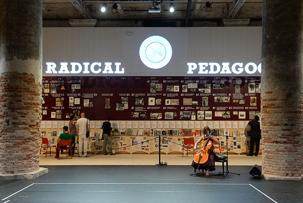
One of the few highlights is the section “Radical Pedagogies” by Beatriz Colomina, Britt Eversole, Ignacio Gonzalez Galan, Evangelos Kotsioris, Federica Vannucchi, and Anna-Maria Meister. Clearly structured, this show-within-a-show presents on a large board a variety of initiatives that use student projects to give architecture a radical makeover. A lot of these are based in Italy and thus smartly intersect with the subject of Monditalia.
Rem Koolhaas and his daughter Charlie also feature as authors. The wall display of photographs of the Biblioteca Laurenziana in Florence, a work by Michelangelo, completed in 1560, is accompanied by a text by father Rem, in which he describes how in the fall of 2006 he set out to re-experience the Italian Renaissance. An architect with an autumnal disposition shares his educational epiphany with us: Here, too, nothing but desperate kitsch? No, rather it’s a key work that aids the comprehension of this Biennale. Koolhaas, whom many expected to engage in urban construction on a global scale, just like he did in abundant studies before, simply did not comply. Instead, he did the opposite! Without giving any clear instructions as to how this knowledge could be usefully applied in the future, he revels in the Biblioteca Laurenziana, which to him is an architectural nightmare, all wrong, against all tradition and reason – and therefore simply magnificent. Just like before in the “Elements of Architecture” section, Koolhaas promises a new start, which is only possible if you radically focus on those things that architecture is made of, namely toilets, windows, and stairs, for example.
Read more about the 14th Architecture Biennale
› Rem Koolhaas’ foundations
› Architecture Know-How in Museum and Archive
› If you want to understand Modernity you need to have fun with it
› Germany’s Ex-Top Models
› Please touch
› A Clockwork Modernism
› Modernism and its uncle
› Import – Export
› The dream of an open society


