The challenger with the tiger nose
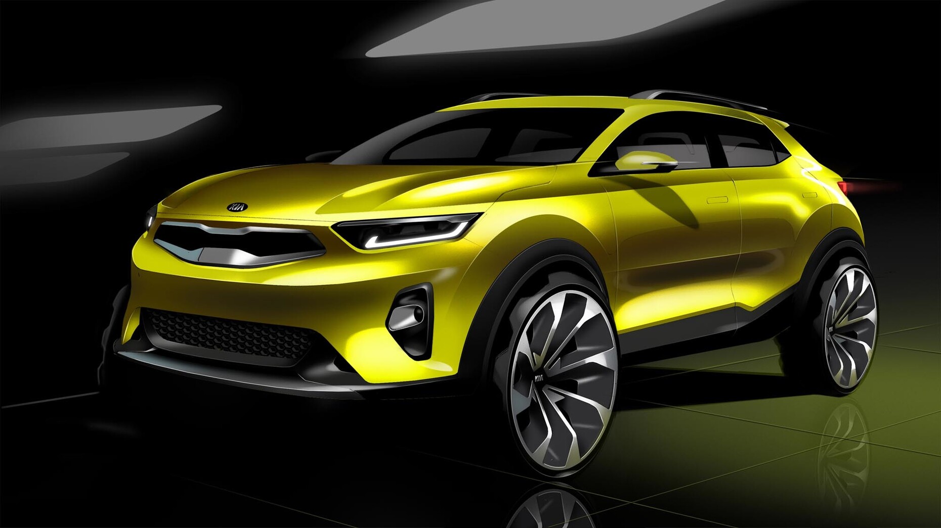
In his 2010 novel “The Map and the Territory”, Michel Houellebecq writes: “Undoubtedly, the best way for a consumer to have a good time in the 2010s was to turn to Korean products: for a car, Kia and Hyundai; for electronics, LG and Samsung.” That still applies today. The Hyundai Kia Automotive Group, with the marques Hyundai and Kia, has not least one man to thank for the competitiveness of its products: namely German designer Peter Schreyer. The company’s Head of Design, who came from Volkswagen in 2006, has given the Korean vehicles a design that makes the competition from Europe, Japan and the United States look pretty dowdy at times. With his latest coup, the compact SUV “Kia Stonic”, which was presented at the IAA, Schreyer once again proves that consumers can most certainly have fun with Korean products.
Fabian Peters: Mr. Schreyer, can you describe in a few words what good automobile design has to deliver today in your eyes?
Peter Schreyer: Essentially what is key today is that as a designer you try to develop the brand and support brand management positively in your work, in order ultimately to guarantee the economic success of the company. As designers we bear enormous responsibility in this regard. After all, thousands of jobs depend on the success of our work. I am always conscious of that.
Can you outline how the profession has changed in recent years and in recent decades?
Peter Schreyer: The job used to be far simpler. You were generally able to focus on just one product or one project. Today product ranges have become far more extensive. It began with a single model 40 years ago – the Hyundai Pony. Today Kia and Hyundai’s product range encompasses some 20 different products and body styles. In addition, everything today not only moves at a much faster pace, but has also become more complex in terms of what an auto model contains. Back in the day it was a chassis with an engine, heater, radio and four seats – that was it. Today cars are extremely complicated organisms. They communicate with the driver and with the environment. There is highly sophisticated technology in everything, even down to headlights that can see.
Your design is now even on show in a museum context. In the exhibition “Korea: Design and Poster” at Die Neue Sammlung in Munich, one of Germany’s most important design museums, the star was a car – namely your Kia “Kee”, a study from 2006. Why precisely this vehicle?
Peter Schreyer: The “Kee” was my first concept car at Kia and premiered at the IAA 2007. We designed the “Kee” shortly after I started here at Kia. You could call it the progenitor of the current Kia design and the first car to have the “tiger-nose” grille.
Does Kia aim to position itself even more strongly as a design marque in future?
Peter Schreyer: We are already perceived as an outstanding design marque, I believe. You need think only of the numerous awards we have won. Yet we don’t just want to shine with the product, but create a certain aura around the marque. Leadership in design also means cultural commitment. For instance, we support the new modern art museum MMCA in Seoul and the LACMA in Los Angeles and host the annual Hyundai Commission together with the Tate Modern in London.
For the last Commission Philippe Parreno realized the huge multimedia installation “Anywhen” in the Tate Modern’s Turbine Hall.
Peter Schreyer: Yes, “Anywhen” was fantastic. The new Hyundai Commission will follow as of October. I am proud that Hyundai and Kia are committed to such projects; it demonstrates incredibly broad cultural horizons.
Do such collaborative efforts inspire you?
Peter Schreyer: Yes, of course that’s inspiring. Such approaches can’t be translated perfectly into auto design, but I find a focus on art incredibly interesting. After all, many outstanding artists have a theme they pursue for a long time. To develop a personality, the marque has to do exactly the same. I think it’s important for a marque to have a personality.
What describes the Kia marque’s personality?
Peter Schreyer: Kia is the “Youthful Challenger”.
And Hyundai?
Peter Schreyer: Hyundai is the “Charismatic Leader”.
Meaning, Hyundai is the more adult marque?
Peter Schreyer: Yes.
So it also has a more adult design?
Peter Schreyer: Definitely.
And Kia is ...
Peter Schreyer: ... Kia is a challenger marque – within the company, too. I think it’s great that we have two marques that do not compete, but repeatedly spur each other on to greater things. If the company only had one marque then it would be easy to become self-satisfied. This way you always have a sparring partner.
As the Head of Design for both marques, aren’t you kind of your own sparring partner?
Peter Schreyer: Yes, true, sometimes I do spar with myself. (laughs)
“Youthful Challenger” – “Charismatic Leader”, how do you develop such a marque image and then realize it?
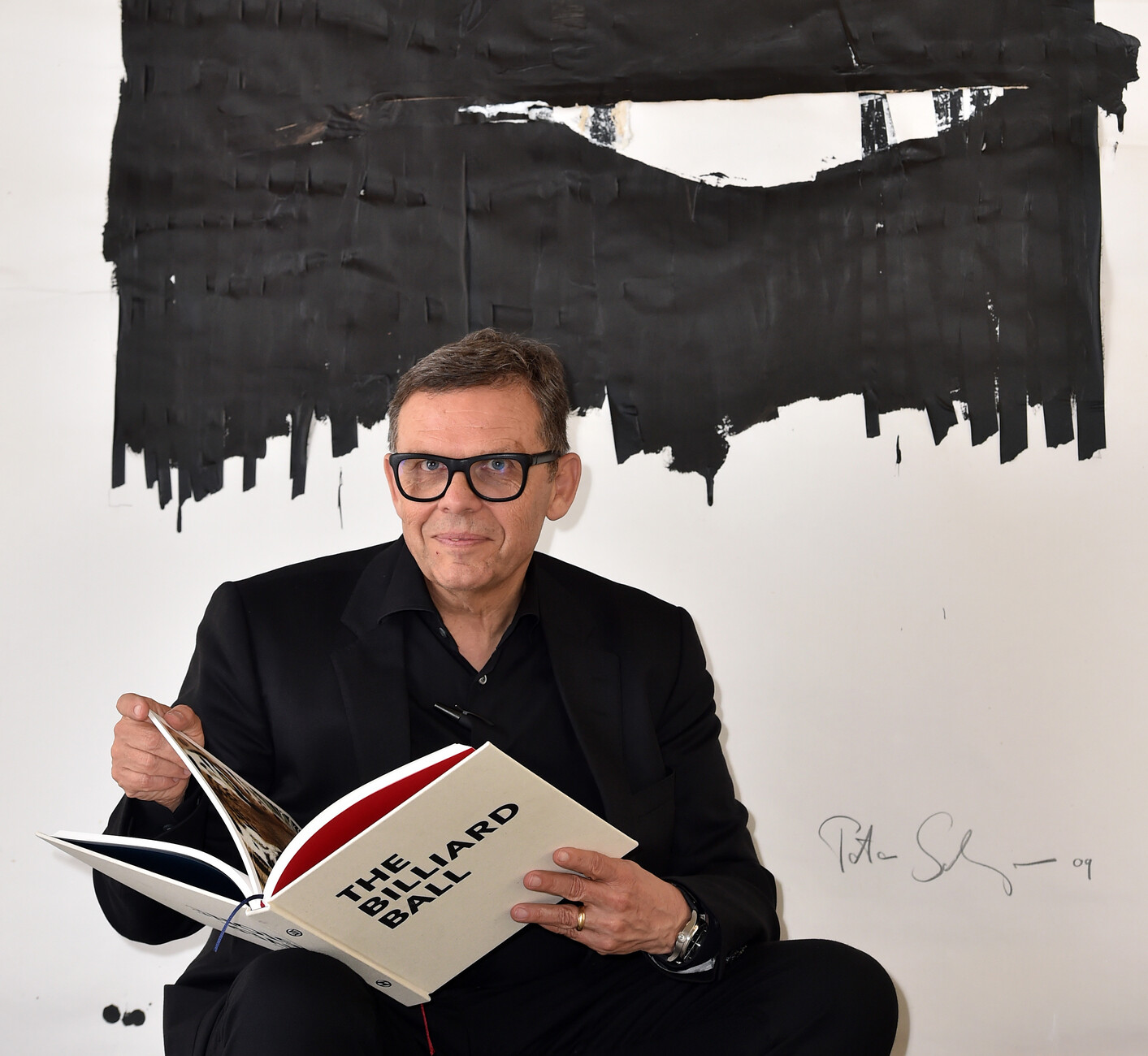
Peter Schreyer: First of all, the design departments started focusing on how to distinguish the two marques and define them more precisely. To that end we developed a “design manifesto”, a book that conveys the idea behind the two marque personalities.
Your design manifesto shows a river pebble on the Hyundai title page and a billiard ball on the Kia title page.
Peter Schreyer: Exactly. It bears saying here that the path to publishing this book was a long one. In the beginning we had a kind of fat pamphlet which always had an example for Kia on the left-hand page and the opposite one for Hyundai on the right. We then very swiftly realized that there were countless things that could not be compared one to one. Which marque is more sporting? How many car marques do you know that don’t want to be sporting? None. Other than Rolls Royce perhaps.
In the book, how do you convey the two marque personalities?
Peter Schreyer: Originally, the manifesto was mainly intended to entail a collection of images. Until I decided that such an approach harbored the risk that our designers would focus too strongly on one image, and consciously or subconsciously set out to imitate it. And that would restrict their creative freedom. Moreover, if the images were architecture or products or even details of cars, then the book would potentially age very quickly. We therefore decided eventually to almost only use language, be it individual words or expressions, in Korean and in English.
Which words or concepts describe the marques, for example?
Peter Schreyer: For example, for Kia the notion of “vibrant optimism” was really important to us, and to make sure the marque has a “progressive spirit”. The “simplicity of the straight line”, that has always been our design philosophy.
So a kind of moodboard made of words?
Peter Schreyer: Yes, exactly. In the book there are also “Guiding Principles”, and they include images, for example an image of a piece of Korean calligraphy. Such an artwork may not have a direct bearing on design, but can encourage new ideas. And then, for Kia there’s the tiger nose. We consciously did not take an image of a radiator grille for it, but that of a real tiger.
So why the billiard ball on the front of the Kia page in the manifesto?
Peter Schreyer: The billiard ball is an object that is manmade but incredibly perfect and precise – we believe that fits our design philosophy for Kia to a T. Now, every Kia designer has a billiard ball on his or her desk to ensure the idea is constantly borne in mind.


