SUSTAINABILITY
Three floors for the future
Strips of insulation wool protrude from site waste bags, while panels of the same material pile up under the exposed ceiling, which reveals joists and installations in the form of red, copper, and silver pipes. The view is spectacular here, in Hamburg’s “Emporio” Tower, what used to be the Unilever building. Built from 1961 to 1964, its star-shaped architecture is a symbol of post-war Modernism and has been heritage-listed since 2000. "Originally, we were hired to design a new entrance," explains Christina Goerling, who is CEO of the interdisciplinary company "Elbstrand & Mannschaft" together with interior designer Steve Jende. That was in February 2020. But the company "Aquila Capital", which specialises in renewable energies and sustainable infrastructure projects and has been a tenant in the Emporio since 2012, also wanted to modernise and expand its offices. And at the same time, they wanted their corporate philosophy to be represented. Now Jende and his team are responsible for 4,500 square metres, distributed over the 18th, 19th and 20th floors, in the 24-storey building.
“Every floor was completely gutted; there was not one stone left on top of another,” reports Janna Störmer, architect at Elbstrand & Mannschaft, during a tour of the 20th floor. She adds: “The grids of the heated ceiling slab, for example, must be strictly adhered to, with a sprinkler every 1.90 meters; fire protection is much stricter in a high-rise building.” The heritage listing also meant that no interior staircase could be added and strictly regulated the lighting systems. These need to be in keeping with the time of the building’s construction and ensure all floors appear similar at night.
Aiming for DGNB Platinum certification
In line with the firm’s own requirements as well as those of the DGNB, and with a view to achieving Platinum certification, old carpets are being recycled and dry-wall profiles reused, as are the insulation materials from the 1960s; indeed “every screw is being reused,” adds Störmer. Many things were done by the craftsmen working here for the very first time, such as installing 25 door frames per floor using staples instead of glue. Planning the interior also proved to be a challenge. “Almost 80 percent of the companies we approached cannot provide full information about any harmful substances or details of the origin of their products,” Christina Goerling found. For the Aquila project, however, this is essential, as all varnishes and paints, construction woods, laminates, cement flooring, and upholstery materials are checked by DGNB auditors. With this in mind, “Elbstrand & Mannschaft” has spent years compiling a database for certifiable materials.
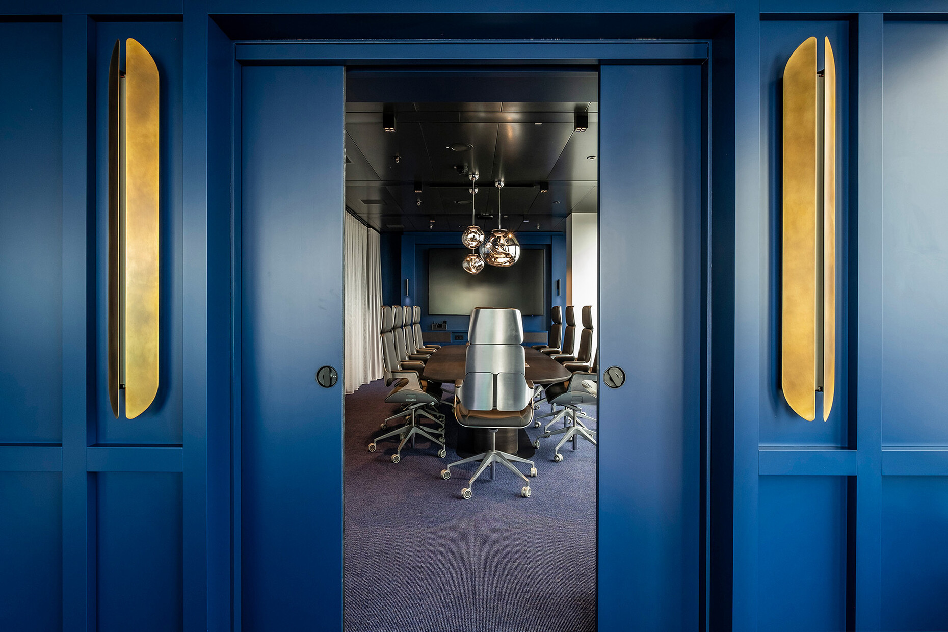
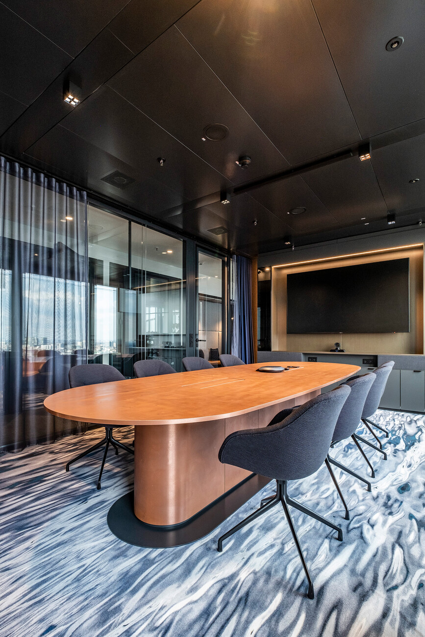
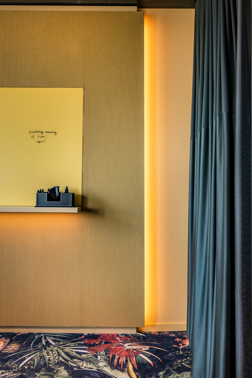
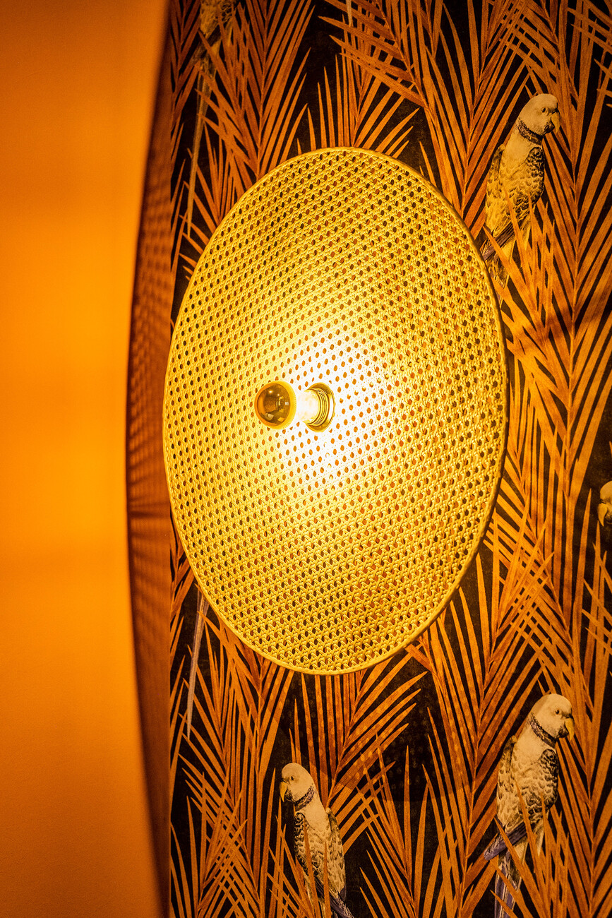
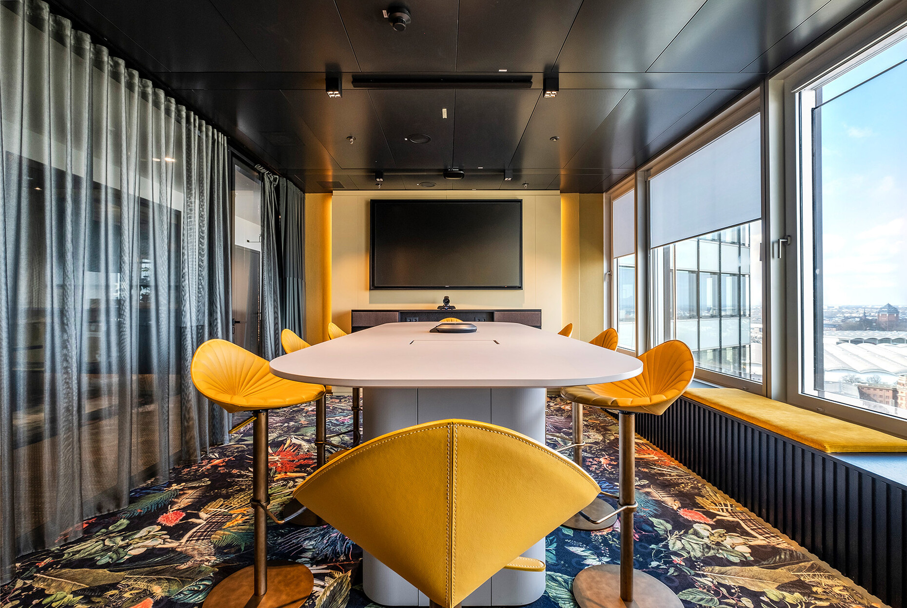
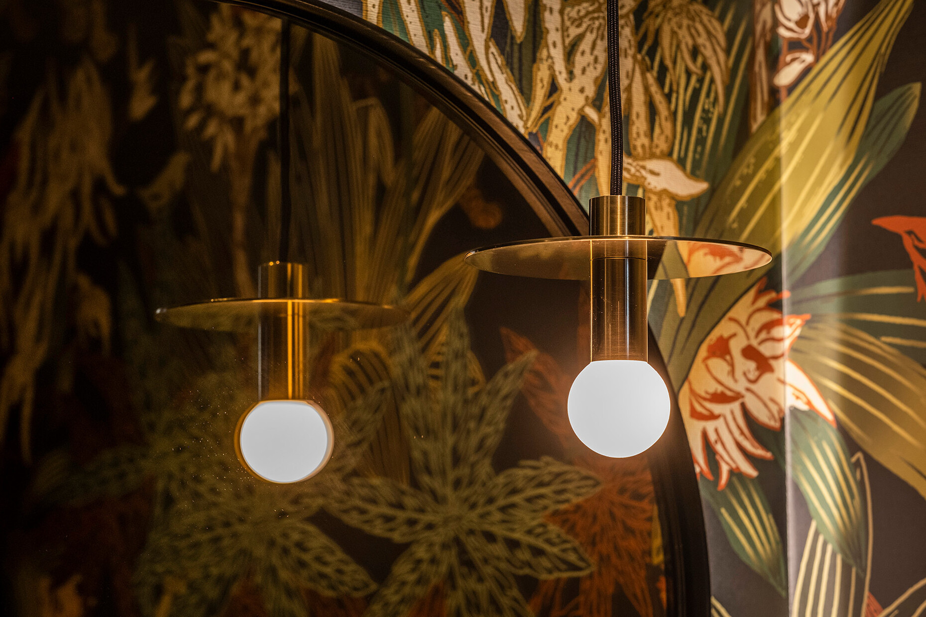
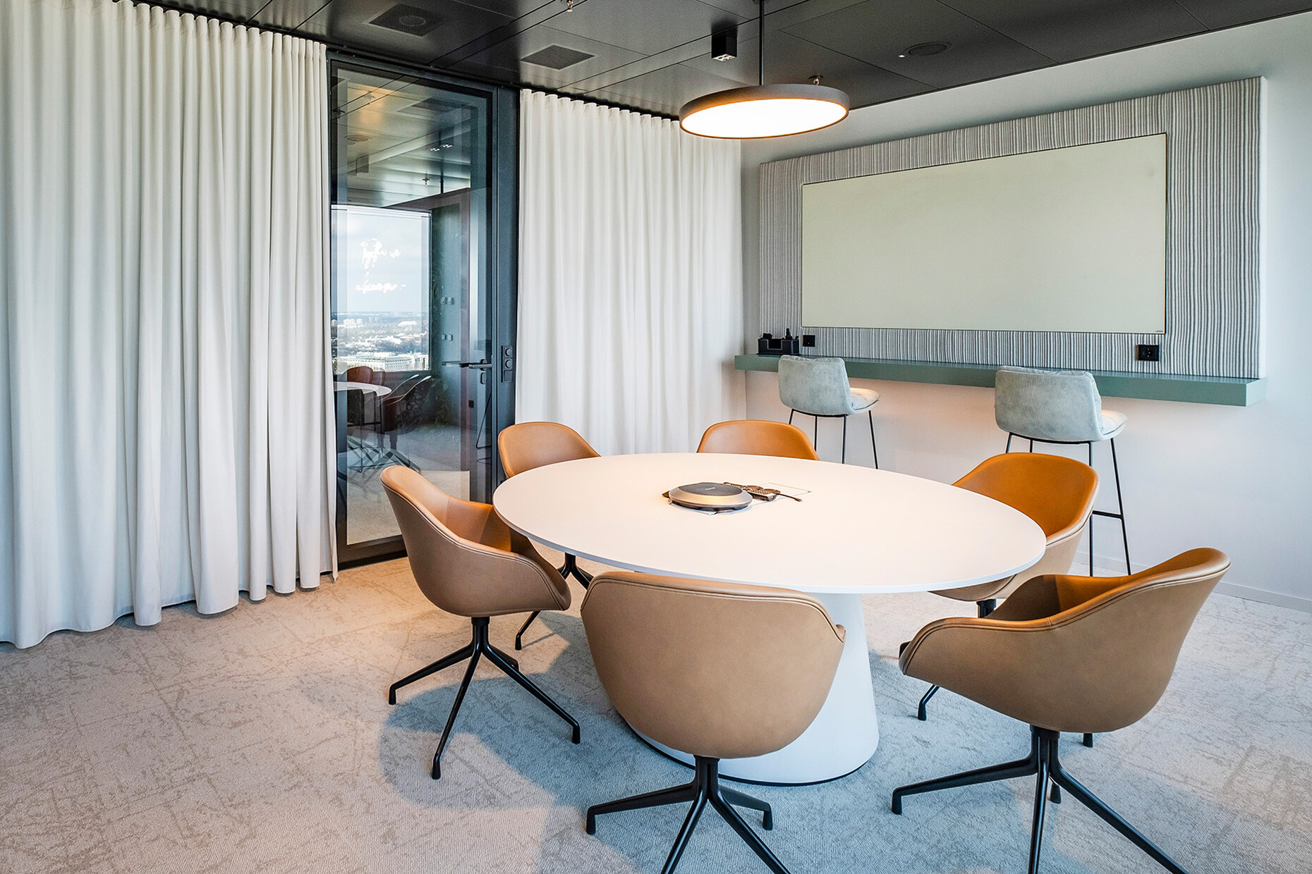
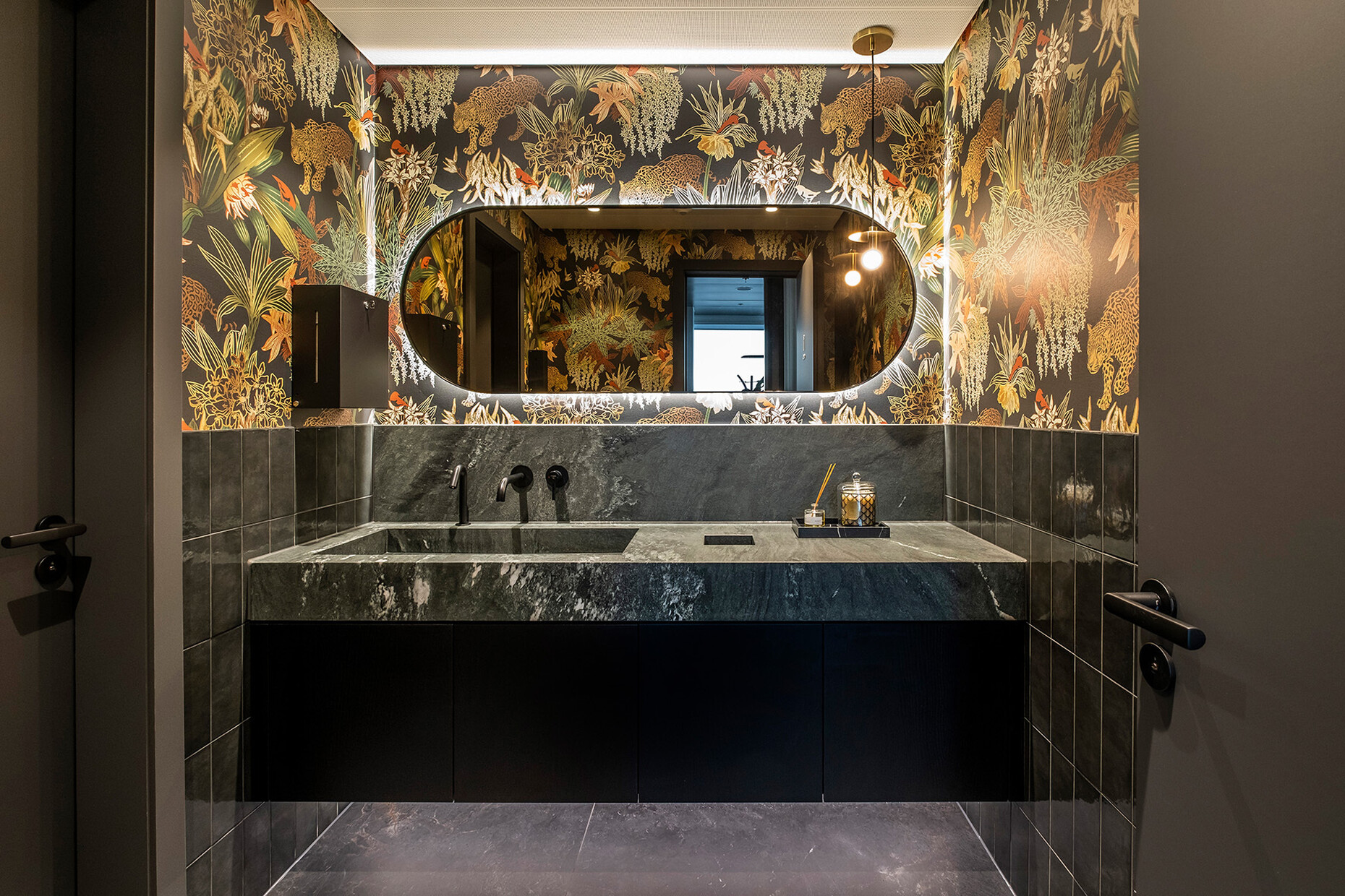
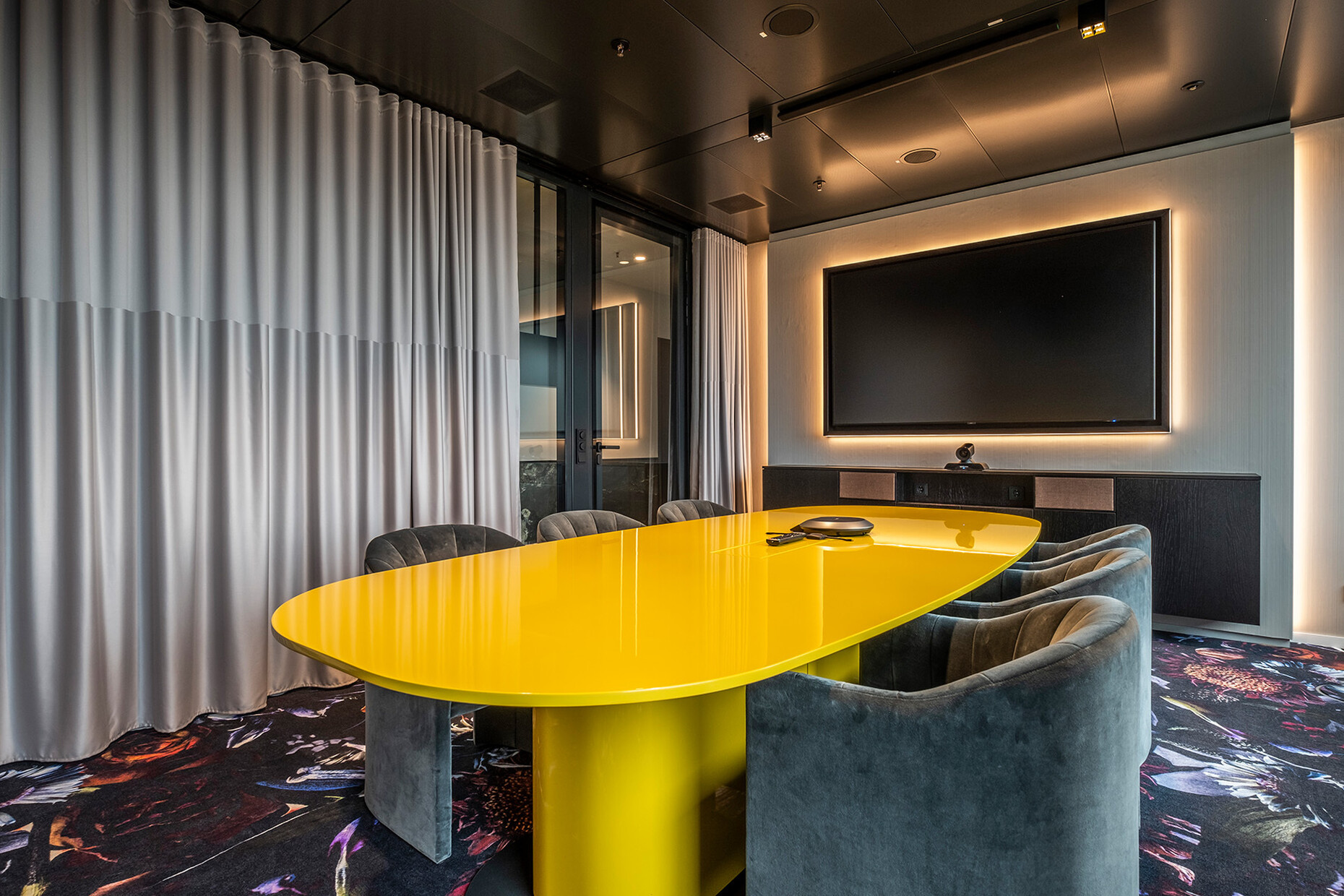
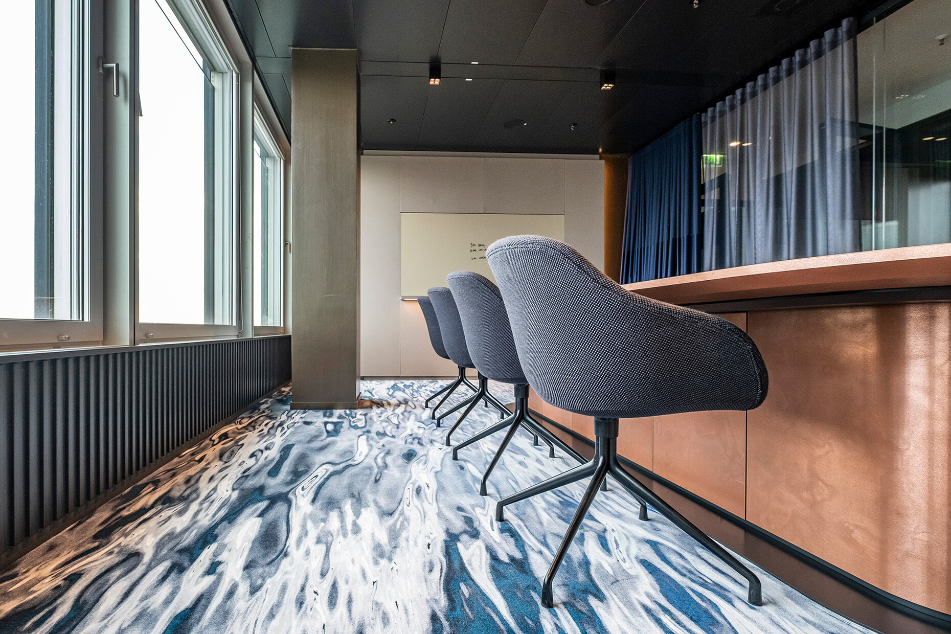
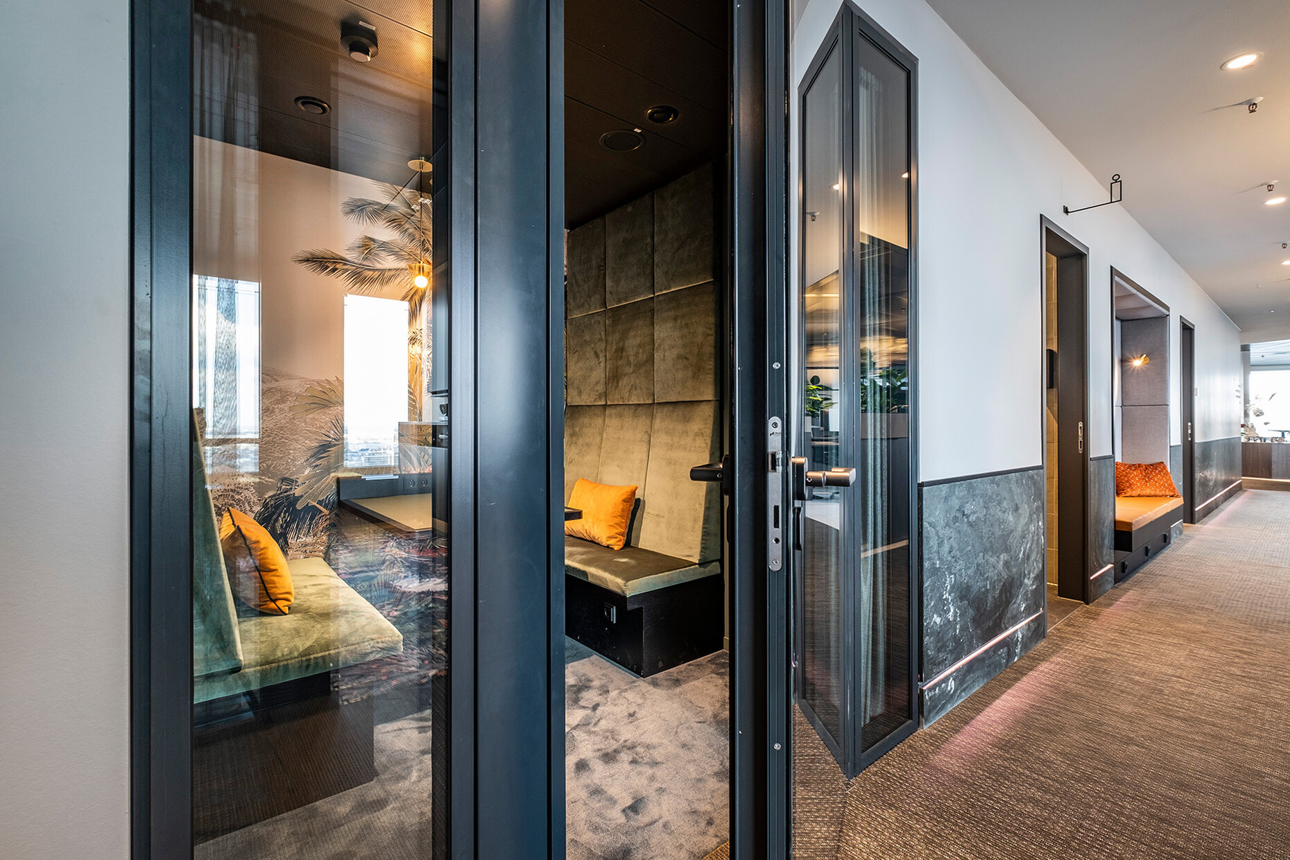
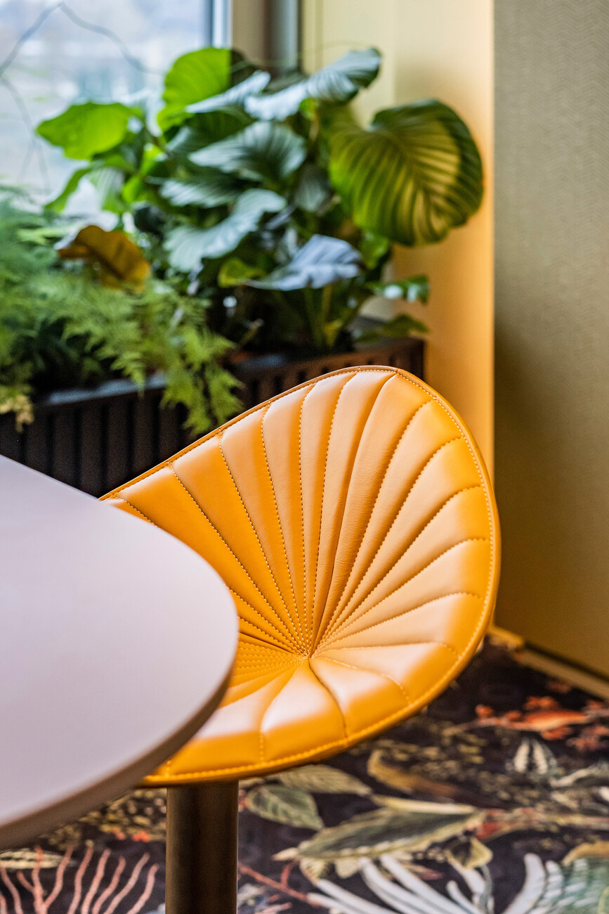
On floors 18 and 19, where the conversion has already been largely completed, it is clearly evident that their use has not spelled making any compromises in terms of design aesthetics. Carpets, sometimes with the pattern of a water surface that is presumably reminiscent of the nearby Outer Alster, sometimes colorful in a dark jungle look or in earthy tones, divide the various areas. Wallpaper and wall and ceiling colors, curtains, and furniture also vary, whereby the client’s original idea was actually a working environment based on the pompous London nightclub “Annabel’s”. Elbstrand & Mannschaft were thinking more of a no-frills Nordic look, hence the result has become an uncompromising mixture, partly quiet, partly loud, but always homogeneous in appearance. Thus, a naturally tanned leather sofa by de Sede dominates a room here, while there we see a canary-yellow conference table or simply the deep blue of doors and wall panels.
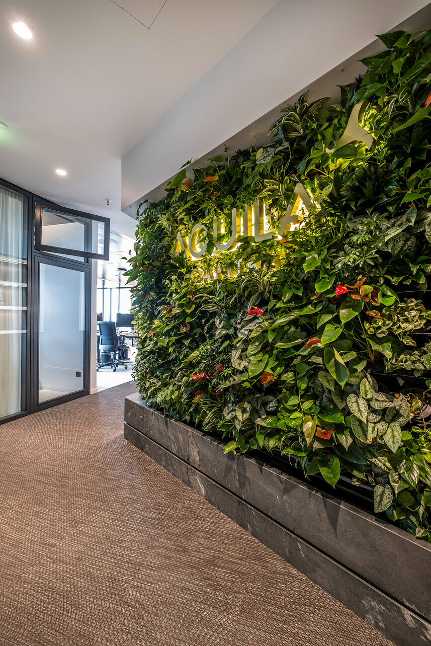
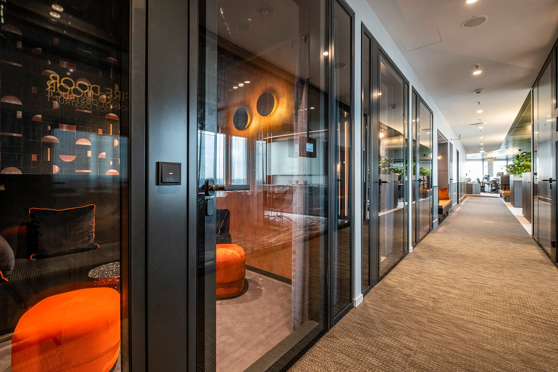
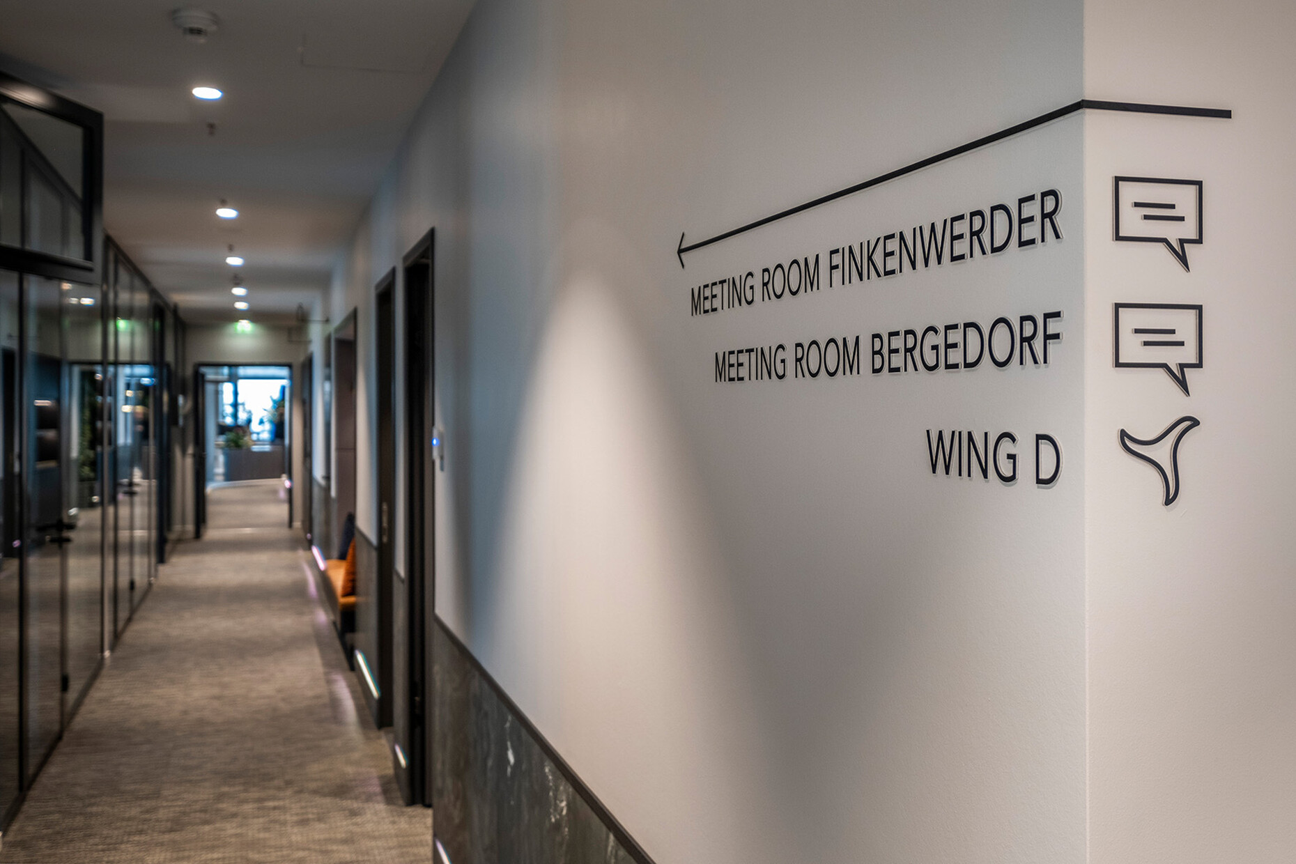
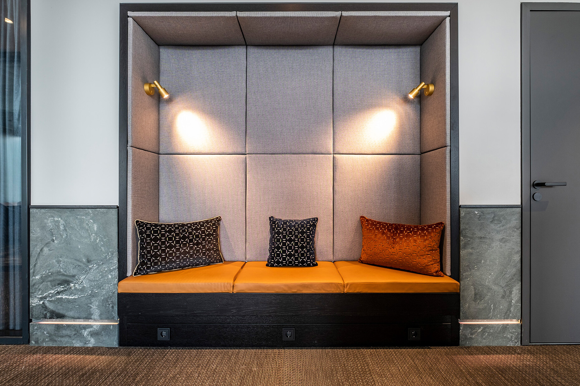
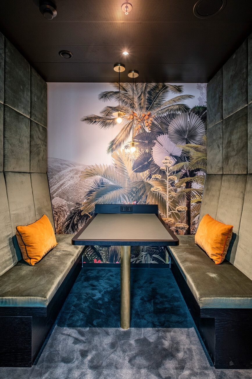
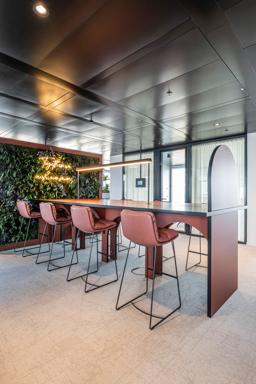
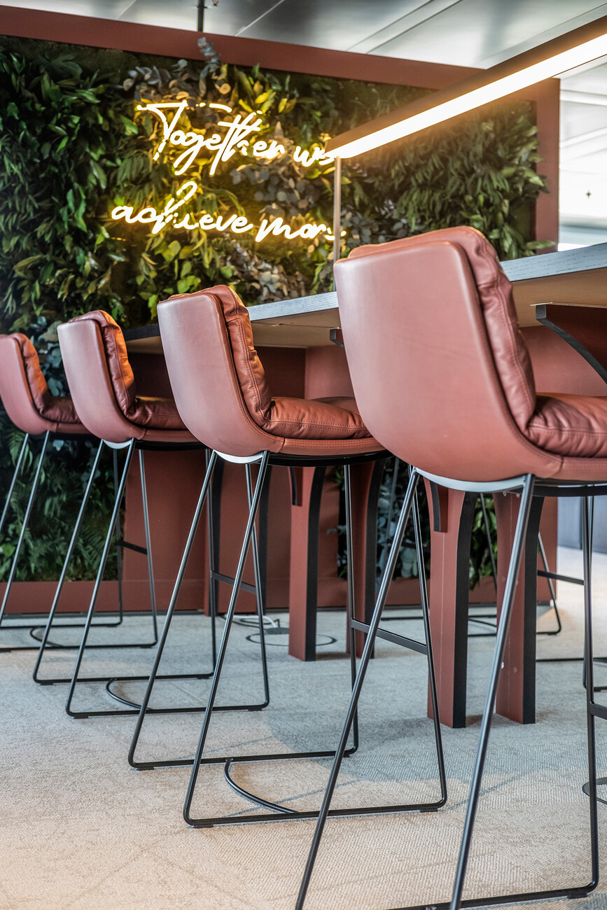
The structuring of the three wings per floor – each of them self-contained and divided into two working wings and a so-called “extra wing” – also reflects the changing demands on a contemporary workplace. This is evidenced by the biophilic, dark green walls of the lobby or rather all the entrance areas of the three floors. In addition, an internal survey at Aquila revealed: The office needs lower noise levels, more space for social interaction, and both open and quiet zones. In a way that is well thought-out and with great attention to detail, meeting areas in the form of terracotta-colored high tables now disrupt the usual open-plan office atmosphere, storage boxes sometimes function as flower tubs, corridors become lounges thanks to clever benches with swivel and height-adjustable tables, and corridors with upholstered niches offer the opportunity for a conversation or a short break. Moreover, open kitchenettes create areas for spontaneous interaction at the bar, while XS booths enable conversations to take place entirely undisturbed. The design of the washrooms and cloakrooms is more reminiscent of a luxurious hotel. Or a club, for that matter. And naturally, the height-adjustable workstations can be booked via an app. Incidentally, the entire project has been completed in budget.
