In 2012, everybody seems to be playing by new rules at Eurocucina. To date, the fair, which takes place biennially in alternation with the "Living Kitchen" show at imm cologne, has been the ideal location to display everything elegant, visionary and maximalist, in short: The global destination for kitchen design. The showrooms scattered across the city served to accompany the fair, as well as providing numerous opportunities to enhance new expertise gained at the fair itself. But this image is beginning to change. Firstly, the number of exhibitors at this year's Eurocucina dropped quite significantly, from 151 at the last event in 2010 to just 132. In addition to the economic difficulties currently plaguing some manufacturers, the recent shift in economic power within Europe is not the least significant factor involved here, as this has had an undeniable impact on trading centers. Visitors, manufacturers and traders are now looking to "Living Kitchen" at the start of 2013 as the key meeting, and are correspondingly focusing their efforts on that. As a result, design fever has also died down among kitchen manufacturers this year, and it is not only the German brands that have opted for restraint, at times even humbleness. Once again a kitchen-design revolution was definitely not on the agenda. New principles, an analysis of cooking habits, new data, new insights: Nothing of the kind was to be seen in Milan in 2012. Revision, improvement, upgrading: These were the buzzwords that echoed throughout the trade fair halls and showrooms.
Brands retreat to their own showrooms
While the trade fair is losing out, single-brand stores are reaping the benefits. These home-bases, where brands can play by their own rules, become a communications hub of sorts – at least in Milan. German (Alno, Poggenpohl, Warendorf) and Italian brands (Arclinea, Dada, Schiffini) had retreated from the trade fair grounds, all that was left of the well-known German brands was Leicht and SieMatic. While Poggenpohl inaugurated a 350 square-meter "Design center" across the street from Milan's new fashion center in Via Galileo Galilei 12, Warendorf was celebrating the launch of their newest kitchen design by Piet Boon "Stockholm", whereas Alno stayed away from the goings-on in Milan all together. Even Arclinea (with a new outdoor kitchen), Dada and Schiffini concentrated on their own showrooms, while Varenna, Poliform's kitchen brand, was present at the fair and in their own showroom.
Dada, the kitchen line by furniture manufacturer Molteni, moved into their first ever flagship store (designed by Ferruccio Laviani) on the close-by Via Larga, at the intersection with Piazza Santo Stefano. Among others Lavani's new kitchen "Hi-Line 6" was on show here, the first to be made with an Alucobond front. But re-editions of the "Trim" and "Set" kitchens also earned a place in the showcase as did a number of products resulting from the brand's collaboration with Armani. Schiffini focused on one new release, "Pampa" by Alfredo Häberli and Theo Gschwind (Häberli also provided the exhibition design together with Alfonso Arosio). The handle as some kind of defilement, an impairment of these monolithic kitchen concepts, as a necessary evil, remained a troubling issue for kitchen designers. When designing "Pampa", Häberli drew inspiration from his fellow Argentinean Lucio Fontana. Thanks to a carefully-placed slit in the doors light and shadow interplay sweetly on the kitchen surfaces. But sure enough the incorporation of the black handles into the veneer was still subject to tweaks and touch-ups right up to the start of production. In addition to their latest release, a number of the designer's favorite objects, their arrangement clearly well thought-out, made a visit to the exhibition worthwhile.
Taking different directions
Valcucine also presented several new releases that took quite different directions and yet mutually complimented and enhanced one another in a rather intelligent way. "Meccanica" by sub-brand Demode functions as a building block for those who like things simple, colorful and fun. Like a childhood game of mechanics, "Meccanica" consists of many (perhaps too many) individual pieces which can be used to construct a kitchen that is open-plan and accessible from all sides. The whole thing comes across as being quite accessible; setting it apart from many of the other high-range manufacturers. Yet one can assume that the system's abundance of bits and bobs has ultimately driven the price up. "Sine Tempore" however blazes a different trail: Present-day meets traditional, its fronts fascinating in their technical elaborateness and rich in detail present themselves as an alternative to stuffy retro designs. Purists would probably be more taken with the "New Logica System", which conceals cooking utensils behind hand-operated, metal sliding elements. After all, in the well-designed kitchens of today the functional aspects, which aid the user when prepping, cooking and eating, are not the only things that count. It is just as important (if not more important) that the kitchen itself can transform into an immaculate monolith, an untouchable shrine, both before and after use. A concept by Dutch architect Wiel Arets takes this "shrine" idea to the extreme. His kitchen design (created in collaboration with Alessi and Valcucine) was conceived for the contract sector and boasts colossal, pristine Corian steel surfaces.
Material samples, but little more
The kitchen as one huge material sample: A challenge Zaha Hadid set herself quite a few years back when she designed a visionary culinary laboratory all in Corian steel, and in doing so caused quite a stir in Milan. Now, same challenge, new material: "Shaping Silestone" with white quartz surfaces by Spanish company Consentino is likewise a three-winged propeller-like culinary installation, designed by brothers Humberto and Fernando Campana, which left visitors gazing in wonderment in Superstudio Più. The kitchen also incorporates compartments for the presentation of other colored surfaces, whereby – quite in-keeping with the zeitgeist – the project begins to drift into the dangerous waters of the marketing gimmick. This certainly wasn't a "kitchen for cooking". Rather to marvel at and then forget just a quickly.
New colors, more colors
This year for the very first time material supplier DuPont presented Corian, the company's own material often employed in kitchens, in color. The new material was not yet available to kitchen manufacturers, such that the new color and material variations were to be seen for the most part in the form of kitchen fronts. Poggenpohl presented their first touch-screen configurator for kitchens in its new design center (in Via Galileio Galilei 12). But against a backdrop of new colors and surfaces (the company now boasts the largest assortment in its 120-year history) there was a lack of new representation and selection techniques. Last year Poggenpohl underwent a change of management and the company's new CEO Lars Völkel has plans to completely make over the company's portfolio from the bottom up. Chef designer Manfred Junker explains: "It isn't the case of creating a 'cheap' line, but taking the lower price range seriously and reinvigorating our product range correspondingly. We have added contemporary color options as well as upscale and good-value materials, before we turn to the re-design of the upper price range." Junker is also keeping his eye on current developments: "The era of dark tones has reached its peak," he comments and adds: "Woods that are lighter in both tone and weight have found their way back onto the agenda. In the future, the actual structure of the woods will be more visually prominent. This look can be combined with beige, brown and grey. We will also be playing with color, though perhaps not to as great an extent as some of our competitors."
Now to something completely different, "Critter", designed and realized by Milan designer Elia Mangia, who was on the scenes as early as 2008 having created a compact, open-space cooking area for a loft in Paris. But with "Critter", shown as part of the "Qualities Uncovered" exhibition, Elia went a step further. His collapsible and thus transportable kitchen for both outdoor and indoor use fundamentally challenges the traditional, unmovable architecture ordinarily seen in food preparation. Mounted on two crossbeams made of solid ash wood, his 2.40-meter-long kitchen can be augmented with a number of accessories, such as additional workspace or a sink, all held together with just eight screws. Like a stretcher, it can be quite easily carried by just two people. In principle, it raises radical yet plausible questions about our present-day habits as well as the established kitchen design industry. Do we really need so much furniture, so many cupboards, so much stove space, so much workspace, such a large sink, just to prepare a well-made, tasty meal for ourselves and our friends?
The constants
Those brands that are happy in themselves, that despite all of the pressure to prove their innovative potential, draw their strength and radiance from carefully planned and, where possible, small steps, face other questions. Since day one, Boffi, Minotticucine and Bulthaup have been counted among such brands. It is difficult to imagine these brands among the hustle and bustle of the trade fair; instead one seeks out their specific locations, in distinctive spaces throughout the city. Boffi for example used their generous showroom on Via Solferino to present new systems, new bathrooms and a number of new kitchens, in addition to the new "K20" by Norbert Wangen, this included new materials and typologies created for the "April" kitchen by Piero Lissoni with fronts made of solid Canaletto walnut, which had been thermo-dried and oiled. In a mixture of precision and rawness, its plank-like appearance is reminiscent of the cityscape to be seen in the outside world, only temporary in its order and arrangement, and is at the same time indicative of the highest precision. Its four-millimeter-thin, stainless-steel countertops contain a well-designed interior made of wooden panels, rendering the whole construction both light and durable at the same time. The "Xila 09" model, produced 40 years ago now, is available with alternative surface looks, or with a countertop and doors made of satined, backside painted glass, for example.
Shrine to the culinary, altars, antique sacrificial sites alike, Minotticucine brings them all into the present. This is where "Era", a kitchen design by Salvatore Indriolo, comes in; made mostly of hand-brushed aluminum sheet metal, its work surfaces and the lines between the aluminum elements in Irish basalt. Or "Aura", designed by "Working Project", which from the outside looks like a huge copper block. But then it opens in the middle, sliding to each side and revealing two large teppanyaki griddles made of hand-brushed stainless steel. Radical, archaic, extravagant.
Playing with prisms
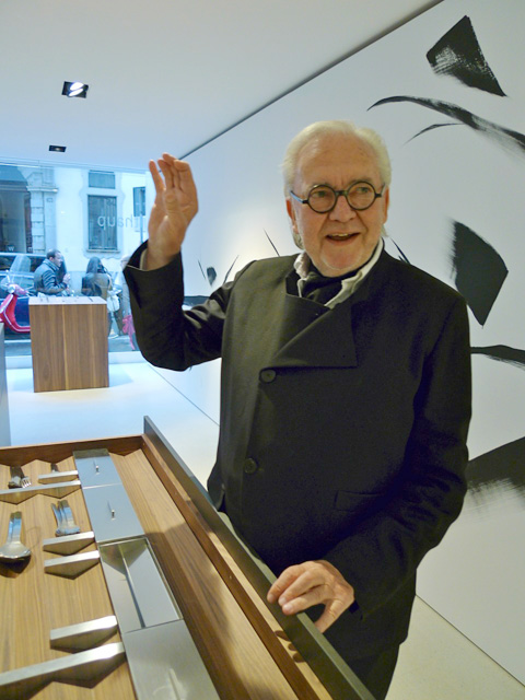
Last year Bulthaup presented a Mike Meiré production. "Shifting Contexts" questioned certainties and shifted perceptions of the German engineering brand. As entertaining and dazing as the presentation may have been, it did help to open new doors for the brand. Now, an old acquaintance is back to usher in the new, namely designer Herbert Schultes. With the "25" and "20" systems and above all the "b3" floating kitchen, Schultes fundamentally shaped the Bulthaup product and brand world. His last piece for the Aich-based kitchen manufacturer was the minimalist "b3" monoblock, an island made of stainless steel, each join flawless. "You couldn't take minimalism any further; that was the boundary," says Schultes in retrospect. Now things have done a complete 180: Rather than attempting to conceal functions, they should be made visible again.
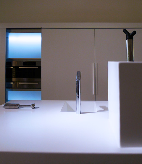
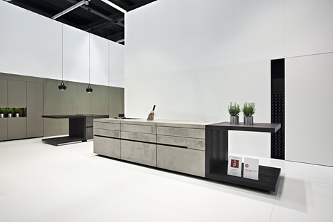
Schultes' understanding of design forces him to only start something new when there is a promise of some kind of improvement in the outcome. In order to advance onto something new, ergonomic considerations always play a decisive role in his designs. When, after a long hiatus Bulthaup boss Marc O. Eckert asked him to come back and develop new ideas for the brand; Schultes began with a detail that upon first glance may appear somewhat unspectacular: He revamped the interior of the "b3" kitchen's push-and-pull system. The drawers were previously structured with chests, crosspieces and boxes, sometimes made of glass, sheet metal or wood, other times covered in leather. Working together with Bulthaup engineers and craftsmen, Schultes began to think outside of the box. A new prism-like structure prescribes a basic arrangement for utensils and silverware, which the user can separate and organize however they like using small stainless-steel tabs. Schultes pushes them back and forth, "like a DJ on the decks," as he explains with a mischievous grin. The very individual arrangement can be rearranged at any time. A wonderfully analog toy. But that wasn't enough: The adaptability, the flexibility, the freedom to vary the arrangement within the space provided by the prism, is intended to revolutionize the kitchen as a whole. To do so, it first of all turns to the wall. One particular study entitled "Konzept Beton", looking at a concrete countertop just ten millimeters in thickness, demonstrates how the prism as an extruded profile lends structure to the wall itself. Mounted shelving, a fridge and other kitchen appliances become light as a feather as they are shifted along the wall with nothing more than two fingers and (remaining true to Otl Aicher) freeing up work surfaces once again: "The kitchen for cooking".
Bulthaup has to "find its way back to the values shown to us by Otl Aicher," comments Marc O. Eckert, reminding us simultaneously of changing needs and the new world created by the Internet. Kitchens have to be adapted to suit these changes. In-keeping with this sentiment, "Konzept Beton" will soon be turned into a real project. From the wall, the kitchen of the future grows out into the space, as a symbol for a new understanding of and playful relationship between freedom and order.
 ”Hi-Line 6” by Ferruccio Laviani for Dada, photo © Dada
 ”Hi-Line 6“ with fronts out of Alucobond, photo © Dada
 “Pampa“ by Alfredo Häberli and Theo Gschwind for Schiffini, photo © Schiffini
 For „Pampa“ Alfredo Häberli was inspired by Lucio Fontana, photo © Schiffini
 The door-guides of „Pampa” show a play of light and shadow, photo © Thomas Edelmann
 “Sine Tempore“ by Valcucine, photo © Valcucine
 Decoration out of tomatoes, photo © Thomas Edelmann
 ”+Artesio” von Poggenpohl, photo © Thomas Edelmann
 ”Plusmodo” by Poggenpohl, photo © Thomas Edelmann
 “Aprile“ by Piero Lissoni for Boffi, photo © Boffi
 “Aprile“ with fronts out of Canaletto nut-tree, photo © Thomas Edelmann
 “Xila 09“ by Boffi, photo © Boffi
 “Xila 09“ is in production for forty years, photo © Thomas Edelmann
 “Era“ by Salvatore Indriolo for Minotticucine, photo © Minotticucine
 ”Konzept Beton” by Bulthaup, photo © Thomas Edelmann
 Drawer-system by Bulthaup, photo © Thomas Edelmann
 ”Artusi” by Arclinea, photo © Thomas Edelmann
 ”Stone Kitchen” by Steininger, photo © Steininger
 “Classic FS Topos“ by Leicht, photo © Leicht
 ”La Cucina” by Wiel Arets in cooperation with Alessi and Valcucine, photo © Alessi and Valcucine
 ”La Cucina” with Corian surfaces, photo © Alessi and Valcucine
 ”La Cucina” has been designed for the contract-clients, photo © Alessi and Valcucine
 “La Cucina“ resembles a clean monolith, photo © Thomas Edelmann
 ”Meccanica” by Demode, photo © Demode
 ”Meccanica” for all, who like it reduced, photo © Demode
 ”Meccanica” exists out of numerous components, photo © Thomas Edelmann
 “New Logica System“ by Valcucine, photo © Valcucine
 Sink of the “New Logica System“, photo © Valcucine
 “Shaping Silestone“ by Humberto and Fernando for Cosentino, photo © Dimitrios Tsatsas, Stylepark
 “Shaping Silestone“ at Superstudio Più, photo © Cosentino
 “Critter“ by Elia Mangia, photo © Francesco Jodice
 “Critter“ is a transportable, demountable kitchen, photo © Francesco Jodice
 “Critter“ with two beams out of massive ash wood, photo © Francesco Jodice
 “Era“ exists out of hand-brushed aluminium sheets, photo © Minotticucine
 Herbert Schultes, photo © Thomas Edelmann
 Prism with spice-containers by Bulthaup, photo © Thomas Edelmann
 ”Beaux Arts” by Siematic, photo © Siematic
 At Steininger, photo © Steininger


