HOTEL
Special senses
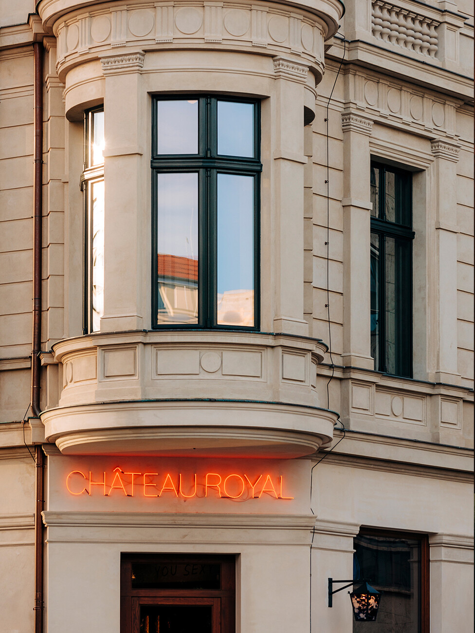
Parisian chic? New York coolness? Not necessary at the Château Royal. Instead, this Berlin hotel is all about Heimatliebe, i.e. a love of home – from the weathercock on the roof by local artist Cyprien Gaillard to the dark mastic asphalt inside in the hallways. Grill Royal greats Stephan Landwehr and Moritz Estermann have managed the trick of creating an exceptional cosmopolitan hotel that remains true to its local roots. Each of the 93 rooms was designed by a different artist, including many Berliners. The Icelandic chef Victoria Eliasdóttir is responsible for providing customers with a variety of delicacies.
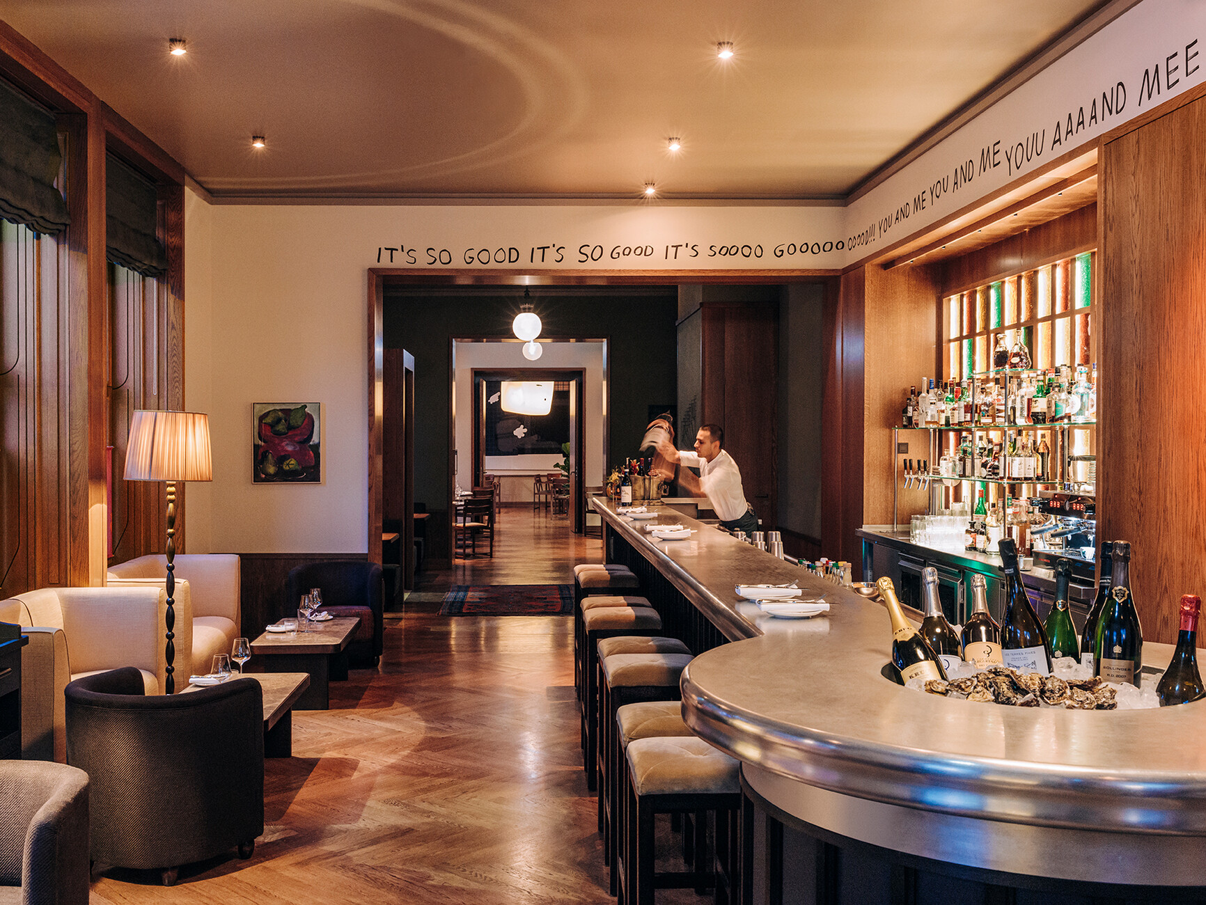
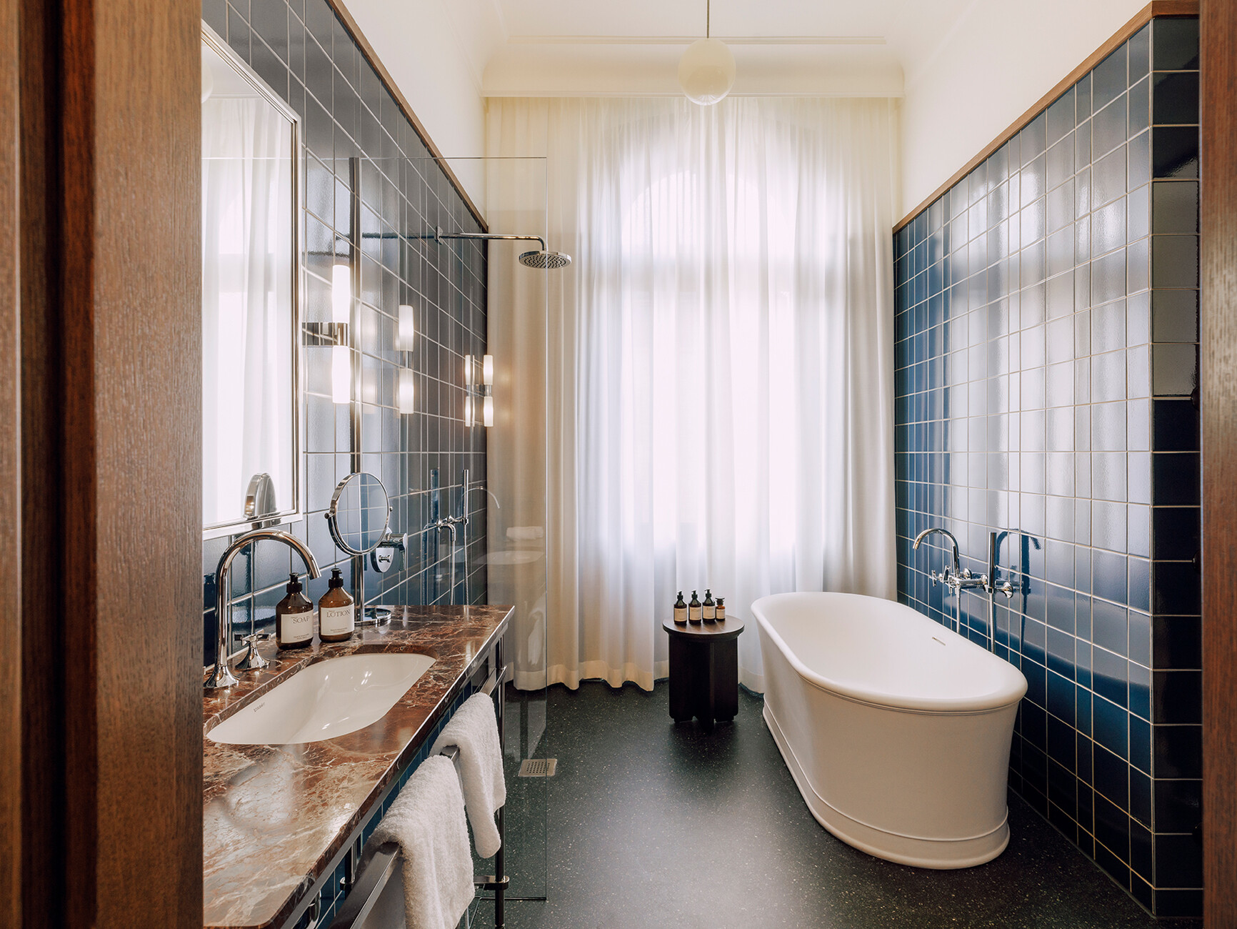
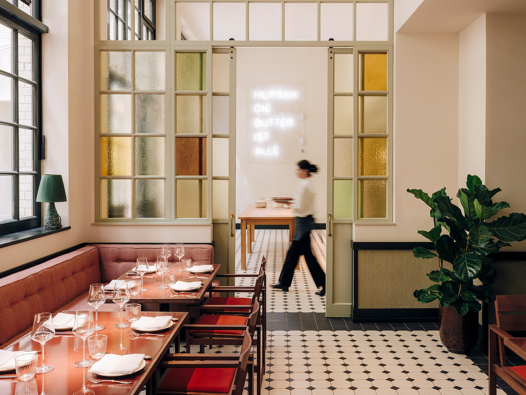
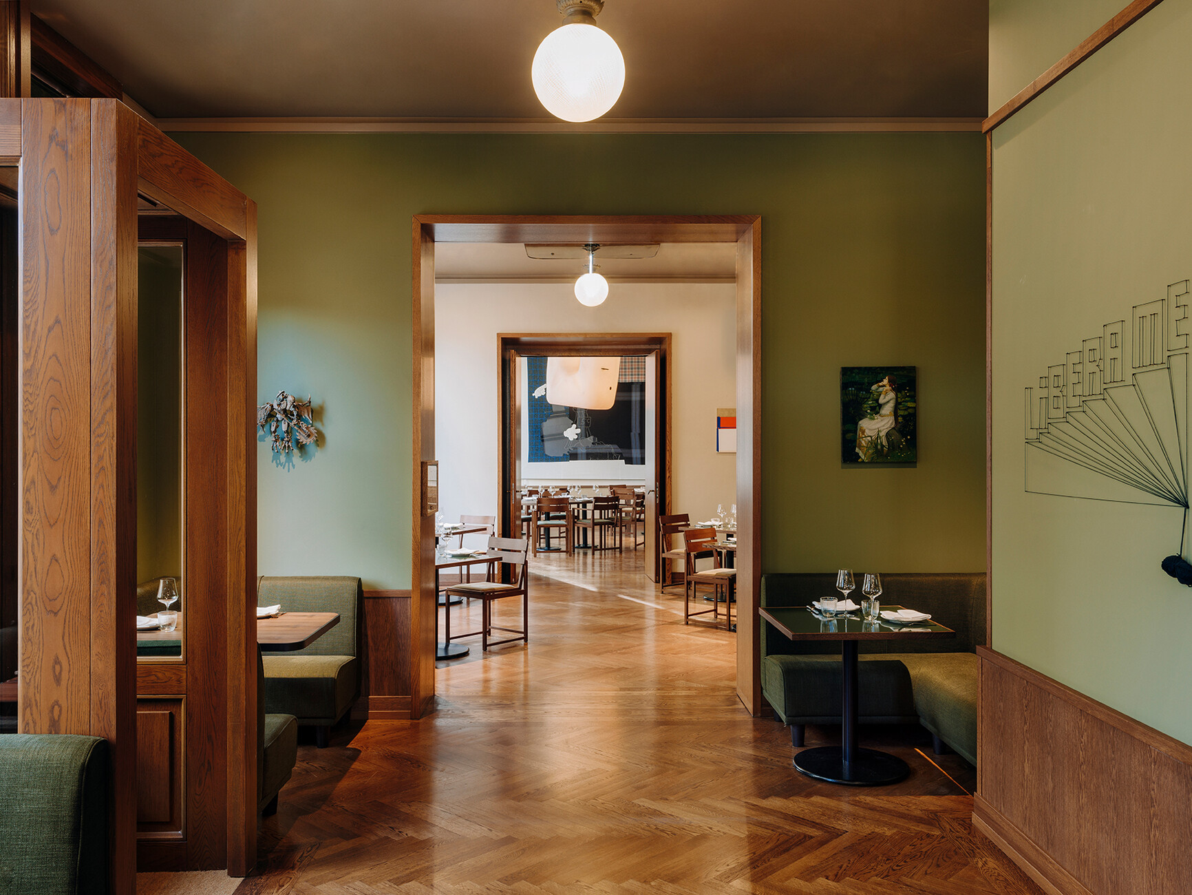
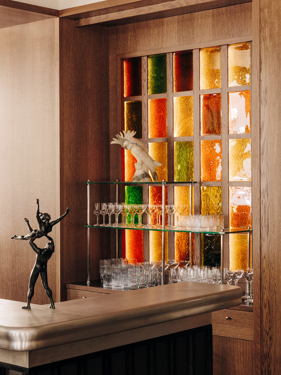
Architect Irina Kromayer, working together with Etienne Descloux and Katariina Minits, designed the detailed interiors and came up with individual solutions, finding her inspiration in the Gründerzeit (the time of industrialisation in Germany) and the 1910s and 20s. This is entirely fitting for the three-building ensemble, which consists of two listed houses, built in 1850 and 1910, and a new building for which David Chipperfield is responsible. Inside, too, every detail reflects the theme of Berlin – art nouveau tiles are reminiscent of historic underground stations, the fireplace shines in the famous “Schinkel blue”, the colourful cast glass elements in the lobby and bar could have been taken from a Charlottenburg bel étage. In fact, the Château often feels more like a West Berlin flat than a hotel. And that's exactly how it's meant to be, says Irina Kromayer, as she talks about her favourite wallpapers, unwanted parties, difficult televisions and well-hidden bathrooms.
Katharina Hesedenz: Over the last few years many hotels have opened in Berlin, and some have been quite successful, some less so. Château Royal has started out with a local advantage, because it's close to the city and its milieu.
Irina Kromayer: The name is of course a big plus, and it's also clear that it's fun to deal with the history of such an exciting city. We used the Gründerzeit and the 1910s and 20s as sources of inspiration because those were formative times in Berlin. Berlin was actually a very small, relatively undeveloped place up until then, and it was only with the founding of the Empire in 1871 that Berlin made a huge leap forward as the capital of the Reich. Through the reparation payments (for the Franco-Prussian War) that France delivered in the form of 1450 tonnes of gold, a lot of money flooded into Berlin and an incredible boom rapidly began. The 1920s were the most creative time; the Bauhaus flourished and Mies van der Rohe designed his first buildings within the city, and Berlin's typical architectural style developed. The city was full of talented architects.
”We used the Gründerzeit and the 1910s and 20s as sources of inspiration because those were formative times in Berlin.“
What does the typical Berlin architectural style look like?
Irina Kromayer: It's characterised by a transition from an era of craftsmanship to one in which everything was allowed to be more decorative, but beyond that there is this very Berlin “DNA”. Bathrooms and staircases, for example, are good examples; they are laid out quite differently in Paris and London. Colours were also used differently here, and the details of the workmanship are different.
Is the unique Berlin identity the thing that holds three such different buildings together?
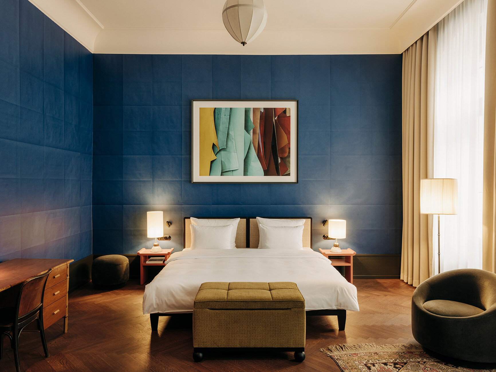
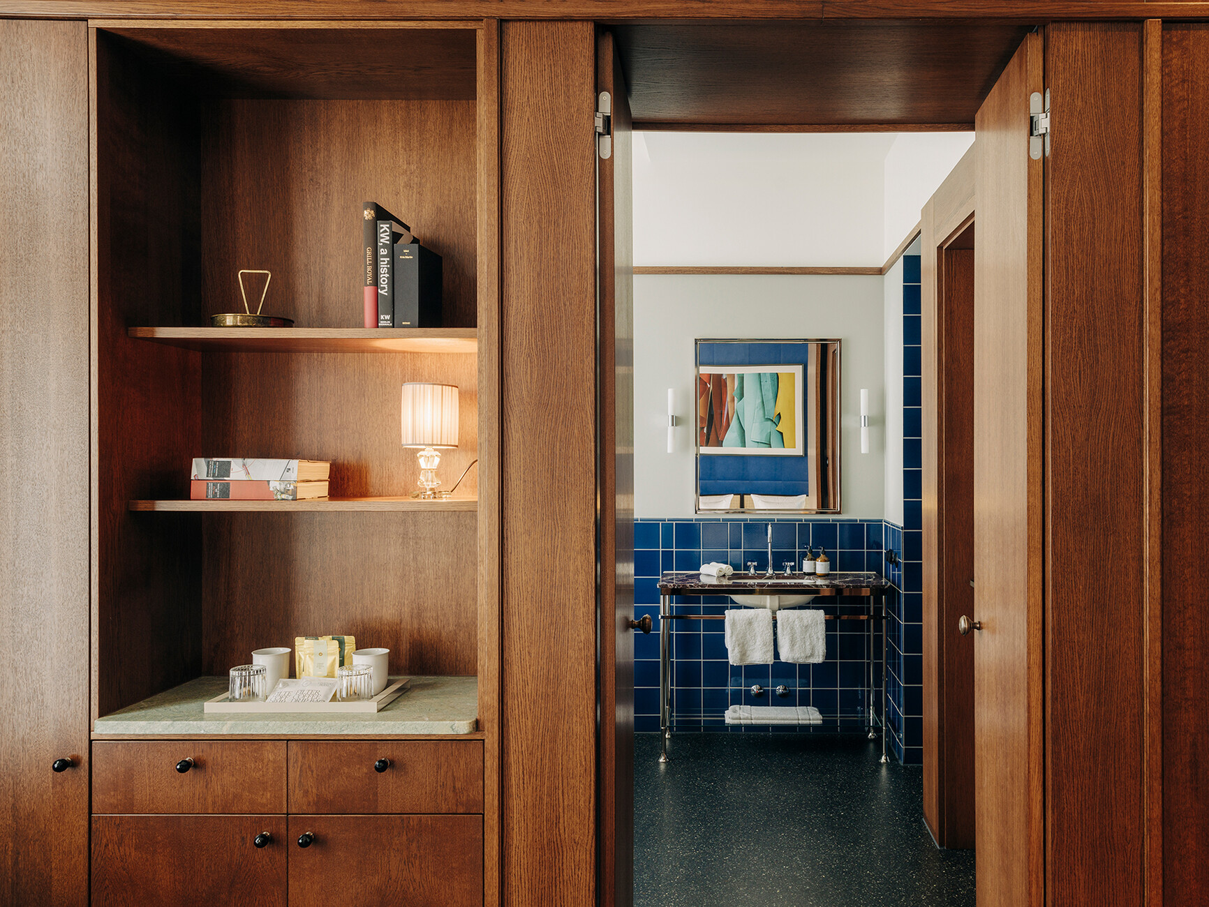
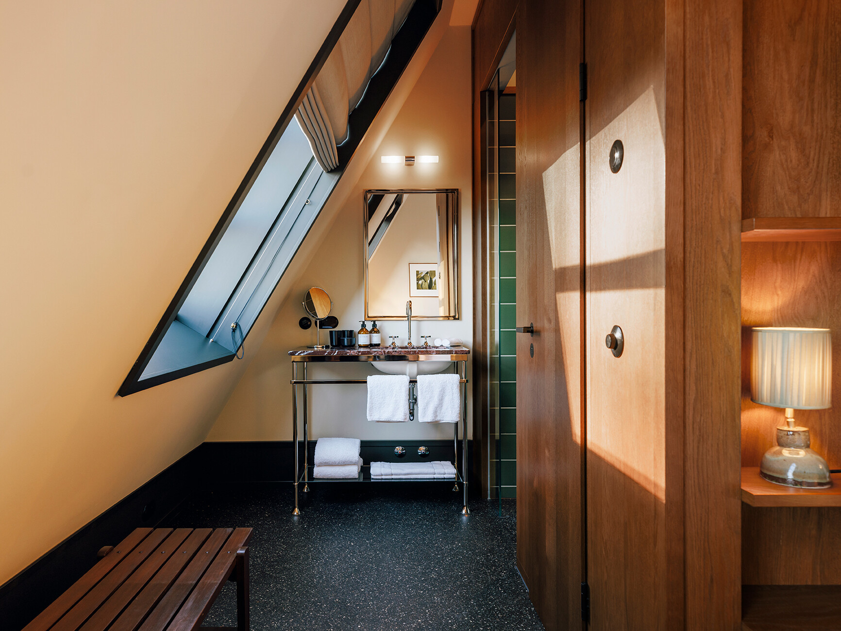
Irina Kromayer: The best possible materials and individual fixtures – used in a way that's typical for the location – also hold the different parts of the building together. What I mean is the way you make an existing room function as a hotel. For example, we were very keen to prevent the bathrooms from looking like standard drywall boxes when they were finished. Of course we built a sample room (No. 210), but its furnishings and fittings could only be roughly transferred to other rooms. There are, after all, 93 rooms with 26 different layouts at the Château Royal, and such intricate layouts are usually only found in Venice. So we relied extensively on individual solutions, which also gives the hotel a pleasant timelessness. I want the hotel to look as good in ten years as it does now. You should never have the feeling of “My goodness, but this is outdated!”.
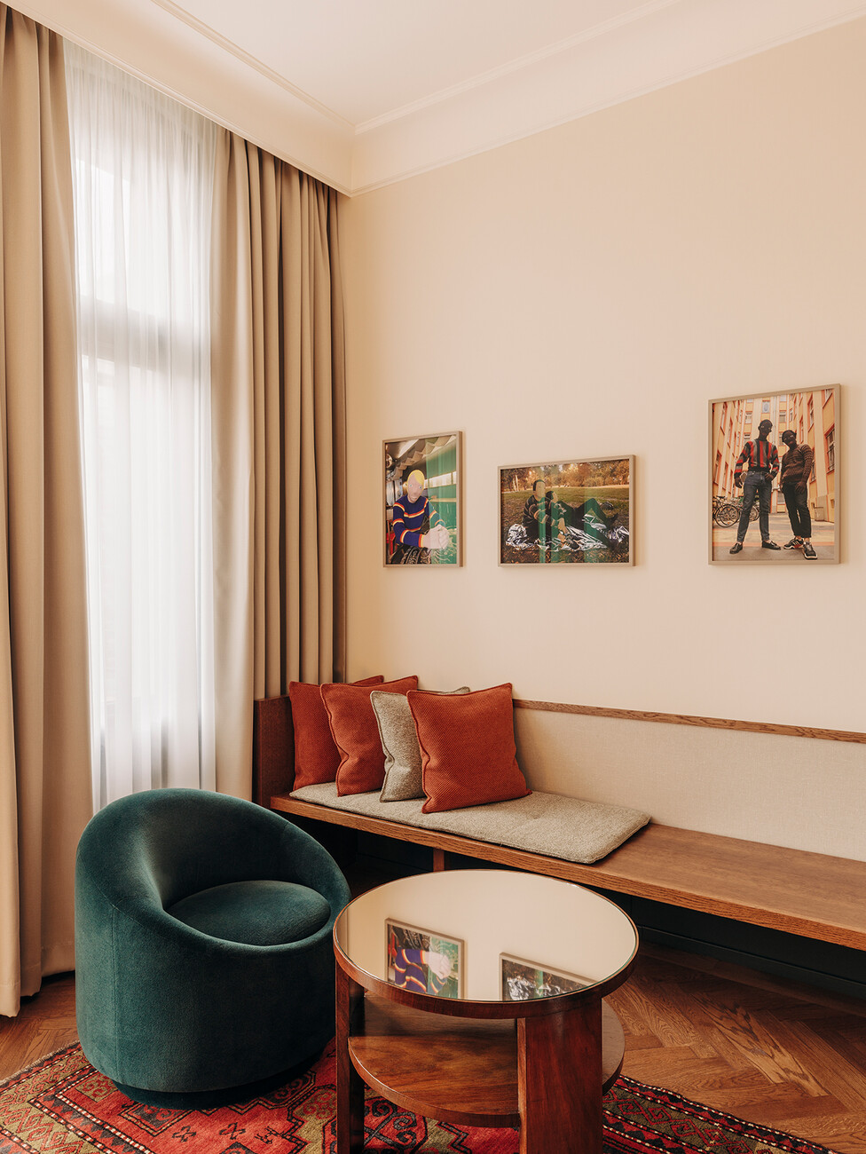
The chances are good that the hotel won't suffer this fate any time soon. Whether it's today, in five years or in ten, I'd love to check into one of the rooms after an exhausting journey, sit in a topaz-coloured armchair designed by Christian Haas and drink a cup of tea. Everything here seems timelessly comfortable and inviting.
Irina Kromayer: The rooms are very warm and welcoming because only the best materials were used, and there's a great attention to detail. There's also an architectural quality that you may not see as a layperson, but you can nonetheless feel it. There are no ventilation louvres, no valves. We've integrated everything, and there's a certain elegance as well.
You often walk into a hotel room that looks good at first glance, and then disappointment slowly sets in. While the trendy details may look good in the photos, everything is done without much love, and feels cheap.
Irina Kromayer: We used high-quality Dornbracht fittings in the bathrooms. On the ground floor, the door handles are made of solid brass, and the fabrics are by Dedar and Kvadrat.
Which colours were used for the Berlin tiles?
Irina Kromayer: A total of four: dark green, light green, blue and brown-beige. The blue is a classic Berlin colour that Schinkel used a lot, the green is a familiar one from the Pergamon Museum or the Neues Museum. Lighter tones, like those used in Milan or Los Angeles, don't fit in here. Berlin is grey and dark for six months of the year, muted colours simply work better here. The lower you go in the building, the darker they get, and in contrast, lighter the higher up you go.
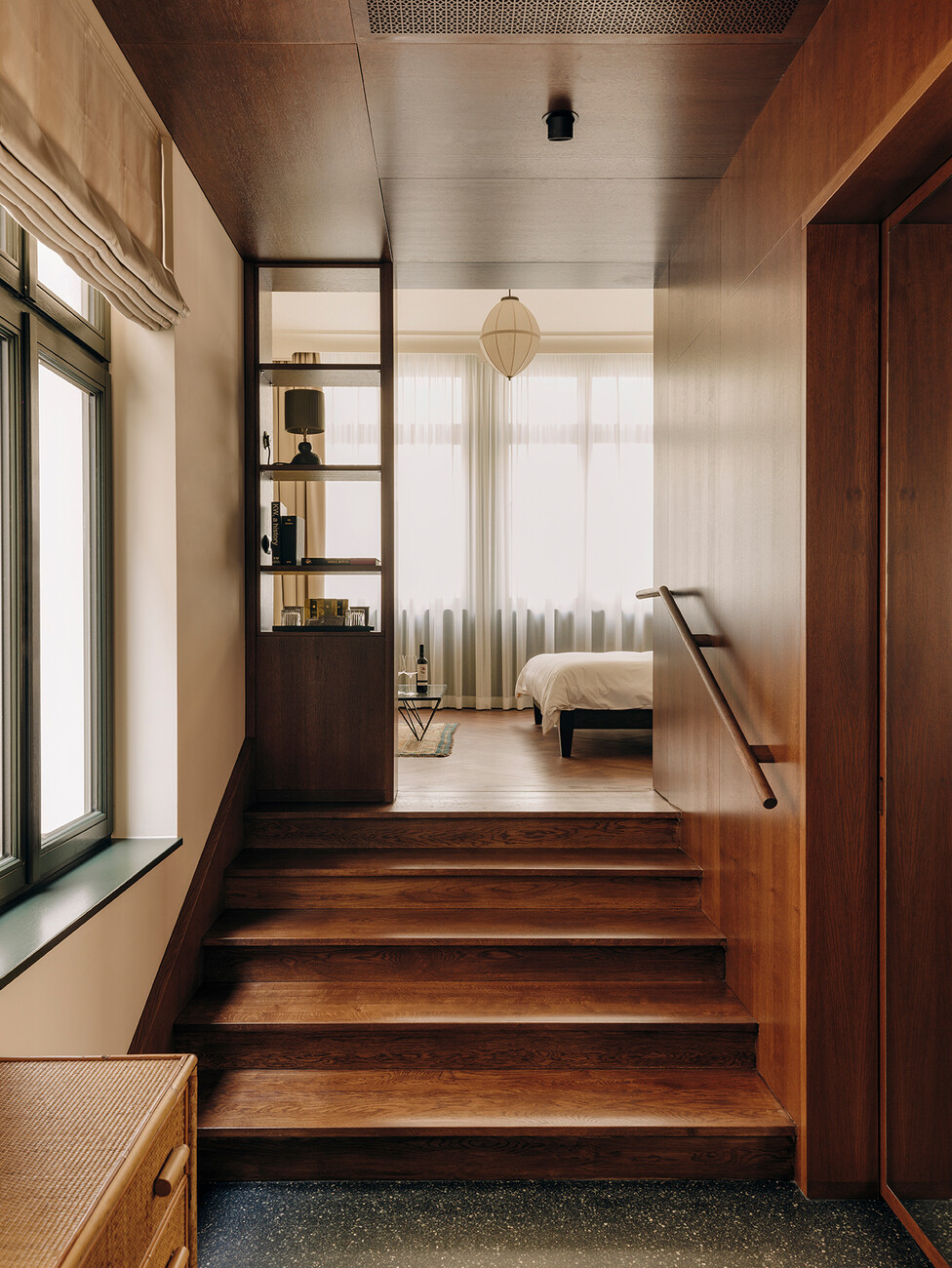
There's a dark mastic asphalt in the hotel corridors , the so-called "Berlin Terrazzo".
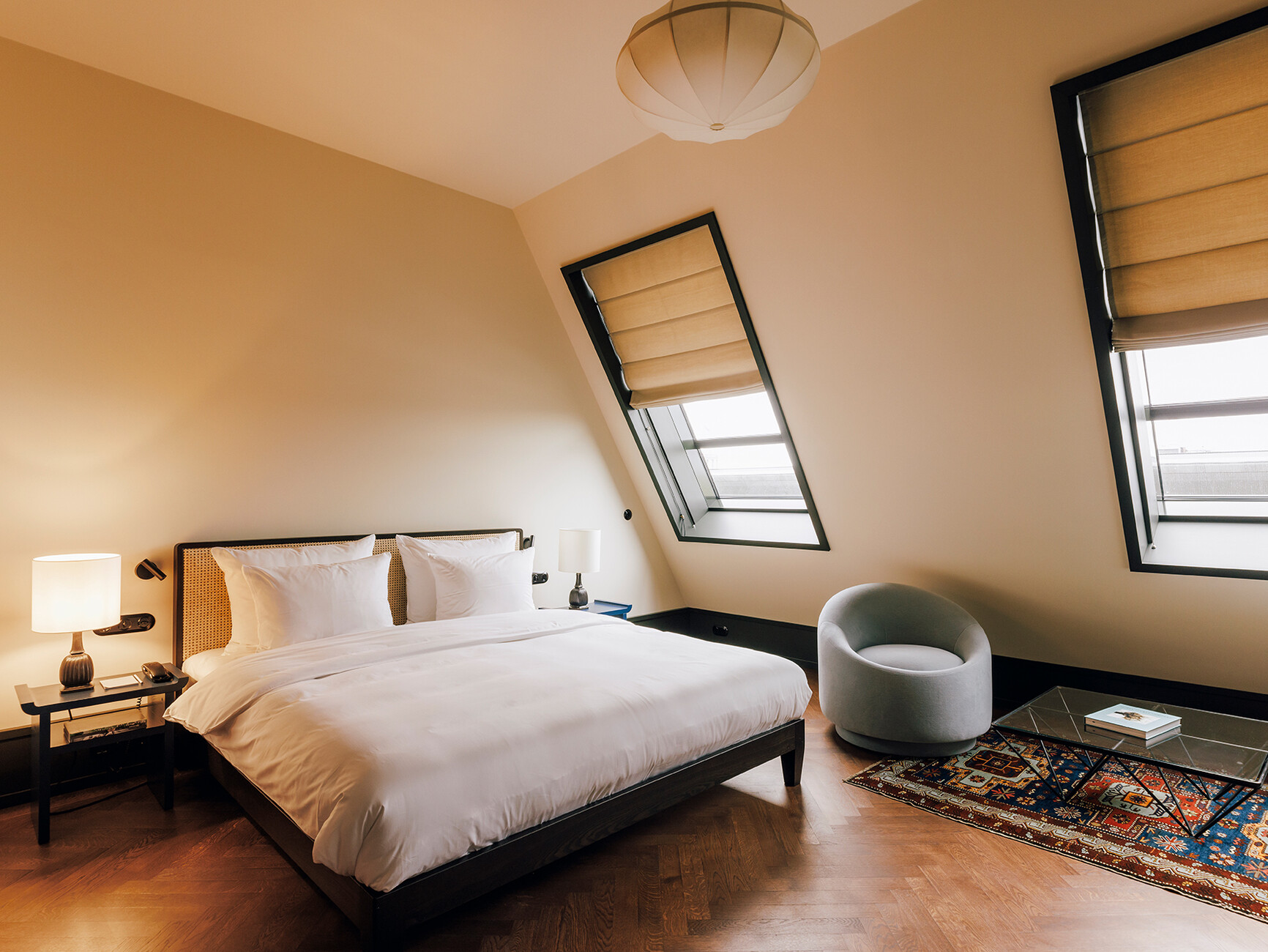
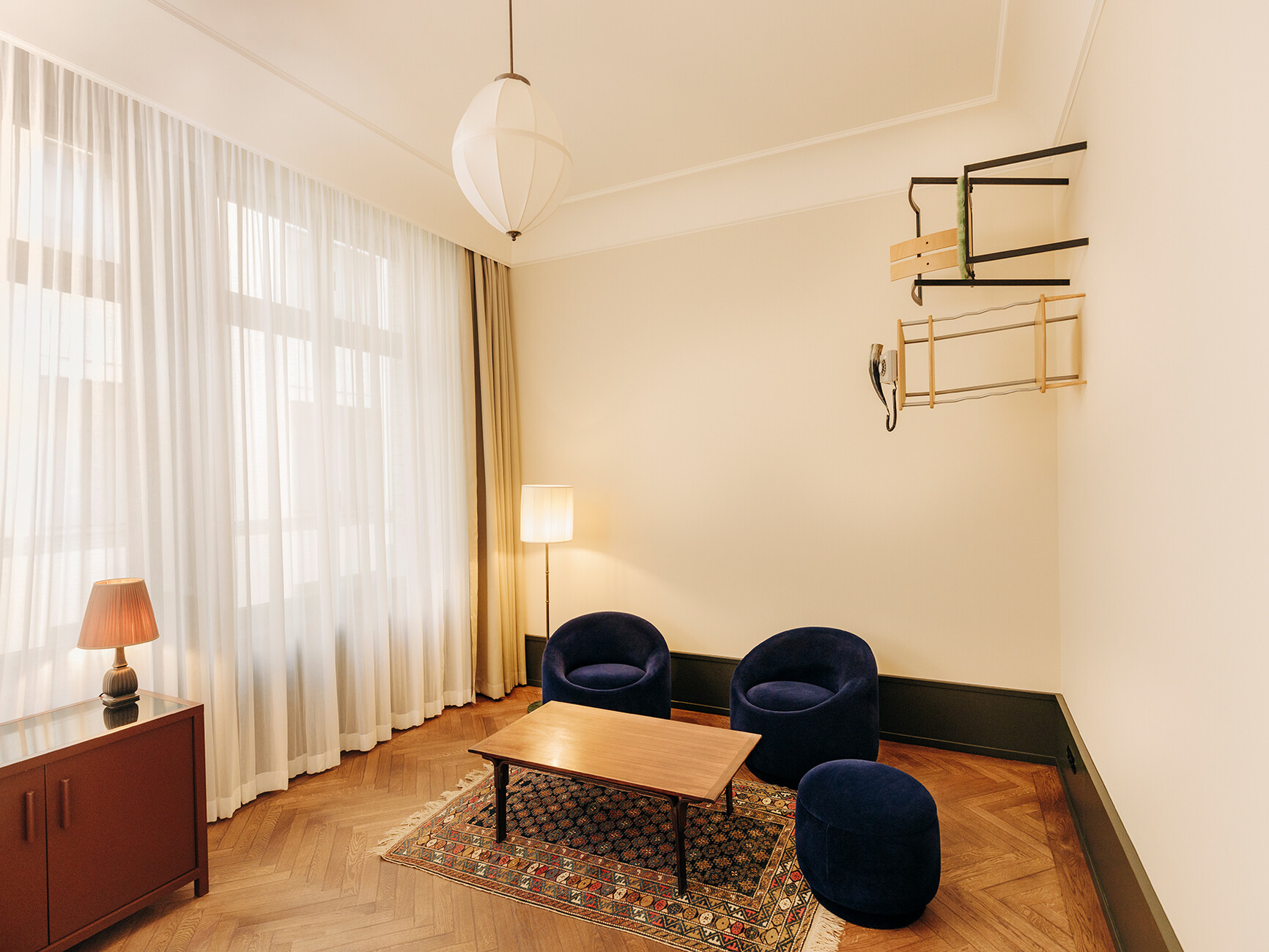
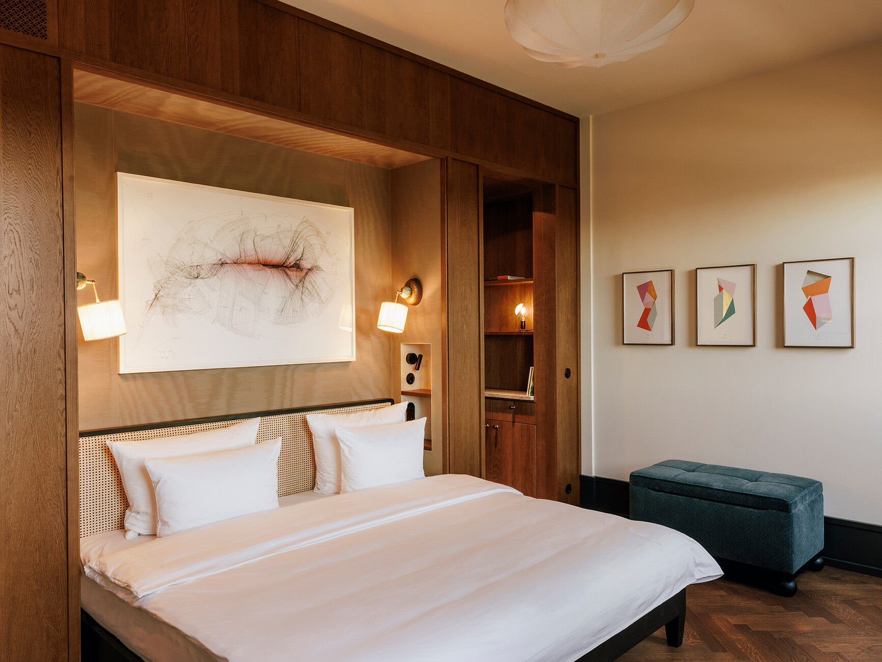
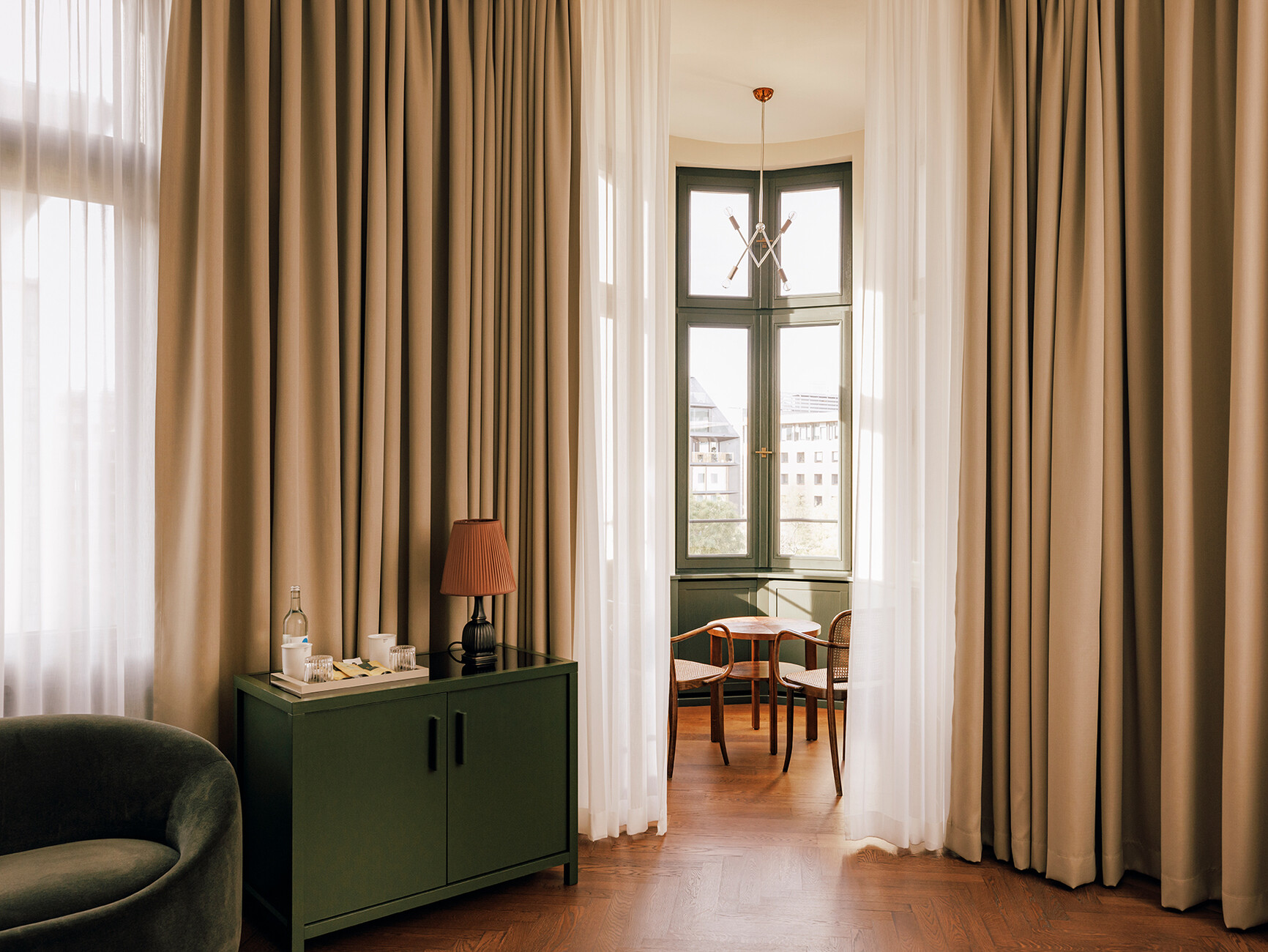
Irina Kromayer: This is ground and polished after being poured and actually looks like a very dark terrazzo. It has very good thermal values and is soft when you walk on it, not as cold as a stone terrazzo. It was used a lot here in the 1910s and 20s, for example in courthouses or the underground. In the rooms we've put down herringbone parquet in a classic German pattern. French and English people tend to lay their parquet a little differently.
The shapes of the seating elements that Christian Haas designed especially for Château Royal are strikingly discreet. The original plan was to offer them for sale in a separate hotel shop.
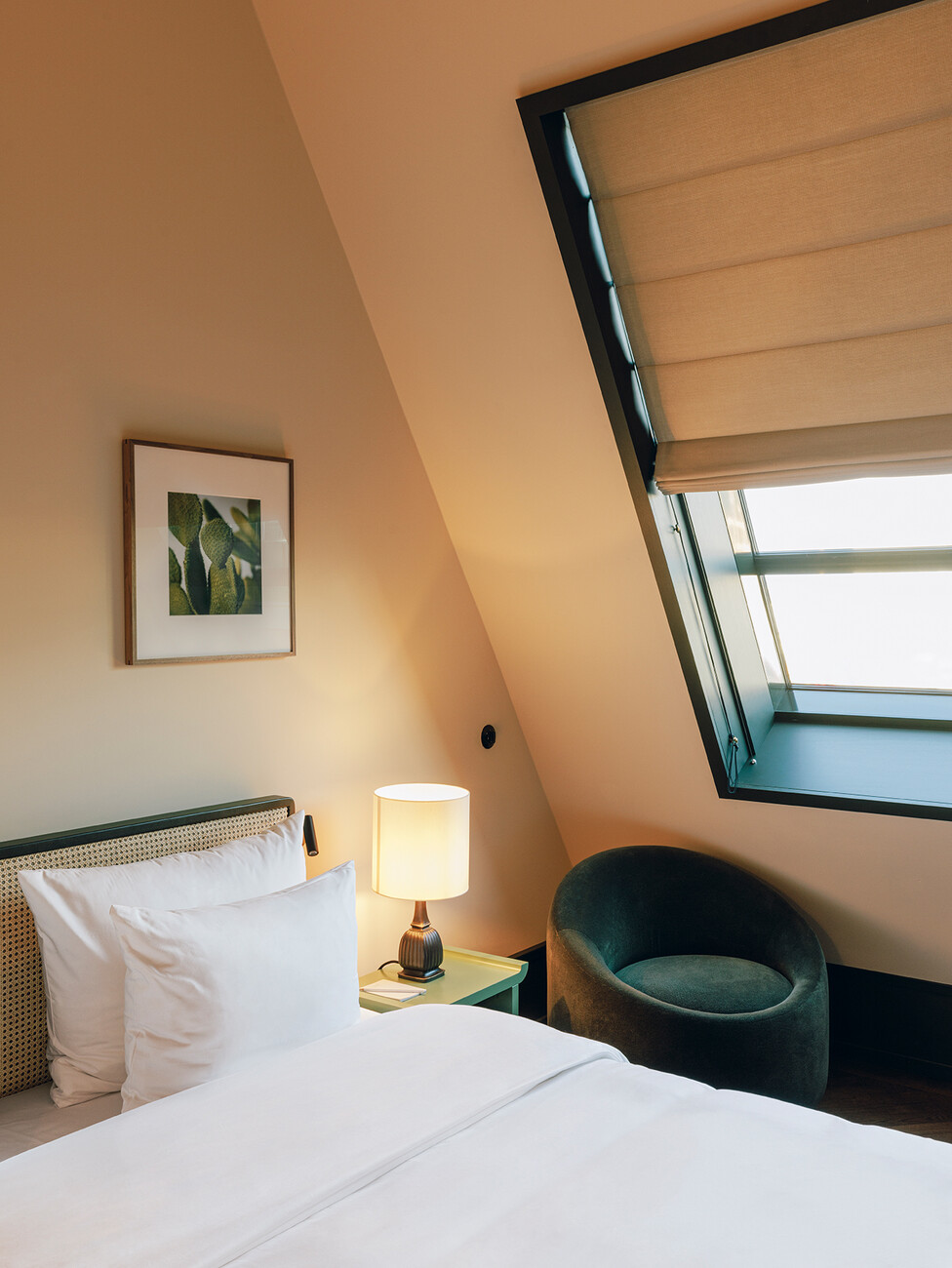
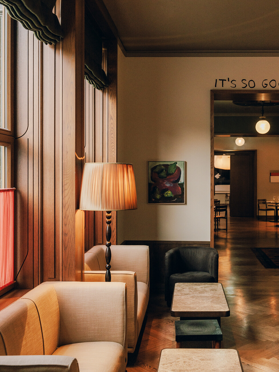
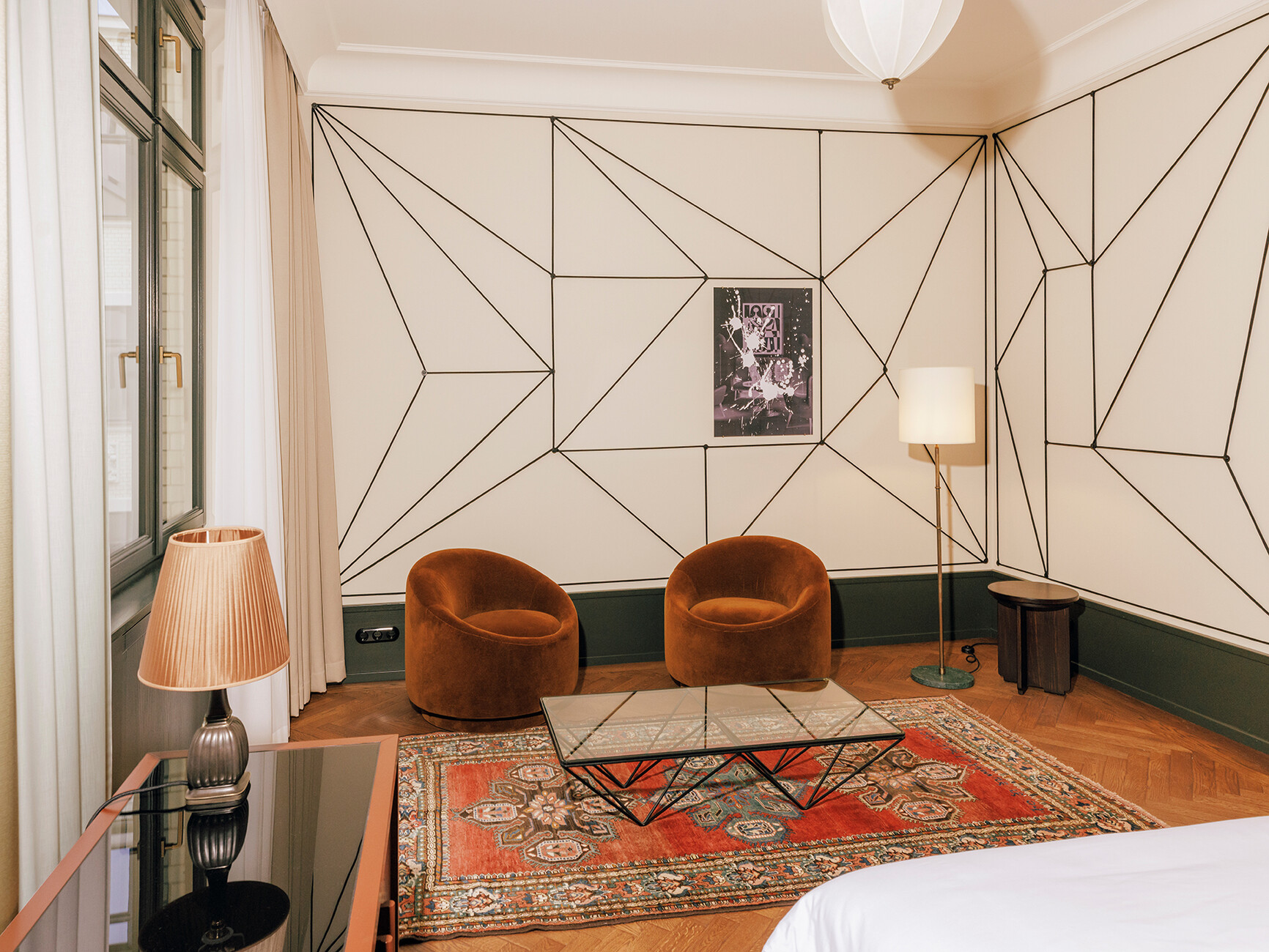
Irina Kromayer: There won't be a shop, but you can order the furniture through the hotel. On the upper floors the seats are all in light blue, on the lower floors in darker shades. All in all, we developed four or five furniture colours – and then did a bit of “composing” with them. We bought a bunch of old Orient carpets to match the Haas armchairs, and often the art brought another colour into play. There's also vintage furniture everywhere, which allowed us to respond individually to the three buildings. With so many different room sizes and layouts, we couldn't go through with a single type of product. Some rooms are only big enough for small cupboards; for them we needed additional chests of drawers, and in another room an extremely narrow, long sofa table was the only thing that fit, which wasn't easy to find at all.
Another big and unique feature is that there is art in every room. The line-up of artists is quite impressive, for example Alicja Kwade, Thomas Demand, Tino Sehgal, Danh Vo...
Irina Kromayer: When your motto is “93 Rooms, 93 Artists”, the list of names gets pretty long. One of my clients, Stephan Landwehr, has been closely associated with a lot of artists for decades. Most of them were at home because of the pandemic and wanted to part of the project; at times the building site was like a home to them. They created works of art especially for the Château, and the selection was curated by Kirsten Landwehr and Krist Gruijthuijsen, the director of KW Institute for Contemporary Art in the Auguststraße.
What came first, the art or the rooms?
Irina Kromayer: That varied from room to room. Kirsten Landwehr discussed with the artists and in consultation with us which work would work best in which room. Thomas Demand, for example, developed photo wallpaper for two rooms early on, and everything was then coordinated with them, including the colour of the ceiling. In other cases the art was created so late that the artists saw the finished room first and then had to react to it.
That's another approach that sounds quite labour-intensive. Were you able to open the hotel on the originally planned date?
Irina Kromayer: We originally planned to do everything in three years, but there was an additional construction site delay due to corona. In total, we planned for four years, which was partly due to the complex construction site. Many things that we'd thought of in the beginning weren't able to be done. Sometimes we couldn't get the products we liked, and sometimes we found ones that were far too expensive. In the end, we produced things ourselves.
The ceiling lamps in the rooms come from a lighting manufacturer in Kreuzberg, the tea trays from the New Tendency design studio in Mitte.
Irina Kromayer: We mainly worked with local manufacturers, locksmiths, electrical companies and carpenters. That's what I meant when I earlier said that the bathrooms are part of the furnishings and everything merges into one another. Because the shelves and wooden fixtures meander into the bathrooms, they had to be custom made by hand for each individual room. In the entrance areas of the hotel rooms, for example, the shelves have integrated sliding doors. When they're closed, you can't see what's behind them, and when they're open, you can go into the bathroom and discover that the shelves actually run into the bathroom to a certain extent. In this way the architecture often becomes the furniture, and vice versa.
Is there a part of the building that you particularly like, or perhaps a favourite room? It doesn't have to be the biggest or the most expensive.
Irina Kromayer: One of my favourite rooms is a suite with wallpaper by Thomas Demand and a big bay window from which you can see Unter den Linden. And there are some very nice rooms under the roof as well. At first I didn't really care much for them because I found the sloping ceilings difficult, but such small rooms under the roof, where you can look up into the Berlin sky, are really wonderful.
Grill Royal is known for its variety of quirky and dazzling guests, and many people specifically go there to meet stars. Is the hotel also a place to see and be seen?
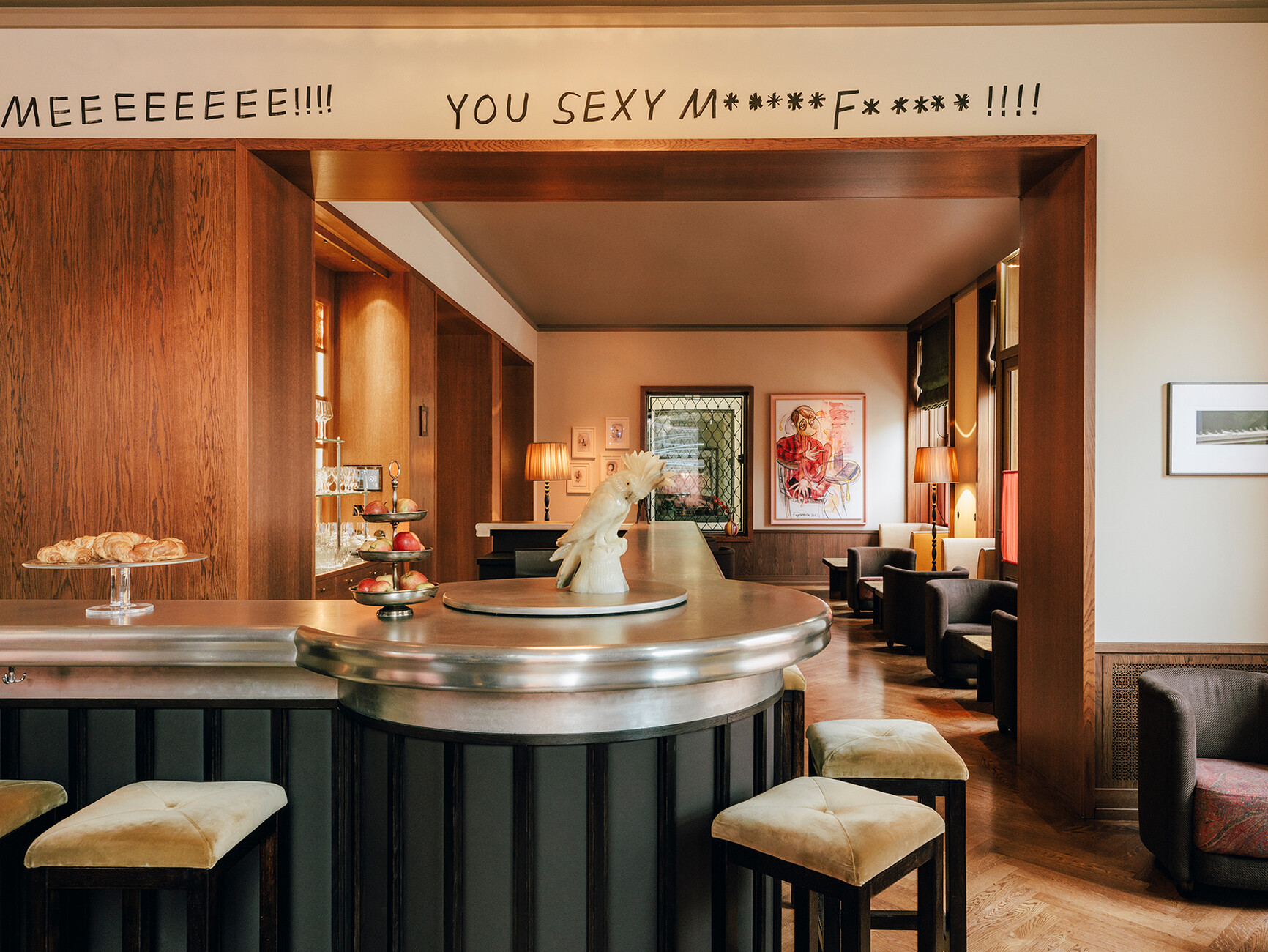
Irina Kromayer: Actually, Grill Royal is a place for people who want to be in a club without having to go to one. You get dressed up, there's action, there's a cool party atmosphere. The hotel is expected to be a little quieter, a cosy retreat after a busy day in the big city. The lobby leads directly into the spacious bar; but hopefully that's where the Berliners will meet. Many hotel lobbies look like huge, oversized halls; you sit inside and feel small and insignificant. I was more in favour of the idea of treating the room like an extension of your own room, so that it becomes a kind of living room. You're not supposed to feel like you're in a transit station there, but like you're at home. This is made possible, among other things, by the architecture, as the three different parts of the building mean that there isn't just one giant space, but a sequence of rooms grouped around a common courtyard. You simply choose the one you would like to be in. Some are big, some are small, some have high ceilings and others low. There's a small fireside room, a lounge, private dining and all the sight lines are wonderful. “Pleasant” isn't quite the right word for it, “cosy” is a better description.
Did you design the restaurant as well?
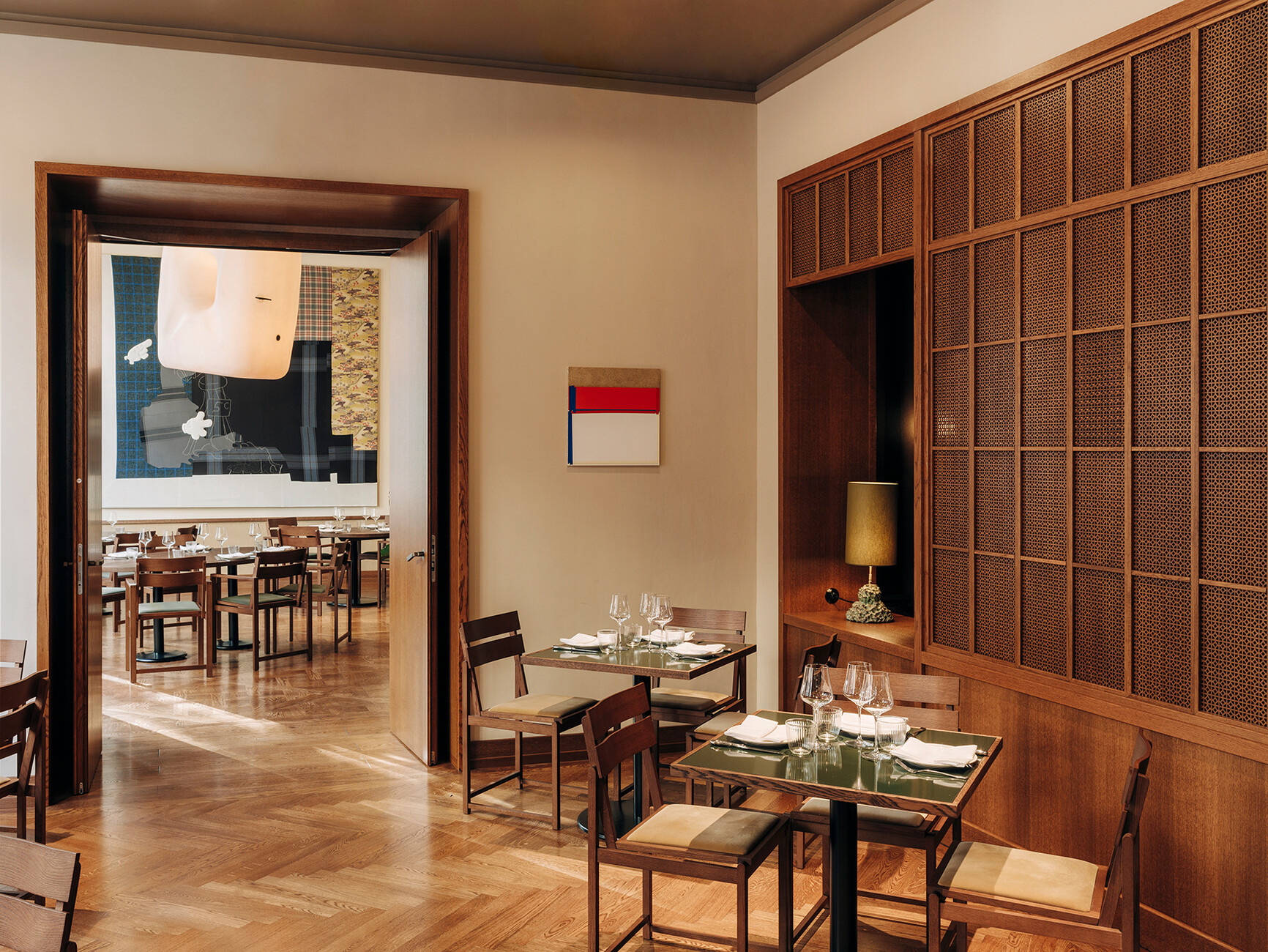
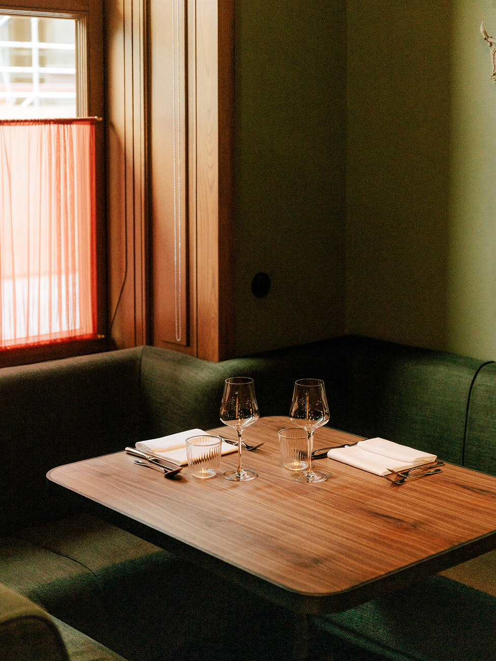
Irina Kromayer: Yes I did. At the Château, Victoria Eliasdóttir wanted to resurrect her famous restaurant Dóttir, which closed five years ago, and so we planned the kitchen together in advance.
When all is said and done, what's the most important aspect of this project?
Irina Kromayer: It's the absolute individuality of the hotel – and the fact that we designed and produced so much ourselves. The beds in turn-of-the-century style, with a headboard made of Viennese wickerwork, the bedside tables, the lamps; we did it all ourselves. We even produced the room numbers ourselves. We laser-cut the Château Royal lettering and had it welded and bronzed by hand. The results are room numbers that shine like little lamps in front of the doors.
How was the room technology integrated into the design?
Irina Kromayer: Specially designed ventilation louvres were laser-cut from wood and inserted so naturally that you simply don't see them. The light switches are from a classic series by Berker and are made of Bakelite, and the televisions are integrated into specially designed footrests, which is technically more complicated than you might think. In some rooms the TVs are even hidden behind the curtains. Art and televisions simply don't go together. For us, art was always the priority.
Have you actually spent a night in the hotel?
Irina Kromayer: I haven't done that yet, which is totally absurd because my whole team already has. I'm still busy with a bit of fine-tuning and working out some of the details that aren't quite there yet. When I'm satisfied that everything is completely finished, I'll definitely come here and spend the night.
Contact Hotel
Mittelstraße 41
10117 Berlin
Phone: +49 30 23 456 770
