HEALTH
Building to heal
In the Middle Ages, almshouses served to house the infirm and poor people and were primarily charitable institutions; with advances in hygiene and medicine they gradually morphed into modern hospitals which are tantamount to factories for the production of health. Today’s buildings are designed to be economic, functional, and efficient. Equally, however, building a new clinic is considered to be one of the most demanding assignments in the construction industry. Few other types of buildings need to unite so many complex medical, organizational, and technical requirements under a single roof. However, the consideration of these technical questions has led to aspects such as human dignity but also the needs and feelings of patients and the people caring for them being neglected.
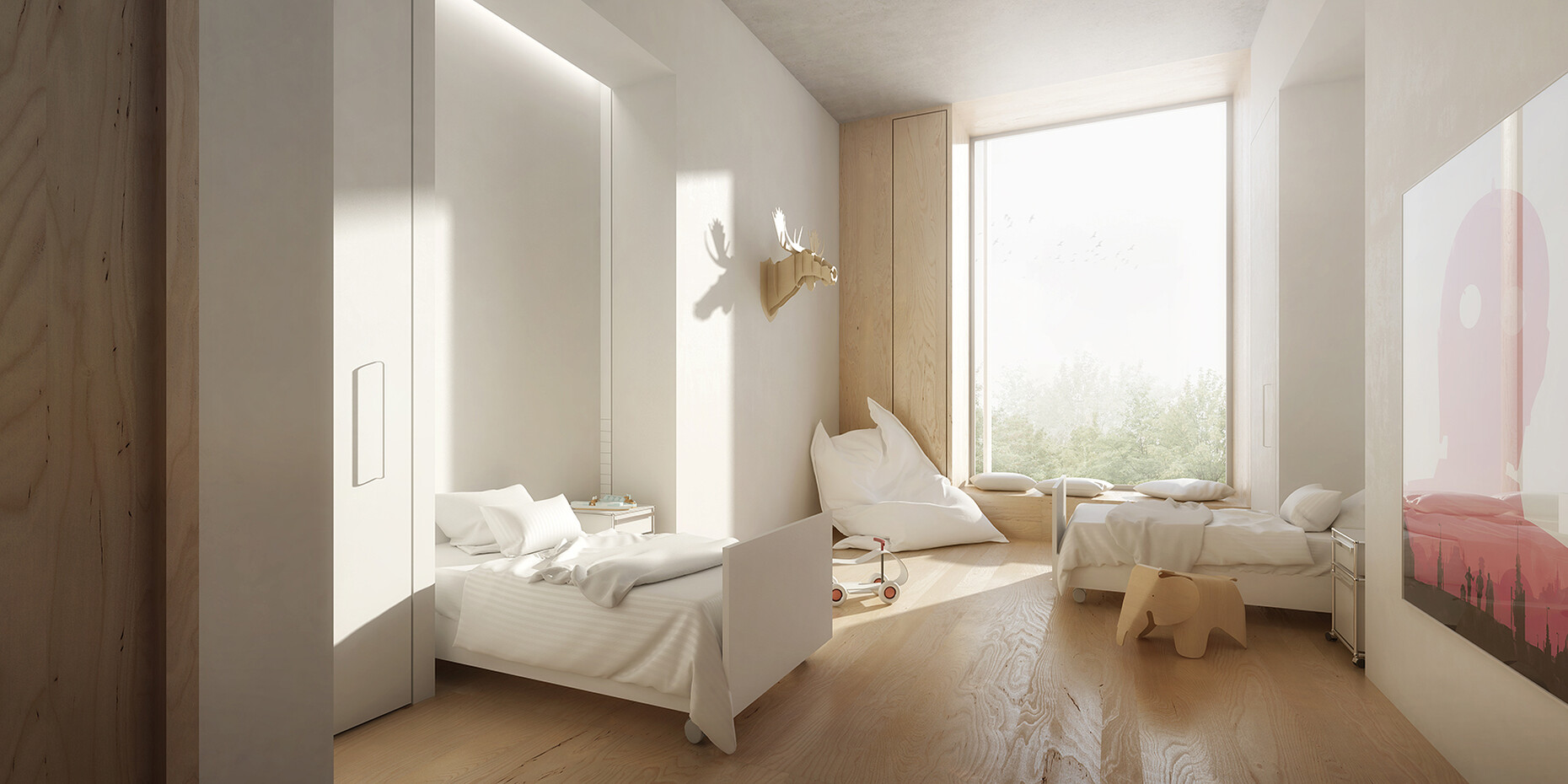
Corridors without windows, a lack of orientation, impersonal rooms with glaring neon lights, unsightly wipe-down surfaces, medical equipment and the mingling odors of disinfectant and hospital food combine to make patients, family members, and staff feel negative and stressed. Yet reliable scientific findings attest to the positive effect that the built environment can have on a patient’s wellbeing, pain levels, and quality of sleep. The findings are based on empirical studies, many of them conducted in the early 2000s in the United States, where the term “healing architecture” was also originally coined. “View Through a Window”, an article printed in the renowned journal “Science” back in 1984 is considered a key driver in this area. It outlines the findings of a study conducted over a period of nine years by architecture professor Roger S. Ulrich in which he compared patients in a clinic in Pennsylvania, whose gallbladder had been removed. One group was able to see a tree from their room, while members of the other group had a view of the neighboring building’s brick wall. Ulrich was able to prove that simply having a more pleasant view of greenery was sufficient to reduce patients’ pain, enabling lower doses of pain killers, and shortened the time of their recovery.
Tanja C. Vollmer, an architectural psychologist who is visiting professor at Munich Technical University calls for “evidence-based design”, which relies on the insights gained in scientific studies. She has been committed to healing architecture for many years, conducts her own studies, interviews patients, and measures various physical responses such as skin resistance and heart rate to evaluate the level of stress in hospitals. In cooperation with her office partner, Dutch architect Gemma Koppen, she has succeeded in summarizing the complex interdependencies in a simple formula: “When the body is sick, the room falls sick with it.” Put differently, the change in perception can be quantified. Attention declines, patients are less able to find their way, while they become more sensitive to environmental stimuli. Vollmer and Koppen derive seven environmental variables from this finding, all destined to supporting patients’ recovery via architecture: Orientation; smells; noise; view and perspective; privacy and retreat; a human scale; and so-called power points – architectural aspects designed to provide support and power.
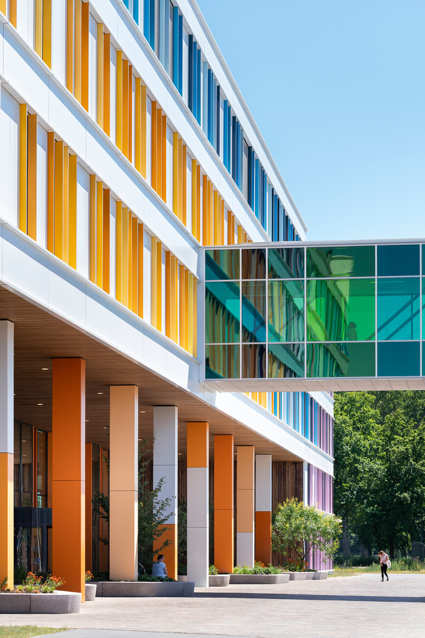
Indeed, the two women talk of supportive design. What it can look like in practice is currently on show in the exhibition “Building to Heal” in the TUM’s Architecture Museum in Munich. In collaboration with students of a project by the same name at the Chair of History of Architecture and Curatorial Practice of Munich Technical University a presentation was devised that analyses 13 examples of best practices from around the world based on the seven environmental variables. The Agatharied District Hospital in Miesbach, Upper Bavaria, masterminded by Nickl & Partner Architekten is considered a flagship project in the context of curative architecture in Germany. Integrating the building into the landscape and maintaining a low height means it is perceived as being on the same scale as people’s customary environment. Thanks to the strong division of the building and the extensive use of wood and glass, at first sight the clinic is reminiscent of a hotel somewhere in the Alps.
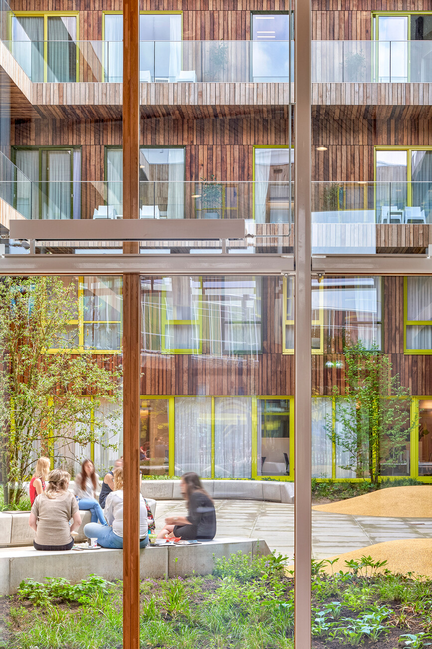
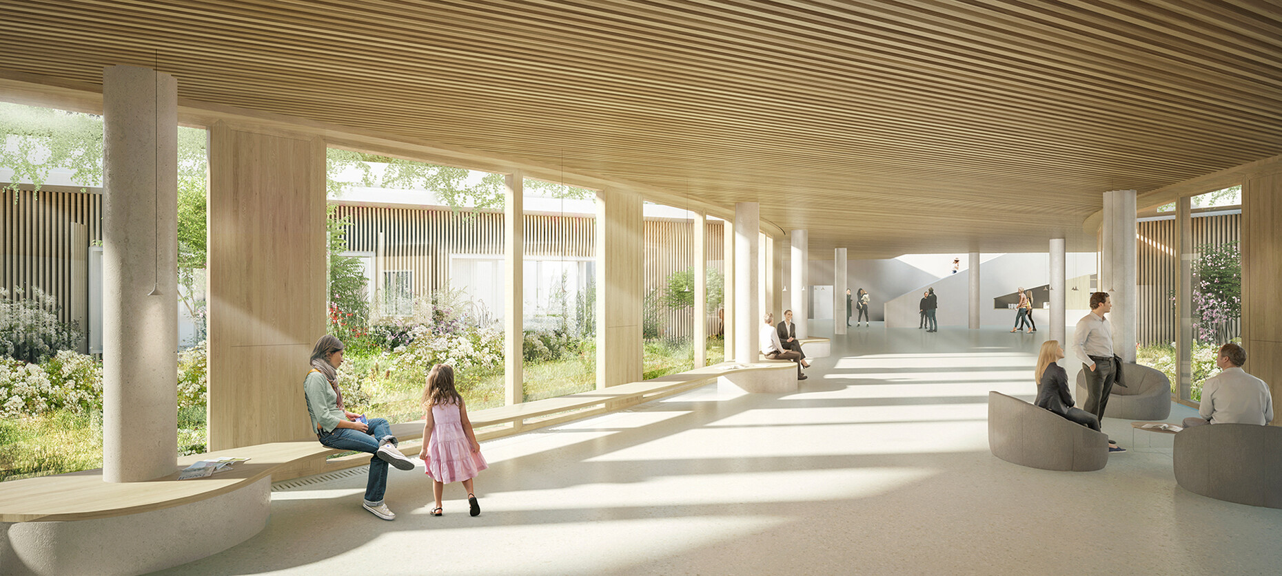
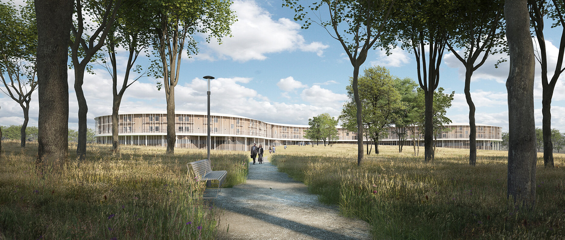
Embedded in what were once rice paddies, the complex of the Friendship Hospital Satkhira by Kashef Chowdhury in Bangladesh looks more like a school campus. The hospital’s horizontal circulation system is guided by a canal that zig-zags through the grounds and divides them. The direction the watercourse flows in and the elements that contain it enable a rapid, intuitive orientation along a calming, natural feature. Located on the Danish island of Seeland and the brainchild of Herzog & de Meuron in collaboration with Vilhelm Lauritzen,there are only single-occupancy rooms in the Nyt Hospital Nordsjælland Hillerød which is designed as a large ring-shaped building. Each room also has a private terrace or balcony with either a view of the forest or the gardens on the inside, which serve as a place for private retreat. Landscaping features ensure each individual can determine for themselves how much contact they have to other persons using the outdoor space.
The designers at IMS Studio working with graphic designer Friederike Daumiller created a concept for the show, which primarily brings the factors “view and perspective” and “privacy and retreat” to bear in the exhibition design. To do so they contrast the transparent outer facade of the architecture museum in Munich’s Pinakothek der Moderne with backdrops staggered in depth. Room dividers styled as undulating forests serve to organize the larger space into smaller cabinets and niches in which the case studies are presented.
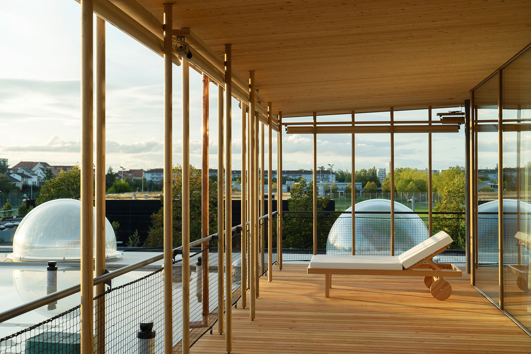
Green is the color of choice. In selecting it, IMS Studio follows the approach of many architects who embed healing architecture in nature. Accordingly, the exhibition begins by featuring a strikingly large number of trees, bushes, flowers, water, and wood on the illustrations. The idea of getting away from a kind of engine room of health production is clearly visible in the showcased projects. For example, with its wooden louvered facade, floor-to-ceiling windows, and greened interior courtyards “Rehab Basel” by Herzog & de Meuron looks more like an ‘organic’ hotel. For the first time, spherical “skylights” were inserted in the ceiling of rooms occupied by patients who have fallen into a vegetative state in order to provide them with a connection to the outside world, a view of the sky. In a different approach the Willem Arntsz Huis in Utrecht, Holland, places so much trust in the calming effect of green floors that the managers of what were previously closed psychiatric wards felt confident enough to open them.
The special exhibition begins by stating that although a number of successful examples of “healing architecture” does exist, there is neither sufficient public awareness of the problem nor the political will to implement the ideas on a wider scale. Yet in light of ongoing crises in the healthcare system in both economic and organizational terms, and given that the Covid-10 pandemic revealed how clinics are a part of a country’s critical infrastructure, the question of how hospitals should be constructed moving forward becomes all the more relevant and compelling.
Building to Heal: New Architecture for Hospitals
Until 21 January 2024
Pinakothek of Modern Art
Barer Street 40
80333 Munich
Opening hours
Daily 10 a.m. to 6 p.m.
Thursday 10 a.m. to 8 p.m.
Closed on Mondays
