Experts for recommencements
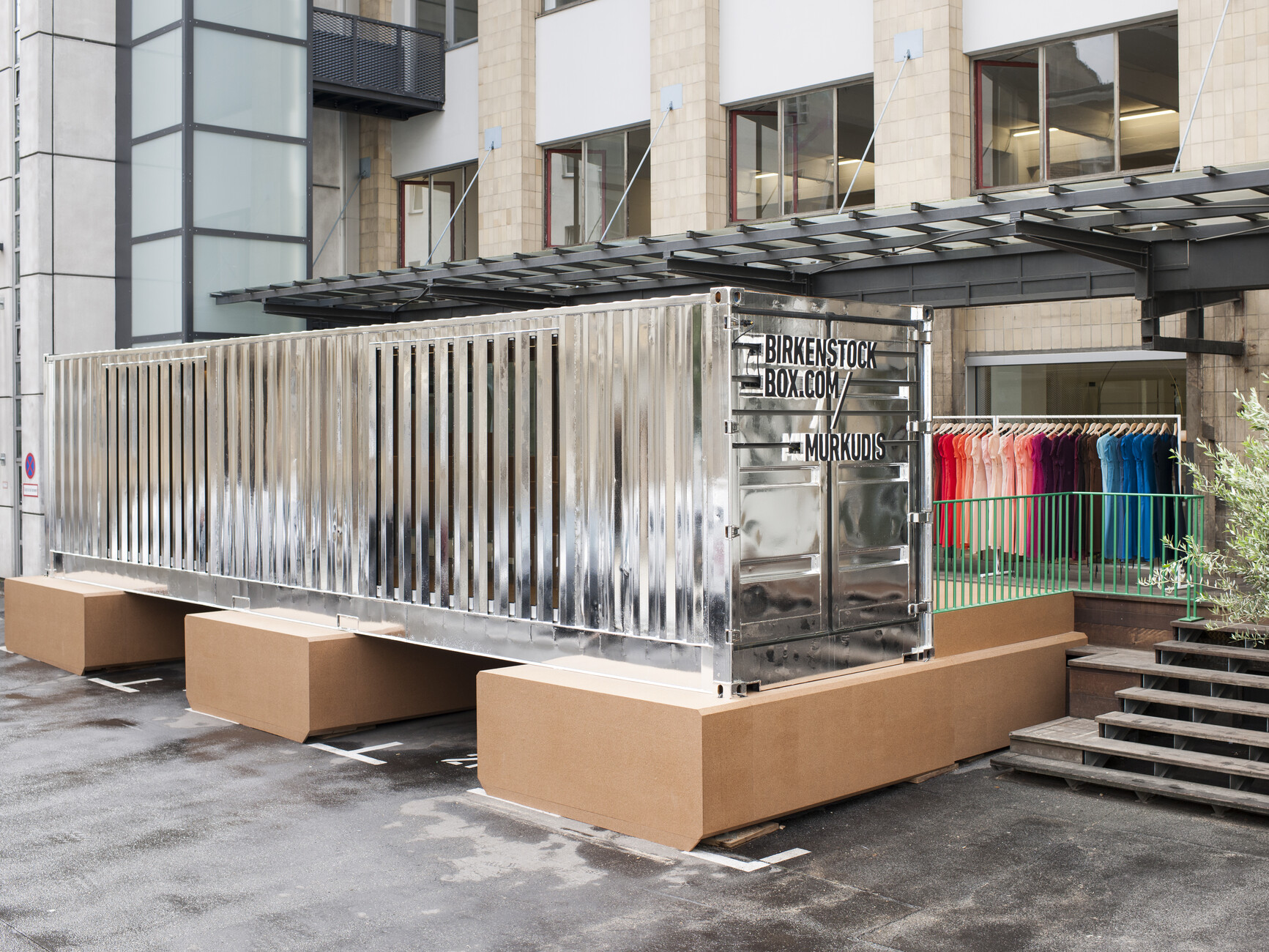
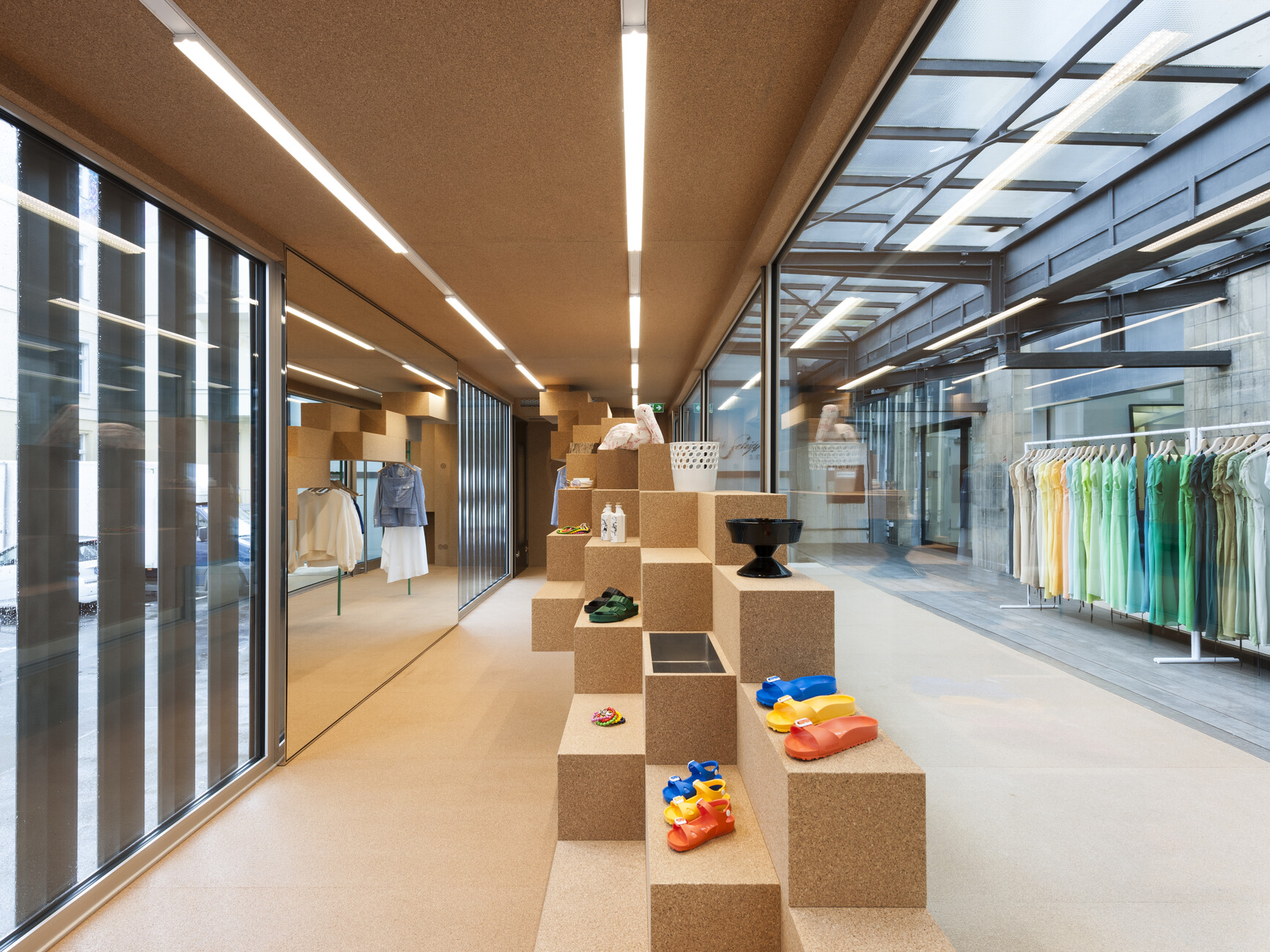
If not everything here were made of wonderfully soft cork, you could get a touch of claustrophobia in the chromed freight container that architecture studio Gonzalez Haase has designed as a mobile pop-up store for Birkenstock. The deeper you go into it, the further the shelving and presentation units extend into the space. What is initially a flat board at the side grows into a room-high fitted unit leaving only a narrow opening for you to squeeze through.
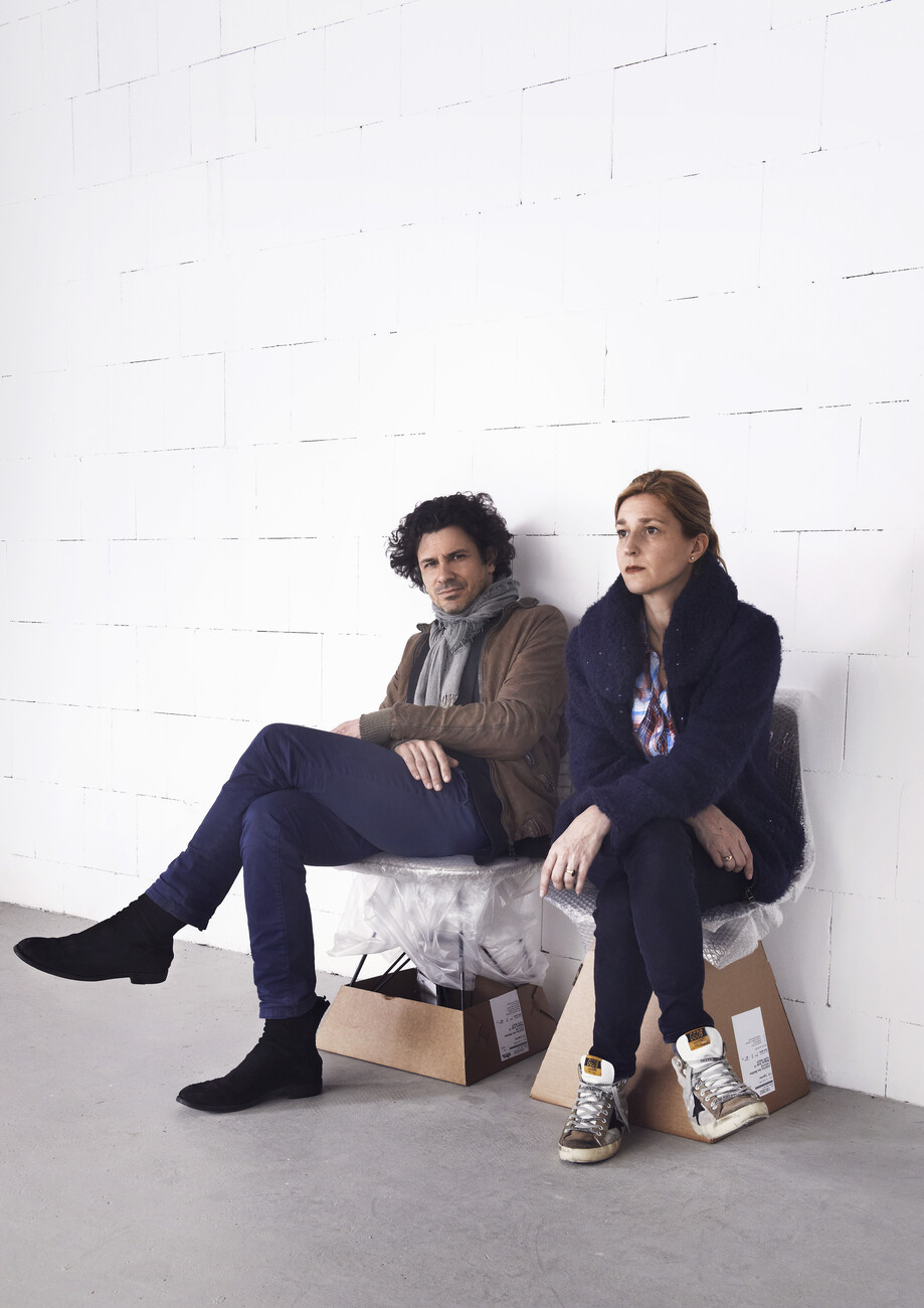
The extraordinary approach of architect Judith Haase and scenographer Pierre Jorge Gonzalez is demonstrated in virtually exemplary fashion in the container’s few square meters. The two specialists for avant-garde retail design no longer give individual sales objects center stage; they conceive surprising spatial experiences – such as that on the increasingly narrow route leading through the Birkenstock container. “We believe that buyers don’t need paternalism,” says Gonzalez, which is also why there are no longer any spotlights in the container. “Instead, we seek to develop an overall lighting mood in the space,” explains Judith Haase. At the end, the walkway in the Birkenstock container widens again, before dispatching visitors out of the rear exit and into the inner courtyard of Andreas Murkudis’ concept store in Berlin’s Tiergarten district once more. This is where the sandal maker’s mobile pop-up store is guesting, before embarking on its journey to the next station in Milan.
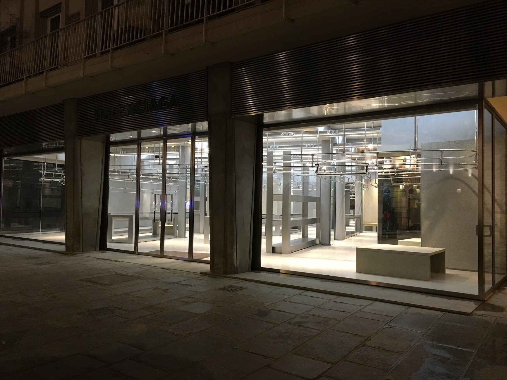
At each location, the particular store acting as the host reconfigures the inner layout of the reflective container together with a designer. Murkudis plumped for Gonzalez Haase – after all, the studio has already designed a variety of store interiors for the Berlin-based design entrepreneur. It was Murkudis who convinced Pierre Jorge Gonzalez and Judith Haase, who had previously enjoyed initial success designing Berlin galleries, to create their first store interior for him. Today the duo are in demand beyond Germany’s borders as designers of shops, department stores and restaurants. Moreover, they have created some of the most unusual interior design concepts of recent years in this field, including in addition to the Murkudis shops, the first Acne Studio store outside Scandinavia, concepts for the luxury department stores KaDeWe and Oberpollinger, and most recently the high-profile Balenciaga flagship store in Paris.
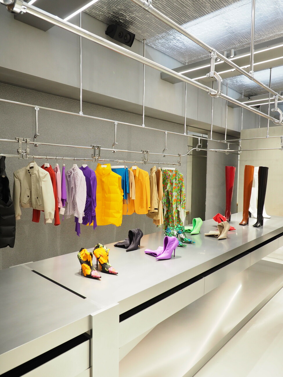
“We are often approached when a client is having or has just had major changes made,” says Judith Haase. And that is probably because to date the two designers and their team have very successfully avoided repeating themselves, instead approaching each new task with remarkable meticulousness. At Balenciaga it was the appointment of Demna Gvasalia as creative director that opened the door for Gonzalez Haase. The German-Georgian was familiar with the pair’s work and held it in such high esteem that he entrusted the design of the store on Rue Saint Honoré to them. Together they conceived a design that is more or less the exact opposite of the luxury-drenched haute-couture interiors à la Peter Marino. On the one hand, they wanted to make the materials visible (a distinguishing feature of their designs) and on the other they sought to create a special relationship to the product – two aspects that are also in evidence in the Birkenstock container.
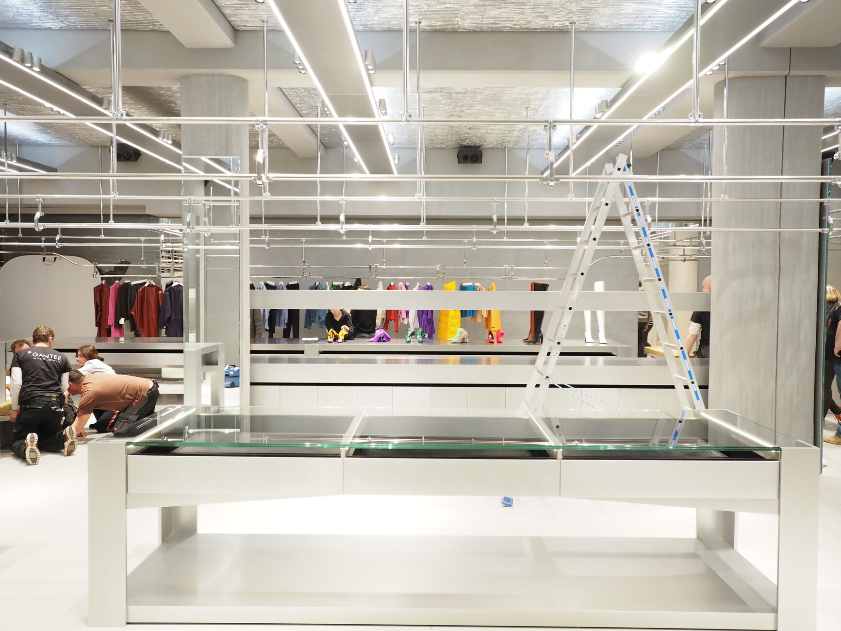
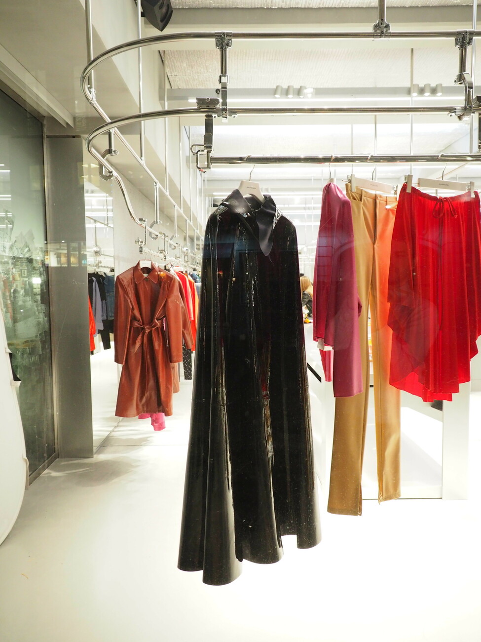
At Balenciaga the couturier’s storerooms and production units served as a source of inspiration. Thus the hook and hanging system that covers the entire store ceiling, for example, is the same as that used in the studios to transport rolls of fabric – although in the store it is not motorized. The bare metal and long tables likewise reference the workshops and their work surfaces. Should these reflective surfaces and the bareness and sterility of the space trigger a certain ambivalence and unease in the observer (we unwillingly think of a slaughterhouse and the abysmal yuppie-splatter fantasies of “American Psycho”) then this is not intentional, says Pierre Jorge Gonzalez. As of course, the space is intended to trigger emotions in the observer. Moreover, he eschews any superficial symbolism and insistence on charging interiors with meaning.
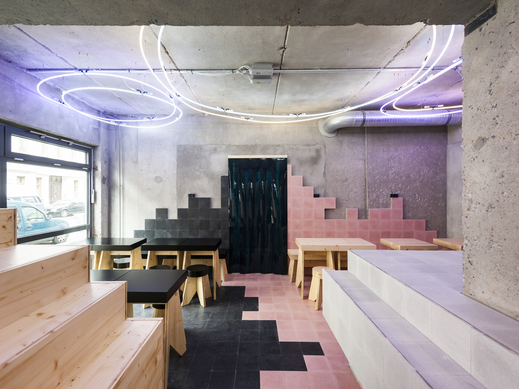
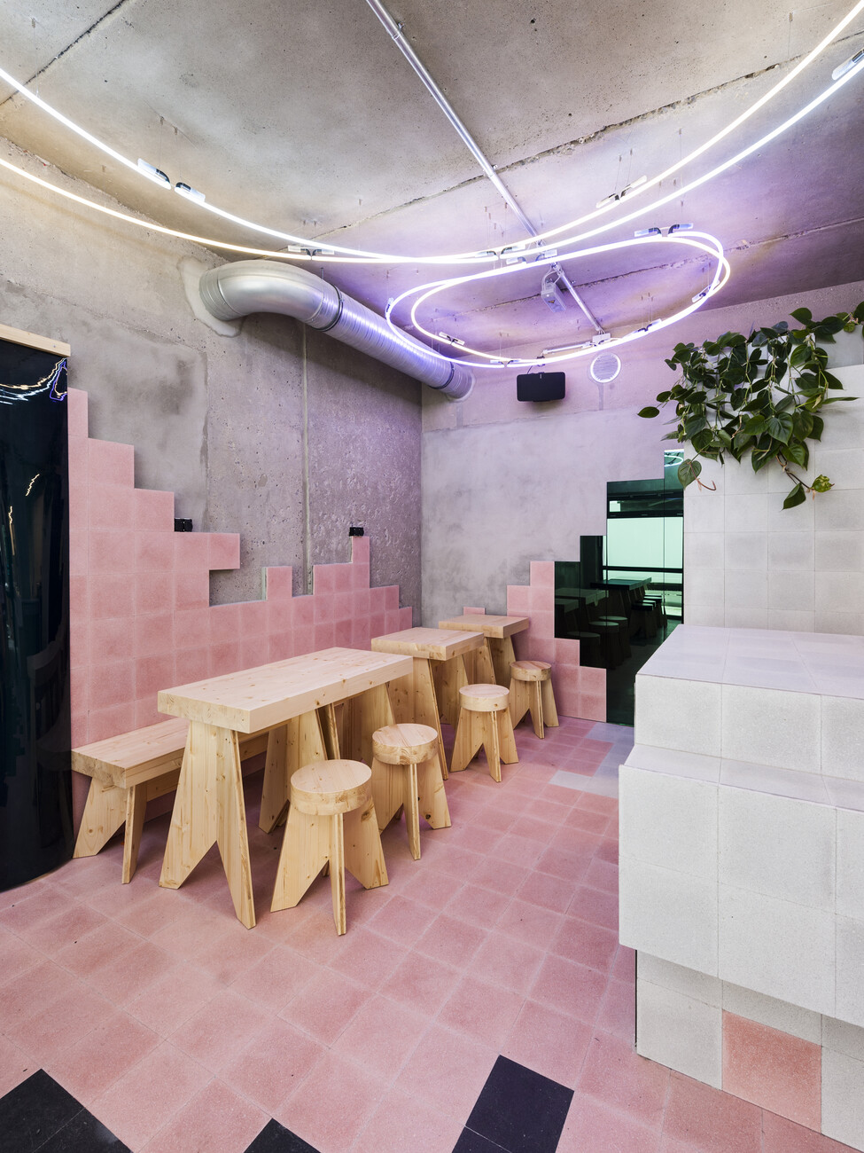
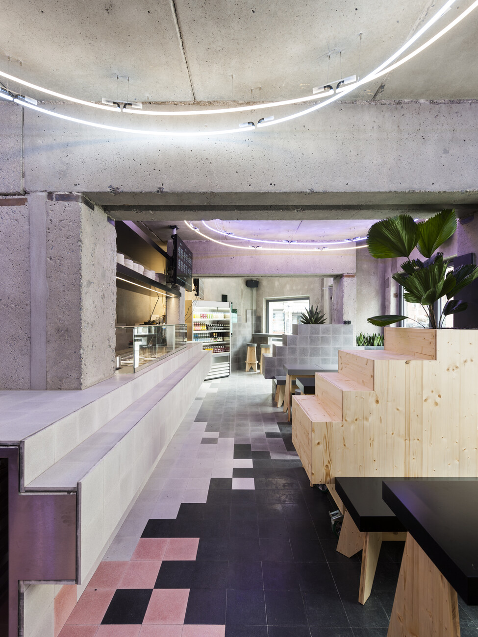
The ambitious restaurant “Ernst” by Canadian chef Dylan Watson-Brawn, whose concept is radical seasonality and regionality, is nearing completion in Berlin’s Wedding district. Gonzalez Haase already realized a project in the hospitality sector last year, although this was in the budget and takeaway segment, namely “Beets und Roots.” The interior in a pre-fab in Berlin’s Mitte district was radically gutted leaving only the bare concrete and then partially reclad using a few, sparingly used materials. The overall impression is informed by the handmade cement floor and wall panels in four different gray tones and one pink tone, which define the individual zones. Other features include colored mirror glass, a ceiling luminaire made of neon tubes and simple plywood furniture produced in a sheltered workshop. Despite the small footprint, by limiting themselves to these materials Gonzalez Haase have managed to produce a highly differentiated spatial structure without disturbing the overall effect.
To date, Gonzalez Haase have frequently worked at the interface of architecture and design. Yet they are currently also delving deeper into both these fields independently. Indeed, an apartment building in Berlin has just been completed and is due to be occupied very soon. And the pair’s first piece of furniture for series production, a screen, is also at the advanced development stage. Thus the success of Gonzalez Haase could soon spread even further.
