Go for it!
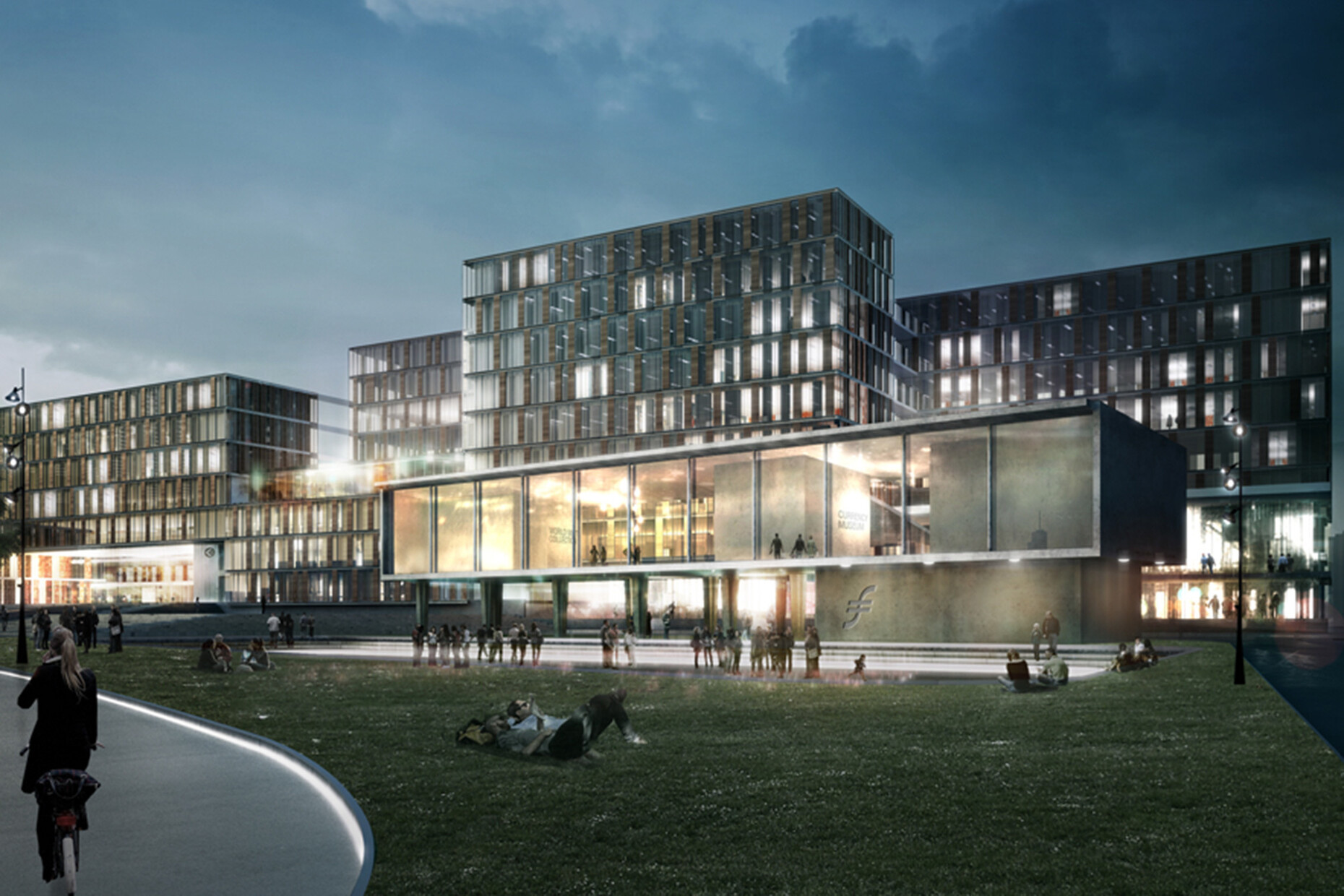
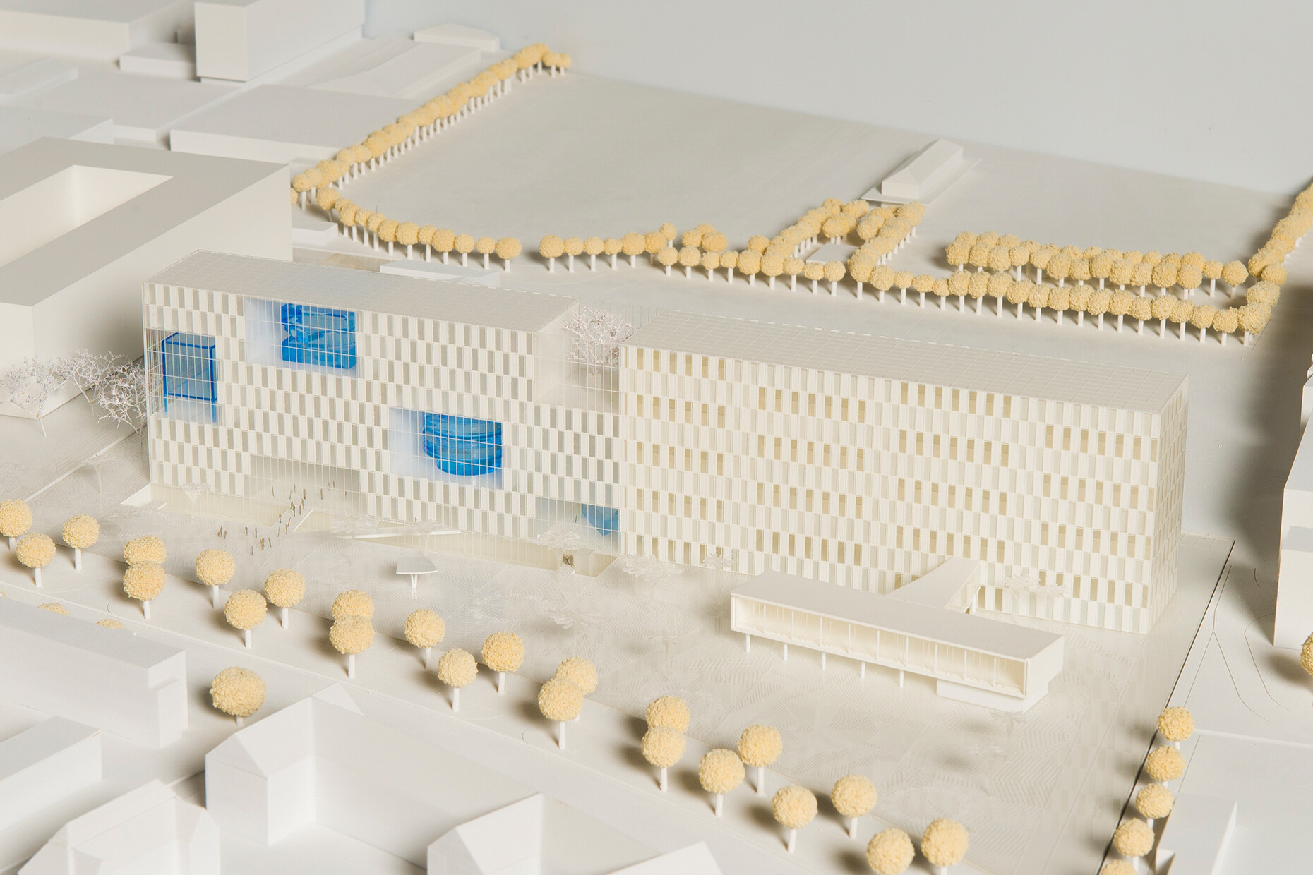
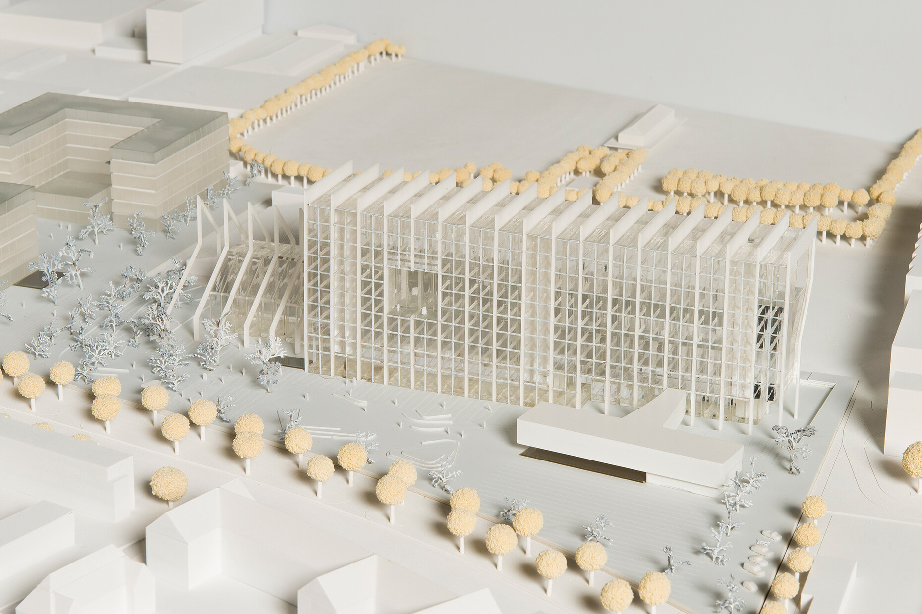
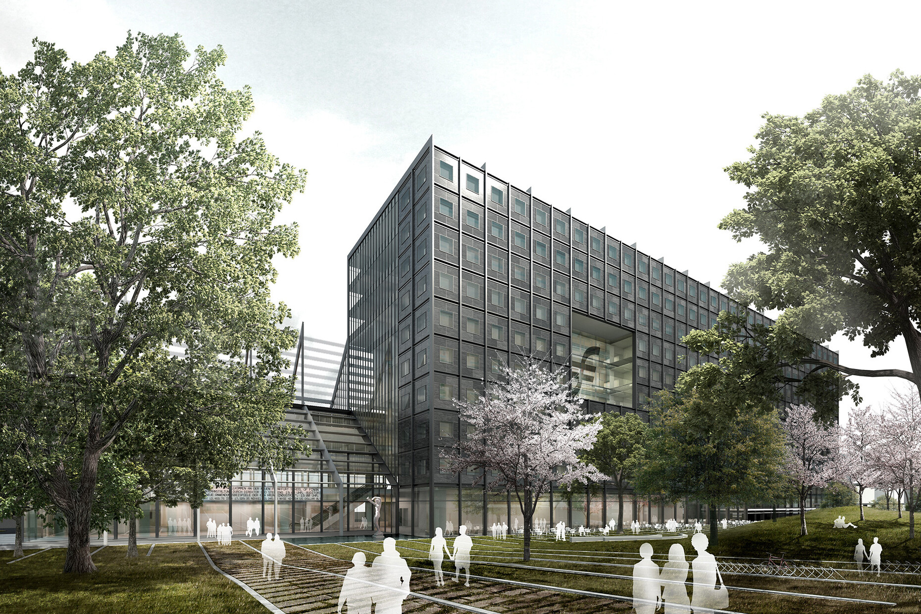
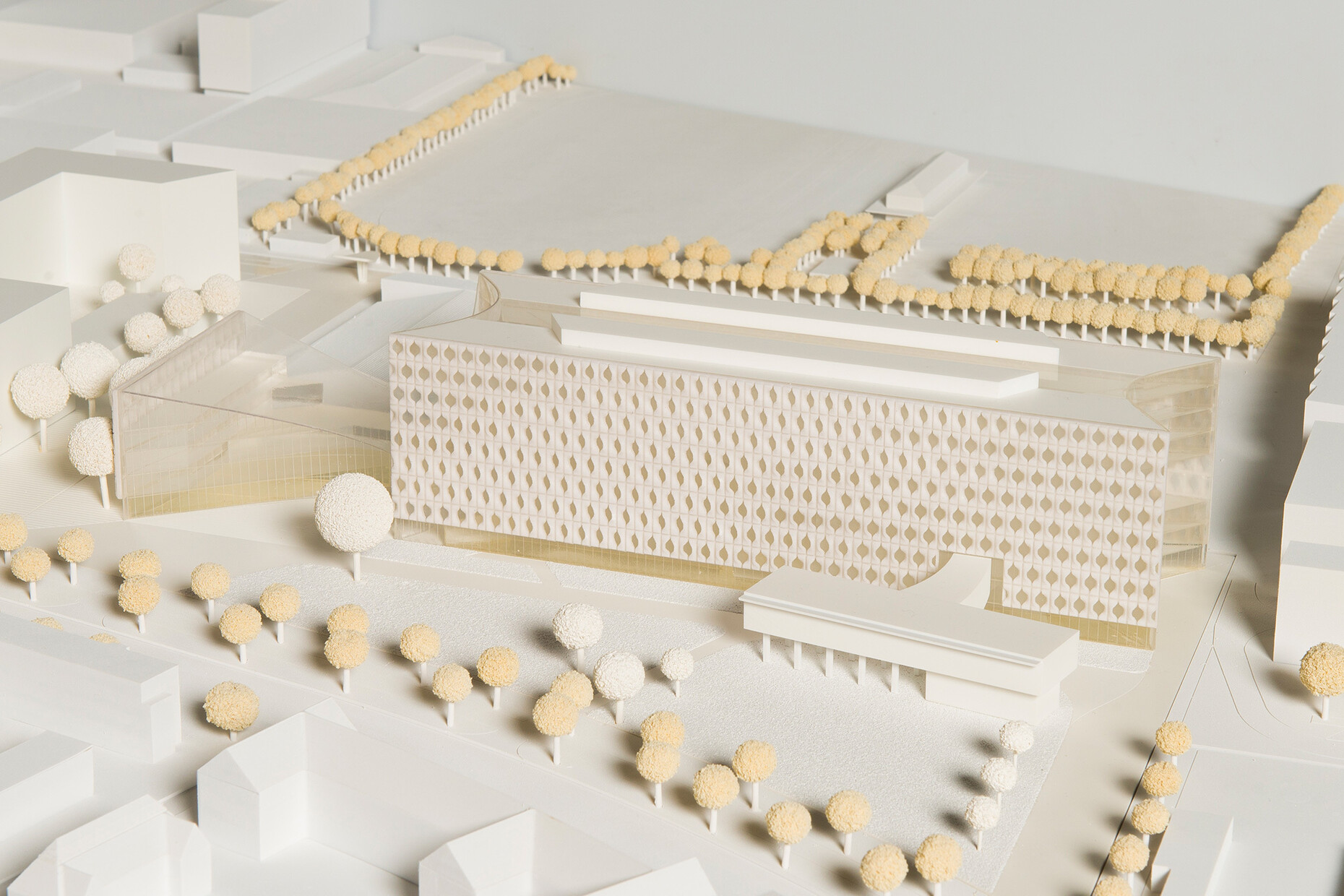
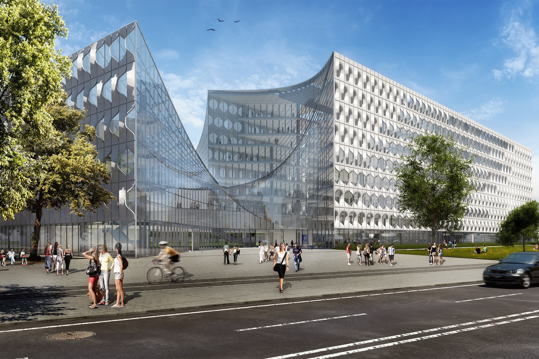
The biggest names from the architecture scene were invited to take part: Zaha Hadid, Dominique Perrault, Rem Koolhaas and a few other star architects to boot. The aim being to create a true architectural “footprint” for the city of Frankfurt, to get one of the big players in the international world of architecture on board for a construction project in the city on the River Main. The result announced this Thursday has hardly left us buzzing with anticipation. First place was shared by a mediocre design by Henning Larssen, which is still to be heavily revised, and a rather uninspiring work by Dominique Perrault.
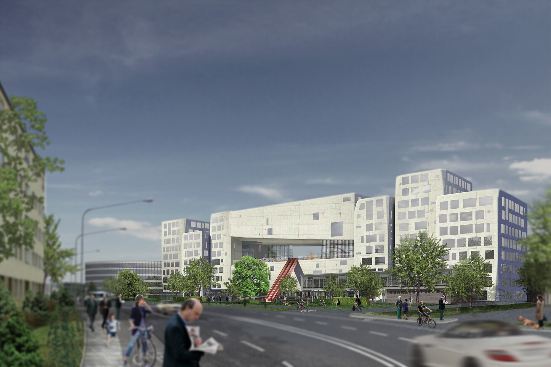
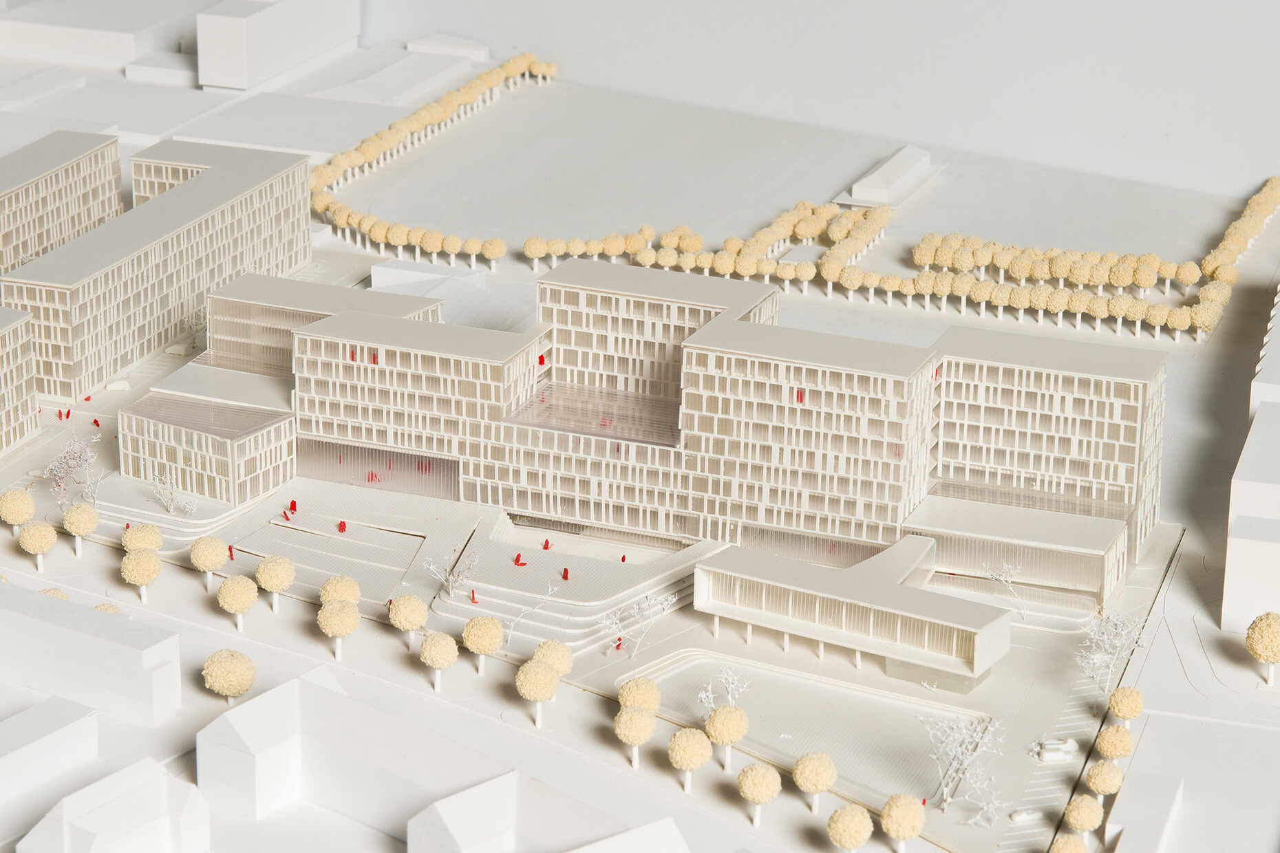
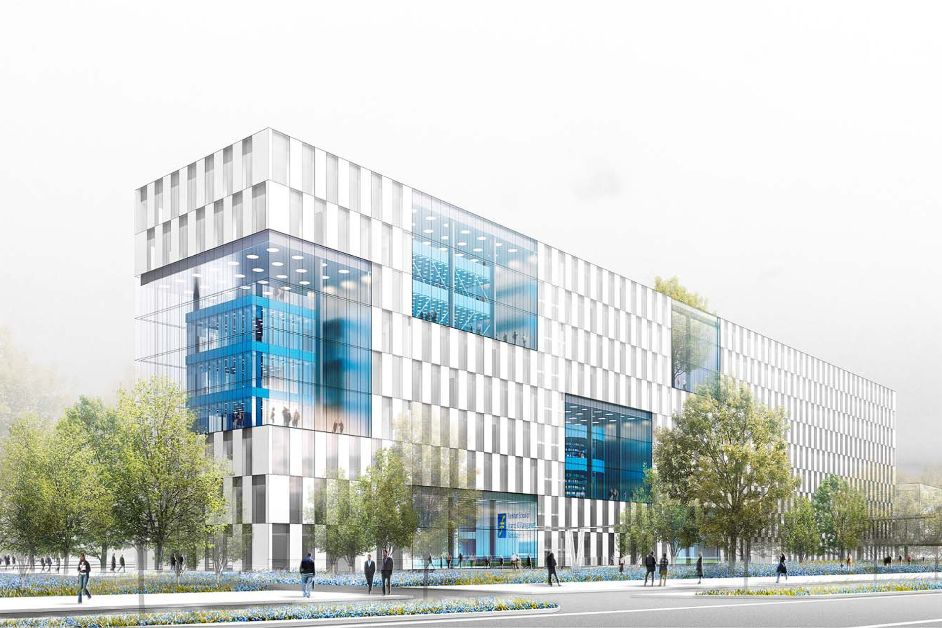
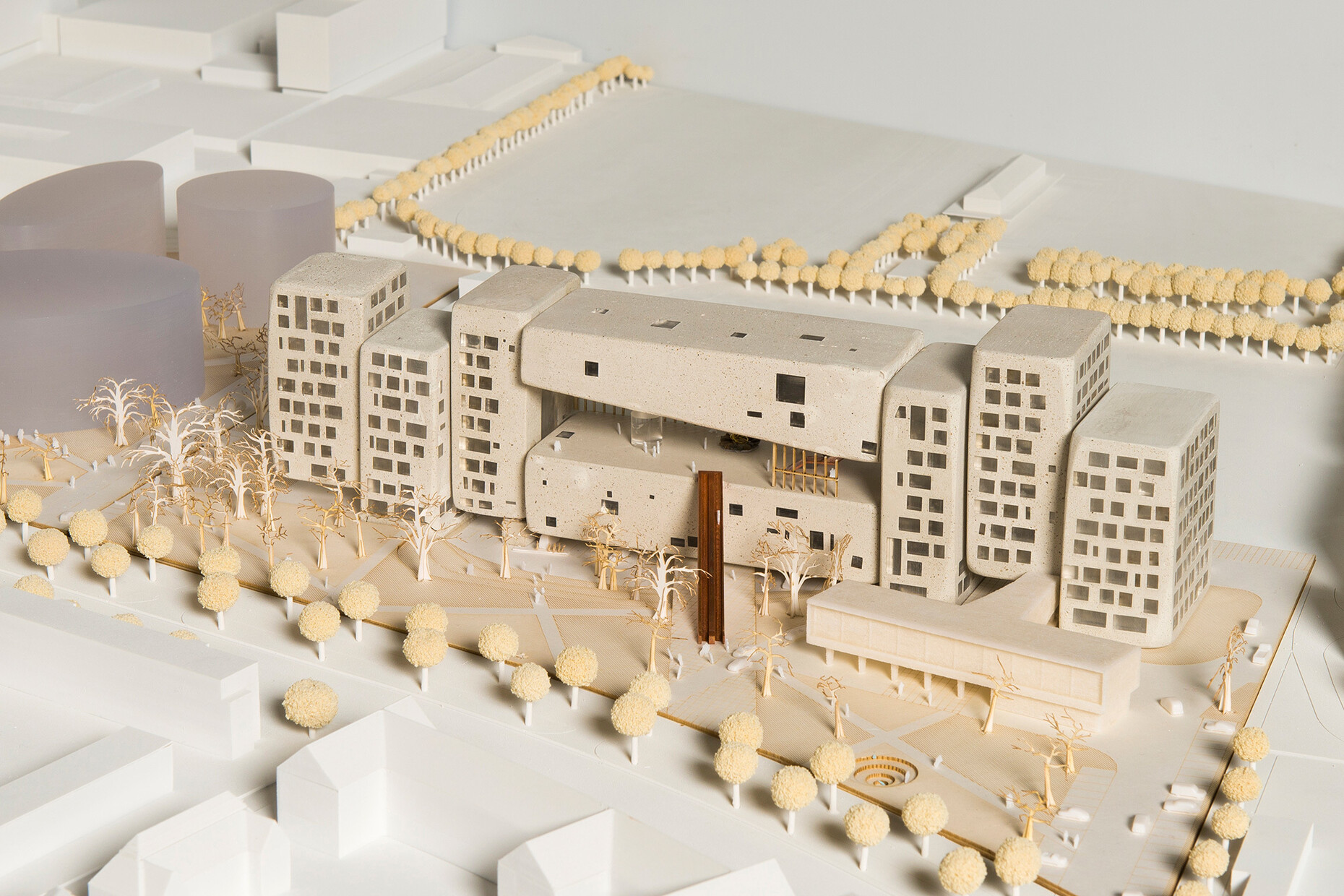
The one everybody had their money on, a design by Rem Koolhaas and OMA that tackled the complex parameters determined by the plot, urban planning classifications and monument protection guidelines in the most creative way by far, had to make do with a thankless third place, squandering any chance of the design becoming a reality. This is a prime example of something that is often the case here in Germany: Decision makers simply don’t have the courage or confidence to take such opportunities with both hands and just run with them – in this case missing out on a chance that would have brought prestige and international esteem to both the client and the city of Frankfurt.
At the same time, the new European Central Bank by Coop Himmelb(l)au, which is of course just around the corner, demonstrates that exceptional, iconic architecture, complex demands and requirements in terms of space, and functionality can indeed be brought together in perfect harmony.
Rem Koolhaas’ proposal for the Frankfurt School has all of this and more. It boasts an iconic quality without appearing unduly modernistic or coming across as a mere attempt to curry favor, a fine feel for the spatial conditions and the building’s integration into the surrounding area, instances of formal discontinuity, which are both surprising and thrilling at the same time but by no means make for discord in the overall appearance; and last but not least the quality of the design, which is simply unimpeachable. The jury’s objection: The building’s interior didn’t boast a clear orientation system. To which we would respond with the argument that this seems rather insignificant given the overall quality of the design, or rather, that a revision, a few tweaks could have rectified this and made a great design even better. Furthermore, the design proposes the inclusion of a semi-public space between the individual buildings, which can be read as an explicit gesture of “opening up” and would have provided the city with a new, completely unique space.
What we will in all probability end up with is an overworked building by Henning Larssen that has been completely robbed of any originality it may (though unlikely) have had in the first place; a building that will not only fail to provide any new impulses for Frankfurt’s cityscape, but will soon become one of those buildings whereby you struggle to even remember the period in which it was built. It is a real shame, which is why one is overcome by the urge to call out to all those involved: Take a look at Rotterdam, Utrecht or Copenhagen, at Sydney or Basel, that’s where you’ll find outstanding architecture.
