Back to basics
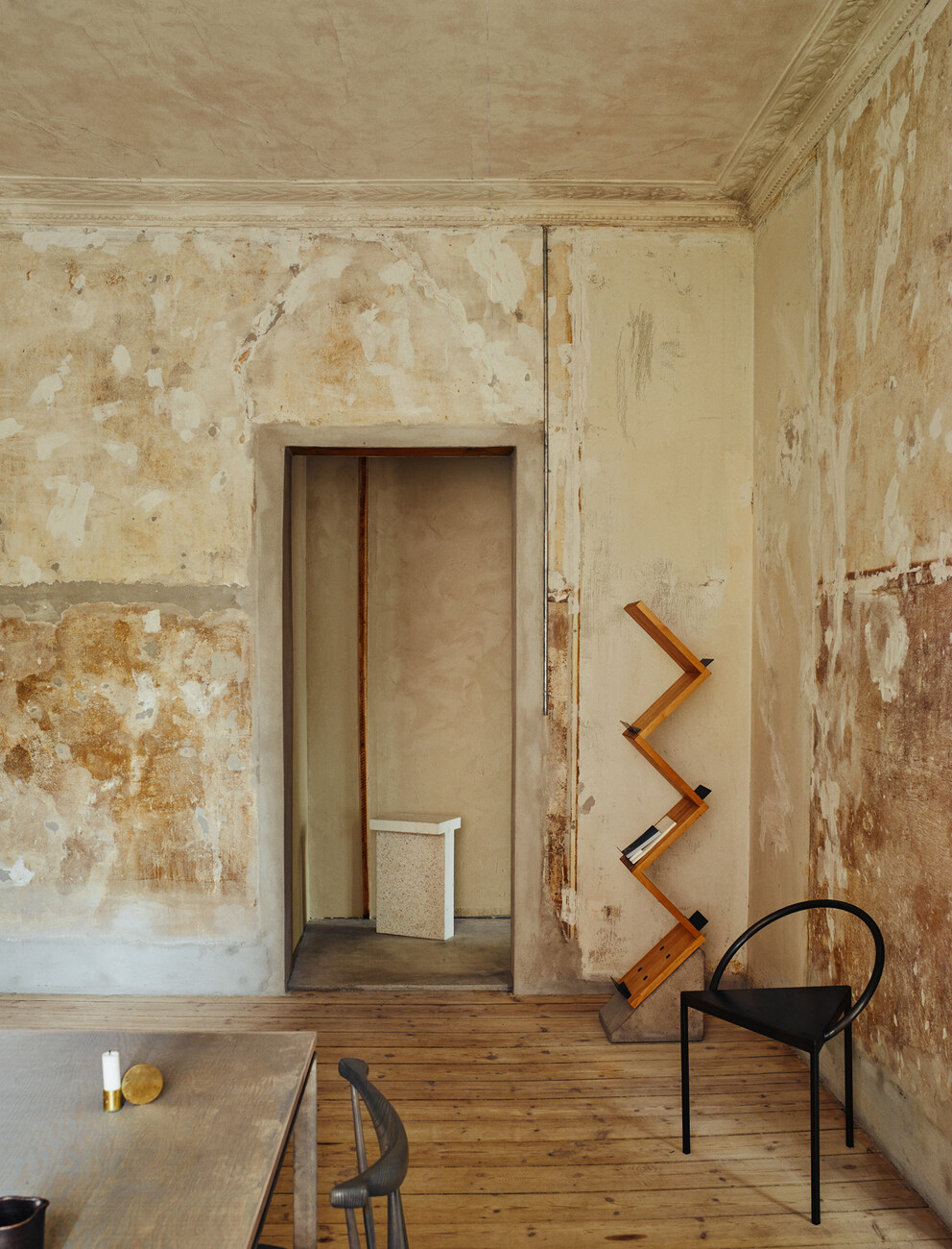
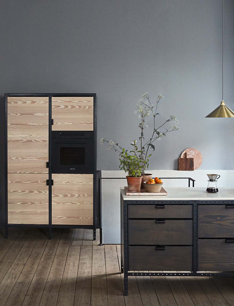
Simple, straight-forward solutions that eschew marketing tricks – this is the approach Scandinavian design label Frama sets out to take. Those stepping into the studio apartment belonging to Niels Strøyer Christophersen, one of Frama’s founders, will instantly know what they mean. A great deal of light, natural materials, clear lines. The interior carefully curated by Strøyer Christophersen is pared back to the essentials – in numbers and shape, such as the geometrical metal “Triangolo Chair” designed by architect Per Holland Bastrup. Instead of adjusting the interior architecture of the space to conform to a showroom-like character, the selected products, from furniture to perfume, smoothly integrate themselves into the lucid atmosphere quite naturally. Walking through the rooms you get a pleasant feeling of calm, where the hectic pace of the outside world seems far away. The minimalist presentation is instantly grounding.
In the Studio Store, located in St. Pauls Apothek in Copenhagen’s historical neighborhood of Nyboder, the concept seems almost palpable, too. The building from the year 1878 has been faithfully restored, with the old pharmacy’s original ornamental wooden paneling remaining intact. Frama’s golden thread can be made out in all of their products, regardless of whether these stem from Copenhagen, Hamburg, Stockholm, Oslo or New York. The walls and floors of these rooms appear deliberately unfinished, almost coarse. Exposed, the building materials and structure provide fascinating insights and a soft contrast. The combination of classical elements and contemporary standards does not appear forced or artificial and affords low-threshold access to Frama’s portfolio – be it product, Studio Store or spatial concept.


