SALONE DEL MOBILE 2018
A tower for Milan
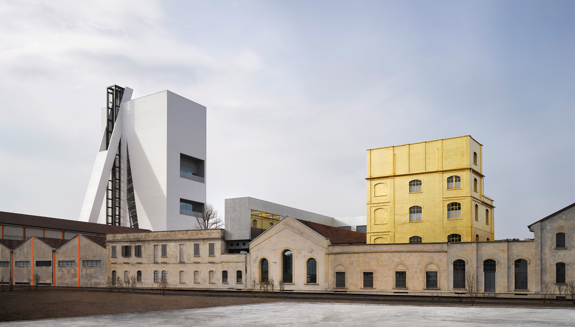
What can you say? “Torre” is a real curiosity. Visible from afar, the white high-rise building by architecture firm OMA for Fondazione Prada hovers like an apparition above abandoned railroad tracks. From close-up it remains enigmatic, impervious, a bright white being that is somehow out of place, a tower that rises up on the periphery of the Fondazione site. The building appears irregular, and each of the four façades looks different. Moreover, a long, equally white something rests obliquely on the south side, interrupts the flat roof and even towers above it. With the 60-meter-tall exhibition gallery made of fair-faced concrete, Rem Koolhaas and his office OMA completed the conversion and extension of the former gin distillery for Miuccia Prada’s art foundation. The Fondazione celebrated the opening of its most recent architectural achievement accompanied by a host of celebrities from the world of art and culture during Salone del Mobile 2018.
A strange building, in other words, that might not live up to expectations. After all, there is something incongruous-looking about the Torre; it does not boast an iconic appearance like the gilt “Haunted House” of the first construction phase. To make up for this Koolhaas, architecture’s grandmaster of ceremonies, has set the stage for amazing experiences that sensitize both the eye and body. Take the elevator that makes its way up the south façade: Every visitor should ride at least twice in this partially glazed cabin, once up and once down. Not because of the view, mind, but rather the sensation you get when the elevator emerges from the dark of the adjoining old building into the light and the floors of the building are visible in passing – what a spectacular architectural experience! In addition, half of the cabin is clad completely with backlit pale-pink marble. And the elevator presents a similar spectacle from the outside, both from the exhibition hall in the old building and the stairwell of the new Torre. Completely energized by this experience, the tour continues through the six exhibition levels, each with a different design: rectangular layouts alternating with wedge-shaped floorplans. The height of the rooms ranges from 2.7 meters on the first floor to 8 meters at the very top. Sometimes it is the short sides that are glazed and sometimes the long side, facing north, towards the city.
On the very top floor Koolhaas and his two coworkers at OMA Chris van Duijn and Federico Pompignoli deprive us entirely of a view. Here, light enters via skylights. In a statement on the project Koolhaas describes Torre as “a collection of varied exhibition conditions.” That arguably comes pretty close to a curator’s definition of paradise, as this setting should provide a suitable framework for any artwork. However, the design does presuppose a certain size, as the large, unsupported halls seem less suited to intimate presentations. The variation in the interiors is also visualized on the façades, especially on north façade, which features two overhangs and thus consists of protruding and receding elements.
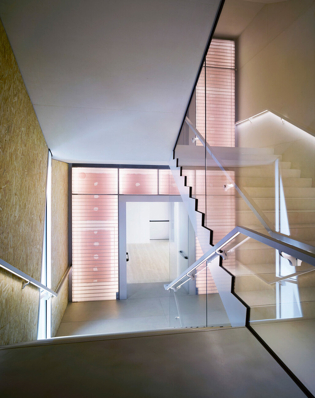
The architects have sandwiched three elements between the exhibition levels: the restaurant with panoramic terrace, the kitchens and the restrooms. The building is topped by a roof terrace. Here, as in the other Fondazione buildings, a visit to the restrooms is an experience in itself. On the seventh floor the style recalls a claustrophobic Art Deco cave, on the first floor a hall of mirrors with a view. And indeed, precisely in the design of the rooms it becomes evident that the new building is not only strange, but also cool. The abstract architecture is enriched with diverse materials and surfaces from top to bottom. In the exhibition rooms travertine floor panels meet wall cladding made of oriented strand board (OSB). Ceilings and walls are flattered with velvety fair-faced concrete. In the stairwell the grating familiar from the first building phase reappears. Walls of pale-pink gypsum plasterboard are visible behind them and all the filled joins form a neat grid-like pattern – truly refined structural work. Such touches are as ironic as they are entertaining. This abundance and variety cites the material culture of Milan, which indulges in the textures and colors of marble, terrazzo and ceramics like no other city. Even in the subway stations people are treated to multicolored natural stone.
And what, then, is the purpose of that long white thing on the south façade? In his statement, Koolhaas simply calls it a “structure,” though in actual fact it is an oversized anchor of sorts that keeps the Torre upright. With its narrow footprint and generous overhangs, it is somewhat top heavy and might otherwise tip over. The architects at OMA could doubtless have solved this problem of statics more discreetly, but this extravagant structure is also a salute to the other tower, to the north, Torre Velasca with its external struts. The high-rise by BBPR was always considered somewhat strange, and cool, of course.


