Classics with a fresh take
Even the fair stand is a treat for the eyes. A simple wooden box, cleanly and precisely worked. At the center an elegant podium of the same timber, in which the luminaires by the Austrian manufacturer are presented as in peep boxes. Nothing diverts the eye, full concentration is given to re-edited classics from the Kalmar archives dating back to the Secession and the Vienna workshops. In this context, while retaining their traditional strength, the luminaires are lent something extraordinarily contemporary. What a coup for designer and art director Garth Roberts and Nicolo Taliani! One of the discoveries at Euroluce.
Sustainability from Mexico
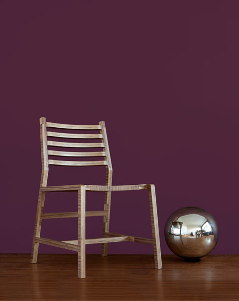
A small side street in the Brera quarter, few visitors to Milan make it here. What I find in a small store is a sensation of sorts. A design firm from Mexico! Is that possible? And offering really good design? Yes, indeed, Pirwi is all of these things. Hugo Kozlowvsky, a Mexican with Eastern European roots stands amidst the products and explains the company’s 100 percent sustainability philosophy. Nothing is thrown away, there are no environmentally harmful adhesives or joining sections. Here sustainability seems to be practiced reality and not just a slogan. And the products stand out for a design language that is both locally inspired and international. Best of all: they are inexpensive. What more could the chronically underfinanced design heart desire?
Design as a national task
Not every country takes design really seriously as a national task. In Scandinavia people apply themselves to the topic with devotion and professionalism. Which made the small exhibition in Ventura Lambrate by Danish Crafts, a national design initiative, one of my personal highlights in Milan. Every year a designer is chosen to curate the exhibition. This year it was Cecilie Manz (who incidentally created her first product for Nils Holger Moormann, namely the ladder “HochAcht“), who with a delicate touch arranged established designers and firms to produce a synthesis of the arts. The highly different exhibition items form a harmonious whole on a podium comprising wooden flooring by danish company Dinesen. The items ranging from furniture and textiles to accessories reflect both Danish tradition and artisanship and innovation and modernity. That is how you (can) do it!
Enchanting, sculptural furniture
It is strange to still describe the company Pastoe as a discovery. But somehow it is still that, even though in 2013 it can celebrate its centenary. It is subtle aspects that characterize Pastoe: a timeless and minimalist design, uncompromising quality and the rejection of loud and strident tones. It is more about the refining and advancement of existing products rather than producing a firework of innovations. A concept also pursued in Milan. The new wooden versions of the “Vision” system are simply enchantingly beautiful and the sculptural shelf “Totem” by Vincent van Duysen (presented last year) has also been advanced. All of this in a low-key, subtle presentation in Via Varese, away from the crowds. Now that is Pastoe!
www.kalmarlighting.com
www.pirwi.com
www.danishcrafts.dk
www.pastoe.com

 Kalmar booth at Euroluce, design by Garth Roberts
 Knit Chair by Pirwi
 Tool Boxes by Line Depping on oak flooring by Dinesen, photo: Jule Hering
 Pastoe presentation in Via Varese during Fuorisalone 2011, photo: Pastoe
 Lights by Kalmar, photos: Kalmar

 Chair Tschichold, Design from Mexico by Pirwi
 Exhibition "Mindcraft11" by Danish crafts curated by Cecilie Manz, photo: Jule Hering
 Conic by Thomas Bentzen, photo: Jule Hering
 Showroom by Pastoe with LC03 chair by Maarten van Severen and Fabian Schwaerzler
