Traces in concrete
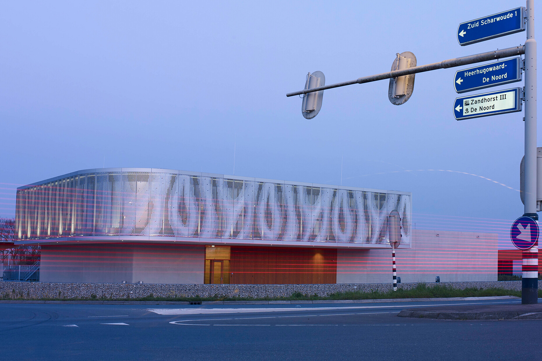
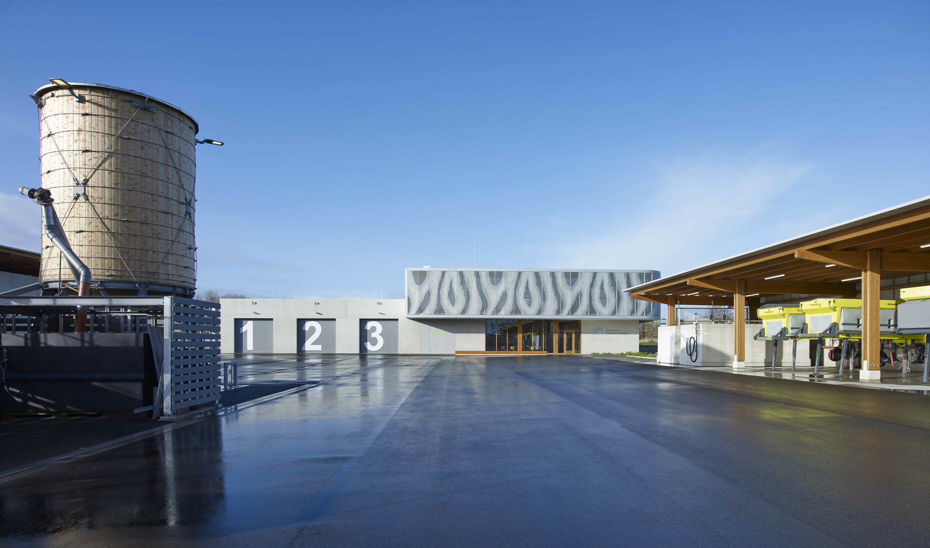
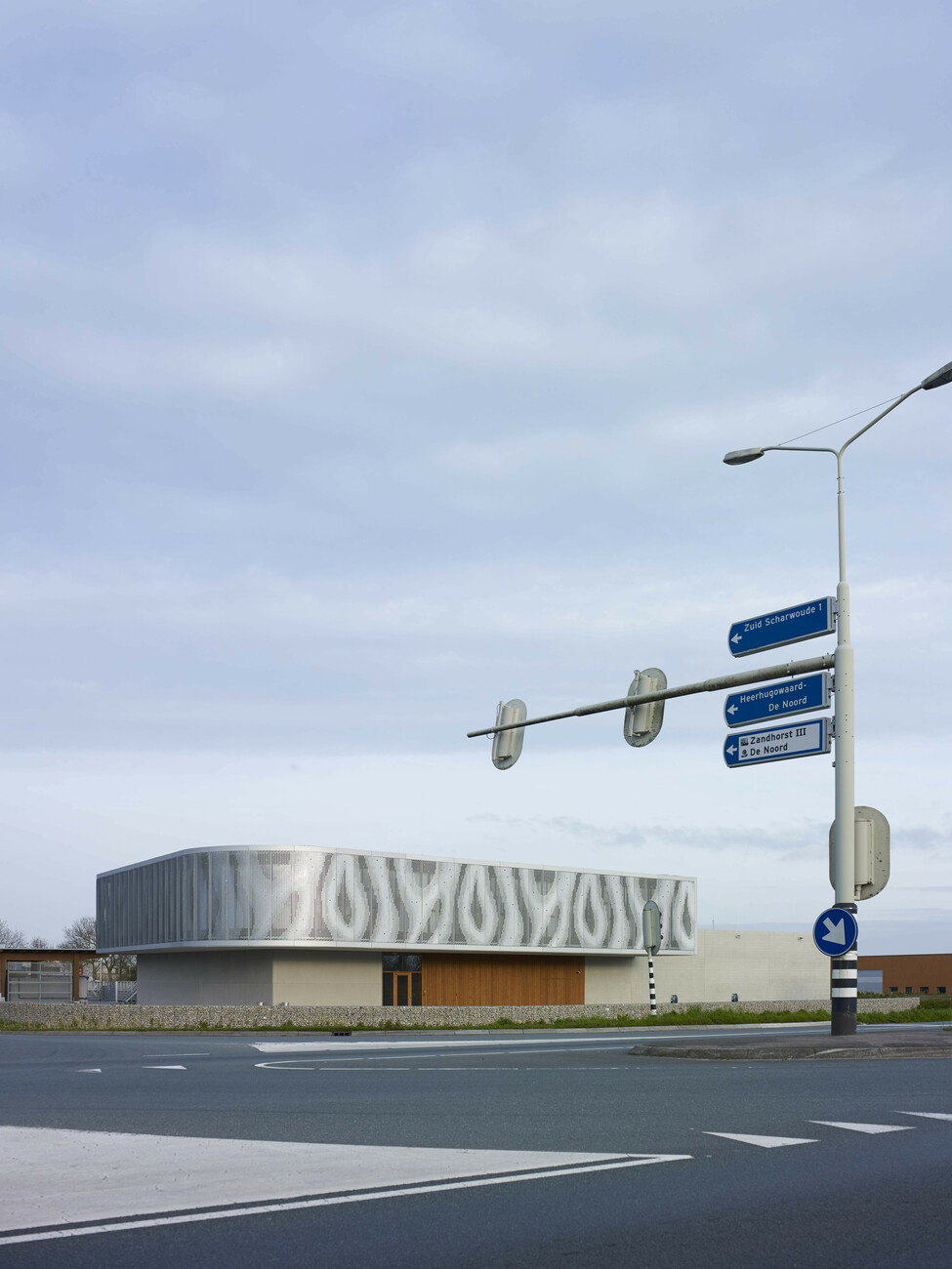
We are on a highway just outside Heerhugowaard, a mid-sized community in North Holland. In this flat landscape in the middle of nowhere an unusual building occupies an intersection. Does the rippling aluminum facade conceal a workshop, a garage or an office? The two-story standalone not only looks extraordinary but also has a special function: It house a new control center that monitors all the locks and bridges in the region. And it also coordinates and discharges local road maintenance tasks.
In 2005, a competition was held for the design of the building, which was won by the company finishing dutch retail design. Architect Gertrud Topper and designer Günter Bauer did not have to travel far to the building site. Their office is in Alkmaar the city famous for its cheese and just a fifteen-minute car drive away. finishing dutch retail design won the job even though, as the name reveals, the studio’s focus is on designing retail spaces on the back of Topper’s previous projects. As the client had always thought highly of her designs it invited the young studio to participate in the competition. "We tried to create a standalone building that the two users – bridge and road administration – can each identify with," recalls the architect. finishing dutch proposed reflecting the building’s dual function by structuring the edifice in two volumes stacked on top of each other, whereby the facades of the one are made from a different material to that of the other.
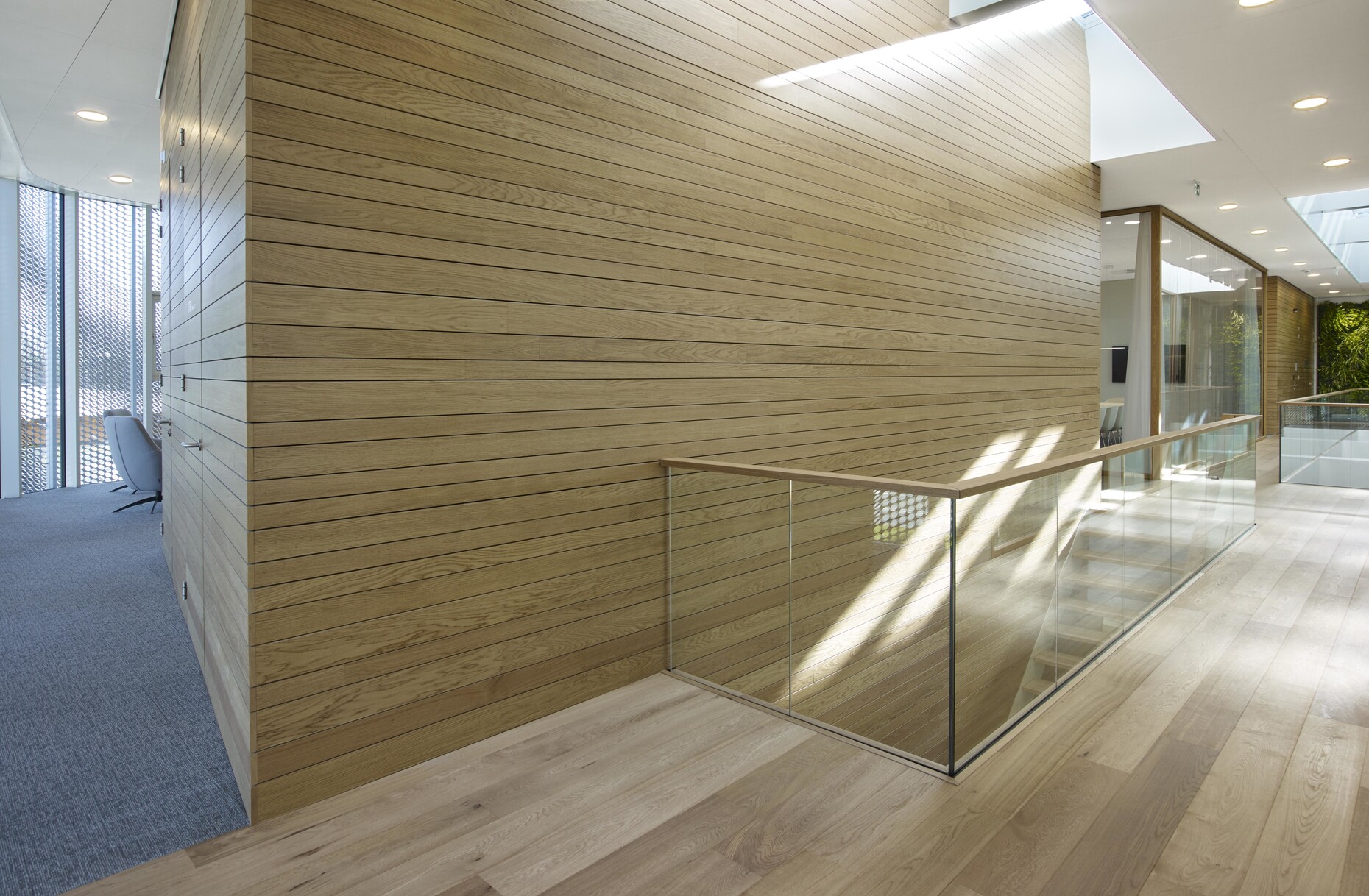
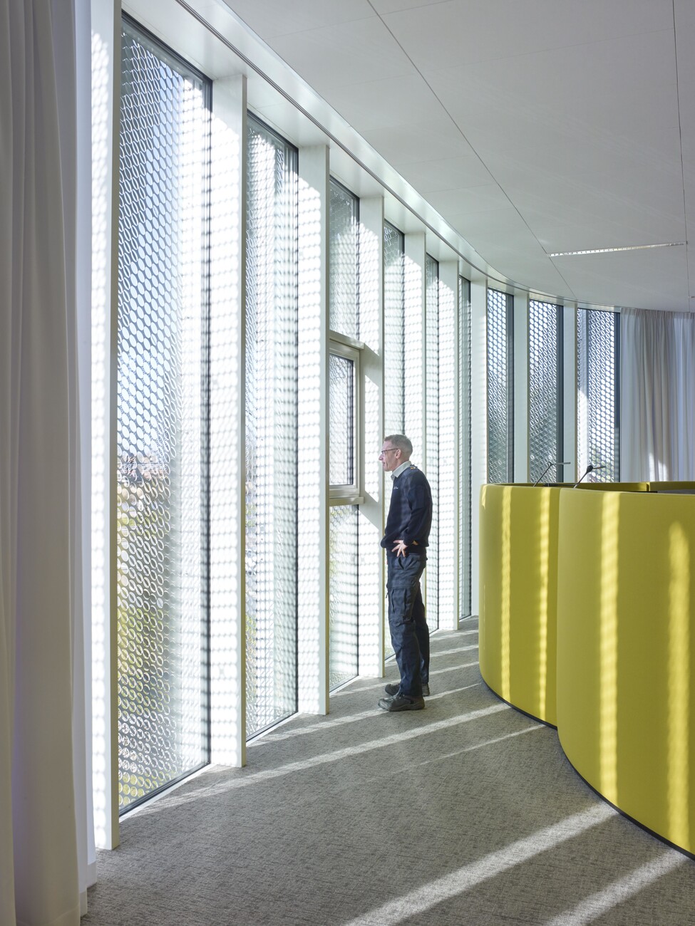
The road maintenance department is located on the ground floor of the new building. And above that in three shifts around the clock the staff of the bridge control center monitor 40 bridges and locks in the surrounding area. To ensure optimal planning, the project architect visited all the employees at work and asked what they wanted from their new building. What they needed and what not. Everyone agreed they wanted a cozy atmosphere and warm materials.
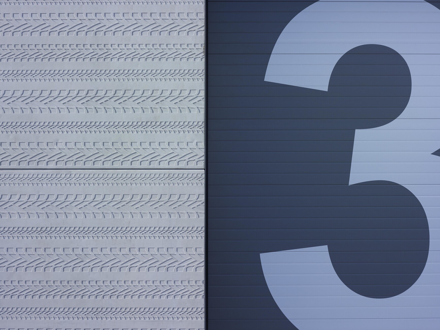
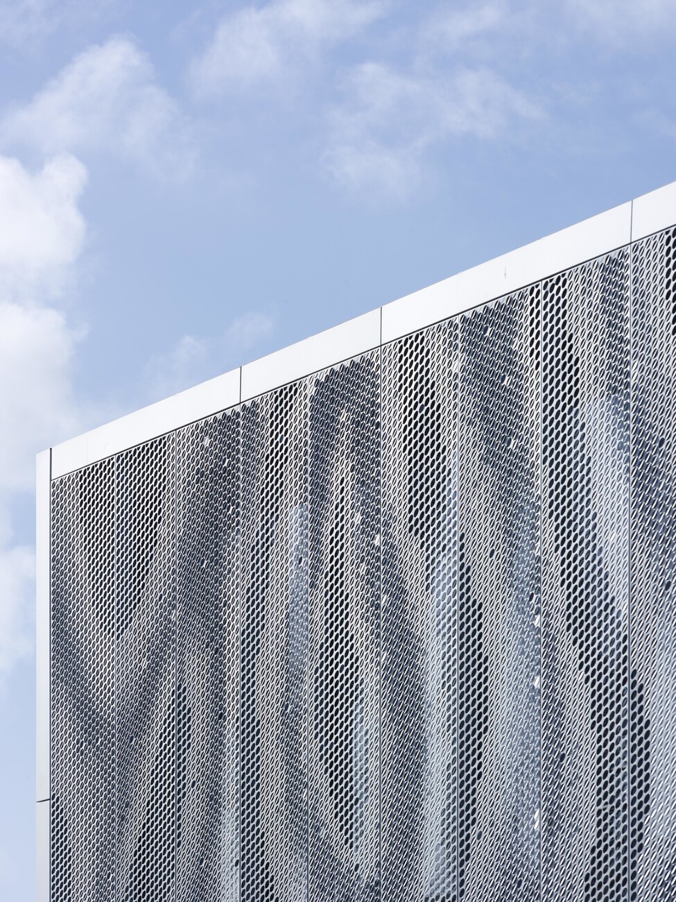
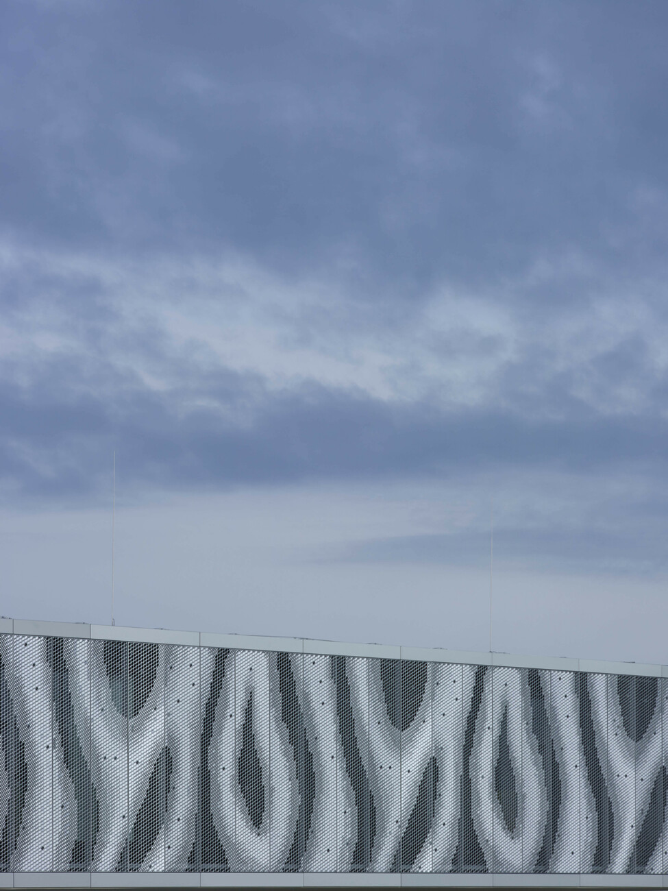
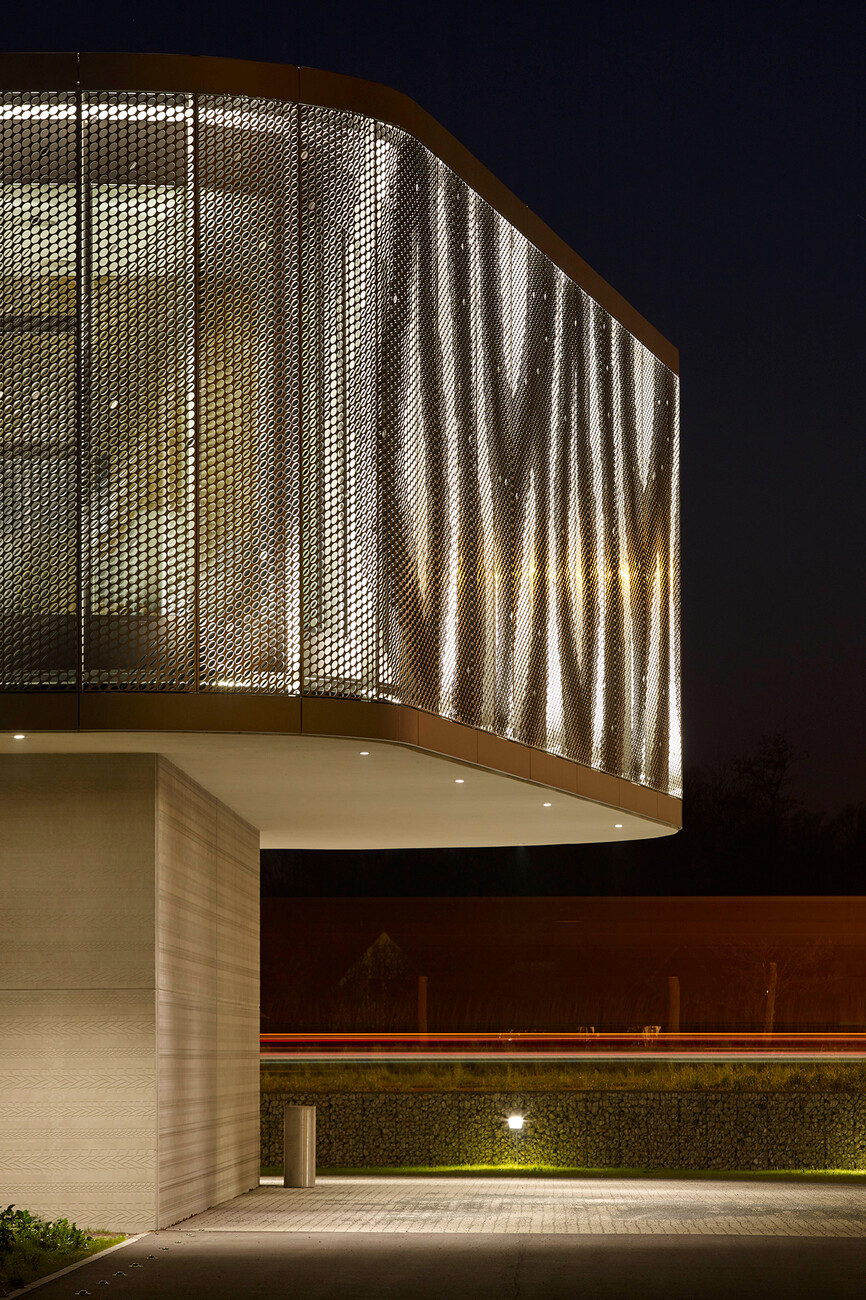
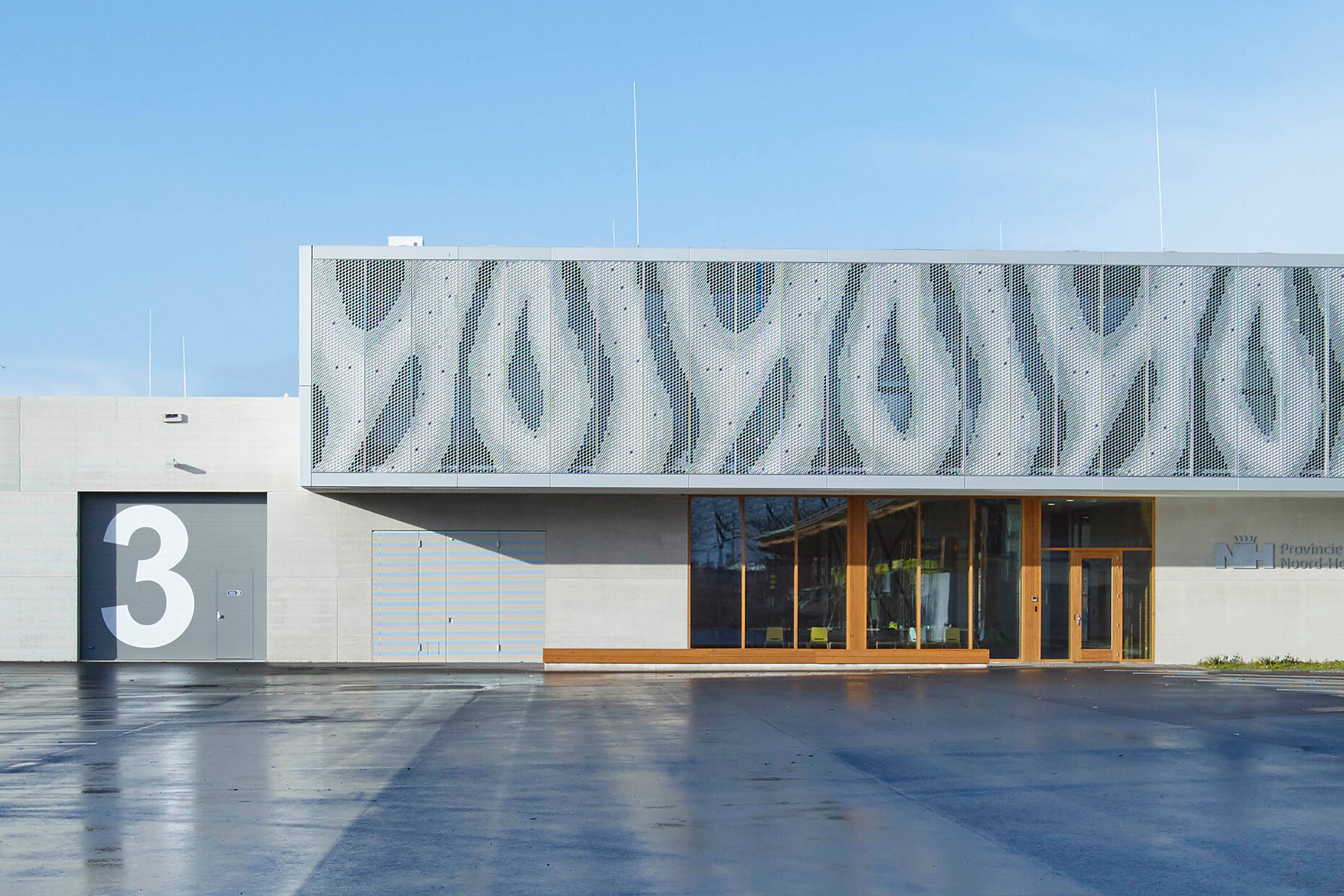
"The office workspaces on the top floor focus extremely on monitors, on the work,” explains Topper. “The translucent aluminum facade filters the daylight into the building’s interior and simultaneously provides shade for the desks.” While the light, undulating shell resembles an abstract image of a rippled water surface the concrete facade on the ground floor that houses communal rooms, changing rooms and staff toilets has a different pattern: Rather than timber formwork the prints of tire tracks form a pattern in the concrete.
The architects play with the viewer’s perception to ensure the facades do not compete with one another. While the undulating facade stands out from a distance, from close up you only see the concrete base. The upper section disappears. “It took several tests and mock-ups to develop the concrete surface so that the tracks are not too deep but not too shallow either,” says Topper. “But we are all really happy with the result.” And why does the new building look so ambitious? “The operator wanted to realize a statement: an eyecatcher,” reply the architects. Which is why finishing dutch simplified the construction as far as possible as this freed up a sufficient slice of the budget for the façade design. Essentially, the ground floor is a simple box, while the upper floor juts out producing a break with the cube. Incidentally, in 2018 the studio finishing dutch retail design won a design for another control center not far from Delft. Perhaps Gertrud Topper and Günter Bauer will soon need to change their studio’s name.
