Too small from the outset
Judging by the Villa Berower and the surrounding, idyllic park, not to mention Renzo Piano’s 1997 museum, you’d think all is good, lying as they do so calmly and sweetly in the quiet of the countryside outside Basel. The impression is deceiving, at least going by press coverage in recent years: Fondation Beyeler is suffering. And has been for some time. As its buildings are simply too small for the ever growing art collection. The current Monet exhibition, for example, attracted over 200,00 visitors over the last three and a half months, and at the recent press conference on the Foundation’s expansion plans Museum Director Sam Keller therefore announced that even in the park land areas (originally meant to be “zones of peace and quiet”) things were now so bustling that visitors could no longer relax there and let their minds drift in a soft swell of art memories, the way the collection’s founders, Hildy and Ernst Beyeler, had intended when in 1978 they acquired the ancient Berower estate.
The news that the rooms of Fondation Beyeler are too small can hardly be considered stunning. The Foundation considered the long low building Piano created too small only two years after it opened, and in 1999 it was extended by 12 meters. However, that maxxed it to the max, as the two founders’ maxim was that the museum was to demonstrate the harmony of nature and architecture. Which was precisely one of the major strengths of Piano’s essentially simple design: its lightness, its airiness, the product of a combination of four very long walls of red porphyry and a glass roof that floated above them. His design actually fills the entire northern section of what is a very narrow parcel of land – that, moreover, lies next to a road with heavy traffic that runs directly along the border between Germany and Switzerland. Yet thanks to the large glass facades particularly in the high rooms at both ends, the parklands are beautifully incorporated into the otherwise closed-off exhibition spaces, and the conservatory on the long western side affords a great view out over the countryside.
Once Piano had himself extended the design in 1999 the question remained how the Foundation could expand the premises at all. Another annex would have destroyed the park, a new story would presumably have ruined Piano’s light pavilion-like edifice, added to which the green zones would have been sidelined. For several years, things hung in a dissatisfactory balance. Not that any of this was to the detriment of the museum, which, in terms of visitor numbers, is now the most popular museum in all of Switzerland.
How to cross Bachtelenweg
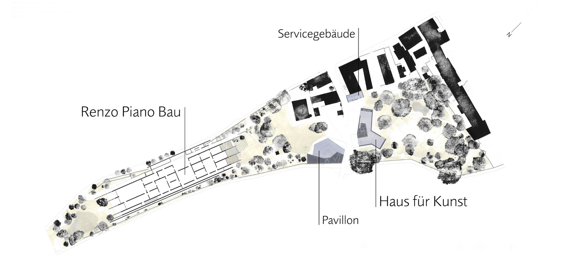
The Foundation has now succeeded in acquiring the hitherto private Iselin-Weber Park immediately to the south, which interestingly enough was designed by Jean-François Caillat, the same landscape architect who created the Berower Park. This very fitting extension means the Foundation’s existing parklands have doubled in size and the Weber Park is now open to the public for the first time. However, key issues arose as regards expanding the buildings: First, how should the new exhibition building(s) relate to the existing structures and to Weber Park. Second, how to forge a link to the existing Foundation grounds, as the new park with its ancient trees and picturesque lily pond is located on the other side of the Bachtelenweg road. Three existing homes and the historical garden wall on Bachtelenweg are to be demolished in order to connect the two parks. In their place, so the plan, would stand new buildings with more exhibition space and halls that are suitable for events.
The Foundation then, so it says, contacted over 100 architects requesting possible ideas on how to solve the problem, and then, as part of a so-called “commissioned study” invited 11 offices to submit initial suggestions for the complex setting: Among the invitees were Sou Fujimoto, SANAA, Junta Ishigami, Christian Kerez, Smiljan Radic and Eduardo Souto de Moura, meaning some offices whose proposals we would undoubtedly all have gladly viewed and debated – publicly. However, the Foundation thought differently. In September 2016 it initially announced that Swiss Pritzker Prize winner Peter Zumthor had been selected to handle the expansion, but that he would first rework his plans before these were presented to the public. Zumthor then tweaked away at his plans and renderings, and it was not until May 4, 2017 that the Foundation was able to present them to a very well attended press conference, where an upbeat architect was delighted to explain them in detail.
How important daughters can be
So it was that Peter Zumthor openly said that he wanted originally to put all the new rooms in a single building. However, the client then informed him that such a large volume would hardly get building approval given the location in question. His daughters then encouraged him to have a thorough rethink, as all his projects had improved in response to pushback, after all. His final proposal thus places three buildings along Bachtelenweg, a three-story exhibition hall, a pavilion for events, and a small admin building for the Foundation. Together with the restaurant on the other side of the street they create a small plaza that in particular is energized by the small pavilion.
This small pavilion plays the central role in the concept: Zumthor uses the historical garden walls of the Berower estate as the rear wall and deploys a slightly vaulted wooden roof to define an auditorium for about 300 across staggered flights of seats. The glass façade boasts sliding sections beneath a large canopy and can thus open out onto the plaza – no doubt the events during balmy summer evenings will be a dream.
The exhibition hall, which he himself calls the “House for Art”, can be read as a contrasting foil to the lightness and tenderness of the event pavilion and to Piano’s museum build, now 20 years old. Although with 1,500 square meters of exhibition space it offers slightly less than half the area of the Piano museum, Zumthor’s house seems far more massive. Where back in the 1990s Piano was still celebrating invisibility (after all, you hardly notice his building from the street), in 2017 a new build is expected to offer a visible prime “address”, to provide a photogenic and unmistakable backdrop for images or films.
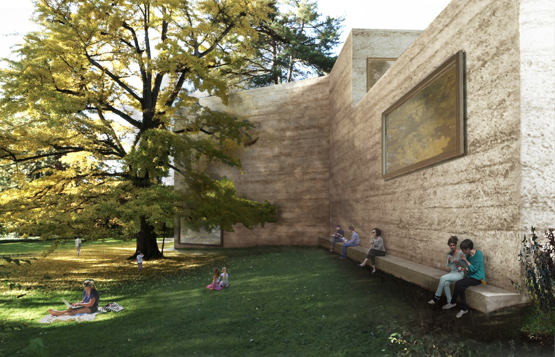
Zumthor will have the largely sealed outer skin made of tamped concrete to create a lively, irregular and open-pore surface, whereby aggregates will give it something like the color of Jura limestone. The hard-edged build has three irregular wings, meaning visitors will tour the rooms of the three wings and three floors by following loops. Large windows will repeatedly offer views of both parks, but unlike the Piano building, these are focused views, framed by the windows. Where Piano let nature enter the building as an equal, and quite unruly Other, Zumthor seems to want to hand it on the wall as a still life that really behaves itself.
Pianos Pavillon and Zumthors Monolith
In his explanations, Zumthor also describes his “House for Art” more or less in terms of it being an archaic block. He wanted a “monolithic” effect, a building that seemed to “have been chiseled out of a large block”. Inside there are “bright, chalk-colored halls”, the main source of light actually being the large windows on the sides – meaning no artificial ceilings for the lighting technology, and a solid build instead. This is again a firm contrast to Piano’s spaces, where the mood is in particular set by the overhead lighting. And while Piano’s halls follow a discernible hierarchy, Zumthor’s tour culminates on the third floor in a “huge double-hall, whose massive panorama window looks out at the tree crowns on the northwest façade and through their branches and foliage to Tüllingerhügel opposite” – meaning toward Germany, and one could say, toward the campus and design museum of a renowned furniture maker in Weil am Rhein.
With this proposal, Zumthor has largely remained faithful to his approach and reliably provides a relatively calm, archaic and hard-edged building in which he develops “leisurely spaces” using a variety of materials, spaces that, as he once put it, “don’t expect anything of me”. It is almost opposite to the max of Piano’s museum, with the latter’s inward, bright and neutral spaces, its low, pavilion-like modesty, its way of engaging with the light and surrounding parkland, and even to its materiality. While Piano pompously and globalistically had the red porphyry imported from Argentina, Zumthor clearly borrows from traditional, regional forms of building and opts for concrete tamped the way clay once was, and on the inside creates pretty untreated interiors that are (for a private Foundation’s museum) quite spectacularly devoid of technology and use natural light from the sides.
Will the grounds as a whole thus offer a productive contrast with buildings from very different ages and with correspondingly different philosophies? First of all, the Foundation needs to raise half of the estimated construction costs of about 100 million Swiss francs. Only then will realization of the proposal commence. Needless to say, the Foundation hopes that the public presentation of the plans will give a real boost to fund raising. Perhaps building approval will thus be forthcoming in 2018 and the foundation stone laid as early as 2019. Will calm then prevail in the Foundation’s grounds, or will this third extension be too small from the outset and the new park will once again be overrun by visitors? We will no doubt find out.


