REVIEW – SALONE DEL MOBILE 2023: EUROLUCE
Milan glowed
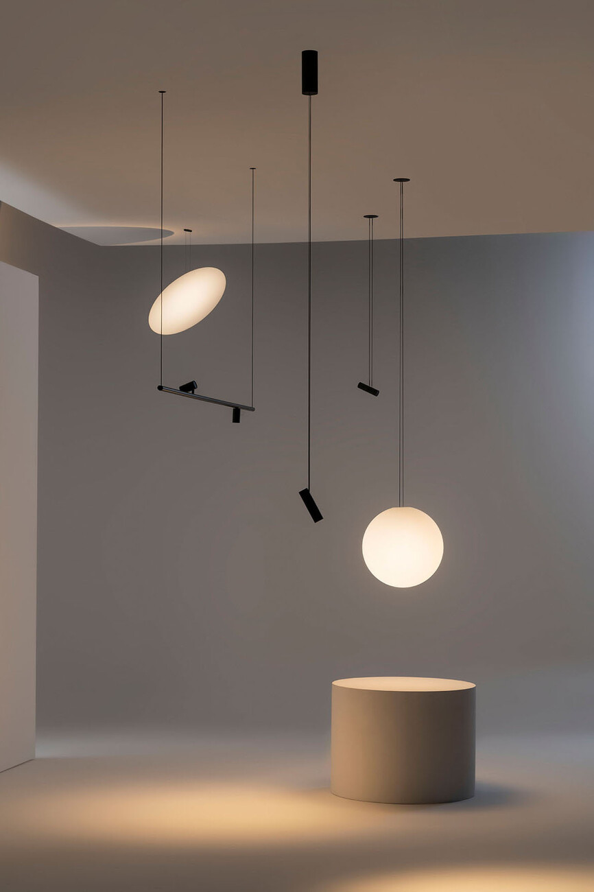
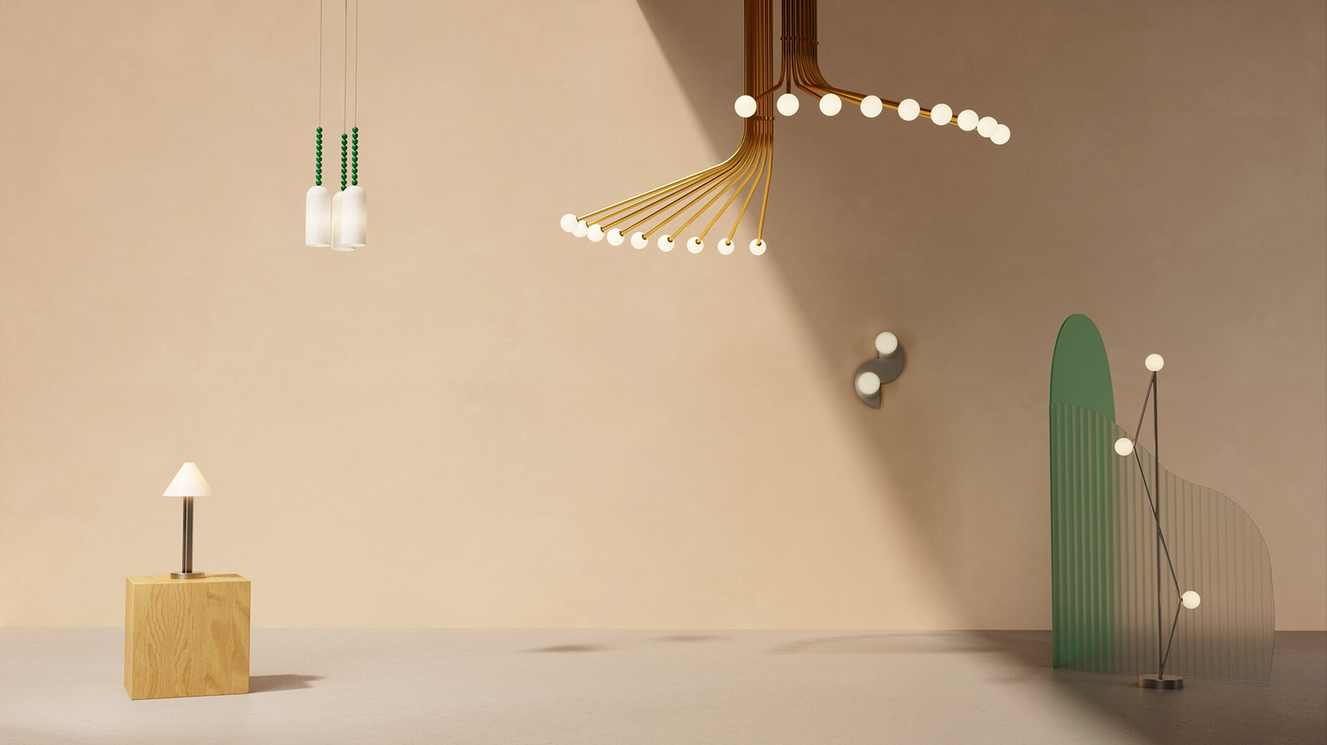
All of a sudden this overview! Wide aisles that almost feel like streets. A circuit that leads you past all the stands as if by itself. A mix of exhibitors that creates a pleasant alternation of larger and smaller manufacturers. Euroluce 2023 has indeed delivered on the promise of becoming more user-friendly. Last week, after a four-year pandemic break, Milan's Salone del Mobile lighting fair presented itself for the first time with a new hall layout and an international list of exhibitors. There was also a lot of light to be discovered in the showrooms and exhibitions in the city centre, especially many of the smaller brands and up-and-coming talents presented themselves here. The tendencies among the new products – despite all the diversity – went in two directions: Many of the large, established manufacturers have newly developed or further developed systems that are to enable uniform solutions for lighting with tracks, cables, tubes and similar structures. In this context, current technologies such as digital control, integration into building services systems or changeable light colours are of course standard, but are not played up in terms of design. Today, system solutions also offer atmospheric light and a selection of decorative luminaires. In addition, there were many individual luminaires and luminaire families on show that fully exploited the sensual appeal of light, with textile shades, coloured glass, extravagant designs, special materials and textures. New production technologies were on an equal footing with traditional craftsmanship.
A tour with a good feeling
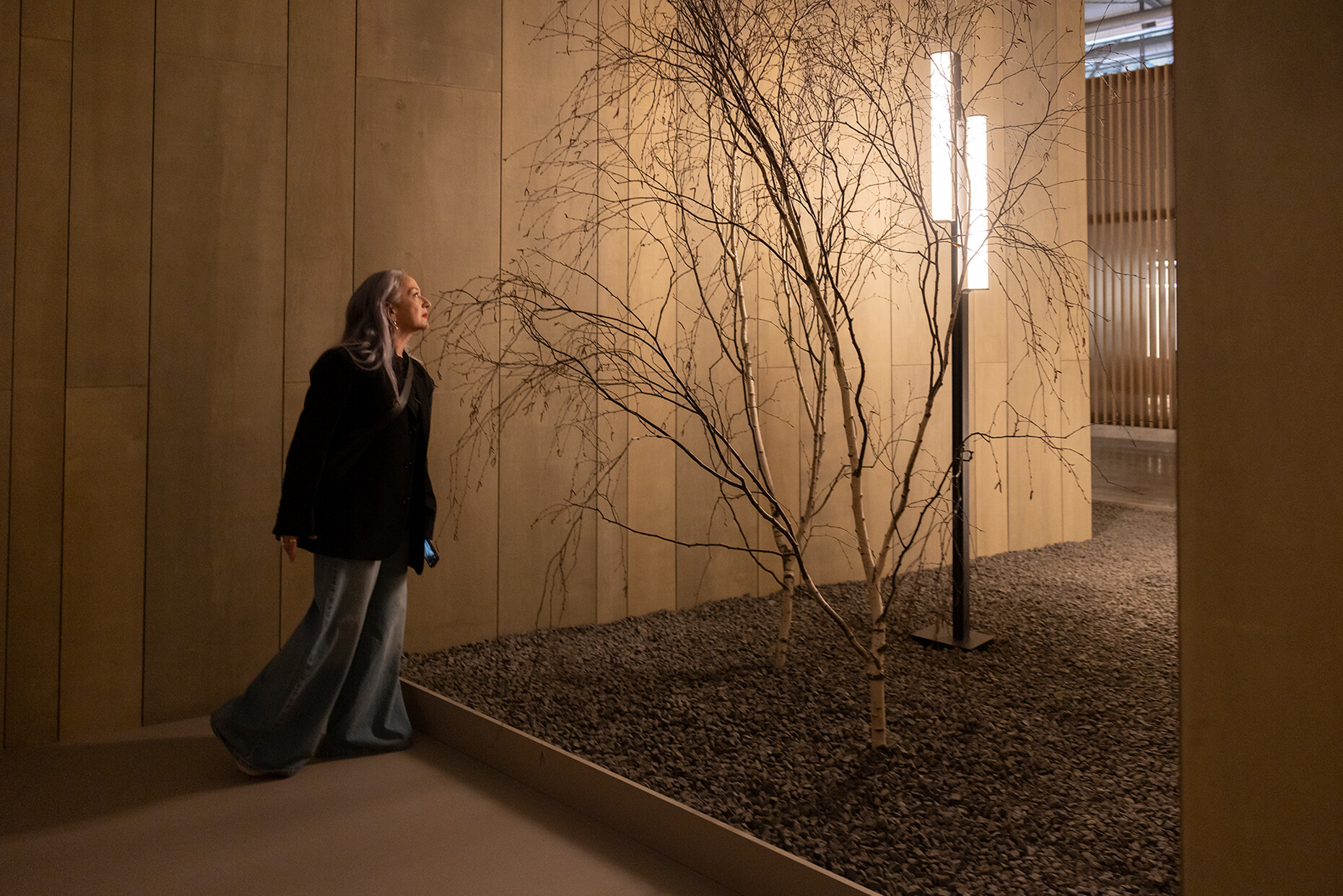
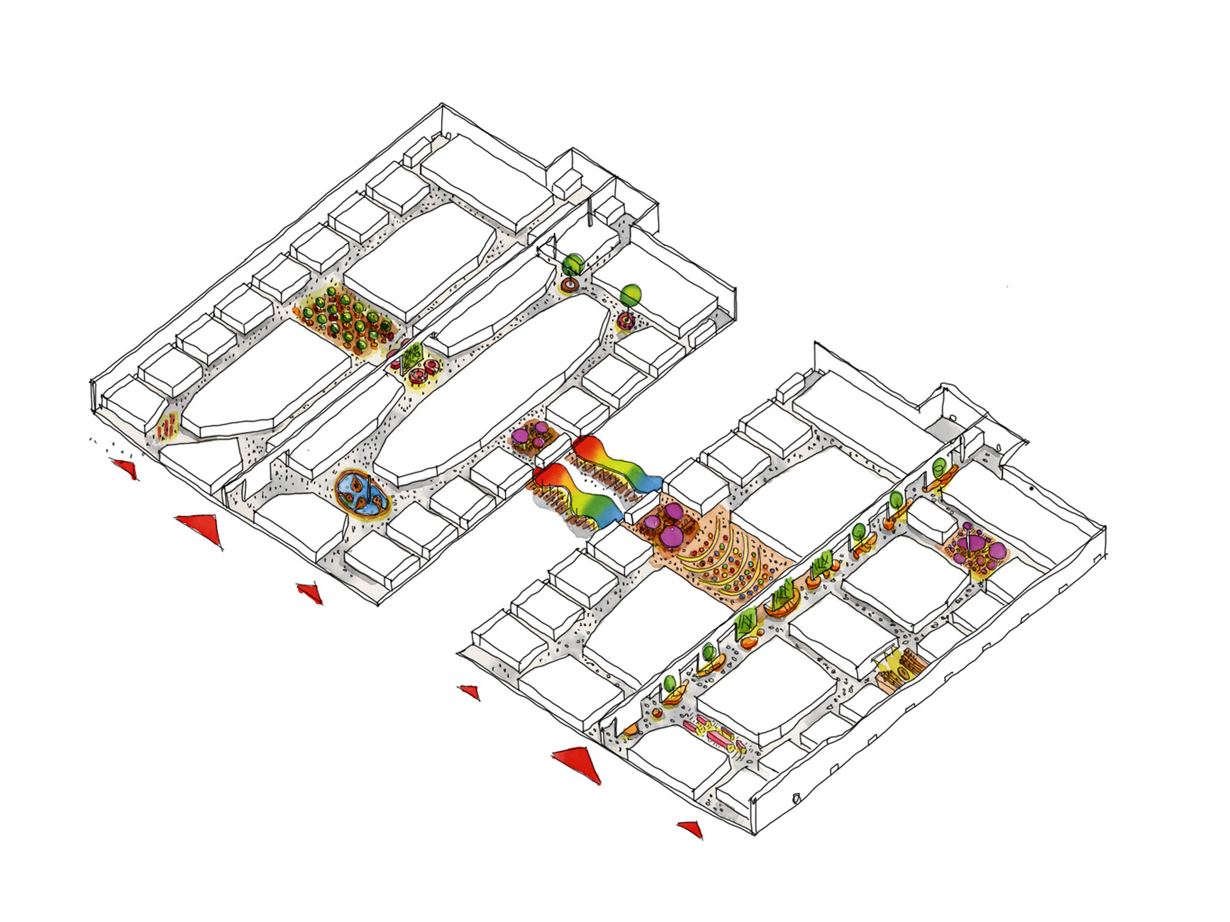
The Milan-based architectural firm Lombardini22 was responsible for the new layout of the stands in the four Euroluce halls. Together with those in charge of the Salone del Mobile, the architects had developed floor plans inspired by the principles of Italian city centres, such as proximity and irregularity. Designing trade fair and exhibition layouts based on traditional urban structures is not a new idea – but in the case of Euroluce 2023, the concept has proven itself. Instead of the previous rigid, orthogonal grid – which could still be admired in all its confusion in the furniture halls – Lombardini22 organised the stands in the light halls around a central, oval circuit in each case. Small "side streets" branched off from this "ring road", and in some places the aisles widened into square-like areas. The lines of the stands along the aisles were not straight, but jumped slightly back and forth. Once visitors had completed the tour and looked down each of the side streets, they could leave the hall with the good feeling that they had not missed anything - not a matter of course at a fair! The exhibitors were also generally satisfied with the new layout and the feeling of space, even if some still saw potential in the layout of the stands. Some manufacturers followed the Fair's call for more openness and less use of materials and did without elaborately designed stands that sealed themselves off from the outside. But the new way of thinking has by no means caught on with everyone: Unfortunately, once again this year many companies felt it necessary to cover their space with drywall and thus turn it into veritable buildings. This is not only unoriginal from a design point of view - after six days of the fair the excavator comes and crushes the whole thing for the waste container. If the format of the fair is really to become more sustainable, as those responsible for the Salone del Mobile keep invoking, then they must impose corresponding regulations on the exhibitors. Voluntarism alone obviously won't work.
From luminaire to e-waste
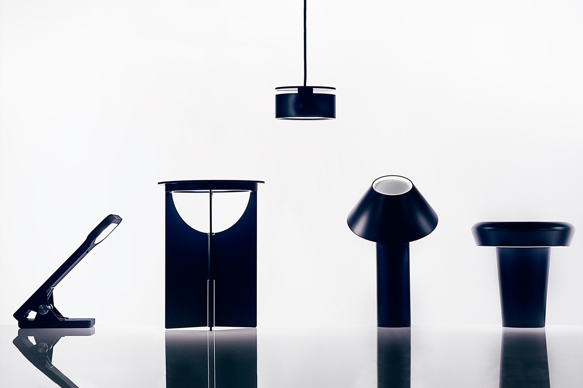
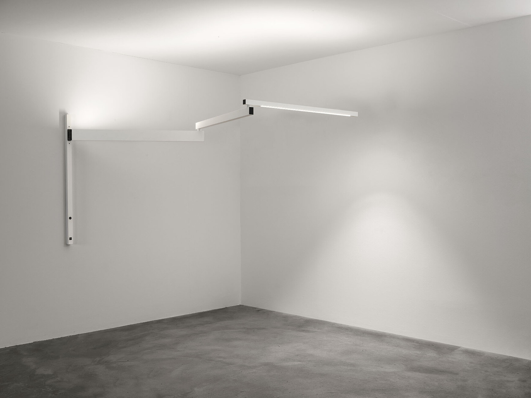
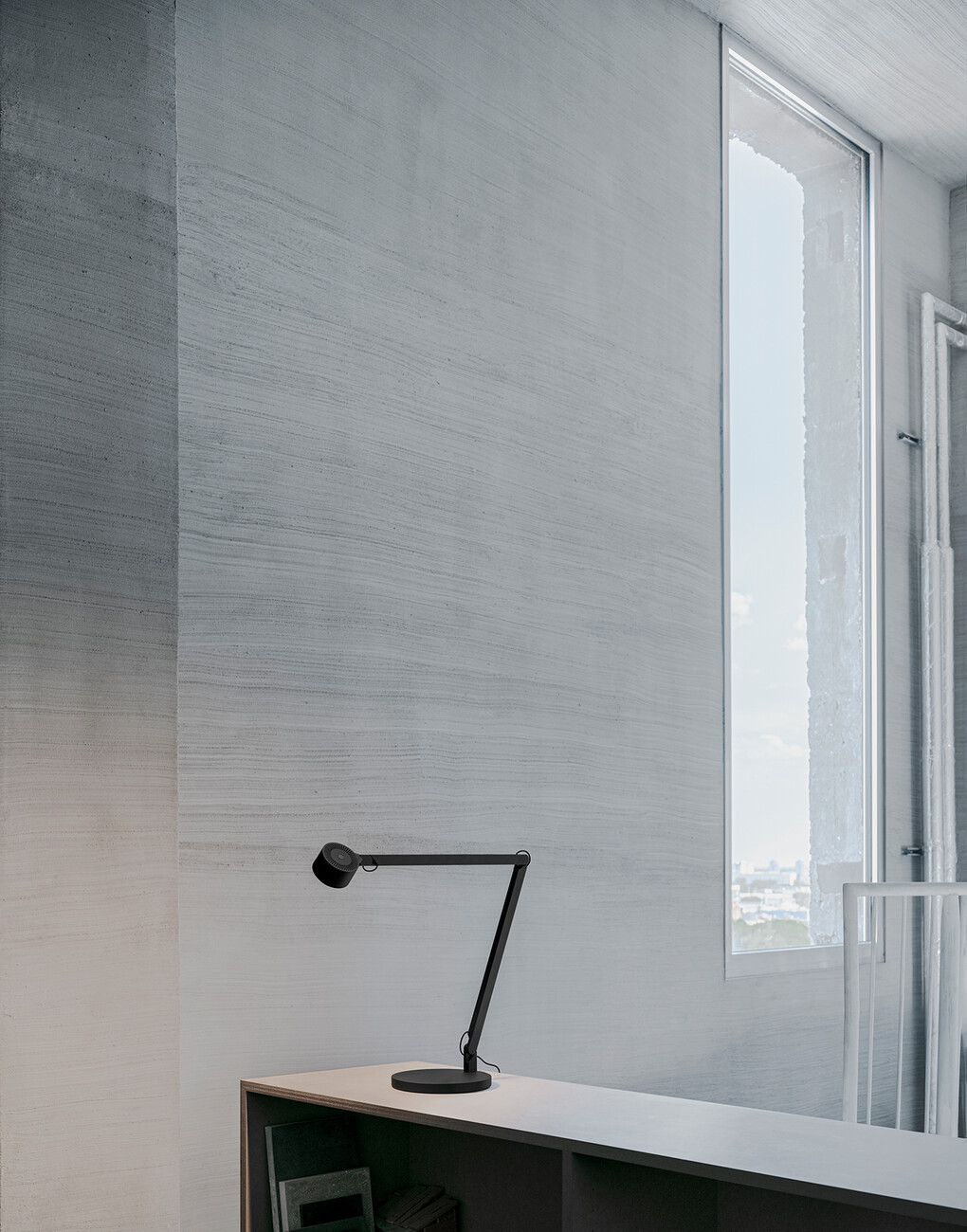
Sustainability is also no easy task for the luminaires themselves. Unlike in the past, today's products contain many permanently installed components – the light source itself, as well as other technical components such as drivers or control units. Even if the manufacturers promise that their products have a long service life thanks to LEDs: If something should break, such a luminaire quickly becomes a pile of irreparable electronic waste. Accordingly, many manufacturers are reluctant to talk about this topic. For large projects such as offices, hotels or similar, there are corresponding replacement and service offers, but no option for end customers. Magnus Wästberg, founder and co-owner of the Swedish lighting brand of the same name, on the other hand, has no reservations about the topic. Wästberg, he said during the conversation at the Euroluce stand, designs all luminaires in such a way that the components can be easily replaced if necessary. That the company's own sustainability claim is seriously meant was also shown by the news at Euroluce. The company not only presented the new "w222" Focal luminaire family by David Chipperfield, but also retreaded versions of the "w103" Sempé, "w132" Nendo and "w227" Winkel products. Already in the brand's portfolio for years, they have now been further developed in terms of efficiency, lighting quality and sustainability. The "w227" task luminaire by Dirk Winkel is even available in a new material, aluminium instead of plastic. The reason: aluminium can be produced in Sweden with green energy and a high recycling rate, and less material is needed for the metal version.
That has a system
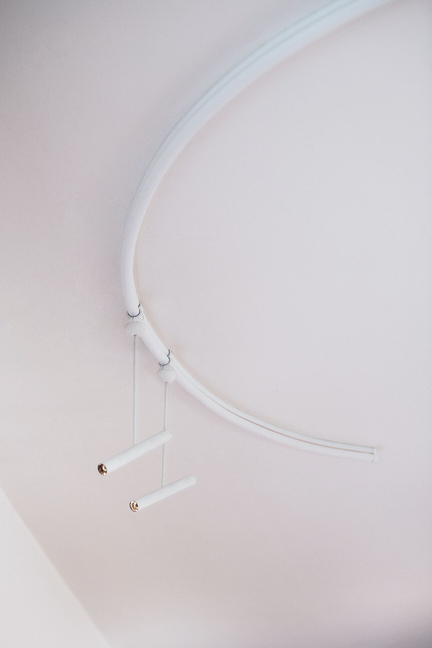
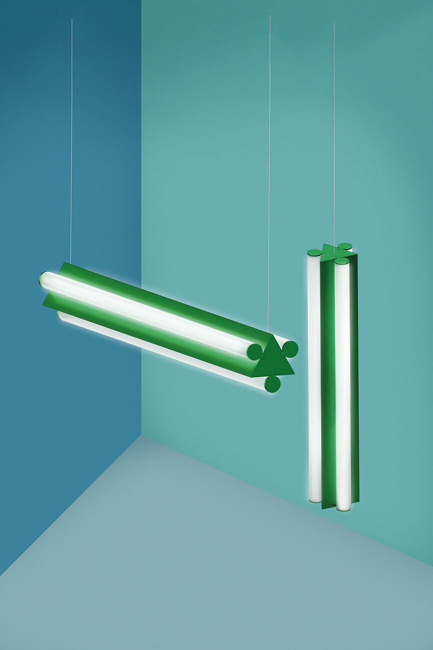
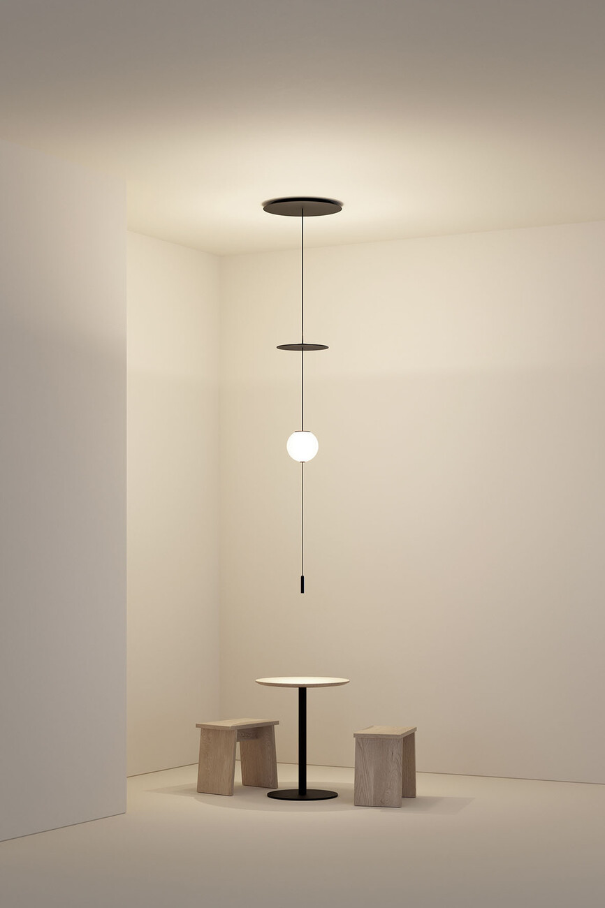
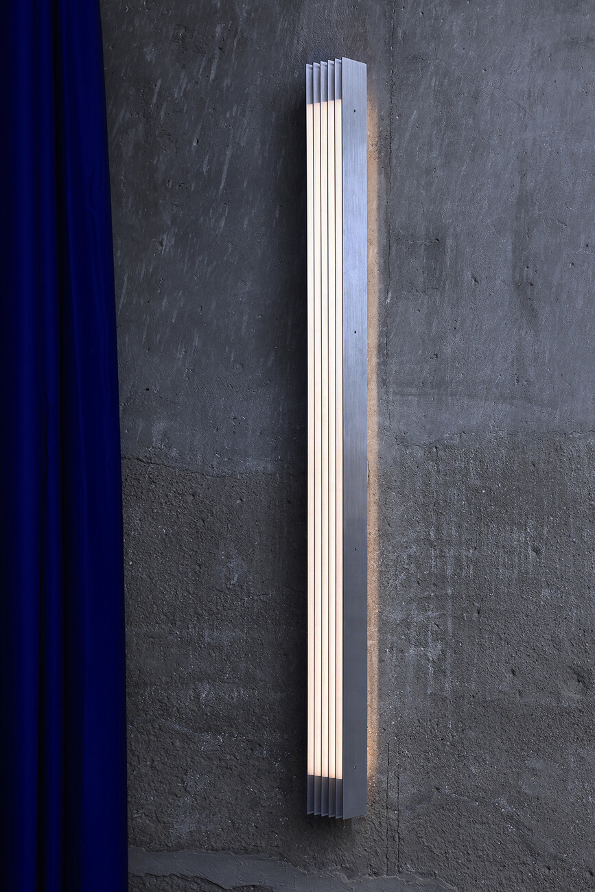
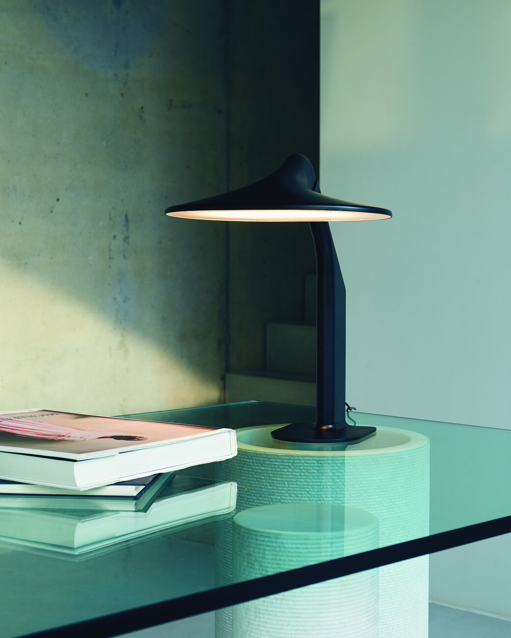
One lesson many luminaire manufacturers have learned in the meantime: good light may need a lot of technology today, but it doesn't necessarily have to look technical. This was particularly evident in systems designed to illuminate entire rooms and buildings with a uniform solution. For example, the all-white "Circuit", now ready for the market, which the London designer Michael Anastassiades developed together with Flos: The ceiling-mounted track of the patented system is made of flexible rubber with a thin copper strip for current conduction. Accordingly, it can be bent and adapted to the interior design. For this purpose, there is a range of different luminaire elements – from the disc to the spot to the rod. They are attached to the track with a clip, and a small sphere holds the necessary technology. The elements are also available as luminaires independent of the system. This is as technical as necessary and as aesthetic as possible. Artemide also presented a new system with "Sylt" by Carlotta de Bevilacqua: a rail in the form of a narrow, black, also freely formable band that is suspended slightly from the ceiling. By means of an adapter, various luminaires from the Artemide range can be integrated into it – from the classic sphere to BIG's "La Linea" light tube. Much more expressive is "Dreispitz" by Herzog de Meuron, another project by Artemide with a renowned architectural firm. In Dreispitz, an elongated, triangular module forms the starting point for various configurations. It can be suspended, mounted on the wall or used as a floor lamp with a base. Vibia from Barcelona also relies on the system: after Stefan Diez' Plusminus, which is based on a textile strip, the company now presented another holistic lighting solution at Euroluce with a preview of the "Circus" concept. Circus is based on a rod that can be suspended from the ceiling with cables at different heights. With spots, spheres, tubes, reflectors and classic shade shapes, there is a whole family of matching luminaires that can create many lighting situations, from functional lighting to atmospheric glow.
Celebration of the Here and Now
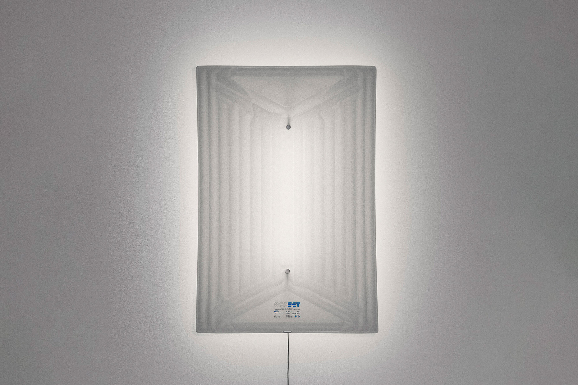
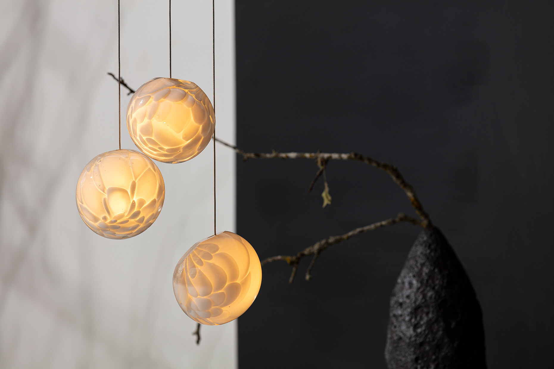
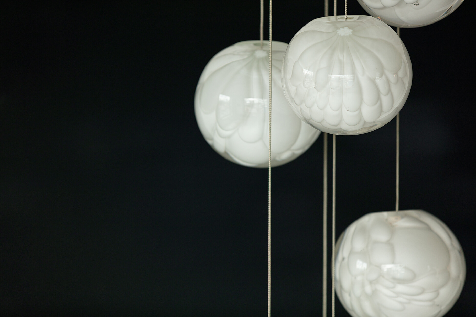
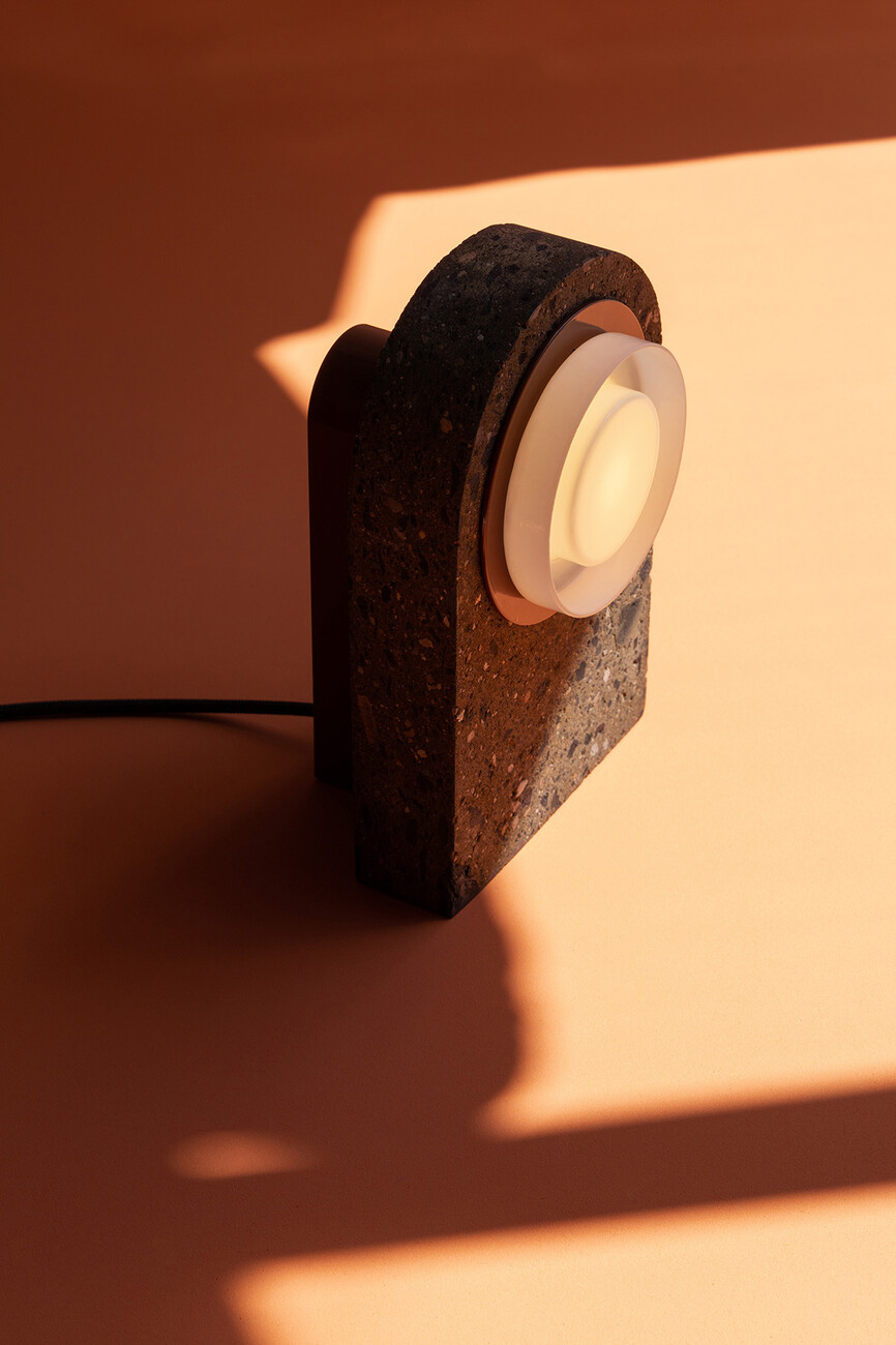
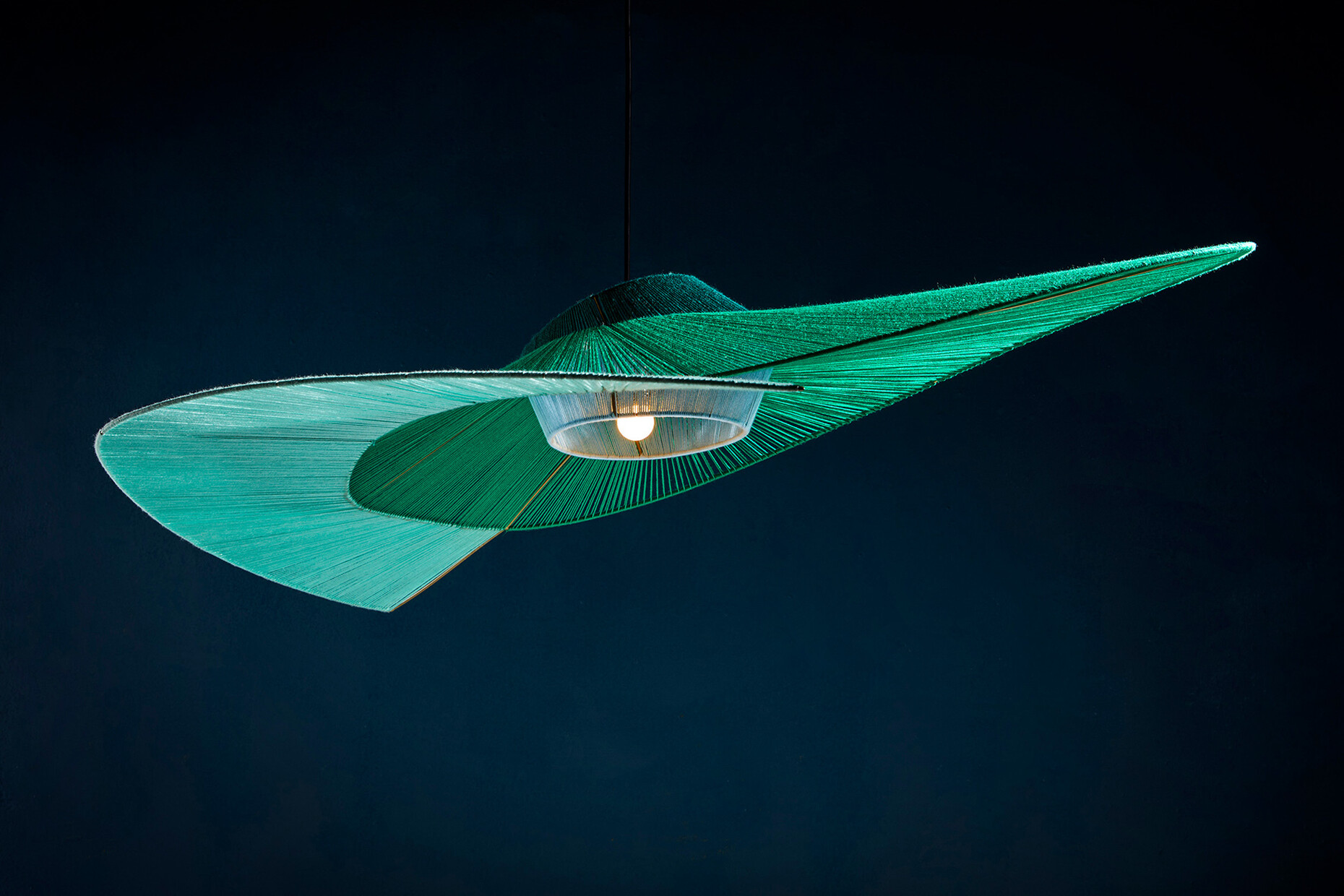
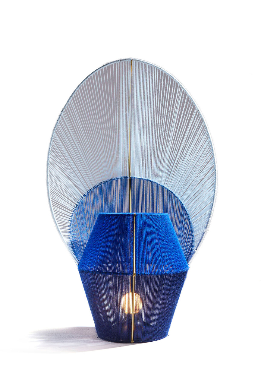
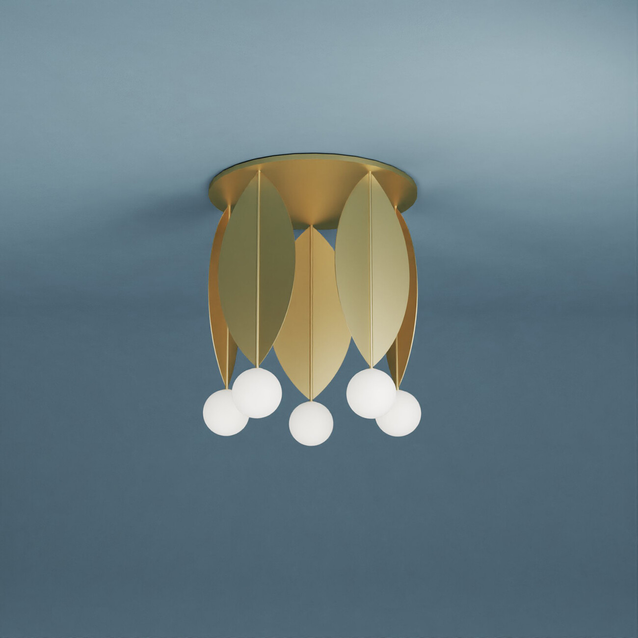
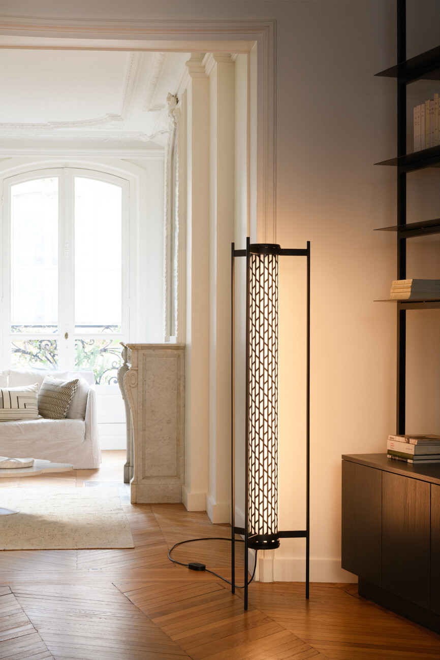
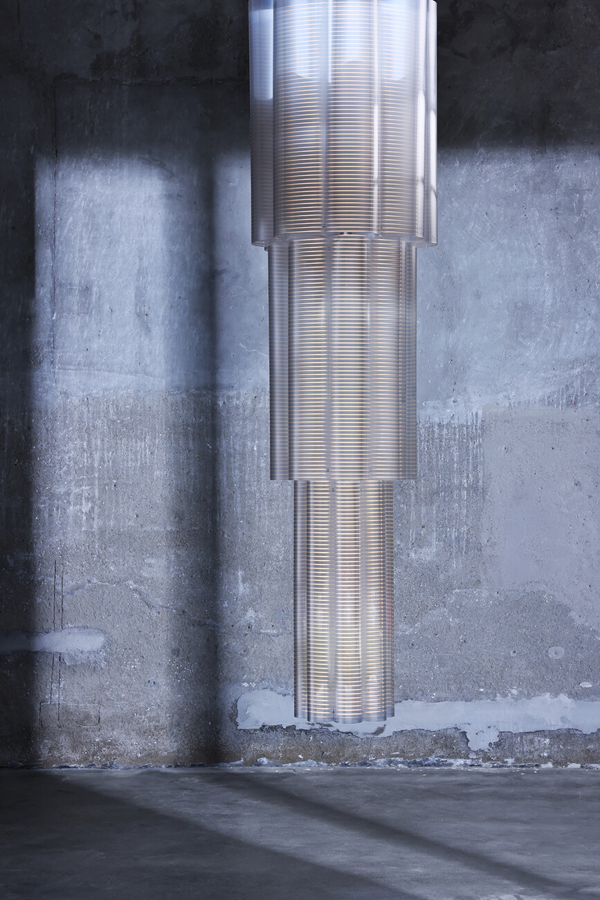
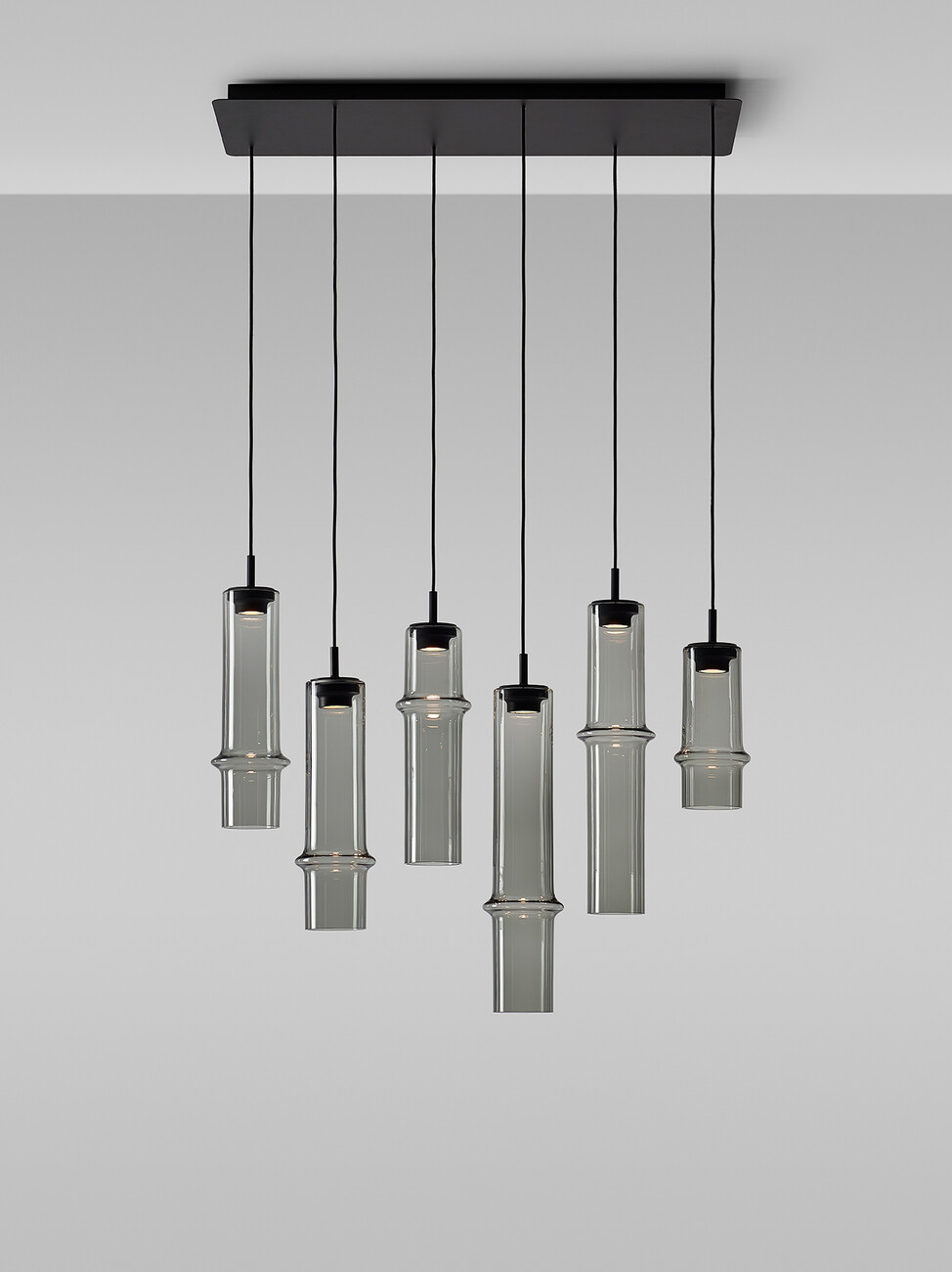
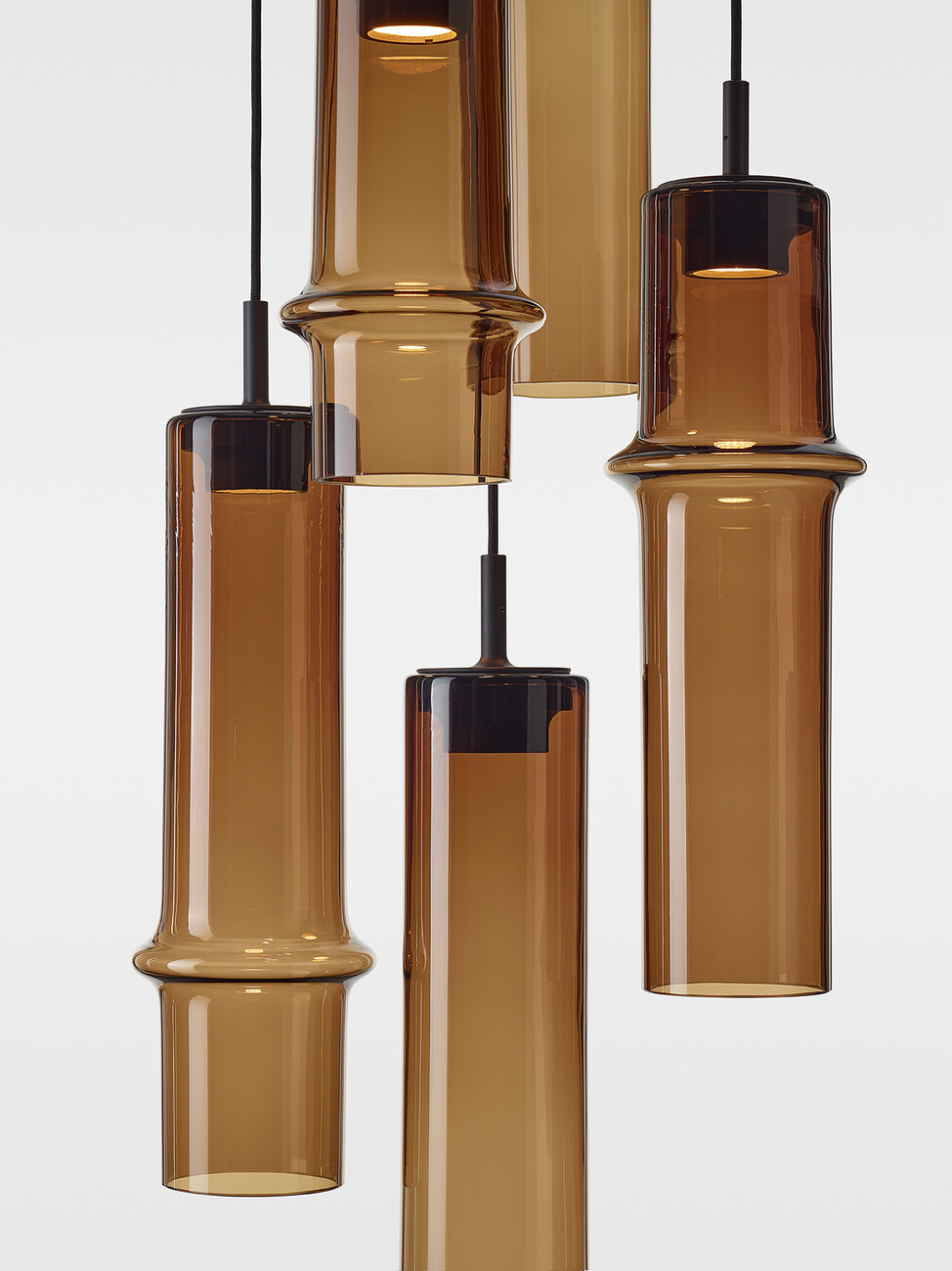
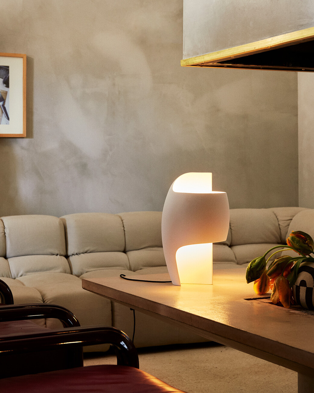
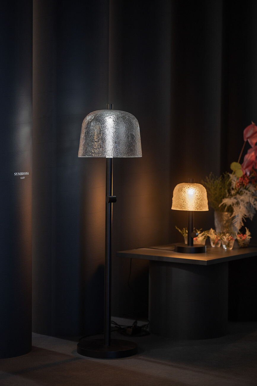
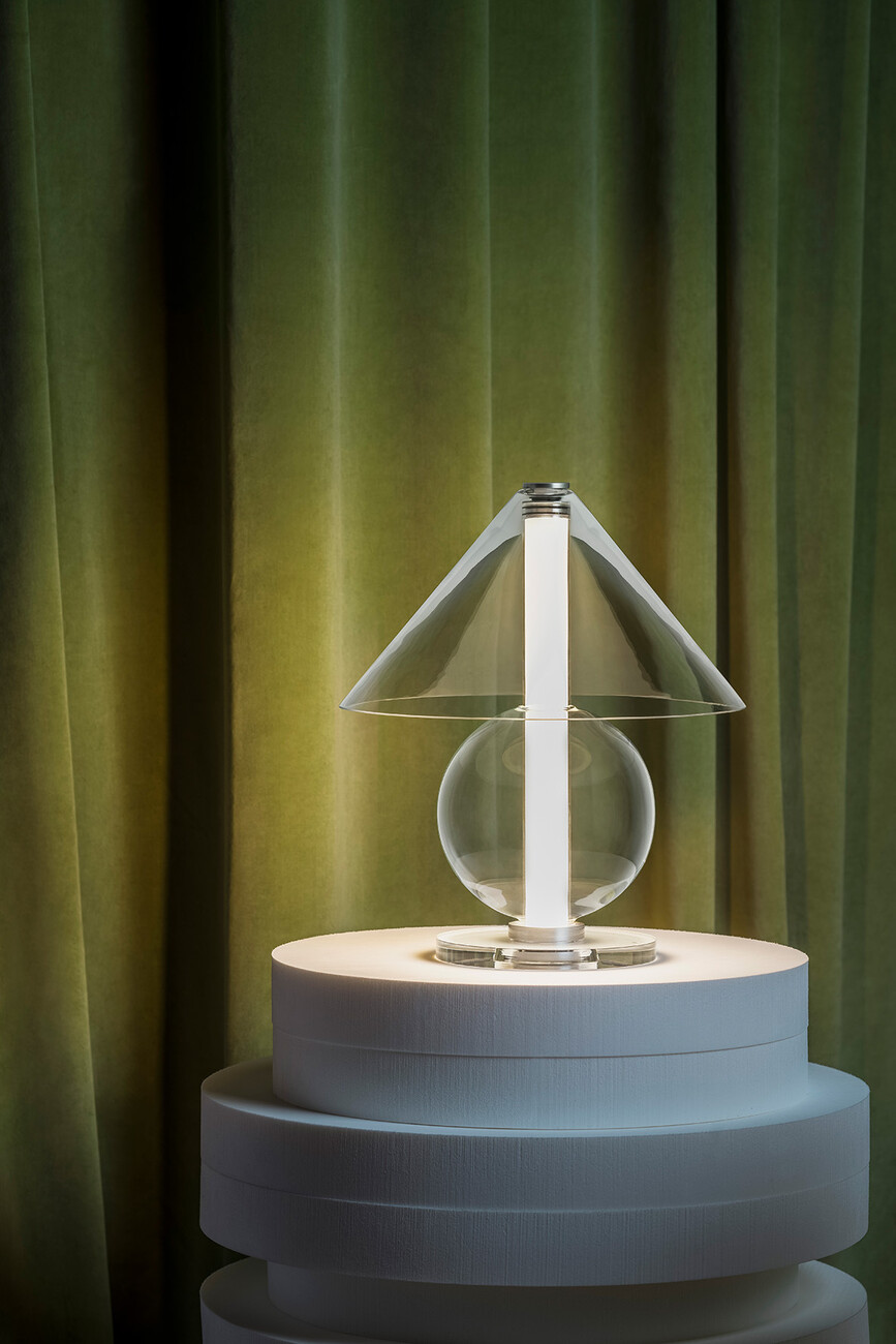
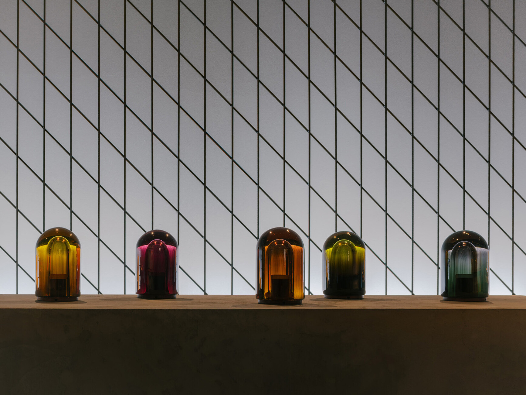
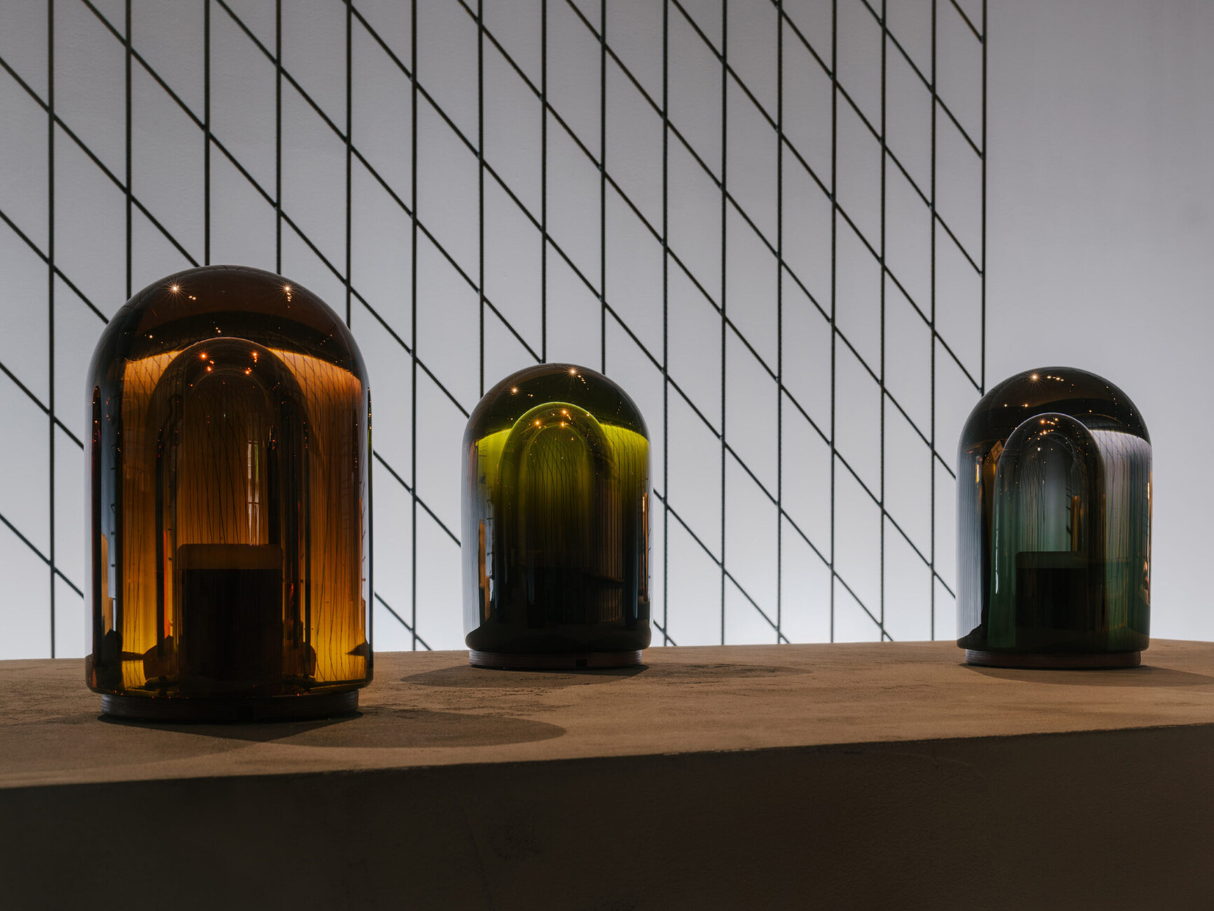
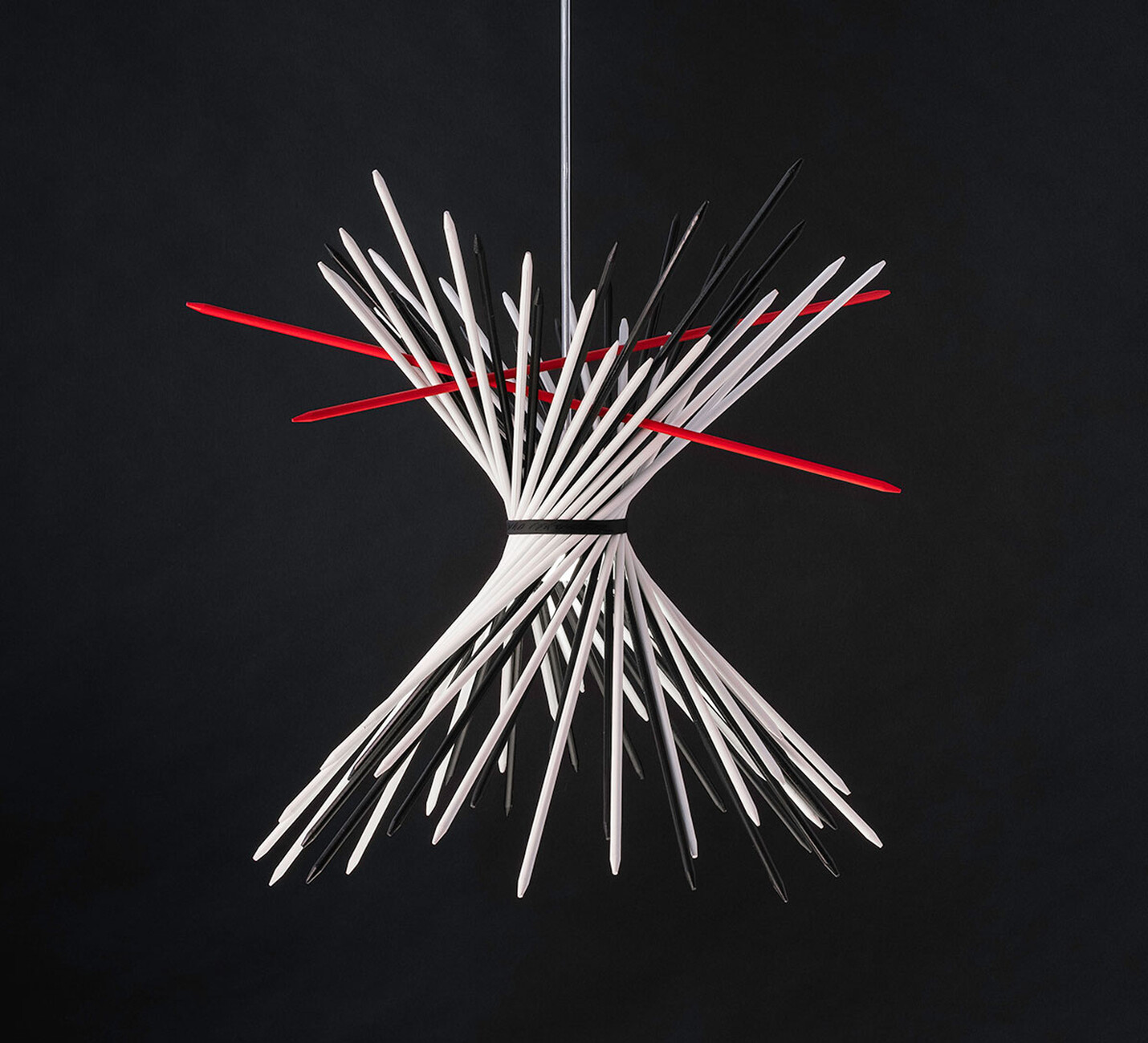
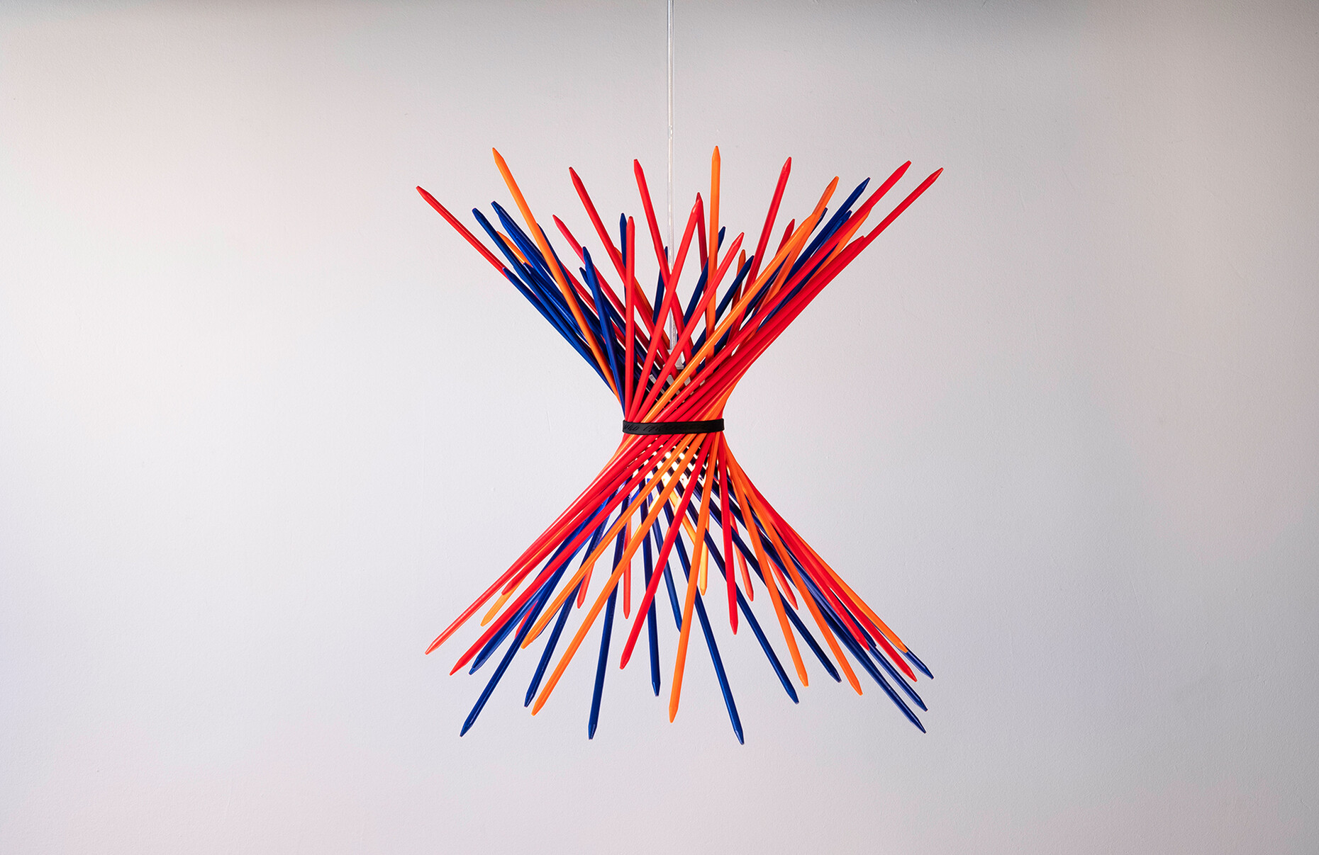
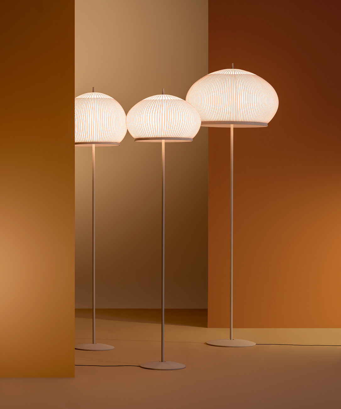
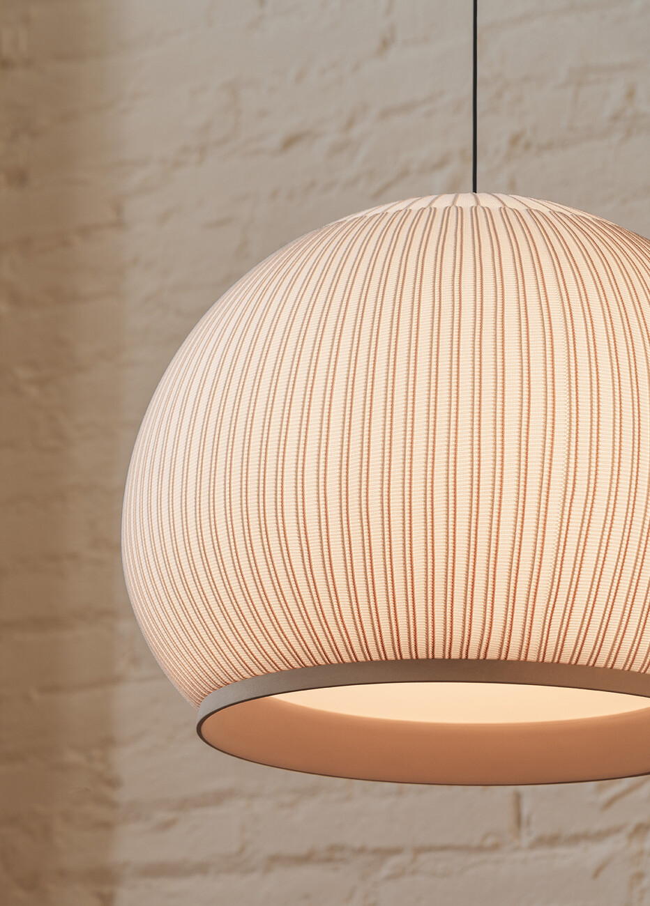
Whereas functional and technical requirements set clear limits to the design creativity of the systems, the designers went all out when it came to the individual luminaires. Whether ornamental sheet metal, structured textiles or colourful shimmering glass: design is once again allowed to be decorative and extravagant – a trend that was also noticeable in the neighbouring halls in furniture design. After years of isolation, design celebrates the beauty of the here and now. Foscarini, for example, showed "Fregio" by Andrea Anastasio at Euroluce, a flat, elongated lamp with a floral ceramic relief. Vibia, on the other hand, drew everyone's attention to "Knit", a family of luminaires by German designer Meike Harde. She formed voluminous shades of fine knitted fabric into luminous objects with a special aura. The Danish label Made by Hand also uses knitted fabric: the Flying pendant lamp made of 3D knitted fabric looks like a UFO that has started to wobble during its landing approach. Textiles in general: the good old fabric shade appeared in updated form at many a stand. Ingo Maurer, on the other hand, who has always been known for playful, artistic designs, presented, among other things, a lampshade made of Mikado rods and a graphic structure that is intertwined in many ways and in which the light source is more of a secondary matter. The traditional luminaire material glass also played out its charms more than ever: at the fair by the big Czech manufacturers such as Lasvit and Brokis as well as by the small label Eloa from Berlin. In the city centre, Bocci with the pendant lamp "118" and Hermès with the table lamp "Souffle" by the Finn Harri Koskinen showed how this millennia-old material can always be made to shine anew.
